Unleashing The Full Potential Of Symbols In Sketch

Email Newsletter
Weekly tips on front-end & UX.
Trusted by 182,000+ folks.
 SurveyJS: White-Label Survey Solution for Your JS App
 Register Free Now


 Celebrating 10 million developers
No matter whether you are designing a whole design system or just a couple of screens, symbols in Sketch will help you keep your file organized and will save you a lot of time in the long run. In this article, I’ll share with you a few best practices and tricks to help you unleash symbols’ full potential.
But first, a bit of a backstory. I started using Sketch a few years ago, as a replacement for my favorite design software back then, Fireworks, which had been discontinued by Adobe — leaving a whole generation of designers broken-hearted. Since my first days of using Sketch, I was very surprised by how easy and straightforward it is to use. I had, once again, found an application focused on user interface (and icon) design — and nothing else.
The apparent lack of features in Sketch, compared to the alternatives full of menus and stacked panels that I was used to, was in fact one of its major advantages and helped me to design faster. Among those few features, symbols were the thing that I used very frequently, and still do, practically every day (yes, even on Sundays… you know, a freelancer’s life).
What are symbols? In a nutshell, symbols enable you to use and reuse an element across a project, keeping a master symbol that automatically updates other instances of the symbol when changes are made to it.
This concept is not exactly new (nor is it exclusive to Sketch, to be honest). However, if you design interfaces, then you’ll find it extremely useful, especially when using components as part of a design system.
In this article, I’ll outline how to make use of symbols in Sketch in order to unleash their full potential, going from the most basic situations to some more advanced use cases. I’ll also include some tips and tricks that I have learned along the way.
A Brief Introduction To Symbols
Before digging deeper, and in case you are new to Sketch, let me give you a short introduction to how symbols work.
Symbols can be made from almost any elements in Sketch: text objects, shapes, bitmap images, even other symbols (we’ll talk about this later). Inside every symbol (double-click a symbol to enter edit mode), you’ll find one main artboard containing the symbol’s layers. This artboard also defines the symbol’s boundaries.
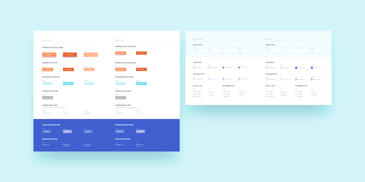
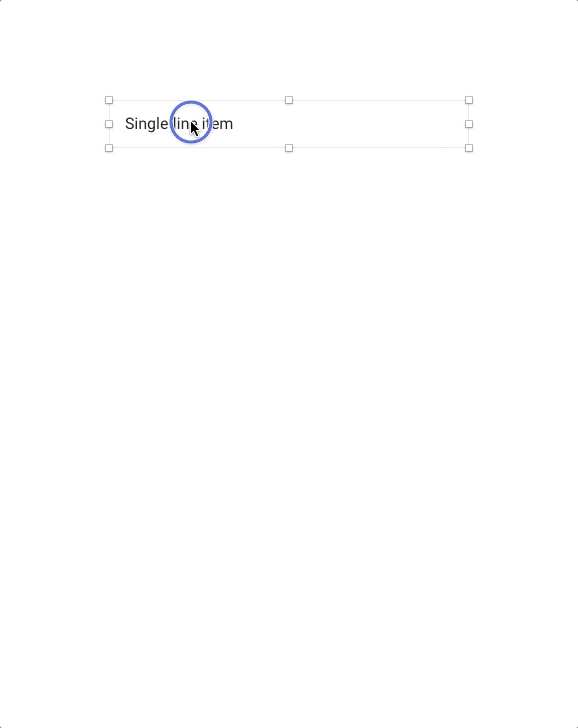
Usually, symbols are created for those elements in an interface that you expect to reuse later on (such as buttons, list items, tabs, etc.) and that will be spread across different screens, pages and artboards in your designs.
Note: For future reference, keep in mind that “copies” of one symbol are called instances.
The best thing about using symbols (instead of grouped, independent and disconnected objects) is that if at some point you decide to change some property in a particular symbol (for example, the color, shape, text size, dimensions or whatever else you want), you’ll just need to edit the symbol’s master once, and this change will be automatically replicated to all of the master’s instances, wherever they are. I don’t know about you, but I find this super-convenient!
Tip 1: Be Organized
Just like in life itself, it’s fundamental to keep everything in order. Always design as if someone else will later need to open and work with your design file and understand it without your help! This also applies to the way you name symbols — naming should meet certain criteria.
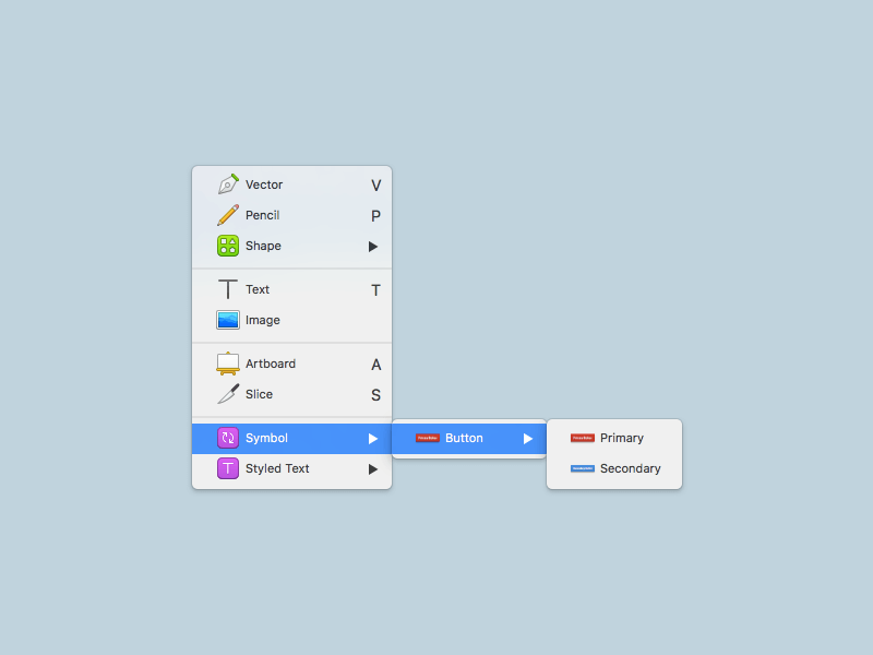
One recommendation is to use a slash (/) in the symbol’s name. Sketch will automatically create a category with the part before the slash, and will name and place the symbol inside it, using the part of the name following the slash. For example, if you have two symbols named “Button/Primary” and “Button/Secondary,” here is how they will look like when you try to insert them from the toolbar:
You can repeat this many times to have several symbols under the same root, grouped by similar logic, making them easier to find. And if your “tree” grows too big, take a moment to reconsider your naming system and see if there’s any possible way to optimize it and make it more manageable.
Tip 2: Naming Conventions
There are many different conventions for how symbols should be named, perhaps one convention for every designer out there. Personally, I prefer not to use names that refer to the visual properties of the elements — for example, “Red Button” would be a bad choice in my opinion because if the color of the button changes later on for some reason, the name of the symbol will become incorrect. Instead, I try to differentiate the symbol’s function and state (such as “Primary/Disabled”).
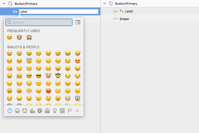
In any case, just be consistent and find something that works for both you and your team, then stick to it; don’t switch the naming system according to the case! This also applies to layers inside symbols: some designers even use emojis to mark which of them are meant to be editable (for example, by adding a pencil emoji to the name). To do this, press Control + Command + Space to open a dialog to select emojis.
Note: Regarding symbols’ names, bear in mind that instances will take their names from the master symbol, but you can change them afterwards to whatever you want. This way, instances of the same symbol can have different names from each other.
Tip 3: An Alternative To The Symbols Page
When you create a symbol, Sketch asks whether you want to send it to the symbols page. My advice is to check this box, even if after a while (and a few symbols later) this dedicated page turns into a mess. (Sketch places one symbol next to the other as they are being created, and when you delete a symbol, you’ll notice the blank space left in its spot.)
Instead, what I do to sort this out is to create my own symbols page (which is just a regular page, which I would usually name “Symbols”) where I can arrange symbol instances in the order I want and, thus, ignore the official symbols page.
This way, I can create artboards that follow categories (such as lists, buttons, inputs and so on) and place symbols in a way that I find convenient and that makes sense to me. You’ll still need to invest some time to update this page from time to time, but once it is created, it will make everything much easier and you’ll be able to build a new screen in no time.
Note: If you prefer to use the symbols page instead, there’s the Symbol Organizer plugin, which could help you keep everything arranged.
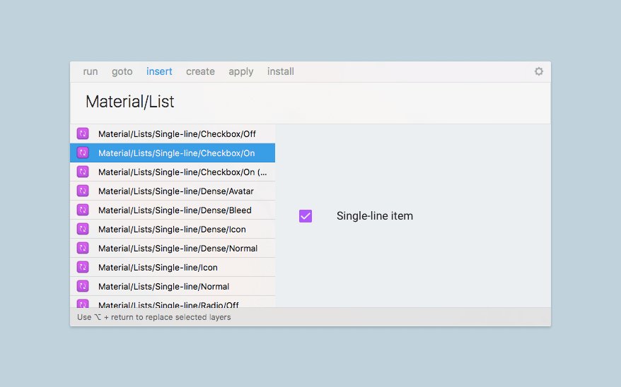
Tip 4: Replacing Symbols
Replacing an existing symbol with another is easy. Just select the symbol and choose “Replace with” from the contextual menu that appears when you right-click over the symbol instance. Then, select the new symbol that you want to use. Keep in mind that the new symbol will keep the same size and position as its predecessor; you can fix this by selecting “Set to original size” from the same contextual menu.
Tip 5: Detaching
Once you’ve made a symbol, you can detach it to recover the elements that form it as a group. To do this, just select “Detach from symbol” in the same contextual menu that I mentioned earlier.
Tip 6: Exporting Symbols As Assets
Symbols, like other elements, can also be exported as bitmap images. To do this, you’ll need to mark elements as exportable. (Select the symbol instance, and then choose “Make Exportable” at the bottom of the Inspector.)
The problem that I found during this process is that if the symbol has some padding (for example, if the shapes inside are smaller than the symbol’s total size), when doing the export, Sketch will omit the blank space and will just create an image with the visible content only.
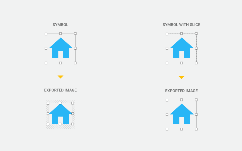
One way to work this around is by using a slice. When creating the slice, place it over the instance and make sure it matches the size of the instance’s boundaries (width and height); then, select the slice and use the exporting options as needed.
Side note: This same trick also applies to other tools, such as Zeplin.
Other Resources
- “Sketch Symbol Best Practices (Now That Nested Overrides Are a Thing),” Lloyd Humphreys
Outlines several other techniques and practices for making good use of symbols.
Handling Different Sizes
In this world full of screens with multiple sizes and aspect ratios, it’s important to make sure your design adapts to many different scenarios. This is easier to accomplish if you don’t have to design everything from scratch every time, by reusing elements (or symbols, as I’m sure you’ve already guessed).
This is where the resizing options in symbols come in handy, helping you to use the same element with different widths and heights with no hassle: If you resize just one instance by selecting it, this won’t affect the other instances. (But remember that resizing options are applied to individual layers inside the master symbol, not to the instance itself. So, even while you can adjust sizes individually from instance to instance, elements inside will always maintain the same behavior.)
Note: The options outlined below apply not only to symbols, but to groups as well. Behaviors are not always predictable, so chances are that you’ll have to play around and explore a bit before finding what you need, combining one or two different settings in most cases.
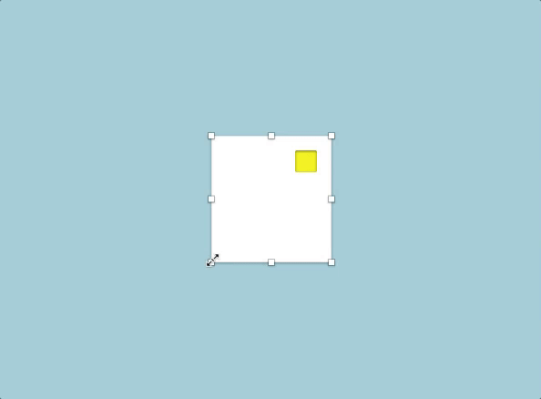
Stretch
When the Stretch option is used, a shape that has specified, let’s say, 50% of the symbol’s total width will keep this same relationship when the instance is extended vertically or horizontally. This is the default behavior.
Pin To Corner
“Pin to Corner” will (as the name suggests) pin an element to the nearest corner, and the element will not resize, keeping the same distance to this corner. Keep in mind that if the object is centered (with equal spacing from both sides), it won’t know which one is the nearest corner, so it’ll stay in the middle.
Resize Object
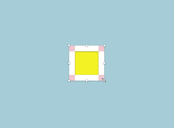
When “Resize Object” is used, elements will grow while keeping an equal (or fixed) spacing from the sides.
Float In Place
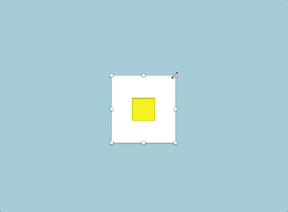
“Float in Place” will make an object stay the same size and will keep its relative position to the boundaries of the symbol.
Tip 1: Back To The Original Size
If you have resized your symbol but aren’t satisfied with the result, you can always go back to the beginning by choosing “Set to original size” from the contextual menu.
Tip 2: Boundaries
Keep in mind that symbols have dedicated artboards, and these will define the symbols’ boundaries (even when shapes inside overflow on them). You can make the symbol’s artboard the same size as of its contents by selecting it and choosing “Resize to fit” from the Inspector.
Tip 3: Using Characters And Operators
In the width and height input fields in the Inspector, you can use operators to change values. For instance, you can use 100*2 to set an element’s dimensions to 200 pixels. Other operators are + (add), - (subtract) and / (divide).
Besides mathematical operators, in the same input fields you can also use L to scale an object from the left (this is the default), R to scale it from the right, T to scale it from the top (this is the default), B to scale it from the bottom, and C and M to scale it from the center or middle.
For example, if you have a shape that has a width of 200 pixels and want to resize it so that it scales from the right to the left side, you can use something like 300r in the width input field.
Other Resources
- ”Sketch 39 Resizing: Cheat Sheet” Peter Nowell
This article is a good reference for understanding the differences in resizing. It also includes some other tips and tricks, so give it a go!
Nested Symbols
What could be better than one symbol? Perhaps a symbol with another one inside it!
This feature is kind of new in Sketch, and it gives you a lot of possibilities when combining symbols together. You can place one symbol on top of another, select both, and then create a new symbol that contains the two instances. You can repeat this as much as you’d like. Be moderate, though, or else you’ll find yourself digging into levels and levels of nested symbols, one inside another. This could make maintenance much harder and could also be a symptom of bigger organizational problems.
Nesting symbols can be especially useful when you need to create variations of one symbol. For example, you could follow a process like this:
- Pick up one symbol that will serve as a base. (this symbol will remain the same in all cases.)
- Overlap it with other symbols (such as icons or badges), which could be there or not, depending on the case.
- Finally, create another symbol with the resulting design.
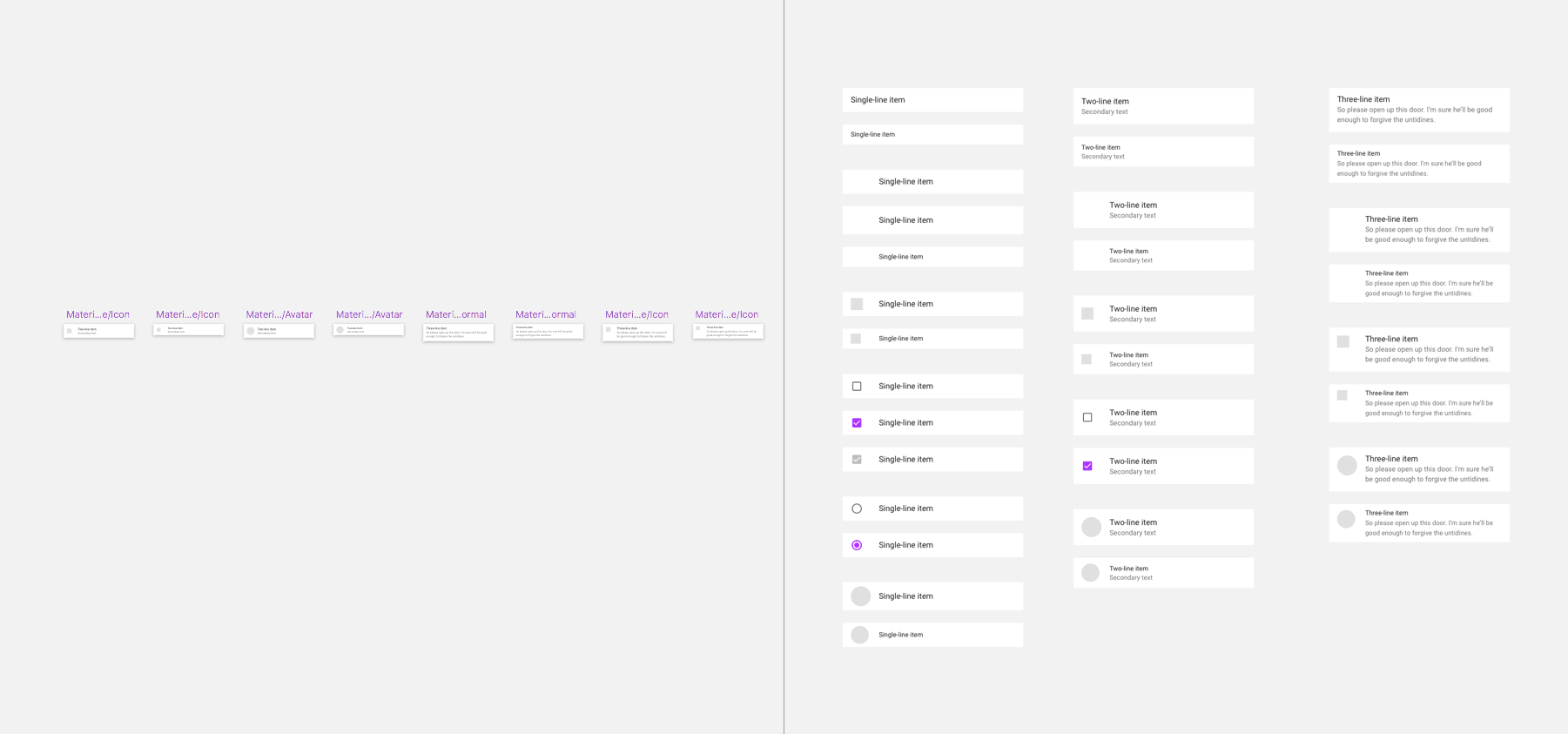
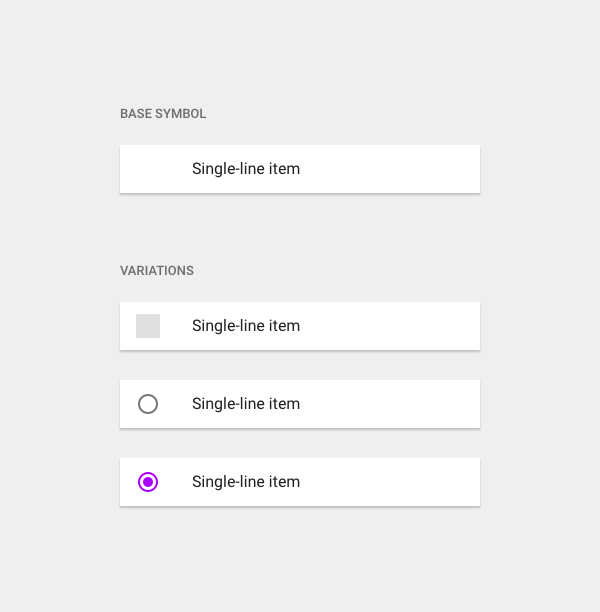
In the image below, you can see that all rows share the same characteristics (they have the same size, text properties and amount of padding on the left), so I created a base symbol that contains only these elements (i.e. elements that will be shared with the other symbols). Using this symbol as a starting point, I then created some overlapping elements that are different, saving the result in each case as a different symbol; so, all of the symbols under “Variations” are actually different symbols.
But you don’t — necessarily — need to create a new symbol for every state of the row. There may be a simpler way: using overrides.
Nested Overrides
If you had to create a lot of different symbols just because one part of their content changes, you’d probably go nuts. One of the main purposes of symbols is precisely to have to design as little as possible and to have fewer elements — and, therefore, more control over them. Enter nested overrides!
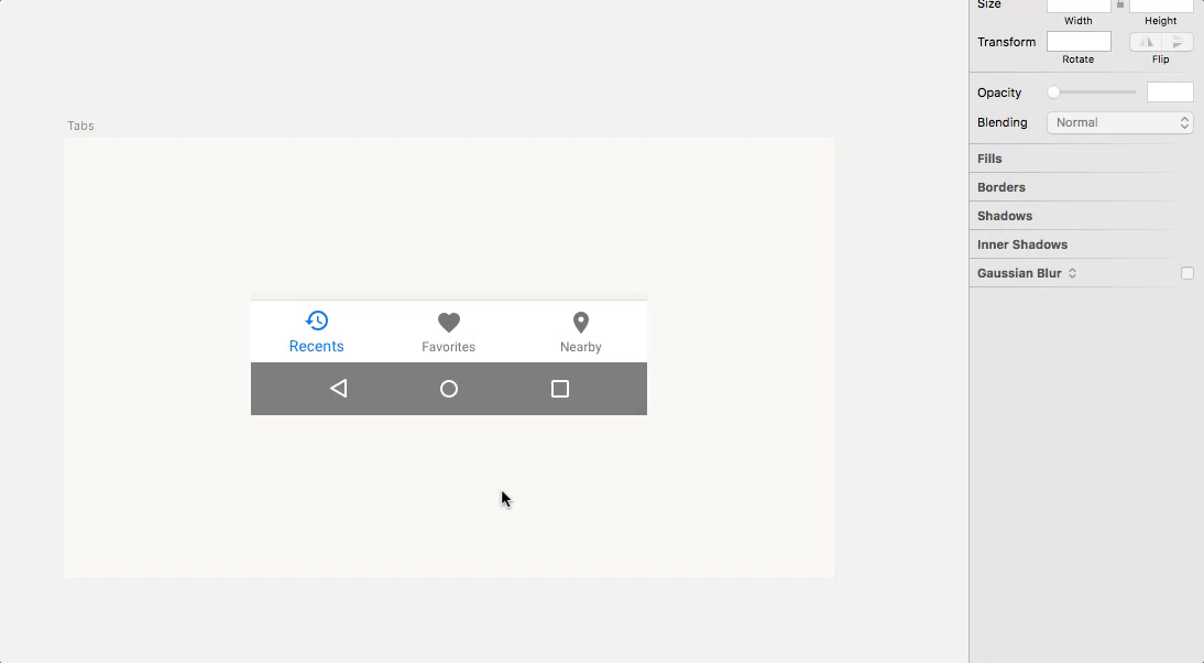
One practical example of this workflow could be designing a tab bar with different states. In this case, the main symbol with the inactive tabs would act as the base, and then there would be a different symbol for each one of the highlighted tabs. Just choose the one that you want from the “Overrides” options in the Inspector.
Note: For this technique to work, keep in mind that the inactive tabs inside the main symbol (the navigation bar) need to be symbols as well. Also, be sure that all symbols (both inactive and active ones) have the exact same dimensions (width, height). Otherwise, they won’t appear as available options in the “Overrides” dropdown menu.
Let’s look at another use case. If you have multiple buttons in a design but with different text labels on them, then the Overrides option will enable you to change the text value (not the font family or font size — you have to modify those inside the symbol itself, when editing the symbol master), without having to create a new symbol each time. This is as easy to do as selecting the instance and changing the text content in the Inspector.
Overrides apply not only to text; you can also use them for bitmap images and even for other symbols, as mentioned before. This way, you can have several instances of a symbol, with a different image in each one of them — and all of this without having to modify the symbol’s master.
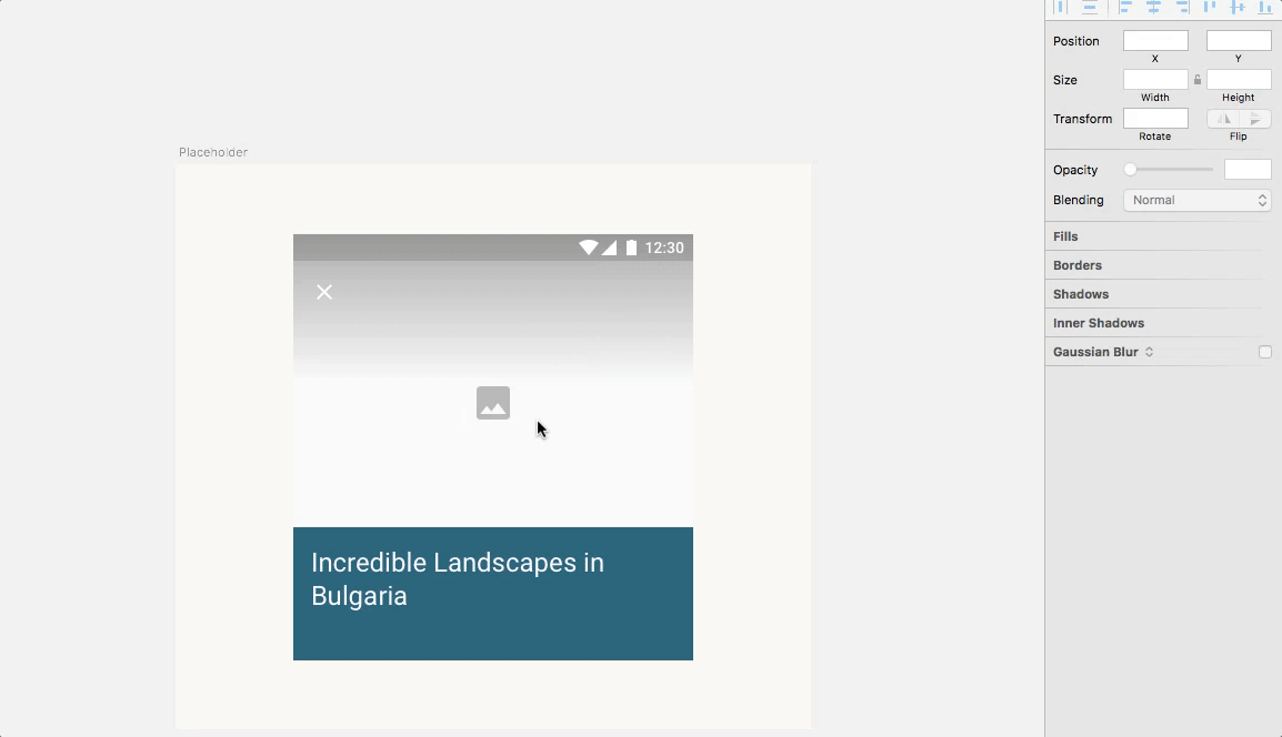
There are cases when I don’t want to have any particular image as part of a symbol’s master. So, what I usually do is to create an empty PNG file with no visible content, create a shape, and use this image as a pattern fill (you can find this option in the “Fill Options” when selecting a shape). Then, when doing the symbol overriding, I just replace this transparent image with the one that I want in each case!
To get the most out of this practice, I also use a layering system with an icon or element that acts as a placeholder underneath the image and that will be visible only if I keep the original transparent bitmap. One benefit of doing this is that I can simulate this empty state that will appear when images are loading in the finished product, something that I consider necessary to design anyway.
Tip 1: Names And Layer Order
One of the reasons why being organized is a good idea is because the way you name and order layers will affect the way they are displayed in the “Overrides” panel. The labels to the left of the input fields in the Inspector will respect the name and order you’ve previously defined inside the symbol itself, so you’d better pay attention to this order if you want to have a more efficient workflow.
Tip 2: Mind The Size
You can replace a nested symbol with another symbol only if the new symbol has the exact same width and height as the current element.
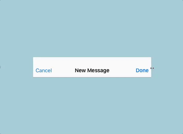
Tip 3: Displacing Elements Depending On Text Length
When changing the text’s value in the Overrides options, you can make an element move as needed when the one to its left is longer (see the following illustration).
The secondary text or shape necessarily needs to be to the right of the text for this to work. Also, both elements should have no more than 20 pixels of distance between them (see the “Further Reading” below).
Tip 4: Avoiding Overrides
A symbol can look a bit messy because of the options in the Overrides section. If you don’t want an element inside it to be able to be overridden, just lock or hide this layer and it won’t appear in the list.
Tip 5: Hiding Nested Symbols
Just select “None” from the Overrides section to hide a nested symbol. Of course, it will only be invisible in that particular instance.
Tip 6: Hiding Text
There’s one way to quickly make a text element disappear in an instance, by using overrides. To do this, just set the text value to a blank space, pressing the space bar and the return key in the Overrides options.
Tip 7: Recovering The Original Image
If you have bitmap images inside a symbol, they can be changed by others using the options in the Overrides section. It’s also possible to recover the original image (the one that forms part of the editable symbol) by choosing “Remove image override” — just right-click over the image box next to “Choose Image” in the Inspector.
Other Resources (And A Video)
- “Hacking the Button in Sketch,” Aleksandr Pasevin
Presents a simple hack to keep an icon to the left of the text (instead of to the right, which is the normal behavior), in just a couple of simple steps. - “Adaptive Text Elements,” Yaron Tamuz
Explains how to use hidden elements as text separators to avoid their overlapping when the values change. - “Sketch: Tint icons using nested symbols,” Francesco Bertocci
A simple technique to change an icon’s colors inside a symbol using masks. - “This Is, Without a doubt, the Coolest Sketch Technique You’ll See All Day,” Jon Moore
Explains how to save time using nested symbols, customizing them to your needs. The article also includes interesting techniques from other designers. - “Creating a Button System With Nested Symbols in Sketch App” (video), Pablo Stanley
Takes you through the steps that you need to perform to create a button system, using many of the things we’ve learned so far.
Plugins That Play Well With Symbols
One good thing about Sketch is that when it falls short of a feature, there’s usually a plugin to make up for it. And some of them work especially well with symbols, making them even more powerful! Some of these plugins have been mentioned, but in case you missed any of them, here’s a list with some additions.
Sketch Runner
Among its many other features, the Sketch Runner plugin will help you easily insert symbols in a document using just a combination of keys. The “go to” option is very useful for jumping right to a particular symbol — very useful if your project has a lot of them and if it’s difficult to find symbols using other means.
InVision Craft Library
If you are working with a team, InVision Craft Library will make it easy to create a shared library with assets that everybody can use, allowing you to sync changes when you need to update a symbol, so that you are always sure you’re using the symbols’s latest version.
Automate
Automate is very powerful and will likely make your work more efficient. Options for managing symbols include ones to remove unused symbols, to select all instances of a symbol, and much more.
Symbol Instance Renamer
Symbol Instance Renamer renames all instances to match the name of their master symbols.
Symbol Organizer
With Symbol Organizer, organize your symbols page alphabetically (including the layers list) and into separate groups determined by your symbol names.
Auto Layout
Auto Layout integrates seamlessly in Sketch and enables defining and viewing different iPhone and iPad sizes including portrait and landscape. It also supports more advanced features, such as stacks (a special type of group that defines the layouts of its child layers), and presets for both Android and iOS. Look at their “Examples” page for more information.
Note: These are only some of the plugins that I think might be most helpful to you, but there are many others. To know more, just visit Sketch’s official plugin page or the Sketch App Sources website regularly.
Final Thoughts
Sketch symbols are constantly evolving, so we can expect further improvements that will make them even more valuable and relevant. However, if I had to name just one thing that I would like them to have, that would be the possibility to have shared symbols’ libraries, something like Figma is doing. This could be extremely useful, especially for team work, when several designers working on the same project need to pick elements from a primary, always up-to-date document stored in the cloud.
(Note: Regarding this feature, I’m aware that Sketch’s team is working on it, so hopefully we’ll see it soon. The more open format in version 43 is probably laying the groundwork for this feature. In any case, I’m looking forward to it, because this could be a game-changer in many designer workflows.)
Truth be told, there are currently some plugins that help you accomplish more or less the same behavior mentioned above, but I always find it more reliable when they are made a part of Sketch’s core functionality — which ensures that the feature will keep working when the software is updated to the next version.
I’m aware that there are many more techniques and tricks. The way one works tends to be kind of personal sometimes, and there’s no single right way to do something. Here, I’ve shared the techniques that I think are reliable, interesting and don’t require much hacking. That’s why some techniques were left out of this article.
I hope this was a useful read! If it was, then symbols will probably become the backbone of your designs, and you’ll use them quite often. Feel free to share your thoughts and other tips and tricks in the comments below.
Further Reading
- Using Sketch For Responsive Web Design
- The Ultimate Round-Up of Print Design Tutorials
- Responsive Web Design Guidelines and Tutorials
- Sketch, Illustrator or Fireworks? Exploring A New Free UI Design App: Gravit
 (mb, al, mrn)

