Better Form Design: One Thing Per Page (Case Study)

Email Newsletter
Weekly tips on front-end & UX.
Trusted by 182,000+ folks.
 Register for Free
 Celebrating 10 million developers
 Custom Web Forms for Angular, React, & Vue. Your backend.


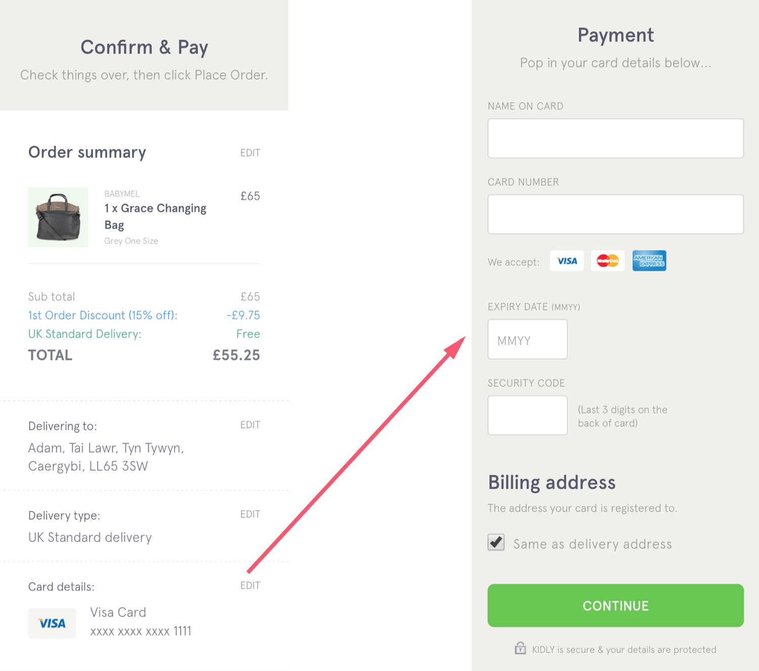
In 2008, I worked on Boots.com. They wanted a single-page checkout with the trendiest of techniques from that era, including accordions, AJAX and client-side validation.
Each step (delivery address, delivery options and credit-card details) had an accordion panel. Each panel was submitted via AJAX. Upon successful submission, the panel collapsed and the next one opened, with a sliding transition.
It looked a little like this:
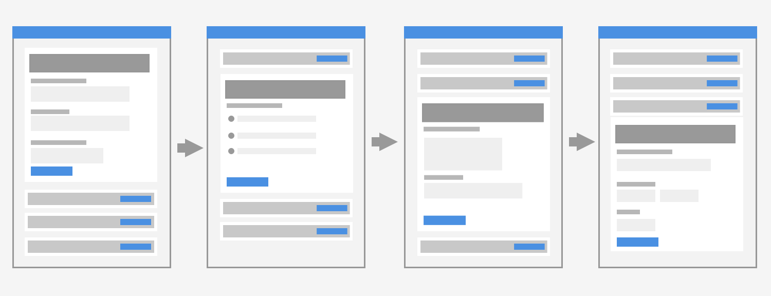
Users struggled to complete their orders. Errors were hard to fix because users had to scroll up and down. And the accordion panels were painful and distracting. Inevitably, the client asked us to make changes.
We redesigned it so that each panel became its own page, removing the need for accordions and AJAX. However, we kept the client-side validation to avoid an unnecessary trip to the server.
It looked a little like this:
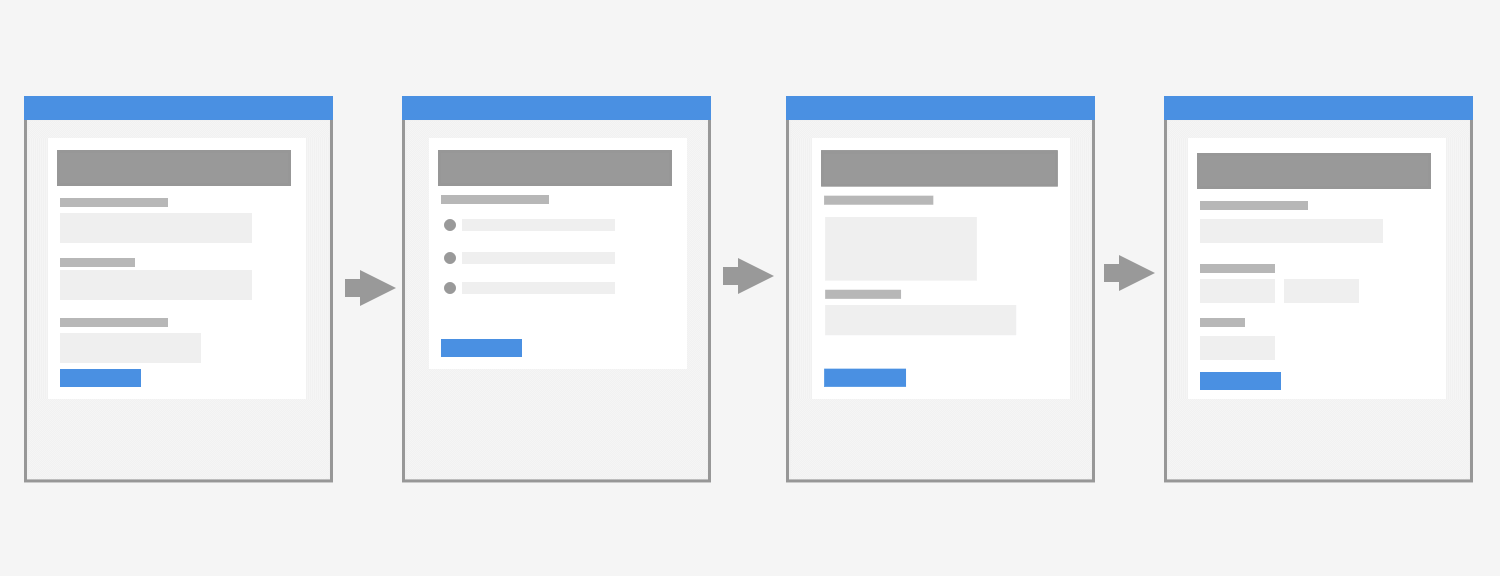
This version converted much better. Though I can’t remember the exact numbers, I do know that the client was happy.
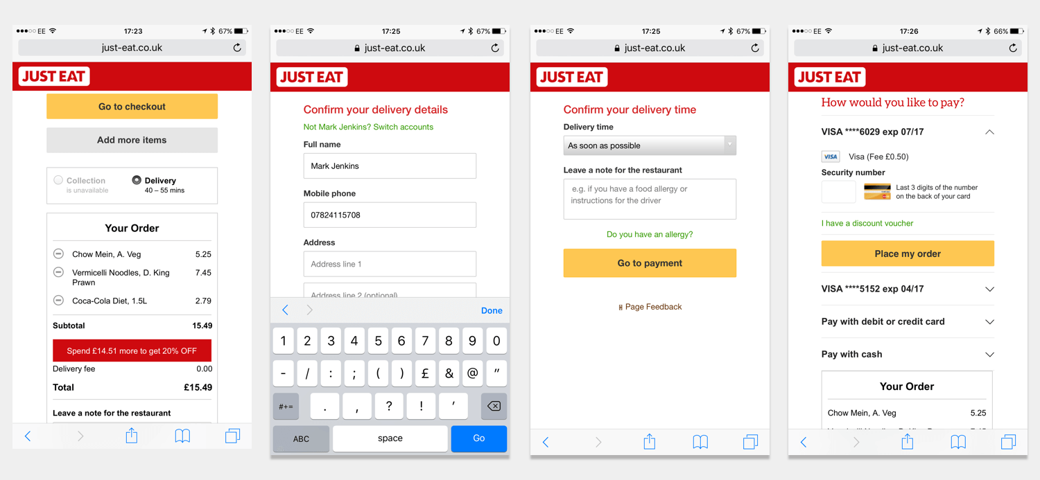
Six years later (2014), when I was at Just Eat, the same thing happened. We redesigned the single-page checkout flow so that each section became its own page. This time, I made a note of the numbers.
The result was an extra 2 million orders a year. Just to be clear, that’s orders, not revenue. The number is based on a percentage increase to conversion at checkout after releasing the new version for at least a week. The percentage was then converted to orders and multiplied by 52.
Here are some of the mobile-first designs we used:
A couple of years later (2016), Robin Whittleton of GDS told me that putting each thing on a page of its own was a design pattern in its own right, known as “One Thing Per Page.” Apart from the resulting numbers, there is a strong rationale behind the pattern, which we’ll get to shortly.
Before we do that, though, let’s take a look at exactly what this pattern is.
What Does “One Thing Per Page” Mean Exactly?
One Thing Per Page is not necessarily about having one element or component on a page (although it could be). In all likeliness, you’ll still have, for example, a header and footer.
Similarly, it’s not about having a single form field on each page either (although, again, it could be).
This pattern is about splitting up a complex process into multiple smaller pieces, and placing those smaller pieces on screens of their own.
For example, instead of placing the address form on the same page as the delivery options and payment forms, we would put it on a dedicated page.
An address form has multiple fields, but it’s a single, discrete question that is being asked of the user. It makes sense to tackle this question on one screen.
Let’s consider why the pattern is so good.
Why Is It So Good?
While this pattern often bears wonderful and delicious fruit (or orders and conversions, if you hate my analogies), it would be nice to understand the rationale behind it.
1. It Reduces Cognitive Load
As Ryan Holiday describes in The Obstacle Is The Way:
"Remember the first time you saw a complicated algebra equation? It was a jumble of symbols and unknowns. But when you stopped to break it down and isolate the parts, all that was left was the answer."

It’s the same for users trying to complete a form, or anything else for that matter. If there is less stuff on screen and only one choice to make, then friction is reduced to a minimum. Therefore, users stay on task.
2. Handling Errors Is Easy
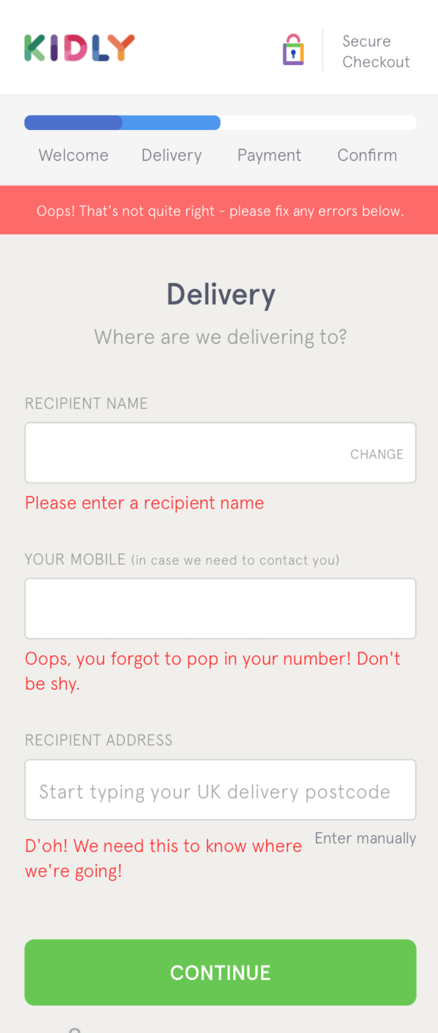
When users fill out a small form, errors are caught and presented early. If there’s one thing to fix, then it becomes easy to fix, which reduces the chance of users giving up.
3. Pages Load Faster
If pages are small by design, they will load faster. Faster pages reduce the risk of users leaving, and they build trust in the service.
4. Tracking Behavior Is Easier
The more there is on a page, the harder it is to determine why a user has left the page. Don’t get me wrong: The ability to analyze a page shouldn’t drive design, but it is a nice byproduct.
5. Tracking Progress And Returning To Previous Steps Is Easier
If a user submits information frequently, we can save it in a more granular fashion. If a user drops off, we can send them an email, prompting them to complete their order, for example.
6. Scrolling Is Reduced Or Eliminated
Don’t get me wrong: Scrolling isn’t a big deal — users expect web pages to work that way. But if pages are small, users won’t have to scroll. And the call to action is more likely to appear above the fold, which reinforces the requirements, making it easier to proceed.
7. Branching Is Easier
Sometimes we’ll send users down a different path based on a previous answer. A simple example would be two dropdown menus; what the user chooses in the first will affect the values shown in the second.
One Thing Per Page makes this simple: The user makes a choice and submits, and the server works out what the user sees next — easy and inclusive by default.
We could use JavaScript. But it’s more complicated to build it and ensure that the UI is accessible. When JavaScript fails, the user might suffer a broken experience. And loading the page with all of the permutations and options could add significant page weight.
Alternatively, we could use AJAX, but this doesn’t free us from having to render new (parts of) screens. More crucially, it doesn’t negate the server-side roundtrip.
That’s not all. We’d need to send more code to send an AJAX request, to handle errors and to show a loading indicator. Once again, this makes the page slower to load.
Custom loading indicators are problematic because they aren’t accurate, unlike the browser’s native implementation. And they aren’t familiar to the user — that is, they are specific to the website showing them. However, familiarity is a UX convention that we should break only if we really have to.
Also, having two or more fields that are dynamically updated on one page depends on the user interacting with the fields in order. We could enable and disable or show and hide fields, but this is more complicated.
Lastly, a user could make a change that requires a subsequent panel to disappear or be replaced by a different panel, which is confusing.
8. It’s Easier For Screen-Reader Users
If there is less on a page, then screen readers don’t have to wade through a lot of superfluous secondary information. Users can navigate to the first heading and start interacting with the form more quickly.
9. Amending Details Is Easier
Imagine someone is about to confirm their order. Crucially, they spot a mistake with their payment details. Going back to a dedicated page is far easier than going to a section within a page.
Being taken halfway down the page is disorienting. Remember that the user clicked a link to perform a particular action — having other things on the page would be distracting.
It’s also potentially more work. For example, if you want to show and hide panels within the same page, you’d need extra logic to handle it.
With One Thing Per Page, these problems fade away.
10. Users Get Control Of Their Data Allowance
Users cannot half download a page. It’s all or nothing. Smaller pages save user’s data. If they want more information, they can click a link, getting the ability to choose. Users don’t mind clicking, as long as each step brings them closer to their goal.
11. It Solves Performance Problems
If everything is one gigantic thing — the extreme of which is a single-page application — then figuring out performance problems is hard. Is it a runtime issue? A memory leak? An AJAX call?
It’s easy to think that AJAX improves the experience, but adding more code rarely leads to a faster experience.
Having complexity on the client obscures the root cause of problems on the server. But if a page has one thing, then there’s little chance of performance issues. And if there is an issue, then finding it will be easier.
12. It Adds A Sense Of Progression
Because the user is constantly moving to the next step, there is a sense of progression, which gives the user a positive feeling as they fill out the form.
13. It Reduces The Risk Of Losing Information
A long form takes longer to complete. If it takes too long, then a page timeout may cause the information to be lost, leading to tremendous frustration.
Alternatively, the computer might freeze, which is the case for Daniel, the lead character in I, Daniel Blake. With declining health and having never used a computer before, he suffers from a frozen computer and lost data. In the end, he gives up.
14. Second-Time Experiences Are Faster
If, for example, we store the user’s address and payment details, we can skip these pages and take them straight to the “check and confirm” page. This reduces friction and increases conversion.
15. It Complements Mobile-First Design
Mobile-first design encourages us to design what is truly essential for small screens. One Thing Per Page follows the same approach.
16. The Design Process Is Easier
When we’re designing a complex flow, breaking it down into atomic screens and components makes it easier to understand the problem.
It’s easy to swap screens to change the order. And analyzing problem areas is easier when, like the user, we’re looking at one thing at a time.
This reduces the design effort — which is a nice byproduct of a pattern that benefits users so greatly.
Is This Pattern Suitable In All Situations?
Not always. Caroline Jarrett, who first wrote about One Thing Per Page in 2015, makes this quite clear. She explains that user research “will quickly show you that some questions will be best grouped into a longer page.”
However, conversely, she also goes onto explain that “questions that naturally ‘go together’ from the point of view of designers… don’t need to be on the same page to work for users.”
She provides an enlightening example when, for GOV.UK Verify, they tested putting “Create a username” on one page and “Create a password” on the next.
Like most designers, Caroline thought that putting these two form fields on separate pages would be overkill. In reality, users weren’t bothered by this at all.
The key point here is to at least start with One Thing Per Page and then, through research, find out whether grouping fields together would improve the user experience.
That is not to say you’ll always end up combining screens together — in my experience, the best results come from splitting things apart, period. I’d love to hear about your own experience, though.
Summary
This inconspicuous and humble UX pattern is flexible, performant and inclusive by design. It truly embraces the web, making things easy for high- and low-confidence users.
Having a lot (or everything) on one page might give the illusion of simplicity, but like algebraic equations, they are difficult to deal with unless they are broken down.
If we consider a task as a transaction that the user wants to complete, breaking it down into multiple steps makes sense. It’s as if we’re using the very building blocks of the web as a form of progressive disclosure. And the metaphor behind pages provides a subconscious sense of moving forward.
I’ve not come across another design pattern that has as many benefits as this one. This is one of those times when simple is just that: simple.
Further Reading
- How To Improve Your Billing Form’s UX In One Day
- Form Inputs: The Browser Support Issue You Didn’t Know You Had
- How To Design A Better Mobile Checkout Process
- An Overview Of E-Commerce Platforms


