Make ‘Em Shine: How To Use Illustrations To Elicit Emotions

Email Newsletter
Weekly tips on front-end & UX.
Trusted by 182,000+ folks.
 Register for Free

 Celebrating 10 million developers
 Custom Web Forms for Angular, React, & Vue. Your backend.
As designers, we often use imagery that resonates with our audience. Yet, often we also end up with stock photos and generic icons that come across as mere decoration. Or we bypass imagery altogether. But custom images are a powerful design tool. They can tell a story and convey a distinct personality. Custom illustrations can be especially impactful. They can make our audience feel personally connected to an app or website, while being an integral part of the design.
The use of illustrations on the web has become more popular than ever because of their unique ability to communicate content, to bring immediate warmth and humanity to a design, and to enhance our online experiences to make them feel more personal.
The Web! “Teacher, Mother, Secret Lover”
It used to be enough for user interface elements to “look professional” or simply to “add polish” to a website. But in the past few years we’ve come to expect more personal interactions and stronger relationships with the apps we use and the websites we visit. Our relationship with the web has evolved dramatically over the past few years. It is a much more intimate relationship than it was before we had smartphones and tablets. Physically, the web is in our pockets. It’s on the couch. It’s in bed with us. As Tom Chatfield explains, “[our phones] are the first thing we touch when we wake in the morning and the last thing we touch when we go to bed at night.” They’ve become extensions of ourselves.
Smart apps and websites take advantage of this personally connected feeling we have with our devices. For instance, Google already tailors your content to let you outsource things you used to have to actively remember. Want to know where you are, whom you’re meeting with today, when your next flight is, or what hotel you’ll be staying at after the flight? Google already knows. Google adjusts your search results, your calendar and your map to account for your personal details. Google is catching up in visual design to that same level of personalization and intimacy by using illustrations to cultivate a relationship that is more emotional, rather than just professional and polished.
Deep Dive: Google Calendar
For instance, the Google Calendar app (on iOS and Android) is a great example of a tool that is made to feel more personal and less mechanical and that makes our relationship with it more emotion-driven. The app could just show you a clean, simple calendar view. Instead, its unique illustrations bring warmth and a human touch to your calendar. First, each month has its own beautiful full illustration, by designer Lotta Nieminen, bringing the digital calendar closer to the feeling of a traditional, graphic wall calendar.
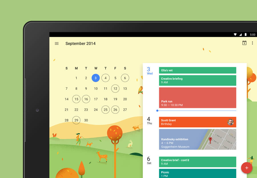
But going one step further, the app also shows illustrations by Maya Stepien that are tailored to your personal agenda. If you add a date for drinks, that event shows a lovely illustration of drinks. It can tell the difference between a dentist appointment and a hair appointment and automatically serves up the perfect illustration. Voila! A personalized experience.
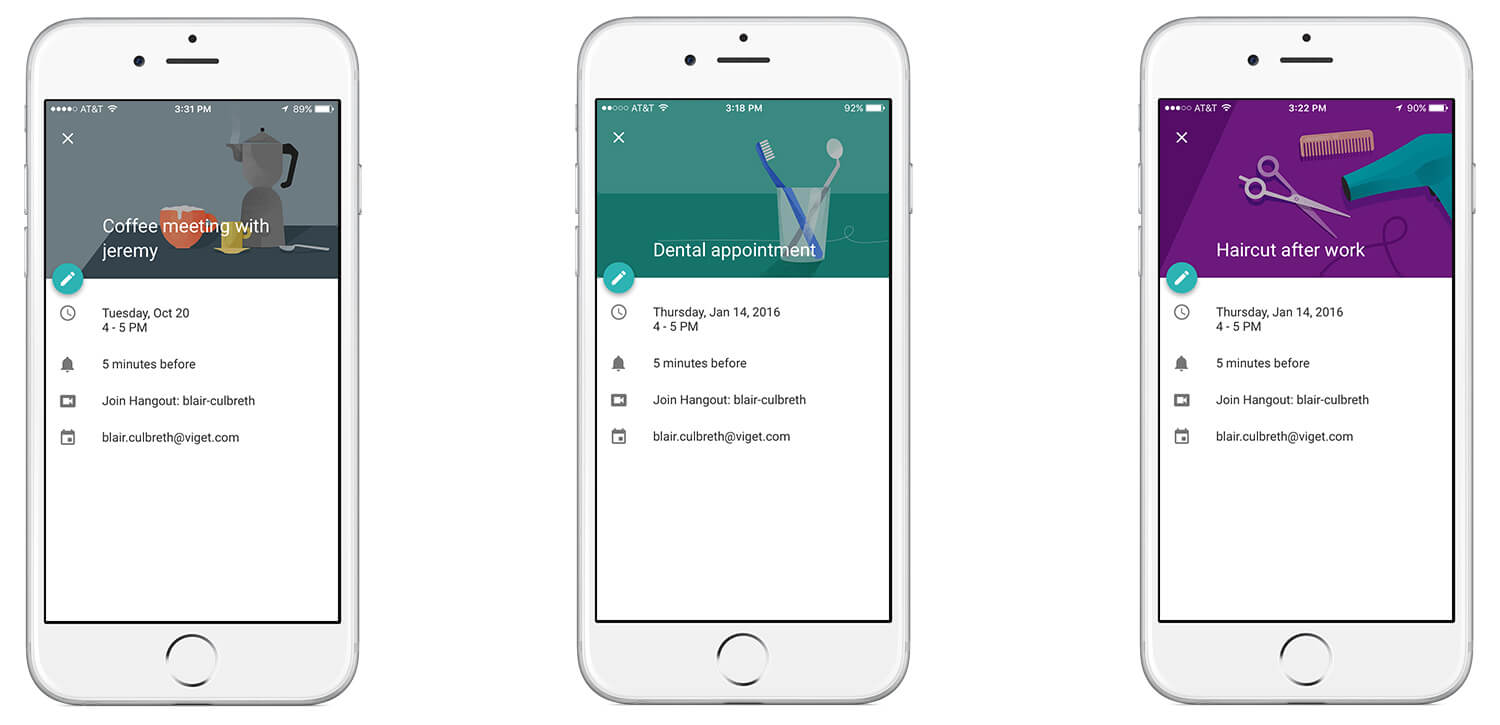
On a practical level, this use of illustrations enhances your experience by breaking up the wall of text listings you would otherwise be faced with. When you’re quickly scrolling, trying to find when exactly your dentist appointment next week is, an illustration will communicate “dentist!” faster than words could. So, you don’t have to slowly read every description as you scroll.
On an emotional level, what could be a very dry calendar app feels like something a little more personal and unique. The organic texture and warm colors of the illustrations inject the app with humanity.
No Time To Read
Illustration brings visual interest and personality to design, but doesn’t photography do the same thing just as well? Not always, mainly because generic stock photography is often difficult to feel connected to.
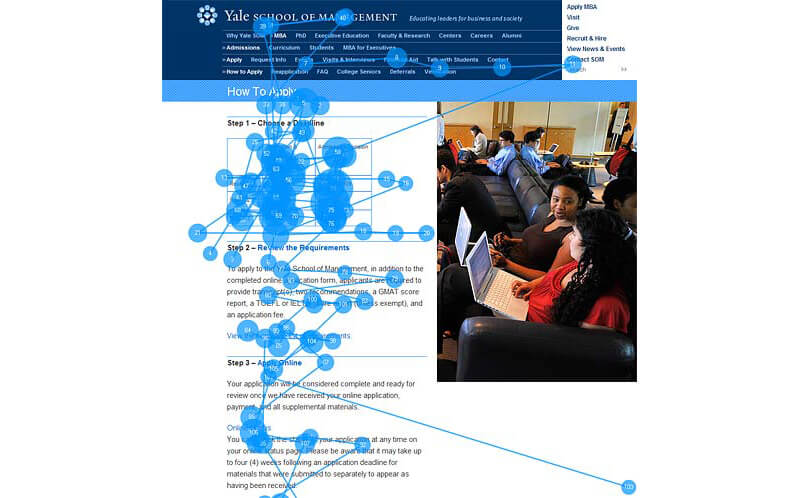
Studies such as Nielsen Norman Group’s 2010 eye-tracking study of photos as content have found most people don’t even look at stock photos. Specifically, we ignore photos that don’t add value or content to a page. By their very nature, stock photos are often decoration to fill out a design.
Nielsen Norman Group’s eye-tracking study made clear how important relevance is to imagery. In one example, a college application page shows a generic photo of students next to important application info. The blue dots indicate the parts of the page that users looked at. The decorative photo was mostly ignored in favor of the more useful application information.
Is the answer, then, to cut all imagery and have nothing but text on the page? Nope. Imagery is powerful when it means something or has some personality. In the same study, on a team page with photos of real team members, users were drawn to the profile photos, rather than the paragraph-long bios next to each name, because it was a faster way to become familiar with the team members.
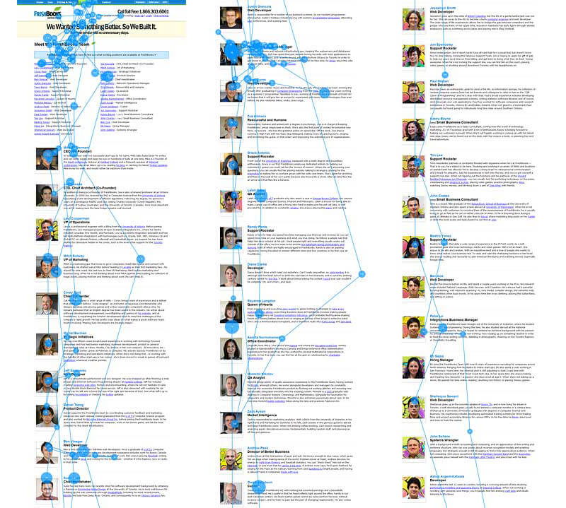
In this case, the images conveyed information. They were not just decoration around the content; they themselves were content.
This also highlights a harsh reality of the web: We don’t read if we don’t have to. On an average page, users read only 28% of the text, according to another Nielsen Norman Group study. We don’t read; we skim.
What, then, are we looking at if we ignore stock photos and don’t read body text?
- We do read headlines and lists, as you could probably guess from the last time you fell into a Buzzfeed-reading black hole.
- We also look at relevant, meaningful images that convey content and inject personality. That’s why unique illustration and custom photography are more effective than stock photography.
Deep Dive: Intercom
A great example of a website that uses illustration as a supplement to written content is Intercom. The website integrates Quentin Vijoux’s illustrations on nearly every page. The graphics’ loose, whimsical style is memorable and endearing. Anthropomorphic giraffes and rhinos on a website promoting customer service tools are certainly a unique surprise.
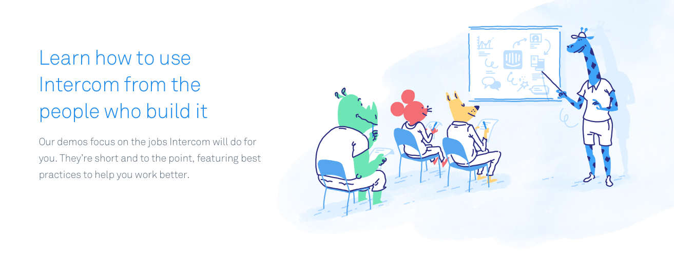
The pictures demand your attention in a way the predictable imagery — generic photography of professional-looking people on phones and computers — could not. They are relevant to their respective headlines and copy. At a glance, you get a sense of the page’s written content without having to read anything.
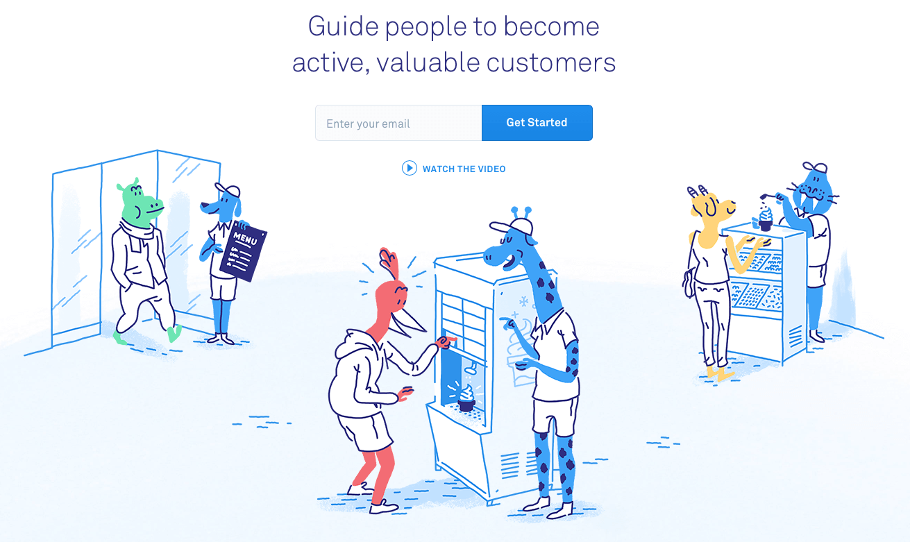
Copy even takes a backseat on some pages where the illustrations make the point. We see a story unfold in the image below, with a beginning, middle and end. It makes the same point as the headline but with more personality (and ice cream) and without the visitor having to read.
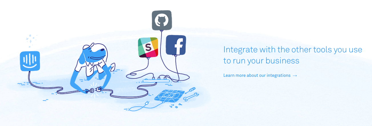
Callouts and featured text, even low-priority ones towards the bottom of the page, get their own unique images. They playfully illustrate and reinforce the message in the text. They support the content, rather than distract from it or decorate around it.
The quirky illustrations do several things for Intercom, beyond supporting content. They make the website immediately stand out from competitors’; other marketing websites may blur together, but you’re probably going to remember the one with the blue dogs in polo shirts. For a service about customer communication and support, the whimsical drawings make a perfect first impression. Intercom’s website is charming and personal; a potential customer is even more likely to feel that Intercom’s tools really would make their own customer communications more charming and personal.
Finally, the illustrations put a face on Intercom’s intangible services. Visual metaphors such as shopping, sitting in a classroom and getting ice cream make services that exist only online suddenly concrete and relatable. Let’s look at other examples of illustration that solve this tricky issue and see why it’s become so common.
“You Can’t Disappoint A Photo…” And You Can’t Always Relate To One Either
The use of illustration can be more effective than photography on the web because the services we use and rely on have become more abstract. Many of the services and tools we use are very real to us and have real benefits but don’t exist in the real world. A photograph might be limiting when it comes to visualizing them and how they work. A photo can’t show Dropbox doing its Dropboxing thing, for example. Custom illustration, on the other hand, can communicate complex, abstract ideas in a way that’s easy to comprehend.
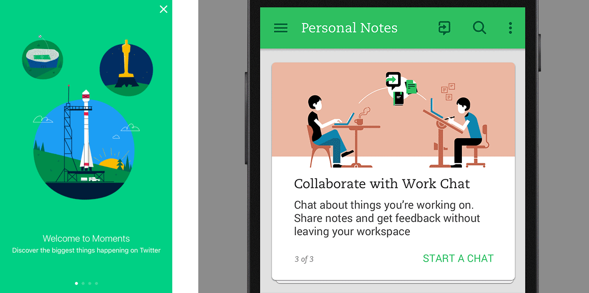
You can see how Twitter relied on illustration when it introduced Moments. And Evernote has used illustration extensively in the past to explain its service and the benefits of the service with charming visuals.
Deep Dive: Dropbox Carousel
The design of the now defunct Dropbox Carousel was an especially good example of using illustration to show something that photography couldn’t, while creating a connection with users. Dropbox Carousel was an app that created a gallery of all the photos and videos in a Dropbox user’s account. Even though it was an app all about photos, the design team relied on illustrations rather than photos to design and brand the app. As one of the designers, Alice Lee, said about the decision to stay away from photography, “We realized a disjoint that users experience when they look at photographs that are of people that aren’t them — it is instantly unrelatable.”
For example, the illustrations showed a collection of snapshots of two characters going from childhood to adulthood and marriage, and they followed users throughout the marketing website and the app itself. On the marketing website, the illustrations were animated and explained how Carousel worked. They gave users a clear, fun demo of the app that felt more like entertainment than exposition. The illustrations educated the user in an immediate, visual way that was easy to understand, even though the tool only existed in the abstract phone world.
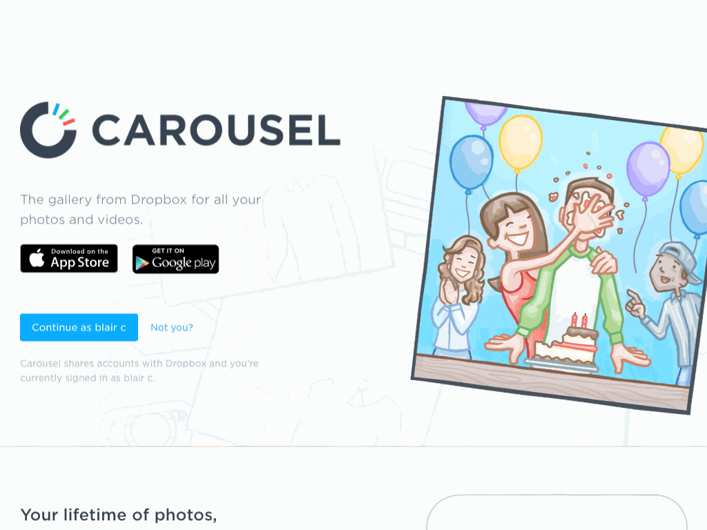
Within the app itself, the same illustrations guided users through setup and filled the initial screens. So, the app never felt empty or broken, even before photos had been uploaded.
Carousel, as a result, had a unique personality and created a story around saving photos. We ended up feeling emotionally attached to a tool that essentially does the rather innocuous job of displaying our files.
When You Gotta Use Stock…
A good illustrator brings a sense of style that gives their work a distinct personality. That personality becomes a part of any design that uses the style. Generic stock photos, meanwhile, seem to be where personality goes to die.
Take the two images below indicating growth: two stock images of a generic businessman and his ginormous line graph of success. Neither is earth-shatteringly exciting. However, the bright colors and clean, efficient lines of the illustration at least create a distinct tone that’s lacking in the photo.

Some Examples Of How We Have Added Illustration In Our Projects
At Viget, I’m part of a team of designers who focus these days on creating meaningful illustrations and animations for internal and client-side projects wherever it makes sense. In some projects, this has meant small touches; in others, we’ve focused the design entirely on illustration. Here are a few things we’ve done recently and what we’ve learned along the way.
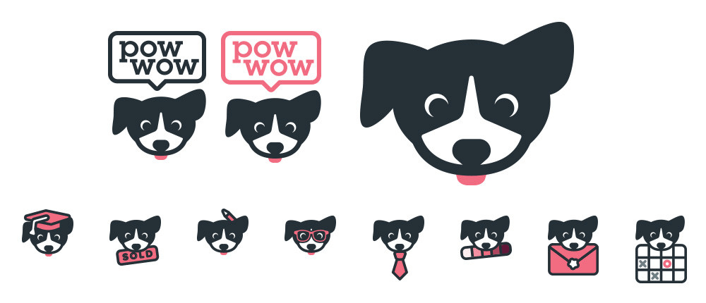
Case Study: Pow Wow And The Power Of A Cute Mascot
Lovable, cute mascots are already ubiquitous. For a web-based company, especially, that has no tangible product that exists in the real world, a mascot grounds its brand and gives users something concrete to connect to. That connection has become a vital aspect for a lot of brands for which feeling professional and trusted is not enough — they want to be loved as well. When a mascot is well designed and carefully chosen, it can go a long way to communicating very quickly the core of what a company is.
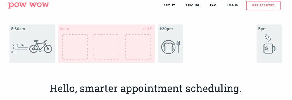
We designed and built pow wow as a tool for ourselves, but also for anyone who needs an easier way to coordinate appointments. In pow wow, you create a calendar with blocks of time when you’re available, then send it out to everyone you have a meeting with. They pick and choose from your available time blocks and add themselves to your schedule.
We launched a rough beta version in 2013, and over the next three years, we found that early users seriously loved the tool. It made a part of their job that had been a hassle simple and fast. They were very verbal about how grateful they were. So, last year, when we rebuilt and redesigned pow wow, my priority for the new design was to create a brand that was worthy of the level of emotional connection that the tool had already garnered. pow wow is loved by its users; therefore, it should look and feel pretty lovable. And what’s more lovable than an adorable mascot?
For pow wow, a border collie that, instead of herding sheep, “herds” your appointments is a perfect fit. On the website, pow wow (the pup) explains features, gives the tool a personal voice when it is needed and even dresses up to represent different target audiences. While pow wow (the tool) connects users to people they need to book appointments with, pow wow (the mascot) connects users emotionally to the app itself.
What pow wow essentially does is straightforward but is still a bit of a mouthful to explain. On the original 2013 home page, we relied on long paragraphs of text and screenshots to do the explaining, which wasn’t great if you know that users read only 28% of that text. With this redesign, it was important to figure out how to convey what pow wow does immediately and visually, with little to no reading required. Simple illustrated elements and icons work with our new mascot and boil pow wow’s concept down to a few simple visuals.

The new home page brings these simple illustrations to life with animations that explain what pow wow does, without having to show literal screenshots of the app in action. Without a word, you can start to see how pow wow works within your existing schedule.
What we found through this redesign was that a single core idea ties everything together. The cute mascot, the bright pink color scheme, everything that is designed to feel personal and warm would ring hollow if there were nothing behind it. For this reason, we wrote brand guidelines (PDF) for ourselves, and with everything we designed, we kept this principle from the guidelines in mind:
"pow wow is a tool for making lives easier. It removes friction for its users and between people. It facilitates human connection. Meetings, appointments, interviews, catching up over coffee, are all a little more simple and joyful and a little less of a burden because of pow wow… Users connect to pow wow as much as they do their real-life appointment bookees."
This is what gives purpose and meaning to the pow wow design. It creates a genuine emotional connection because it is designed not just with usability and functionality in mind, but also with a sense of the purpose it serves on a human level and how it makes life better.
Case Study: Refrigerator Refresh
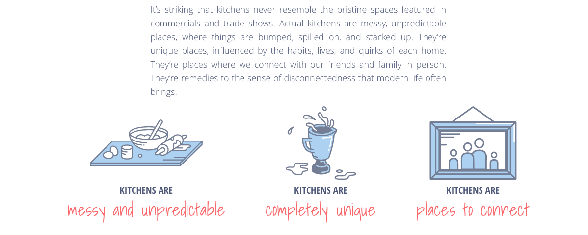
At Viget, when we have downtime, we often get together to research and brainstorm on topics that interest us, and then we put our ideas and hypothetical solutions into one-page long-form explorations. One such exploration that we heavily relied on illustration for is “Refrigerator Refresh: Designing for the Realities of the Home.” The exploration looks at how smart products, particularly the refrigerator, are designed now, and it thinks through the possibilities on the horizon. It’s a great example of how just a moderate amount of illustration can seriously shape the tone of a design.
A lot of content is on the page, and most of it pertains to solutions that don’t exist; we didn’t build a real-life smart fridge, so photos weren’t an option. Photo-realistic mockups were considered early on, but they felt lifeless and cold for a topic as personal as your kitchen. In the end, simple line drawings in soft colors were the perfect way to tie together research findings and editorial content and to illustrate hypothetical smart fridge features, all while feeling as homey and inviting as a real kitchen.
In this project, illustrations mostly supplement the written content, making it quick and easy for viewers to get the point without having to read every word.
But halfway down the page, where we write in detail about future concepts and ideas — things that don’t yet exist, basically — the illustrations become important. At this point, the illustrated fridge isn’t tacked on; it’s a key part of the layout. Simple animations move elements around on a fridge, creating visuals in the left column that demonstrate the ideas being written about in the right. The reader doesn’t have to rely on their imagination; they can see the concepts in action immediately.
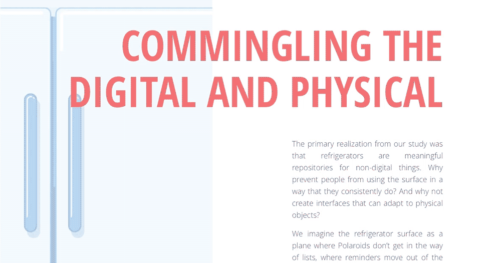
The result is a page that transforms what is essentially an essay into a full-on experience, one that feels like a warm, lively kitchen, thanks to the soft colors, simple illustration style and prominent animations. More importantly, the illustrations mean something and rise above mere decoration. They make the content more memorable and faster to read and make the ideas presented easier to comprehend.
Case Study: Know Lupus
Finally, on the heavily illustrated end of the spectrum is a project Viget worked on with the Lupus Foundation of America. We designed and built Know Lupus, a small website that ties into the foundation’s larger campaign for lupus awareness month to promote lupus education. Our mission was to turn dry, clinical and often unpleasant facts about lupus into a game that people would be entertained by and would want to share with others. And we wanted to educate people and present the facts in a way that would stick in the viewers’ minds.
We decided to make a card game that tests the user’s knowledge of lupus, while educating them with new information. The card format gave us a lot of opportunities to tie in a lot of illustration and immersive animation, to create a full experience that feels fun and interactive.
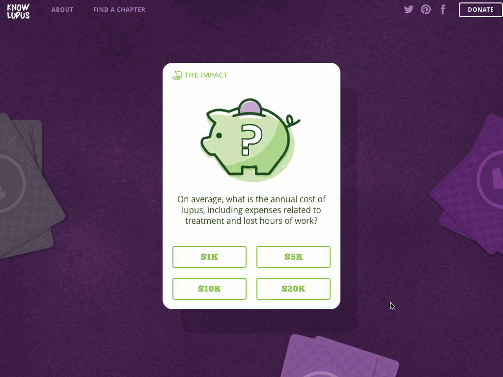
The illustrations in the Know Lupus card game presented a unique challenge. On the one hand, the tone of the game is meant to be fun and enjoyable — cute even! We wanted the user to want to keep playing this game through all three of its levels. So, lighthearted and adorable were high priorities.
On the other hand, the game raises awareness about a serious, incurable disease. The facts you learn through the game are all very medical, technical and downright serious. How do you reconcile “fun” with “kidney inflammation”? How do you illustrate medical concepts such as chemotherapy and infection without looking like a textbook?
For this project, the answer turned out to be “with a lot of style.” The pictures themselves are simple and straightforward, almost like icons. This makes them easy and quick to understand as you’re flipping through cards in the game. Repeating a limited set of shapes and colors builds a visual shorthand and creates a nice flow throughout the game as users flip through dozens of cards quickly. For example, once you’ve seen the couple of shapes that are supposed to represent a woman, like the swirly hair cut or swept bangs, you instantly recognize women in later questions.
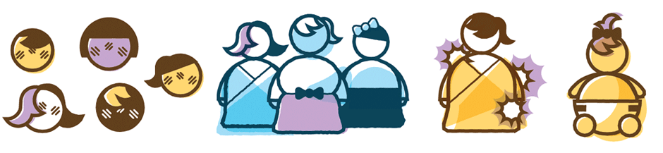
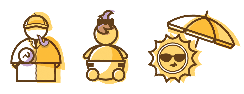
We also decided to avoid using realistic human figures or detailed faces, because pictures of sickness and pain would affect the light tone of the game. So, when we do use people, they’re highly stylized, chunky, weeble-wobble people. They don’t look very realistic, and they don’t have facial expressions. Therefore, users will not get upset about facts and answers that are about physical pain.
The colors are bright and cheerful. Everything is colored with over-the-top offset color blocks. The overall impression as you go through the game is upbeat and positive, but not to the point where it feels like we’re taking the content or taking lupus itself lightly. The illustrations enable us to keep the tone of the game light, to speed up comprehension and to keep the focus on learning facts about lupus.
Some Things To Keep In Mind As You Start Incorporating Illustration Into Projects
Start small; you don’t have to rethink everything overnight. Special drawings for edge cases such as error states, 404 pages and onboarding bring some delight, without committing you to illustrating an entire website.
In addition to starting small, start early getting clients, investors, other team members or whoever else is involved on board. It’s easier to work through debates on illustration style before you’ve invested a ton of time and love on your artwork. Or start by introducing small, illustrated enhancements; this might get them comfortable with the idea that illustration can be an appropriate, professional solution faster than hitting them with one really big change.
Work flexibly. When you can, take the time to make illustrations vector-based, even when the result is meant to look hand-done. You never know what will pop up. Maybe images will need to be bigger or smaller than you had planned. Maybe you will need to make several variations of a figure and don’t have the time or budget to create every single one from scratch. Starting in Illustrator or a similar vector-based program will help you be ready for anything.
Dedicate time in your workflow to it. Avoid jumping back and forth between illustration and UI design as much as you can. Getting into a flow and not having to switch context is, really, always a good thing, but especially so in this case.
Finally, take advantage of all the opportunities that come with illustrating for an interactive medium! Move things around and bring them to life. Animation can be a powerful way to communicate a complex idea. Also, personalize illustrations for different contexts and use cases.
Key Takeaways
Custom illustration can seem daunting, but it doesn’t have to be scary. You don’t need a fine arts degree to create imagery that will enhance your content. Even small, simple illustrations or custom icons would be worthwhile if they communicate something relevant or add something unique to your design.
We don’t read text, we don’t look at generic images, and we don’t appreciate decoration. But we do connect to images that mean something, that are relevant and that tell a story. Unique imagery can humanize an app or website and can personalize our experience and relationship with it. Animation can guide a user’s attention and communicate an idea instantly. Our expectation as users is for more personal interaction and stronger relationships with the apps we use and the websites we visit. Thus, designing with emotional connection in mind is becoming a necessity.
We don’t just use our phones — we love our phones. We want to love the apps on our phones just as much. Illustration is a surefire way to inject the personality and humanity that inspires that kind of love.
Further Reading
- Why Should We Design Emotional Systems?
- How To Add A Personal Touch To Your Web Design
- When Typography Speaks Louder Than Words
- Not Just Pretty: Building Emotion Into Your Websites


