Low-Hanging Fruits For Enhancing Mobile UX

Email Newsletter
Weekly tips on front-end & UX.
Trusted by 200,000+ folks.


Obviously, if an app is not useful, it will have no practical value for the user, and no one will have any reason to use it. And even if the app is useful but requires a lot of effort, people won’t bother learning how to use it.
Good design addresses both problems: It has a clear focus on key user goals, and it removes all obstacles from the user’s way by bringing clarity to the interface. In today’s article, I’ll share seven UX design tips that I think are key for creating really great mobile user experiences. Also, there’s a way you can create and design your own prototypes (for free!): All you need to do is to download Adobe XD and get started right away.
1. Clear And Seamless User Flow
Reduce the effort users have to put in to get what they want.
Users often have to quickly accomplish one core function in a mobile app: make a payment, check for new messages, etc. Focus on users’ key goals, and remove all obstacles from their way:
- Break large tasks into smaller, meaningful chunks.
Prioritize the actions on screen. Highlight the core action (that is directly related to the user’s goal), and hide all secondary actions. - Offload tasks.
Look for anything in the design that requires user effort (for example, reading text, entering data, making a decision), and look for alternatives. Can you show a picture instead of text, or reuse previously entered data instead of asking the user to type more, or use already available information to set a smart default? - Design for interruption.
Whatever you’re designing, mobile devices are used on the go. Allow users to save state and re-engage with the app later. - Don’t interrupt.
Avoid interrupting users by asking them to rate your app if they’ve only recently downloaded it. Instead, wait until they prove to be repeat users and they’ll be more likely to rate your app and provide more informed feedback.
Focus On User Goals
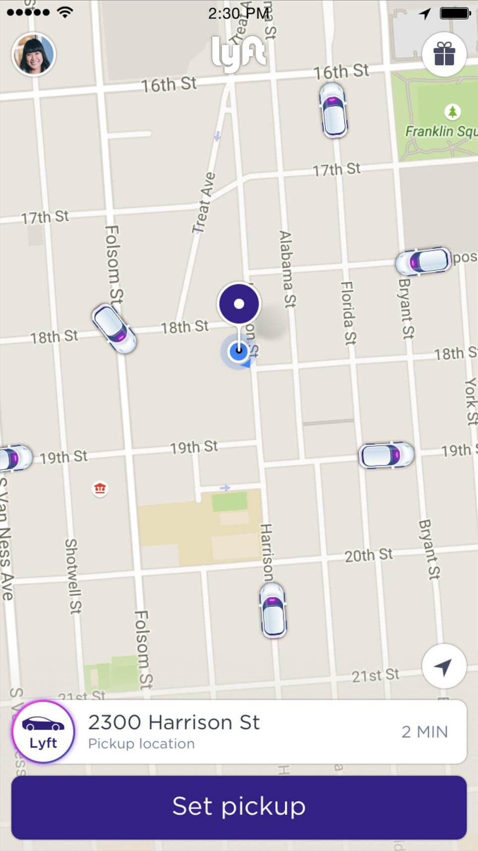
Divide complex tasks into smaller activities. These smaller tasks may better meet user goals. Take Lyft. It knows that the goal of its user is to get a ride somewhere. The app does not overwhelm the user with much of information: It automatically detects the user’s location based on geolocation data, and the only thing the user has to do is select a pickup location.
Avoid Login Walls
Login walls are pages that ask the user to log in or register in order to proceed. A login wall is commonly shown when an app launches for the first time or when a web page is first accessed. Keep in mind that forcing registration too early can cause more than 85% of users to abandon the product.
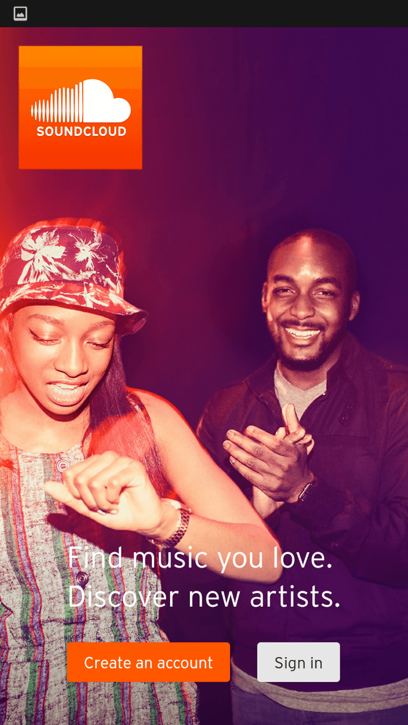
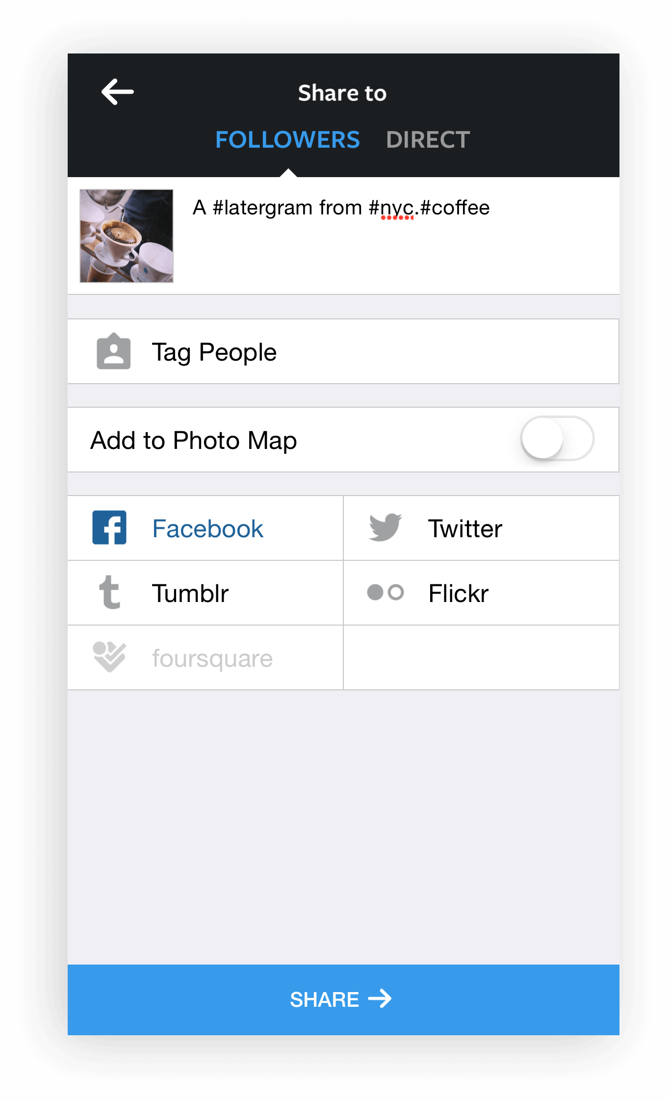
In the example below, Soundcloud requires its users to log in to access the app’s content.
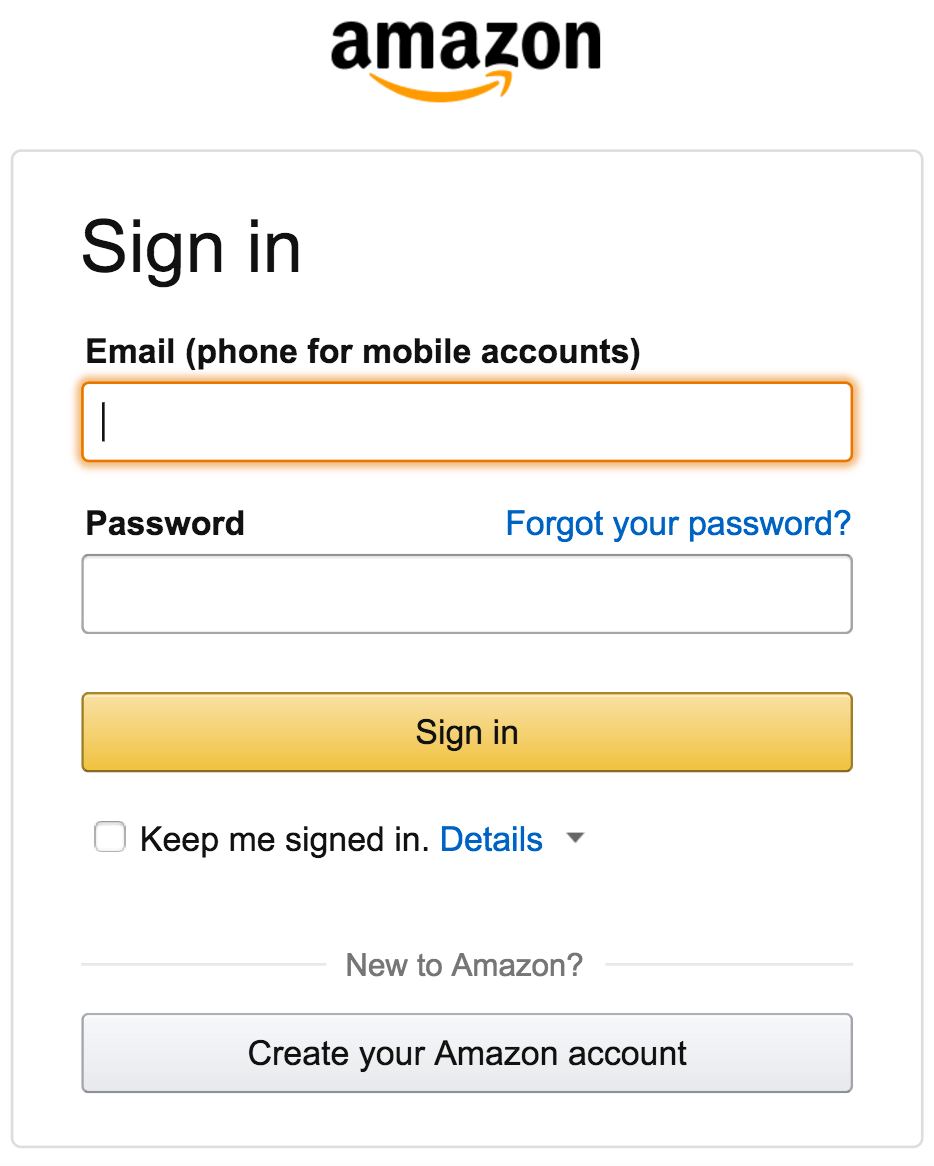
Login walls are encountered quite often in store checkouts. Designers of e-commerce websites and apps think that, by logging in, users will be able to take advantage of previously saved account information and thus won’t need to type in information such as their shipping address and credit card number. Even Amazon has this problem — the service doesn’t provide a guest checkout option.
The registration option could probably be safely replaced by a guest checkout option. Gather data slowly as the user moves through the checkout, asking for a password with the incentive of a coupon code after purchase.
Avoiding Information Overload
The term “information overload” was coined by Bertram Gross, professor of political science at Hunter College, in his 1964 work The Managing of Organizations. Gross defined information overload as follows:
"Information overload occurs when the amount of input to a system exceeds its processing capacity. Decision makers have fairly limited cognitive processing capacity. Consequently, when information overload occurs, it is likely that a reduction in decision quality will occur."
Information overload is a serious problem, preventing users from making decisions or taking action because they feel they have too much information to consume. There are some simple ways to minimize information overload. One common technique is chunking. A checkout form is a perfect example. A rule of thumb is to display at most five to seven input fields at a time and break down the checkout into pages, progressively disclosing fields as necessary.
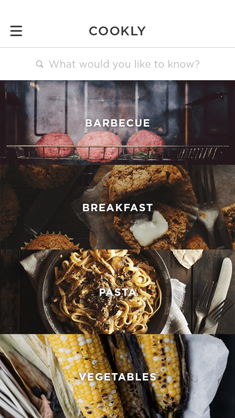
2. Invisible User Interface
Make the content the interface.
Content is what provides value in most apps. Whether it’s a social feed, news updates, a to-do list or something more technical, like a system dashboard, content is why people are there! This is why it’s critical to focus on the content and remove unnecessary elements that do not support user tasks. Given their reduced attention span, users should be guided to the content they’re looking for, quickly. Content should be the interface.
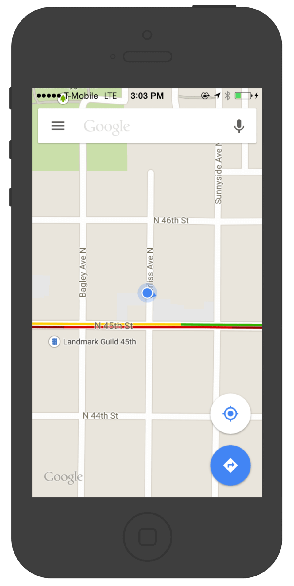
Maps
Google Maps is a great example. For its redesign, Google removed all unnecessary panels and buttons, saying that the map is the interface.
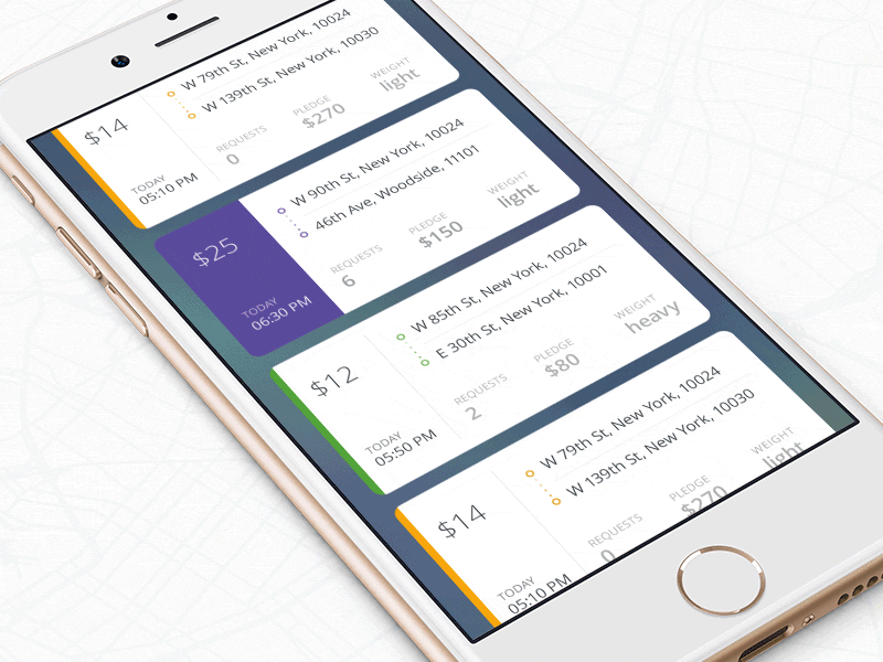
Cards
Another pattern that can be used as an interface is card-style design. Cards are great way to display actionable content, because they allow content to naturally reveal itself.
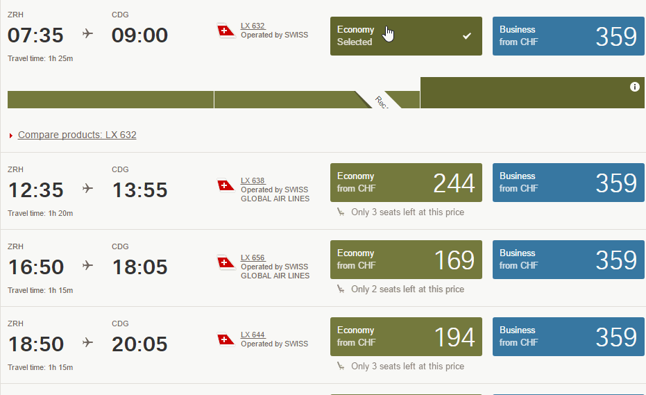
An example of a common approach would be Swiss Air’s app. In the fare tables, every row becomes a collapsed accordion, which can be opened if needed.
Flipboard is another good example of cards in an interface. Flipboard is a personalized magazine that aggregates content from news feeds and social media networks, enabling you to discover and share stories.

3. Breathing Room
Use white space to draw attention to important content.
White space (or negative space) is the empty area between and around elements of a design, and it is often neglected. Though some designers consider it a waste of valuable space, it is an essential element of mobile design. Jan Tschichold says:
"White space is to be regarded as an active element, not a passive background."
Cut Out The Clutter
Clutter overloads an interface with too much information. Every added button, image and line of text makes the screen more complicated.
As Antoine de Saint-Exupéry famously said:
"Perfection is achieved when there is nothing left to take away."
Get rid of anything in a mobile design that isn’t absolutely necessary, because reducing clutter will improve comprehension. A simple rule of thumb is one primary action per screen. Every screen you design for the app should support a single action of real value to the person using it. This makes it easier to learn, easier to use and easier to add to or build on when necessary.
Prioritize Content
White space largely contributes not only to readability and content prioritization, but also to visual layout. Thus, it can simplify the UI and improve the UX.
4. Navigation Made Simple
Navigation should inspire users to engage and interact with the content you are delivering.
Helping users navigate should be a high priority for every app. Mobile navigation must be discoverable and accessible and must occupy little screen space. However, making navigation accessible on mobile is a challenge due to the limitations of the small screen and the need to prioritize content over chrome.
Take a few general rules of thumb into account when designing a navigation system for a mobile app:
- Know your users.
Navigation should accommodate the needs of the majority of your app’s users. Each target group expects a certain type of interaction with your app, so make these expectations work in your favor. - Prioritize navigation options.
Assign different priority levels (high, medium, low) to common user tasks. Give prominence in the UI to paths and destinations with high priority levels and frequent use. Use those paths to define your navigation. - Make it visible.
As Jakob Nielsen says, recognizing something is easier than remembering it. Minimize the user’s memory load by making actions and options visible. Navigation should be available at all times, not just when we anticipate that the user needs it. - Leverage visual communication.
Icons and other graphic elements should help users to understand the menu options. Think of the shopping-cart icon; it serves as an identifier to check out or view items. Users don’t have to think about how to navigate to make a purchase; this element directs them to the appropriate action. - Communicate the current location.
“Where am I?” is a fundamental question that users need an answer to in order to effectively navigate. Failing to indicate the current location is a common problem in many apps. Think about location indicators. - Make it easy to interact.
Make menu options big enough to be easily tapped. Items that are too small or too close together are a huge source of frustration for mobile users. - Measure user engagement and retention.
Engagement is the first thing you will need for your product, because it is where most companies actually make money. Make sure to measure the app’s success with retention of users over time.
Even designers who are familiar with all of these rules still end up creating menus that are confusing, difficult to manipulate or simply hard to find.
Navigation UI patterns are a shortcut to good usability. Let’s see some examples.
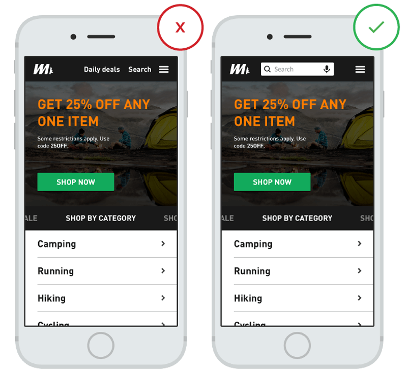
Toggle Menu
It’s tempting to rely on menu controls in order to simplify a mobile interface — especially on a small screen. But hiding critical parts of an application behind these kinds of menus could impair usage. Hidden navigation drives down engagement, slows down exploration and confuses people.
Exposing menu options in a more visible way increases engagement and satisfaction.
Tab Bar
Tab bars and navigation bars are well suited to apps with relatively few navigation options. The pattern is adopted on both iOS and Android. Tabs are great because they display all major navigation options up front, and with one simple tap, the user can instantly go from one view to another. For this type of navigation, I strongly recommend using labels for navigation options. Don’t make navigation a guessing game.
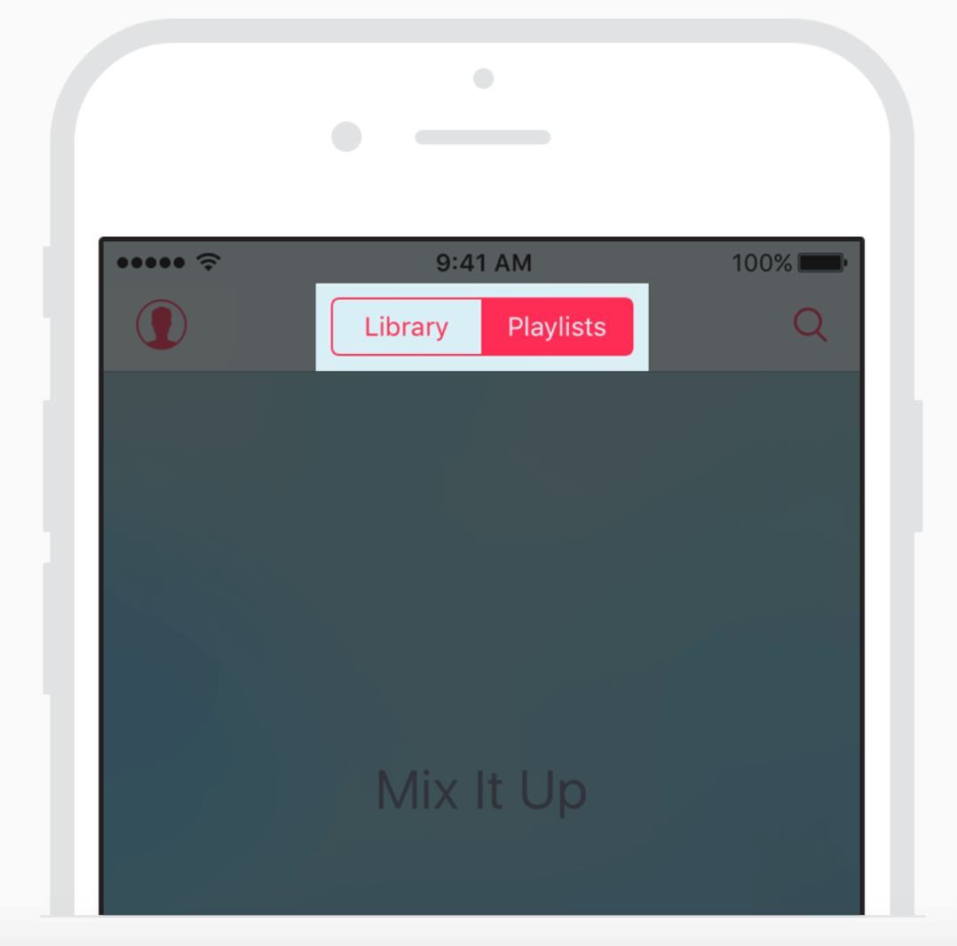
Segmented Control
If there are only a couple of destinations, you can use segmented control. As with a tab bar, all options are visible at once and can be accessed with a single tap.
Full-Screen Navigation
It might sound contradictory to what I said about saving screen space, but full-screen navigation might be a good choice. Basically, it’s a page (usually the home page) that lists all navigation options. Though you won’t be able to display any content, the full-screen navigation pattern is good for simplicity and coherence. Once the user decides where to go, then you can dedicate the entire screen space to the content. This type of navigation works well in task-based websites and apps, where users are squarely focused on accomplishing a very specific task (for example, checking in for a flight or changing the settings on their phone) or where they limit themselves to one branch of the navigation hierarchy during a single session (for example, if they’re intrested in a particular service or product).
This type of navigation is good when you have hierarchical tree navigation — for example, when you have a menu with seven primary options and each option contains layers of subcategories.
Search Box
If search is a key function of your app, it needs to be in front of people. Don’t hide it. Either display it at the top of the screen, or have a visible reference (a magnifying glass icon) that activates search mode.
5. One-Handed Operation
Adapt your design to big screens.
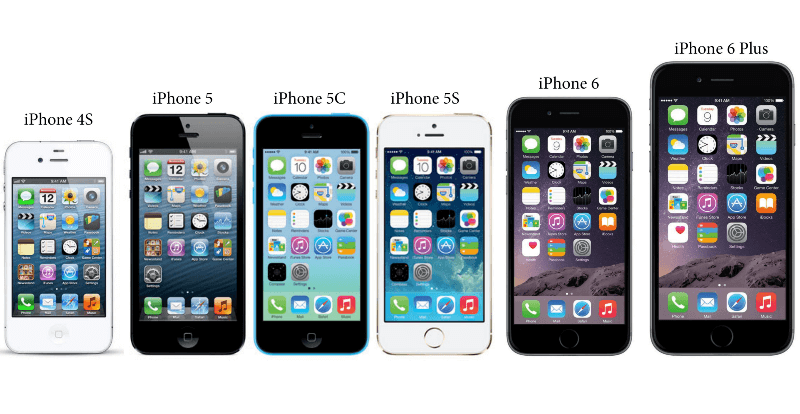
With the release of the iPhone 6 and 6 Plus, it’s become clear that screen sizes are going to keep expanding.
Here are three basic ways of how people hold their phone:
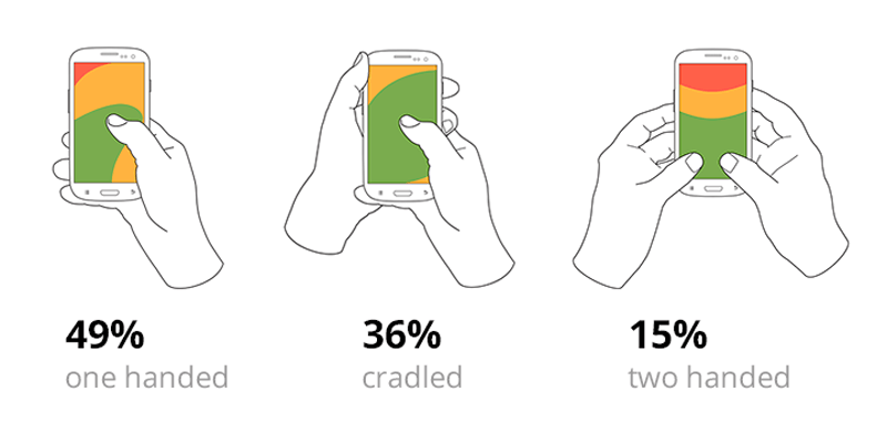
According to research by Steven Hoober, 85% of users use their phone with one hand. The following heat map shows the thumb zones for every iPhone display size since 2007. You can see that the bigger the display is, the more of the screen is less easily accessible.
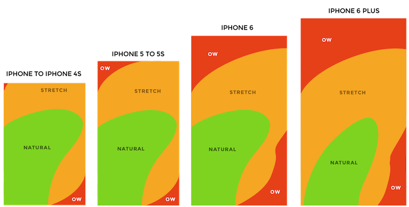
Adapt your design to improve the user experience. Make sure that your app can be easily (and fully) used on a large screen (such as an iPhone 6 or 7) with one hand.
Green Zone For Common Actions And Navigation
Place the top-level menu, frequently used controls and common action items in the green zone of the screen, which is comfortably reached with one thumb.
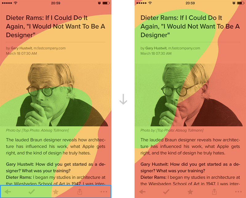
Red Zone For Destructive Actions
Place destructive actions (such as delete and erase) in the hard-to-reach red zone, because you don’t want users to accidentally tap them.
6. Appearance Of Speed
Don’t make users wait for content.
While an instant response is best, there are times when your app won’t be able to meet the standard guidelines for speed. A slow response could be caused by a bad Internet connection, or an operation could be taking a long time (for example, installation of an update for the operating system). As much as possible, make the app fast and responsive.
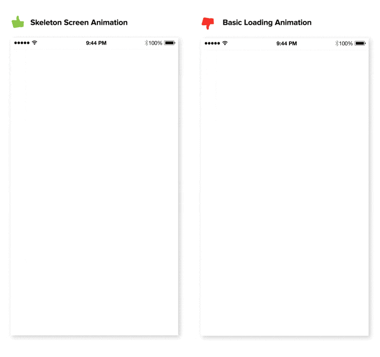
Skeleton Screens
Let people know that things are going to take a while by using a progress indicator. That being said, while the intention behind a progress indicator is good, the result can be bad. As Luke Wroblewski mentions, “Progress indicators by definition call attention to the fact that someone needs to wait. It’s like watching the clock tick down — when you do, time seems to go slower.” There is a good alternative to progress indicators: skeleton screens. These containers are essentially a temporarily blank version of the page, into which information is gradually loaded. Rather than show a loading indicator, use a skeleton screen to focus on actual progress and create anticipation for what is to come. This creates a sense that things are happening immediately, as information is incrementally displayed on the screen and people see that the application is acting while they wait.
Visual Distraction
Keep in mind that perception can be just as important as raw speed. If an app gives users something interesting to look at while waiting, they will pay less attention to the wait itself. Thus, to ensure that people don’t get bored while waiting for something to happen, offer a distraction.
Operations In The Background
Do things in the background to make imminent actions appear fast. Actions that are packed into background operations have two benefits: They are invisible to the user, and they happen before the user asks for them.
A good example of this technique is the process of uploading pictures in Instagram. The app uploads photos early. As soon as the user chooses a picture to share, the app starts uploading; and by the time the user is ready to press the “Share” button, uploading is complete, and the user can share their picture instantly.
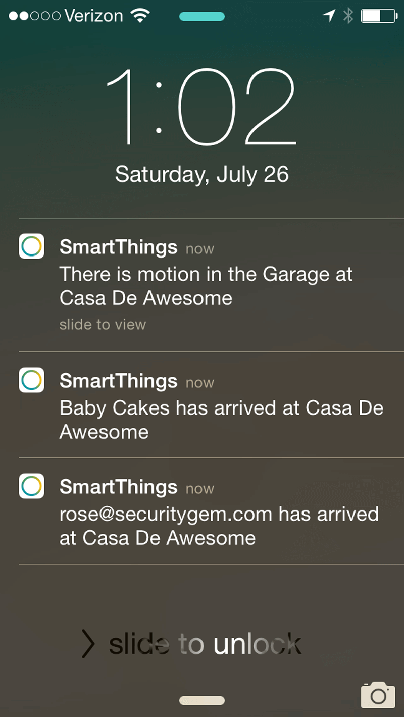
7. Well-Timed Push Notifications
Think twice before sending a message.
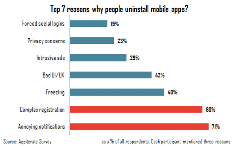
Every day, users are bombarded with useless notifications that distract them from their day-to-day activities, and it gets downright annoying. Annoying notifications are the number one reason people uninstall mobile apps (according to 71% of survey respondents).
Below are four principles to remember when crafting user-centric notifications.
Mobile Is All About Making Every Message Count
The most common mistake you can make when sending push notifications, and the most damaging in the long term, is to send users more notifications than they can handle. Don’t overwhelm users with push messages, or they might end up deleting your app altogether.
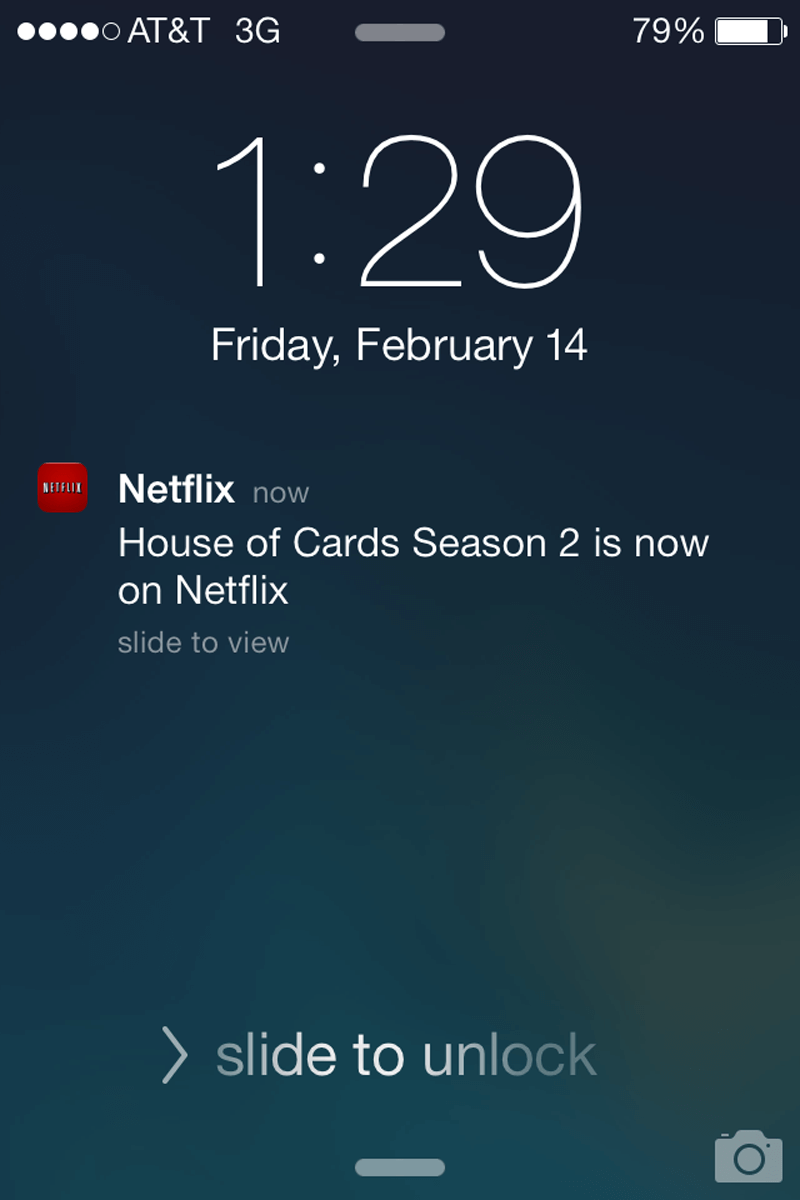
Push Value
When a user starts using your app, they won’t mind getting notifications, as long as the value they get is sufficiently greater than the interruption. Don’t send push notifications just for the sake of “engaging users.” For example, Facebook routinely sends notifications inviting users to connect to randomly suggested people or to “Find more of your friends on Facebook.” This is a poor attempt to direct users back to the app. Also, it interrupts users with irrelevant alerts.
Personalizing content to inspire and delight is critical. Netflix carefully uses viewing data to present recommendations that feel tailor-made.
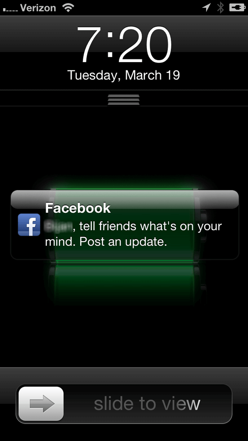
Time Your Notifications
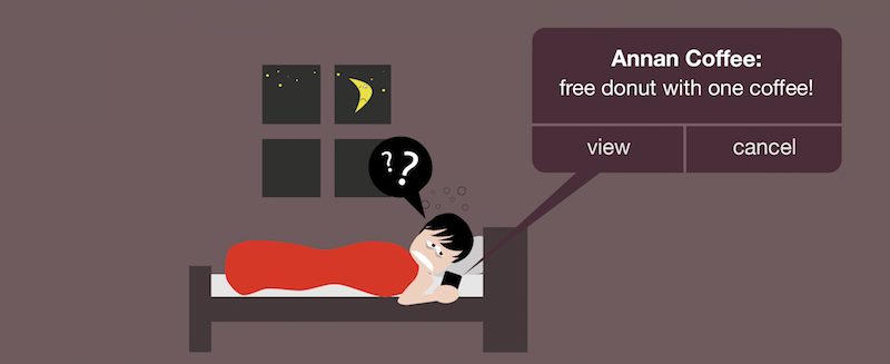
Tailoring your notifications to users isn’t just about what you say, but about when you say it. Don’t send push notifications at odd hours. An ill-timed notification sent between 12:00 am and 6:00 am risks waking up or disrupting users:
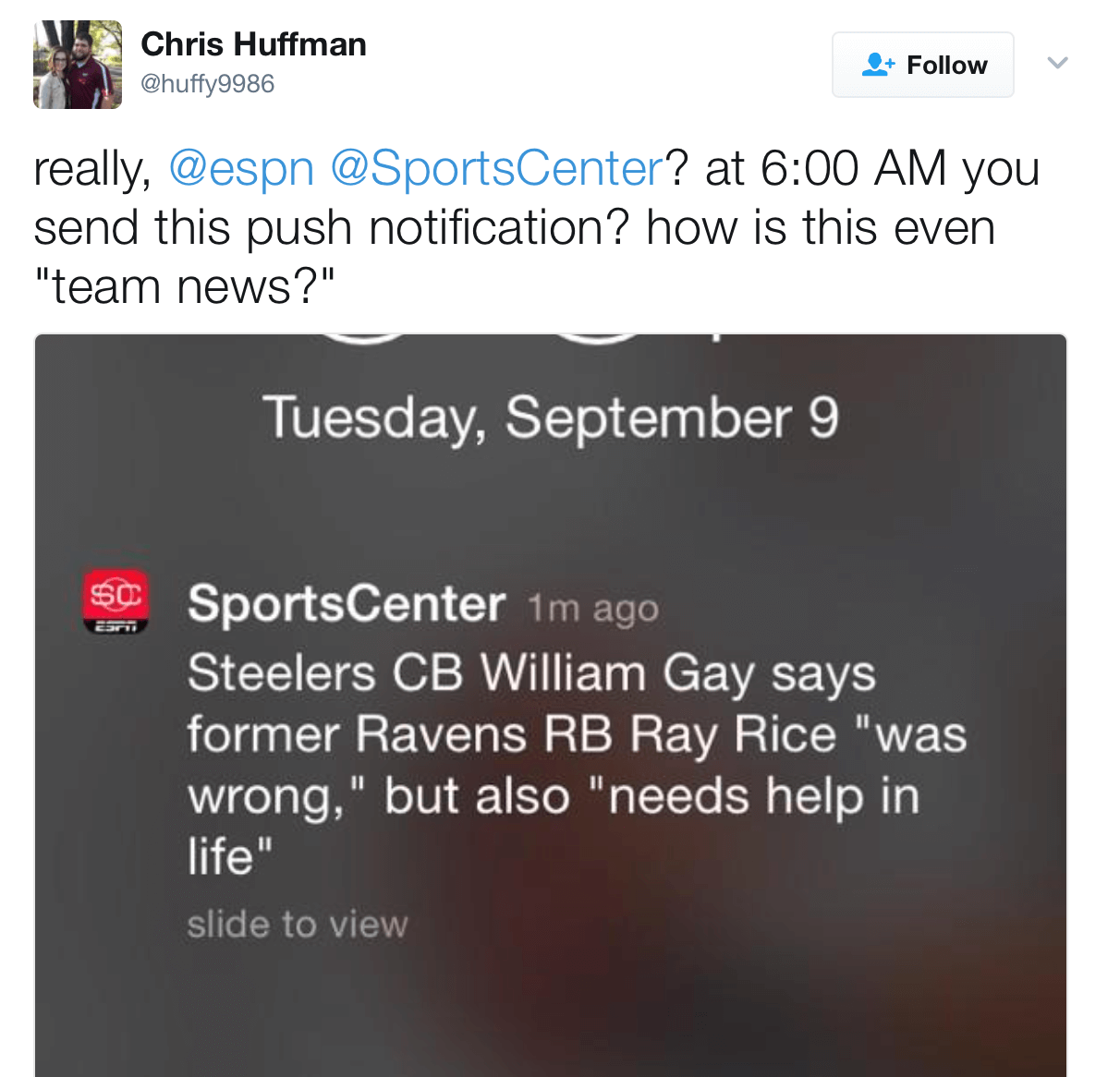
Of course, users could always disable notifications while they’re sleeping, but that’s not a good solution. A real solution would be to send notifications at times that would be most convenient for users, unless it’s critical to inform them of something right away. According to comScore, a good time for push notifications is between 6:00 pm and 10:00 pm. Always push notifications according to the user’s time zone.
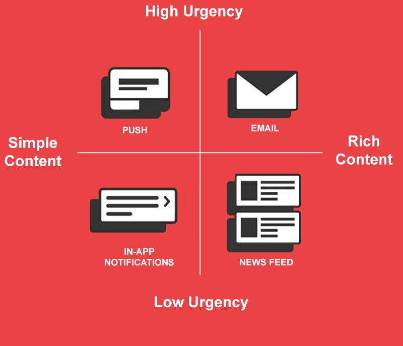
Diversify Your Messaging
The most effective mobile messaging strategy is to use different message types: push notifications, email, in-app notifications and news feed updates. Diversify your messaging — your messages should work together in perfect harmony to create a great user experience.
Conclusion
As with any other design element, the tips shared here are just a start. Make sure to mix and match these ideas with your own for best results. Remember that design isn’t just for designers — it’s for users. Treat your app as a continually evolving project, and use data from analytics and user feedback to constantly improve the experience.
"This article is part of the UX design series sponsored by Adobe. The newly introduced Adobe Experience Design CC (Beta) tool is made for a fast and fluid UX design process, as it lets you go from idea to prototype faster. Design, prototype and share — all in one app. You can check out more inspiring projects created with Adobe XD on Behance, and also visit the Adobe XD blog to stay updated and informed. Adobe XD is being updated with new features frequently, and since it’s in public Beta, you can download and test it for free."
Further Reading
- Motion & Animation: A New Mobile UX Design Material
- The Underestimated Power Of Color In Mobile App Design
- How To Design Better Buttons
- What Is User Experience Design? Overview, Tools And Resources
 (ms, vf, al, il, mrn)

