Just Keep Scrolling! How To Design Lengthy, Lengthy Pages

Email Newsletter
Weekly tips on front-end & UX.
Trusted by 182,000+ folks.
 Celebrating 10 million developers
 Register Free Now
 SurveyJS: White-Label Survey Solution for Your JS App


Websites with long or infinite scrolling are becoming more and more common lately, and it’s no mere trend or coincidence. The technique of long scrolling allows users to traverse chunks of content without any interruption or additional interaction — information simply appear as the user scrolls down the page.
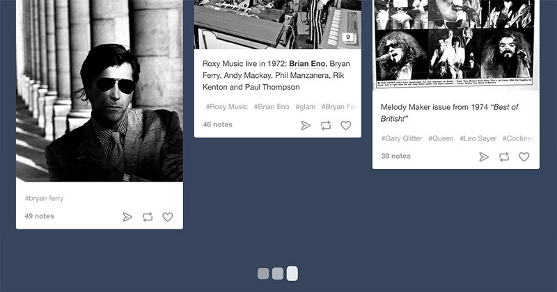
Infinite scrolling is a variety of long scrolling that allows users to scroll through a massive chunk of content with no finish line in sight (it’s the endless scrolling you see on Facebook, Twitter and Tumblr feeds).
Long scrolling has the following benefits:
- It has more potential to engage users. (Scrolling minimizes the interaction cost required to attain a variety of user goals. The advantage of not having to click “next” keeps users engaged with the content and less focused on the mechanics of navigating to the next page.)
- It translates well to mobile devices. The increased use of mobile screens has played a key role in the widespread acceptance of this technique: The smaller the screen, the longer the scroll. The gesture controls of mobile devices make scrolling intuitive and fun.
Scrolling opens a lot of new doors to designers. However, this pattern is not without its drawbacks. It requires designers to pay strong attention to content and navigation. In this article, I will discuss some of the benefits, things to consider and quick tips for long scrolling. If you’d like to get more creative with your designs, you can download and test Adobe XD for free and get started right away.
When To Use Long Scrolling?
Long scrolling is not for every website. It is appropriate in the following circumstances:
- For storytelling (it creates a linear structure that storytellers can leverage);
- For continuous and lengthy content, such as a long article or a multi-step tutorial (it provides a better user experience than slicing it up into several separate pages);
- When the content cannot be divided into separate parts and should be presented as a whole (for example, an infographic);
- To highlight the features, qualities or attributes of a product in a story.
In these contexts, long scrolling and long reading are synonymous.
How To Implement Long Scrolling
The following 10 rules will help you to provide a good user experience for long scrolling.
1. Encourage Users To Scroll
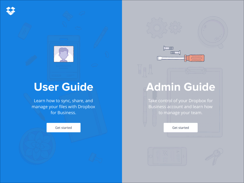
Despite the fact that people usually start scrolling as soon as the page loads, content above the fold is still very important. What appears at the top of the page sets the initial impression and the expectation of quality for visitors. People do scroll, but only if what’s above the fold is promising enough. Thus, put your most compelling content above the fold:
- Offer a good introduction. (A good introduction sets the context for the content and helps to answer the user’s question, “What’s this page about?”)
- Use engaging imagery. (Users pay close attention to images that contain relevant information.)
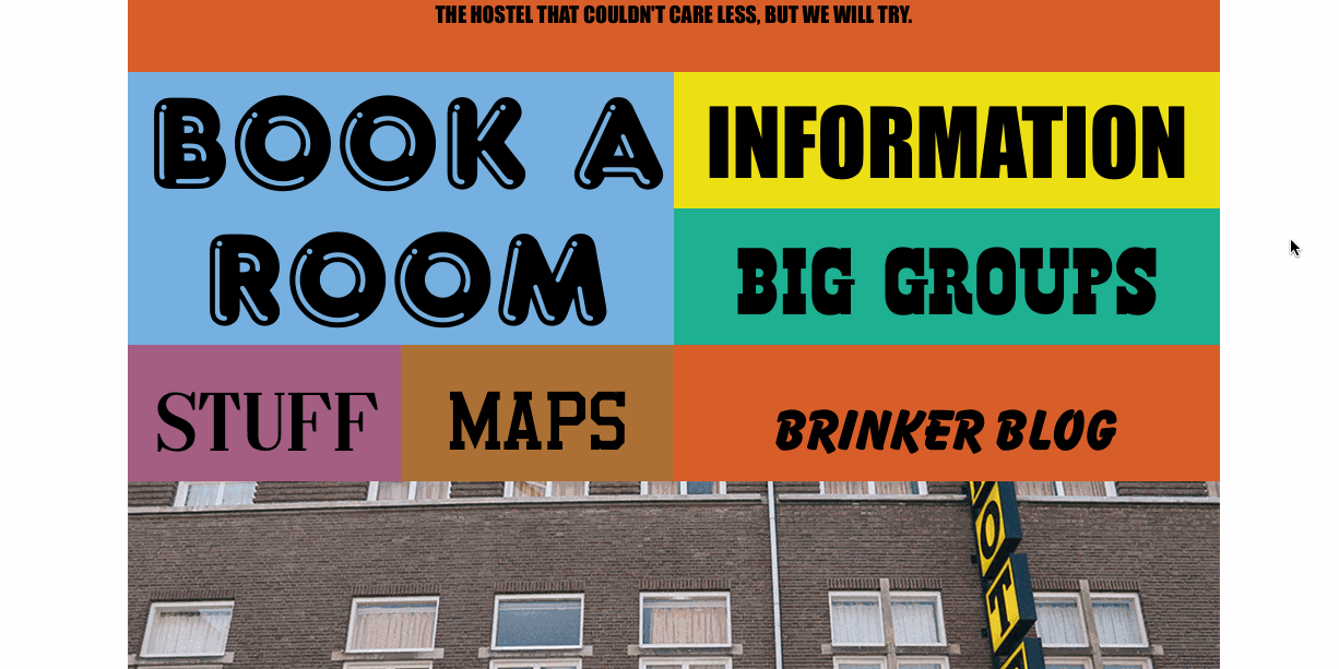
2. Keep Navigation Options Persistent
When you create a longer-scrolling website, keep in mind that users still require a sense of orientation (i.e. their current location) and a sense of the navigation (other possible paths). Long scrolling can make navigation problematic for users: If the navigation bar loses its visibility when the user scrolls down, they will have to scroll all the way back up when they’re deep within the page. The obvious solution to this problem is a sticky menu that shows the current location and that remains on screen in a consistent location at all times.

For mobile devices only: Because a mobile screen is much smaller than most other devices, a navigation bar can take up a relatively largely portion of the screen. If the screen shows a scrolling feed, then you could hide the navigation bar when the user is scrolling for new content and then reveal it once they pull down to get back to the top.
Tip: You can also enable users to jump between sections of a page with supplementary navigation. For example, the solution shown in the animation below helps the user to track their progress and at the same time can be used as a shortcut to a particular section.
3. Make Sure The “Back” Button Works Properly
Long scrolling often causes the user to lose their position on the page. This happens when they click away from a long scrolling list and, upon returning by clicking the “back” button, are brought to the top of the original page instead of where they left off. But when the user follows a link on the page and then clicks the “back” button, they expect to return to the same spot on the original page. Losing their spot forces them to have to scroll through content they have already seen. It’s no surprise that users get frustrated quickly by not getting proper “back to position” functionality.
When activating an element in the feed, users must be able to return to the original element that activated it. Flickr is a good example of matching the browser’s “back” button behavior to the user’s expectation. The website remembers the user’s scroll position, so when the user presses the “back” button, they return to their original position.

4. Change URL Based On Scroll Position
One of the most common problems with long scrolling is that sharing a URL to a particular spot on the page is impossible: The user’s scroll position isn’t reflected in the URL, and the URL leads to the top of the page. The user will become easily frustrated when they can’t easily switch between devices to continue browsing from their current spot because the URL doesn’t capture that spot. Starting with HTML5, changing the URL displayed in the browser without reloading the page is possible. The history.pushState() function enables us to invoke a URL change without reloading the page, thus allowing us to match the scrolling behavior to the user’s expectation.
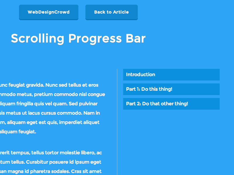
5. Consider Jump-To Options
Another common problem with long scrolling is disorientation: The user might have difficulty finding something they have previously seen on the page. This can be a serious problem when content is broken down into multiple equally important sections or blocks (such as a long tutorial). A “jump to section” option would solve this. For example, on Tumblr, users can jump down the page or jump back to the start if they get lost. The content on the page is broken down into several blocks that are clearly distinguished, and big indicator dots are fixed to the left side of the screen.
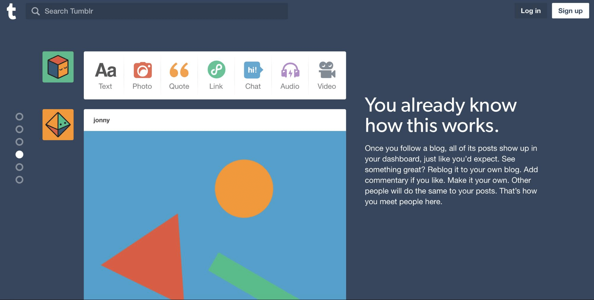
Tip: If you are going to use the “jump to section” feature, make sure that the series of dots are easy to use. If they’re small or hard to click with a mouse or to press accurately on a touch device, then they will frustrate users. Thus, make sure the dots are sized appropriately.
6. Provide Visual Feedback When Loading New Content
According to one of Jakob Nielsen’s original 10 heuristics for usability, visibility of the system’s status remains among the most important principles in user interface design. The user wants to know their current context in a system at any given time, and a website shouldn’t keep them guessing — it should tell the user what’s happening via appropriate visual feedback. If your website dynamically loads content, then users need a clear sign that the website is doing this. Keep them informed; use a progress indicator to show that new content is loading and will soon appear on the page.
Because loading of content is supposed to be fast (it shouldn’t take longer that 2 to 10 seconds), you can use looped animation to indicate that the system is working.
7. Don’t Hijack Scrolling
Websites that hijack scrolling take control of the scrolling and override a basic function of the web browser. Scroll hijacking is bad because the user no longer has full control of the page and is unable to predict its behavior.
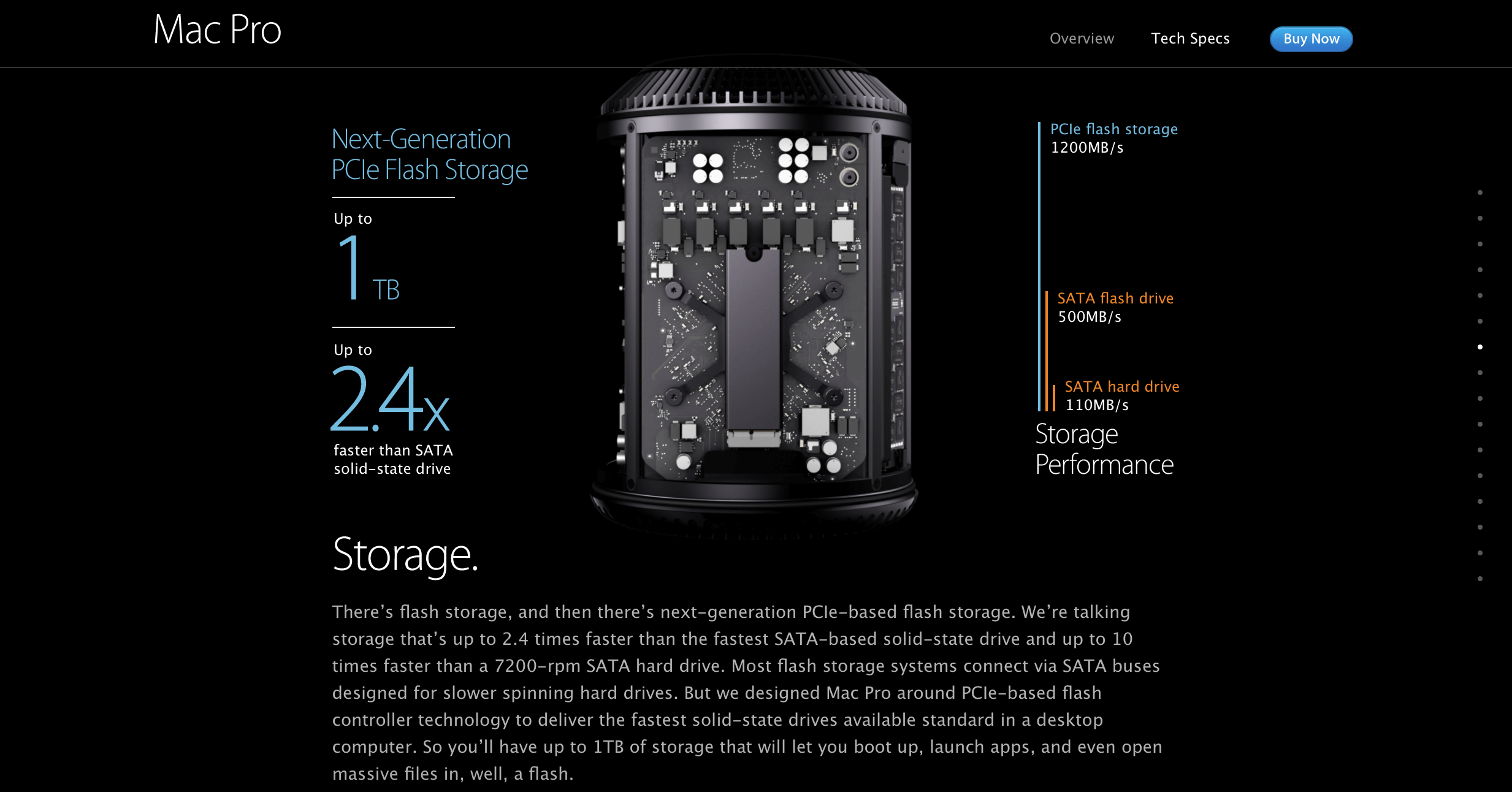
The problem can be seen on Apple’s Mac Pro page. No matter how fast you scroll, the layout moves at a predetermined speed. Because all content on this page is tied to scrolling, the visitor is forced to browse the page at a slow pace.
8. Optimize Page-Loading Time
Slow loading times are a common problem with long scrolling pages. But for websites, slow performance is a death blow. In fact, 47% of users expect a web page to load within 2 seconds. If a page hasn’t loaded within 3 seconds, 57% of users will leave.
Though loading time is a problem for long scrolling pages, it can be solved. Page-loading time can be optimized with sequential loading techniques, such as lazy loading, enabling users to access basic content really quickly. Read about the performance improvement that the team at Smashing Magazine achieved based on The Guardian’s redesign.
9. Consider How Much Resources Your Page Consumes
Always consider how much resources (CPU and memory) your page consumes if you’re using long scrolling (especially for pages with a lot of images and animation). Scrolling through multiple pages of photos, animated GIFs and videos without the page reloading can take a significant toll on system resources, and devices with limited resources, such as the iPhone, can start slowing down because of the sheer number of assets it is loading. Thus, test your website using different devices, and use tricks like pausing animation and video when the user scrolls past them.
10. Consider User Behavior On The Page
To determine how effective long scrolling is, find out how users are interacting with it. Analytics data are able to answer this question. In Google Analytics, for example, you can open the page analytics to see how many people click below the fold. Based on the data, you can then tweak the design if necessary.
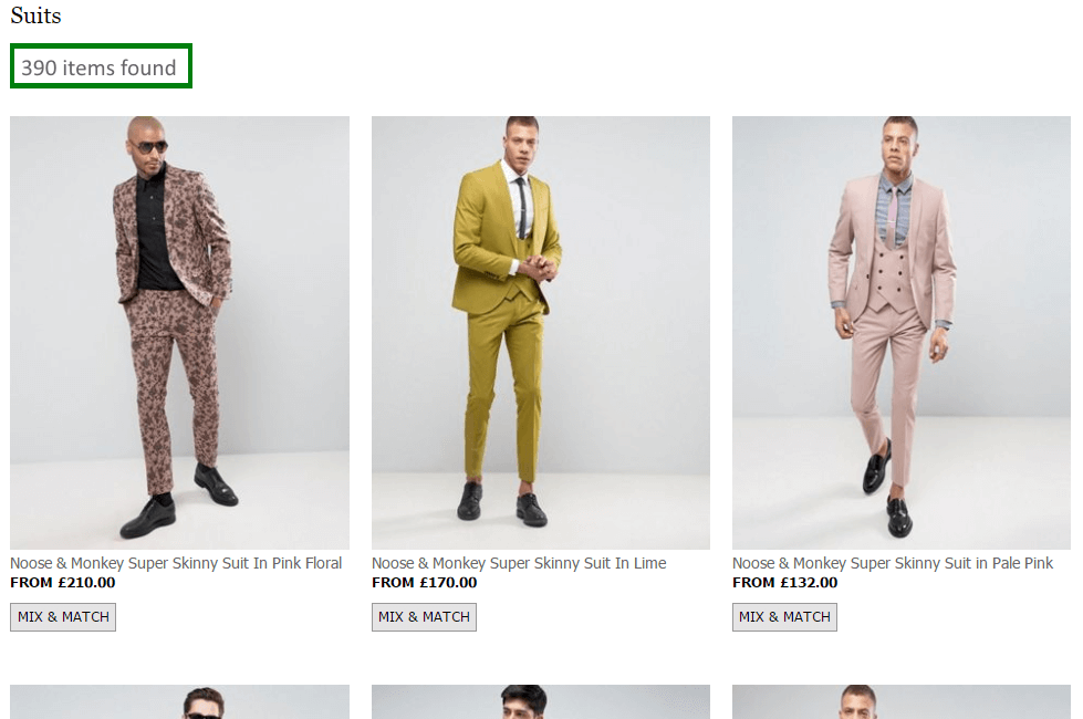
Long Scrolling For E-Commerce Websites
Long scrolling is often used on e-commerce websites. For product listings and search results, this pattern has one key benefit: Users can scroll the list of products or results without any interruption. No interaction is needed — products simply appear as the user scrolls down the page.
However, to create a good user experience, you need to address a few common issues.
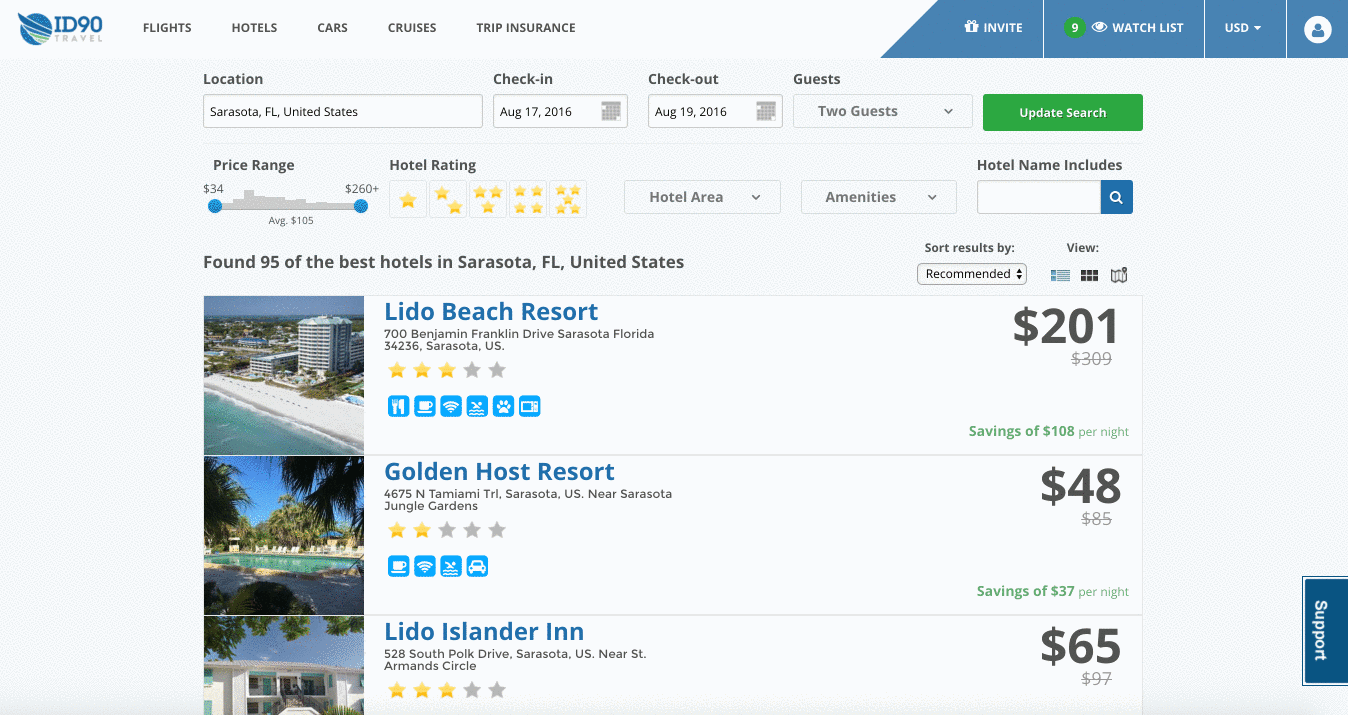
Make Navigation And Filters Sticky
When done right, filters enable the user to narrow down a website’s selection of thousands of products to only those few items that match their needs. As with navigation menus, keeping filter options persistently visible is important because users want to feel in control.
Enable Individual Items To Be Bookmarked
A simple bookmark (or “save for later” feature) of favorite items for future reference is a powerful tool for users.

Display The Number Of Matching Results
Show the number of items available, so that users can decide how long they want to spend scrolling through results.
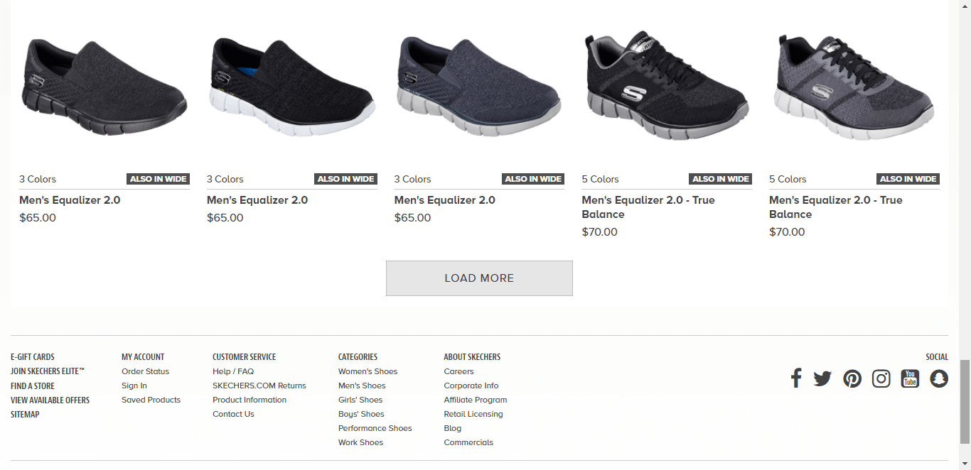
Make The Footer Accessible
People understand the concept of a footer, and they expect to find links to important website information there (such as contact information), but long scrolling often impedes the user’s access to the footer: New items continually load as the user approaches the bottom of the list, pushing the footer out of view. While this sounds like a serious problem, it can be solved with a “Load more” button. With this solution, content is loaded on demand: New content won’t automatically load until the user clicks the “More” button. This way, the user can get to the footer easily without having to chase it down. You can find practical tips on how to implement this solution in the article ““Infinite Scrolling, Pagination or ‘Load More’ Buttons? Usability Findings in eCommerce.”
Parallax Effect For Long Scrolling
Interaction design underlies long-scrolling websites, and animation is an essential part of this design. Considering that users’ attention span on the web is about 8 seconds, a delightful scrolling experience will certainly prolong user interest. One interesting animation that can delight users is the parallax effect.
With parallax scrolling, the background image moves more slowly than the content in the foreground, creating the illusion of depth and immersion. This effect makes imagery feel less flat and more three-dimensional.
When Is Parallax Scrolling Effective?
In web design, the journey can be as enjoyable as the destination. Parallax is an entertaining visual effect that can make a great first impression and encourage visitors to scroll more. It’s very useful when you want to wow your audience.

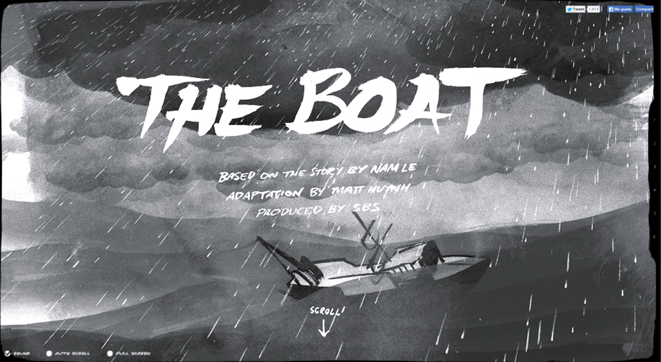
Parallax scrolling is also very effective in guided storytelling. When you want to tell a story in a smooth, linear fashion, pairing long scrolling with the parallax effect can create a completely immersive browsing experience. In The Boat, shown below, as users scroll, animations take them to the next screen while creating a path of content to follow. This turns scrolling into something more fun and makes the user wonder “What will happen next?”
When Is Parallax Scrolling The Wrong Approach?
Avoid this technique if the majority of your users are looking to accomplish clearcut tasks (for example, purchase a product). Imagine, for instance, how frustrating Amazon would become if you had to see a parallax effect each time you wanted to buy a product.
Parallax And Page Performance
The vast majority of websites that use the parallax effect suffer from terrible scrolling performance. It’s especially bad on devices with high pixel densities, like the iPhone. While all potential performance problems cannot be completely solved, you still can improve scrolling performance by following simple techniques:
- Only use properties that are cheap for the browser to animate. These are
translate3d,scale,rotationandopacity. - Don’t animate massive images or dramatically resize them. Forcing the browser to resize images (especially huge ones) could be costly.
- Avoid animating a lot of things at once.
You can find more practical tips for the parallax effect in the article “Parallax Done Right” by Dave Gamache.
Parallax And Accessibility
Consider how users with visually triggered vestibular disorders will use your website. Animation is capable of making this group of users feel dizzy. Val Head has a few practical recommendations for designers on how to design safer motion, with one perfect recommendation for parallax: If your website has a lot of movement that covers a lot of visual ground, provide an alternative way to view that content — consider an option to turn off motion. This can be accomplished via a button or toggle switch to reduce or turn off animation globally on your website. To explore this idea, Nat Tarnoff developed a prototype of a toggle switch that could be used on any website.
Conclusion
Long scrolling can create a completely immersive browsing experience. If users like a UI and find it intuitive, then they won’t really mind the length of the scrolling. Thus, focus on their goals and make things more convenient for your users.
"This article is part of the UX design series sponsored by Adobe. The newly introduced Adobe Experience Design CC (Beta) tool is made for a fast and fluid UX design process, as it lets you go from idea to prototype faster. Design, prototype and share — all in one app. You can check out more inspiring projects created with Adobe XD on Behance, and also visit the Adobe XD blog to stay updated and informed. Adobe XD is being updated with new features frequently, and since it’s in public Beta, you can download and test it for free."
Further Reading
- Quick UX Prototyping With Adobe XD Shortcuts (PDF Cheat Sheet)
- Infinite Scrolling, Pagination Or “Load More” Buttons? Usability Findings In eCommerce
- How Functional Animation Helps Improve User Experience
- The Golden Rules Of Bottom Navigation Design
 (ms, vf, al, il, mrn)

