Building Production-Ready CSS Grid Layouts Today

Email Newsletter
Weekly tips on front-end & UX.
Trusted by 182,000+ folks.

 Custom Web Forms for Angular, React, & Vue. Your backend.
 Celebrating 10 million developers

Industries often experience evolution less as slow and steady progress than as revolutionary shifts in modality that change best practices and methodologies seemingly overnight. This is most definitely true for front-end web development. Our industry thrives on constant, aggressive development, and new technologies emerge on a regular basis that change the way we do things in fundamental ways.
Today, we are in the early stages of such a revolutionary shift, brought about by CSS Grid Layout. Much of what we know of the possibilities, limitations and best practices surrounding web layouts is effectively rendered obsolete by this new layout module, and in their place we find new possibilities, limitations and best practices that will take us into the next era of web design.
Progressively Enhancing CSS Layout
Can we use CSS Grid already, and what about IE9? Good question! Here's how to progressively enhance your layout all the way up to CSS Grid, today. Read more →
Much has already been said about the technical aspects of CSS grid and its one-dimensional cousin flexbox by people smarter than me. In this article, I want to bring these concepts into practical use. What you’ll get is a starting point for exploring what new layout opportunities and challenges CSS grid brings, what old problems it solves and how to start using the module in production websites today.
My examples and focus will be on WordPress themes, but the practical approaches and code examples are agnostic and can be used in any web project, regardless of CMS, technology stack or tool.
Let’s get crackin’!
The Case For CSS Grid
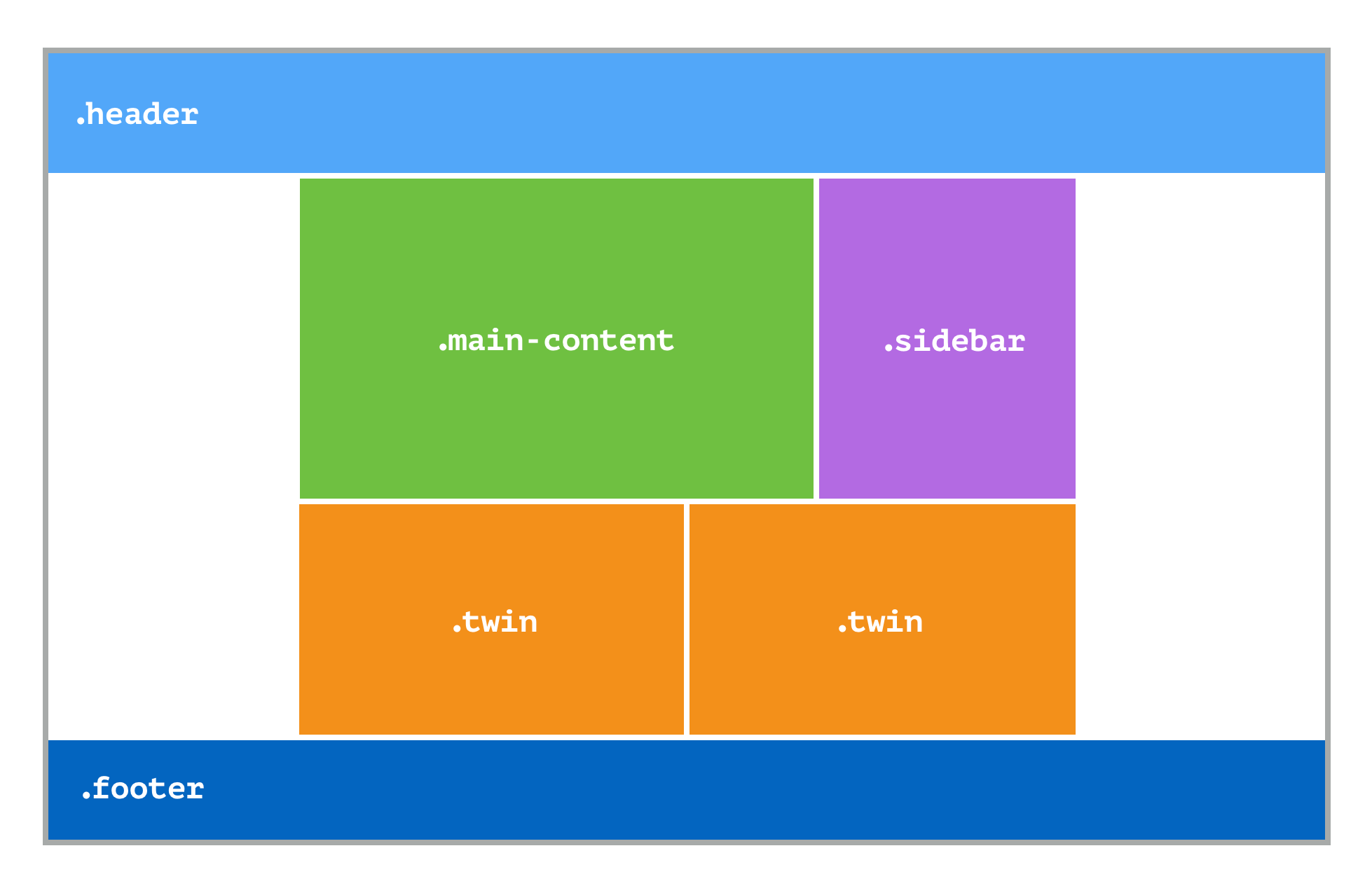
Think of how you would create the layout below using CSS: a responsive two-column layout with a full-bleed header and footer, the main area center-aligned with a maximum width of 60 ems. The content takes up two-thirds of the available space, the sidebar one-third, and the two sections below half the space each.
To solve this layout challenge using traditional CSS layout methods, the content, sidebar and two equal-sized sections would be grouped together in a container, with max-width set to 60em; that container would be centered, setting margin-right and margin-left to auto; the different sections would be placed next to one another by setting the main container to display: flex; and each element would be given a flex value or, in the days before flexbox, by floating them left and right.
Now, put away your web design hat for a moment and think of this as a layout you are asked to create in your favorite design application. What’s the first thing you do? You create a grid: four rows and eight columns.
In a print environment, you don’t use margins to center-align content or apply flex sections to match the height of sections — you just place them where they belong on the grid: The header, content and sidebar area, and footer each take up one row, the header and footer take up all eight columns, while the content occupies columns 2 to 5, and the sidebar columns 6 and 7.
With CSS grid, you can now do the same in the browser:
.site {
    display: grid;
    grid-template-columns: 1fr repeat(6, minmax(auto, 10em)) 1fr;
    grid-template-rows: minmax(1em, auto) 1fr auto minmax(1em, auto);
}

.masthead,
.colophon {
    grid-column: span 8;
}

.main-content {
    grid-column: 2/6;
}

.sidebar {
    grid-column: 6/8;
}

.twin {
    grid-column: 2/5;
    grid-row: 3/4;
}

.twin:last-of-type {
    grid-column: 5/8;
}
You can view the live version on Codepen:
CSS grid takes the best parts of print-based grid layouts and enhances them with the fluidity of the browser’s viewport: The six middle columns would have a maximum width, thanks to CSS’ minmax() function, and the first and last column would be set using the fr unit, to share a specified fraction of the remaining available space. What we’re left with is a center-aligned responsive grid layout, in the browser. And because this is all powered by CSS, we can use media queries to change the layout for different viewport widths.
Like flexbox, grid honors the text direction of the document, so if the dir attribute is set to rtl, the layout automatically mirrors, placing the sidebar on the left.
The New CSS Grid Mindset
As this example shows, to start working with CSS grid, you first need to set aside the habits, assumptions and practices that have enabled you to create advanced CSS-based layouts. In many cases, these established approaches are hacks developed to work around the limitations of CSS as a layout tool. CSS grid is, in my opinion, the first true layout module in CSS. It gives you two dimensions to work with and the ability to place any element in any cell or combination of cells. That requires a whole new mindset: Rather than asking, “How do I make this vertical stack of content behave as if it were laid out in a grid,” you simply define the grid and place each piece of content within it.
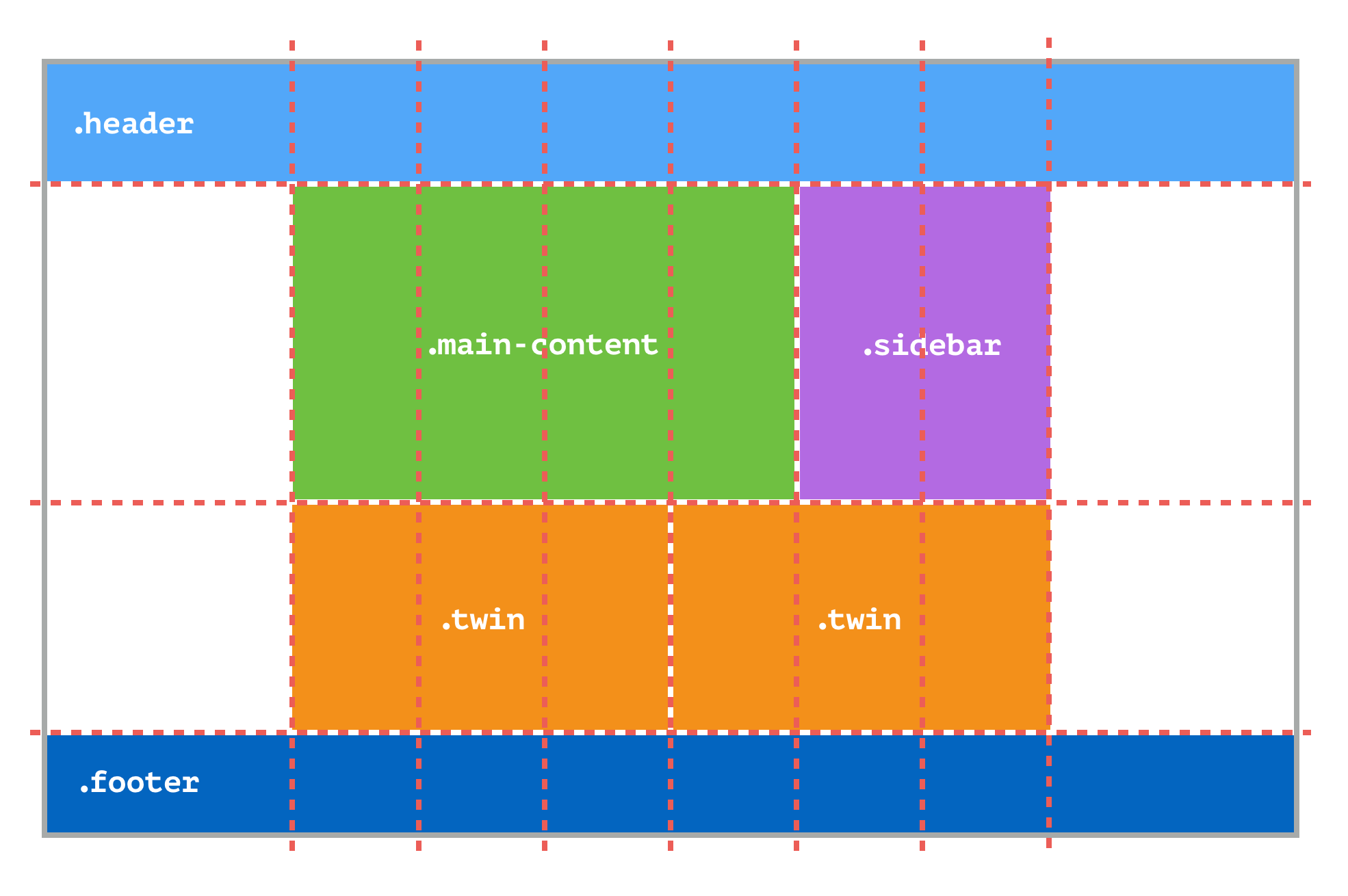
Let’s look at one more example to see just how different this is from how we used to do things.
Consider this single-column layout, containing both width-constrained, center-aligned content and full-bleed images and backgrounds:
The grid layout (right) has 8 rows and 4 columns. Using CSS grid, you should be able to position elements on that grid in any way you like. However, a grid container (one whose element is set to display: grid) only treats the elements that are direct descendants as grid items. This means you can’t create a single layout grid here. Instead, you have to create grids at the component level, effectively creating multiple grids with the same properties.
Side note: The grid specification contained a proposal for subgrids, which allow a descendant element to inherit the parent grid and apply it to its children. The subgrid feature has been moved to level 2 of the specification, meaning it will not be available in browsers for the foreseeable future. Rachel Andrew is following this development closely and has published extensive information about where subgrid currently stands and what comes next for the feature. Until that time, the most practical workaround is to nest grids within grids, effectively defining grid descendants as their own grids.
To build the layout above in the browser, you would use CSS grid in cohort with other tools and practices, as we’ll see.
If you don’t do anything, each section will be full width out of the box. For each section with center-aligned content sections, you apply the .grid class and create CSS rules that set up a four-column grid and position the content in the two center columns. The layout of three buckets in the third section is achieved using flexbox. The last section, with two full halves, comprises two individual grid items, taking up two columns each. This is achieved using grid-column: span 2; (meaning the grid items span two columns) and allowing grid auto-placement to handle the rest.
/* Four-column layout. Two center columns have a total max-width of 50em: */
.grid {
    display: grid;
    grid-template-columns: 1fr repeat(2, minmax(auto, 25em)) 1fr;
}
/* Center items by placing them in the two center columns: */
.splash-content,
.more-content,
.buckets ul {
    grid-column: 2/4;
}
/* Use automatic grid placement + span to let each item span two columns: */
.twin,
.colophon aside {
    grid-column: span 2;
}
You can view the live version on Codepen.
This example shows both how CSS grid can be used to solve common layout challenges like full-bleed sections, and how there are still limitations to what we can do with the module. As explained, ideally, you’d want to draw a single grid, and use subgrid to handle all of the sections and subsections. However, for now, only first-level descendants of the container whose display property set to grid can be positioned on the grid, and the subgrid property has not been implemented in browsers, so we are forced to come up with workarounds like what you’ve seen here. The good news is that this is still better than older methods, and it produces clean and readable CSS.
A Process For Using CSS Grid In Production
Now that you have an idea of why CSS grid is so important and how to adopt a CSS grid mindset, let’s look at how to use this module in production.
More than a layout module, CSS grid is an invitation to reaffirm our original intent with web design and development: to create accessible, extensible solutions that bring content to those interested in the best way possible.
At the core of any front-end web project is a simple principle: First make it accessible, then make it fancy, and make sure the fancy doesn’t break accessibility.
We also need to consider responsiveness, cross-browser and cross-platform compatibility, and progressive enhancement. Putting all this together, we end up with an outline for a practical process of development:
- Create accessible HTML with a sound hierarchical and semantic structure.
- Create a responsive single-column layout for all screen widths.
- Apply advanced layouts and functionality (grid, flex, JavaScript, etc.).
This should result in an accessible solution that works in all browsers on all platforms, while taking advantage of the latest technologies.
Backwards Compatibility And Browser Support
Before we continue, let’s quickly address the giant neon-orange elephant in the room: CSS grid is bleeding-edge technology, and while it has support in modern browsers, it has zero backwards compatibility. This could be considered an automatic non-starter, but I would argue it’s an opportunity to reframe the way we think about backwards compatibility:
CSS grid is a layout module; it allows us to change the layout of a document without interfering with its source order. In other words, CSS grid is a purely visual tool, and used correctly, it should have no effect on the communication of the contents of the document. From this follows a simple but surprising truth: The lack of support for CSS grid in an old browser should not affect the experience of the visitor, but rather just make the experience different.
If you agree with this (and you should), there is no reason you can’t use CSS grid today!
Here’s how that approach could work in practice. Rather than using fallbacks and shims to ensure a design and layout look the same across all browsers, we’d provide the mobile vertical single-column layout to all browsers and then serve up advanced functionality to those browsers and viewport widths that can take advantage of them. It might sound like progressive enhancement, but it’s actually more of an accessibility-centric approach enabled by a mental shift.
Before applying any CSS, we start with a properly marked-up HTML document, laid out in a single column. The document is navigable with any input device and has a hierarchical structure that ensures that reading it from top to bottom conveys the message in the best possible way. This is what makes it accessible. Based on what we know about the web-using public, we can assume that a significant portion of the visiting audience will come to the website using a smartphone. Using mobile-first design, we use CSS to style the single column of the document to fit the smallest mobile screen. This gives us the baseline of the design.
Now comes the mental shift: If the message of the document comes across in a single column on a narrow screen, then that same layout will work on a wide screen as well! All we have to do is make it responsive to fit the given viewport. This gives us an accessible, cross-browser, backwards-compatible baseline on which we can build advanced layouts and functionality using modern web technologies like CSS grid and advanced JavaScript.
In short, we would use CSS grid for visual and layout enhancements, not for meaningful changes to the content. The former leads to better design, the latter to broken accessibility.
Example: Using CSS Grid In A WordPress Theme
CSS grid simplifies age-old approaches and opens the door to dynamic new web layouts for all sorts of applications. To see how this works in the wild, let’s use CSS grid in a distributed WordPress theme via the process outlined earlier. Here, I’ll use the _s (or Underscores) starter theme as my starting point. And as I stated in the introduction, these approaches are agnostic and can be used with any starter theme or theme framework or even outside of WordPress.
If you want to get a firm handle on how CSS grid works in the browser, I recommend using Firefox and its Grid Inspector tool. That way, you’ll have a visual reference of where your grids are and what items they are acting on.
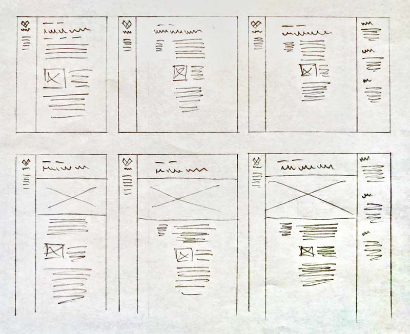
0. Structural Layout Sketches
To start off the project, I’ve created structural layout draft sketches for the main views of the theme. These will serve as guides as the design and layout process takes place in the browser. You’ll notice these sketches do not contain sizes or other specifications; they only outline the general layout and how they relate to the grid.
For narrow screens, such as mobile devices and for browsers lacking support for CSS grid, the layout would be a single center-aligned column with the content following the document’s hierarchy.
For modern browsers, there are two main layouts:
Index and archive views show published posts in a grid pattern, where featured posts take up twice as much space as other posts.
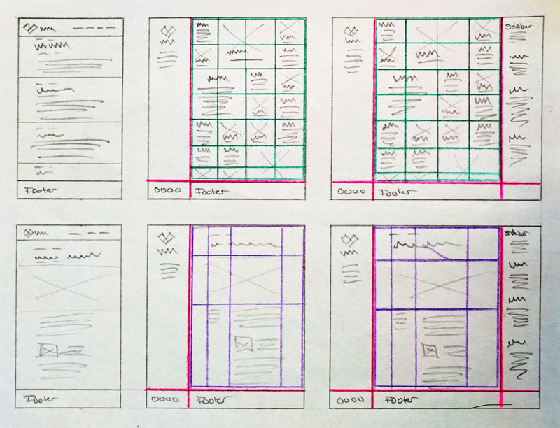
A single post and page view with grids would change the layout and displayed order of content depending on the viewport’s width.
1. Create Accessible HTML With A Sound Hierarchical And Semantic Structure
One of the major advantages of using a content management system such as WordPress is that, once you’ve created accessible, semantically sound and valid templates, you don’t have to worry about the structural components of the generated HTML documents themselves. Using _s as a starting point, we already have an accessible platform to build from, with only a bare minimum of interactive elements, like a small JavaScript file for adding keyboard navigation to the main menu.
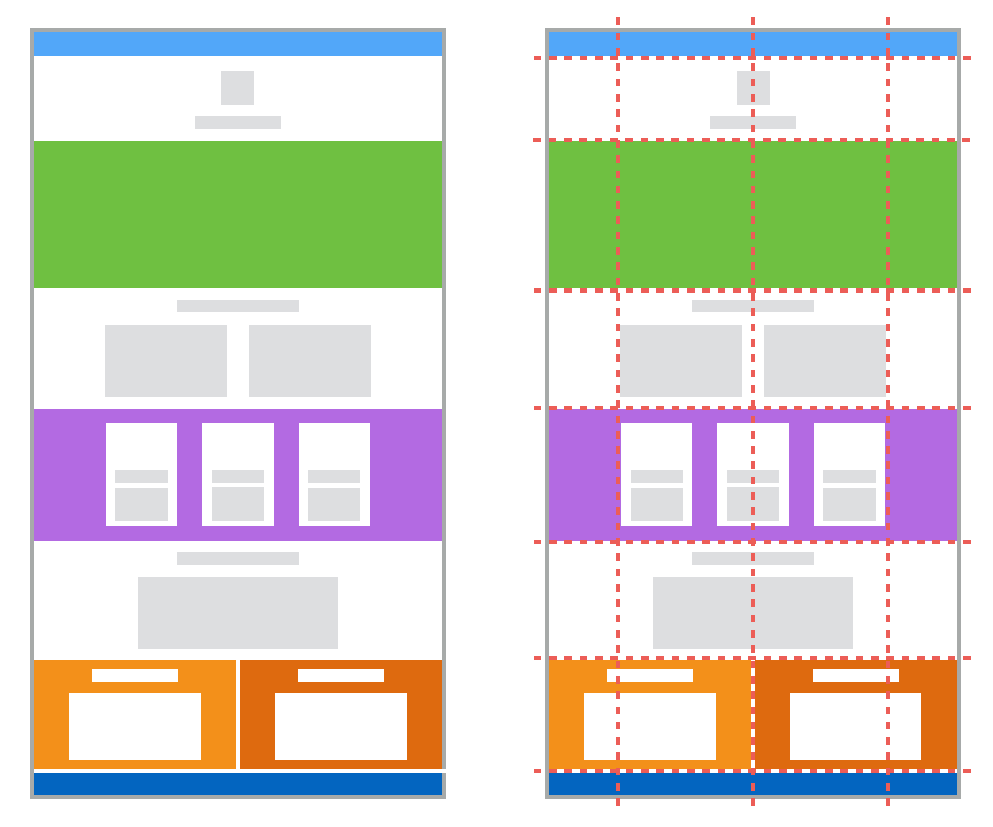
Due to the historical limitations of CSS, most frameworks like _s heavily nest containers to group elements together in an effort to make it easier for developers to do things like position the sidebar next to the main content. The simplified schematic below shows how the .site-content div wraps .content-area and .widget-area to allow them to float left and right:
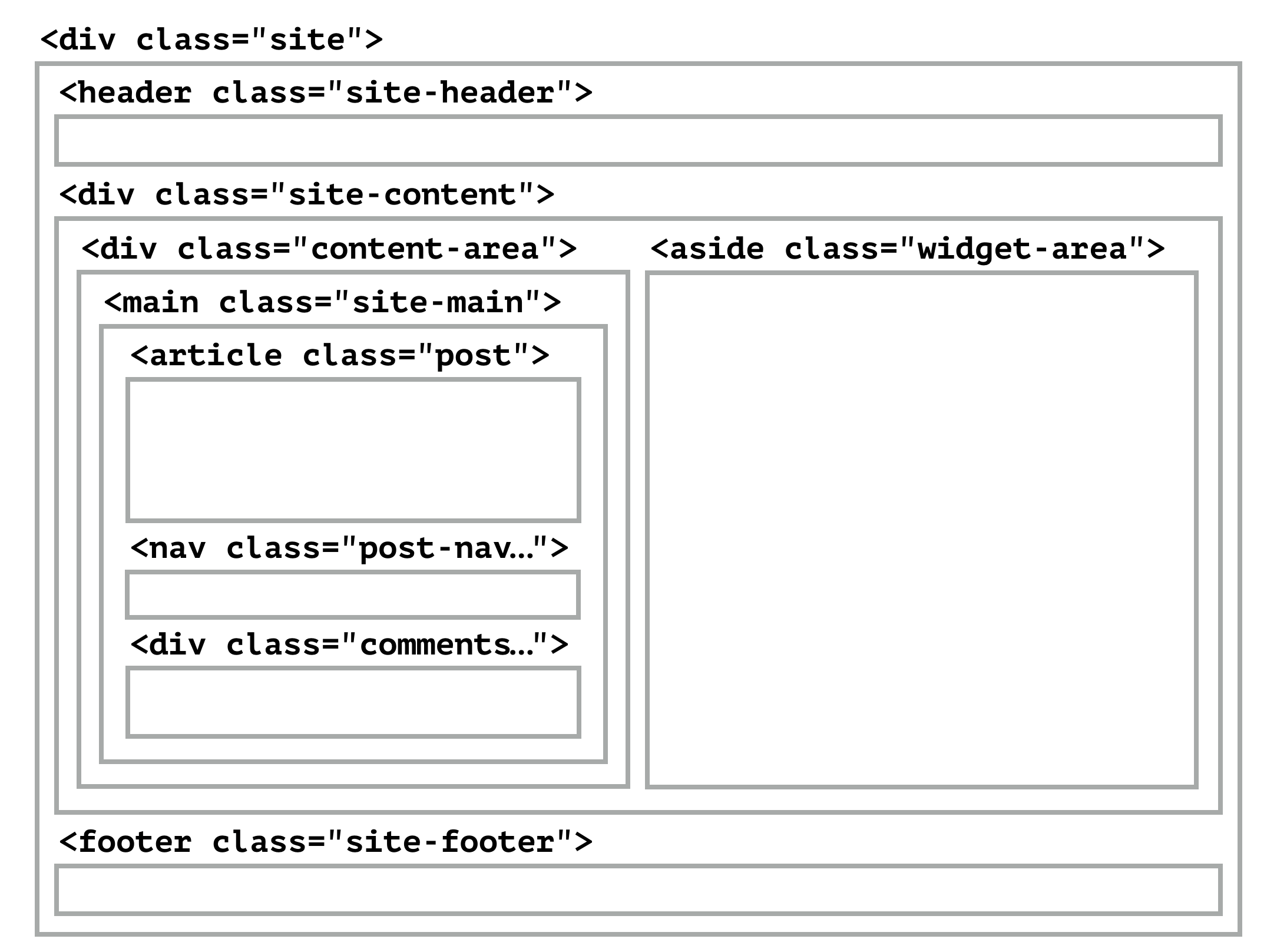
A grid container treats its first-level children as individual grid items, and CSS grid eliminates the need for floated and cleared containers. That means we can reduce the level of nesting and simplify the overall markup of the templates and the final output.
Out of the box, making .page a grid container would make .site-header, .site-content and .site-footer grid items, but .site-main and .widget-area are nested inside these containers and are, therefore, unavailable for placement on the grid.
Drawing out the layout on a piece of paper can help us to identify what level of container nesting is necessary and where to change the markup’s structure to allow for grid layouts. While doing this, it’s important to remember you can nest grids within grids and that this often allows for better layout control.
As explained earlier, _s defines containers whose sole purpose is to allow for wrapping and for layouts to use old CSS methods. You can usually spot these containers because they are generic divs, thus the name “divitis.”
Now that we’re using CSS grid for layout, we can remove some of these containers by flattening the HTML and bringing it back to a cleaner semantic hierarchy:

In practical terms, this means removing <div id="content" class="site-content"> from header.php (where it opens) and footer.php (where it ends) and removing <div id="primary" class="content-area"> from archive.php, index.php, page.php, search.php and single.php. This leaves us with a logical content hierarchy that we can position in our grid:
<div id="page" class="site">
    <header id="masthead" class="site-header" role="banner"></header>
    <main id="main" class="site-main" role="main"></main>
    <aside id="secondary" class="widget-area" role="complementary"></aside>
    <footer id="colophon" class="site-footer" role="contentinfo"></footer>
</div>
2. Create A Responsive Single-Column Layout For All Screen Widths
Before applying new styles, it is necessary to clean up the existing CSS that ships with the theme out of the box. The _s theme assumes we will float items to create side-by-side layouts, and it takes a brute force approach to resolve container-clearing issues by applying a clearfix at the root of most elements. This approach introduces invisible pseudo-elements in the DOM that are recognized by the browser and interfere with both flexbox and grid. If these rules are left in place, flexbox and grid will treat the pseudo-elements as flexbox and grid items and cause the layout to include what appears to be empty flexbox and grid cells. The quickest way to resolve this is to remove these CSS rules altogether by deleting the entire clearing section, or wrap them in feature or media queries so that they are applied only when flexbox and grid are not in use. If you need to clearfix specific elements within the layout, there should be a dedicated .clearfix class and CSS rule for this, to be applied when required. Clearfix is a hack to get around issues with floats and clears, and with flex and grid available, it now becomes graceful degradation and should be treated as such.
To provide a great user experience for all visitors, apply style rules to all elements in the document, starting with the smallest agreed-upon viewport width, usually 320 pixels.
Increase the viewport width incrementally, and add media queries to keep the visual experience pleasing, while taking advantage of the available space. The result should be a responsive single-column layout across all possible screen widths.
At this stage, refrain from making layout changes such as horizontal positioning: You are still working on the fallback for browsers without grid support, and we will be handling all layouts beyond the single column using grid in the next step.
Side Note: A Word On Browser Support
From here, we’ll start creating advanced layouts using CSS grid and other modern tools. You may feel compelled to try to make your grid layouts backwards compatible using a tool like Autoprefixer, but you’ll find this will have limited success. Instead, the best way forward is progressive enhancement: Give all browsers a well-functioning experience, and allow browsers with grid support to use grid for layouts.
How you approach this will depend on your overall fallback strategy: If your design calls for fallbacks to kick in where grid is not supported, you might be able to resolve the fallback by simply declaring another display property higher up in the cascade. Grid overrides other display property declarations, and browsers without grid support will use these declarations instead. Rachel Andrew has a detailed description with examples of this approach. You can also omit entire CSS rules from browsers without grid support using feature queries. In the current example, fallback is handled by serving up the mobile layout to all browsers. This means we can use feature queries to apply what I call “scorched-earth progressive enhancement”: Give all browsers the basic experience we’ve built above, and serve grid layouts only to browsers that can handle them.
We do this using feature queries in the form of @supports rules. Like with media queries, CSS nested inside an @supports rule will only be applied if the browser supports the specified property or feature. This allows us to progressively enhance the CSS based on browser support. It’s also worth noting that feature queries test for declared feature support in a browser. It does not guarantee that the browser actually supports a feature or honors the specification.
In its most basic form, a feature query for grid support looks like this: @supports (display: grid) {}.
The challenge is Microsoft Edge, the only modern browser that, as of this writing, still uses the old grid specification. It returns true for @supports (display: grid) {}, even though its grid support is spotty and non-standard. Most relevant for our example is the lack of support for the grid-template-areas and grid-area properties and for the minmax() function. As a result, a feature query targeting display: grid would not exclude Microsoft Edge, and users of this browser would be served a broken layout. To resolve this issue and serve up grid layouts to Microsoft Edge only when the browser gets full support for the specification, target one of the unsupported features instead:
@supports (grid-area: auto) {}
This returns false in current versions of Microsoft Edge, and the browser would not try to render CSS it does not understand.
3. Apply Advanced Layouts And Functionality
From here, we continue the mobile-first approach for all rules:
- Start with the smallest viewport.
- Increase the width until things look strange.
- Add a breakpoint.
- Go back to step 2.
In most cases, you would not change the single-column layout until the viewport’s width is fairly wide, so the first grid rule would usually appear in a media query. You’ll also find that most layouts require several grids — typically, one for the structural site-wide layout, and others for individual content models like archives, single posts and so on.
Structural Site-Wide Layout (Main Grid)
In our example, the structural layout calls for a simple two-column grid on medium-width screens and a three-column grid on wide screens, to allow space on the right for the sidebar.
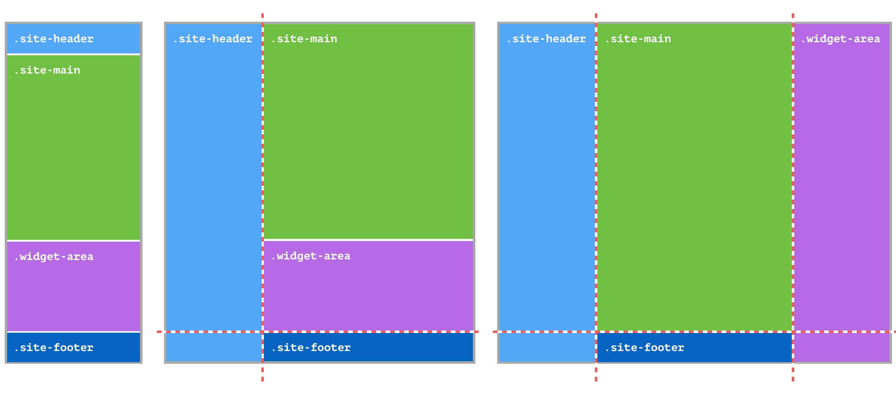
Playing around with the width of the viewport, you’ll find an ideal breakpoint for the medium-width grid. Inside this media query, declare the .site element as the grid container:
@supports (grid-area: auto) {
    @media screen and (min-width: 56.25em) {
        .site {
            display: grid;
            grid-template-columns: 15em 1fr;
            grid-template-rows: 1fr minmax(1em, auto);
        }
    }
}
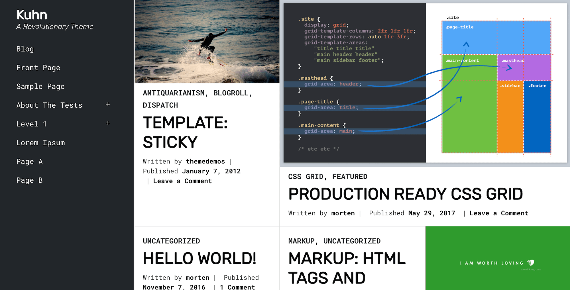
To make it easier to understand what is going on within the grid, we’ll use grid-template-areas to name different sections of the grid. The grid-template-area property allows us to draw a map of sorts of rectangular, named areas within the grid spanning one or more cells. Once a grid template area has been defined, a grid item can be assigned to that area using the grid-area property and the area name. In the example below, the grid-template-area property is used to “draw” a two-column layout by defining the entire first column as the header area and dividing the second column between main, sidebar and footer:
@supports (grid-area: auto) {
    @media screen and (min-width: $query__medium) {
        .site {
            display: grid;
            grid-template-columns: 15em 1fr;
            grid-template-rows: 1fr minmax(1em, auto);
            grid-template-areas: "header main"
                           "header sidebar"
                           "header footer";
        }
    }
}
Now, we can position the header, main content, sidebar and footer in the named template areas. This makes it easy for anyone reading the CSS to understand what is happening:
@supports (grid-area: auto) {
    @media screen and (min-width: $query__medium) {
        .site {
            display: grid;
            grid-template-columns: 15em 1fr;
            grid-template-rows: 1fr minmax(1em, auto);
            grid-template-areas: "header main"
                           "header sidebar"
                           "header footer";
        }
        .site-header {
            grid-area: header;
        }
        .site-main {
            grid-area: main;
        }
        .widget-area {
            grid-area: sidebar;
        }
        .site-footer {
            grid-area: footer;
        }
    }
}
Extra-wide viewports get their own media query. Here, the sidebar takes up a new column on the right side of the grid. This is accomplished by changing the grid template to place the sidebar area in a new column. Because the sidebar is already positioned in the sidebar template area, we only need to change the .site rule:
@supports (grid-area: auto) {
    @media screen and (min-width: 56em) {
        .site {
            display: grid;
            grid-template-columns: 15em 1fr;
            grid-template-rows: 1fr minmax(1em, auto);
            grid-template-areas:
                "header main"
                "header sidebar"
                "header footer";

            @media screen and (min-width: 70em) {
                grid-template-columns: 15em 1fr 15em;
                grid-template-rows: 1fr minmax(1em, auto);
                grid-template-areas:
                    "header main sidebar"
                    "header footer footer";
            }
        }
        .site-header {
            grid-area: header;
        }
        .site-main {
            grid-area: main;
        }
        .widget-area {
            grid-area: sidebar;
        }
        .site-footer {
            grid-area: footer;
        }
    }
}
Using @supports (grid-area: auto) { }, you can create additional CSS rules elsewhere in your style sheet that kick in only when grid layouts are supported by the browser.
Archive Layout
In WordPress, archive pages include the blog index; the category, tag, author and date archives; and the search results view. In _s, they are displayed using the index.php (main blog index), archive.php (category, tag, author, date and other archives) and search.php (search results) template files. Other archive templates can be added using the template hierarchy.
To minimize the need for dedicated CSS rules for each possible individual archive, we can use a filter in the theme to apply a custom class to the body element of any archive view. The best place for this filter is inc/extras.php, alongside other similar filters. Rather than using conditional statements to target every possible archive type, we can use a bit of reverse psychology to say, “If the current view is not a singular element — so, not a single post or page — then apply the .archive-view class to the body element.” There is already a condition for this in _s, so all we’ll do is add the additional class to it:
function mytheme_body_classes( $classes ) {

    // Adds classes hfeed and archive-view to non-singular pages.
    if ( ! is_singular() ) {
        $classes[] = 'hfeed archive-view';
    }
    return $classes;
}
add_filter( 'body_class', 'mytheme_body_classes' );
Now, we can use the .archive-view class to restrict CSS rules to just archive views.
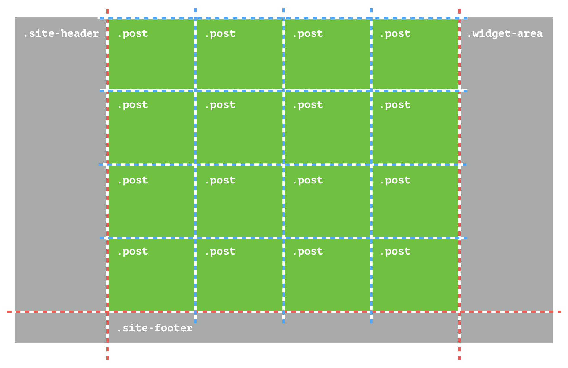
In archive views, the template should display each post (green) in a separate grid cell (blue grid). If we provide the browser with a uniform grid — with two, three, four or five columns, depending on the viewport’s width — and let it figure out how many rows are required, it will automatically place each post in a cell and generate the implicit row lines required. Because each column takes up an equal fraction, we can use the fr unit to define the columns’ width. Take note that the fr unit distributes the available space into fractions. It does not constrain the minimum width of the content. This means that if very long words or other wide content appear inside an element sized with the fr unit, then the element will retain the minimum size of the content even if that means it will be wider than the fraction specified. To avoid this, make sure words break or wrap and that content such as images do not have fixed minimum sizes.
The posts are individual article elements nested in a section with the class .site-main. That gives us the following SCSS:
@media screen and (min-width: $query__medium) {
    .archive-view {
        .site-main {
            display: grid;
            grid-template-columns: repeat(2, 1fr);

            @media screen and (min-width: $query__wide) {
                grid-template-columns: repeat(3, 1fr);
            }

            @media screen and (min-width: $query__x_wide) {
                grid-template-columns: repeat(4, 1fr);
            }

            @media screen and (min-width: $query__xx_wide) {
                grid-template-columns: repeat(5, 1fr);
            }
        }

        .entry-title {
            word-break: break-word;
        }
    }
}
Testing the layout in the browser, you’ll see that the grid is organized dynamically and grows and shrinks to accommodate the available grid items.
If you feel compelled to add a thin 1-pixel line between each of the grid cells, you’ll quickly discover you can’t use border or outline because the lines will overlap. To get around this problem, you can set the grid-gap property to 1px, adding a 1px gap between each cell horizontally and vertically, and then set the background-color of the grid container to the line’s color and the background-color of each cell to white:
@media screen and (min-width: $query__medium) {
    .archive-view {
        .site-main {
            display: grid;
            grid-template-columns: repeat(2, 1fr);
            grid-gap: 1px;
            background: grey;

            @media screen and (min-width: $query__wide) {
                grid-template-columns: repeat(3, 1fr);
            }

            @media screen and (min-width: $query__x_wide) {
                grid-template-columns: repeat(4, 1fr);
            }

            @media screen and (min-width: $query__xx_wide) {
                grid-template-columns: repeat(5, 1fr);
            }
        }

        .entry-title {
            word-break: break-word;
        }

        .post {
            background: white;
        }
    }
}
To make the grid a bit more dynamic, the layout calls for featured items to take up two columns. To make this happen, we’ll apply a category named “Featured” to each featured post. WordPress automatically applies category classes to each post’s article element using the formula category-[name], meaning we can target these posts using .archive-view .category-featured as our selector. We are not explicitly defining where on the grid any item will appear, so we’ll use the span keyword to specify how many rows or columns the item should span and let the browser figure out where that space is available. Because we are making the item take up two columns, we’ll do this only for layouts that have two or more columns:
@media screen and (min-width: $query__medium) {
    .archive-view {
        .site-main {
            display: grid;
            grid-template-columns: repeat(2, 1fr);
            grid-gap: 1px;
            background: grey;

            @media screen and (min-width: $query__wide) {
                grid-template-columns: repeat(3, 1fr);
            }

            @media screen and (min-width: $query__x_wide) {
                grid-template-columns: repeat(4, 1fr);
            }

            @media screen and (min-width: $query__xx_wide) {
                grid-template-columns: repeat(5, 1fr);
            }
        }

        .entry-title {
            word-break: break-word;
        }
        .post {
            background: white;
        }

        .category-featured {
            grid-column: span 2;
        }
    }
}
Single Post Or Page Layout
For single posts and pages, we’ll use two CSS grids: one for the overall layout structure of the post, and one to change the visual layout and order of blocks of content when appropriate.
First, we’ll define a grid for the .site-main container, which will hold the post’s article, the post’s navigation and the comments. This is primarily to allow grid to center-align the content within the container in wide viewports:
body:not(.archive-view) {
    @supports (grid-area: auto) {
        @media screen and (min-width: $query__medium) {
            .site-main {
                display: grid;
                grid-template-columns: 1fr minmax(auto, 46em) 1fr;
                align-content: start;
                grid-template-areas:
                    ". post ."
                    ". nav ."
                    ". comments .";
            }
            .post {
                grid-area: post;
            }
            .post-navigation {
                grid-area: nav;
            }
            .comments-area {
                grid-area: comments;
            }
        }
    }
}
Next, let’s look at the article itself. Here, we’ll define a four-column grid targeting the .post class:
.post {
    grid-area: post;
    display: grid;
    grid-template-columns: repeat(4, 1fr);
}
Now we can use CSS grid to create a dynamic layout that changes the visual order and presentation of the header and meta content depending on viewport’s width:
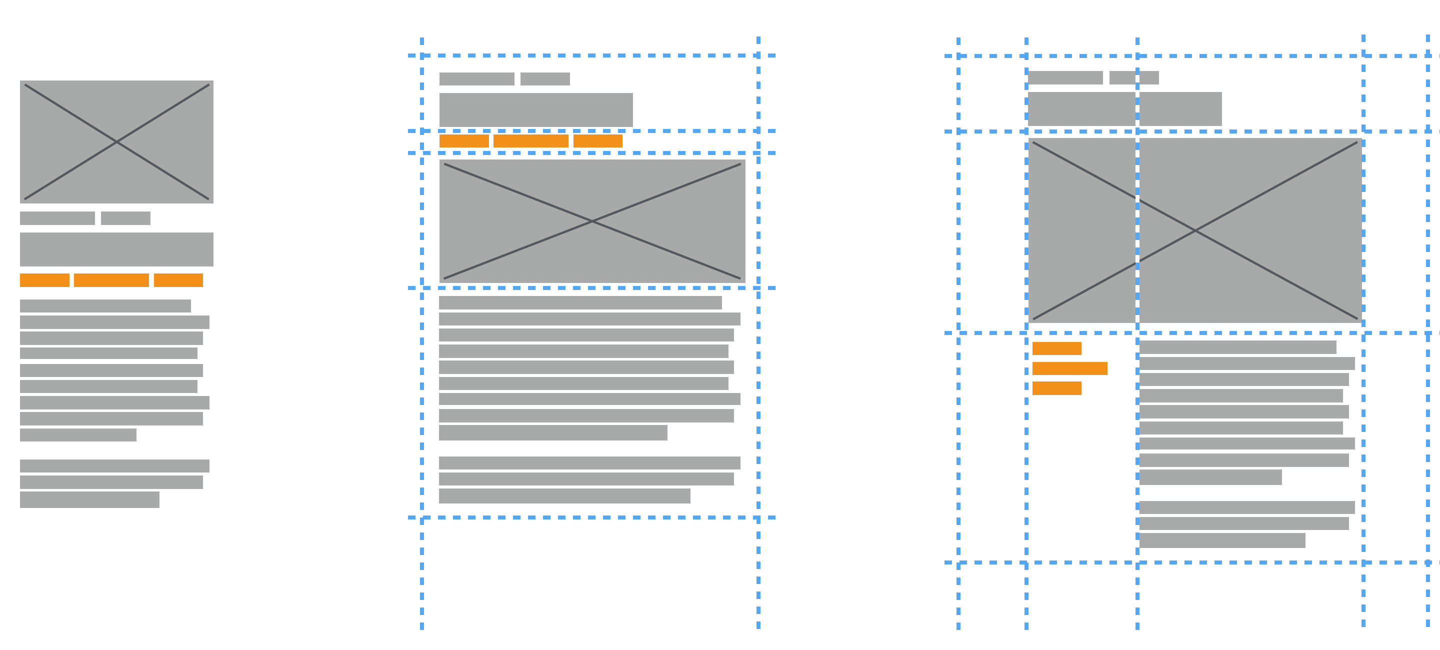
This is done by changing the visual order of elements without changing the HTML markup or interfering with the content’s hierarchy. Exercise caution because it can be tempting to disconnect the visual order from the document’s hierarchy and content order, causing unexpected behavior. For this reason, keep the content hierarchy intact both visually and structurally, and only use the repositioning abilities of CSS grid to change the layout as is done here.
Rule of thumb: Never change the meaning of content by repositioning it.
Out of the box, a post with a featured image has the following hierarchy:
- featured image
- post header: categories + title + meta data (i.e. author, date, number of comments)
- content
Based on the layout in the figure above, in wider viewports we want a visual structure that looks more like this:
- post header: categories + title
- featured image
- meta data (author, date, number of comments)
- content
To achieve this, we need to break apart some more of the nesting that comes with _s. Like before, we can get more control over elements by flattening the HTML’s structure. In this case, we just want to move the meta section out of the header to make it available as its own grid item. This is done in header.php:
<header class="entry-header">
    <?php
        if ( is_single() ) :
            the_title( '<h1 class="entry-title">', '</h1>' );
        else :
            the_title( '<h2 class="entry-title"><a href="' . esc_url( get_permalink() ) . '" rel="bookmark">', '</a></h2>' );
        endif;
    ?>
    </header><!-- .entry-header -->

    <?php
    if ( 'post' === get_post_type() ) : ?>
        <div class="entry-meta">
            <?php kuhn_posted_on(); ?>
        </div><!-- .entry-meta -->
    <?php endif; ?>
Just like before, we can now apply the layout changes using grid-template-areas:
.post {
    grid-area: post;
    display: grid;
    grid-template-columns: repeat(4, 1fr);
    grid-template-areas:
        "header header header header"
        "meta meta meta meta"
        "featimg featimg featimg featimg"
        "content content content content"
        "footer footer footer footer";
}

.entry-header {
    grid-area: header;
}

.entry-meta {
    grid-area: meta;
}

.featured-image {
    grid-area: featimg;
}

.entry-content {
    grid-area: content;
}

.entry-footer {
    grid-area: footer;
}
In our case, posts with no featured image don’t need separate rules: the featimg template area will simply collapse because it is empty. However, if grid-gap is applied to rows, we’ll need to create a separate .post rule with grid-template-areas that do not include featimg.
On wider screens, the post’s meta area should shift down, below the featured image, to appear to the left of the main content. With our flattened markup and the grid in place, this is solved by making a small change to the grid-template-areas property in a separate media query:
post {
    grid-area: post;
    display: grid;
    grid-template-columns: repeat(4, 1fr);
    grid-template-areas:
        "header header header header"
        "meta meta meta meta"
        "featimg featimg featimg featimg"
        "content content content content"
        "footer footer footer footer";

    @media screen and (min-width: $query__wide) {
        grid-template-areas:
            "header header header header"
            "featimg featimg featimg featimg"
            "meta content content content"
            "footer footer footer footer";
    }
}

.entry-header {
    grid-area: header;
}

.entry-meta {
    grid-area: meta;
}

.featured-image {
    grid-area: featimg;
}

.entry-content {
    grid-area: content;
}

.entry-footer {
    grid-area: footer;
}
Real-Life Example
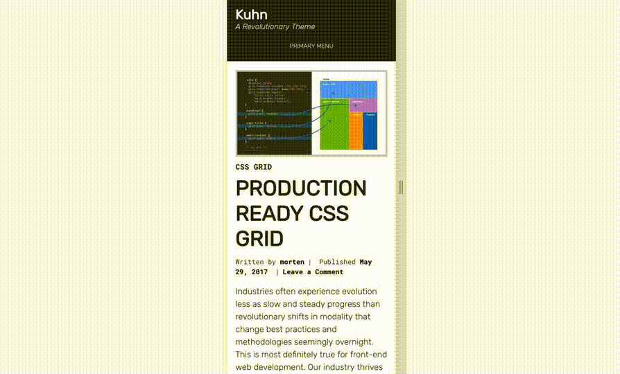
By now, you’re probably wondering what this would look like if it were implemented on a real website. Wonder no more. As part of writing this article, I have built a free WordPress theme named Kuhn, incorporating the layouts explained here and more. It is live on my own website, and you can explore the code, use the theme on your own WordPress website and contribute to make it better on GitHub.
Watch My Talk
Conclusion
With this article, I set out to demonstrate both how CSS grid allows you to create dynamic, responsive, modern layouts using pure CSS and how clean and easily managed this code is compared to traditional layout methods. On a more zoomed-out level, I also wanted to give you a new framework for thinking about web layouts. Using CSS grid, much of what we know about placing content within the viewport has changed, and even for simple layouts like what I’ve demonstrated here, the approach is both fundamentally different and much more intuitive. Gone are all of the CSS alchemy and counter-intuitive tricks and hacks, replaced by structured grids and declarative statements.
Now it’s time for you to take CSS grid for a spin in your own projects. You can take my hardline approach and pave the cowpaths with this new module, or you can combine it with backwards-compatible code to serve up the same or similar experiences to all visitors. It’s entirely up to you and your development philosophy.
Even if you are working on projects that require backwards compatibility and think CSS grid is too bleeding-edge, start incorporating it in your projects anyway. Using @supports and the approach I’ve outlined in this article enables you to progressively enhance existing websites without causing problems in legacy browsers. CSS grid requires a new mindset, and we all need to start that transition today. So, go forth and gridify the web!
Further Reading
- How Marketing Changed OOP In JavaScript
- Solving Media Object Float Issues With CSS Block Formatting Contexts
- CSS Scroll Snapping Aligned With Global Page Layout: A Full-Width Slider Case Study
- A Primer On CSS Container Queries
 (md, vf, yk, al, il, mrn)

