Designing Efficient Web Forms: On Structure, Inputs, Labels And Actions

Email Newsletter
Weekly tips on front-end & UX.
Trusted by 182,000+ folks.
 Register for Free


 Celebrating 10 million developers
 Custom Web Forms for Angular, React, & Vue. Your backend.
In this article, you’ll see practical techniques that have been gleaned from usability testing, field testing, eye-tracking studies and actual complaints from disgruntled users. These techniques — when used correctly — enable designers to produce faster, easier and more productive form experiences. There’s a way you can create and design your own prototypes: All you need to do is to download Adobe XD (for free) and get started right away. At the end of the article, you’ll also find new ways to design forms.
The Components Of Forms
The typical form has the following five components:
- Structure
This includes the order of fields, the form’s appearance on the page and the logical connections between multiple fields. - Input fields
These include text fields, password fields, checkboxes, radio buttons, sliders and any other fields designed for user input. - Field labels
These tell users what the corresponding input fields mean. - Action button
When the user presses this button, an action is performed (such as submission of the data). - Feedback
The user is made to understand the result of their input through feedback. Most apps and websites use plain text as a form of feedback. A message will notify the user about the result and can be positive (indicating that the form was submitted successfully) or negative (“The number you’ve provided is incorrect”).
Forms may also have the following components:
- Assistance
This is any explanation of how to fill out the form. - Validation
This automatic check ensures that the user’s data is valid.
This article covers many aspects related to structure, input fields, labels, action buttons and validation.
Form Structure
A form is a type of conversation. And like any conversation, it should consist of logical communication between two parties: the user and the app.
Ask Only What’s Required
Make sure to ask only what you really need. Every extra field you add to a form will affect its conversion rate. Always consider why you are requesting certain information from the user and how you will use it.
Order The Form Logically
Ask details logically from the user’s perspective, not from the application or database’s perspective. Typically, asking for someone’s address before their name would be unusual.
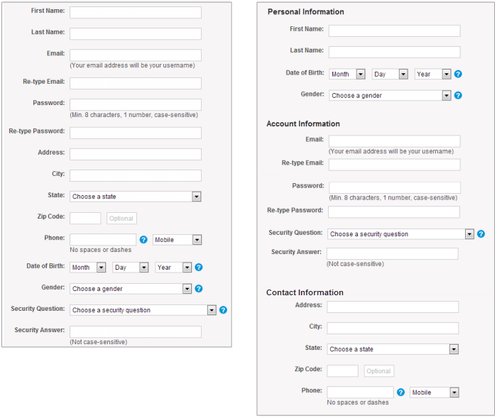
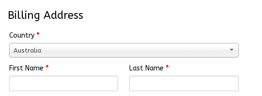
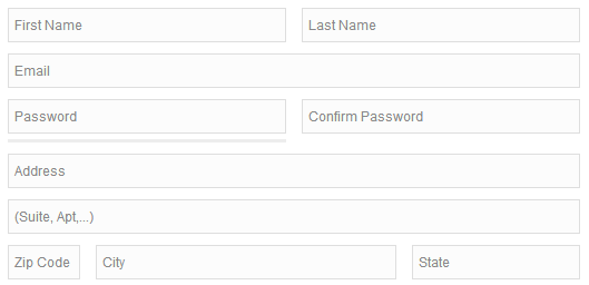
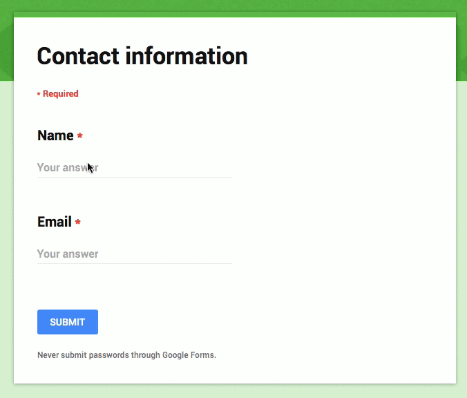
Group Related Information
Group related information into logical blocks or sets. The flow from one set of questions to the next will better resemble a conversation. Grouping together related fields will also help users make sense of the information they must fill in. Compare how it works in the contact information form below.
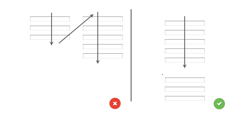
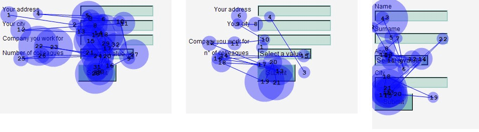
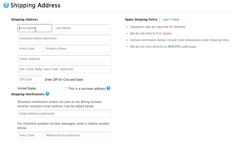
One Column Vs. Multiple Columns
One of the problems with arranging form fields into multiple columns is that users will likely interpret the fields inconsistently. If a form has horizontally adjacent fields, then the user must scan in a Z pattern, slowing the speed of comprehension and muddying the path to completion. But if a form is in a single column, the path to completion is a straight line down the page.
Input Fields
Input fields are what enable users to fill in a form. Various types of fields exist for the information you need: text fields, password fields, dropdowns, checkboxes, radio buttons, date-pickers and more.
Number Of Fields
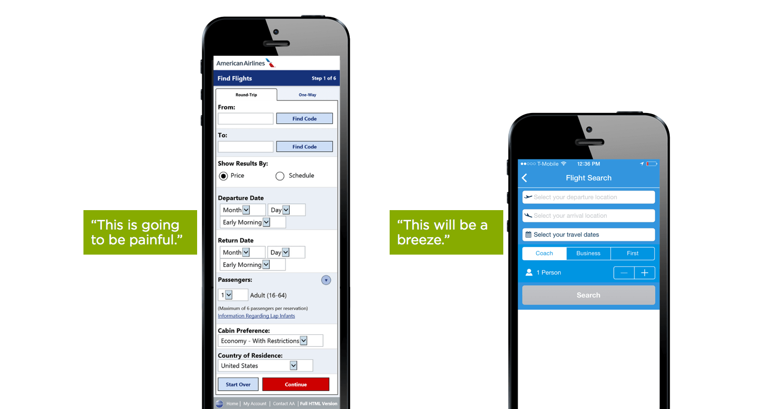
A rule of thumb in form design is that shorter is better. And this certainly seems intuitive: Less effort on the part of the user will lead to higher conversion. Thus, minimize the number of fields as much as possible. This will make your form feel less loaded, especially when you’re requesting a lot of information. However, don’t overdo it; no one likes a three-field form that turns into a 30-field interrogation. Displaying only five to seven input fields at a given time is a common practice.
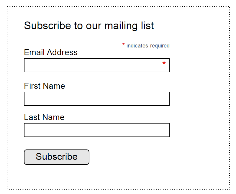
Mandatory Vs. Optional
Try to avoid optional fields in forms. But if you use them, at least clearly distinguish which input fields may not be left blank. The convention is to use an asterisk (*) for required fields or the word “optional” for non-required fields (which is preferable in long forms with multiple required fields). If you decide to use an asterisk for mandatory fields, show a hint at the bottom of the form explaining what the asterisk is for, because not everyone understands what it means.
Setting Default Values
Avoid setting defaults unless you believe a large portion of your users (for example, 90% of them) will select that value. Particularly avoid it for required fields. Why? Because you’re likely to introduce errors. People scan online forms quickly, so don’t assume they will take the time to parse through all of the choices. They might skip something that already has a value.
But this rule doesn’t apply to smart defaults — that is, values set based on information available about the user. Smart defaults can make form completion faster and more accurate. For example, preselect the user’s country based on geo-location data. Still, use these with caution, because users tend to leave preselected fields as they are.
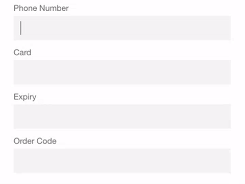
Input Masks
Field masking is a technique that helps users format inputted text. A mask appears once a user focuses on a field, and it formats the text automatically as the field is being filled out, helping users to focus on the required data and to more easily notice errors. In the example below, the parentheses, spaces and dashes are applied automatically as the phone and credit-card numbers are entered. This simple technique saves time and effort with phone numbers, credit cards, currencies and more.
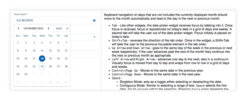
Desktop-Only: Make Form Keyboard-Friendly
Users should be able to focus on and edit every field using only the keyboard. Power users, who tend to use the keyboard heavily, should be able to easily tab through and edit fields, all without lifting their fingers off the keyboard. You can find detailed requirements for keyboard interaction in the W3C’s guidelines on design patterns.
Desktop-Only: Autofocus For Input Field
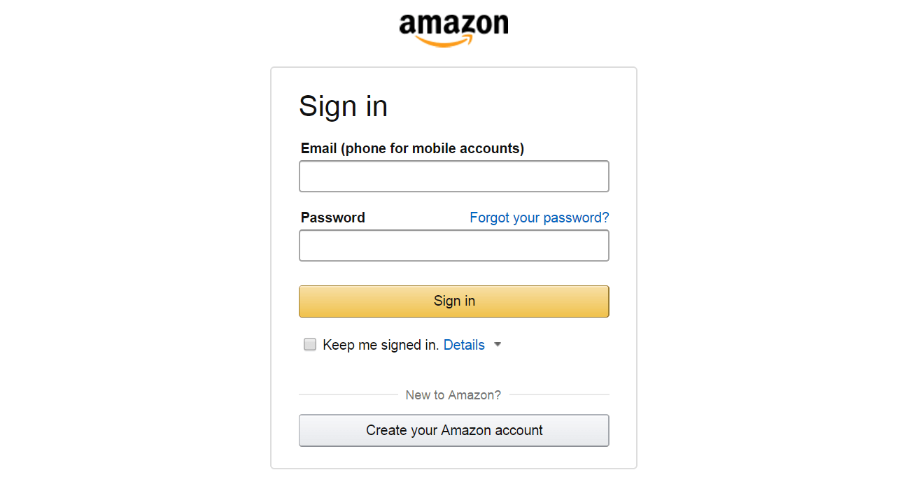
Autofocusing a field gives the user an indication and a starting point to quickly begin filling out a form. Provide a clear visual signal that focus has moved there, whether by changing a color, fading in a box, flashing an arrow, whatever. Amazon’s registration form has both autofocus and visual indicators.
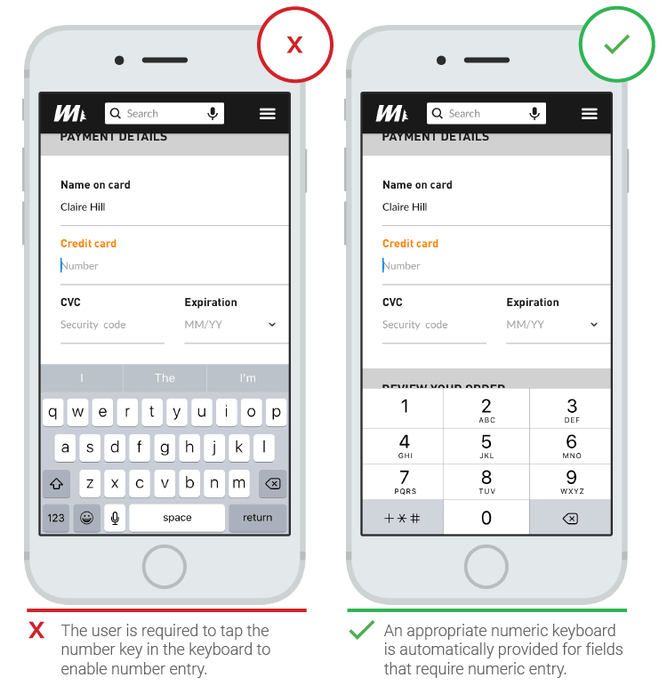
Mobile-Only: Match Keyboard To Input
Phone users appreciate apps that provide the appropriate keyboard for text being requested. Implement this consistently throughout the app, rather than merely for certain tasks but not others.
Limit Typing (Autocompletion)
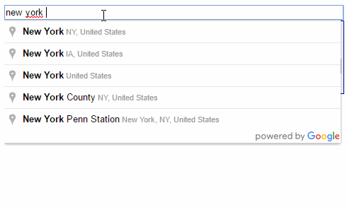
With more and more people using mobile screens, anything that can be done to prevent unnecessary typing will improve the user experience and decrease errors. Autocompletion makes it possible to eliminate a huge amount of typing. For example, filling out an address field is often the most problematic part of any registration form. A tool such as Place Autocomplete Address Form (which uses both geo-location and address prefilling to provide accurate suggestions based on the user’s exact location) enables users to enter their address with fewer keystrokes than regular input fields.
Labels
Clearly written labels are one of the primary ways to make a UI more accessible. A good label tells the user the purpose of the field, maintains its usefulness when focus is on the field itself, and remains visible even after the field has been filled in.
Number Of Words
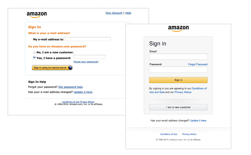
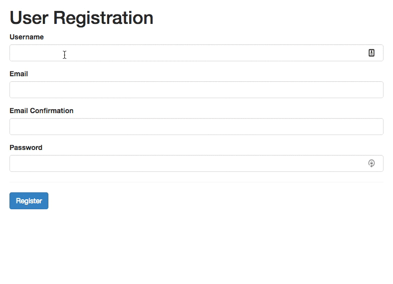
Labels are not help text. Use succinct, short, descriptive labels (a word or two) so that users can quickly scan your form. Previous versions of Amazon’s registration form contained a lot of words, which resulted in slow completion rates. The current version is much better and has short labels.
Sentence Case Vs. Title Case
In most digital products today, there are two ways to capitalize words:
- title case: capitalize every word. “This Is Title Case.”
- sentence case: capitalize the first word. “This is sentence case.”
Sentence case used for labels has one advantage over title case: It is slightly easier (and, thus, faster) to read. While the difference for short labels is negligible (“Full Name” and “Full name”), for longer labels, sentence case is better. Now You Know How Difficult It Is to Read Long Text in Title Case.
Avoid All Caps
Never use all caps, or else the form will be difficult to read and much harder to scan quickly, because there will be no variation in character height.
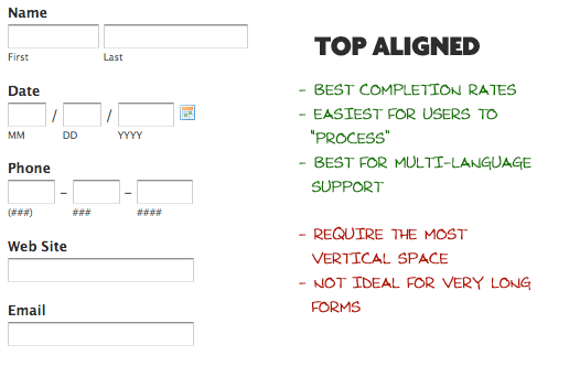
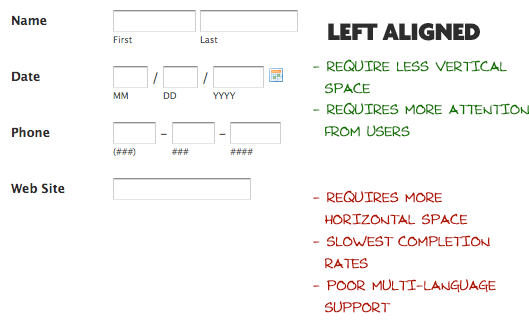
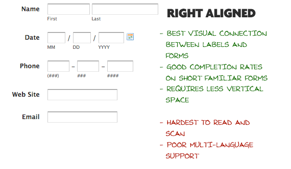
Alignment Of Labels: Left Vs. Right Vs. Top
Matteo Penzo’s 2006 article on label placement suggests that forms are completed faster if labels are on top of the fields. Top-aligned labels are good if you want users to scan the form as quickly as possible.
The biggest advantage of top-aligned labels is that different-sized labels and localized versions can more easily fit the UI. (This is especially good for screens with limited space.)
The biggest disadvantage to left-aligned labels is that it has the slowest completion times. This is likely because of the visual distance between the label and input field. The shorter the label, the further away it will be from the input. However, a slow completion rate isn’t always a bad thing, especially if the form asks for sensitive data. If you are asking for something like a driver’s license number or a social security number, you might deliberately want to slow down users a bit to make sure they enter it correctly. Thus, the time spent reading labels for sensitive data is insignificant. Left-aligned labels have another disadvantage: They require more horizontal space, which might be a problem for mobile users.
The big advantage of right-aligned labels is the strong visual connection between the label and input. Items near each other appear to be related. This principle isn’t new; it derives from the law of proximity, from Gestalt psychology. For short forms, right-aligned labels can have great completion times. The disadvantage is discomfort; such forms lack that hard left edge, which makes it less comfortable to look at and harder to read.
Takeaway: If you want users to scan a form quickly, put labels above the fields. The layout will be easier to scan because the eye will move straight down the page. However, if you want users to read carefully, put labels to the left of the fields. This layout will slow down the reader and make them scan in a Z-shaped motion.
Inline Labels (Placeholder Text)
A label set as a placeholder in an input field will disappear once the field gains focus; the user will no longer be able to view it. While placeholder text might work for two-field forms (a simple log-in form with username and password fields), it’s a poor substitute for visual labels when more information is required from the user.

Once the user clicks on the input field, the label will disappear, and so the user cannot double-check that they wrote what was being asked of them. This increases the chance of error. Another problem is that users could mistake placeholder text for prefilled data and, hence, ignore it (as Nielsen Norman Group’s eye-tracking study confirms).
A good solution for placeholder text is a floating label. The placeholder text would be shown by default, but once an input field is tapped and text is entered, the placeholder text fades out and a top-aligned label animates in.
Takeaway: Don’t just rely on placeholders; include a label as well, because once a field has been filled out, the placeholder will no longer be visible. Use a floating label so that users are sure they’ve filled out the correct field.
Action Buttons
When clicked, an action button triggers some activity, such as submission of the form.
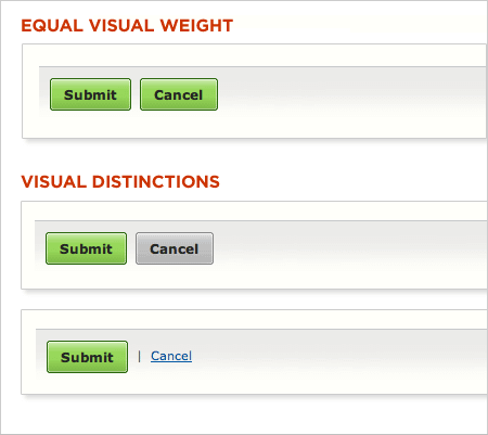
Primary Vs. Secondary Actions
A lack of visual distinction between primary and secondary actions can easily lead to failure. Reducing the visual prominence of secondary actions minimizes the risk of error and reinforces people’s path to a successful outcome.
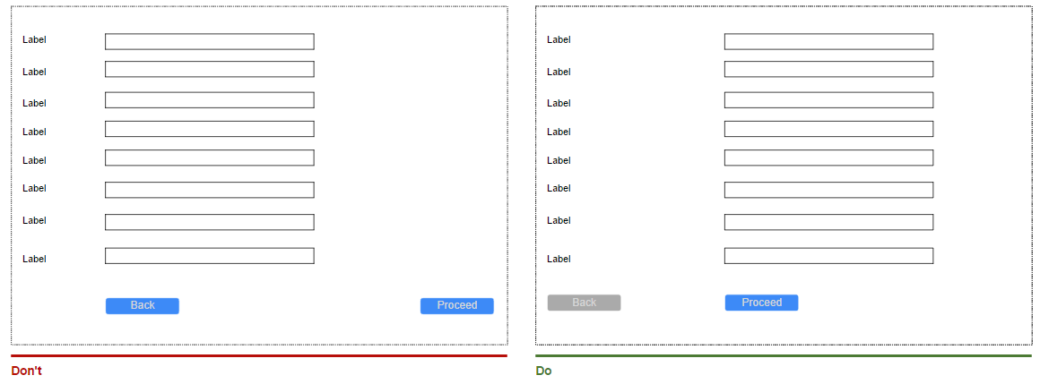
Button Location
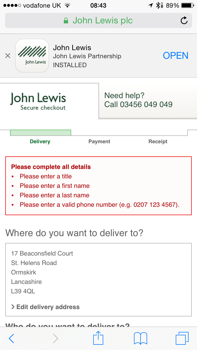
Complex forms usually need a back button. If such a button is located right below an input field (like in the first screenshot below), a user could accidentally click it. Because a back button is a secondary action, make it less accessible (the second form below has the right location for buttons).
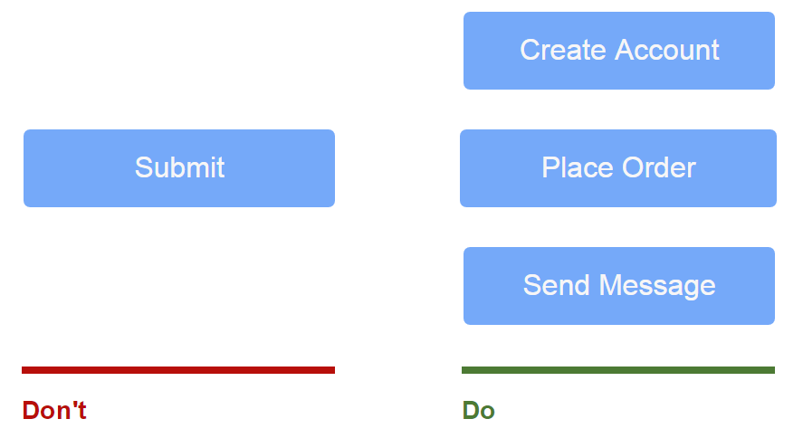
Naming Conventions
Avoid generic words such as “Submit” for actions, because they give the impression that the form itself is generic. Instead, state what action the button will perform when clicked, such as “Create my account” or “Subscribe to weekly offers.”
Multiple Action Buttons
Avoid multiple action buttons because they might distract users from their goal of submitting the form.
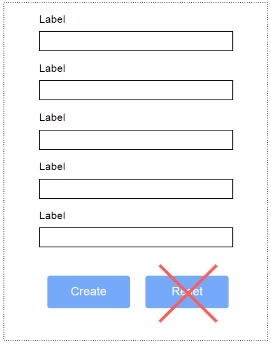
The Reset Button Is Pure Evil
Don’t use a reset button. This button almost never helps users and often hurts them. The web would be a happier place if almost all reset buttons were removed.
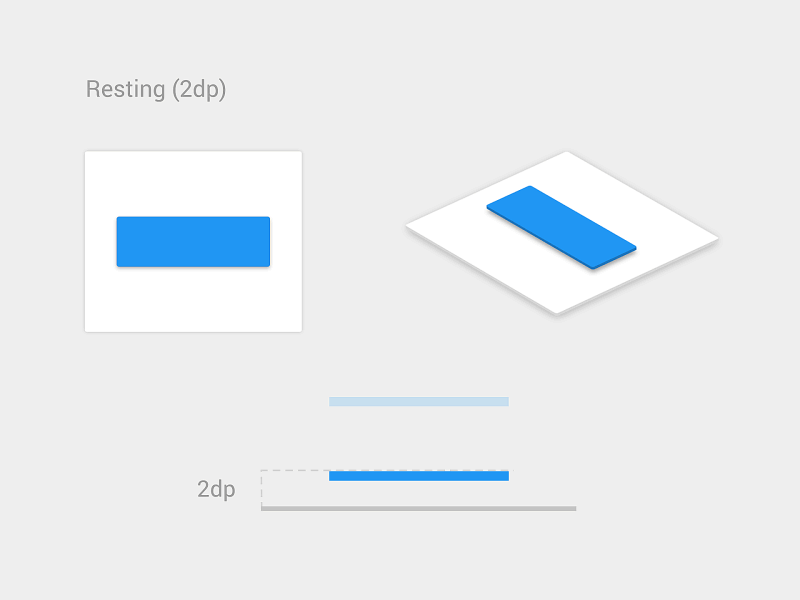
Visual Appearance
Make sure action buttons look like buttons: Indicate that it is possible to click or tap them.
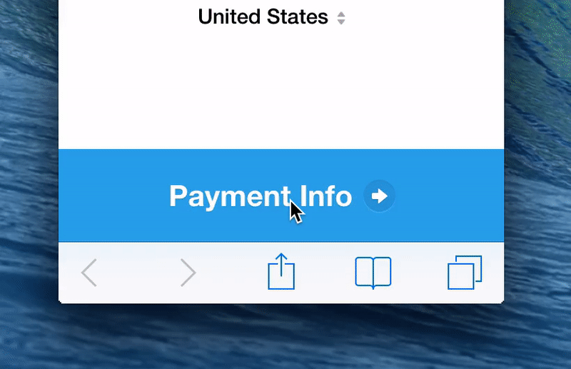
Visual Feedback
Design the “Submit” button in a way that clearly indicates the form is being processed after the user’s action. This provides feedback to the user while preventing double submission.
Validation
Form validation errors are inevitable and are a natural part of data entry (because users are prone to making errors). Yes, error-prone conditions should be minimized, but validation errors will never be eliminated. So, the most important question is, How do you make it easy for the user to recover from errors?
Inline Validation
Users dislike having to go through the process of filling out a form, only to find out upon submission that they’ve made an error. Especially frustrating is completing a long form and upon pressing “Submit,” you are rewarded with multiple error messages. It’s even more annoying when it isn’t clear what errors you’ve committed and where.
Validation should inform users about the correctness of text as soon as the user has inputted the data. The primary principle of good form validation is this: Talk to the user! Tell them what is wrong! Real-time inline validation immediately informs the user about the correctness of their data. This approach allows them to correct any errors faster, without having to wait until they press the “Submit” button to see the errors.
However, avoid validating on each keystroke because, in most cases, you simply cannot verify until someone has finished typing an answer. Forms that validate during data entry punish the user as soon as they start entering data.
On the other hand, forms that validate after data entry do not inform the user soon enough that they’ve fixed an error.
Mihael Konjević, in his article “Inline Validation in Forms: Designing the Experience,” examines different validation strategies and proposes a hybrid strategy to satisfy both sides: Reward early, punish late.
- If the user enters data in a field that was in a valid state (i.e. previously inputted data was valid), then validate after data entry.
- If the user enters data in a field that was in an invalid state (i.e. previously entered data was invalid), then validate during data entry.
Protecting Data
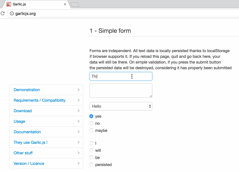
Jef Raskin once said, “The system should treat all user input as sacred.” This is absolutely true for forms. It’s great when you start filling in a form and then accidentally refresh the page but the data remains in the fields. Tools like Garlic.js help you to persist a form’s values locally until the form is submitted. This way, users won’t lose any precious data if they accidentally close the tab or browser.
Conversational Interfaces: New Ways Of Designing Forms
Recently, we’ve seen a lot of excitement around conversational interfaces and chatbots. Several trends are contributing to this phenomenon, but one in particular is that people are spending more time in messaging apps than on social networks. This has led to a lot of experimentation with supporting a range of interactions, such as shopping, in threaded conversations, often in a way that mimics messaging. Even as established an element as a web form has undergone a change under this trend. Designers are looking to transform traditional web forms into interactive conversational interfaces.
Natural Language Interface
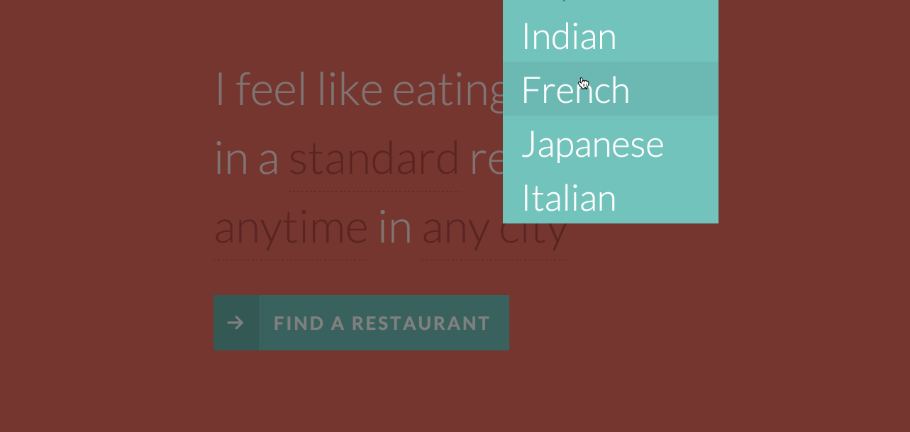
Every interface is a conversation. Traditional forms (the ones we design every day) are quite similar to a conversation. The only difference is the way we ask the questions. But what if we designed our forms to ask questions in a format that more closely reflects real human (not machine) conversation? So, instead of communicating with a machine on its own inhuman terms, you would interact with it on yours. The form shown below creates a conversational context, facilitating understanding without relying on the traditional elements of web forms (such as labels and input fields).
Conversational Form
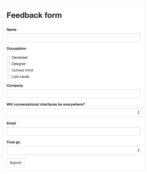
Conversational Form is an open-source concept that easily turns any form on a web page into a conversational interface. It features conversational replacement of all input elements, reusable variables from previous questions, and complete customization and control over the styling. This project represents an interesting shift in how we think about user experiences and interactions, leaning more towards text-based conversation to help users achieve their goals.
Conclusion
Users can be reluctant to fill out forms, so make the process as easy as possible. Minor changes — such as grouping related fields and indicating what information goes in each field — can significantly increase usability. Usability testing is simply indispensable in form design. Very often, testing with just a few people or simply asking a colleague to go through a prototype can give you good insight into how usable a form is.
"This article is part of the UX design series sponsored by Adobe. The newly introduced Adobe Experience Design CC (Beta) tool is made for a fast and fluid UX design process, as it lets you go from idea to prototype faster. Design, prototype and share — all in one app. You can check out more inspiring projects created with Adobe XD on Behance, and also visit the Adobe XD blog to stay updated and informed. Adobe XD is being updated with new features frequently, and since it’s in public Beta, you can download and test it for free."
Further Reading
- Icons As Part Of A Great User Experience
- How To Design Error States For Mobile Apps
- An Extensive Guide To Web Form Usability
- Web Form Design: Showcases And Solutions
 (ms, vf, al, yk, il, mrn)

