Designing The Perfect Accordion

Email Newsletter
Weekly tips on front-end & UX.
Trusted by 182,000+ folks.

 Celebrating 10 million developers


 Custom Web Forms for Angular, React, & Vue. Your backend.
Design patterns. An almost mythical phrase that often inspires either awe or resentment. As designers, we tend to think of design patterns as generic off-the-shelf solutions that can be applied to various contexts almost mechanically, often without proper consideration. Navigation? Off-canvas! Deals of the day? Carousel! You get the idea.
Sometimes we use these patterns without even thinking about them, and there is a good reason for it: Coming up with a brand new solution every time we encounter an interface problem is time-consuming and risky, because we just don’t know how much time will be needed to implement a new solution and whether it will gracefully succeed or miserably fail in usability tests.
Design patterns can be extremely helpful, mostly because they save time and get us better results, faster. We don’t need to apply them exactly as they are to every problem we encounter, but we can build on top of them, using our experience to inform our decisions because we know they’ve worked in other projects fairly well.
Over the last few years, I spent a lot of time working with various companies trying out various approaches and studying them in usability tests. This series of articles is a summary of observations and experiments made throughout the time. Tighten up your seat belts: in this new series of articles on SmashingMag, we’ll look into examples of everything from carousels to filters, calculators, charts, timelines, maps, multi-column tables, almighty pricing plans all the way to seating selection in airline and cinema websites. But before we head off to complex interface problems, let’s start with something seemingly simple and obvious: an accordion.
Part Of: Design Patterns
- Part 1: Perfect Accordion
- Part 2: Perfect Responsive Configurator
- Part 3: Perfect Date and Time Picker
- Part 4: Perfect Feature Comparison
- Part 5: Perfect Slider
- Part 6: Perfect Birthday Picker
- Part 7: Perfect Mega-Dropdown Menus
- Part 8: Perfect Filters
- Part 9: Disabled Buttons
- Subscribe to our email newsletter to not miss the next ones.
The Barebones Of An Accordion
There is a good reason why the accordion is probably the most established workhorse in responsive design. It’s an immensely useful pattern for progressive disclosure — highlighting important details of a section and revealing more details upon a tap or click, if necessary. As a result, the design stays focused and displays critical information first, while everything else is easily accessible. In fact, if you encounter a problem of any kind — too many navigation options, too much content, too detailed a view — a good starting point would be to explore how you could utilize the good ol’ accordion to solve that problem. More often than not, it works surprisingly well.
However, even a component as predictable and frequently used as an accordion has a lot of room for interpretation and ambiguity. Now, don’t get me wrong: context matters. An accordion for a navigation will require a different approach than a Q&A section. But in all the different contexts we have to thoroughly consider two things: the visual design and the interaction design of an accordion to eliminate all points of confusion and misinterpretation.
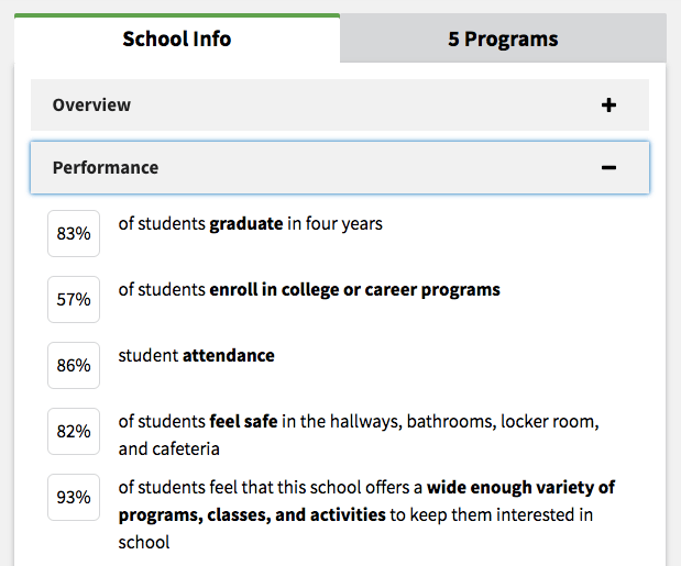
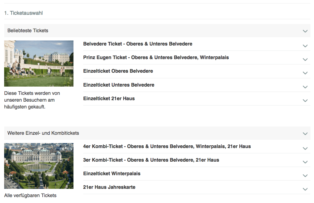
Now, if we look a bit more closely into the accordion’s barebones, it won’t be difficult to see all of its atomic elements. An accordion always contains the category title, an expanded and a collapsed state, an icon indicating expansion, and the spacing between them. Once the category is expanded, the icon should change to indicate collapsing. However, what if the user clicks on a collapsed card while another card is open? Should the expanded card close automatically, or not? What if not all items can be displayed — should the user be automatically scrolled up? Let’s take a closer look at these, and related issues, one by one.
Choosing An Icon To Indicate Expansion
Now, let’s get started. What do we know? Well, obviously, in most left-to-right interfaces, the category name will be left-aligned, too. Assuming that, like in many accordions, the sub-items will slide in between two sections, what icon would you choose to communicate this behavior? An arrow pointing down, an arrow pointing to the right, a chevron pointing down, a plus, a circled plus — maybe something entirely different?
In my experience, it appears that the choice of icon doesn’t really matter as long as it isn’t overloaded with various meanings in the same UI. E.g. you could potentially use circled plus to indicate expansion, zooming and a bundle of two items in a pricing plans — and that might introduce confusion. However, in context of the accordion, users seem to understand that if some of the navigation items have an icon, while other sections do not, it’s some kind of sign that more content is available upon click or tap. We couldn’t spot any indication of one icon being more or less recognizable than others. However, it doesn’t mean that some options might not cause more confusion than others.
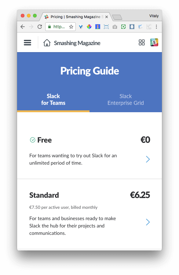
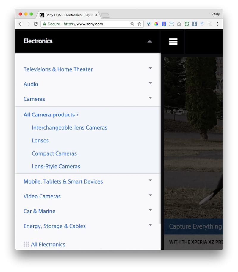
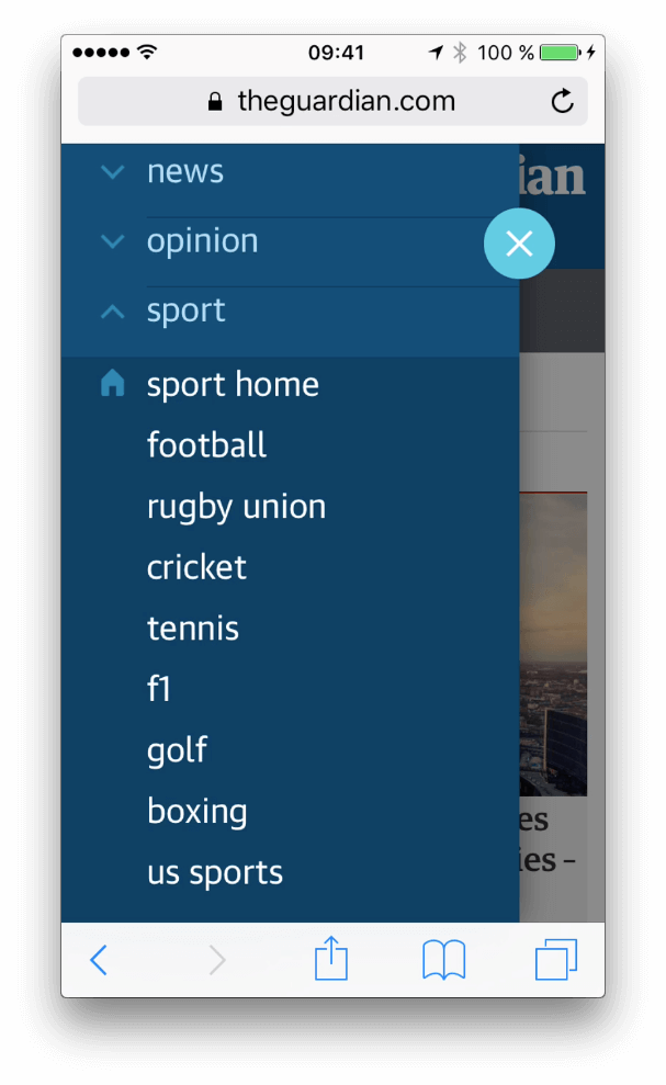
For example, Slack uses an arrow pointing to the right, although accordion items slide in vertically between category titles, rather than from to the right of it. Now, at this point it’s worth asking what purpose the direction of the icon should have? It should probably serve as an indicator of the direction of movement, or more specifically, where the user’s view will be moved to once the icon has been tapped or clicked. In Apple Mail on iOS, for example, the chevron pointing to the right maps to the movement of the user’s view from left to right.

Having a mapping between the direction of the icon and the movement of the user’s view seems reasonable, but since different interfaces behave differently (with mysterious icons often playing mind games with users) not everybody will be expecting this behavior. So in the end, it doesn’t really matter what you do as a designer: one way or another, you won’t be able to match the expectations of some of your users. When designing, we tend to focus on what we are designing, but even if we are extremely consistent in our UIs, our users will come with expectations influenced by their experiences on websites we’ve never even seen. The key, then, is to be as resilient as possible and provide an easy, straightforward recovery in case the expectations aren’t met.
So looking back at the choice of the icon then, if the accordion items slide in vertically, intuitively it seems safe to use any of the icons listed above except the icon pointing to the right. The only issue to consider here would be if the icon you choose is already overloaded with another meaning in a different context — for example, if you’re using a plus icon to highlight the parts of a bundle deal in a pricing plan (where the plus is not clickable), and then use exactly the same plus icon for the accordion. In such a case, it’s better to avoid using exactly the same icon for different purposes as it might cause confusion.
Is it all cleared up then? Well, not really.
Let’s think about the expected interaction for a second. While the arrow and chevron usually serve as cues for change in the indicated direction, the plus indicates addition and expansion. In both cases, the change can happen in various ways: a tap on the icon causes either an overlay with navigation items appearing above the content, or the items to slide in vertically (not horizontally). So far so good.
However, when a user lands on a page, initially they don’t know if they’ve landed on a long-scrolling page with links jumping to some parts of the page or just a “regular” website with sections existing on their own separate pages. Quite often, an arrow pointing down triggers jumps to sections within the page, rather than expanding navigation options. It’s likely that the user might have been disoriented in the past, being brought to a section of a long page and then returning back to the top of the page, and continuing from there.
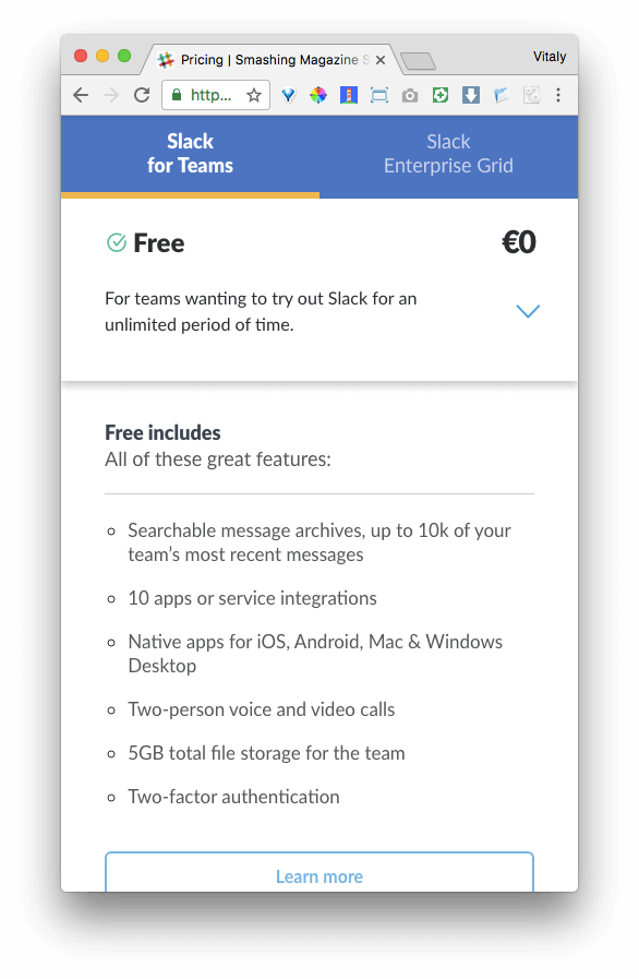
As a result, if you choose to use an arrow, you might end up with some users expecting to be scrolled down to that section of the page, rather than see subitems sliding in between categories. Thus, the chevron seems to be a safer and more predictable option; if you choose to use it, then point it down in a collapsed state and point it up when expanded. For the plus icon, you could choose between the minus icon or a close icon instead.
So, what does all of this mean for us, as designers? First, if accordion items are supposed to slide in horizontally from left to right, it’s safe to use an arrow pointing to the right. Secondly, if accordion items are supposed to slide in vertically from top to bottom, either a chevron pointing down (not arrow!) or a plus icon might work well.
With this in mind, a choice of the icon should be a quite straightforward decision. But depending on how close that icon is to the category title, it might cause confusion, too. Now, what options do we need to consider when choosing the position of that icon?
Choosing The Position Of The Icon
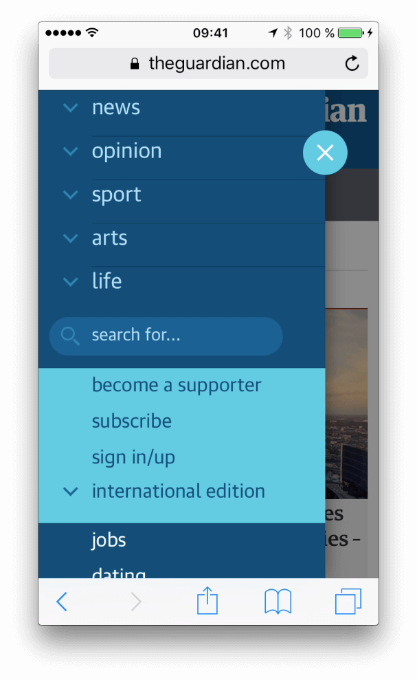
Options! Nevermind which icon you’ve chosen, you could choose to place it a) to the left of the category name or b) to the right of it, or c) align the icon along the right edge of the entire navigation item bar, spacing out the icon and the category name.
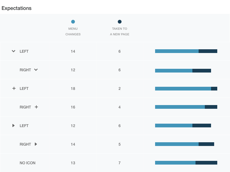
Does the position matter? Actually it does. According to Viget’s “Testing Accordion Menu Designs and Iconography,” some users tend to focus on hitting specifically the icon, rather than the entire navigation bar. There is a simple reason why it happens: in the past, some users might have been “burned” with alternative implementations of the accordion. On some websites, the category title doesn’t trigger expansion and instead goes straight to the category. In other implementations, a tap on the navigation bar doesn’t cause expansion nor jump into the category — it does absolutely nothing.
Although we’ll of course design the entire area to be a hit target, as not every navigation has this behavior, some users won’t know if your navigation is one of the “bad ones” or “good ones” until they actually click on it (or hover over it). As hover isn’t always available, hitting the icon just seems to be a safer bet — a click on the icon will almost always trigger the expected behavior. That’s an important detail to know when designing an accordion.
Across various interfaces and implementations, it seemed that with the icon placed to the right of the category title, users choose to focus on the icon more often than if the icon is placed on the left (where users click on the category’s title or the empty bar). However, some users still tend to choose the icon. Consequently, it’s a good decision to make the icon large enough for comfortable tapping, just in case — at least 44×44 pixels in size.
Left-aligned, right-inlined or right-aligned? It doesn’t seem to matter that much. But if you have a group of accordions (maybe living in a navigation menu), with the length of category titles varying a lot, toggling the accordion states across many sections will require slightly more focus than just running down the navigation bar from top to bottom. It’s just that the mouse pointer or finger has to be repositioned all the time to hit that fancy icon! Also, if the icon is right-inlined, on a narrow screen the finger would need to travel across the navigation area, obfuscating the view. With the icon positioned on the right edge of the bar, this issue would be resolved.
But if the icon is aligned to the right edge of the bar, we still need to be careful not to place it too far from the category’s name. Visually, it should be obvious that expansion relates to the category; so, in different viewports, the position of the icon could change to keep the visual connection obvious. Also, the icon could become slightly larger on wider screens. This option seems to be preferable for a group of accordions, but doesn’t really make a big difference for a single accordion — well, unless your data proves otherwise.
Designing Interaction For The Accordion
However, even with all these fine details out of the way, the interaction still raises some questions. Let’s assume that the category title is left aligned and the icon is aligned to the right edge of the bar. Following up with the discussion above, what should happen when a user clicks on the category name or on the icon or on the empty space in between? Should they all trigger expansion or should they serve different purposes?
Well, we can be quite certain about one thing: When the user clicks on the icon, they are probably expecting some sort of expansion, so a tap on an icon surely should prompt expansion. The category title, however, could be clicked with the intention of jumping straight to the category or with the intention of expanding.
If the category title triggers expansion, we definitely need to provide a link to the category in the sub-dropdown menu to let users jump right to that section (such as “All items”). That means that the user’s journey from the front page to a category might cause confusion because they wouldn’t expect to need an extra tap when clicking on the category title. However, recovery in that case is obvious and doesn’t really force user to restore the previous state as they can continue right away.
If the link to the category in the accordion is obvious, it won’t feel disruptive, whereas jumping to a category instead of having to expand the navigation item and then return back might feel disruptive. That’s why it’s probably more reasonable to have both the icon and the category title triggering expansion. It’s just less obtrusive this way. Should this interaction happen in between the category title and the icon as well? Some designers might argue that when a user taps on the area when navigating the site, they might not want expansion but rather “anchor” the mouser pointer to start scrolling on the page, and consequently it feels disruptive. That’s possible, of course, but it’s unlikely to happen if the user chooses to open a navigation menu to explore the navigation options.
Accordions are often used for cards, and depending on the viewport’s width, cards can be quite wide, so while some users will desperately try to hit the icon, some of your users will be used to collapsing and expanding cards by tapping on the empty area in the bar. Other users will be used to the empty area serving no purpose at all and will just ignore it. Only few will expect the bar to serve as a link to the category. In our tests, it proved to be less confusing to have empty space trigger expansion, rather than — well, frankly, anything else, so that’s what we choose to use, too.
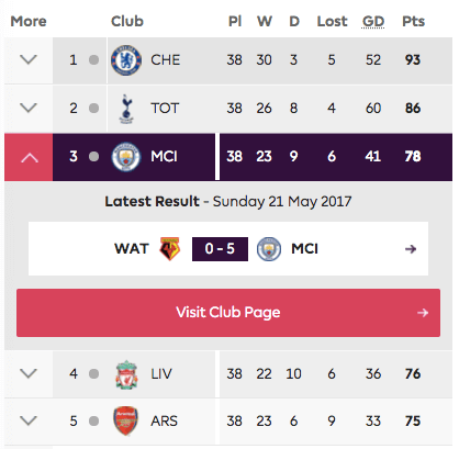
But what if you do want the category title to be linked straight to the category? One idea would be to bring clarity by having two visually distinctive elements that “hint” at the boundaries of elements — for example, with different background color for the icon and the category title (see the example above). In our experiments, we couldn’t notice any change in behavior and expectations — some people will still click on the category and wonder what happened. Again, having the section linked within the expanded accordion seems to be a safer bet.
Good enough? Well, we aren’t there quite yet. What if the user taps on the icon for expansion but there isn’t enough space on the screen to show all subitems? Somebody on your team might suggest to automatically scroll up the page to make sure that the expanded area is displayed at the very top of the screen. Is it a good idea?
Whenever we try to take control away from the user, that decision has to be thoroughly tested and considered. Perhaps the user is interested in viewing multiple sections at once and wants to quickly jump between the contents of these sections. Rather than making the user wonder about the auto-scrolling or jumping behavior and then scrolling back to restore the previous state, it seems less obtrusive just to keep things as they are, to leave the decision up to the user, as they can scroll down if necessary. Not many users will expect the jump to the top — not interrupting the flow or perhaps having a permalink to the section (if it’s really lengthy) seems to be a better option.
And then another question arises: If one section is already expanded, and the user clicks on another section, should the first one collapse or stay as is? If the first section is collapsed automatically but it’s not quite what the user was hoping for, they could always open it again, but they wouldn’t be able to scan or compare both categories simultaneously. If the section stays expanded, they would have to actively close the category they don’t need. Both options seem to have reasonable use cases.
The nature of an accordion would call for automatic collapsing, but it might not be the best option in terms of usability. For accordions with many items, we tend to leave sections expanded, because the jumping around that occurs as a result of panels closing and opening at the same time is too noisy. Hence, alternatively you could provide a “collapse all”/“expand all” button, which can be very helpful when designing a schedule or a detailed table. If there aren’t that many items, then the section could be collapsed by default because the jump would be minimal. (Please notice that the section would definitely collapse for horizontal accordions — keeping it open just wouldn’t make sense.)

And then there is something else. Nevermind the choice of icon or its position, whenever an accordion is expanded, it should be easy to immediately collapse it. This interaction shouldn’t require any extra movement of the mouse cursor or finger — just like with any other hide-and-reveal interaction. This means that the icon for collapsing and expanding should of course change when activated, but its position should remain exactly the same, allowing for an instant toggling of the accordion’s state.
Wrapping Up
Phew, that was a lengthy examination of a seemingly obvious design pattern. So, how do we design the perfect accordion? We choose an icon that indicates expansion (chevron pointing down or a plus icon), make it large enough for comfortable tapping and position it across the right edge of the bar. The entire navigation bar triggers expansion — with enough padding around the bar to toggle the states and a link to the category’s main page within the accordion’s category.
If we do choose to use a chevron, the direction should change on tap, and if it’s a plus icon, it could easily transition into an “—” or “x” to indicate collapsing. To keep the interaction even clearer, we can use subtle transitions or animations that would slide in and slide out category items.
Of course, your solution might be very different as your context might be very different as well, so if you are looking for an alternative solution, below you’ll find some questions we always ask when designing an accordion.
Accordion Design Checklist
- What icon will you choose to indicate expansion?
- What icon will you choose to indicate collapsing?
- Where exactly will you place the icon?
- How do you design a category title?
- How do you indicate collapse and expanded states (beyond the icon)?
- What happens if the user clicks on the category?
- Should the accordion contain a link to the category’s main page?
- What happens if the user clicks on empty space?
- Should an expanded section collapse automatically when another section is selected?
- What if there isn’t enough space to display all items?
- Should you have a “collapse all/open all” link or button?
The level of consideration required for a component as seemingly established and predictable as an accordion turns out to be an almost never-ending story of design experiments and usability sessions, because there are only a few established guidelines for the appearance and interaction of that component. While building an accessible accordion isn’t difficult, designing an accordion that is universally understood isn’t that easy. Consequently, users often feel lost because their expectations aren’t matched or because the interaction interrupts their flow. Our job is to reduce friction and make sure it happens as rarely as necessary. With a forgiving and resilient design we can achieve just that.
Perhaps you had a very different experiences than the ones mentioned in the article? Let us know in the comments to this article! Also, if you have another component in mind that you’d love to have covered, let us know, too — we’ll see what we can do!
Stay Tuned!
This article is a part of the new ongoing series about responsive design patterns here, on your truly Smashing Magazine. We’ll be publishing an article in this series every two weeks. Don’t miss the next one — on fancy (or not so fancy) date pickers! Ah, interested in a (printed) book covering all of the patterns, including the one above? Let us know in the comments, too — perhaps we can look into combining all of these patterns into one single book and publish it on Smashing Magazine. Keep rockin’!
Further Reading
- Everything I Know About UX Research I First Learned From Lt. Columbo
- Creating And Maintaining A Voice Of Customer Program
- Web Quality Assurance: From User Requirements To Web Risk Management
- The State Of Usability In 2023 🎊
 (il, mrn)

