Taming Advanced Color Palettes In Photoshop, Sketch And Affinity Designer

Email Newsletter
Weekly tips on front-end & UX.
Trusted by 182,000+ folks.
 Register for Free
 Custom Web Forms for Angular, React, & Vue. Your backend.
 Celebrating 10 million developers


Creating large, harmonious and uniform color palettes can be a challenge. Good intentions and confident plans can be abandoned when things get a little unwieldy. But you can equip yourself with some tools to manage the complexity. With the right techniques, large color palettes can be created, refined and refactored at will. Large color palettes can be tamed.
Creating Color Palettes Using Adjustment Layers
Quite a few techniques can be used to create large color palettes from a few base colors. Automatically generating color variations helps to keep colors uniform and easy to manage, while providing a large menu of possibilities.
One of the simplest ways to do this is by stacking partially transparent objects on top of base color swatches, altering portions of the swatch to create the variations. Photoshop and Affinity Designer’s adjustment layers can also be used for this purpose, and they offer more control. Adjustment layers modify the color of layers below, which means base colors can be edited, and additional variations are created automatically.
In a recent project, I used 14 base colors with 4 variations on each to create a palette of 56 resulting colors.

Instructions for Photoshop, Sketch and Affinity Designer are included below, but other tools can be used. It is also worth noting that design tools have different capabilities and use different rendering engines, and the results generated can vary slightly.
Base Colors
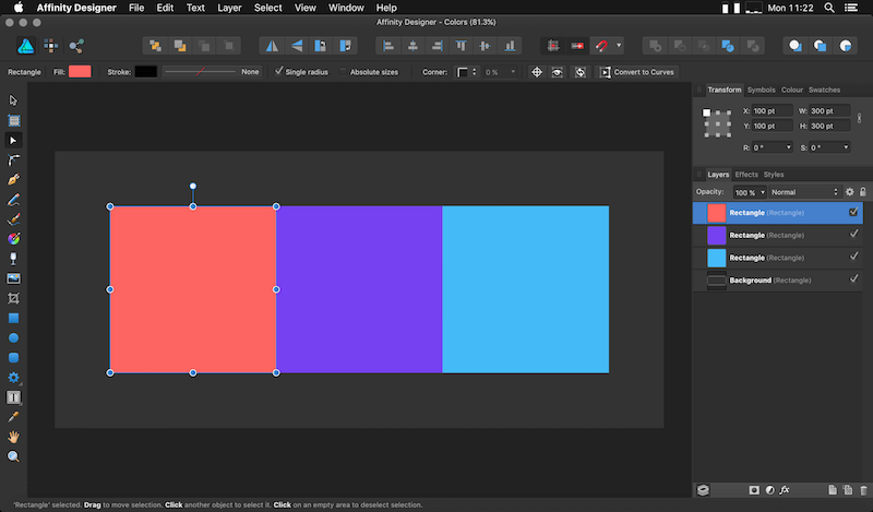
To get started, choose some base colors by drawing large blocks of solid color next to each other. The colors don’t need to be final — rough approximations will do. Place them in a horizontal row.

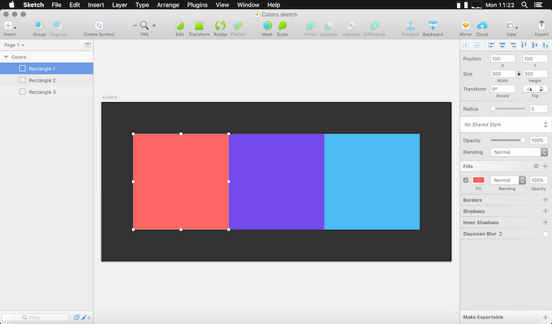
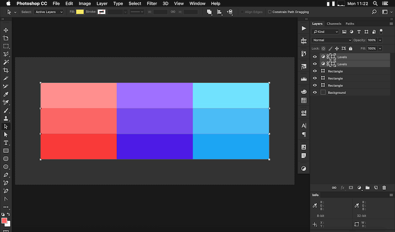
With the base colors in place, it is now possible to create an adjustment layer with a mask running horizontally across all of the colors (either a vector or bitmap mask will do). I’ve used two levels of adjustment layers here — one to lighten the top third of the blocks and another to darken the bottom third.
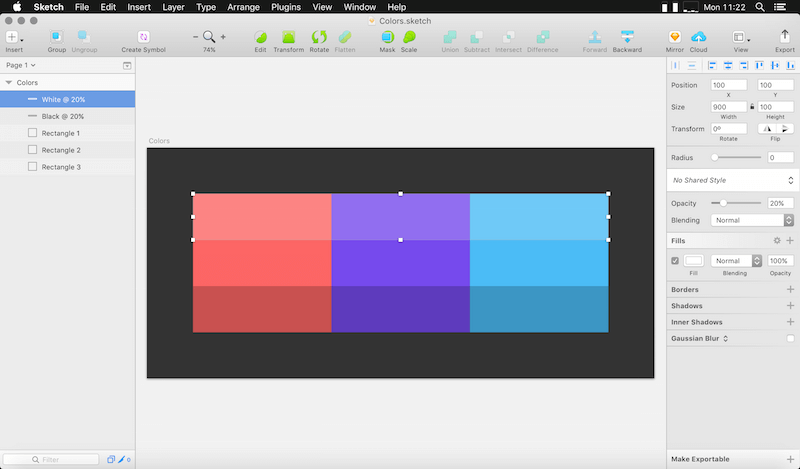
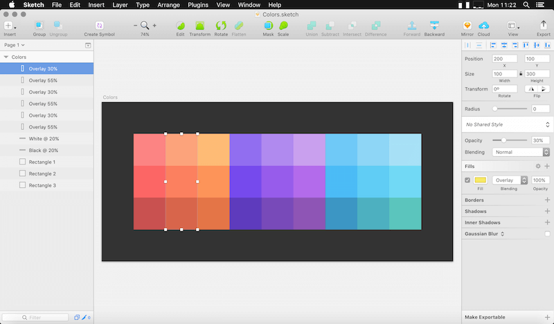
Sketch doesn’t have adjustment layers, but using white and black blocks with a layer opacity around 20% will do the trick.
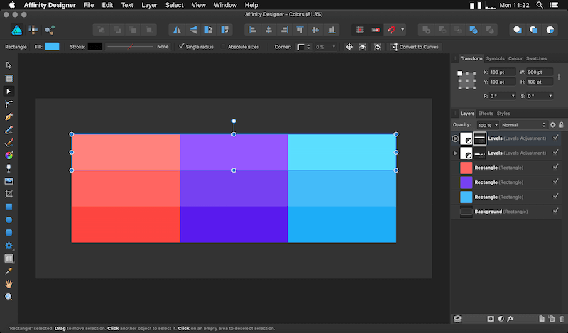
I’ve used levels adjustment layers as an example, but hue/saturation, vibrance, curves and other adjustment layer types can be just as effective, depending on your needs.
Blending Modes
The technique also works well with blending modes. Here are some yellow blocks to split the base colors into vertical thirds. They’re both using the overlay blend mode, with 40% and 80% opacity, respectively.
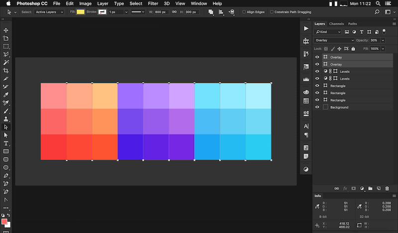
The result is a nice shift, providing stronger and brighter colors that relate to the original colors.
Fine Tuning
Because the adjustment layers and layers with blending modes alter the layers underneath, everything can be tweaked in real time. They’re dynamic. They can be edited now or at any point in the future, and all of the variations will be created automatically.
Creating Color Palettes Using Gradients
Gradients can also be used to create sets of related colors. In their simplest form, linear gradients provide a smooth blend from one color to another. Given that we’re interested in a palette with a fixed number of colors, rather than a continuous gradation, that’s not quite what we’re after. It is possible to sample colors at various points along the gradient to build a palette, but that would require manual work, and we’re after an automated solution. Yes, it could probably be scripted in Photoshop, Affinity Designer, and Sketch, but other techniques are easier than scripting. Posterizing a gradient will split it into a fixed number of steps (posterizing limits the number of colors used). Both Photoshop and Affinity Designer include the ability to posterize, via posterize adjustment layers. A posterize adjustment layer can be placed above the gradient to split it into steps of flat color.
To limit the scope of the posterize adjustment layer, the enclosing group’s blend mode should be set to “Normal,” rather than “Pass-Through” (both Photoshop and Affinity Designer can do this). Setting a group’s blend mode to normal means the contents of the group will be posterized, but everything outside the group will not — the group and its contents are composited to a single buffer, and blending is contained. This is a handy technique in situations where you’d like to stop the posterize adjustment layer or other adjustment layers from affecting other parts of the document.
A few gradients with carefully chosen colors can be used to construct a large and maintainable color palette, and the results can be combined with other adjustment layers (as previously discussed) to automate the creation even more.
However, posterizing a gradient might not produce the results you’re after, depending on the colors chosen. In the example below, the black and white gradient is split nicely into flat areas, but the color example doesn’t have nice even steps using values from the original gradient. Not at all what we want.

If you’re following along and are seeing fuzzy edges in your posterized gradients, they are due to gradient dithering. The fuzzy edges are an unfortunate side effect of a feature that normally increases the quality of gradients. Gradient dithering is a good thing, but a bit of a distraction in this particular scenario. If you’d like to disable gradient dithering in Affinity Designer, you can do so by unchecking “Dither gradients” under the “Performance” section in “Preferences” (it’s a global setting). Disabling gradient dithering isn’t essential, though.
Gradient dithering can be disabled per layer in Photoshop, from the gradient fill window or panel. In the example above, the Photoshop gradient also has smoothness set to 0%, which uses linear interpolation between color stops on the gradient — it means the blocks created by the posterization will be even sizes. Affinity Designer, Illustrator, Sketch and other tools use linear interpolation between color stops by default, and they have no options for other interpolations, so you only have to worry about this setting in Photoshop.
The color gradients currently don’t look very good and are not what we’re after. That’s OK, though — we’re not done yet. By introducing a second adjustment layer, a gradient map, it is possible to get evenly stepped, nicely blended colors, using the exact colors specified for the end points.
But first, a quick lesson (or refresher) on how gradient maps work.
Gradient Maps
I love gradient maps. I really love gradient maps. You should, too, because they’re incredibly flexible, accurate and easy to work with. They’re also surprisingly unknown to most designers. Photoshop and Affinity Designer’s gradient map adjustment layers read the pixels below, mapping the grayscale intensity to a corresponding color along a gradient.
Imagine a grayscale photo. Being grayscale, it can only contain black pixels, white pixels or pixels that are shades of gray. Now, imagine that instead of being shades of gray from black to white, the lightest parts of the image are yellow and the darkest parts are red, with a smooth blend of oranges in between. That’s a gradient map.

Gradient maps use brightness to assign corresponding colors taken from a gradient of your choice. In the example above, it was a gradient from yellow to red, but gradients can contain many points, too.

The color and position of the points in the gradient map gradient can be used to control contrast and brightness, as well as color. Gradient maps have been around since Photoshop 4 (that’s version 4.0, released in 1996, not the slightly more recent CS4), so they’re far from new, but I feel like they’re one of the most powerful features in Photoshop for working with colors.
Gradient maps can be added via the adjustment layer icon in the “layers” panel in Photoshop and Affinity Designer.
Accurate And Absolute
Most adjustment layers in Photoshop and Affinity Designer are relative — make the image brighter or more blue or higher contrast or less saturated. Gradient maps deal in absolutes. You get to set the exact colors that are used. And being absolute, gradient maps can’t push colors outside the normal range (0 to 255 for 8-bit), so accidental clipping won’t occur.
Gradient maps also enable you to create effects that would take several other adjustment layers to achieve, lowering the chance of rounding errors, which typically manifest as gradient banding. They offer more control and more precision. Effects that would require more layers can be constructed with a single layer, which produces higher-quality results, with less chance of banding.
Being an adjustment layer, gradient maps can be applied to many things at once and can be contained within clipping groups, which is incredibly handy — it’s possible to build a complex composition of gradients and effects, then color them with a single gradient map adjustment layer. As a bonus, working this way also lets you easily replicate the same color treatment to different elements in your document or different documents.
If you’re an iOS or macOS developer, Core Image contains a filter named CIColorMap, which does the same thing, so you can use gradient maps in your apps, if you’d like.
There is no pre-made filter for Android. However, RenderScript, Vulkan or OpenGL could be used to achieve the same effect.
The same is true of the web — a single gradient map filter does not exist, but two SVG feColorMatrix filters can be combined, and other strategies can be used to get identical or similar effects.
Given that what they do it quite simple, gradient maps are fairly performant, too. They are a per-pixel effect, and typically they do require a repaint when content underneath changes, but it’s not an expensive repaint.
Creating Color Palettes Using Gradient Maps
We now know that black and white gradients can be nicely posterized, but color gradients often can not. We also know that gradient maps can be used to map grayscale to colors referenced in a linear gradient. Combining the two methods means we can create a black and white gradient, posterize it, then convert the nicely stepped grayscale gradient to any colors we choose.

The example below uses two colors we’ve chosen (one at each end of the gradient map’s gradient), and the additional four colors in between are automatically generated.

It is also possible to add some other adjustment or overlay layers on top, to create more variations. Adding another five overlay layers at varying opacities (as we’ve done in the past) gives us 36 colors in total. And those 36 colors aren’t static — editing the gradient ends will instantly provide the intermediate colors for our generated palette.

If you’re not happy with the gradient interpolation, a curves adjustment layer or other adjustment layers can be placed under the gradient map. This will alter the colors while they’re still grayscale, ensuring that only values present in the gradient map are used.
Color-Blindness Testing
It’s a great idea to test your color palette for color-blindness compatibility, while everything is still easy to change. Photoshop has built-in color blindness preview modes that can be enabled via “View” → “Proof Setup.” The Stark plugin adds color-blindness previewing to Sketch.
Affinity Designer does not include a way to view the canvas as someone with a color blindness would see it, but Sim Daltonism can be used to preview a portion of your screen, which means it can be used with any design tool.
It’s also a good idea to be aware of the Color Contrast when creating color palettes.
Replacing Colors Using Layer Tags
Most design tools, including Photoshop and Sketch, have the ability to filter the layers list, letting you search for a layer by name. At the time of writing this article, Affinity Designer can’t filter its layer list, but hopefully the feature will be added soon.
One of my favorite uses of search is for tagging — applying something to layers for easy recall at a later date. Appending hashtags to layer names works well for this purpose — adding “#red” to a layer name is preferable to just “red,” because searching for the latter would match layer names that contain “red,” like “colored.” The hash symbol makes it less likely to get false positive matches, and it also makes it obvious which parts of the layer name you’re using for tagging.
If your color palette document needs to contain many duplicates of a base color, then layer tagging can help you update them all quickly. It’s just a matter of updating one of the layers, copying the style of that layer, searching for the tag, selecting the layers, then pasting the style. It’s not fully automated, but it’s quicker than updating the layers one by one.
Photoshop Layer Colors
Photoshop also has the ability to set a color for each layer in the Layers panel. These colors only appear in the layers panel, and may only be one of the seven predefined variations, but this can still be helpful for organization and filtering. I often use red for deprecated or incorrect layers, and purple for labels (non-artwork layers).
Another favorite is searching by layer effect — really helpful if you’re hunting for all instances of a particular overlay or drop shadow. Or you could search for all disabled layers, to quickly clean up a messy document.
Replacing Colors Using Symbols And Smart Objects
In Sketch and Affinity Designer, symbols replicate changes from one instance of an object or group to the other instances. In both Sketch and Affinity Designer, symbols can also be resized. For our specific use, this means symbols can be used as the base blocks of color in a color palette, even if the blocks need to be different sizes at different places in the document. Changes will always be in sync. It’s a good way to construct our color palettes, but probably not an ideal way to keep colors in sync in other design documents.
Photoshop doesn’t have symbols, but smart objects can be used in some situations to mimic the same capability.
Creating A Symbol In Sketch
To create a symbol in Sketch, select the layer or group you’d like to convert into a symbol, and click “Create Symbol” in the toolbar at the top of the window. By default, Sketch’s symbols are added to a separate page, but they can live anywhere in your document. With the symbol created, you can now use “Insert” → “Symbol” to create an instance, anywhere in your document.
Creating A Symbol In Affinity Designer
To create a symbol in Affinity Designer, select the layer or group you’d like to convert into a symbol, and click “Create” in the “Symbols” panel. The Symbols panel can be opened via the “View” → “Studio” → “Symbols” menu command. To create more instances of the symbol, drag it to the new layer icon in the layers panel, or press ⌘ J.
Affinity Designer’s global colors are another way to replicate color changes across an entire document. Global colors can be added and used via the swatches panel.
Creating A Smart Object In Photoshop
To create a smart object in Photoshop, select the layer or group you’d like to convert into a smart object, and choose the “Layer” → “Smart Objects” → “Convert to Smart Object” menu command, or right-click the items in the layers panel and choose “Convert to Smart Object.” To create more instances of the smart object, drag it to the new layer icon in the layers panel, or press ⌘ J.
Saving And Transferring Color Palettes
Once you have a palette worked out, what’s the best way to use it in your designs? What’s the best way to share it with friends and colleagues?
My preferred solution is a simple one — save the palette as an image. Images can be placed alongside your artwork and sampled in almost every design tool. Images can adhere to color management needs. Images can be easily replaced to update the palette. Images can contain labels and other text that describes how the colors should be used. Popular image file formats should be able to be opened in the future, but some other format for storing colors might not be. Best of all, saving images from your favorite design tool is easy.
To share a color palette, create a document containing some large blocks of color, as in our previous examples. If you’d like, include labels and other information to assist those using the palette. Then, export an image using a lossless format, such as PNG. Ensure you use the “PNG-24” setting in Photoshop and Affinity Designer. Sketch’s PNG exports all use “PNG-24,” so no settings need to be changed or checked.
With your color palette image saved, you can drag it into other documents and sample the colors as needed.
The macOS Color Picker And Images
The built-in color picker in macOS can even sample colors from an image. To do so, switch to the image tab and drag a file to the big area in the middle to load it in.

You can now sample colors from the image by clicking. macOS’ color picker stores the images used, so you can load in a lot of swatches and switch between them at any time.
Other Swatch Formats
A variety of swatch file formats can be used to transfer color palettes between teams and tools. Photoshop’s .aco can be used by Photoshop and many other tools.
Adobe Swatch Exchange files (.ase) can be read by Photoshop and Illustrator, as well as Affinity Designer. Affinity Designer’s own .afpalette swatches can be used to transfer palettes between designers using Affinity Designer.
For Sketch users, the .ase to .sketchpalette utility and the Sketch Palettes plugin can be used to import Adobe Swatch Exchange files and to share palettes between designers using Sketch.
Adobe’s “Library” panel also lets teams share color palettes, with the added advantage of the palettes being kept in sync via Creative Cloud.
Night Shift, f.lux And Dynamic Display Warmth
When creating color palettes, be mindful of features and apps that could alter the appearance of colors. Features such as Night Shift and True Tone on iOS, and apps such f.lux on macOS and Windows, can subtly or drastically change the color temperature and color accuracy of a device’s display — what you see is different from the typical standard sRGB calibration used on the web and for most native apps.
According to f.lux’s developer, it “makes the color of your computer’s display adapt to the time of day, warm at night and like sunlight during the day.” Apple states that Night Shift “uses your iOS device’s clock and geolocation to determine when it’s sunset in your location, then it automatically shifts the colors in your display to the warmer end of the spectrum” and True Tone “uses advanced four-channel ambient light sensors to automatically adapt the color and intensity of the display to match the light in your environment”.
f.lux, Night Shift, and True Tone can alter display warmth and might do so in an unpredictable fashion, so it’s best to disable them and other similar features while picking colors.
In fact, even the seemingly innocuous “Automatically adjust brightness” in macOS’ System Preferences can alter how colors are displayed — macOS El Capitan and Sierra combined the existing ambient light compensation into the “Automatically adjust brightness” feature. It’s subtle but definitely another thing to watch out for, or disable altogether.
Other Resources
While researching and writing this article, I created a set of documents for Photoshop, Sketch and Affinity Designer, demonstrating the techniques discussed. The templates are available for free as open source under the BSD license.
- Color Creator (ZIP), templates
- “Color Creator Templates,” GitHub
- PSD file (ZIP) of the Color Palette with Blending Modes
- Sketch document (ZIP) of the Color Palette with Blending Modes

There are an almost infinite number of approaches that can be taken to create color palettes, but hopefully this article has given you some useful tips and techniques. Do you have other techniques you use to create large color palettes? Please let us know in the comment section below.
Further Reading
- The Complex But Awesome CSS border-image Property
- Top Front-End Tools Of 2023
- Mid-Century Modern Illustration: Creating A Cover Book With Illustrator And InDesign
- Color Mechanics In UI Kits


