Designing The Perfect Date And Time Picker

Email Newsletter
Weekly tips on front-end & UX.
Trusted by 182,000+ folks.
 Celebrating 10 million developers

 Custom Web Forms for Angular, React, & Vue. Your backend.

Well, not every date picker fits every interface, just like not every interface actually needs a date picker. But when a date picker is required, quite often it’s just a bit too tedious and annoying to specify that one date, and too often it produces irrelevant results or even a zero-results page, although just a few minor refinements would make it much easier to use.
Over the last few years, I’ve spent a lot of time working with various companies trying out various approaches and studying them in usability tests. This series of articles is a summary of observations and experiments made throughout that time. Over the course of months, we’ll be exploring everything from carousels to car configurators. Having looked into the design of accordions two weeks ago, let’s look into the design of date and time pickers today — in all the various facets and flavors of their visual appearance and interaction design.
First things first, though: Date pickers are often considered to be a foolproof component for date selection — predictable, consistent, generic — and so more often than not, we use them just because they seem to be a universally accepted pattern for date input. But just like any other form element, sometimes they should be the method of last resort, aiding the user’s input if it can’t be inferred in a better way. Now, there are situations where date pickers are extremely helpful, and there are situations where they just slow users down. Our job, then, is to carefully study our own scenarios and figure out an optimal way to frame the question of time and date to help users provide the input quickly and easily.
The best input is the one that matches the user’s intent, without having to ask the user to be precise, of course. But what if we set a budget on the date input as at most two taps? Three taps for a date range? Five taps if we bring a time slot into the game as well? You might be wondering if it’s really a big deal; after all, it’s just a tiny little date picker! If date selection is front and center in your interface, you should expect users to use it a lot, and going to extremes to optimize date input isn’t really a matter of optimization, but is rather a core element of your website’s experience.
In fact, there are plenty of contexts in which date pickers matter: whether it’s for a medical appointment, a spa treatment, a boat rental, a TV guide, online banking, a flight ticket or a summer cottage rental — pretty much anything that requires date input is likely to have some sort of a date and time picker. And more often than not, all such websites tend to use the same (jQuery) implementation, plugged into the UI a while back and happily forgotten ever since. However, it might not be the best option for your particular case.
Part Of: Design Patterns
- Part 1: Perfect Accordion
- Part 2: Perfect Responsive Configurator
- Part 3: Perfect Date and Time Picker
- Part 4: Perfect Feature Comparison
- Part 5: Perfect Slider
- Part 6: Perfect Birthday Picker
- Part 7: Perfect Mega-Dropdown Menus
- Part 8: Perfect Filters
- Part 9: Disabled Buttons
- Subscribe to our email newsletter to not miss the next ones.
Date-Picker Design Considerations
If we look closely at the nature of a date picker, there are a good number of design questions to be resolved — and many of them aren’t straightforward at all:
- Are we designing a date picker, a date-range picker or a time picker?
- Should the user be able to type in a date in the input field or only select predefined values using a date picker?
- Should the date-picker overlay appear when the user clicks on the input or when they click on the calendar icon (or both)?
- Should the date picker contain default prepopulated values? If yes, what values should be default?
- Should we include some sort of “previous, current, next” navigation? If so, how do we design it for days, months and years?
- Should we enhance the experience by displaying availability, price, etc.?
- For date-range pickers on narrow screens, should the overlay automatically disappear once two dates are selected, or only when the user clicks on the “Continue” button to proceed?
- Should the week run from Monday to Sunday or from Sunday to Saturday?
- How do we avoid displaying unavailable dates or zero-results dead ends?
- Is a date picker the right pattern to use for date selection in the first place?
Indeed, we have many decisions to consider, and most of them aren’t that straightforward at all. But let’s tackle one issue at a time. The main question we should ask ourselves first is what problem and in which context exactly are we solving and how can a date picker help there or, more specifically, what kind of a date picker would help users move forward in completing their task seamlessly.
What Kind Of Input Do We Need?
Before choosing an interface pattern to apply to your problem, it’s important to understand what kind of date input you actually need. Is it enough to know just one day, or do you need a date range? The latter doesn’t mean that you have to use two date-pickers, though, but it will affect the interaction and the design of the component.
You might also want to extend the date picker with a time input, but it doesn’t mean that the experience has to happen in steps — date picker first, time picker second. There are also ways to integrate both the day and time selection in one single component. We’ll explore some of them later in the article.
Beyond that, it’s a good idea to look into the expected range of values that your visitors will most likely type in. Perhaps you’ll need to extend the date input with a set of predefined options, or limit the range of accepted values, or complement it with numerical input so that customers can type in the values manually. In fact, the latter option might be useful more often than not — the problem is that it’s quite difficult to get right.
Numerical Input For Longer Date Ranges
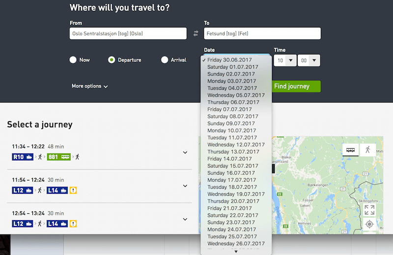
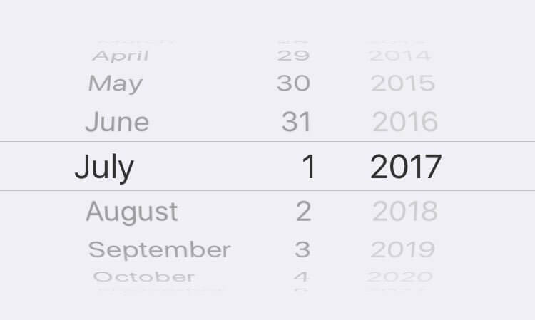
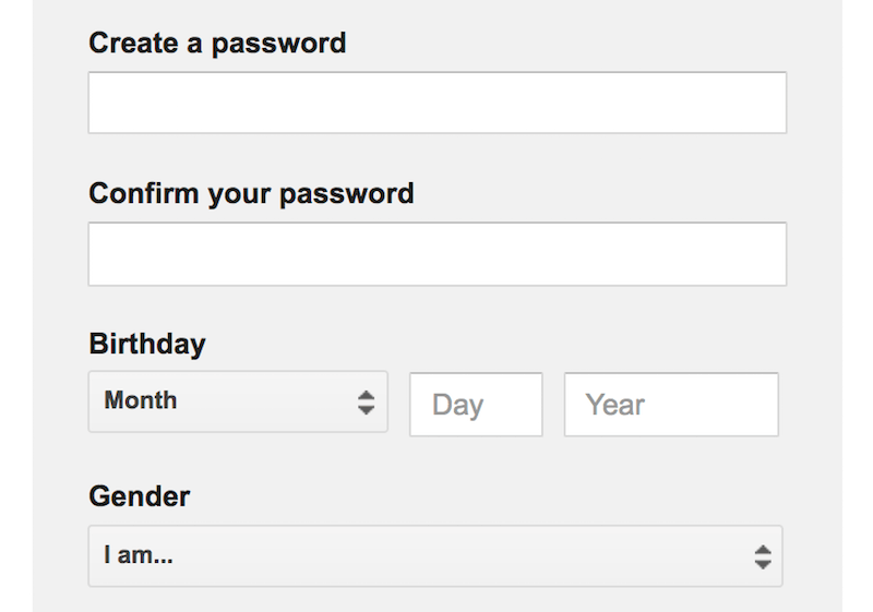
One thing is certain: If you’ve been considering a date picker, chances are high that, you know, you need some sort of a date input (duh!). You could, of course, use three separate numerical inputs, separated by a separator symbol — perhaps a <select> dropdown for the day, month and year — but with that design, users will embark on a journey through tapping and scrolling, which isn’t necessarily the most seamless or fastest experience. We want the date to be chosen as quickly as possible, and being able to set the date with two taps (tap to open the calendar, and tap to pick a day) would be much easier than dealing with three separate input fields.
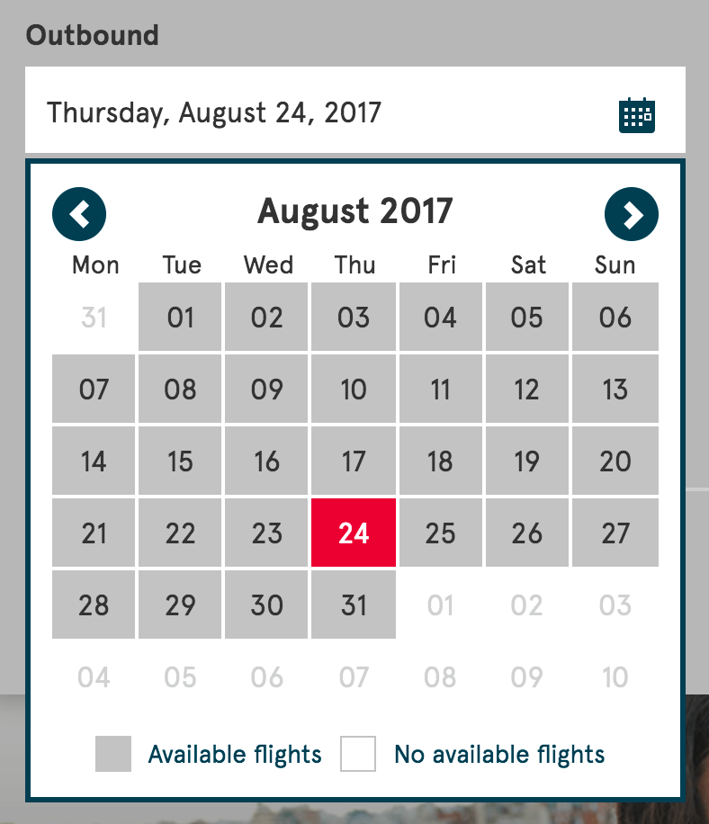
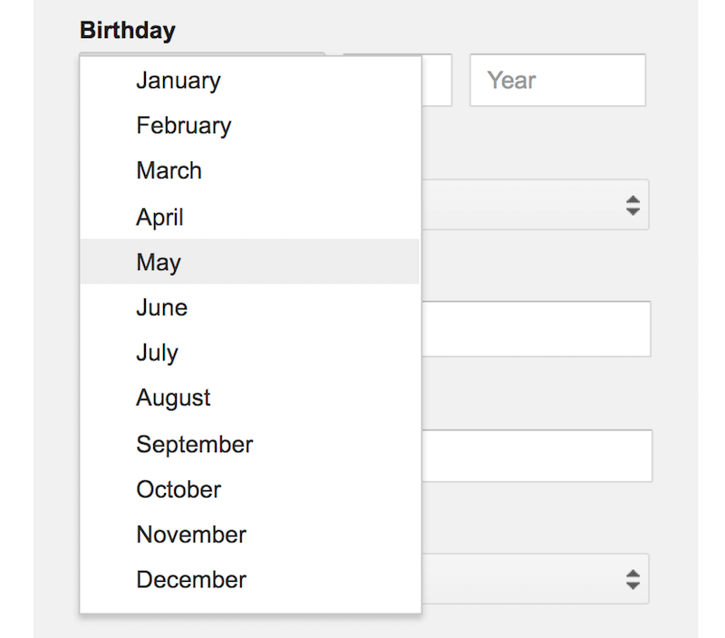
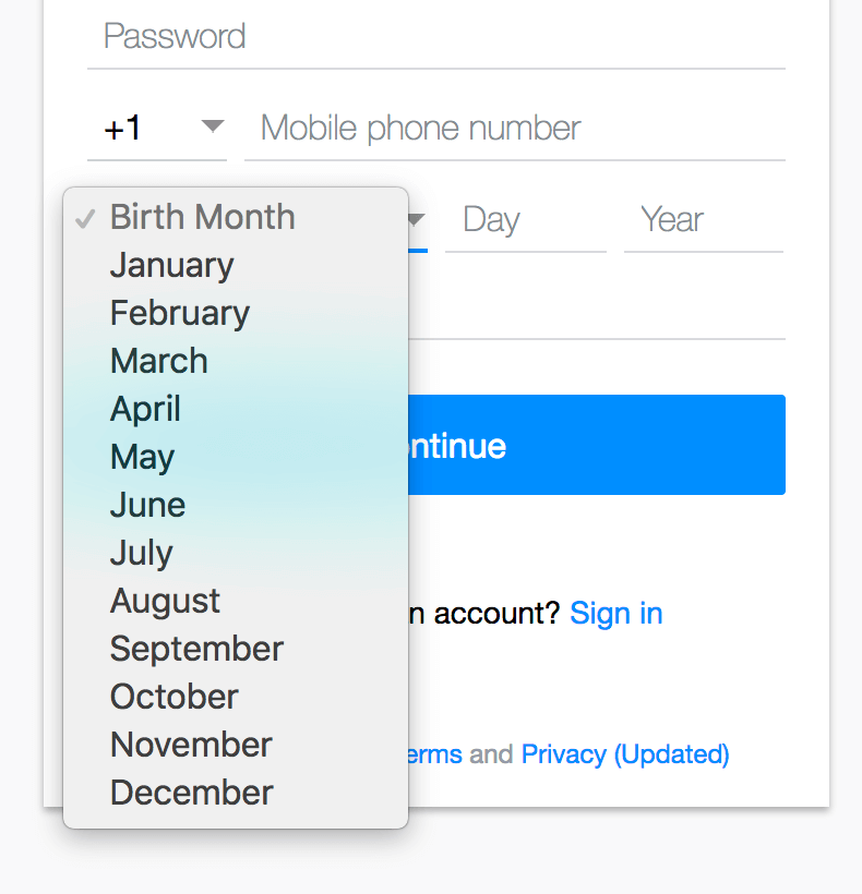
select dropdown for date selection. It prompts a long scrolling area and might not be the fastest way to input. (View large version)All right, then. What if instead of three separate inputs, we keep only one — perhaps with the format helper DD/MM/YYYY, for example? As the user starts typing, the transition between day and month and year should happen seamless and automatically, so that the user wouldn’t need to do anything but keep typing on the numerical keyboard. Ideally, they’d be finished with the input after, at most, eight keystrokes. Obviously, we can’t assume whether the user knows the exact date, but it would be useful to make precise input possible, complementary to a regular date picker. Especially in interfaces where the date input can vary a lot (such as with passport expiry dates), typing the value instead of endlessly tapping through years and months just sounds more reasonable, right?
Well, numerical input has to be reliable enough to manage all kinds of edge cases — and there are plenty of them. Of course, we’ll be using some sort of a label or placeholder to indicate the order of the day, month and year input and an example of the input format, but inline validation should pick up an ill-formatted input quickly and suggest corrections to drive the user forward in the input flow. Watch out for the day on which the week starts. If your company is international and most customers come from the US, then you’ll probably need to change the UI based on the user’s location or preferences to avoid misbookings.
Being reliable also means being forgiving. If the user wants to select March 1st, 2019, with the numerical input MM/DD/YYYY, they would need to type in 01 / 03 / 19. As designers, that’s exactly the input we are expecting.
Now, how would users type in the data when encountering that numerical input? If you observe users typing in a date in an input, you’ll see them pause for a second, type in 1, then manually switch to the month input, type 3, then manually switch to the year input and type the year — either 19 or 2019.
Other users will play it safe and type in 03 and 01 explicitly. Still others will try to include a separator sign in either of these inputs. Because in some implementations the placeholder disappears once the input is activated, some users will use a different separator sign than the one you’ve accounted for — often a hyphen (-) or slash (/). Some users will try to increment the value by using the up and down arrows in the input fields. And some users will choose to tab through the fields when typing in the date. Oh, what a nightmare it is for inline validation!
Why do users do this? Mostly because they have been burned in the past — by clunky interfaces whose data input was designed poorly, resulting in a frustrating experience of going back and forth — for example, seeing an incorrectly interpreted input, then hitting a tiny day or month selection input to correct it, but ending up resetting the other input as a result. In all of these cases, it’s easy to get frustrated. And in all of these scenarios, the designer’s implementation should be able to properly interpret the input and support the user, rather than throwing errors left and right (with autocomplete or smart suggestions).
Keep the date format suggestion (in the placeholder) when the user activates the input field. Keep the delimiters and placeholders displayed as the users manually inputs the date. If that’s not possible for some reason, use a floating label to continue displaying the format (this does have some accessibility issues, but there are some solutions as well.)
Numerical input matters in cases where the range of input varies widely — potentially spanning years, such as visa validity dates, or accounting for predictable input, such as birthday dates. That’s where it’s w orth investing into a proper numerical input. You could even take it to the next level, supporting actual context-sensitive input. Perhaps instead of asking for a specific input format, you could support queries such as “yesterday,” “now,” “today,” “next Friday,” “one year ago,” “two weeks ago” or even “5 days into July.”
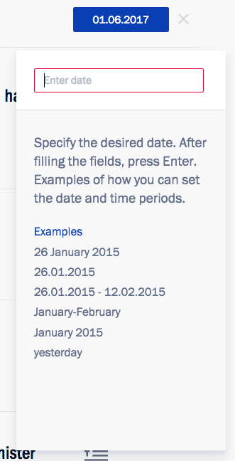
Depending on the nature of your application, allowing for flexible dates might be useful, and typing the query in the input field would be easy enough. If that’s not possible, then it might be a good idea to add easily tappable, predefined options for “today,” “tomorrow,” “in 7 days” and so on alongside the date picker. It could be useful when searching for the optimal fare for an airline ticket. In fact, that’s exactly the technique that Kremlin.ru uses. Of course, you also need to communicate that you support this kind of “smart” fuzzy input prominently as well.
While numerical input is useful and it’s good to have it available as a fallback, in some situations a date picker is infinitely more useful — for example, when the customer is booking a short vacation. What if the user is looking for a quick weekend trip within the next six weeks, but they don’t have exact dates in mind — instead, they are exploring pricing and availability, which means they will be jumping between days and weeks, and potentially even months, a lot. In such cases, numerical input would be way too slow and tiring, whereas a calendar view would be way more relevant because it displays weekend options lined up in a grid upon a tap.
But What About Default Values?
If we examine the interaction with the date-picker input field a bit closer, we’ll stumble upon a number of micro-decisions around its interaction design. Should the input field have default values, or should it be left blank, perhaps populated with a date placeholder, showing an example of the correct input? If we do use default values, which values do we choose? And once the user has selected dates but refreshes the page, should the input be persistent in the fields or reset automatically?

Frankly, we didn’t test, nor did we spot any preference for, any of the options above, but it seems that setting random values for the customer isn’t really the best option because it would force customers to “fix” the values from the seemingly random ones to the ones they are actually looking for. However, if your customers are likely to buy last-minute deals on your website (be it shows, public transportation or hotels), then the current date (“today”) or even current time (“now”) might be a good option — especially in a time-sensitive context, like a TV guide. The final decision will come from the general behavior you’ve gathered from your frequent customers.
Once the user has selected dates or time slots but refreshed the page (accidentally or deliberately), we can choose to cancel the selection or keep it as is. If the user accidentally refreshed, they won’t be delighted about their input being lost and having to retype it again. That’s frustrating. If the user deliberately refreshed, they’d see predefined dates and have to “fix” the dates. This can be quite frustrating as well, unless you provide a noticeable “Reset” or “New search” link next to the date input. Instead of manually deleting all of the previous input, the customer can clear the selection with one tap. This is also where a mini-stepper could be helpful as well, as dates might not change significantly. In that latter case, adjusting the date using two native scroll wheels, for example, would be just way too annoying.
In a nutshell, it’s a good idea to prepopulate the dates only if you are certain that the user is likely to choose these dates; also, persist data after a page refresh (unless the input is time-sensitive), and add a “Reset” link to enable the user to cancel their input easily. By the way, that reset link should probably be available in the calendar overlay as well.
Designing The Calendar Overlay
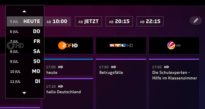
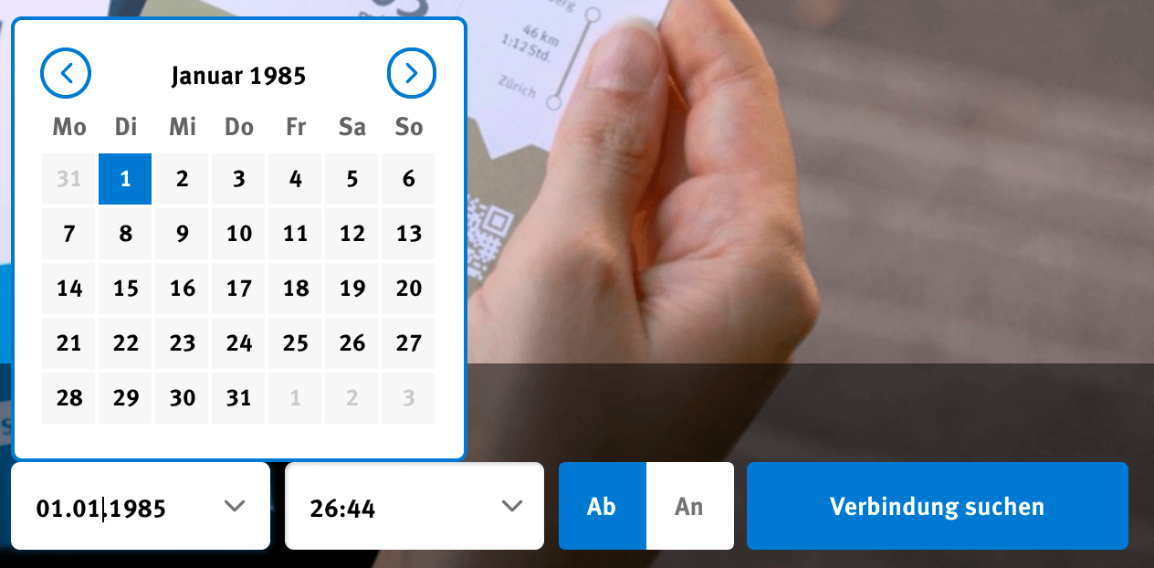
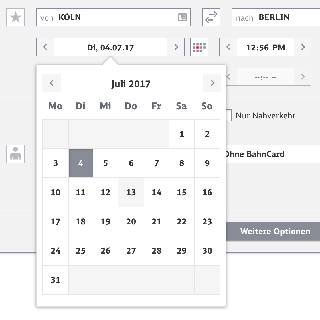
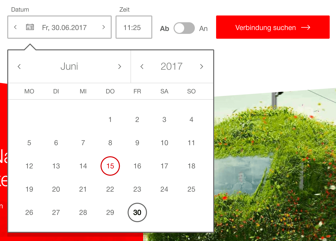
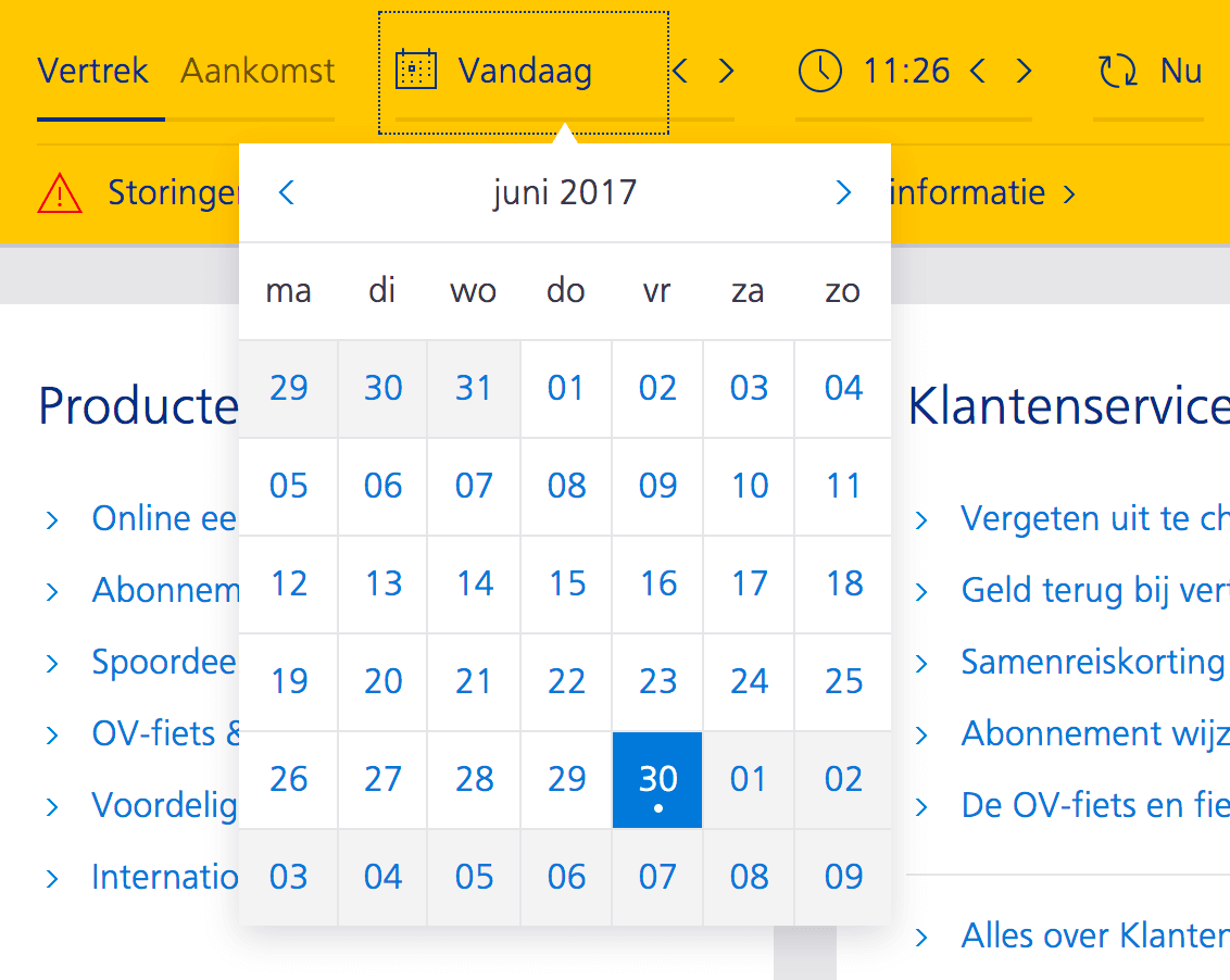
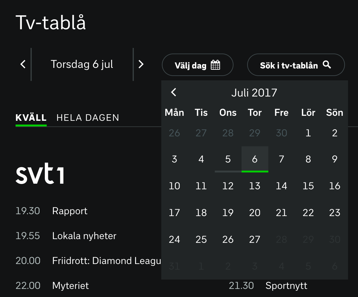
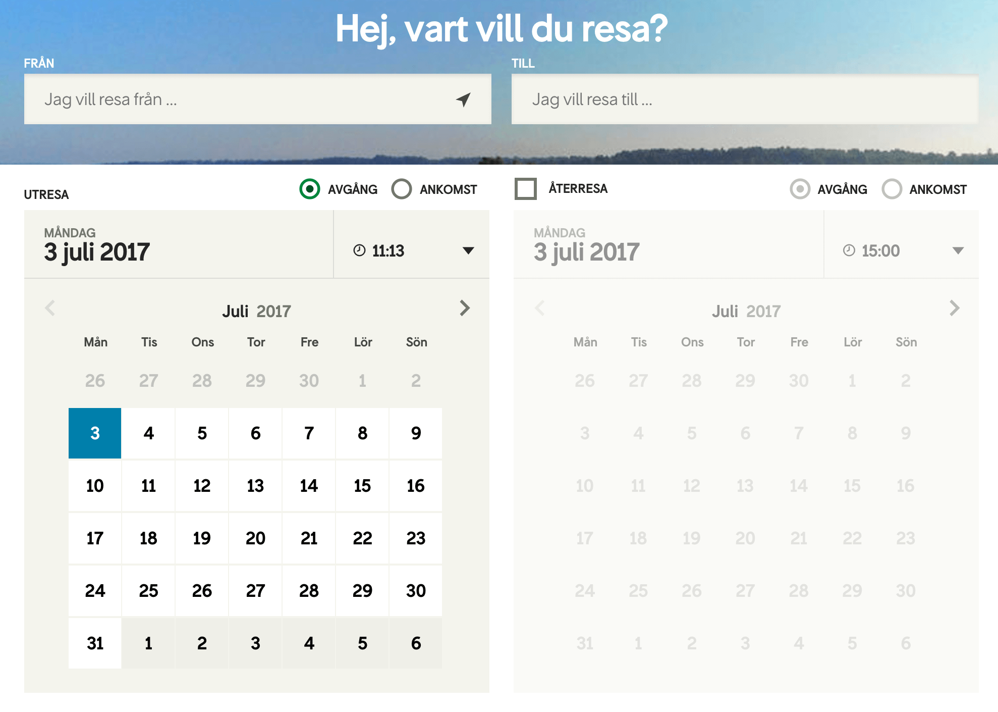
One might think that you’d need to be really creative to come up with a distinct design for the calendar overlay. After all, they are so generic most of the time! Usually, the overlay appears under the date-input field, and mostly as a full-screen overlay on narrow screens and as a smaller panel on the desktop. The days are lined up in rows, grouped as weeks, with drop-downs to navigate the years and months. However, as it turns out, a calendar overlay could contain various level of detail and navigation.
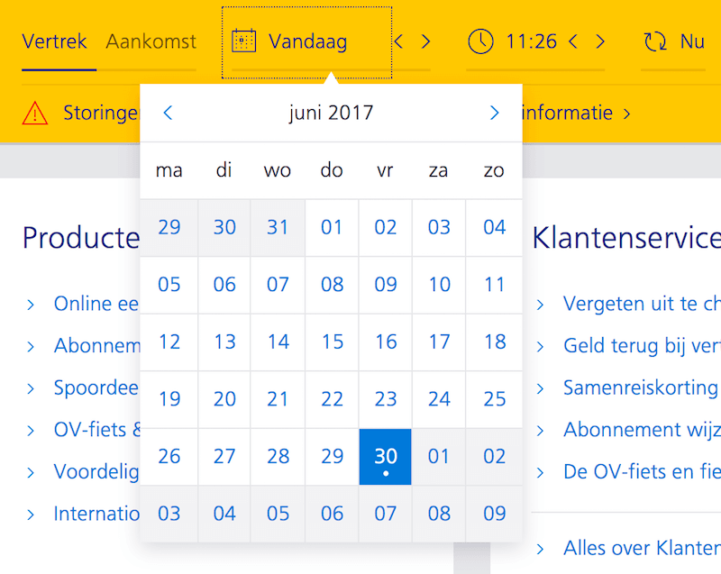
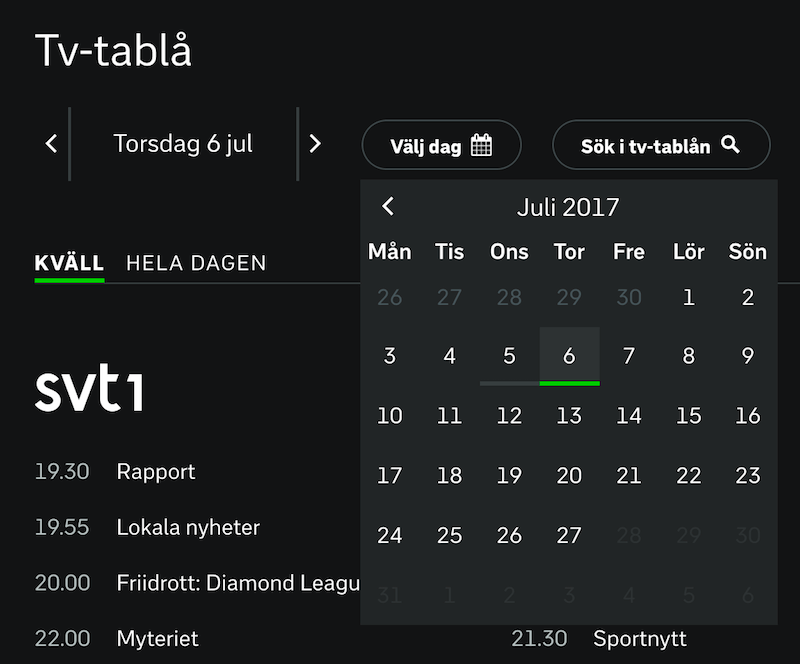
The simplest question is, should the week row start on Monday or Sunday? Well, it depends on the service you are providing and the audience you are targeting. Should a date picker always contain the year input? Probably not on a public transportation website, a TV guide or a food delivery service. Should you display all day options and month options all the time? Probably not if you are designing a car rental website — you probably wouldn’t need to book a car more than a few months in advance. And if you are using these services in months when the next year could be an option — such as in mid-December — you might get away without displaying the year, because January would obviously be January of the upcoming year.

There is another level of complexity to it, though. In some situations, displaying an actual day of the week (Monday, Tuesday, etc.) is important (for example, for booking an appointment). In other situations, it’s irrelevant (such as for a birthday). Sometimes we do want to display availability or pricing (such as for booking a flight). And sometimes we want to know a date range (for renting a summer cottage) or an exact time slot (a restaurant reservation), rather than just a date. In such cases, we need to complement a date selection with a time-slot selection, or indicate the connection between the start date and end date somehow.
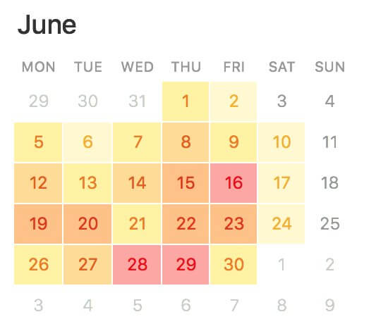
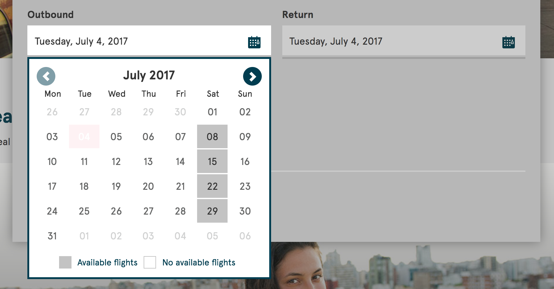
It’s worth considering the level of detail to provide in your date picker early on to help users make an informed choice more quickly. If availability matters, consider clearly separating available and unavailable options. Additionally, if there are different options or price tags associated with different dates, then it might be useful to color-code to indicate better fares or better availability. If many customers are booking your services over the weekend, clearly indicate weekends and, potentially, public holidays.
What would you choose to highlight for a selected day in your interface? Perhaps availability on that day? Maybe different opening or closing times? The kind of show running on that particular day? It’s also a safe bet to restrict or disable certain selections, or at least provide a hint right away in the calendar if a selected date range won’t bear the expected result.
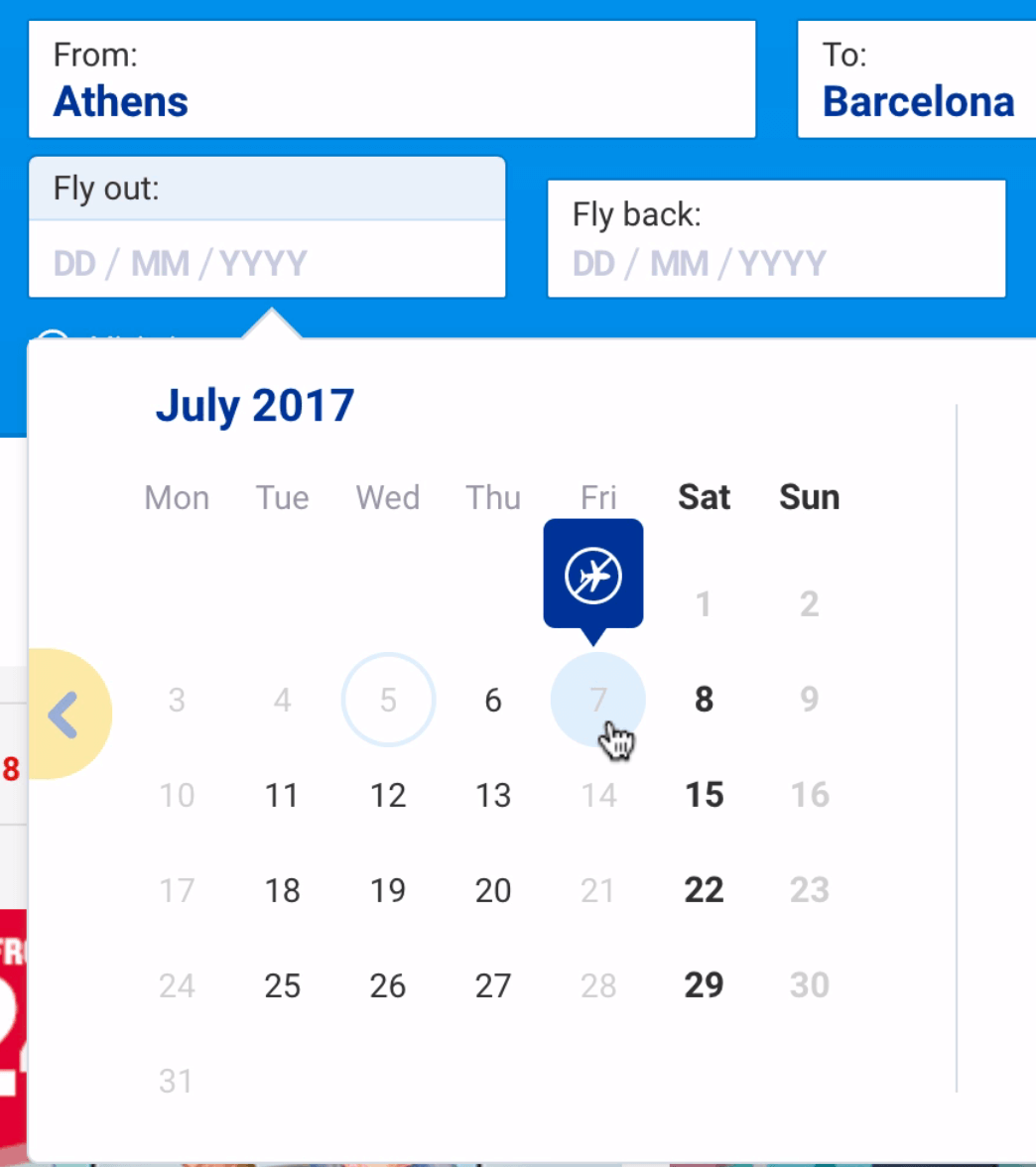
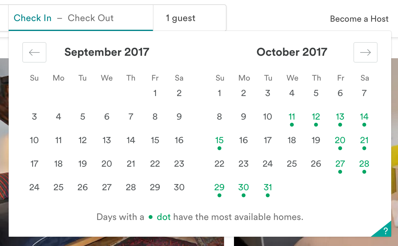
Figure out the critical detail that’s important to your customers and expose it prominently — for example, with gray dots (to denote unavailable) and green dots (available). The latter could appear in different sizes, for different grades of availability. It doesn’t have to be a full-detail view, though — potentially, even a color gradient overlay would do the job, with a list detail view that could be progressively disclosed once the date is selected.
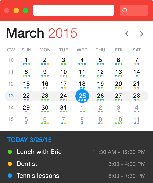
It’s easy to get lost among all those fine features and indicators, but it’s also critical to get the basics right first. Don’t forget to indicate the current day, so that customers can easily see the relationship between a remote date and the current date.
Obviously, you will need the day and probably the month most of the time, but you might not need to display the year all the time. Or at least, if the year isn’t used that much, it doesn’t have to be as prominent as the other input, and perhaps appear only when needed, with some sort of progressive disclosure. In all of these cases, you’ll also need to include some sort of navigation between days, months and years. It doesn’t have to be only a select drop-down though.
For date selection that is not so fixed, such as a wedding date or the beginning of employment, you might want to look into a more dynamic input that would complement a good ol’ date picker — for instance, a mini-stepper.
Mini-Stepper For Quick Date Jumps
If many customers are likely to explore a quite short range of date options, you could add quick “previous” and “next” navigation next to the day input right in the input field. For example, when booking a weekend trip, a user might want to leave either on late Thursday or early Friday, but late Saturday is definitely out of question, so instead of retyping the input or selecting the date in the calendar overlay, a single tap would produce the expected result.
In fact, that’s exactly what Google Flights uses as an addition to its date-range picker. To be able to jump quickly between months and years, you could add a mini-stepper for them as well (again, think how quick the change of the date would be for a passport expiry input).

In general, a mini-stepper is a good enhancement for every date picker. However, it probably shouldn’t be considered a replacement for a calendar overlay. Of course, tapping is easy; but it can also get very tedious very quickly. In usability sessions, you can see how the annoyance level (and blood pressure) increase with every tap after the 10th tap. Eventually, some users switch to numerical input instead altogether (if it’s possible, of course).
So, what to choose? Study the purpose of the calendar and the scope of the date input range first. If the date is likely to be quite far in the past or the future (for example, for booking a vacation), then a numerical input with a date picker might be a good option. If the date input range is usually quite short (less than six weeks, such as when booking a medical appointment), definitely consider adding a mini-stepper for quicker jumps.
Ideally, providing all three options — a numerical input, a calendar overlay and a mini-stepper — seems to be a safe bet, as long as numerical input is reliable enough. If there are only a few options to display at a time, then perhaps a date picker isn’t necessary for your interface at all. Consider displaying predefined options as links, buttons or perhaps even a slider, instead of prompting a calendar overlay.
Date input doesn’t necessarily require a date picker, but usually a date picker is a good solution. However, not all date pickers are created equal, and interaction design will vary quite significantly depending on the context. One thing is certain, though: Unless the date picker is displayed as is in plain sight, it will have to be prompted by a click or tap on an input field or a date picker icon (usually some sort of a calendar icon).
Here’s another question: Should the overlay appear when the user chooses to click on the calendar icon or on the input field — or both? Of course, if numerical input is possible, the click on the input field shouldn’t trigger the calendar. However, if that’s not the case, the entire field should trigger the date picker overlay. But maybe we should treat the use case of a user manually prompting a date picker as an exception rather than a rule for interaction with our interfaces?
Always Move Forward: Seamless Flow Matters
It’s quite remarkable that in many interfaces, date selection is usually not the very first data that the user is asked for. For some mysterious reason, it is often preceded by other, often more general, input.
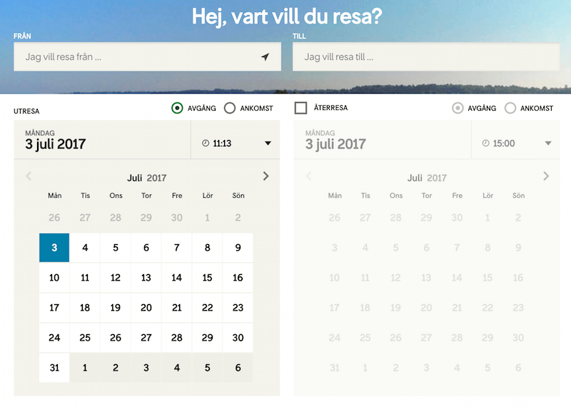
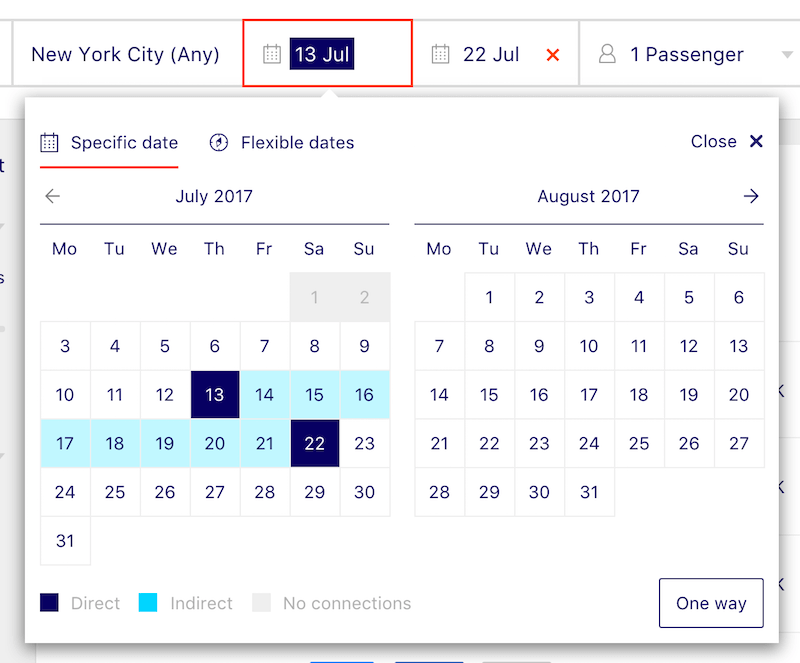
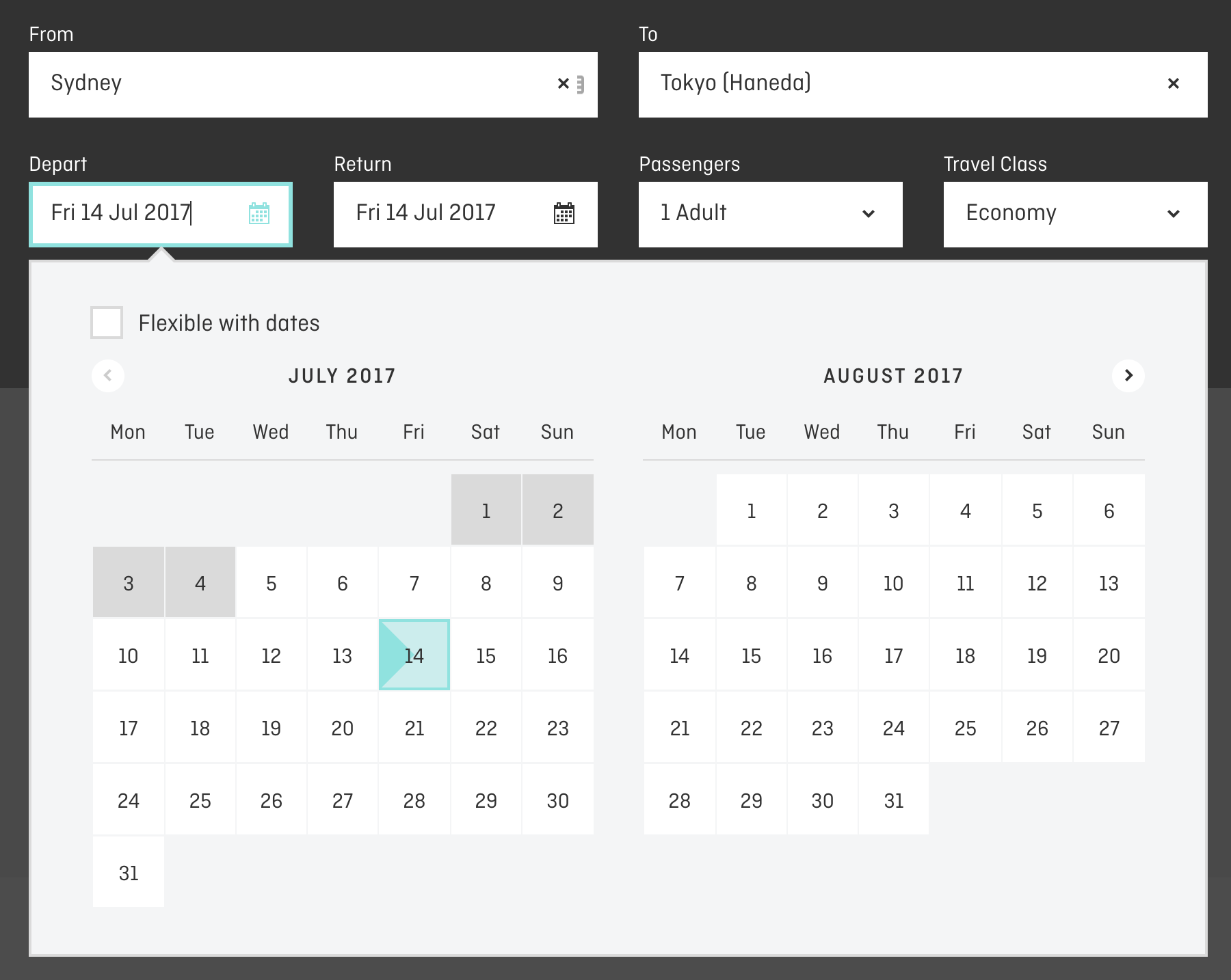
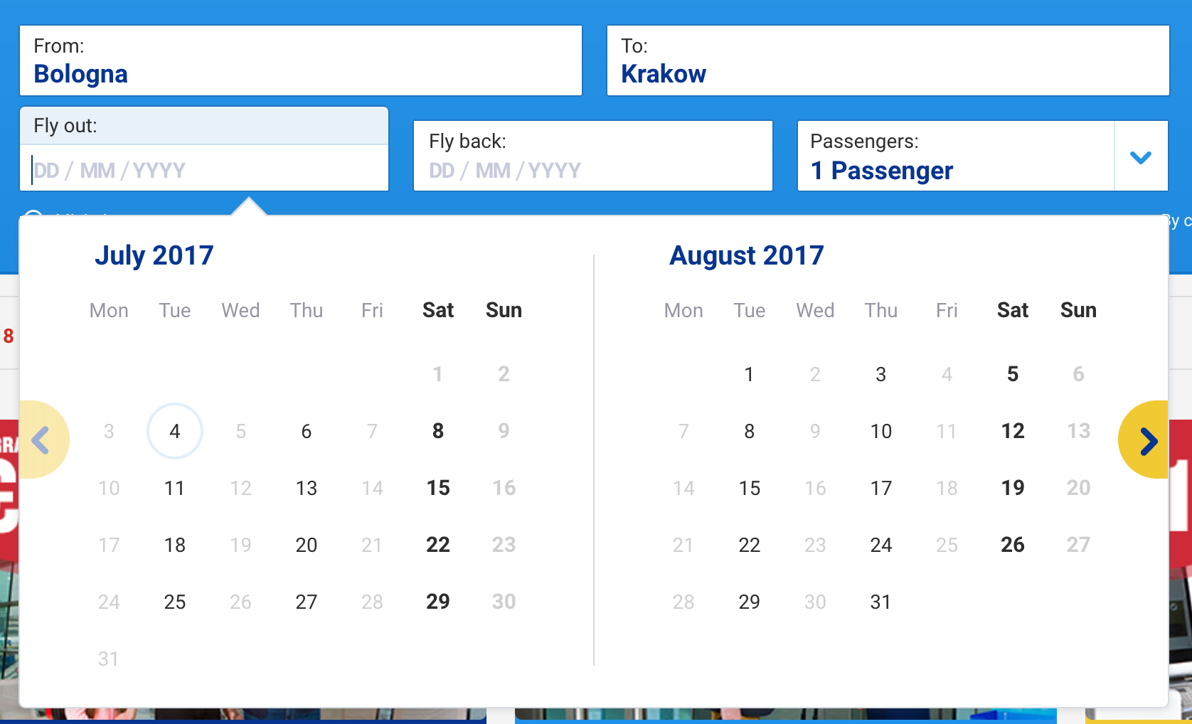
For example, booking interfaces usually ask users about the destination of their journey before asking for the dates. While the calendar overlay should, of course, be triggered by a tap on the icon and in many cases the input field, what if it was triggered automatically once the user finished the preceding input?
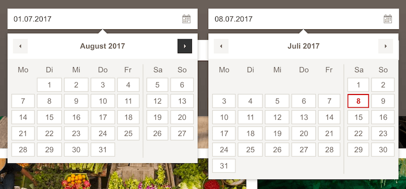
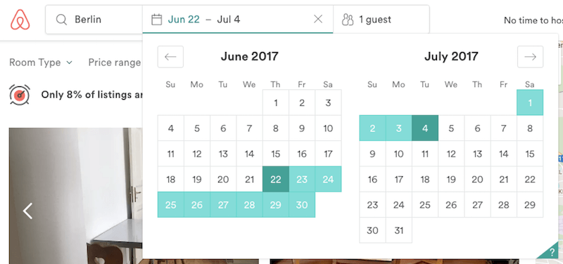
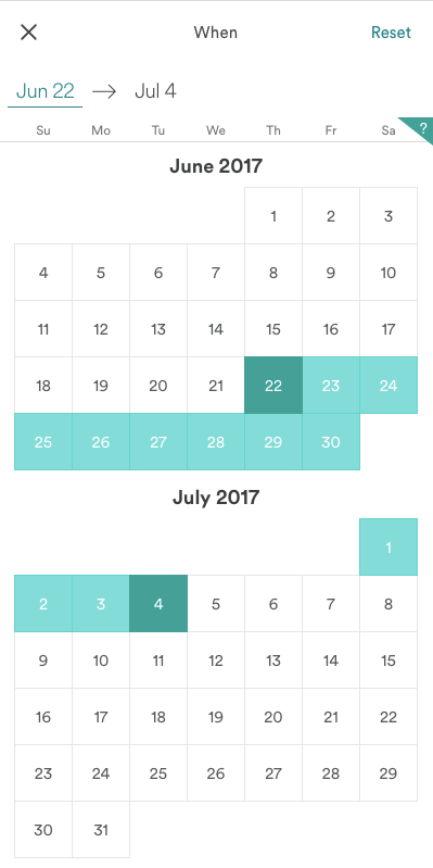
Ryanair, for example, seamlessly drives the user forward through the input, displaying the date picker automatically. When the initial date selection is done, the second date picker for the end date is triggered automatically. In an ideal scenario, then, defining a date range takes just two taps, unless you have to switch between months. The interface takes care of this issue: At any point of time, the date picker displays the view with two months at a time (on both narrow and wide screens). Because most journeys are unlikely to span more than two months, jumping between months is often not necessary, and input can be achieved much faster. Unfortunately, the website is hardly accessible, which makes input literally impossible with voiceover.
The selected range is visualized immediately by connecting the dates visually in the calendar with a background color change. This range should be announced by a screen reader as well when a selection is made.
This simple technique boosts completion of the date-range input because no click or tap on the date-input field or icon is required in the entire interaction. By always moving forward in the form, the user never has to actively switch or think about the date selection — everything is literally just a tap away.
Keyboard Shortcuts For Date-Range Pickers
It’s all good if a date picker is used every now and again, but what if you wanted to really power-boost the experience for your frequent customers? What are the common issues that keep appearing? How can interaction with a date picker be designed even better?
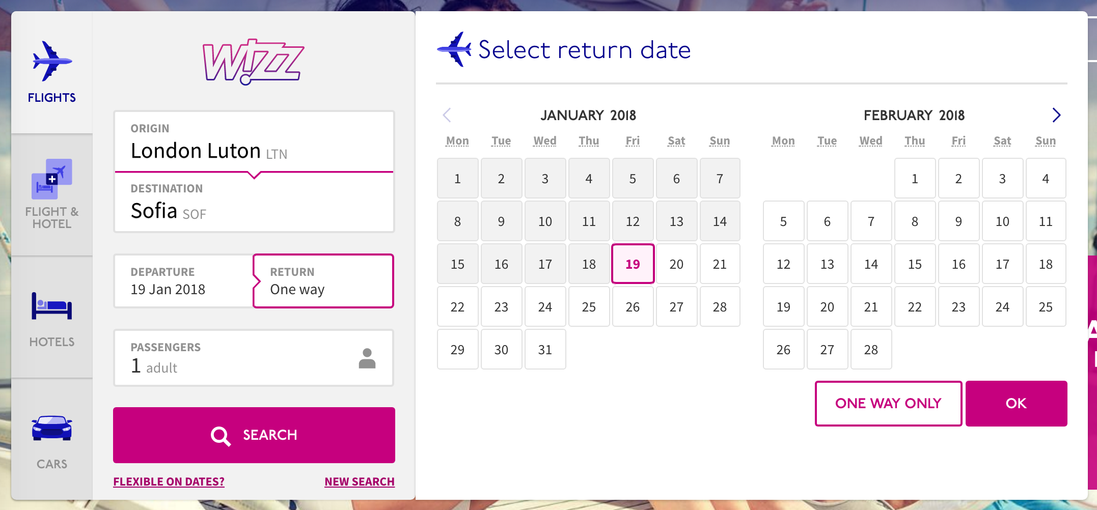
That’s where we need to dive slightly deeper into the features and functionality that a date picker might provide. What if you included keyboard shortcuts to enable keyboard-accessible selection of the date and movement by days, weeks or months? It might be helpful to be able to jump to the first or last day of a week, and to escape to the date input field.
That’s exactly what Airbnb does. In fact, Airbnb’s date picker is open-sourced and can be used right away as a React component — comprehensive and bulletproof, and it supports localization as well. If your customers are relying on a date picker, enabling them to jump between dates via keyboard shortcuts does have a learning curve, but it could be a real boost. It would be quite difficult to make a date picker more powerful than that.
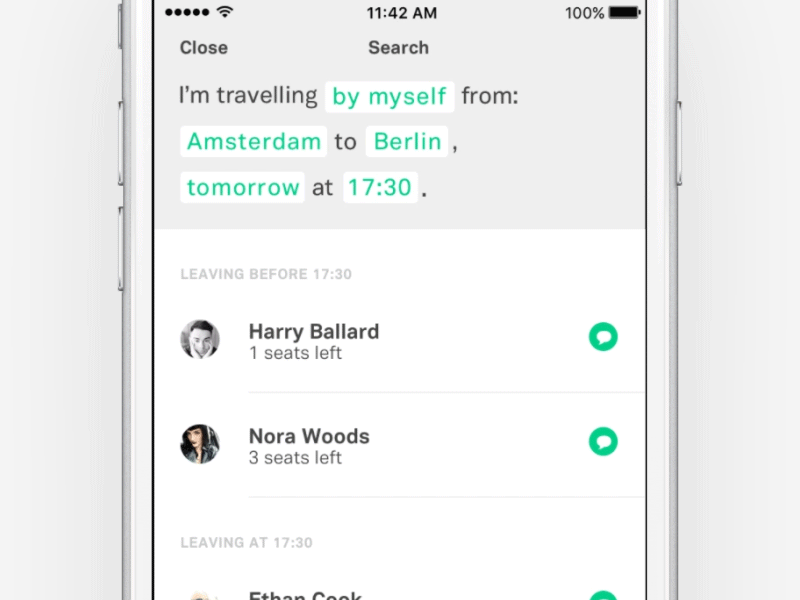
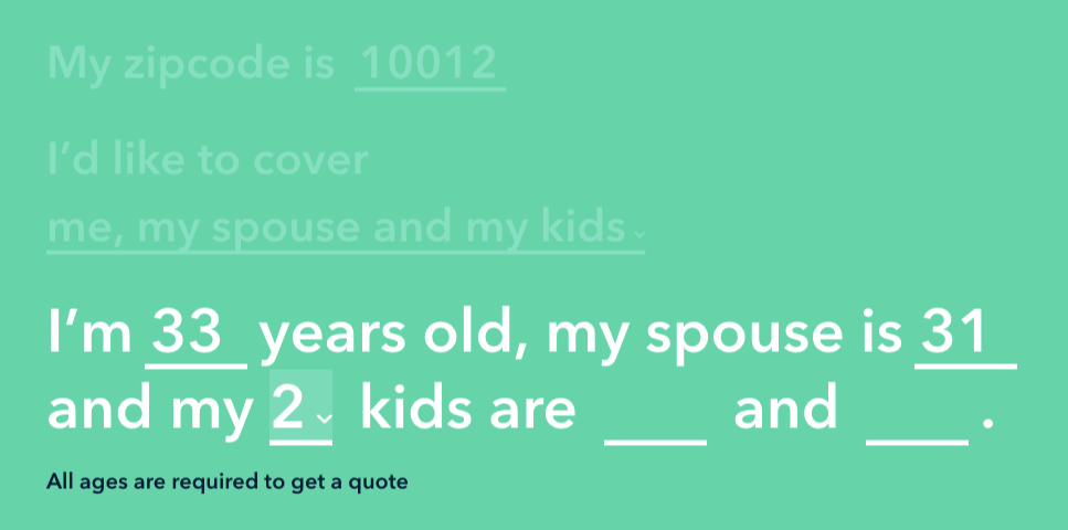
A Date-Picker That Isn’t
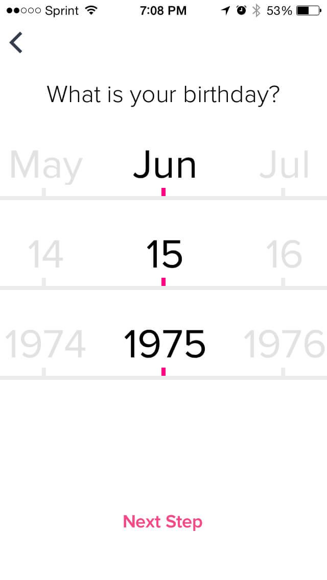
When we think about date selection, we probably imagine a couple of input fields along with a calendar overlay. Date selection doesn’t have to use form elements at all, though. Here’s an idea: What if we used a conversational interface with smart defaults, asking the customer to either type or choose the day, month and year — obviously, with a date picker, just in case the date doesn’t come up in the overview of predefined options. Adhithya Kumar built a quick Invision mockup of what the basic interaction could be like. You’ll find a couple of examples of such interaction below as well.
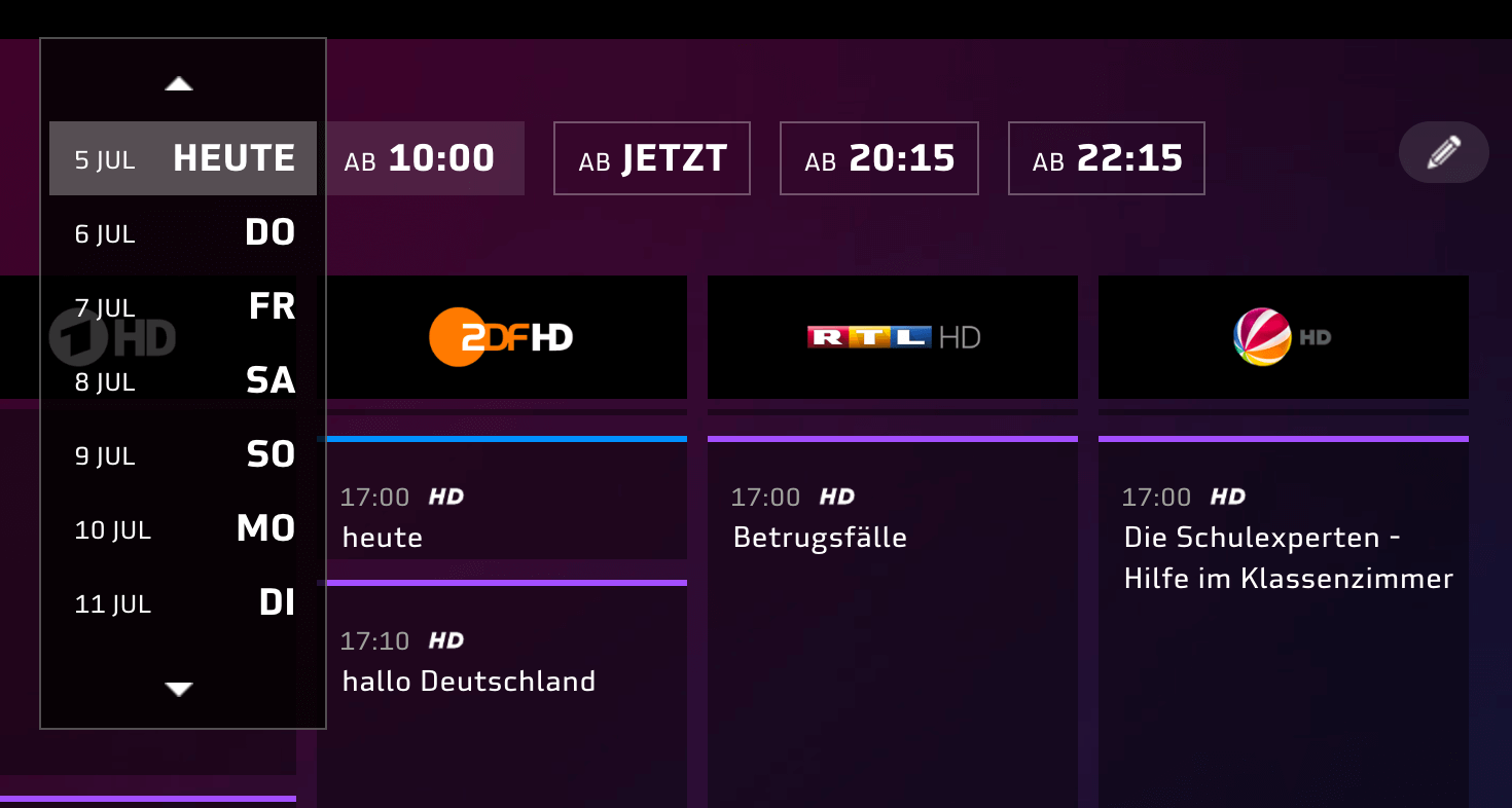
In some situations, asking for the exact date might be overly specific and unnecessary. For instance, a food delivery service might benefit from quick shortcuts to “tonight,” “tomorrow morning” or “Monday,” rather than a calendar overlay. Museum website could offer tickets for the next few days (“today,” “tomorrow,” “weekend”) and a calendar overlay for more precise input. In fact, you could explore most frequently used timeframes and suggest quick shortcuts to the most common selections.
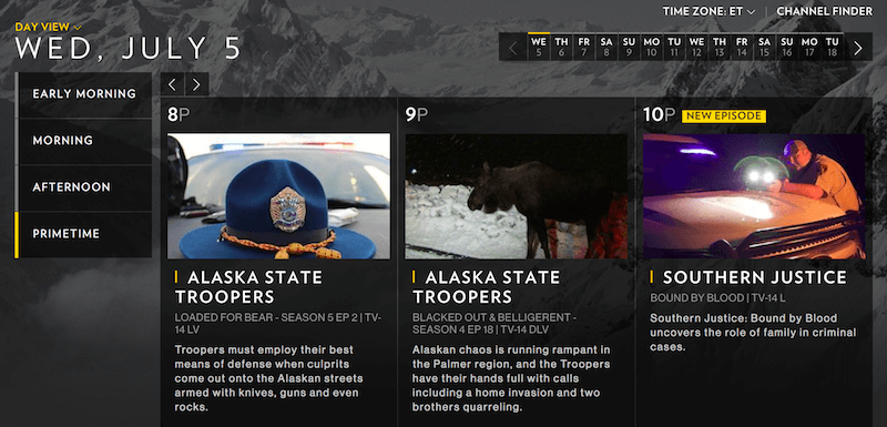
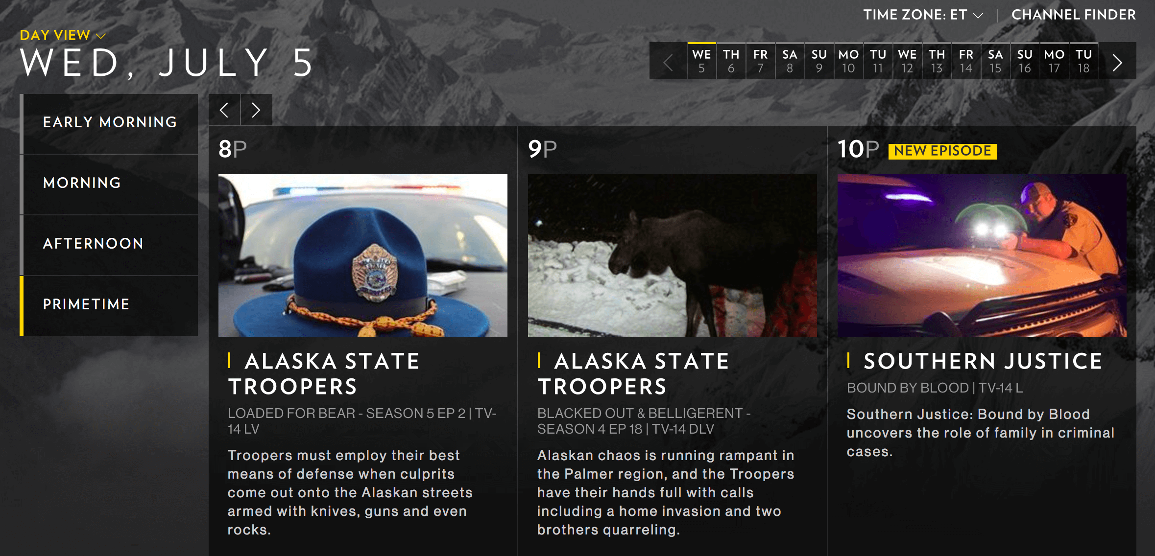
The National Geographic schedule page highlights shows prominently, grouping them by time. A little switcher in the left upper corner switches between daily and weekly views. The mobile view is not available, but it could easily display daily view on mobile (by default), with an option to switch to weekly view, and the other way around on desktop. Common selections (“Early morning”, “Morning”, “Afternoon”, “Primetime”) are extracted from the time picker — a precise input isn’t necessary.
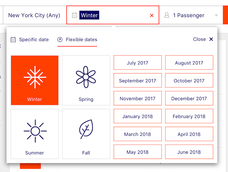
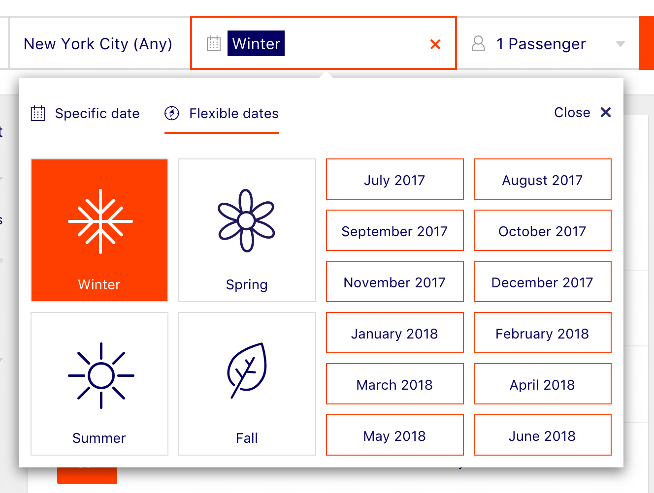
Flexible Dates, Flexibly Picked
If your date input should be even fuzzier than above, or your customers sometimes don’t have a specific date in mind, a date picker should probably be the method of last resort. More often than not, a couple of presets and general suggestions, combined with filters, would work way better than browsing months and years ever would.
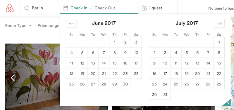
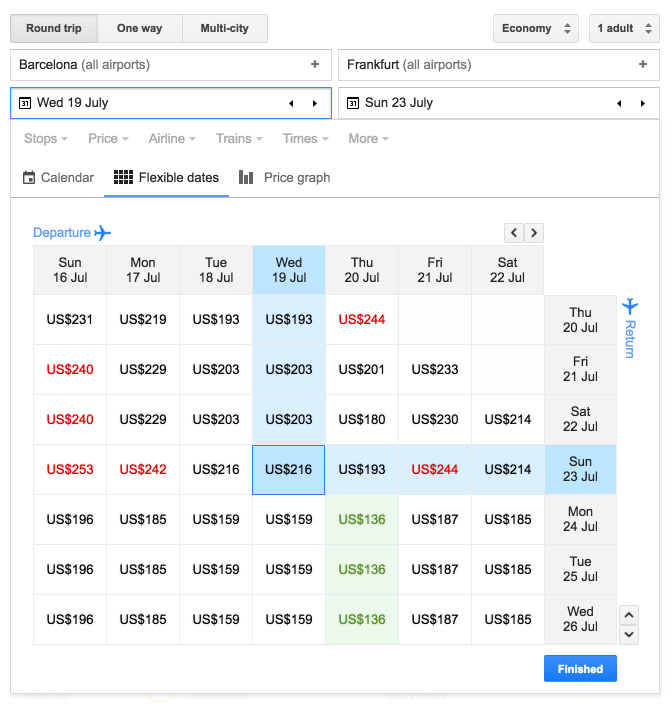
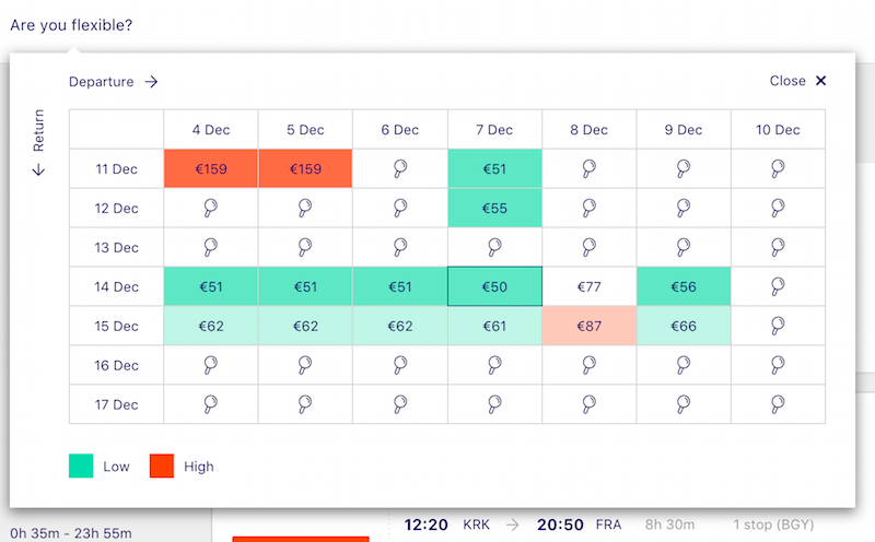
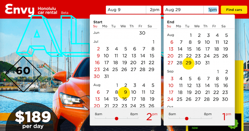
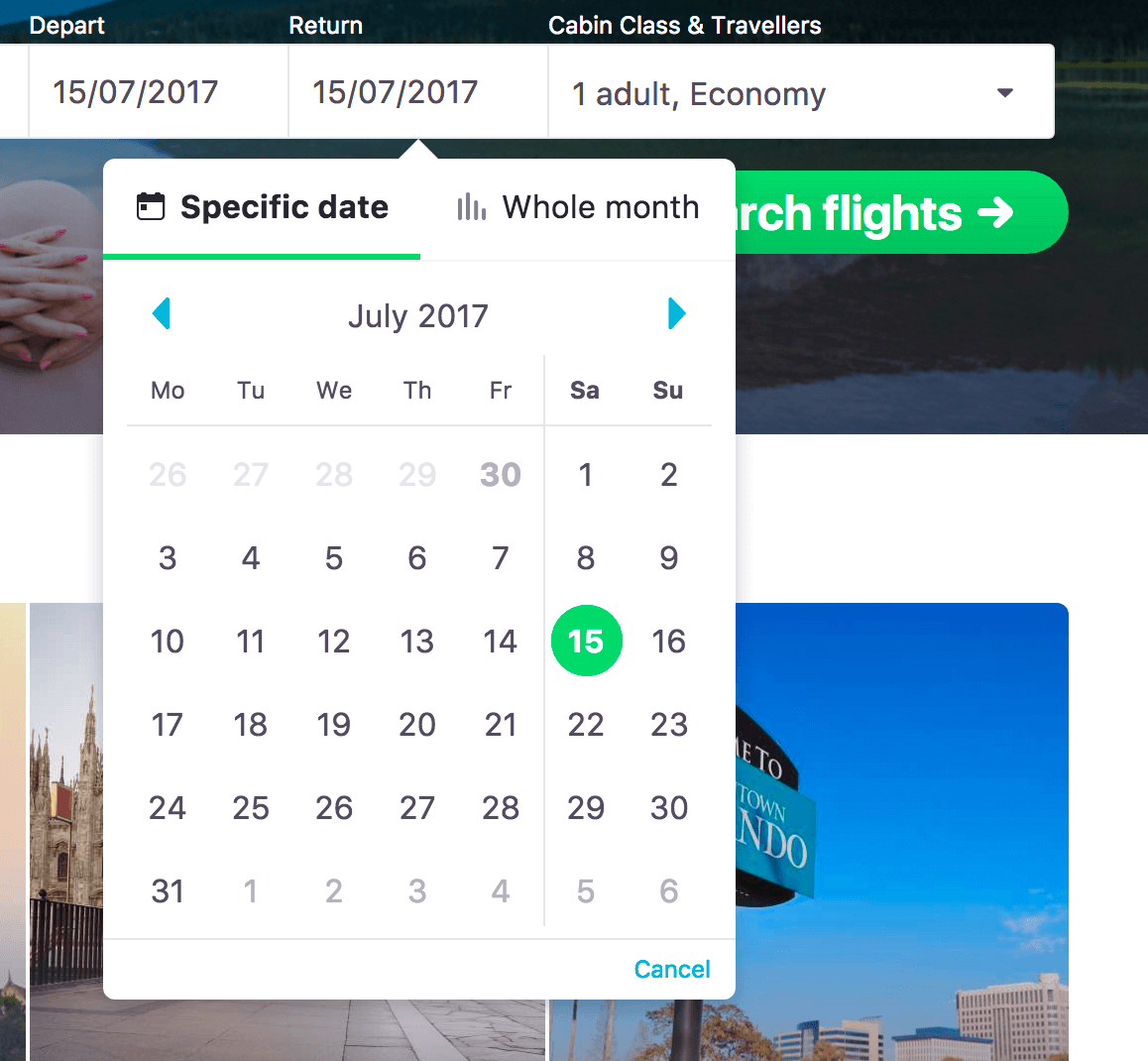
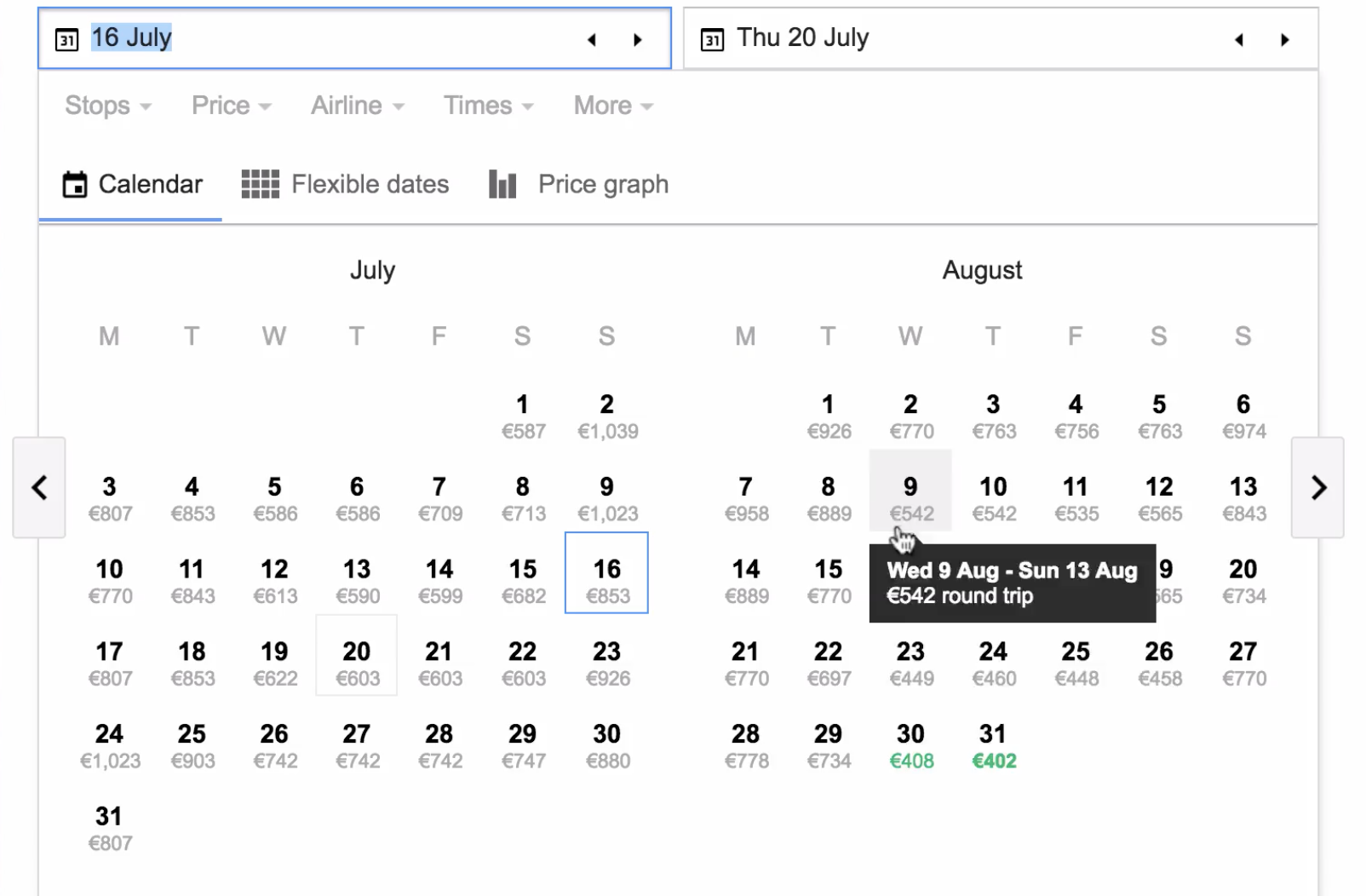
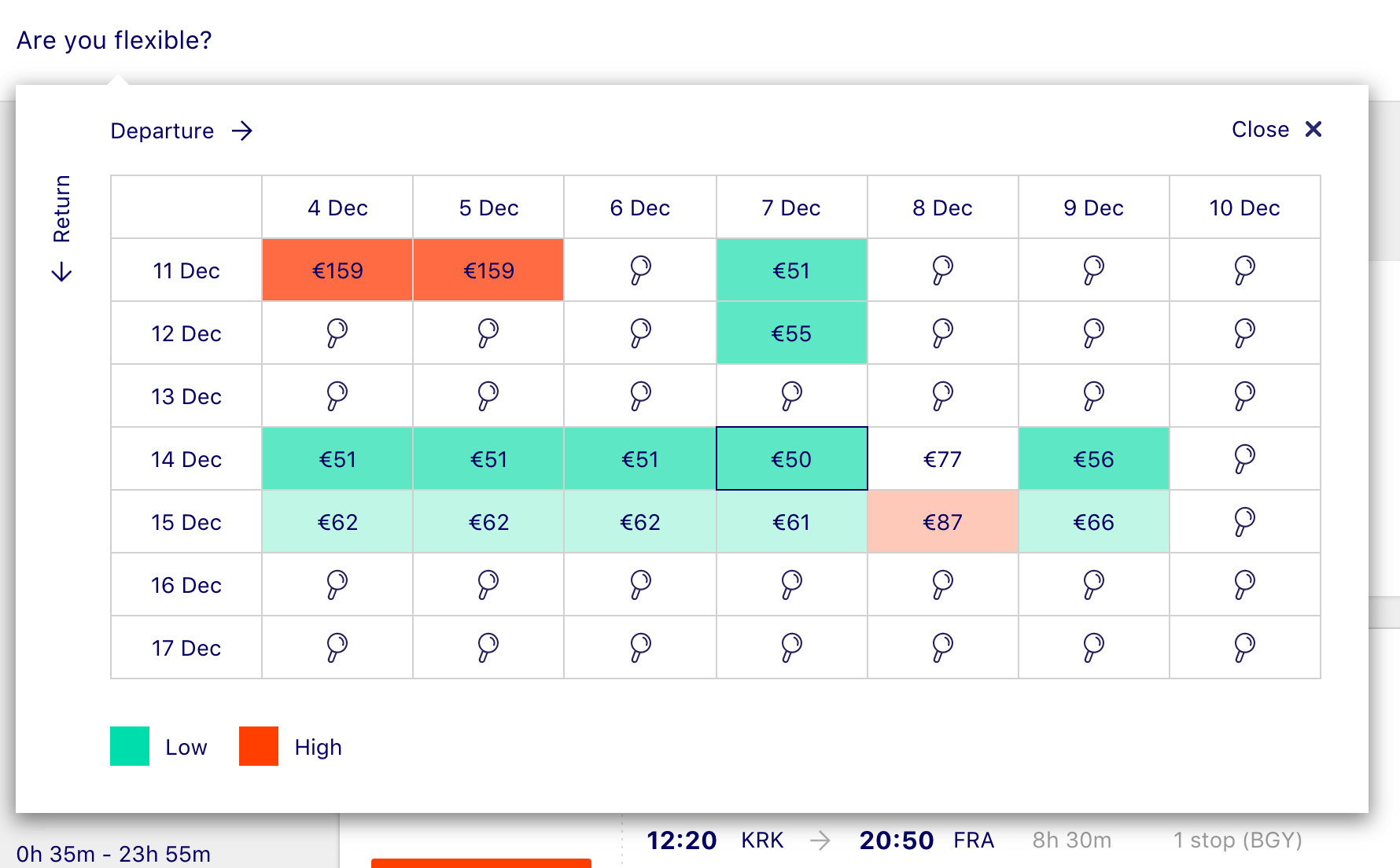
In that case, you could still provide a detailed calendar view, displaying all options at once, and using color coding, for example, to indicate best prices. In fact, that’s what Google Flights displays when flexible dates are selected. However, the option is dropped on narrow screens altogether.
Dohop, on the other hand, uses not only flexible dates but also flexible location as the main feature, prominently highlighting both features as the user starts typing in their destination or date. Instead of the price, the calendar view highlights the availability of direct and indirect flights, as well as whether there are flight days with no connections (based on the user’s defined departure days, for example).
What About A Good Ol’ Slider?
Just like any other input, a date input can also be accomplished by moving the knob of a slider. The good ol’ slider can be used either for a single value input or to specify a date range, and indeed it’s often featured in interfaces where the customer can set a predefined range of dates.
A discussion of sliders deserves another article, but the main problem is that too often they just don’t allow for precise enough input. The wider or the denser the range selectable through a slider, the harder it is to use. In usability tests, you’ll see users desperately try to set the exact date in a slider by moving the knob very carefully and very slowly. If we think about the date or time range — which can vary a lot, and encompass months or a wide range of time slots — then picking one of the options can become quite an adventure on narrow screens.
Sliders seem to work best when the specific value does not matter much, or when you have a very limited set of options to scrub through. Unfortunately, it won’t be the case for most date pickers, especially when the date is adjusted and refined quite frequently.
Where Does This Leave An OS’ Native Date Picker?
At this point, you might be wondering whether all of that effort and all of these considerations are actually worth it. Why not use native date pickers — isn’t that exactly what they are intended for? Besides, because they are native, they will look and behave consistently with the user’s expectations anyway.
The problem with native date pickers is that they are very limited in their design and functionality. For example, it’s impossible to add any details such as availability or pricing to a native date picker to avoid zero-results pages. It’s also impossible to select a date range and highlight the connection between two dates because it doesn’t provide a calendar overview.
Just like with regular numerical input, the starting point and end point require two separate date pickers. Scrolling through dates is predictable and consistent, but because selection requires precision, they become very annoying very quickly in usability interviews. Also, native date pickers aren’t supported in desktop browsers, and so you still would need to design the experience for larger views, essentially transforming a <select> menu into a calendar overlay anyway.
Does it mean that using a native control is always a bad idea? Not at all. If the date input in your case is faster with native controls, and you don’t need a calendar view, then using a native date picker is absolutely reasonable. In fact, while numerical input might have formatting issues due to differences in day formats, the user is more likely to provide proper data quickly this way because native controls cater to the user’s mobile device. However, whenever you need slightly more than just an exact and “stable” date, such as a birthday, then native date pickers seem to hit their limitations quite quickly.
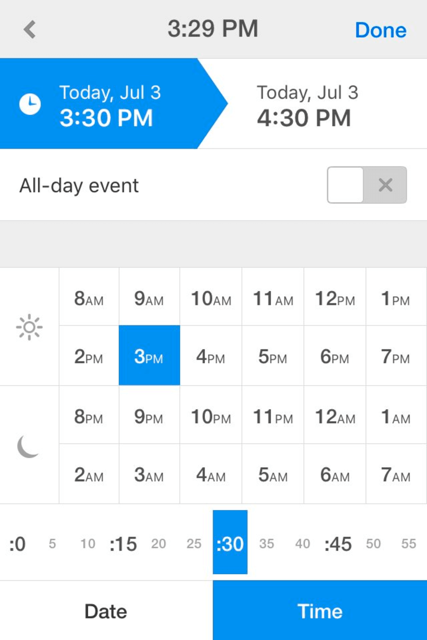
Bringing Time Slots Into The Game
Things get slightly more complicated when, in addition to a date picker, you also need to provide a time-slot picker. The easiest way to achieve time selection would be by providing an extra input field as a step after the date has been selected. This brings us back to square one again: That input field could support manual input, or contain a mini-stepper, or prompt a custom drop-down, or appear as a slider or be a native <select> menu.

But what if we look at this issue from a slightly different perspective? Now, a typical example of an interface with a time picker would be booking an appointment or a restaurant reservation. In these cases, both the date and time matter, but sometimes the date matters a bit more, whereas other times, time matters a bit more. One thing is certain, though: Choosing a date isn’t helpful if there are no appropriate time slots on that day. Wouldn’t it be more reasonable, then, to ask for the time slot first, just to display all available days with the time in question (or closest slots) for quicker selection? In that case, time selection acts as a filter to remove all unavailable days.
In fact, when it comes to appointments, a good number of users have a certain time slot in mind, because the day might be packed with work time and family matters. The selection of time, then, can’t be a radio button, but rather a multi-select group, allowing for various options at once.
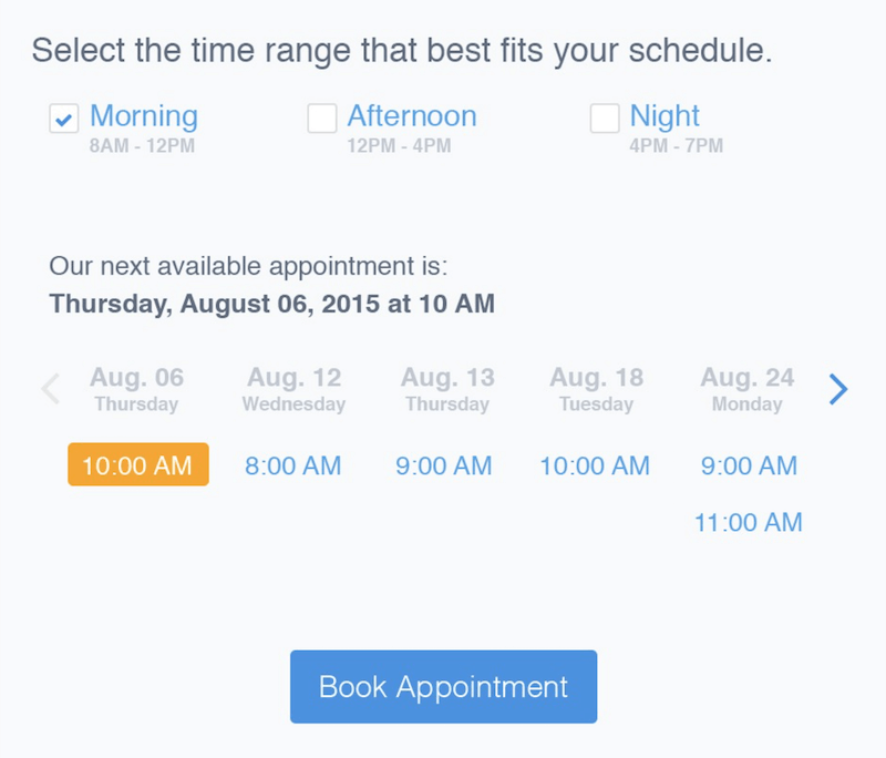
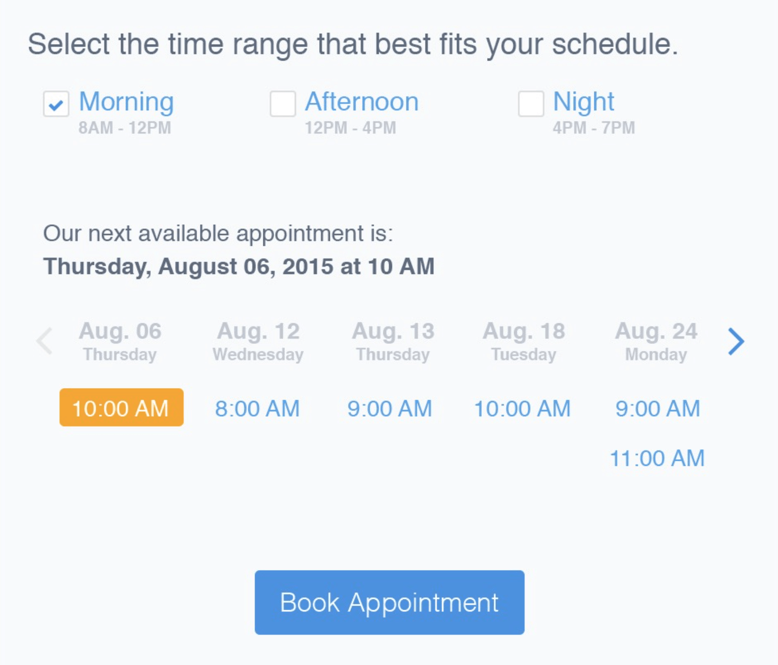
In fact, that’s exactly the idea that Matthew Talebi suggested recently. Prompt the customer to select the time range that best fits their schedule (morning, afternoon or evening), and display next available appointments in a list, available for booking.
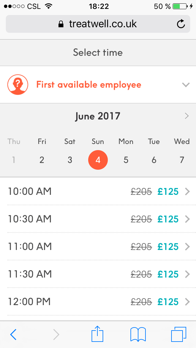
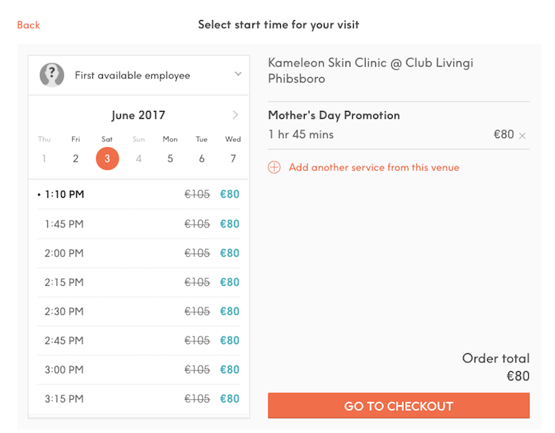
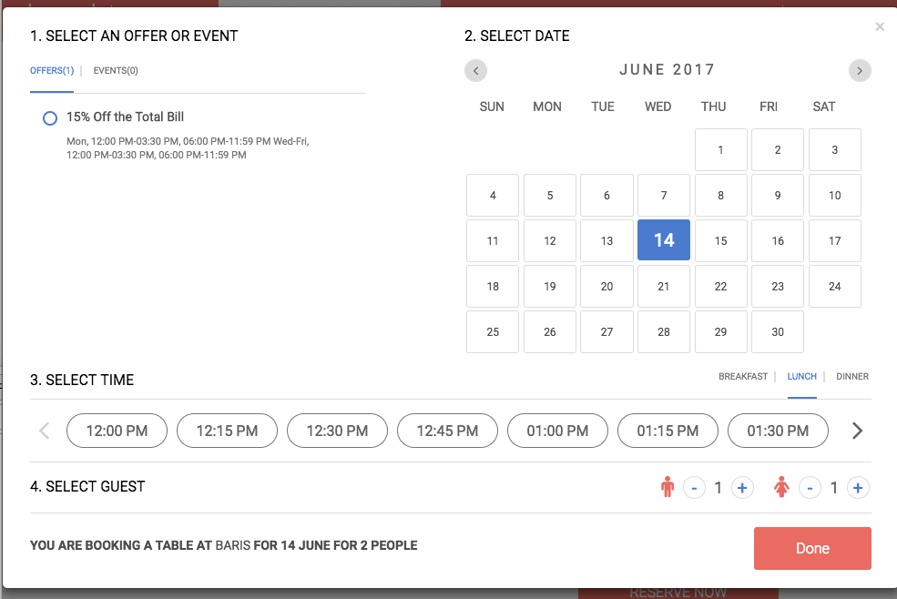
Alternatively, you could combine date and time selection in one screen as well. On Treatwell.nl, customers can slide through the days horizontally while the list of available time slots appears horizontally — with the price displayed inline. That’s a slightly more compact way to combine date and time pickers in one place — and it’s quite common in TV guides as well.
Envy.rent extends its date picker with a slider for selecting an approximate time slot to pick up a rented car. A precise slot doesn’t matter much in that case, but a group of checkboxes would do the job here as well.
The Calendars 5 app uses a sort of tabbed navigation to switch between date and time selection. The panel at the bottom is easily accessible for the thumb. The time view, though, has a very unusual layout for time selection, with options grouped by daytime and nighttime, and minutes listed in a slider, basically resulting in 36 clickable buttons. A slightly better way to provide exact input would be to use a native control or progressive disclosure, where we could display only AM or PM first, and then allow users to dive into specific hour or minute input if needed.


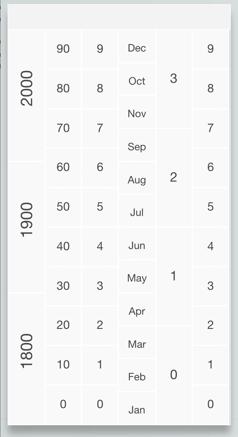
If your problem is very specific, you might explore alternative designs altogether — the date-picker overlay doesn’t have to contain a calendar view, but could rather be a group of pre-defined buttons to “construct” the date. Alternate Date Picker is designed with the goal to provide the easiest way to define a date from very wide range of dates (1800–2999). The selection doesn’t require keyboard input, nor does it prompt a calendar overlay or slider. You just tap on buttons to build the date. (Thanks to Slav for heads up in the comments!)
Localization And Accessibility Issues
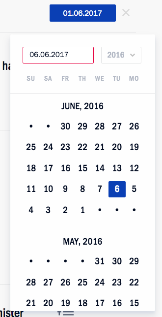
Localization matters. Whether you are using a date input or time input, it’s critical to have some sort of strategy of how you will target specific regions of the world to avoid misbookings. You could use a combination of drop-down and numerical input to minimize the number of mistakes made, like Gmail and Yahoo do for input fields. But at least when it comes to the calendar view of weeks, you’ll need to dynamically switch between US-formatted dates and EU-formatted dates, for example — and potentially consider Hijri, Hebrew, Chinese and your user base-specific calendars in addition to Gregorian calendar as well. You can always check the Date Format By Country Wikipedia page as a reference as well.
Making one of those date pickers accessible isn’t trivial, because date selection should be keyboard-accessible and you would need to toggle between open and collapsed states. You can find an overview of accessible date pickers. Also, consider looking into Whatsock’s examples.
Summary
Looking back now, what can we do with a date picker? We can combine day, month and year into one input field, add a fancy calendar icon, and prompt a calendar overlay that exposes the main purpose of the calendar prominently. We could use smart inputs, a mini-stepper and flexible dates, and we could allow users to switch between week and month views or change the level of fidelity of the calendar accordingly.
We could even consider two separate views — a big-picture calendar along with a detailed list. The transition from start date to end date should be seamless and should happen without prompting a second calendar, just with a few taps. Typing in an input field might be less annoying than scrolling through the select wheeler or jumping back and forth between months and years. And to help users find the perfect day, we can expose the most relevant detail, such as availability or pricing, in the calendar as well.
Perfect Date And Time Picker Checklist
If you’re about to design a date picker, here are all of the questions you might have to ask yourself in order to choose the right solution for your problem:
General Questions
- Decide whether you are designing a date picker, a date-range picker or a time picker.
- Is the flow between input fields and calendar overlay seamless, with the next step triggered automatically?
- Is date picker the right pattern to use for date selection in the first place? Would it be faster to have predefined options as radio buttons instead, or a slider, or a native OS date picker, or a conversational interface?
- How do we avoid displaying unavailable dates or zero-results dead ends?
- Consider localization techniques; for example, a mix of a “month” drop-down and manual date input for month and year for birthdays.
Input Field Design
If the date is likely to be quite far in the past or the future (for example, when booking a vacation), a numerical input with a date picker might be a good option. If the date input range is usually quite short (less than six weeks, such as when booking a medical appointment), definitely consider adding a mini-stepper for quicker jumps.
- Should the user be able to type in a date in the input field or only select predefined values using a calendar overlay?
- With a numerical input, is inline validation robust and reliable enough for various separators and ill-formatted inputs? Is it also keyboard-accessible?
- Do we allow for “smart” date input? For instance, do we accept “three days ago,” “yesterday,” “next week” or “in July” as an input?
- Should the date-picker contain preselected default values? If yes, then what values will be default?
- Do we keep the expected date format suggestion (placeholder) when the user activates the input field?
- Persist data after a page refresh, and add a “Reset” link to enable the user to cancel their input easily or not?
- Do we add a mini-stepper navigation for quick jumps between days, months or years — right in the input field and in the calendar overlay?
Calendar Overlay Design
Ideally, providing numerical input, a calendar overlay and a mini-stepper seems to be a safe bet, as long as numerical input is reliable enough.
- Ideally, any date selection should be achieved within at most three taps.
- Should the date-picker overlay appear when the user clicks on the input or with a click on the calendar icon (or both)?
- How many weeks, months or days would you display in a given view?
- How do we incorporate any localization techniques? For example, should the week run from Monday to Sunday or from Sunday to Saturday?
- How do we indicate the current day and time in the calendar overlay?
- Should we include some sort of “previous, current, next” mini-stepper for quicker navigation?
- Figure out the critical detail that’s important to your customers and expose it prominently. It could be availability, pricing, public holidays. Use colored dots or background color-coding for different options.
- Did you make sure that the date-picker disappears when the user clicks outside the date-picker overlay? Do you have a “close” button as well?
- Is it possible to escape to the numerical date input field?
- Should user be able to clear the selection with a “Reset selection” button?
Date-Range Picker Design
- Ideally, any date-range selection should be achieved within at most six taps.
- Is the selected range visualized immediately by connecting the dates in the calendar with a background color change?
- Is the range announced by a screen reader as well when a selection is made?
- Have we considered the design of the “flexible dates” picker?
- Do we use keyboard shortcuts for faster navigation between days, months or years?
Time-Picker Design
- The simplest option is to combine a vertical slider for days, with a horizontally laid out data list of time slots.
- What’s more useful: asking for the time slot first, or for the date first? Time selection could act as a filter to remove all unavailable days.
- Consider adding most frequently used timeframes and suggest quick shortcuts to the most common selections.
And that’s a wrap! Perhaps you had very different experiences than the ones mentioned in the article? Let us know in the comments to this article! Also, if you have another component in mind that you’d love to have covered, let us know, too — we’ll see what we can do!
Stay Tuned!
This article is part of the new ongoing series about responsive design patterns here on yours truly, Smashing Magazine. We’ll be publishing an article in this series every two weeks. Don’t miss the next one — on fancy (and not so fancy) responsive car configurators sliders. Interested in a (printed) book covering all of the patterns, including the one above? Let us know in the comments, too — perhaps we can look into combining all of these patterns into one single book and publishing it on Smashing Magazine. Keep rockin’!
Other Resources
- “Calendars UI Designs” UI Movement
- “Date Picker” (slightly outdated), Robert Leotta, Pinterest
- “UI Mechanics of a Date Picker,” Adhithya, UX Design
- “Baremetrics Date Range Picker (but with jQuery dependencies), Baremetrics, GitHub
- Flatpickr (a lightweight and powerful date-time picker)
- Accessible Date Picker
- React Dates, Airbnb, GitHub
- “Awesome JavaScript: Date Libraries” (a growing repository of JavaScript libraries for parsing and formatting the date correctly.)
Further Reading
- Modern Technology And The Future Of Language Translation
- Five-Second Testing: Taking A Closer Look At First Impressions (Case Study)
- An Actionable And Reliable Usability Questionnaire With Only 7 Items: Inuit
- Product Reviews And Ratings UX: A Designer’s Guide
 (al, yk, il, mrn)

