Designing The Perfect Slider UX

Email Newsletter
Weekly tips on front-end & UX.
Trusted by 182,000+ folks.
 Register for Free
 Celebrating 10 million developers


 Custom Web Forms for Angular, React, & Vue. Your backend.
We’ll look into the fine details of designing better slider controls for selecting a value or a range of values. Think of price range sliders, 360-degree-view sliders, timeline sliders, health insurance quote calculators, or build-your-own-mobile-plan features.
In all of these use cases, a slider is helpful because it allows users to explore a wide range of options quickly. For precise input, a slider can never beat a regular input field, but we can use a slider to nudge our customers to explore available options and, hence, aid them in making an informed decision.
However, more often than not, sliders are just a bit too difficult to use, require just a bit too much precision, are a bit too confusing to navigate, and are a bit too difficult to grab and move around. After a close look at perfect accordions and date and time pickers, let’s turn our attention to sliders, with do’s and don’ts and things to keep in mind when designing one. But first, we need to figure out when a slider makes sense in the first place.
Table Of Contents
- When Do We Need A Slider Anyway?
- The Many Facets Of Sliders
- “That Slider Doesn’t Belong Here”
- Slider Design Considerations Checklist
- The Rules Of Thumb For Spacing
- Displaying Tick Marks And Current Values
- Choosing The Slider’s Scale
- Eliminating Zero-Results Filtering
- Indicating The Range Visually
- Visualizing The Output
- Smooth ’n’ Silky Sliding, Guaranteed!
- They Ought To Slide, But They Choose To Click
- Enhancing A Slider With Precise Inline Editing
- Visual Feedback On Cursor
- Giving A Slider That Extra Touch
- Contrast and Keyboard Accessibility
- Where Does It Leave Vertical Sliders?
- Summary
- Further Resources
When Do We Need A Slider Anyway?
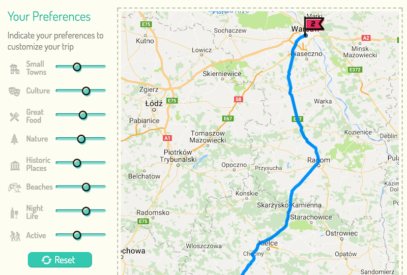
It’s not that every interface would benefit from a fancy slider. However, when we want to expose a variety of options or help users limit a number of options quickly, a slider can serve the purpose very well. In fact, whenever the input is “fuzzy” or not precise, then a slider is probably the first option one would consider — for example, when the user must choose a down-payment range for a mortgage or a time range for an airport departure (i.e. earliest to latest). In this case, choosing an amount down to the last cent or choosing a departure time to the last second isn’t really necessary.
Similarly, when buying a household item like a dishwasher, your customers might want to specify minimum and maximum measurements for the item, so that it’s not too small but still fits the space in their kitchen.
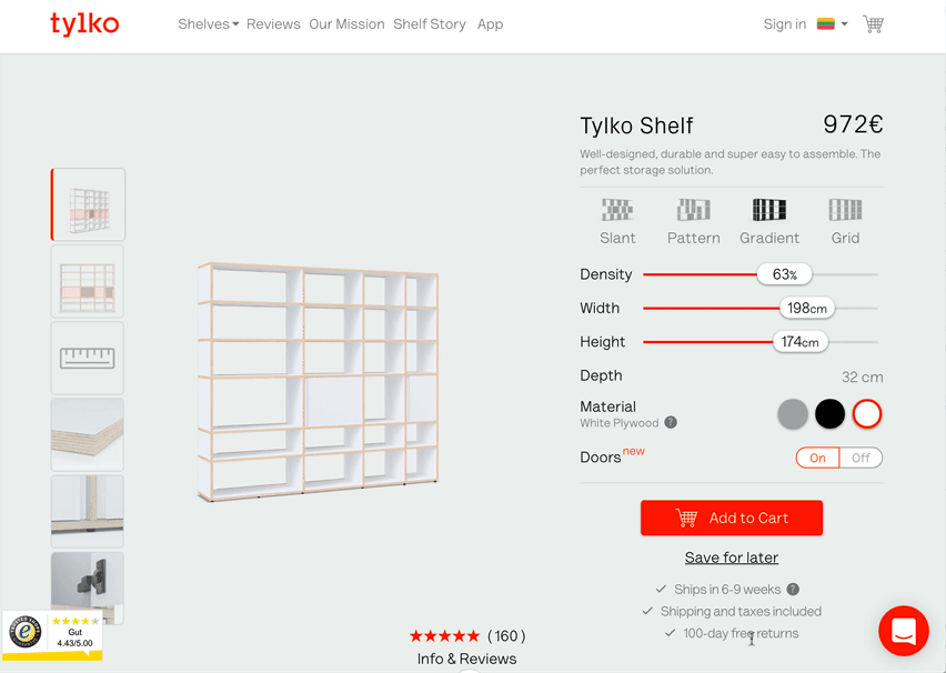
On Tylko, the slider is complemented with a segmented control — options displayed as the users hovers or taps over the product areas. The price is adjusted continually, and the slider is never blocked by changes in input. Minor downsides: Visual feedback when hovering over the track would help, and increasing the padding both for the thumb and the track would help. Also, it would be helpful to be able to tap on the current value and adjust it manually.
When exploring a vacation destination, e.g. on RoutePerfect, users might want to filter their options by activities they’d love to experience. In this case, a slider could be used to enable them to assign weights to various kind of activities, so that the final selection of options are accurately tailored to their interests. Or when dealing with maps, a slider could help users limit or extend the geographical scope of their search.
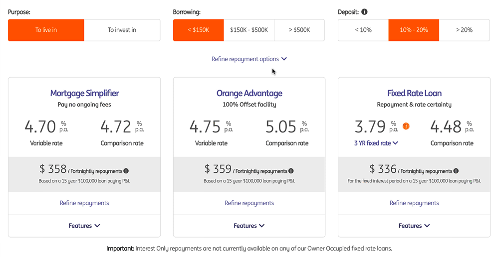
This isn’t to say that sliders can’t be precise. In an online shop, you might want to indicate delivery options, ranging from “Standard” to “Express” to “Priority” to “Overnight.” You could, of course, use a regular dropdown, but then the user would need to choose one of the dropdown options first to see how it affects the total price. A better way would be to use radio buttons instead, explaining how long delivery would take for each option and how much more it would cost. Showing all options in plain sight right away seems to be the better option.
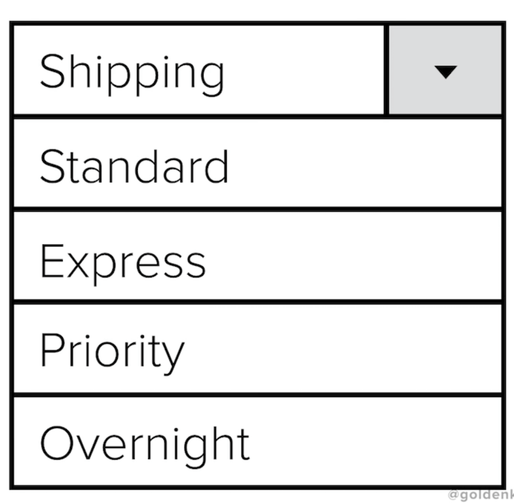

However, users might need time to figure out their best option. Is “Overnight” faster than “Express”? How “express” is “Express” anyway? Is “Priority” faster than “Overnight”? That’s a classic problem for which a slider shines. Once the labels are arranged horizontally, you can use the area above the slider to communicate when the item will be delivered at the latest and what the total price will be, while also perhaps adding an expected delivery time range under each label. The further you slide to the right, the more expensive the delivery and the faster they’ll receive their item. It’s just a bit clearer this way.
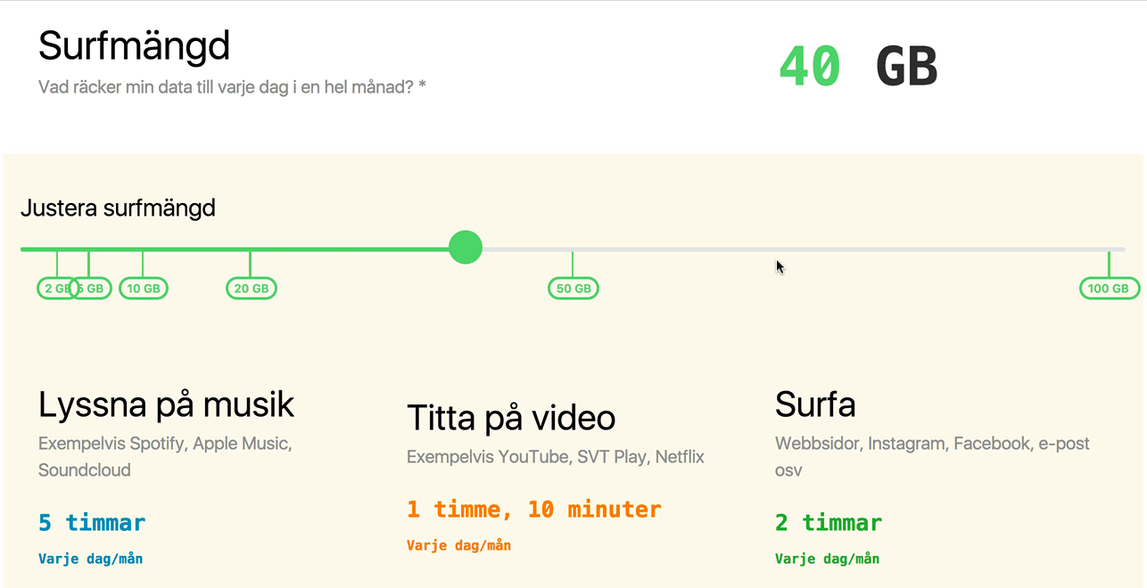
On Swisscom, radio buttons trigger progress bar animations for visualizing a plan. On Surfmangd.se, a plan is explained in plain text, but users can choose any amount of data. If you have only a few distinct plans, then the first option seems to be better, but if the user can choose any plan of their choice, then the animation could be adjusted based on the value on the slider as well.
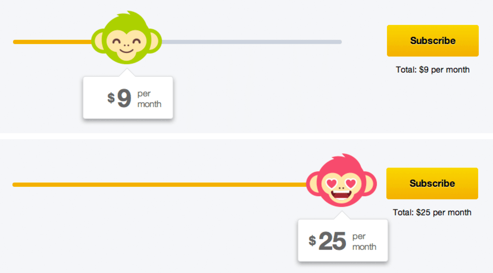
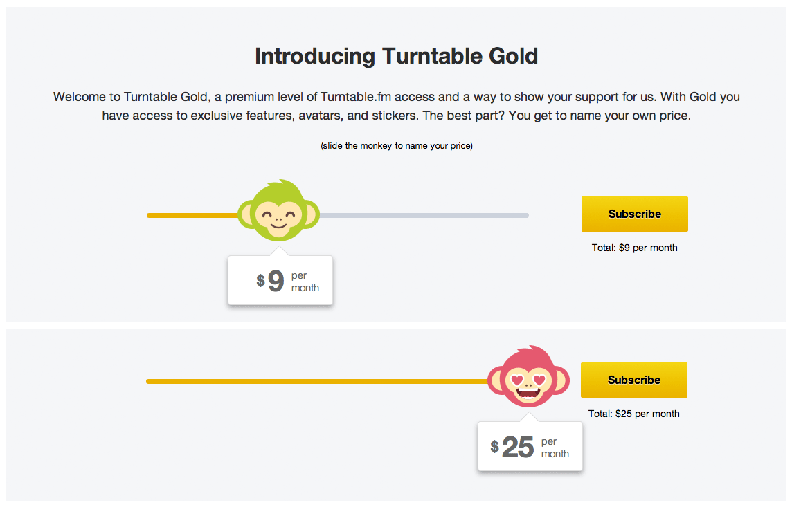
That’s how a slider could be useful beyond filtering: explaining options or informing decision-making. When choosing a mobile plan, for example, the customer could choose how much data they’d love to have and see the monthly pricing adjusted right away. A slider could also be a good extension (though not a replacement) for a pricing table; so, instead of browsing through a (potentially complex) feature-comparison table, users could see the benefits of different tiers of pricing by sliding their thumb horizontally. This also goes for any “pay what you want” kind of service, where the slider could explain what the owner would be able to afford offering with each pricing tier.
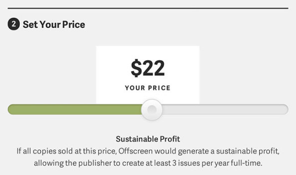
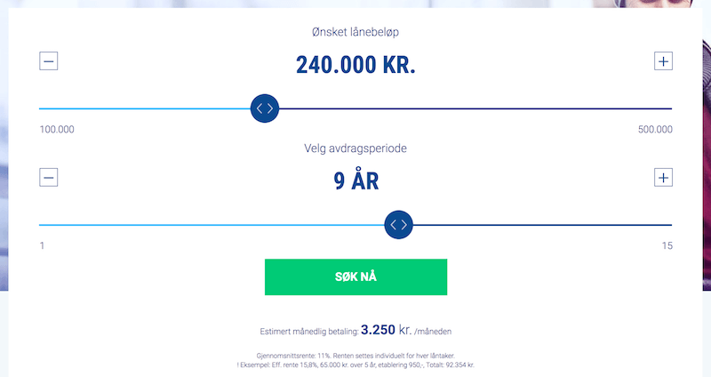
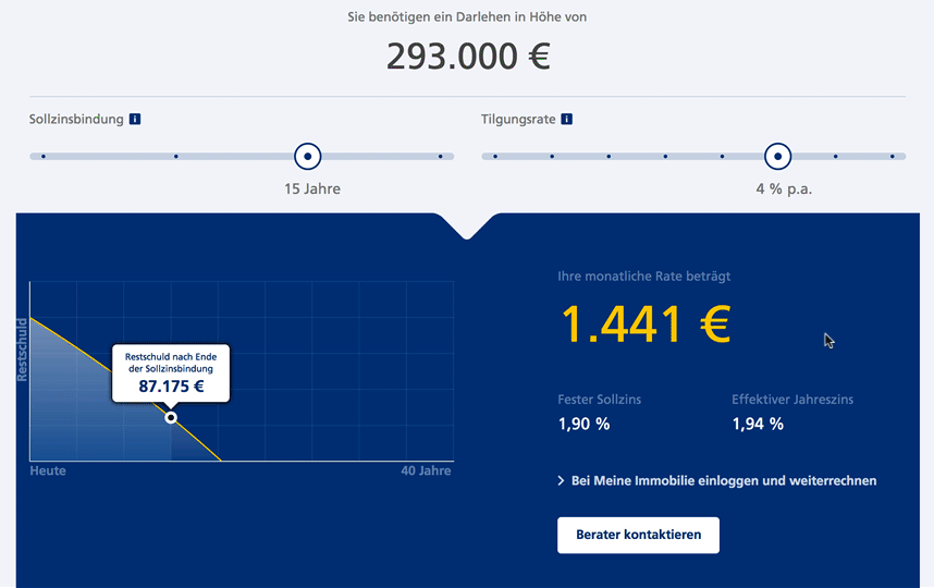
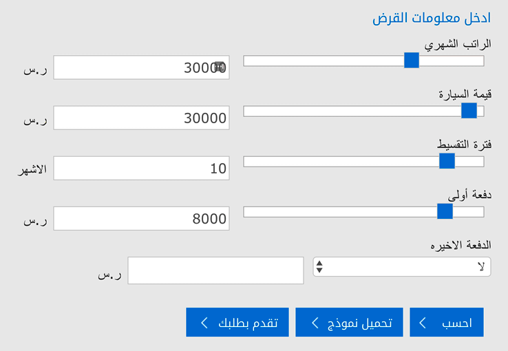
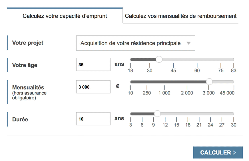
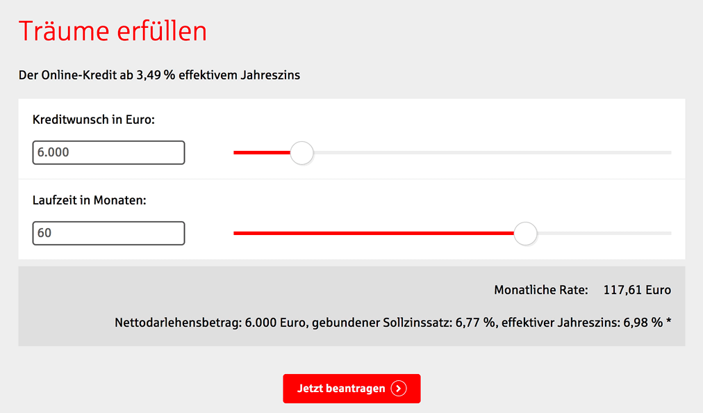
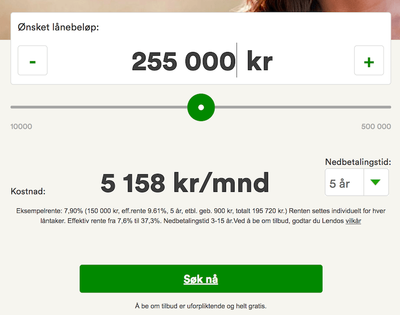
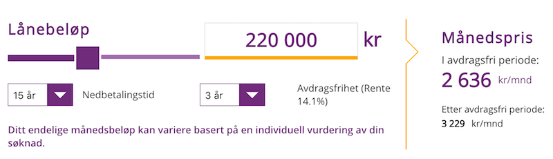
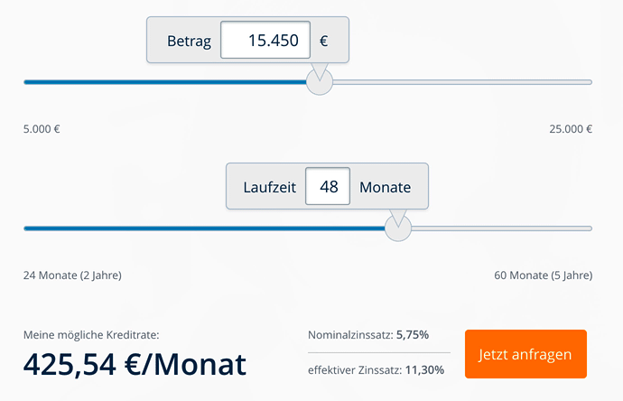
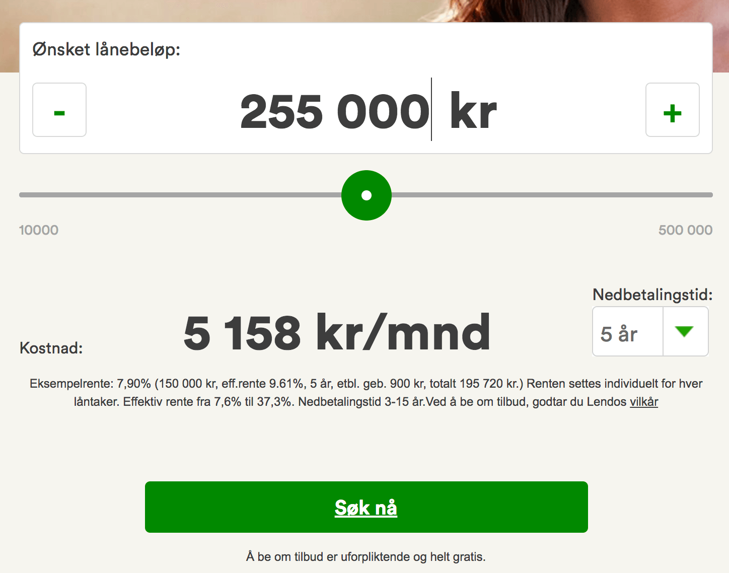
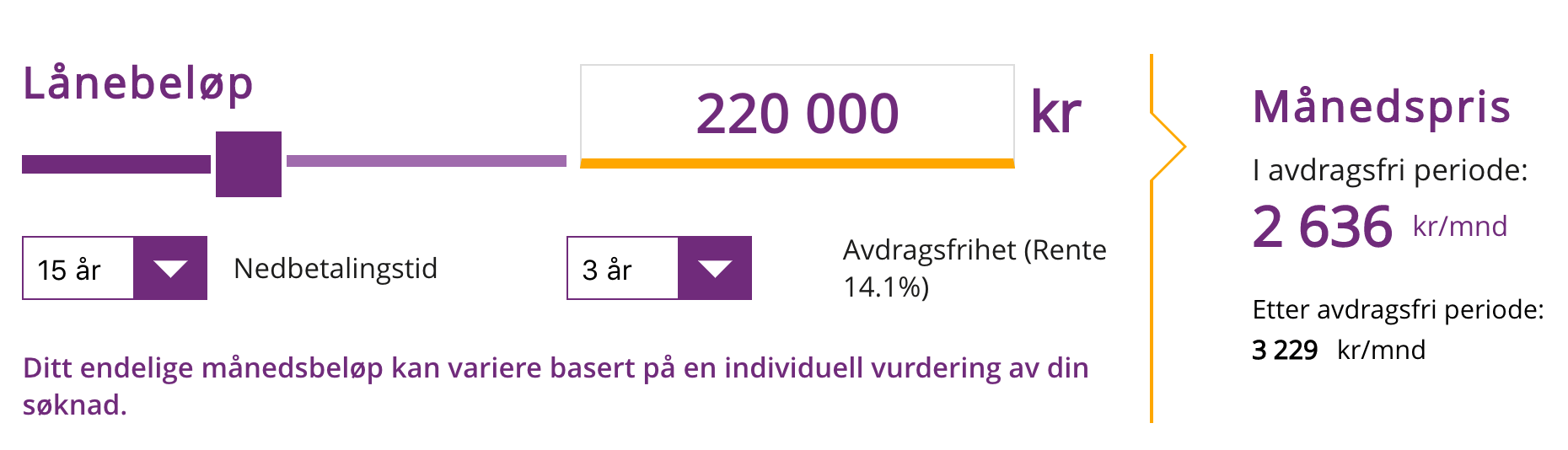
Another common use case where sliders are almost omnipresent is banks and energy suppliers. Most banks will offer house loans, car loans and mortgage calculators, and most energy companies will help you choose your plan based on your household’s energy consumption. In these cases, the actual monthly payment will depend on calculations that aren’t always straightforward and easy to understand, and a slider — showing financing options and the cost of a house or car or initial downpayment — would visualize these options.
In general, every time you’d like to add a “fuzzy” filter to your interface or indicate relationships between options, a slider is an option worth considering. However, a slow clunky slider is way more frustrating than a predictable, generic set of buttons. To be effective, a slider has to be very easy to manipulate, and it has to respond to changes quickly and continually. This requires a very thorough study of the appearance and interaction design of the absolutely perfect slider — and its main building blocks, of course. Luckily (or unluckily), sliders have many facets, and plenty of decisions can (and, therefore, eventually will) go wrong.
The Many Facets Of Sliders
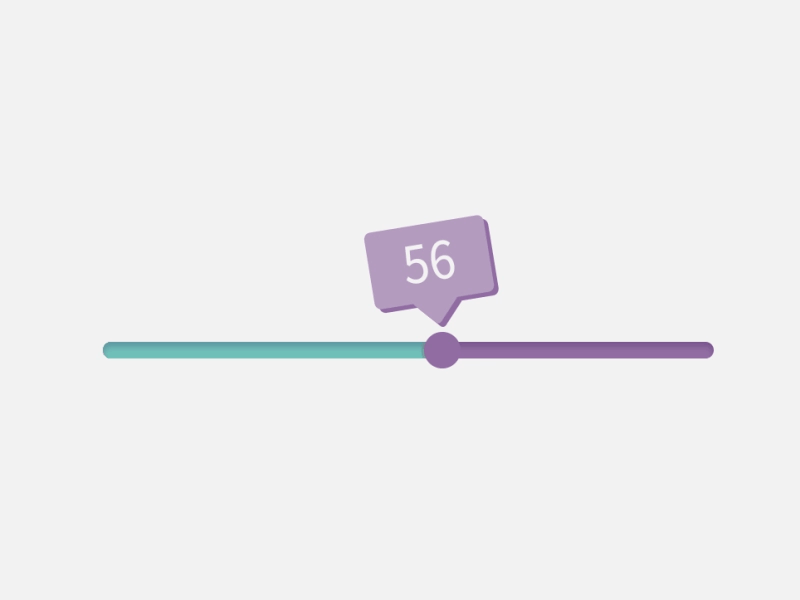
Although a slider seems to be a very simple component, it comes in surprisingly many facets and shapes. Now, every slider has a thumb (also called handle or knob) and a track, which the customer can slide over. As a slider’s value changes, usually the portion of the track between the lower-bound value and the position of the thumb fills with color. Because sliders always control something — be it a single value or a range of values, a pricing tier, a position in 3D space, the level of fidelity of a map, etc. — that something has to be visualized and announced somehow, and its changes will probably trigger some changes in the interface as well.
Quite unsurprisingly, a horizontal slider resembles a timeline or, to be more specific, an audio or video player track, and in many situations, that’s exactly the mental model that we could be tapping into when designing our interfaces. The mechanics of a video player component are well known, and it makes sense to use this established pattern when making small and big decisions about the aesthetics and interaction design of a slider.
That means that, just like in a video player, the ranges should be clearly labelled, and the current value should be clearly visible. If we choose to display a thumbnail or preview or detail view, it should appear above the slider, and as the user slides from left to right, the track should fill like a tank (for example, its color should change). If the slider acts as a filter, then only the selected range on the track would be filled, of course. (The only exception would be a slider that accepts “negative” values as well: in that case the track should be filled from the center (0) to the thumb, clearly showing that the default value is located in the middle.)
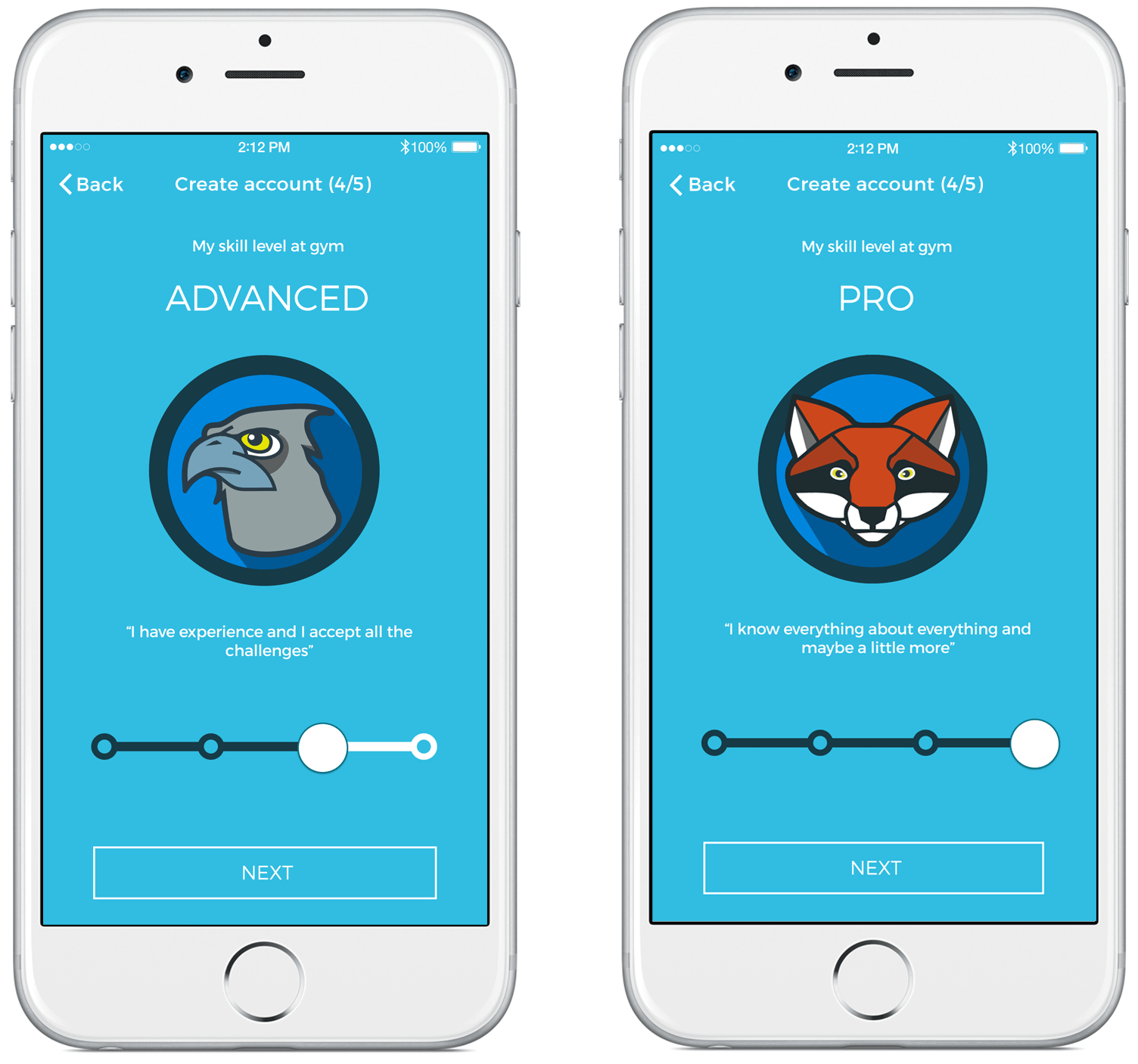
Because there aren’t really many established conventions for the design of slider components, many questions have to be answered by designers. If you look at the Lloyds Bank’s example above, you’ll find that the thumb has an icon indicating dragging. Though not very common, the icon clearly indicates affordance — that is, the possibility of action on the thumb. Adding a visual indicator might not be necessary, but it does raise a question: If you were to add a visual indicator on a thumb, what icon would you choose? After all, there are plenty of options: arrows pointing left and right, greater-than and less-than symbols, a custom thumb image, a rectangular handle?
As it often turns out in user observations, it doesn’t seem to matter that much. However, some users can be confused when they discover an arrow pointing in one of the directions as they feel that the handle can be dragged only in one direction. What to choose then? Personally, we’d probably go with Lloyds’ dragging icon or a large enough circular knob.

Single, Continuous Sliders
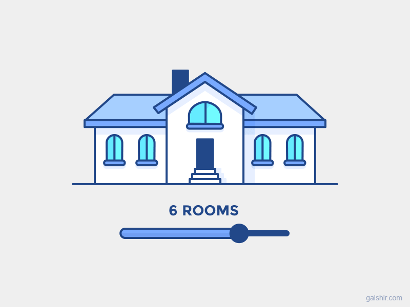
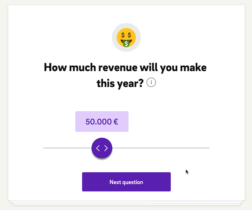
Now, if the main goal of a slider is to choose a single value from a range of values (for example, a mortgage calculator spanning up to 20 years from now), then we can use a single, continuous slider. One thumb and one track to rule them all. For example, almost every single 360-degree-view slider would be a single continuous slider. The position of the thumb on the track would indicate the current value, and this value would be updated as the user slides over the track. To help the user navigate the range of values, we’d probably need to indicate the minimum and maximum values on the slider as well. That’s certainly no groundbreaking news at this point.
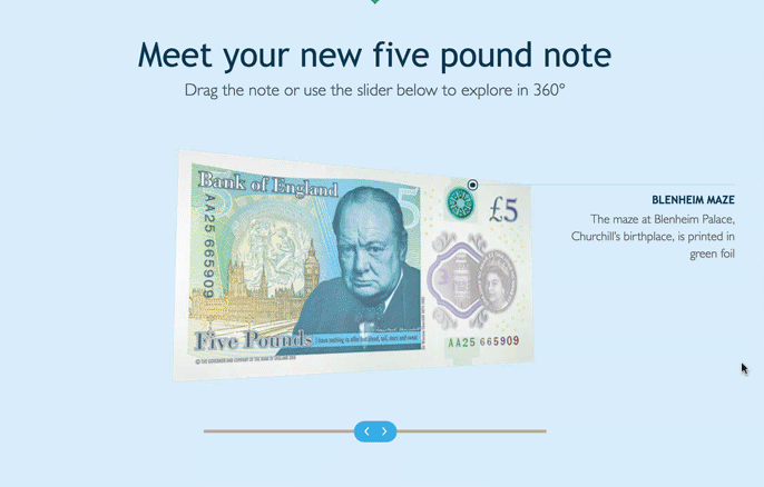
If we want to encourage users to explore various discrete positions or perspectives, a slider can help nudge users to these specific positions. It also provides a clear indication of what to do and allows for interaction with the keyboard. While “Celebrating Canada’s 150th” looks very appealing, it’s not as accessible as The New Fiver. How would you rotate the bill with the keyboard alone?
A single slider is common in cases when we don’t expect users to provide a very specific input. It’s almost like a way out — an option to provide a more relaxed, “close enough” estimate as input. For a mortgage calculator, instead of stating “If I wanted to finish pay off by 15 November 2020, what would my monthly payments have to be?,” a customer can choose “If I wanted to finish paying off by late 2020, what would my monthly payments have to be?” Why does it matter? In this case, the input doesn’t require specificity, but requiring specific input makes it more difficult to consider various scenarios quickly. Jumping to exact dates requires making slow, exact decisions with every variation considered, and that goes against the purpose of the slider, which is to explore options quickly.
The same goes for a project timeframe estimator in corporate settings. A single slider would nicely map with the timeline all the way until the deadline. Based on the input, a slider could also automatically display milestones that need to be achieved to complete that goal. That’s not something you can elegantly accomplish with a group of buttons or dropdowns.
Single, Discrete Sliders
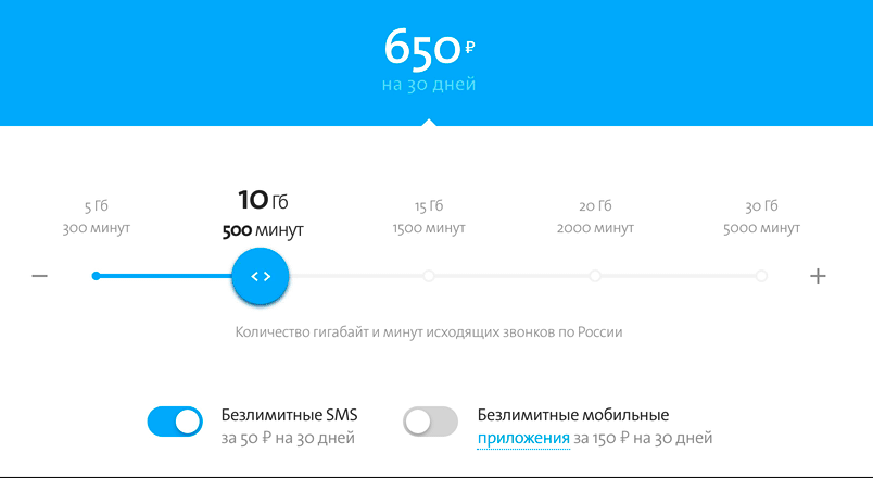
If continuous sliders allow customers to change the values on a slider continuously, discrete sliders allow only for predefined sets of values to be chosen. For example, you might be offering only a couple of predefined mobile data plans, rather than “choose any amount you like” kind of data. In such a case, a discrete slider could nicely present available options.
Some discrete sliders don’t provide a smooth (continuous) transition between states. As a result, navigating between values on, say, Postbank Property Financing slider might feel a bit laggy because the position on the track never actually follows the mouse pointer, but it’s clear that only a few predefined values are accepted.
A quick note: If you have just a handful of options, then you’ll need to actively consider why you’d choose a slider over a set of radio buttons, for example. In general, the fewer the options, the less likely a slider would be a good choice. We’ll discuss this a bit later in detail.
Double Or Dual-Point Sliders
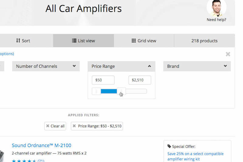
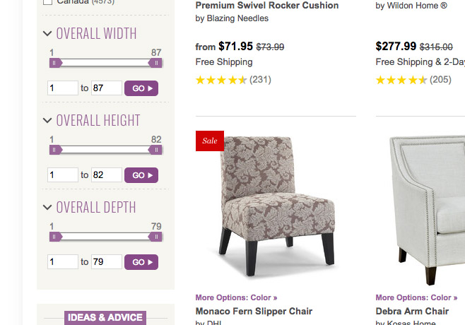
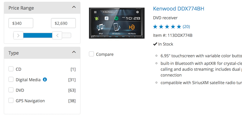
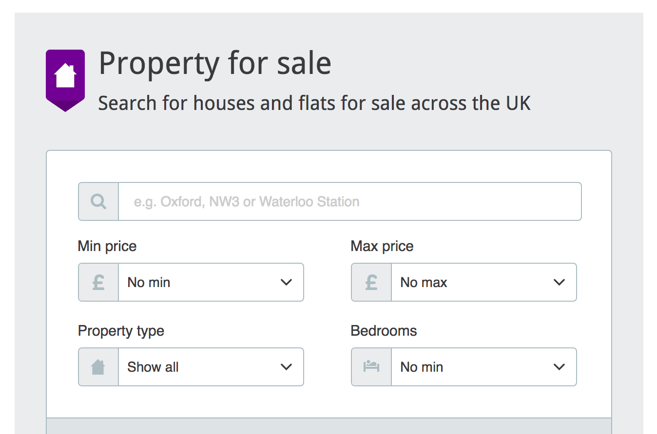
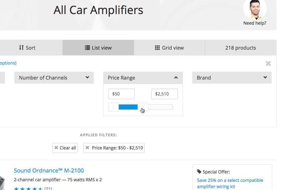
Choosing just one value with a slider might not be enough in some scenarios, though. If we wanted to help users filter out irrelevantly priced items in an online shop, we would need to scope the results. We could just create two sliders — one for the minimum value and one of the maximum values. That’s not necessary, though. Instead, we can use a double, continuous slider (also called a dual-point slider), with two thumbs, indicating the lower and upper boundaries of the range, respectively. Just like with a single slider, we would probably use labels to indicate a minimum and maximum value on the slider’s full range.
In fact, every single price range filter is a double slider at its heart. However, you might wonder why you do not find it in many retail stores. The reason is the speed of selection. Especially with price filtering, users often want to be more precise than they can easily be with a slider — mostly because sliders are often tucked away with other filters (such as size, brand, features, color) in the sidebar, leaving the main content area for the product display. A price range slider just doesn’t yield the same input speed as input values and a set of predefined price ranges in smaller sizes.
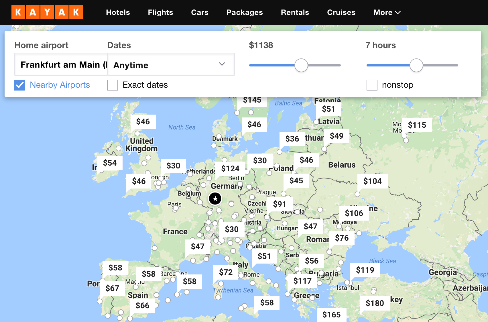
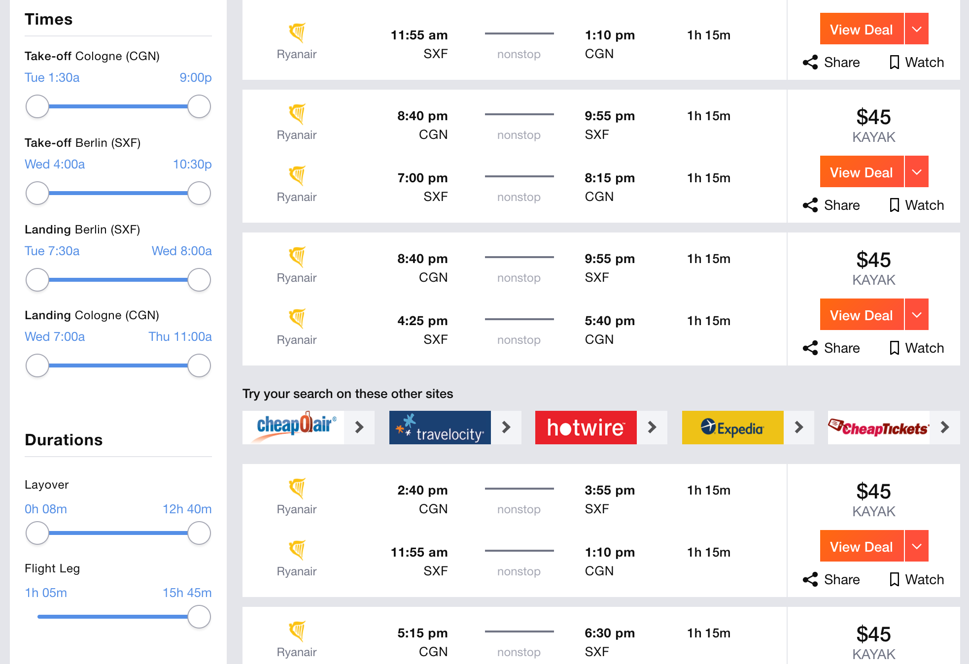
If the user doesn’t have to be specific in their input, then it’s not really necessary to use a dual slider for a price or duration of a flight. Kayak uses a single slider when the user is exploring options but uses dual sliders when the user is searching for a specific flight. For a single slider, the input is interpreted as the maximum value that’s still acceptable. Notice that taps on the track are disabled: It’s possible to only manipulate the handles of the slider.
In fact, while most slider controls tend to be either single or dual, what if we combined both dual and single sliders into one? On the first tap, the user would select a single value, indicating a way to define a range as well. Another tap would prompt a change of the value, while dragging the slider would create a range of values.
Discrete Sliders
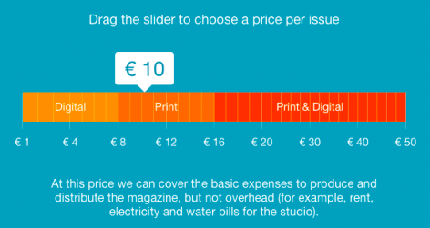
A slider with “min” and “max” labels alone leaves a bit too much room for interpretation. Of course, the selected value on the slider would appear above the thumb as users slide it, but if there are no “landmarks,” then the interaction is nothing but a boring guessing game — a bit further to the left or a bit further to the right to hit just the right price point? Even though the input is likely to be fuzzy, it has to be predictable enough to define the boundaries of the fuzziness easily.
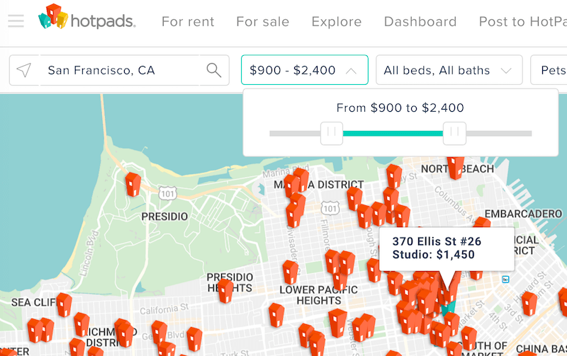
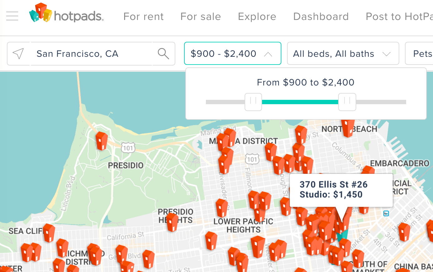
Defining a price range without tick marks predictably and precisely could be quite difficult, especially if the scale isn’t linear. Notice that on Hotpads.com, although the price range goes up to $7,500, the middle value on the track is $1,800. Adding presets and tick marks could be helpful here.
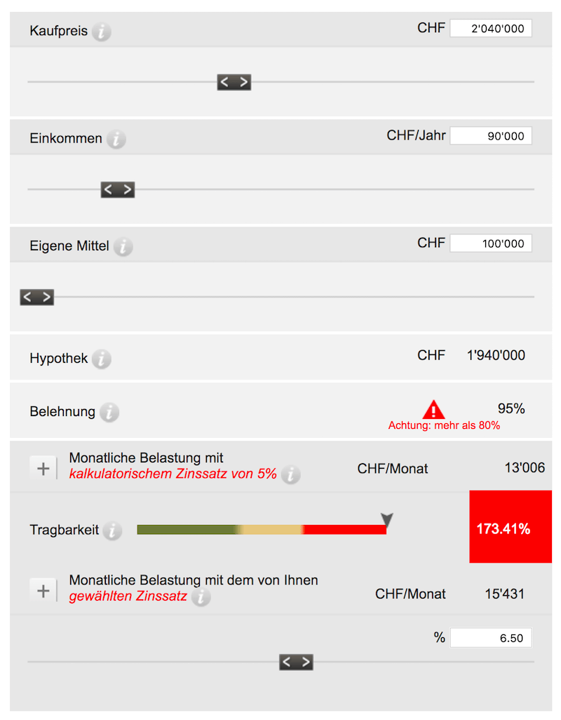
The situation appears to be even more difficult on UBS Hypothekenrechner, where labels are missing entirely. How can the customer know what they are sliding over and know how precise they should be? It’s not really a big deal because the user is exploring values anyway, but they would need to orient themselves first. In such a case, some users would be more likely to use manual input than to start sliding.
Therefore, for both single and double sliders, it’s usually a good idea to add a few distinct predefined values (the trusty tick marks along the slider rail) that customers can easily snap (or “dock”) to. If every tick mark is clearly labelled, then tapping on each tick mark should change the value accordingly. And even if users don’t tap on these labels, seeing them helps to orient users within the slider. Not so surprisingly, sliders with discrete labels are called “discrete” sliders.
As you probably spotted above, most discrete sliders are continuous as well. As we saw in Postbank’s Property Financing slider, some implementations allow users to snap only to preselected, predefined values. By their nature, such sliders don’t feel snappy and just aren’t as engaging as continuous sliders. If you happen to have a scenario where they seem to be necessary — for example, for product ratings — that’s usually a warning sign that something isn’t quite right.
“That Slider Doesn’t Belong Here”
Have you ever patiently observed users navigating a page with a slider control? Once you do, you are likely to make quite an astonishing discovery: It doesn’t matter how boring or exciting your UI components are on the page — nothing can compete with a good ol’ accordion and a good-lookin’ slider. In fact, when your users notice a slider control, a remarkable number of people will navigate towards the slider to “try it out” — grabbing the thumb and sliding it across the track to see what happens. Apparently, interactive elements do matter. We would observe it over and over and over again, on various websites representing various industries.
Sliders Always Indicate Inclusion Or Progress
Knowing that, then using a slider sounds like a catch, right? So, should a slider be preferred over everything else? Not really. The main problem we keep running into with sliders is the mismatch of expectations and the slider’s appearance. As designers, we might not think about it thoroughly, but for users, every value within a slider also indicates either inclusion, progress, growing size or increased intensity. If a slider has five predefined values and the user picks the third one (either by tapping on the label or by sliding towards it), there is a common expectation that the two options preceding the chosen one (to its left) will be fully included in that third option as well. Sounds obvious, right? Well, this has some important practical implications.
Whenever the slider is manipulated from left to right, it’s important to keep in mind that the final value should have a relationship to preceding values. This is quite self-explanatory when you’re dealing with a better, more expensive service or a higher price point, but it gets confusing when a higher pricing plan communicates lower waiting times or a cheaper total price. Instead, it’s better to reframe the message by communicating “faster processing time” and “more or better savings.” In fact, in interviews, users often compare a slider with a volume control or an air-conditioning knob: The further the thumb is away from its initial position, the more, the faster, the better or the higher the value should be. One direction, with related values “growing” from left to right, is just more reliable.
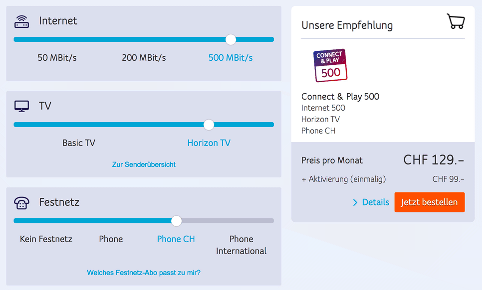
On UPC.ch, a radio button for the “Basic TV” and “Horizon TV” selection might be more obvious than a slider. Also, the filling of the track is a bit confusing because the track should always be filled up to the thumb.
In these cases, a set of checkboxes (for filtering) or mutually exclusive radio buttons (for selecting one size, as on a product page) might work better. Besides, if radio boxes are styled as labelled boxes, then your interface will be ready if some of the sizes go out of stock. To display “out of stock” with a slider, we would need to disallow a jump to some values and “jump over” these values to the available ones automatically. This might be quite confusing.
At this point we’re probably assuming that the direction of the slider — be it progress or intensity — should be flipped upside down with a right-to-left interface. Indeed, that’s the case in many banking interfaces in Arabic world, but it’s not necessarily the rule in all of them.

Sliders Are Not Optimal For Limited Options
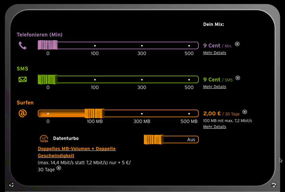
It’s important to note that whenever only a few options are available, using a discrete slider to make a selection might feel a bit awkward. Congstar’s prepaid plan builder provides only a few options. Just like in the previous example, radio buttons might be a better option, especially for the “Datenturbo” feature (which is basically an on/off toggle, but has to be operated as a slider).
While a single slider with a few available options feels awkward, it would be very frustrating to use in cases when the selection is very limited. Neither is a slider a good option if inclusion or progress or emphasis aren’t applicable to the problem you are solving. (It’s interesting that image galleries and carousels, which actually use the same metaphor of moving forward on a track of images and often even look similar to slider controls, usually aren’t used as much as “original” slider controls. Maybe that’s also because they often don’t convey any sense of inclusion or progress, and they appear to be placed in the carousel randomly.)
Value Change Should Be Displayed Prominently
Because the main point of interaction with an slider is to display options quickly, it’s critical to display the actual value or change right away, without prompting the customer to actively select an option or click on a button first. The cash loans calculator on Zagreb Bank includes both numerical value input and a slider (displayed on hover) to manipulate the value, but the user has to click on “Show options” to actually see the options. Displaying options right away would be better — otherwise, the slider wouldn’t really serve any purpose except perhaps to try to engage the user.
Deutschebank Service calculator, on the other hand, uses a slider control as input for the number of children in a household, and prompts a number pad to edit the value inline. A plain input field is probably a better option here.
Whenever one of the conditions isn’t really fulfilled, it’s probably a sign that a slider isn’t a perfect fit to solve the given problem. However, if it does make sense in your context, then you’d have to make a good number of design considerations to find the optimal solution for your design.
Slider Design Considerations Checklist
So, what do we need to keep in mind when designing that perfect slider? Once we understand the problem we are solving, here are the questions we could ask ourselves next:
- Is a slider the right solution for this problem, or should we use radio buttons or checkboxes instead?
- How much space can we afford for the slider, and how do we make it work well on small and large screens?
- Do we use a single or double slider?
- Should the slider be continuous or discrete?
- How do we design the thumb, the track and the labels?
- How do we choose the slider scale: linear or non-linear?
- How many tick points do we need, and how do we design them?
- How do we label the lower and upper boundaries of the slider?
- What icon do we use for the thumb, if any?
- How and where do we display the current value?
- Should the slider be complemented with a precise input (for example, an input field)? If yes, how do we indicate that a numeric input is editable?
- Do we need any frequently used values or value ranges as presets to nudge users to the “best” options?
- How do we indicate availability to avoid dead ends?
- How should the slider track change with thumb movements?
- With a double slider, what happens if the user moves the end thumb over the left thumb, or the other way around? What happens if the user taps or clicks on an area between two thumbs? Should the UI adjust the lower or the upper boundary? Or should this action be disabled altogether?
- Are there any values on a slider that shouldn’t be accepted?
- Should we accept ranges that have too many or too few options?
- Should the user be able to restore previous states of their manipulation of the slider?
- Should we add animations or transitions to the interaction as well?
- What and how do we announce to a screen reader, and what do we need to keep in mind in terms of accessibility?
- Do we have interdependent sliders, where a slider’s input depends on previous input? Should users be able to “lock” some values?
Again, not many straightforward answers to these seemingly innocent questions. Now that we know the building blocks of the slider, let’s take a closer look at all of the design decisions listed above step by step.
The Rules Of Thumb For Spacing
While, as designers, we tend to dedicate a large portion of screen real estate to images and videos and galleries and carousels, sliders are often tucked away in sidebars and toolbars, primarily because they are supposed to act as filters, and so they are placed next to other filtering options that usually don’t need that much space, such as humble checkboxes and accordions. Admittedly, sliders do get a well-deserved spotlight in calculators and “builders,” but those are relatively rare.
To be effective and easy to manipulate, sliders need space, a lot of space actually — but most importantly a lot of horizontal space. The thumb has to be large enough and the track has to be wide enough to jump to the tick marks. It’s going to be very difficult to make the exploration of options comfortable if a slider is around 200 to 300 pixels in width, tucked away from the main content area. Now, how do we translate that to general rules of thumb when designing a slider, then?
An important variable that has a strong impact on spacing requirements is the number of “critical” tick marks on the slider. These are the marks that stand for important thresholds, be it an average price point or a budget threshold. The more critical tick marks you need to display, the more space a slider will need. Because the slider will have to be responsive as well, the spacing between these tick marks has to be large enough to not require too much precision.
So, how large is large enough? If you can ensure that the horizontal spacing between critical tick marks is at least 65 pixels — on narrow and wide screens alike — that’s probably a good amount. And then there is the actual thumb and getting comfortable padding around it, so that the thumb is easy to grab and move across the track. In general, experiments show that making the thumb at least 32 × 32 pixels (rectangular or circular), with 3vw or 1.5vmax padding (the former on narrow screens, the latter on wide screens) around it, seems to work fairly well. In fact, just from going through dozens of slider implementations, we see that the most usable ones hit that sweet spot well.
Now, the numbers above might feel like magic numbers, and to some degree that’s true: they’ve been discovered empirically by looking into sliders that appear to be more comfortable for users. It’s not that these numbers are always just right, but they give you a good enough estimate of the size that might work best.
You might be wondering why the padding is defined in vw and vmax units, rather than, say, pixels or percentages. The larger the area to traverse to hit the thumb, the larger the padding should be. In the worst case, traversing would need to happen from the edges of the viewport, and if we set padding in vmax, then it will always be large enough to hit the target easily. Instead of tying the padding to the width of the container, it feels more reliable to connect it with the actual viewport’s width or height. On narrow screens, where tapping is to be expected, 3vw seems to be enough, but on desktop, you might be better off dialing the padding to 1.5vmax.
So, what does this mean? Well, if you want to design a (single or dual) slider that works well at a 400-pixel width on narrow screens, then the considerations above would limit the number of critical tick marks in your budget. In fact, you’d be able to accommodate at most five items comfortably — anyway, this will usually be more than enough to display critical options. The math speaks for itself:
(400px - 32px - [(3vw * 500px) * 2]) / 65px =
(400px - 32px - (12px * 2)) / 65px =
344px / 65px =
5.29
Again, please do take these values with a grain of salt: We didn’t run any studies on the various sizes of the handle and its padding; we just determined these values experimentally, and tend to use them as a shortcut for better decisions. What works in one case might not work in another, but this might give you an idea of how to start designing that perfect slider.
Now, what about the responsive behavior of that layout? Obviously, the spacing between tick marks would scale down with narrower viewports. Because we are designing with viewport units in mind, grabbing the thumb and moving it will still work well. But moving between discrete values could become more difficult unless you start dropping a few tick marks and “widening” the scale artificially. Alternatively, it might be worth look into adjusting the number and the position of tick marks, and including slightly different scales on narrow and on wide screens.
On larger screens, eventually you would need to set a maximum width on the slider as well, because, otherwise, the area to traverse would be too large. Again, the fewer the tick marks, the less space a slider needs to remain usable.
Once we know the spacing constraints, we can design the slider around it. First, we need to position the labels for tick marks and choose the slider’s scale.
Displaying Tick Marks And Current Values
Here’s a tricky question: Should tick marks be placed above or below the slider track? The question might sound obvious because sliders usually display marks below the track (not unlike school rulers), but would it be your first choice if you had to design it from scratch?
Let’s assume that we have plenty of tick marks to be placed on the track of a slider. If we displayed those marks very close to the track (above or below), then the label would definitely be obscured by the handle once the user slides over to that value. We could space out the label vertically and add a subtle vertical line indicating a connection between the value and its position on the slider.
For example, SGS’ housing cost calculator might not be the most attractive slider out there, but it does everything right. The tick marks are spaced out vertically and, as such, are easy to choose. While snapping to preselected values is easy, all values in between are accepted as well.
That’s already helpful, but a slider never exists in isolation. And so, as we display the tick marks, we also need to display the current value (or values) prominently — either above or below the slider as well. We could also display the current value on the thumb if it’s large enough — of course, if it’s not editable. What’s better? Well, the value is actually the main point of interaction, so displaying it prominently above the slider makes sense. Otherwise, if the current value is displayed below the slider, users on narrow screens might feel pressured to lift up their finger to see the value. In general, both options could work — we just need to make sure that we space out labels well enough.
But what if your interface contains a set of sliders — for example, a slider that adjusts brightness and contrast, RGB/HSB triplets, or a vertical equalizer? How would you display current value then? Well, in that case we have to distinguish between current values of each slider, and the final computed value. Obviously, the final value should be more prominent than each of the slider’s values. However, we need to ensure that it’s the main focus of interaction: so on narrow screens, for example, that value could be displayed in a floating fixed bar, following gradual slider adjustments.
In general, it seems to be a good idea to position tick marks below the track and position value labels above the track. And if your slider doesn’t have any tick marks (for example, in a price range filter), then placing the value labels above the track seems to be a bit more resilient — because the view would never be obscured by a floating finger.
Choosing The Slider’s Scale
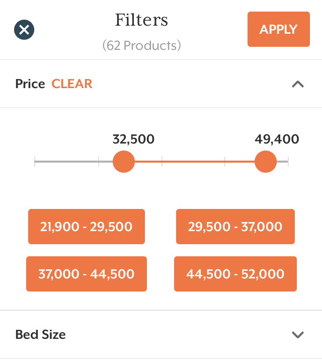
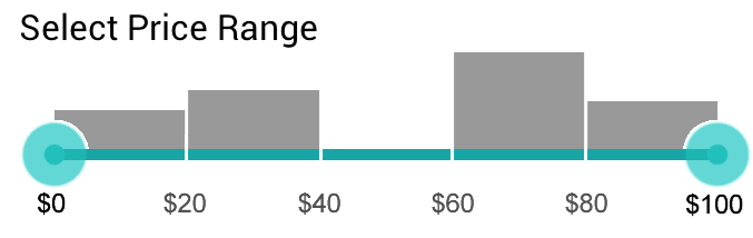
The positioning of labels is one thing, but picking a scale to accurately reflect the range of options is another. If your clothing store has hundreds of items, with prices ranging from $50 to $15,000, how exactly would you design the scale for your slider? What value would you position in the middle of the slider? What if most items are priced around $80, and exactly one item is priced at a remarkable $15,000?
By default, we’d assume that a proper slider scale should be linear, breaking down the entire range into a set of equidistant segments. However, in the case above, it would mean placing $7,500 in the middle of the slider. That would be highly ineffective, though, because 50% of the track would be used to control 1% of the products. Not only that, but choosing the desired range of values would become unnecessarily difficult, and if most products are in the $50 to $300 price range, then 5% of the track would be used to control 50% of all products. In other words, large portions of the slider would represent no change in the filtering, and small portions would represent huge changes in the filtering.
Disneystore.com has a couple of issues. Not only is the slider space very narrow, but selecting the price range between $800 and $1000 requires impeccable precision. When one of the values is selected, the entire page is blocked, and the user is automatically scrolled to the top of the page. This doesn’t encourage exploration. Adding manual text input or changing the scale could help here.
In practice, a vast majority of products are clustered in a very narrow range, with very few residing at the edges of the scale. However,, as Sigurt Bladt Dinesen discovered, underlying data is rarely a uniform distribution. If the scale of your slider doesn’t account for the distribution of prices in your inventory, then providing an accurate range of values would be an extremely frustrating experience, requiring explicit precision in contexts where it shouldn’t be required.
When this happens, users would suffer through slow, intense, strained attempts to set just the right range of values before giving up and resetting the filter altogether.
As Baymard Institute discovered in usability tests, at Crutchfield, 50% of the slider’s width is used to control just 2% of the 200+ products in the list. This, in turn, makes the slider needlessly sensitive in the $50 to $300 range, where 5% of the slider’s width is used to control 50% of all products.
To solve this problem, for lengthy videos, YouTube changes allows users to change the scale and jump to a specific second if they want to. The feature might be difficult to discover, because it’s indicated with an arrow pointing up, but it’s useful. The track scale doesn’t hame to remain the same permanently. Thanks to Chazz Basuta for the heads up.
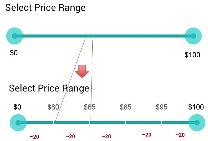
What would be a better scale, then? Study the purchasing behavior of your customers and find the most frequent range for their purchases. It could be a price range, but also a mobile data plan or a mortgage payoff timeframe. That range will inform your design decision: Dedicate as much as 50 to 60% of your track to that range, with outliers residing on the edge.
You could go so far as to create distinct clusters of ranges — perhaps “low-cost products” (up to $50), “popular products” ($50 to $350) and “high-cost products” (above $350), assigning 20% to the outliers and 60% to the most common range. Furthermore, you could extend the slider by providing frequently used presets as buttons just below the slider — some of your customers might appreciate it.
You might even go further by dynamically adjusting interval jumps based on the pricing distribution of your products (using histogram equalization to create so-called “biased” scales). So, as new products are added to the content management system, the intervals would be recalculated, and the design would be adjusted automatically.
A slightly simpler and, therefore, often preferred alternative is to use a logarithmic or exponential curve, which often matches real-world data quite accurately. In this case, the fewer the products above a certain threshold, the less area would be reserved for them on the slider track.
This approach doesn’t just help users navigate the ranges on the slider, though. Because the scale heavily depends on the inventory’s distribution, rather than a linear distribution of values, it also reduces dead ends — frustrating no-results pages. After all, most area on the track would be reserved for the most frequently purchased items.
But what if we wanted to eliminate a no-results experience altogether? Despite our efforts, users might choose just the range that has only a few items or no items at all. Your store might not have any shirts priced below $10, for example. Or by the sheer beauty of an accident, you don’t have any items in the $40 to $60 price range. That’s where we could use an inventory count slider or a histogram slider.
Eliminating Zero-Results Filtering
An alternative way to design a scale is by examining the inventory count from a slightly different perspective. As Greg Nudelman suggests in his article, we can extend the slider with discrete values based on inventory counts.
We would divide our entire inventory — say, 100 capes — into 5 intervals, and we get 20 capes per interval. Next, we scan the price range to figure out the price (rounded to the nearest dollar) that corresponds to the approximate inventory count of 20. Suppose the first 19 capes cost between $0 and $60 (remember that we’re still assuming no inventory in the $40 to $60 range), the second 21 capes fall in the $61 to $65 range, and so on.
We basically break down the entire range into segments, each with the same number of results. Hitting that unfortunate area of $40 to $60 is still possible, of course, but it is less likely to be hit than in the previous examples. If the customer’s price range is larger than that of a single 20-item interval, then they can simply select a larger interval using the dual slider.
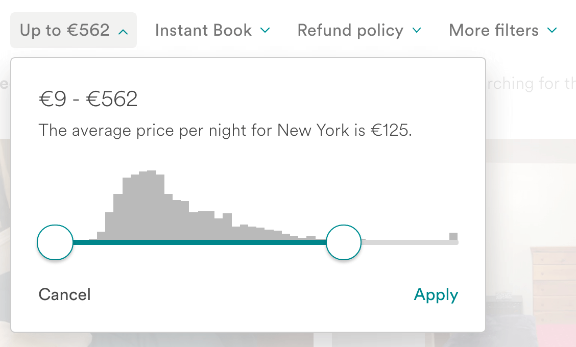
The ultimate solution would be to actually display the distribution of items for every price range, as a histogram. We could reserve 50 to 100 pixels in height above the slider to display a histogram with a product count. The taller the bar in a certain range, the more items would be matched there; the shorter the bar, the fewer products would be matched there. The histogram could be used for single and dual sliders, with or without discrete values, with a linear or algorithmic scale. In fact, it could also indicate most watched moments in a video or the most common selections in a mobile data plan.
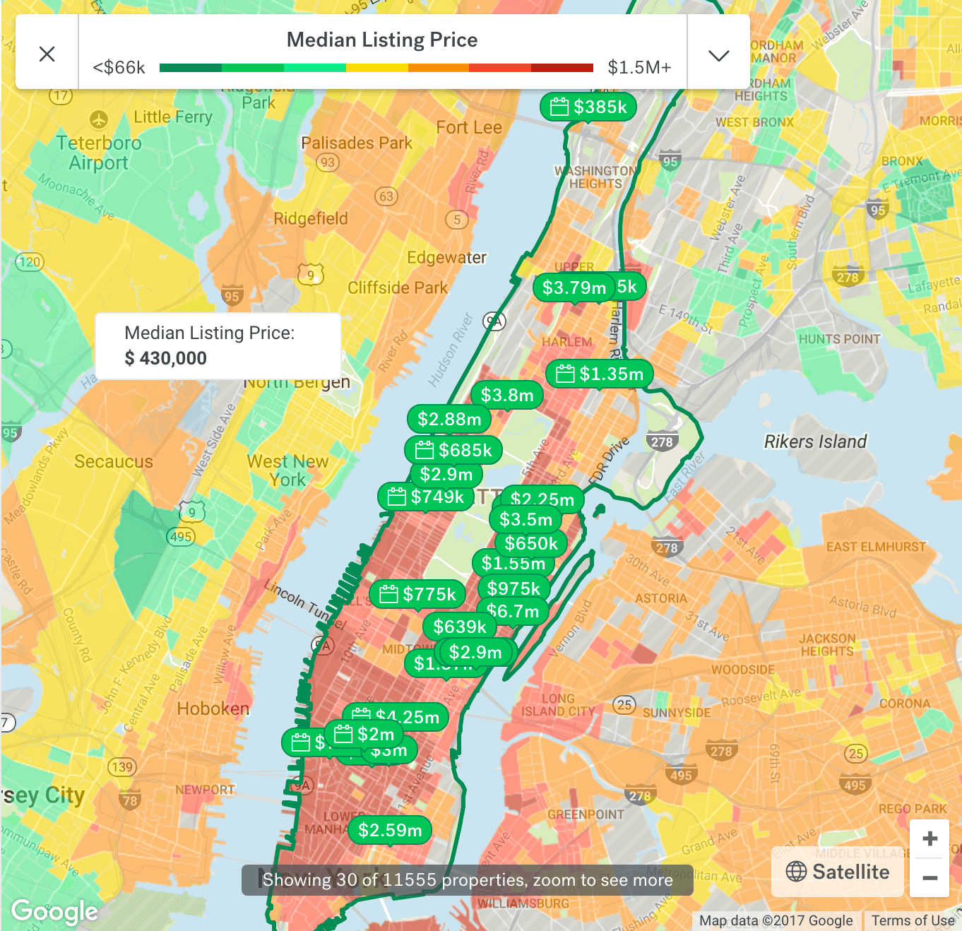
By providing a hint about the expected number of results, users have to actively choose to see zero-results pages. In fact, that’s exactly what Airbnb does to eliminate dead-end searches, which don’t yield any available apartments to rent.
Indicating The Range Visually
When it comes to making purchasing decisions — for example, for a mobile data plan, clothing or energy consumption — each of us is a special snowflake. Sometimes we have a clear enough idea of how much mobile data would be acceptable (“I need just about 5 GB of data”); sometimes we have a fuzzy idea of how much we’d be willing to spend on clothing (“I need to find a $50-ish gift”); and sometimes we need a visual or aural aid to make an informed decision (“I don’t know how many kilowatt hours I consume monthly in my household”).
In all of these cases, users would experience the slider very differently, approaching the filtering with different intentions. Depending on the level of confidence in their choice, users would pick different values as boundaries for the input. The more vague a user’s idea of what they want, the more likely that desired option would need to be placed in context, ending up in the middle of the selected range. The more confident the user, the more likely that desired option would end up as the lower or upper boundary of the selection. That’s hardly surprising but quite important to understand, because although many users are purchasing items in a few specific ranges, it doesn’t necessarily mean that they filter items accordingly.
It’s interesting that, in both of these cases, while the interface forces users to specify a range of values, customers actually might have only one single value in mind. In fact, users often have a single-point mentality, and so when operating a dual slider, they might be confused because they have to select two values instead of one. According to Baymard Institute, “more than 50% of the test subjects misinterpreted dual-point range sliders for price with a single-point slider.”
The solution? When designing a dual slider, it’s a good idea to add some visual clues to indicate that the expected input is a range of values, rather than one single value. A simple way of doing it is by attaching arrows to the handles, pointing towards each other. The arrows suggest a direction and act as indicators for a “from” to “to” input, implying that multiple values have to be set.
Another solution would be to accept both single and multiple values. So, as the user taps on a value on the slider (let’s say on $80), you could automatically interpret the selection as a filter between $70 and $90, for example, and beautifully animate the transition from a $80 pricing point (a dot on the track) to a $70 to $90 range (a filled line on the track). You could also add a little hint explaining that users can adjust a range on the slider as well — and display the number of matches, too.
Visualizing The Output
Remember that third case in which users need a visual or aural aid to make an informed decision? In that case, it’s a good idea to use some kind of visualization to explain the various options and the common scenarios in which they are used. The energy plan calculator, for example, could suggest a common range for an apartment, a house or a villa — illustrating each of the options, respectively.
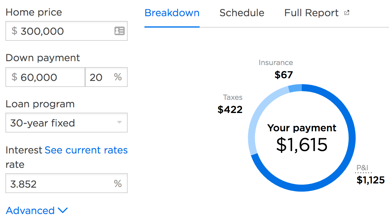
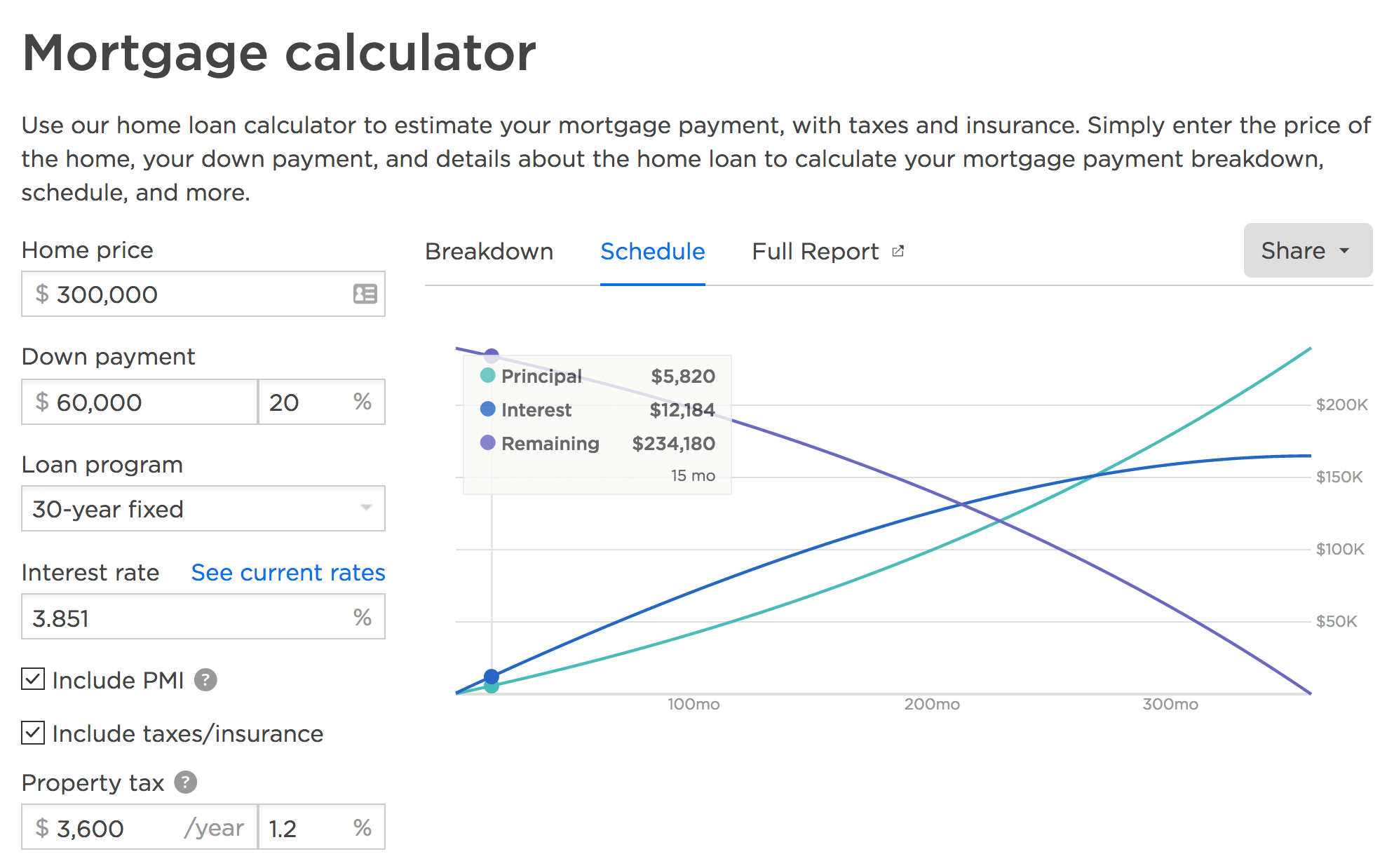
Deutsche Bank visualizes house financing expenses and the outcome by adjusting the house preview. The further the user slides over the track, the more impressive the house becomes.
For its visualization of home renovation costs, Deutsche Bank uses a set of accordions and sliders. Every selection contains a detailed suggestion about the expected costs. This makes a task such as calculating renovation costs more manageable and less overwhelming.
Goteborg Energi uses illustrations to indicate various energy-consumption levels for an apartment, house or villa. It also uses an overlay to explain each selection as the user moves the handle. Suddenly, abstract values make sense, because they are put in context.
As a bonus, the slider also has predefined presets located further below the slider on the page. Notice how the slider’s value changes automatically to an input field when the user reaches the upper boundary of the slider. The only drawback is that the padding around the track could be slightly increased.
Smooth N’ Silky Sliding, Guaranteed!
We said it before: The main purpose of a slider in the first place is to allow users to explore options. However, if the sliding experience is slow or clunky or unexpected, then exploration will quickly become frustrating. When a user interacts with a slider, we have to make sure that the interaction is continuous and effortless, and that requires a close look at the interaction design of the slider.
Now, as designers and developers, we expect users to grab the handle and move it across the horizontal track. This requires their thumb to be large enough for comfortable tapping (see “Rules of Thumb” above). However, this interaction is one of the many possible interactions, and not necessarily the one that users will prefer most of the time.
An obvious enhancement beyond moving the handle would be to allow users to jump to any value on the track. That means that not only the thumb but also the track should have enough vertical and horizontal padding (across the track and at the edges of the track) to be tapped easily — probably as much as the thumb itself. Also, we need to ensure that the visual feedback happens both when the user interacts with the handle and when they hover over the track. That visual feedback doesn’t only have to be the change of the mouse cursor over the entire slider area, though.

We could also enlarge the handle, change its color, add some shadow to the handle or even change the color of the track — on :hover, on tap and when the slider is being dragged. On :focus, then, we could add a box around the whole slider and change the color or shade of the thumb, or add a thick border to the thumb to indicate that it’s active. Combine that with a lovely transition or animation, and you have a recipe for a quite lovely slider! Now, compare the two implementations below, on Trulia and Housing.com.
This raises another common implementation detail: As the slider is being used, some of the input can get out of sync. As Ilya Birman reminds us, the slider is usually there to control something else — a value, a range of values or a state. It’s critical to ensure that everything stays in sync: the cursor’s shape, the hover effects, the position of the handle, the responsive to clicking and dragging, the change in values, the change of states inside and outside the slider area.
This might be easy for a designer to require in their specifications, but from the technical perspective, it might be quite difficult to achieve. For example, if the slider affects the number of matches in the database, you’d need to execute AJAX requests to get that shiny JSON file with the results and update the results page live. In fact, it might take a noticeable amount of time to fetch new results, interpret them, map them on the slider and display them. Despite all of this happening in the background, we want to achieve a smooth ’n’ silky, continuous feedback as the slider is being manipulated.
For example, Sparkasse Dresden has a noticeable lag between movement of the slider on the track and the calculated value (displayed at the bottom of the screen). Also, the input field allows for any value to be typed in but accepts only very specific values, without providing any feedback. Feedback matters.
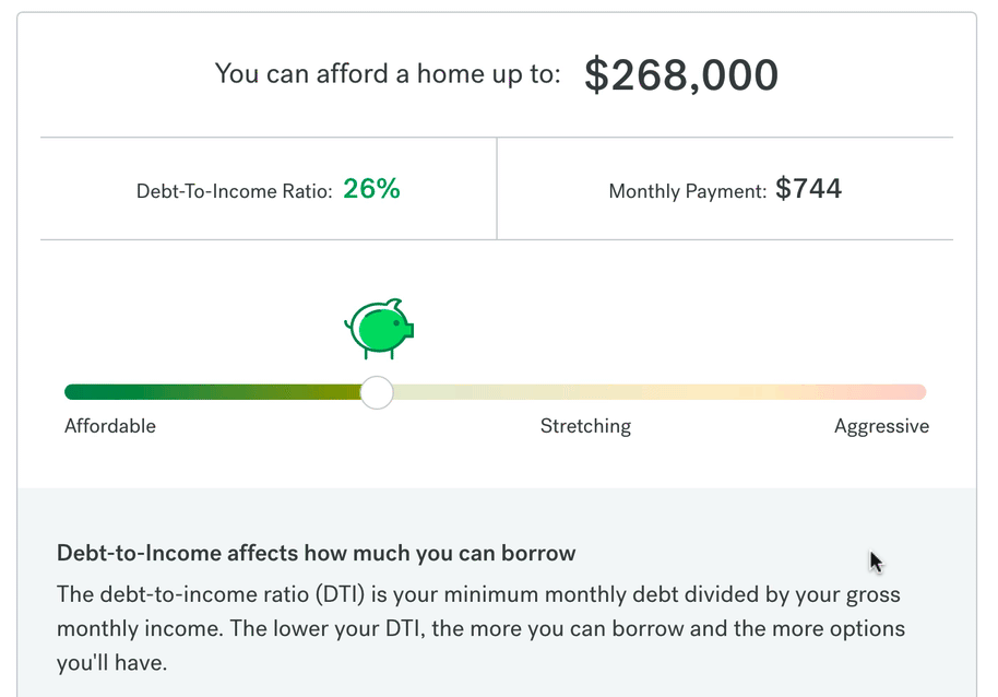
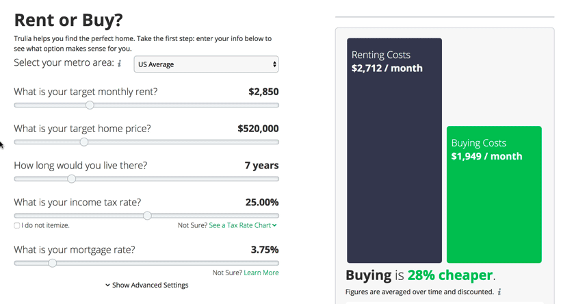
On Zillow’s rent versus buy calculator, there is a slight delay between changes to the slider and the graphical presentation of the outcome. However, because the values are updated right away and there is a smooth animation between the states of the chart curves, it’s hardly annoying.
So, what would be the ultimate solution? Instead of repainting the slider only when the data becomes available, we could repaint the slider continuously while updating results asynchronously. In general, the slider should never freeze, even if the data is not there yet. Ilya Birman provides a reference implementation with full continuous feedback, which is definitely worth looking into before you begin implementation.
Another problem that comes up quite frequently is the magnifying glass and text selection on mobile devices. As the user grabs the handle and moves it across the track, sometimes due to inaccuracy of the finger, the movement might be interpreted as a double-tap, prompting selection or a magnifying glass. To solve this issue, disallow events on anything that isn’t interactive to prevent annoying prompts.
They Ought To Slide, But They Choose To Click
Jumps on a track are quite predictable if we have a single slider allowing for a single value input. But what if we have a dual slider allowing for a range input? What should happen if the user clicks outside of the specified range or somewhere in the middle of the range, rather than dragging the handle left and right?
Because we can’t predict the intent of this interaction, sometimes designers tend to disable clicking behavior within the specified range altogether, providing a tooltip that suggests to drag the handles instead. Now, the reason why a user would tap on a specific point inside of the range is because they want to limit the scope of the search, and that tapped value is an important representative value in that range.
If that value is positioned close enough to the lower boundary, we could shift it to the selected value. The same goes for the upper boundary. How close is close enough? Perhaps around 10 to 20% of the track’s width — at least that seems to be a reasonable value to indicate a relationship to the boundary. It won’t work all of the time, but it might work more often than not.
Alternatively, we could suggest a smaller range around the tapped value or indicate that the user can actually shift the entire range across the track, preserving the scope of the range.
Now, what happens if the user chooses to click outside of the specified range? That could be an indicator that the user would like to extend the range, but it could also be an indicator that the user is interested in that particular value. The decision isn’t obvious here, but, intuitively, we’ll look into extending the ranges, rather than change the scope of the range altogether.
If the click happens outside of the left boundary, we’d extend the left boundary. If it happens outside of the right boundary, we’d extend the right boundary. Either way, adding a link to restore the initial state would mitigate confusion and unexpected changes.
Enhancing A Slider With Precise Inline Editing
You might have created a beautiful slider design with an appropriate slider scale and enough padding; the tick marks are thoughtfully set; the slider responds continuously; and users can easily snap to any value on the track. Sorry to be a party pooper, but it still might be not good enough to make the experience smooth, especially if users require just a tiny bit more precision when setting values on the slider.
To provide a shortcut to precise input with a slider, we can use either predefined presets — frequently chosen values or value ranges — or enhance the slider with a text input field fallback. Both presets and the input field could be progressively disclosed — either by a tap on a button or just from a tap on the current value on the slider.
Now, how would you indicate that the value is editable? The obvious way would be to display it within an actual input field, or use a gray border on the white background, or add a dotted border bottom for that value. If nothing else helps, we could add a pencil icon. Or, upon pressing the handle, the text box could become editable and the value would be updated automatically with the thumb movement.
Editable input raises another question. As the user taps on the value, should it disappear entirely, or should the cursor jump to the end of the input? In most cases, the second option would work better since it’s more predictable and easy to adjust. If the user has moved a slider’s thumb to a specific position and wants to make a fine adjustment, it’s easy enough to do by removing a few characters from the input rather than retyping it over again. However, it could be helpful to have a “reset” option to be able to restore the position on the slider — just in case.
Precise input might not always be necessary, but an interface would only improve from having an option to jump to a specific value. In general, it’s a good idea to keep the value editable for every slider — just in case the user wants to make a tiny final adjustment quickly.
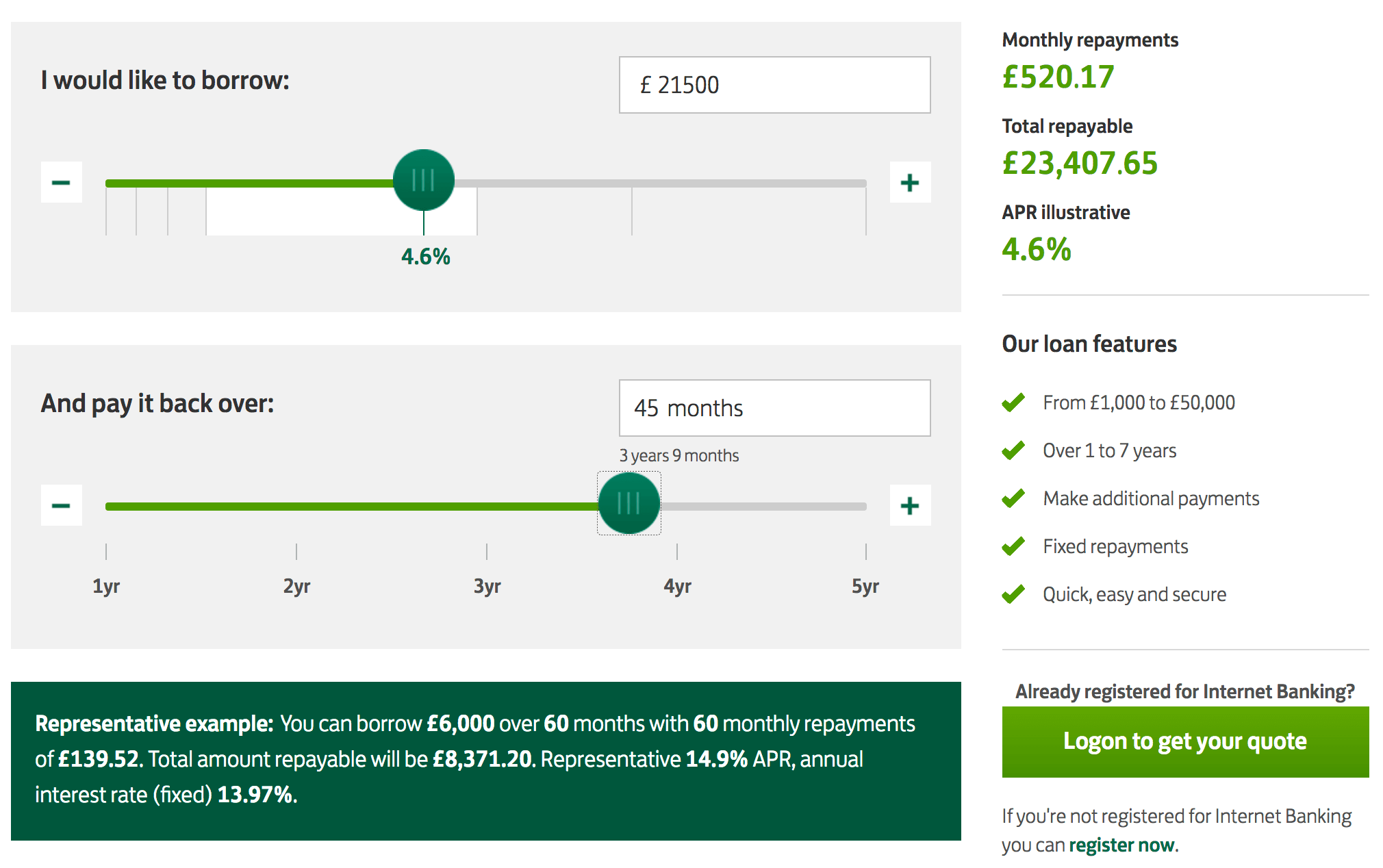
The online loan calculator by Halifax beautifully illustrates the annual percentage rates for different loan amounts. Precise input is possible in the input field or by using steppers. It’s remarkable how much detail the slider provides without being overwhelming. The only downside is that it’s impossible to snap to the ranges displayed below the track or to tap on the tick marks.
Visual Feedback On Cursor
And then there is the question of how exactly the cursor should change when the user is hovering over a thumb. Should the cursor become a pointer, or a resize cursor (ew-resize), or a resize column cursor (col-resize), or a move cursor, or perhaps a grab/grabbing cursor? The problem with all of these options is that they don’t necessarily indicate exactly what we need — usually they aren’t restricted to just one axis.
For example, in a drag-and-drop interface, we can move blocks both vertically and horizontally. The only exception is resizing (ew-resize or col-resize, to be specific), which indicates exactly the right direction. However, we aren’t really resizing a slider here, but dragging it across the track.
ew-resize on hover. Notice the unusual pendulum effect on the calculated value. The track could have larger padding, and the input is just a tiny bit difficult to edit. (View large version) (Watch video in HD)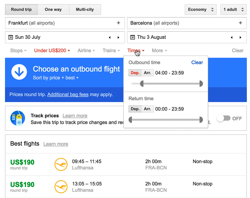
col-resize to indicate that the item can be moved horizontally.As the user hovers over a thumb or a track, the safest option would be to use pointer to indicate interactivity. As the user grabs the handle, we could change the cursor to grab, and as it then wanders across the track, it could become grabbing. That would provide clear feedback of the current state of interaction.
Giving A Slider That Extra Touch
The context of your website or application might require quite specific slider features or enhancements. If the range of values is likely to remain consistent but the lower and upper boundaries will change a lot — for example, in a TV guide or online banking application with a date-range selection — what about allowing users to shift the range of values across the track?
Indeed, on narrow screens, Urban Ladder allows users to shift a price range. Notice how the price range shrinks automatically when the selected track area reaches the lower or upper boundaries. Unfortunately, with this implementation, touch events sometimes get in the way.
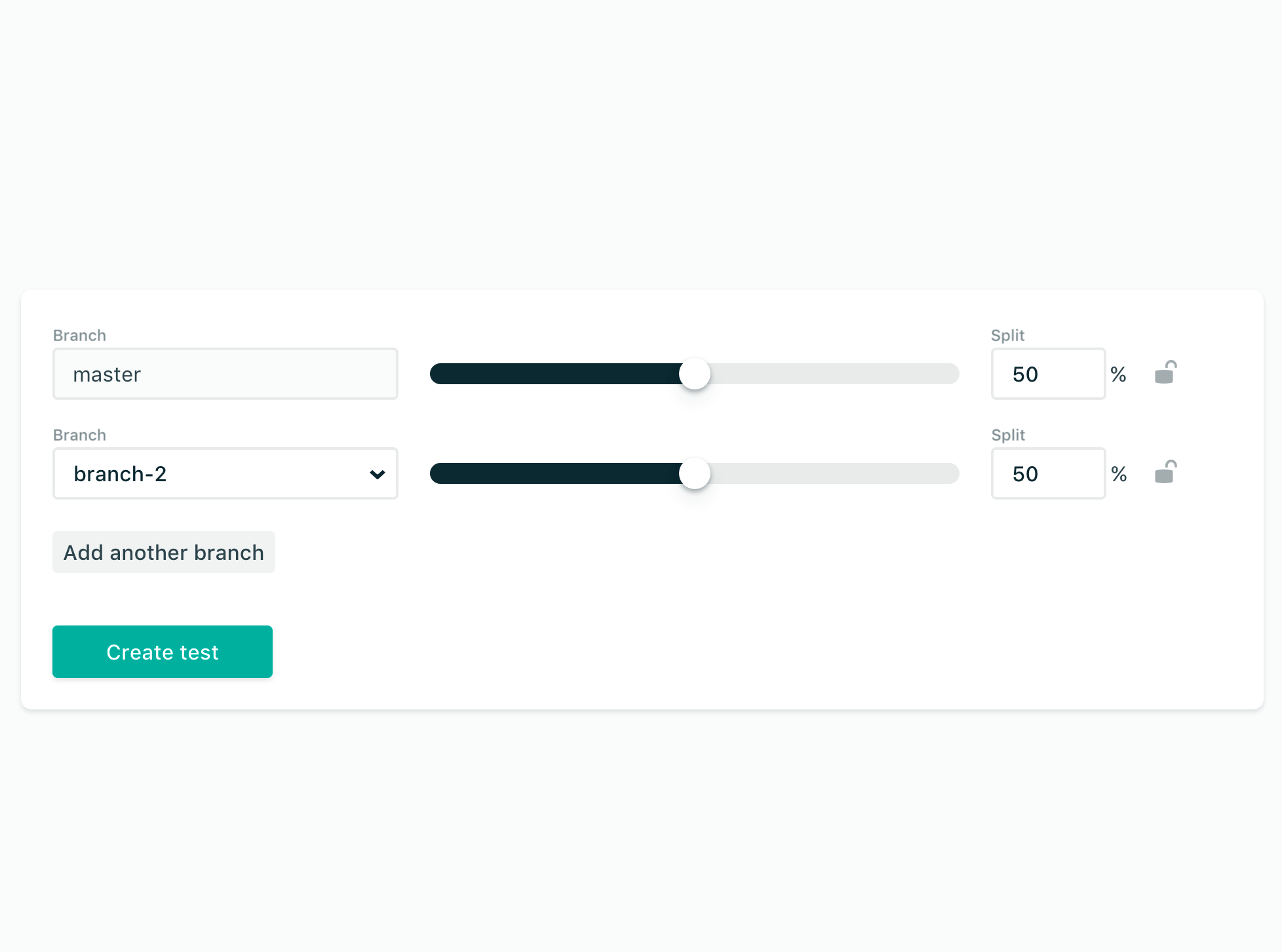
However, the situation is slightly more complicated if we have interdependent sliders. A change on one slider might limit options for succeeding sliders. For Taskstream, Juweek Adolphe suggested to extend the “fillable” area on sliders to indicate the changed range.
If a change in value in one slider prompts other sliders to scale up or down, we could also “lock” a value in one slider with a padlock icon next to it — for example, for split testing, as suggested by Rafael Conde.
Skandia’s våra bolåneräntor, a mortgage rate calculator, discloses progressively. As the first input is made, the rest of the calculator appears below. Simple and well designed.
Obviously, fancy animations and transitions won’t work in every scenario, but sometimes being less generic and predictable and slightly more experimental is worth it. Take a look at the nice overview of unusual progress indicator demos on “Elastic Progress” on Codrops.
Contrast And Keyboard Accessibility
Throughout this article, we’ve mostly talked about the experiences users have by tapping or dragging the slider or by interacting with it using a mouse. What we didn’t mention is the big number of accessibility issues that sliders often raise. The suggestions below are generously shared by Ramón Corominas.
One of them is contrast. In fact, as you might have spotted in some examples above, some sliders have almost no contrast between the selected part of the track and the unselected one. The track, tick marks, range labels, histogram bars and the thumb all need enough contrast against the background on which they are placed — otherwise detecting and operating a slider for users with low vision can easily become a nightmare.
Dual sliders and the sliders enhanced with a histogram require extra level of detail as they present a lot of detail that a screenreader user wouldn’t be able to access. That’s where we would need to use ARIA live regions and/or roles (aria-live, aria-controls, aria-valuenow, aria-valuemin, aria-valuemax) extensively to announce that extra level of information.
You don’t need ARIA if a slider is used on <input type="range">. The current value is always read out when it changes in screen readers, without aria-valuenow included. You can see Heydon Pickering’s Drum Machine slider implementation as a reference.
Another issue is the appearance of sliders in the high contrast mode. If a slider uses only background colors or images for track, tick marks or even the thumb, they might completely disappear in high contrast mode. There, we could create three SVG images — one for the thumb(s), one for the “filled” part of the track, and one for the “empty” part of the track. Moving the thumb then will just change the widths of the “filled” and “empty” bars, so the full width of the slider remains the same. We could also include a 1-pixel white border, so it will appear when high contrast mode is activated.
Beyond that, the slider has to be keyboard-accessible as well. It doesn’t just mean that we need to design the controls to be accessible — keyboard input works slightly different when a screen reader is active, so we need to test both scenarios. Either way, interaction with a slider would be done in “steps.”, also providing aural feedback to screen reader users.
Once the user tabs through the page and hits the handle, they should be able to edit the numeric value or use left and right arrows to increment or decrement the value. It’s up to us, then, to choose a value that will make it comfortable to adjust the filter in granular steps. In the YouTube app, you can double-tap on the left to go back 10 seconds and on the right to go forward 10 seconds. On Netflix, you can use the left and right arrows to jump 10 seconds as well.
There are some fully accessible solutions for sliders, such as Whatsock’s ARIA Horizontal Slider or fd-Slider. Obviously, they might not be perfect for your needs, so making fine adjustments and testing with real users will be necessary.
Still, even if all of these issues are solved, a slider might not be the fastest control for screen reader users or keyboard users. It might be better to announce common choices first and use a plain input field instead, then progressively enhancing it towards a slider with an editable value display. This might make interaction a bit more straightforward.
Where Does It Leave Vertical Sliders?
While all examples and design considerations in this article focus on horizontal sliders, one might wonder where does it leave vertical sliders, when are they used and if there are any issues specific to them. In fact, vertical sliders are quite difficult to spot, and when they are used, they usually control a spatial view or data visualization. With maps, vertical sliders can help move between different panes or levels, while horizontal sliders enable interaction left and right.
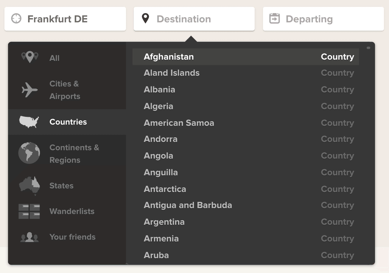
One option would be to enable quick jumps to specific regions of a long list without using a dropdown menu — similar to the vertical alphabet bar used on iOS contacts. In fact, because lengthy lists often have a scrollbar, those scrollbars actually become single, continuous sliders; it’s just that the handle is often too tiny to navigate comfortably. Now, what if instead of a tiny scrollbar track we used a large enough thumb?
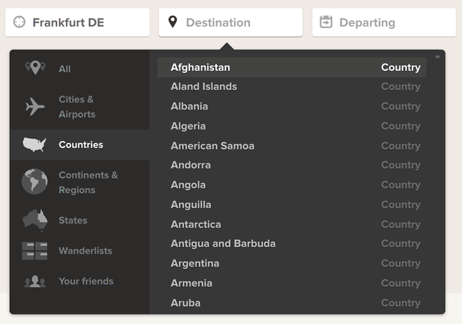
Adioso, a flight search engine, provides a sophisticated list of destinations grouped by cities, countries, continents, regions, states, wanderlists or even your friends. The list contains a tiny, almost unnoticeable, scrollbar on the right side which, for long lists, can be very difficult to scroll through. In cases when the handle becomes smaller than a certain threshold, we could replace it with a large thumb might help make the list easier to explore. Admittedly, autosuggest relieves this problem for Adioso, and so do tabs on the left side.
Another scenario where a vertical slider could be an interesting option, is a histogram view. If a service displays available flight options based on the departure/arrival time (with a dual horizontal slider, like Kayak does), sometimes a single very expensive flight might alters the scale of the whole visualization, so the differences in the lower prices become undistinguishable. What if we enhanced this experience with a vertical slider to adjust the scale or filter the price range, hence allowing users to “zoom in” to the lower values?
Finally, when it comes to spatial navigation in a map — which can be quite challenging in terms of accessibility — a combination of a horizontal and vertical sliders could be used to help users move through the map using the keyboard. Huge thanks to Ramón Corominas for these suggestions!
Summary
If your interface accepts only a few input options, then using a slider probably would be an overkill. A set of radio buttons, checkboxes or predefined options might work better. But whenever the user’s input is supposed to encourage exploration, rather than precision, a slider is definitely a good option to consider. However, to be effective, a slider need space — the track should be wide and tall enough, the thumb large enough, and the padding for both generous enough; displaying the distribution of values in the background would mean that it needs enough both horizontal and vertical space.
The main point of interaction with the slider is to display options quickly. This means not forcing the user to click on a button to see the outcome or wait until the result is displayed. Feedback should be smooth and continuous, without noticeable lag — in fact, a slider should never freeze.
The thumb usually doesn’t need any special iconography, but it needs proper visual treatment, and smooth transitions and animations can increase the customer’s engagement. Tick marks not only are useful shortcuts to jump to discrete values, but also help orient users on the slider. When setting those tick marks, though, keep in mind that an algorithmic scale usually works better than a linear scale.
As users move the handle across the track, we could enlarge the handle on hover, add some shadow to it and change the color of the track. We also have to consider ARIA live regions and “manual” steps for keyboard accessibility and screen reader users. Finally, a good slider allows for precision if needed; so, extending it by turning the chosen value into a plain input field is usually a good idea.
Phew! And that’s a wrap! If you need some inspiration for better design of your slider, look into implementations of sliders in video players of popular streaming platforms. Unlike in other interfaces, sliders there are quite meticulously crafted as they are heavily used by their customers all the time.
Perhaps you’ve had very different experiences than the ones mentioned in this article? Let us know in the comments below! Also, if you have another component in mind that you’d love to have covered, let us know, too — we’ll see what we can do!
Stay Tuned!
This article is part of a new ongoing series about responsive design patterns here on yours truly, Smashing Magazine. We’ll be publishing an article in this series every two weeks. Don’t miss the next one — on fancy (and not so fancy) feature comparison tables. Interested in a (printed) book covering all of the patterns, including the one above? Let us know in the comments, too — perhaps we can look into combining all of these patterns into a single book and publishing it on Smashing Magazine. Keep rockin’!
Part Of: Design Patterns
- Part 1: Perfect Accordion
- Part 2: Perfect Responsive Configurator
- Part 3: Perfect Date and Time Picker
- Part 4: Perfect Feature Comparison
- Part 5: Perfect Slider
- Part 6: Perfect Birthday Picker
- Part 7: Perfect Mega-Dropdown Menus
- Part 8: Perfect Filters
- Part 9: Disabled Buttons
- Subscribe to our email newsletter to not miss the next ones.
Further Resources
- Continuous Slider, “Components,” Material Design
- “Sliders,” Human Interface Guidelines, iOS, Apple
- “Slider Control Design Guidelines for Windows Phone,” Windows Dev Center, Microsoft
- “Input Controls for Parameters: Balancing Exploration and Precision with Sliders, Knobs, and Matrices,” Page Laubheimer, Nielsen Norman Group
- “Mobile UX Design: Sliders,” Nick Babich, UX Planet
- “Mobile Design Pattern: Inventory-Based Discrete Slider,” Greg Nudelman and Daria Kempka, Smashing Magazine
- “Slider Design: Rules of Thumb,” Aurora Harley, Nielsen Norman Group
- ARIA Horizontal Slider, Whatsock
- fd-Slider: HTML5 Input Range Polyfill/Unobtrusive Accessible Slider, Brian McAllister, GitHub
- “My Sliders, Ana Tudor, Codepen A huge collection of designs and implementations of sliders, collected and implemented by the one and only Ana Tudor.
- Sliders Inspiration Album, a collection of 50 short videos of sliders, collected for this very article.
This article is written with remarkable contributions by Ilya Birman, Christian Holst (Baymard Institute), Maya Virdee, Ramón Corominas, Sumit Paul, Melissa Regina — thank you so much for sharing thoughts and suggestions for this article!
Further Reading
- Five-Second Testing: Taking A Closer Look At First Impressions (Case Study)
- An Actionable And Reliable Usability Questionnaire With Only 7 Items: Inuit
- Bottom Navigation Pattern On Mobile Web Pages: A Better Alternative?
- Product Reviews And Ratings UX: A Designer’s Guide
 (al, il, mrn)

