Friendly, Frictionless Work: Best Practices For Enterprise Messaging UX, From Slack

Email Newsletter
Weekly tips on front-end & UX.
Trusted by 182,000+ folks.

 Celebrating 10 million developers
 Register Free Now
 Try ProtoPie AI free →

 SurveyJS: White-Label Survey Solution for Your JS App
Creating good user experiences for apps inside messaging platforms poses a relatively new design challenge. When moving from desktop web to mobile interfaces, developers have had to rethink interaction design to work around a constrained screen size, a new set of input gestures and unreliable network connections. Like our tiny touchscreens, messaging platforms also shake up the types of input that apps can accept, change designers’ canvas size, and demand a different set of assumptions about how users communicate.
Our extended UX guide walks you through designing a good experience end to end, but here, we’ll focus on a few things:
- Identify basic assumptions about users. Who are they? What do they know about and expect from your app? How do they expect to receive information?
- Consider UI aspects that are specific to messaging platforms, including available components and expected behaviors.
- Write app text for conversation (i.e. doing more with fewer words).
Building Delightful Mobile Experiences
Apps are often abandoned due to a poorly designed interface or an overall negative experience. Make sure that you clearly show users why they need your app. Read a related article →
Basic Assumptions: Who Are The People Using My App?
This is probably the most critical step when it comes to building your user experience. In order to cater to your users, you need to know what they need and expect from the messaging service they’re using, and what they need from your app.
We’ll spare you any preaching on the value of user personas for consumer apps; in this article, though, we do want to call out specific needs that users have in enterprise messaging apps.
The most basic assumption about people using an enterprise messaging app is that they are using the messaging client at work, for work. It’s a big assumption but is key to everything else: You are building an app for an organization, and your app is helping that organization be productive.
There are many variables to consider:
- Users might be from a big enterprise group or a small company.
- Users might belong to different business units, such as engineering or HR.
- Administrators might have different preferences or requirements when it comes to app installation, permissions and security.
Your app might target all of these people or just a subset of them, but your users could come from any company. They will be people of all ages, races, genders and ability levels. They might have poor Internet connections, use the messaging app only on mobile or be forced to use it by their boss.
The four factors below will ensure that they all have a great experience.
Consider Team Size
There are 5-person non-profits and 50,000-person enterprises that could use your app. Some teams keep their conversations in a dozen channels, while others create five channels for every new project or subteam across their organization.
To make your app work well for 5-person teams and 50,000-person teams, take into account how your app uses lists of users and channels. You might need to leave room in your UI for extra channels, or find ways to abbreviate or truncate what you display.
Don’t Forget About Time Zones
Even on a single team, users might be spread out across multiple time zones. If you’re planning to post notifications at a particular time of day, understand that some people might be seeing the notification at a different time than everybody else on their team.
People also use their work messaging apps while traveling, so they might be in one time zone when they installed your app but in a different time zone a few months later.
Be Mindful Of User Access
Access controls are extremely important in enterprise software. For example, team administrators might permit only certain people to install and manage apps according to company policy. Prompting a user to install your app when they don’t have permission to will fail; check their access levels before suggesting an action, or fail gracefully with informative error messages and an escalation path to their team administrator. If you can, test the installation flow and interactions in your app using a variety of user types.
Think About Familiarity With Apps
Just because somebody installs your app on their team doesn’t necessarily mean that everybody else on the team knows about it. In fact, some people might not even realize they’ve installed an app and might think that your app is part of the messaging client’s built-in functionality. As the app developer, you are responsible for making a great first impression on those interacting with your app.
UI Considerations: Make It Pretty, Make It Work
Messages inside any enterprise messaging tool should be designed to help people get work done efficiently. Here are some general rules we’ve learned from seeing hundreds of apps.
Simplify Before You Build
Create a storyboard of your app’s interactions before you start coding it. It’s a great way to stay user-centric and provide the most valuable and pleasant experience possible. Mapping out a user’s journey can also help you spot any inefficient paths to completing a task, redundant flows or confusing cycles.
Keep Text Segments Bite-Sized And Conversational
People don’t read big blocks of text. Make text scannable by keeping it short.
Make Use Of Each Platform’s Built-In UI Elements
When you use system features, you stay consistent with the platform’s UI (for example, fonts will look good together, buttons will stay in proportion with everything else on the screen), and you’ll also benefit from the work each company has done to optimize those features for display across mobile and desktop. Remember that your app is contained within the frame of another app, so completely rolling your own style would look more jarring than unique.
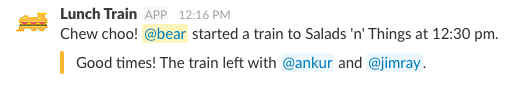
What’s more, UI elements such as buttons, attachments and menus give you a lot of flexibility to make your messages pop. If you’re having trouble keeping your messages short, think about using images or linkified text to make them easier to read.
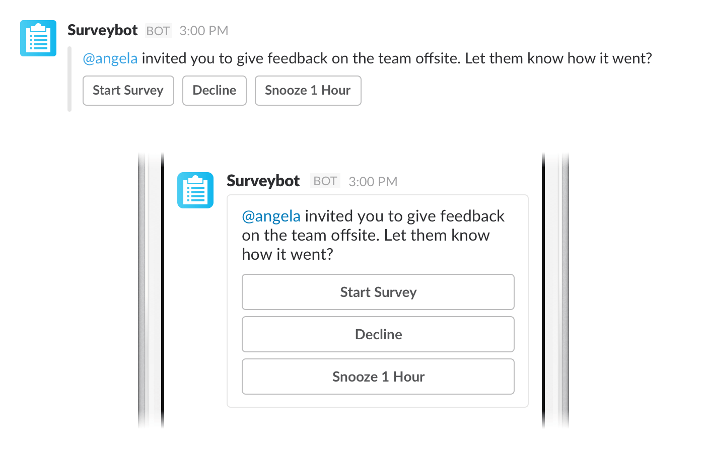
For example, the message below uses links and colored buttons to highlight the key elements of the message: There is a task to be completed, related to a specific message belonging to a specific topic.
Besides making sure your app’s messages look great, you’ll want to do a few more things.
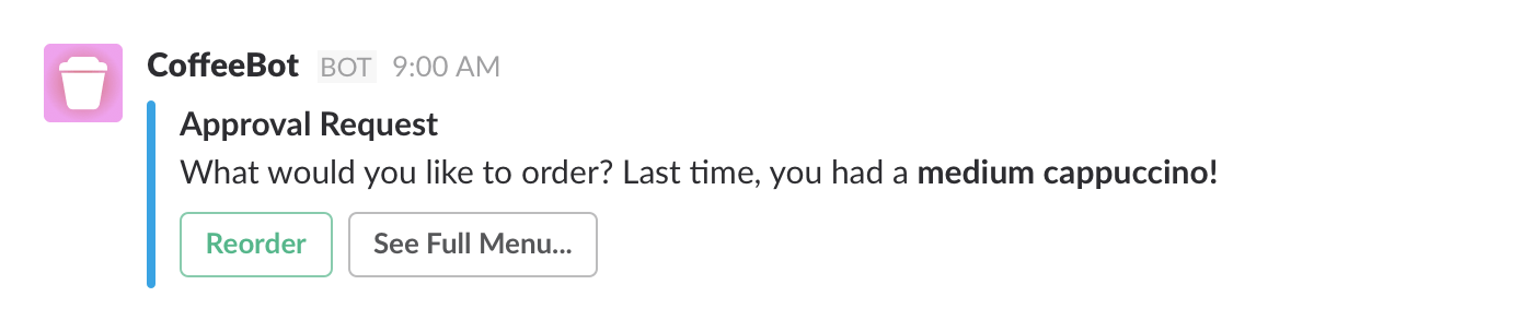
Help Users Choose By Picking Sensible Default Options
Save people work wherever you can by minimizing the choices they have to make. When you give menus and buttons good default values, you decrease the number of choices users have to make from many to just one: yes or no.
Say your app helps people buy coffee. Instead of presenting a full menu of choices every time someone orders, you could make the user’s last order the default option. In the best-case scenario, this reduces the coffee order to a single click.
Know That Messages Have A Lifecycle
Users will be interacting with your app asynchronously. They might begin a task, then get interrupted and revisit later. Your app should plan for that. Interruptions or periods of inactivity may or may not signal a loss of intent on the part of the user.
Decide whether anything in your workflow is time-sensitive. Should someone be able to jump in on a task again at any time? Should some content expire or need to be redone? Make a conscious choice about the lifespan of messages.
Clean Up After Yourself
UI-heavy messages are great in the moment you receive them: They’re easy to read, good to look at and simple to interact with. They also take up a lot of space on the person’s screen.
In your storyboard, think about what a person will need to remember about their interaction with your app when they come back to it later, at the end of the message’s life or after an exchange of several messages. Do those buttons and menus need to stick around, or could you condense the message down to a simple text record of what happened? Be considerate and update your message after the interactive portion of the conversation has expired.
Communicating For Clarity
If your app has a conversational bot component, the way your bot communicates will become part of your brand’s voice. In the most literal interpretation of a chat UI, your bot is your company’s logo having a conversation with the end user — so, no matter what, you are expressing something about your brand and values, and you should be thoughtful about what you say.
Be Clear, Concise And Human
If you strive to make your bot sound clear, concise and human, you can’t go far wrong. The bot’s voice could start out being more or less your own, progressively edited for clarity.
Believe it or not, if you’re doing any sort of natural language processing on your users’ responses, taking the time to write clear, concise bot copy will pay dividends. On nearly all platforms, your bot will speak to the user first. This helps set the tone for the conversation, since people generally mimic the way they’re spoken to when replying. If your bot speaks clearly and in grammatical English (or the language of your choice), you’re more likely to get grammatical replies back.
But What Is My Brand?
Write down some adjectives that you’d like people to use to describe your brand or your bot (for example, “friendly,” “authoritative”). Then you can go back and edit the words you would have used as yourself, and make sure they’re consistent with how someone communicates when they’re friendly or authoritative.
Small words can make a difference. Think about how you would reply to a bot that greets you like this…
"Hello, how may I help you?"
… versus like this:
"Hey, how can I help you?"
For further reading, MailChimp’s “Voice and Tone” guide is a very helpful way to frame how you approach writing for your bot.
How Much Personality Is Too Much?
Your bot’s primary purpose is not to sound clever or to entertain users, but to help them accomplish a task — even if that task is inherently entertaining, like finding just the right cat GIF. Even if your app is useful, if it feels like more work chatting with your bot than just doing the same task outside of the messaging interface, then you’re going to lose some users.
A bot with personality can help you stand out, but within limits:
- Don’t construct a personality that requires you to add a lot of fluff to messages in order to express character or humor. Get to the point.
- Try to avoid puns or wordplay if they detract from the meaning.
- Informality is good, but getting overly friendly will be charming to a very small number of people. The rest will find it grating or even culturally insensitive (particularly in a workplace).
- If you decide to give a gender to your bot (and it’s very easy not to), then be appropriate with the kinds of things they say and don’t say. Don’t be tempted to use it as an excuse to get lazy about behaviors or about phrases stereotypical to one gender or another (or to particular age groups, or anything else). You’ll end up driving people away.
- Using contractions and conversational cadence is a good way to lightly infuse your bot with human personality — “You’ll be able to” rather than “You will be able to.”
A little goes a long way. We cannot say this enough.
Be Brief
Don't add a joke or aside just to add one. Almost every word your bot says should facilitate an interaction. (Courteous parts of speech, such as greetings, are also useful.)
Don't do this:
Try this instead:

The second example still has plenty of distinctive personality, but gets straight to the point.
Be Clear
Try to write copy for your interactions that someone who doesn't speak your language fluently could easily understand. That means:
- avoid over-relying on jargon and slang;
- avoid culturally specific references, such as jokes from movies;
- stick to common, simple words;
- don't replace words with emoji.
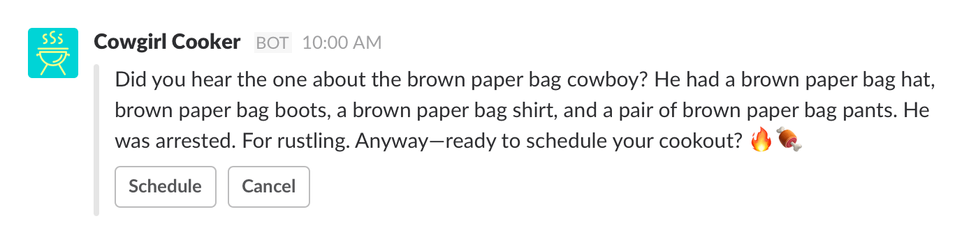
No:
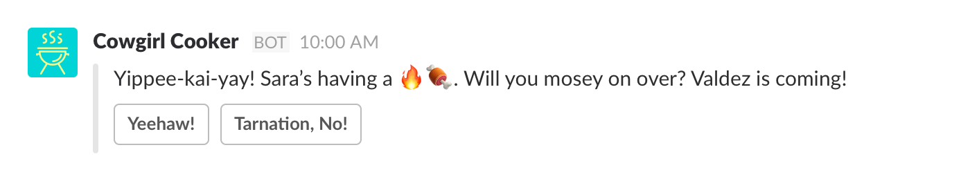
Yes:

The emoji combination is also potentially confusing and might stall some users as they try to decipher it (“Fire?… Meat?… Firemeat?”).
This button copy is similarly difficult to understand and, in the worst case, could prevent users from selecting a response at all. Try to use standard combinations on buttons ("Yes" and "No," "Confirm" and "Cancel") to help users have a smooth, simple experience with your app.
Read over the copy and ask yourself, "Is there anywhere a user might pause in confusion?" Better yet, watch someone read your copy and see if they get confused.
Be Empathetic
Your users could be people of all ages, races, genders and ability levels. Write for them all:
- Consider using "they/their" instead of "she/hers" and "he/his."
- Consider using a variety of emoji skin tones.
- Avoid sexist, racist or ableist language. (We like Lydia X.Z. Brown's list of ableist terms and the APA's guidelines on non-sexist language and on inclusive language in general.)
- Make an effort to test your bot with users from a variety of backgrounds, in different settings (on mobile, with flaky Wi-Fi, etc.).
- Don't assume any level of technical fluency from your users.
Writing for a broad audience takes a bit of practice if you're new to it, and it is usually easier if you have a team of people from diverse backgrounds working on your bot from the start.
Write For A Global Audience
Words and copy used in your interactions should be easily understood even by someone who doesn't speak the same language fluently.
- Avoid jargon and slang.
- For basic actions, stick to common, simple words.
- Write button copy in the active voice, and reflect the user's outcome ("Save," "Book Flight," "Place Order").
- Be concise. Button copy should only rarely exceed two words.
- Avoid vague, non-actionable text like "Click here" or "Settings."
Above all, don't get too attached to anything you write for your bot. Good writing is always in the editing; be open to changes and to feedback, and you'll iterate your way to success.
Tying It Together
Taking your app to a new platform requires that you adapt to your users' expectations and needs in that new medium. We hope this guide has clarified some of the things that are most impactful to enterprise users of messaging apps: the context of work, UI primitives and how to speak in messages.
We don't have all the answers. Everything we've recommended here is what we've seen work for us (building Slackbot) and for successful apps on Slack. If you have your own ideas on what works, we'd love to hear them — drop us a line!
This is an excerpt adapted from Slack's new UX guide — a comprehensive look at what goes into building a great app for Slack. You can read the full version here.
Front page image credit: Should I Use Slackbot (Flowchart)
Further Reading
- Sustainable Web Development Strategies Within An Organization
- How To Enable Collaboration In A Multiparty Setting
- How To Design Powerful Narratives On Mobile
- An Actionable And Reliable Usability Questionnaire With Only 7 Items: Inuit


