An Introduction To Gravit Designer: Designing A Weather App (Part 1)

Email Newsletter
Weekly tips on front-end & UX.
Trusted by 182,000+ folks.


 Celebrating 10 million developers

 Custom Web Forms for Angular, React, & Vue. Your backend.
Being a designer at the moment is great because a wealth of modern design applications are available that let you easily bring your ideas to the screen: Sketch, Affinity Designer, Adobe XD (beta) and Figma, to name just a few (not to mention the classics, Photoshop and Illustrator). One app that is quite new, though — and perhaps a bit overlooked — is the free Gravit Designer app. Gravit gives you all of the tools needed to create functional and elegant screen designs. It can also be used to make icons, designs for print, presentations and much more.
With the recent release, it’s gotten even better: Now you can import your Sketch files into Gravit (similarly to Figma, which also supports the new Sketch file format), save designs locally or sync them to Gravit Cloud, and get started quickly with design templates. Gravit also has Symbols and improved anchoring options (also called constraints in other apps) now. Gravit Designer is free, works on all major OS platforms and is available as both a web and desktop (standalone) app.
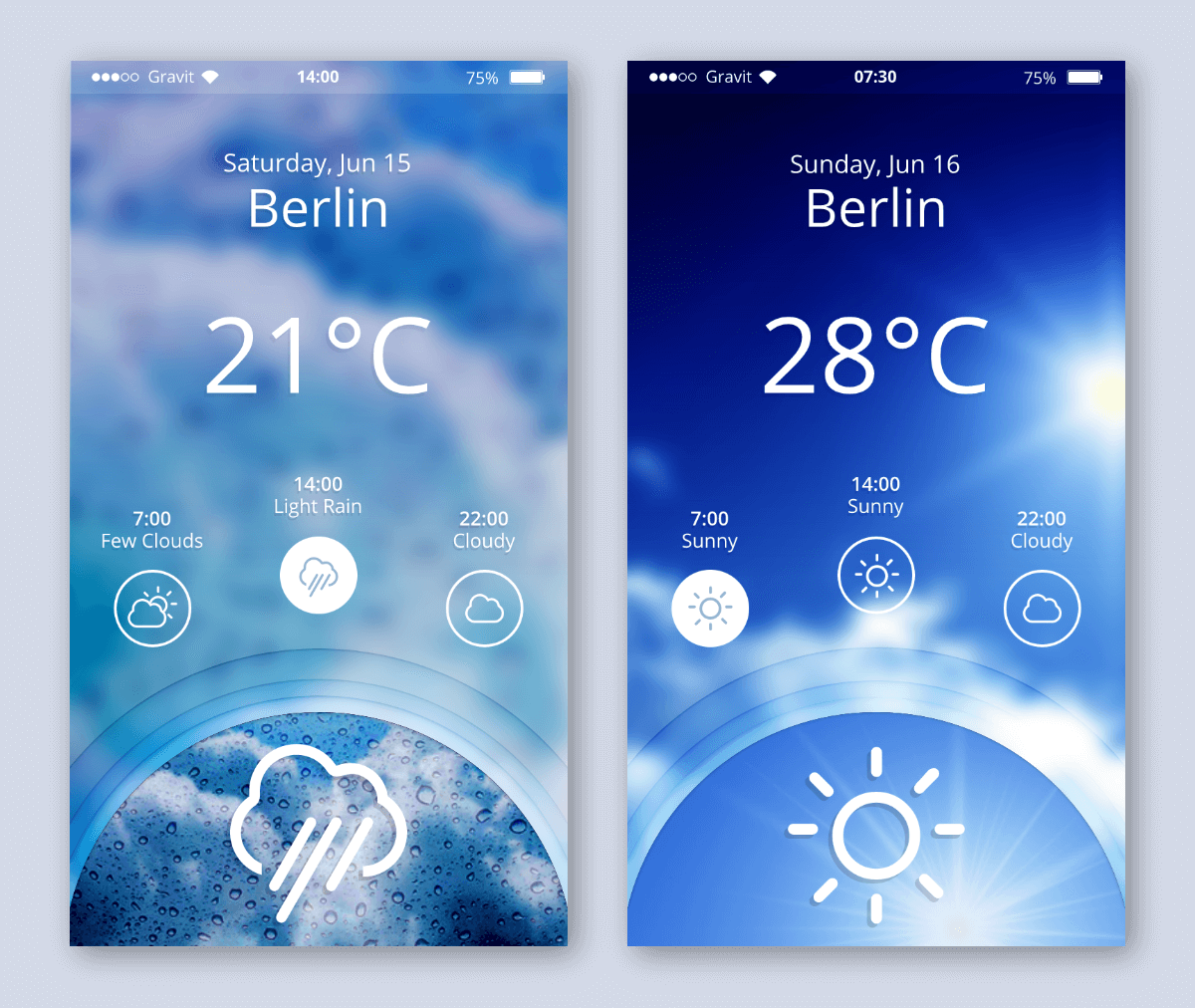
Every new tool can feel daunting at the beginning. So, in this tutorial I will walk you through the creation of a neat weather app (designed by Claudia Driemeyer). You can download the design file to inspect it or use it as the base of your own work. (Please remember that you need to select “View” → “View Mode” → “Output View,” so that the overflowing parts of the design are clipped when you initially open the design in Gravit.)
Moving From Photoshop And Illustrator To Sketch
If you're a UI designer and you still haven't made the transition, it's worth trying out. In Sketch, you can work with various plugins that automate parts of your workflow and help you work much more efficiently. Read a related article →
Start Me Up
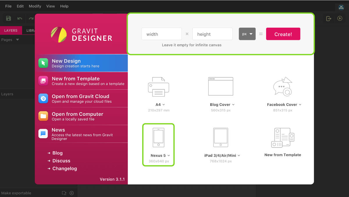
The first thing you will see when you open Gravit Designer is the start screen, with a broad selection of presets (see figure 2). For the purpose of this tutorial, let’s start with the “Nexus 5” template, which has the common size of 360 × 640 pixels. (Click and select the template from the dropdown.) If you don’t want to limit your imagination, you can also leave the “width” and “height” fields at the top empty, which will create an infinite canvas; going for a fixed-dimension canvas later will be easy: Just enter width and height values.
This initial screen also lets you open files (either from Gravit Cloud or from your computer) and start from a selection of templates.
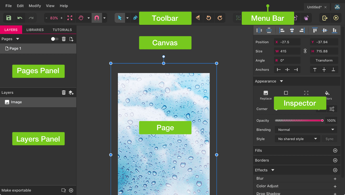
After having selected the “Nexus 5” preset, you will be presented with a new “page” (known as an artboard in other design applications) at the center. The page will hold all of the elements of the proposed app. Because it’s an app about weather and a potential user should see the current conditions at a glance, let’s start with a full-sized background image. I’ve prepared a rainy image, which you can either save to your computer and drag it to the canvas from there, or copy and paste directly from the browser.
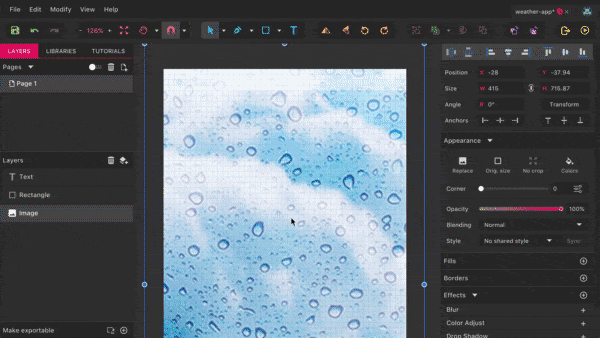
This image will create the first entry in the Layers panel (on the left), and it will also be placed in the center area of Gravit Designer, on the canvas (figure 3). In case the image hasn’t been centered to the page, right-click and select “Align” → “Align Center,” followed by “Align Middle.” Alternatively, you can drag the image until the pink smart guides show you this centered position.
Now, switch to the Pointer tool (press V), hold Shift and Alt both to constrain the ratio of the image and to resize it from the center, and drag out the bottom-right handle. It should have a width of about 415 pixels, visible from “Size” → “W” in the Inspector, the right-hand panel of Gravit Designer (figure 3). The image will overflow the page now — to clip it, select “View” → “View Mode” → “Output view.” Another handy option here is “Outline View,” which shows the outlines of the layers only.
Note: Usually, enlarging bitmap images is not a good idea, but as we will be blurring the image later on, this is not so important.
Now is a good time to save our file. The best way is to save it to Gravit Cloud with the related option in “File” in the menu bar, which makes it available everywhere and on all devices. Want to start the design in the Mac app and keep working in the browser or on Windows? No problem. You just need to create an account, which is only a matter of seconds (you can read more about Gravit Cloud in my overview on Medium). For the file name, use something like weather-app.
The other option, of course, is to save the file to your computer with “Save to file…” (from the desktop app version) or “Download File…” (from the web app version of Gravit).
What’s Your Status?
Let’s continue with the status bar of the app, whose basic shape is a rectangle. Press R to switch to the Rectangle tool, start to draw in the top-left corner, go all the way to the right, and make it 24 pixels high.
Note: All of these tools (such as the Pointer tool mentioned a little earlier) can also be accessed from the toolbar at the top of Gravit Designer (figure 3)
In case you didn’t get the right dimensions for the rectangle, you can also enter them in the Inspector (the width should be “360.”) The reason we chose exactly 24 pixels is that we will be using an 8-point grid, which prevents an arbitrary placement and sizing of elements. You can display the grid from “View” → “Show Grid” or by pressing Alt + Command + G (or, on Windows and Linux, Alt + Control + G). The actual grid size can be set in the Inspector (“Grid” → “Width and Height”) once you click anywhere outside the page — use “8” for both fields.
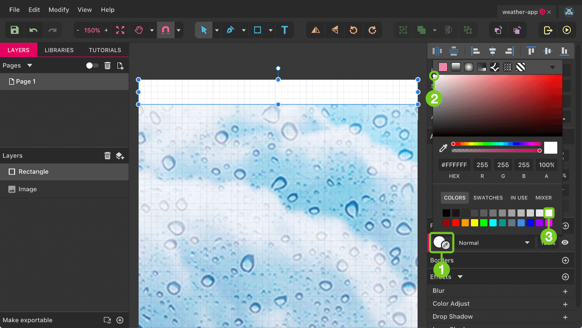
Select the rectangle again with a click, and change the color to white. You can do so by clicking on the color field in “Fills” in the Inspector (figure 4, callout 1), which will bring up the color dialog, with many different options. For now, either drag the color picker to the top-left (figure 4, callout 2) or select white from the swatches in the bottom-right (figure 4, callout 3). To let the background image shine through, set the “Opacity” to 50%. Instead of doing that in the color dialog, close it, and enter this value just above the “Fills” area in the Inspector.
Note: The opacity affects the global transparency of the layer, while the “A” field (alpha) in the color dialog sets the opacity of only the current fill. This is especially important because you can add multiple fills with the “+” icon on the right. To delete a fill again, select it with a click and press the trash bin (delete) icon.
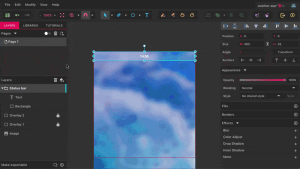
Back to the status bar: The next element will be the time, a white text layer with a size of 12 pixels. To add it, switch to the Text tool with T, click in the center of the rectangle, and write “14:00” for example (figure 5). When done, press Esc, set the “Size” to “12” and the font face to “Open Sans” with a “Bold” weight in the Inspector.
Note: Gravit Designer comes with a wide selection of fonts, but you can also bring in your own fonts with “File” → “Import” → “Add fonts…” in the web version; in the desktop app, all fonts on your system can be used out of the box.
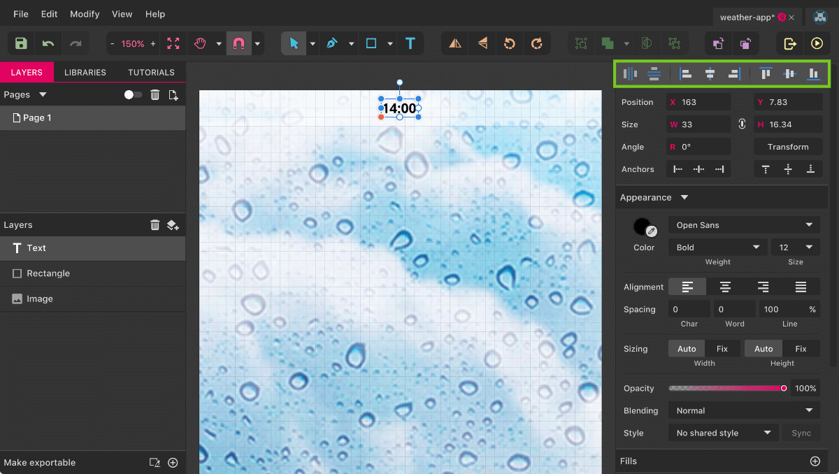
Select the time along with the rectangle (hold Shift and click on both), and center them to each other. You can either right-click and select “Align” → “Align Center” and “Align Middle” or use the alignment icons in the top-right — in particular, the fourth and seventh icons from the left. Another option would be to drag the time until the pink smart guides show you this centered position. At the moment, the text layer is barely visible, so we will treat the background image before continuing with the rest of the status bar’s elements.
Wonderful Imagery
First, create another full-width rectangle, starting from the top-left, with a height of 376 pixels. Enter the color dialog and, instead of a solid fill, select the second option at the top, a linear gradient (figure 6). It will be created horizontally by default, going from the left to the right. What we want, however, is a vertical gradient, so click on the round arrow pointing to the right twice to rotate it clockwise. The starting color stop of the gradient should still be selected — change its color to #070031 in the “Hex” field. For the other gradient stop, you can use the same color but with 0% alpha.
To blend it in with the image, click anywhere on the rectangle to close the color dialog, and select “Soft Light” from “Blending” right above the “Fills” area in the Inspector.
Note: As with the opacity of a layer, there is a “general” blending, which affects the entire element and how it blends with objects behind it, and a “separate” blending for each fill, which just affects how the various fills interact with each other.
For an even stronger effect, clone this layer with Shift + Command + D (on Windows and Linux, Shift + Control + D). Rename the first rectangle to “Overlay 1” with a double-click in the Layers panel, and the second to “Overlay 2,” select both after holding Shift, and drag them below the other white layer (the background of the status bar). Finally, lock them with a click on the lock symbol so that you don’t interfere with them by accident later on.
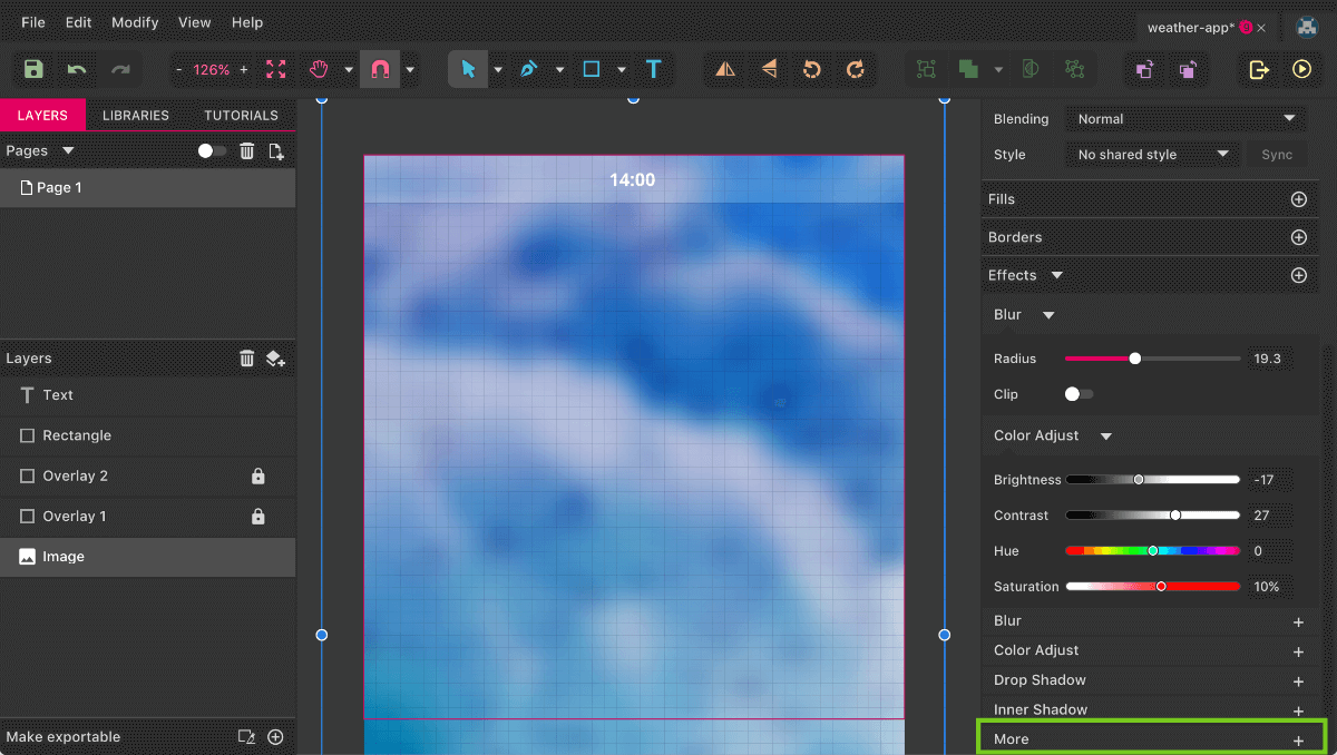
Now to the background image itself. Gravit Designer enables you to directly tweak the colors of a bitmap without needing to fall back on another application. Select the image, click on “Color Adjust” in the Inspector, and change the “Brightness” to “-17%,” the “Contrast” to “27%” and the “Saturation” to “10%” (figure 7). Looks way better, and the time already comes to the fore. Besides this color correction, you have many other filters with which to modify bitmaps. Click on “More” at the bottom of the Inspector, which will show you a comprehensive list of effects to choose from. Be sure also to click on the dropdown at the top.
Back to the background image, where we need to fix one last detail: applying a “Blur” with a “Radius” of “17” (figure 7). To make the white layer of the status bar better blend in with the background image, you can also set its “Blending” to “Soft Light” in the Inspector.
Important: Keep in mind that effects such as blur can slow down Gravit Designer considerably. If you experience this, switch off the effects temporarily with “View → Show Effects” (on a Mac, Command + E, and on Windows and Linux, Control + E).
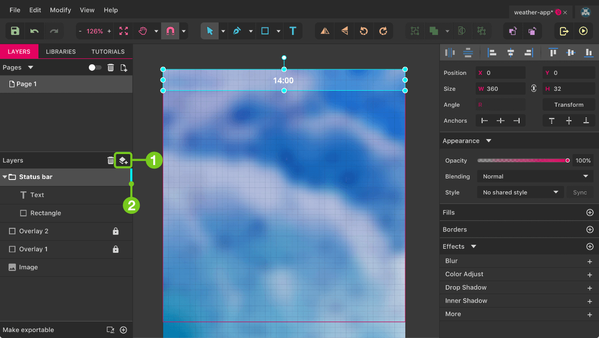
Before we continue with the other elements of the status bar, select its existing parts (the time text layer and background rectangle), and press Command + G (on Windows and Linux, Control + G) to group them, and name this group “Status bar” by double-clicking. This lets you select the entire group, but you can still pick individual elements by holding Command (on Windows and Linux, Control) and clicking on a layer. The same behavior will be enabled with “Click-through this element” in the Inspector.
A handy alternative to using a group is to use a so-called “layer.” (Do not confuse this with a general layer, which is an individual element on the canvas and in the Layers panel.) Add such a layer with a click on the “New Layer” icon (figure 8, callout 1) in the Layers panel. Just like with a group, such a layer (group) also allows you to combine elements but has the following advantages:
- You can define a color that is shown for all related elements on the canvas (click on the colored bar on the right side of a layer — see figure 8, callout 2),
- You don’t need to hold
CommandorControlto select an individual layer within the layer (group) on the canvas. - Elements are automatically added to the layer (group) after their creation.
- You have a separate “Layer” tool (press
M, also available from the “Select” tools in the toolbar) that will let you select the entire Layer group.
If you like, you can add a layer and drag the elements from the group in there (and delete the now empty “Status bar” group with Backspace (or, Windows and Linux, Delete).
Signal Lost
The next element for the status bar is the icon for the receive signal (see figure 9 for the process). We’ve drawn some inspiration from iOS’ icon here with its circles — and although that’s quite a contrast from the typical Android design, it’s the perfect opportunity to show the smart duplicate feature of Gravit Designer (more on that in a minute).
Press E to switch to the Ellipse tool, hold Shift to make it a perfect circle, and add a first circle with a diameter of 6 on the left. Switch off the grid with Alt + Command + G (on Windows and Linux, Alt + Control + G). Give it a white fill.
If you’re having trouble creating such a small element, you can also add it at a bigger size and then bring it down to 6 × 6 using the Inspector. Just be sure that “Keep Ratio” (the small icon between the width and height fields) is enabled. Alternatively, press Z to switch to the Zoom tool and drag a selection in the top-left of the page to enlarge this area.
Getting to the other four circles is easy. First, press Command + D (on Windows and Linux, Control + D) to duplicate the element. Then drag it up, so that it is at the same height as the other circle and has a distance of 1 pixel (the pink smart guides help here). After that, press Command + D again to create three more instances at the same distance. This “smart duplicate” feature works for all kinds of transformations, such as rotations, and always repeats all of the steps between the first and second duplication.
The difference between duplicate (Mac: Command + D, Windows and Linux: Control + D) and clone (Mac: Shift + Command + D, Windows and Linux: Shift + Control + D) is that the former offsets the new layer by 10 pixels in each direction (X, Y) and allows for smart duplication. The latter doesn’t.
Let’s suppose the signal isn’t the best over here. So, select the last two circles and apply a border instead of a fill. Click on the eye icon on the right side of the fill to disable it, and instead add a border with the “+” icon in the “Borders” section below. Also, give it a white color.
This default centered border isn’t suitable, however, so change it to an inside type by clicking on the “Advanced stroke settings” on the right. There, change the “Position” to the first icon. For the border width, pick “0.5.”
There are several ways to change a value in an input field in Gravit:
- Click inside an input field, type the desired value, and press
Enter. - Use the up or down arrow key on the keyboard to increase or decrease the value by 1;
- Hold
Altand use the arrow keys to go in increments of 0.1; - Hold
Shiftand use the arrow keys to go in increments of 10.
For our border, the easiest way is to hold Alt and press the down arrow key five times on the keyboard. (With the rise of high-resolution mobile devices, it’s probably OK to use a half-pixel value here, because it will still appear sharp when exported.)
Finally, select all circles and perform the following steps:
- Create a group with
Command + G(on Windows and Linux,Control + G). - Name it “Receive signal” (double-click in the Layers panel to rename).
- Drag it into the “Status bar” group.
- Move it so that it is 2 grid units (16 pixels) away from the left edge of the page. (You can show the grid again with
Alt + Command + G, or on Windows and Linux,Alt + Control + G.) PressingAltto display the smart guides will assist you here. - In the vertical direction, center it to the white background (and rename this one to “BG”).
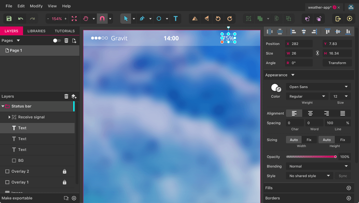
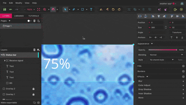
The next element we will tackle is the carrier name (figure 10). Pan a bit to the right (hold the space bar and drag), select the time text layer, hold Alt and drag it to the left to create a duplicate. Make sure that it’s 6 pixels away from the receive signal, change the text to “Gravit,” and the weight to Regular. Do the same for the battery level indicator, but drag it to the right, with “75%” as the content (figure 10). Remember that you can press Esc to leave text-editing mode. Of course, we could take a premade icon for the battery symbol, but where is the fun in that? Let’s give it a try (figure 11).
Recharge Your Batteries
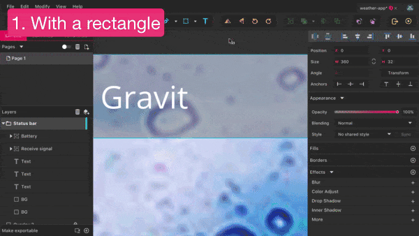
The first element is a simple rectangle (24 × 10) with a white inside border of 0.5 and rounded corners of “1.” (You can add the rounded corners in “Corners” in the “Appearance” section of the Inspector.)
Clone this rectangle with Shift + Command + D (on Windows and Linux, Shift + Control + D), move it to the left and down by 1 pixel with the arrow keys, and change the size so that it’s 2 pixels smaller in each dimension.
Please note that Gravit Designer supports mathematical operations in input fields, so you can use “+5,” for example, to add 5 to the current value, or “*3” to multiply by 3. In our case, enter “24-2” for the “Width” in the Inspector, and “10-2” for the “Height,” and press “Enter” to get to the desired dimensions.
This second shape should have a white fill, without a border. Also clone it, move it to the right so that its left edge touches the right edge of the bordered shape, and change the size to 1.5 × 4. Center it vertically to the other shapes.
The third shape has rounded corners on all sides now, but we only want them on the right side, so we need to enter the “Advanced Settings” on the right. Uncheck “Uniform Corners” so that you can enter “0” for the top-left and bottom-left corner, and 0.5 for the top-right and bottom-right pendants. Select all three rectangles, combine them into a “Battery” group and drag it into the “Status bar.” Make sure that it is 2 grid units (16 pixels) away from the right edge of the page, vertically centered to the status bar, and that the battery level has a gap of 6 pixels to it.
Command + E (on Windows and Linux, Control + E) for performance reasons.Good Vibrations
There’s one last thing to manage for the status bar: the Wi-Fi signal indicator (figure 12). We can approach it in two ways. First, a white rectangle. Create one next to the “Gravit” text layer, with a size of 9 × 9 (hold Shift to create a square). Turn it by 45 degrees, either in the Inspector (“Angle” → “R”) or by grabbing the top-most handle on the canvas and holding Shift to constrain the movement to 15-degree steps.
Now we need to convert it to a path (Mac: Shift + Command + P, Windows and Linux: Shift + Control + P, or right-click → “Convert to Path”), so that we are able to manipulate its individual points. Change to the Subselect tool (press D), select the top-most point and click on the second icon at “Joint” in the Inspector. This will convert the former “Straight” point, with no curve, to an evenly rounded “Mirror” point. Increase the curve a bit by dragging out either of the handles to the sides of the point while holding Shift (to keep the movement horizontal), and move it 3 pixels down with the keyboard. Goal accomplished!
Note: The difference between the Pointer tool (V) and the Subselect tool (D) is that the former selects entire shapes or layers, while the latter is mainly used to manipulate an individual point or to show more manipulation options.
The second approach for the Wi-Fi icon would be with the Bezigon tool (figure 12). Keep the icon we just created as a reference, but tone it down to an opacity of 40% in the Inspector. Now, enable the Bezigon tool from the “Path” area in the toolbar (or press B) and make a first click at the bottom-most point of the other Wi-Fi symbol. Make another click at the left-most point, then continue to the top-most point, but hold Alt before you click.
This move is especially vital with the Bezigon tool because it creates a curve that automatically adapts to the surrounding points. Continue at the right-most point, but release Alt again, and finish the shape with a click on the first point at the bottom. You can see how a point that was created with an Alt click of the Bezigon tool adapts automatically if you select the top-most point with the Subselect tool (D) and drag it around.
Keep the version of the icon you like, center it vertically to the status bar, and move it away 6 pixels from the “Gravit” text layer. Finally, rename it to “WiFi” before you drag it into the “Status bar” group. With this last step, we’ve finished the status bar and can turn to the contents of the app.
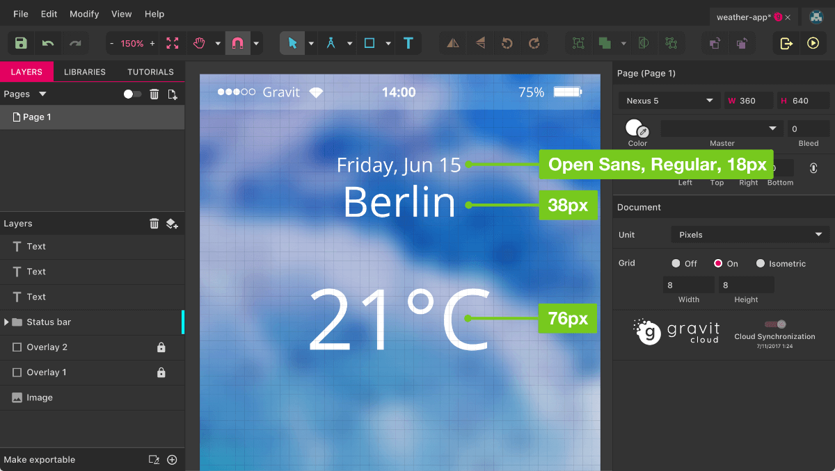
The first element here is the current date (“Friday, Jun 15”), a white text layer with a size of 18 pixels and a “Regular” weight (figure 13). Zoom out to 100% again with Command + 0 (on Windows and Linux, Control + 0), so that the placement becomes easier. Center the text layer to the page and place it on a grid line, about 36 pixels away from the status bar. Hold Alt and drag it to the bottom to create another text layer for the location. Double-click so that you can change it to “Berlin”; for the text size, choose “38.” It should also sit on a grid line right below the date and be centered to the page.
The final text layer we need now is for the temperature (“21 °C”). Proceed as before, but for the font size, you can simply add “*2” to the current value of the input field and press Enter, which will double the size. It should be about 28 pixels away from the other layer.
Conclusion
With this ends the first part of the tutorial. I hope you have enjoyed it so far and that it has given you valuable insight into Gravit Designer, its features and what it can do.
In the second part, we will look at some more sophisticated techniques, see how we can make the weather icons to create a version of the app with sunny weather, and learn how to export the final design.
If you have questions regarding this tutorial, please leave a comment below and I will gladly help you. And if you have ideas on how Gravit Designer could be further improved, don’t hesitate to reach out to the Gravit team on Twitter or on Facebook. Your feedback would be more than welcome!
Further Reading
- Meet Penpot, An Open-Source Design Platform Made For Designers And Developers Alike
- Top Front-End Tools Of 2023
- Solving Media Object Float Issues With CSS Block Formatting Contexts
- Sketch, Illustrator or Fireworks? Exploring A New Free UI Design App: Gravit
 (mb, al, il, mrn)

