CSS Grid Gotchas And Stumbling Blocks

Email Newsletter
Weekly tips on front-end & UX.
Trusted by 182,000+ folks.
 Custom Web Forms for Angular, React, & Vue. Your backend.
 Celebrating 10 million developers


CSS Grid is such a different way of approaching layout that there are a number of common questions I am asked as people start to use the specification. This article aims to answer some of those, and will be one in a series of articles on Smashing Magazine about layouts.
Why Use Grid Instead Of Flexbox?
Prior to CSS Grid Layout landing in browsers, many people saw flexbox as the answer to all of our design-related problems. However, flexbox doesn’t provide a grid system any more than floats do, although it does make creating one simpler. A true grid is two-dimensional. The two dimensions are rows and columns, and with grid layout you can control both at once. With flexbox, you choose whether to lay the items out as a row or a column, one or the other and not both.
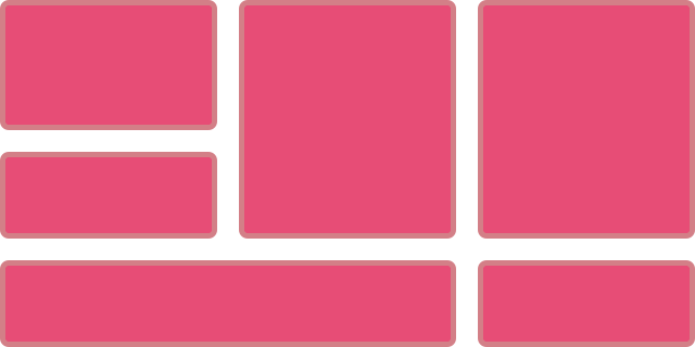
Here is a simple example which highlights the difference. The first layout uses flexbox to display as many boxes as will fit into the available width. Here we are controlling the layout across the row. We are allowing the flex items to wrap, so they create new rows, but each row is a new flex container. The space distribution happens across the row and so depending on how many items the final row has, they sometimes won’t line up with the items above to make a grid.
Example 1: Flex layout in one dimension.
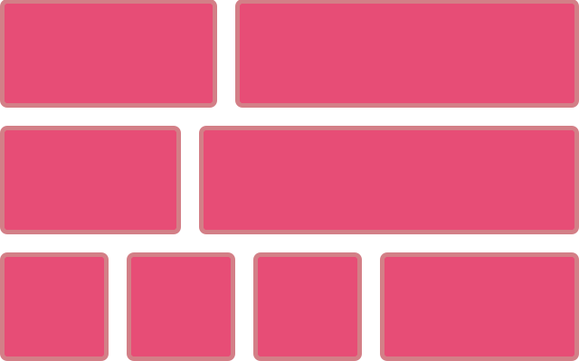
The second example uses Grid to make the same kind of layout, however, you can see that the items in the final row always remain lined up in their columns. This is because with grid we line our items up in rows and columns — two dimensional layout.
Example 2: Grid layout in two dimensions.
You can also see in that second example, that with grid layout we don’t need to add anything to the grid item to make the layout. Everything is being set on the container. In a flex layout you have to target the flex item to set the properties of flex-grow, flex-shrink and flex-basis. This is something key to understand about grid layout and is perhaps where much of the confusion people have lies. Grid is mostly about the containing element, whereas all of our previous layout methods have relied on our setting widths on the items in the layout to make something that looks like a grid.
If you take a simplified floated twelve column “grid”, we have to calculate the percentage size of each column, plus the percentage size of each gutter margin. To create items that span multiple columns we need to add up the widths of all the items plus the width of the margins used to separate them.
Example 3: A simple floated grid framework.
The same is true for grids created with flexbox. While we create our flex layout on the parent by setting display: flex all of the sizing needs to happen on the individual items. To make a flexbox “grid” we have to stop flexbox doing it’s flexible thing, instead setting percentage widths just as we would be floats. We get some benefit from using flexbox over floats, the ability to use the alignment properties and have full height columns is one of them. However we still don’t have a grid, in both flex and float methods we are creating something that looks like a grid by way of setting the size of items and lining them up.
Example 4: A simple flexbox-based grid framework.
With grid all of our sizing happens on the container. Once we have created our grid tracks, we can then tell individual items how many tracks to span, but we have an actual grid. We can completely lose row wrappers as grid already has rows. This also means that we can have items span rows too, in exactly the same way as we span columns. Something that has been very difficult to do before now.
Example 5: A 12-column layout using Grid.
Should Grid Be Used For Main Layout And Flexbox For Components?
This myth keeps popping up as people start to learn grid layout. Perhaps it comes from the use of grid systems such as those found in Bootstrap or Foundation where we are concerned with placing items on an overall grid. That is certainly one way to use grid layout. I would however move to thinking about the differences I mentioned in the last section. Ask yourself, is this layout one or two dimensional?
If you can take your component and draw a grid over it, with rows and columns. It is two-dimensional — use grid layout for that.
If instead, you want individual items to expand within a row, without respecting what happens in the row above. That’s a flex layout.
It doesn’t matter if the item you are trying to lay out is a full page, or a tiny component. What matters is how you want the items inside that layout to distribute space and relate to each other.
Can Grid Track Sizing Be Dictated By Content?
We’ve now seen how, when using Grid Layout, we set up the grid and grid sizing on the container. However it is possible for items inside the grid to dictate track sizing. The key thing to remember here is that a change of size in one cell will change the size all along that track. If you don’t want that to happen, you probably want a single dimensional flex layout.
The simplest way in which we see items changing the sizing of their track is when we use auto, which is the default for tracks created in the implicit grid. An auto sized track will expand to contain all of the content placed into it. In the example below I have a two-column layout, adding more content to the right hand column causes the whole row to expand. The second row is also auto sized, again expanding to contain the content.
Example 6: A two-column layout with content.
We can allow tracks to size within two parameters, for example creating tracks that are at least a minimum size but will still grow to accommodate larger items. We do this with the minmax() function. The first value passed into minmax() being a minimum size for the track, and the maximum the maximum size. Therefore you can form rows that are 200 pixels tall but by setting the maximum as auto ensure that you don’t end up with overflows when there is larger content.
Example 7: minmax() allows fixed height until too much content is entered.
We also have some interesting new sizing keywords, that I’ll be having a proper look at in a future article. These work with grid specifically to allow content to change track sizing, and can be found detailed in the CSS Intrinsic and Extrinsic Sizing module. The keyword min-content for example, when used for grid track sizing will create a track that displays as small as possible when all soft-wrapping opportunities are taken.
In my example below this means the word opportunities. becomes the widest thing and the track shrinks down to fit that.
The opposite happens if you use max-content — you get a track that stretches as large as possible without wrapping. This may lead to overflow situations, in my example I have set the grid to overflow: scroll so the max-content track is causing a scrollbar.
Once again, the key thing to remember is that this is going to happen right across the track. You need to ensure that items in other cells of that track will also absorb that extra space neatly.
Understanding how to size tracks, and how content will change track sizing is probably one of the things that newcomers to grid layout find most confusing. It’s ok to find this takes a little while to understand — we’ve not had anything that behaves like this before. Play with examples, it is the best way to start to understand how things work.
Can I Do A Masonry Layout With Grid?
There is a misconception that grid layout is the same as a Masonry or Pinterest layout. This is generally based on seeing how auto-placement works in grid layout, which at first look seems a bit like Masonry. In this next example I have a layout using auto-placement with grid-auto-flow set to dense. This causes grid to pick items up, take them out of source order and try to backfill gaps in the grid.
Example 10: Using dense packing.
However this isn’t really Masonry as we still have a strict grid of rows and columns, and potentially items are taken out of source order. A real Masonry layout would keep things in source order working across the row. Items are pushed up to fill partial spaces left. It’s more like doing flex layout but in both dimensions at once.

You can get the look of Masonry with a grid layout by positioning all of your items but the ability to do an auto-placed Masonry layout isn’t there yet. It is something we are thinking about however for future levels of the specification.
How Do I Add Backgrounds And Borders To Grid Areas?
While on the subject of things that grid doesn’t do yet, a common request is to style the backgrounds and borders of the grid areas themselves. Can you add borders and visually display the grid? At the current time this isn’t possible, you need to insert an element and style that, this could be an HTML element but could also be some generated content.
In this next example I have added some generated content to the grid, positioned it using line-based placement and then added a background and border to that area.
Example 11: Generated content can be styled to add a background or border to an area.
Another thing I sometimes do to get round the lack of backgrounds and borders, is use a single pixel grid gutter — as in this next example.
Example 12: Using a 1px gutter in a contrasting colour to fake cell borders.
To be able to have proper styling of areas of the grid we would need to introduce the concept of grid area pseudo-elements, a special sort of generated content. There is an issue raised regarding this on the CSS WG GitHub site, so you can follow discussion and add your own thoughts.
Spanning To The End Of The Grid
Grid Layout has a concept of the implicit and explicit grid. The Explicit grid is the grid that we define when we use grid-template-rows and grid-template-columns and pass in a track listing. This track listing defines the extent of the explicit grid. The implicit grid is created when we place an item outside of the explicit grid, or when we have more items placed via auto-placement than we have created tracks for.
Tracks created in the implicit grid will be auto sized unless you set a track sizing using grid-auto-rows or grid-auto-columns.
In many cases the implicit and explicit grids behave in the same way, and for many layouts you will find you define columns and then allow the rows be created as an implicit grid. There is a difference however that trips people up, and this is found when you start using negative line numbers to refer to the end line of the grid.
Line -1 is the end of the explicit grid
Grid respects writing mode. In a left to right language, column line 1 is on the left and you can us line -1 to target the right-hand column line. In a right to left language, column line 1 is on the right and -1 will target the left-hand line.
Example 12: Using line numbers on the grid I left to right and right to left directions.
Where people get caught out is that it is only the explicit grid that can count backwards. If you have added rows in the implicit grid and then try to target the end line with -1, you will find that you get the last explicit grid line and not the actual end of your grid.
Example 12: Line -1 represents the end of the explicit grid.
I’m Having Trouble With My Percentages!
At the beginning of this article I described how grid is very different to the layout methods that came before it. Due to the limitations of float and flex-based grids, we have needed to become good at calculating percentages in order to do layout and so the first thing that most people do is try and use the same method in their grid layouts. However, before doing so don’t forget our new friend the fr unit. This unit is designed for grid, and works because of the way that grid sets up sizing on the parent element.
The fr unit allows us to distribute a share of available space. It does so by looking at what space is available in the grid container, taking away any space needed for gutters, fixed width items, or content that is defining track sizing and then sharing out the rest according to the proportions we have specified for the tracks. This means that the scenario we have with a floated or flex layout for example, where we have to have flexible gutter tracks so that all of our percentages add up, isn’t the case with grid layout.
In most cases the fr unit is a better choice than percentages. A reason you might choose to use percentage would be where you need a grid layout to match up with other elements using some other layout method and relying on percentage sizing. However if that isn’t the case, see if the fr unit will serve your needs before starting down the route of doing all the maths yourself!
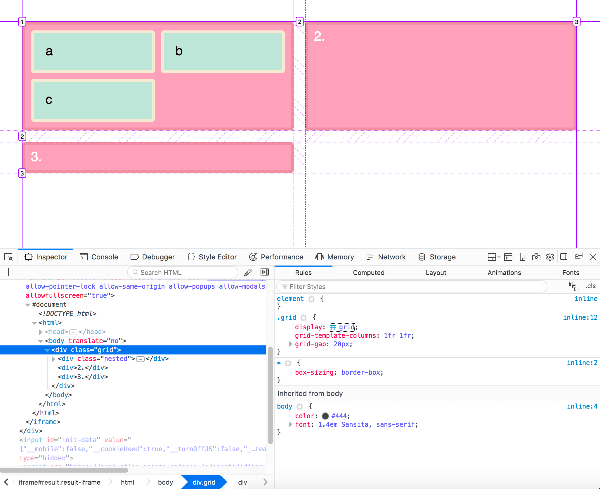
Can I Nest Grids?
A grid item can also become a grid container, in the same way that a flex item can become a flex container. These nested grids however have no relationship to the parent grid, so you can’t use them to line up internal elements with other nested grids.
Example 15: Grids inside grids.
Example 15: Grids inside grids
In a future level of grid layout we may well have a method of creating nested grids that do maintain relationship to the parent grid. This would mean that items other than direct children of the grid could participate in an overall grid layout.
Can I Polyfill Grid Layout?
I’m often asked if there is a way to polyfill grid layout, with people wanting to know if there is a drop in and forget it way to support older browsers.
My advice would be that this isn’t something you want to do. It is likely to create a very slow and janky experience for those browsers already struggling to render modern websites. If you need older browsers to look identical to modern ones then maybe you should reconsider using grid on this project. However in most cases it is possible to use older methods to create a simpler fallback tailored to non-supporting devices without needing to create two completely different sets of CSS. This really needs an article to cover it in detail, so look out for that on Smashing Magazine soon!
Debugging Grid Layouts
As you start to work with grid you will quickly want to be able to see your grid and how the items on it are laid out. I would suggest that you download a copy of Firefox Nightly and use the Grid Inspector in the Firefox DevTools. If you select a grid you can then click the small grid icon — which I like to think of as a waffle — to display the grid.
Firefox have created an excellent tool here, and while Chrome have begun to implement something into Chrome DevTools, right now the Firefox tool is the best in class and it makes working with grid so much easier.
This Is Still New To All Of Us
I know the CSS Grid specification very well, but I’ve only been able to use it in production since March, just like everyone else. As we all move from creating little examples and really start to push the edges of the specification in production work, we will start to find new ways to use grid and of course new problems to solve! I would love to see your own write-ups and demos of the way you are using Grid and other layout methods. I’m also going to be digging into layout issues here at Smashing Magazine over the next few months, so do let us know what you are finding out, and what you would like to know more about.
Further Reading
- The Complex But Awesome CSS border-image Property
- CSS Blurry Shimmer Effect
- A Primer On CSS Container Queries
- How To Build A Magazine Layout With CSS Grid Areas
 (yk, vf, il, mrn)

