How New Font Technologies Will Improve The Web

Email Newsletter
Weekly tips on front-end & UX.
Trusted by 182,000+ folks.

 Custom Web Forms for Angular, React, & Vue. Your backend.

 Celebrating 10 million developers
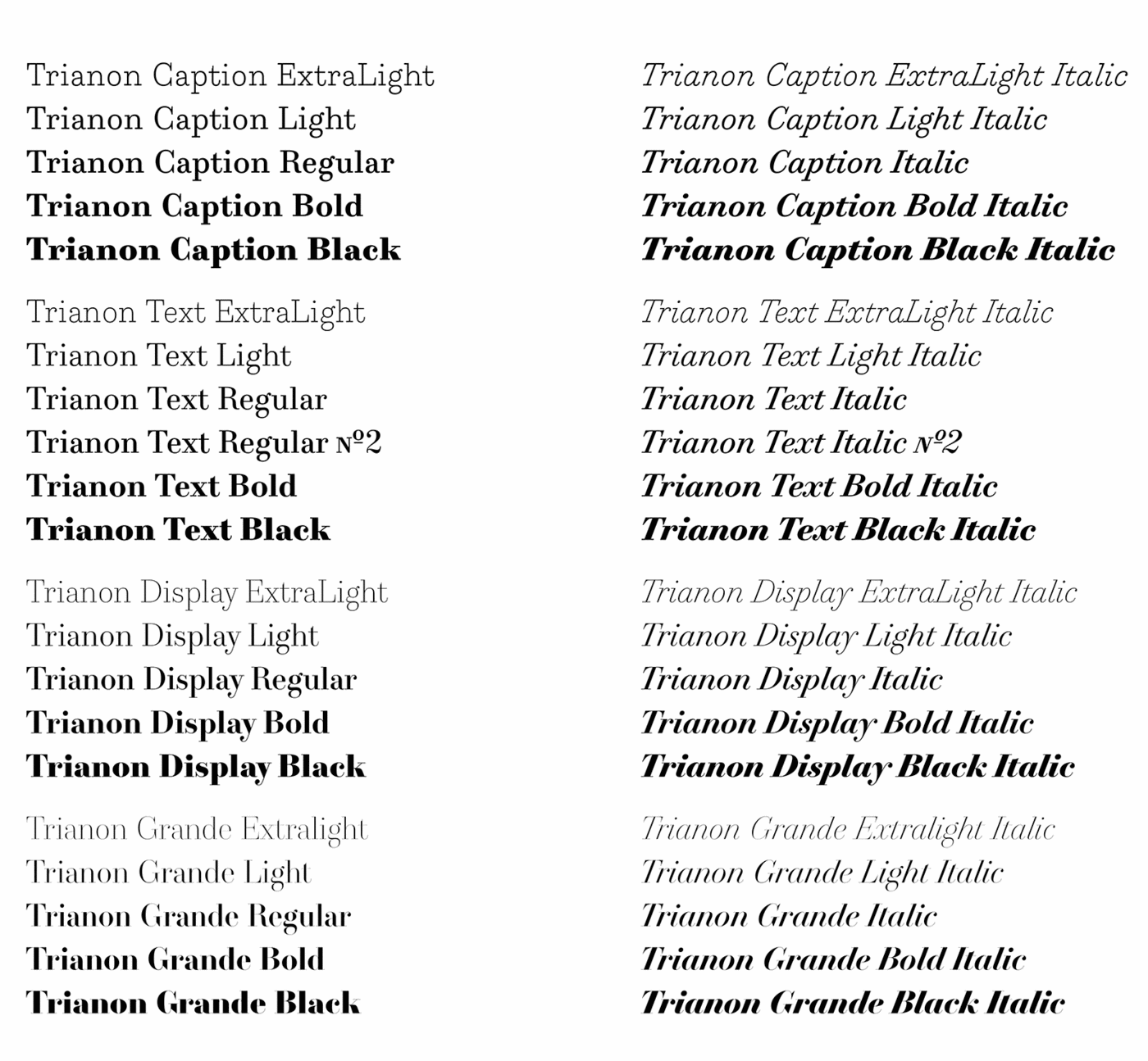
Words are the primary component of content for the web. However, until a short while ago, all we had at our disposal were but a few system fonts. Adding to that, those system typefaces weren’t necessarily coherent from operating system to operating system (OS). Fortunately, Windows, macOS and Linux made up font-wise, and since then, all modern fonts have been compatible across those OS’. There’s no question, the future of web typography looks promising.
And it’s looking more and more promising, too. At the 2016 ATypI conference, the world’s biggest type design conference, Microsoft, Google, Apple and Adobe announced that they have been working on a new iteration of the OpenType standard, called variable fonts. Because it gives a lot more control to the user to modify the typeface depending on the context and device, this new version opens new opportunities for web typography and will close the gap in quality between web and print.
Variable fonts and parametric fonts are tools that will undeniably revolutionize responsive web type. They will allow graphic and web designers to explore shapes and sizes on their own and to tailor typefaces to their needs. Let’s learn the ins and outs of these new tools and how to take control of our typography.
Creating Scalable, Fluid Typography
Fluid layouts have been a normal part of front-end development for years. The idea of fluid typography, however, is relatively new and has yet to be fully explored. Read a related article →
Web Is Not Print With Pixels
When a paradigm shift comes forth, such as a new medium for typography, the first thing it encounters is resistance. We feel like we need to push the status quo to its limit before it can break free and make room for a new way of thinking. Typography is no exception, and for a long time designers have considered screen as paper made of pixels instead of trees. Typefaces used on computers were, and still are for the most part, just a static embodiment of physical fonts. Sure, the screen medium brought with it a number of necessary and extra elements, such as hinting, but the legacy of physical fonts still resonate strongly in type design.
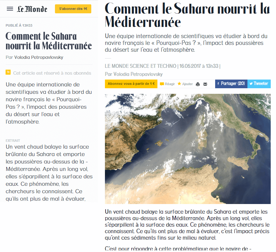
Still, it feels like digital typography is behind physical typography on a range of issues, not so much in the diversity or quality of design, but in the huge fragmentation of screen media. For print design, a cast of physical fonts could be optimized depending on the sizes and shapes of the letters to increase readability. Once the fonts were produced, the result was the same every time; you got exactly what you paid for.
On a screen, it’s a lot more complicated. Once you’re lost in a forest of DPI values and different renderers, what the user gets is all up in the air. And because type designers have little incentive to produce different optical sizes, a lot of digital typefaces include only a couple of them, which hinders the readability of web typography.
When a graphic designer works on a poster, they already know how it will be displayed or distributed. They know the size of the poster, the size of the font, the colors they will use, etc. All of these are known variables that will contribute to their design choices. Also, the designer knows that, once it’s done and printed, the design will not change, and all viewers will experience the same poster.
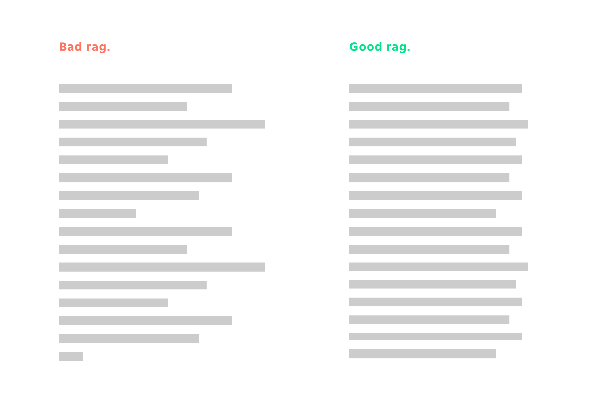
Let’s look at another aspect that is difficult to fix in web typography: rags. Rags are easy to deal with in print: You can adjust the tracking a bit, insert line breaks or hyphenate to clean up the rags. Unfortunately, achieving this degree of detail in web typography is more complicated. The width changes, and the font size can be changed by the user. The dynamism of web pages makes it difficult to make the right choice of size, letter-spacing, etc.
Fortunately, it is possible to gather some data about the context in which your website will be browsed. Thanks to CSS and JavaScript, you can adapt the typography of a web page. However, as easy as it is to change the size of a typeface gradually, it is still impossible to easily change from one variant to another progressively. The only option left is to set up breakpoints, with one variant on one side and another on the other side.
Loading more variants has a price. Adding 150 KB of fonts might not seem like a bad trade-off, but it compounds every time you add a new font to the website. Because loading time is a major factor in the bounce rate of a page, you wouldn’t want users to bail just because your web page has too much to load.
Responsive Web Type Technologies
Having described the challenges of web typography, let’s dive into the heart of the matter. We’ll go deep into the two main technologies that help us make great typography for the web: variable fonts and parametric fonts.
Variable Fonts
With the ATypI 2016 conference on variable fonts, variable fonts have made a big entrance on the web. They’re pushed by the biggest names in web browsing (Google, Adobe, Apple and Microsoft), and they are here to stay.
If you want to see what people do with and say about variable fonts, we’ve gathered resources from around the web. You’ll have to use a browser that supports variable fonts, either Chrome from version 59.0 or Firefox from version 53.0:
- Axis-Praxis (variable fonts playground)
- “Typographic Potential of Variable Fonts,” Alphabettes
- “Decovar, A Multistyle Decorative Variable Font by David Berlow,” TypeNetwork
- Zeitung (variable font), Underware
The best source of news on variable fonts is, without question, the Twitter feed led by Nick Sherman, who collects everything on the web about variable fonts (and for which we should be grateful).
Thanks to the new variable fonts format, it will be possible to precisely adapt typography to its context. Variable fonts are based on a pretty simple idea: They contain several variants of a single typeface or, more precisely, a master variant and deltas from other ones, and the user is free to choose an interpolation of these different versions using only CSS. For example, the typeface could contain a light variant and a bold variant, and you would be able to choose a weight between these light and bold weights using CSS, like so:
 h2 {
    font-variation-settings: "wght" 200;
}
Variable fonts are picky. For them to work, all masters of the font’s base variants must have exactly the same number of points. Morphing between two shapes will be smooth and unique only if the shape you start from and the shape you end up with are similar. Nevertheless, some type creators are used to designing for masters for variable fonts. A similar concept was used for Adobe’s “multiple master” format, and type designers use interpolation to create extended families with tools such as Superpolator. Yet font-variation-settings is still not prevalent in web browsers, and as of the time of writing, only Firefox has implemented the feature. But others should soon follow suit.
There are still a lot of hurdles to jump before variable fonts become an integral part of responsive web typography. Making them is a long endeavor, and type designers now have to think about variations from the get go in order to create typefaces that take full advantage of these new features. Even though converting old typefaces to variable fonts is possible, the old ways are not necessarily suited to the new and more relevant uses that we’ve discussed:
- generating grades on the spot for screens with different DPI.
- changing the width of a typeface depending on the way the user wants to fill lines,
- modifying the optical size depending on the font’s size.
Unfortunately, variable fonts don’t solve every problem with responsive web typography. For example, how do we reduce the number of media queries? How do we handle outliers? How do we make the typeface a part of the web page?
Parametric fonts are intended to fix these issues. They differ from variable fonts in concept and production. They put customization logic at the heart of the font, instead of letting a software do the transformation. All typographic rules are inherently a part of the font, but the font is still easily customizable on the user’s side.
Parametric Fonts
Parametric fonts are an old idea that seems to be revisited regularly by people from different backgrounds. It looks to solve the same issues that variable fonts solve but coming from a more automated way of thinking. So, it has usually been a subject tackled by computer scientists who take an interest in type design.
As with variable fonts, we’ve gathered links from around the web that deal with parametric fonts and their history:
- “Metafont,” Wikipedia
The father of all modern parametric typeface frameworks - Metaflop
A Metafont graphics interface - Metapolator
A parametric typeface creation tool based on Metaflop - “Parametric TrueType Fonts,” TrueType Typography
Information about the now discontinued FontChameleon, which is font software that let you merge fonts from a wide library
It’s been almost 40 years since Donald Knuth pioneered the concept of parametric fonts. By creating Metafont and Tex, Knuth opened up a new era of typography, in which typefaces were created using a series of steps and equations to describe each character.
That’s the big difference between variable fonts and parametric fonts. Variable fonts are interpolated, meaning that they are confined in a design space. The designer is not able to escape this space; moreover, adding dimensions to it requires the type designer to create a new master (i.e. a completely new font). Parametric fonts are extrapolated, meaning that they emerge from a single definition. The space in which they live is not limited because they behave like a mathematical object.
Take the simple example of a circle. In a variable font world, the type designer would produce two circles and tell you, “Choose either of these circles.” In a parametric font world, the type designer would tell you, “Give the font a radius, and it will produce a circle of that radius.”
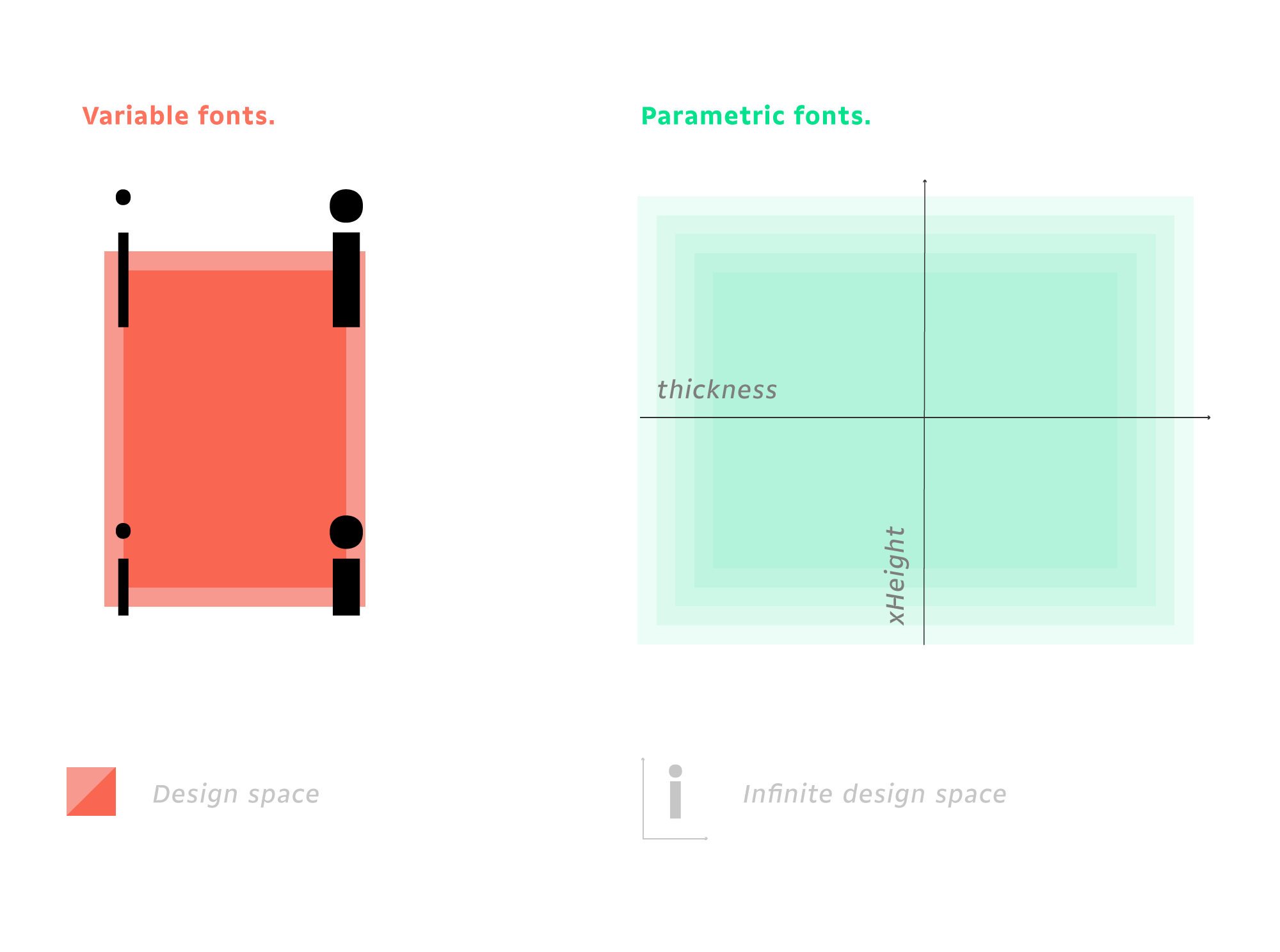
Adding a new dimension to your design space is easy with parametric fonts. For variable fonts, it would mean creating a new master. For a parametric font, you just have to bake the new dimension into the existing equations.
It is also easy to add constraints or to alter the rate of change of some points using parametric fonts. As well, you can add logic directly into the font.
How To Start Working With Parametric Fonts?
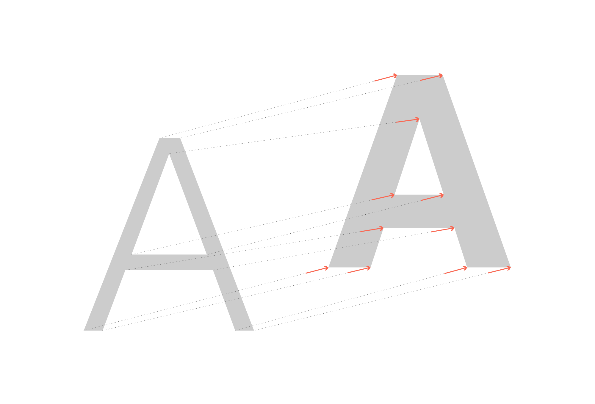
Parametric fonts are pretty easy to use, and the result can look gorgeous. As we’ll see in the examples, parametric fonts can mitigate optical differences between different colors of text. You can also create text that responds to its context or to any interface you can imagine.
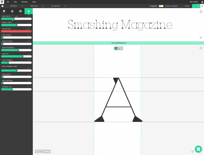
To make life easier for you, we’ve created Prototypo, a free web application for tweaking and adjusting parametric fonts. You’ll need a subscription to take full advantage of parametric fonts. But in the free version, you’ll be able to use subsetted fonts that contain lowercase and uppercase glyphs (no diacritics or figures). The paid subscription unlocks the full fonts.
Here’s how to start experimenting with parametric fonts:
- Use our web preview extension to test your parametric font directly on your website.
- Embed a parametric font on your website using our JavaScript library.
Prototypo Chrome Extension
The extension can be used to try out parameters for different display sizes and layouts. The extension lets you replace the typefaces on your website. All of the modifications you do in Prototypo are applied to your website in real time. This is the perfect tool to try out different optical weights and widths for your fonts in their final context.
Prototypo Parametric Typeface Library
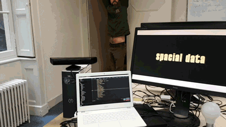
The other option is to use Prototypo parametric technology directly. We’ll explain how you can add the Prototypo library to your website. You’ll be able to create parametric fonts on your website and make them interact as your users need. You can see examples of the parametric technology in our lab. For example, you can use a Kinect to generate fonts, or morph and switch letters based on the current timestamp. We’ll discuss how it works and how you can use it in your projects, including how to:
- set up the project,
- create a font on the fly,
- use the created font in CSS,
- modify the font with JavaScript.
Set Up The Project
This is the tag you will have to add to your HTML to import the Prototypo library.
<script type="application/javascript" src="https://library.prototypo.io/ptypo.js"></script>You can also import this script asynchronously, but you’ll have to wait for its load event to use the library:
<script async type="application/javascript" src="https://library.prototypo.io/ptypo.js" id="script"></script>
<script type="application/javascript">
    document.getElementById('script').addEventListener('load', function() {
        // You’ll have access to the Ptypo global variable here
    });
</script>
So, what can this library do for you, you ask? Well, it will create a Ptypo global variable that we will use to create our parametric font.
Let’s look at an example to better understand how we can use the library.
Making A Light-Font Mode And A Dark-Font Mode
See the Pen bRKbxY by Francois Poizat (@FranzPoize) on CodePen.
For the first example, we will try to create a font whose weight looks the same whether written in dark on light or light on dark. Text tends to look bolder when written light on dark because light colors tend to bleed on dark colors, making the lighter font seem heavier.
We’ll make a simple HTML document that can be switched from light mode to dark mode, and we will change the parameters of the font accordingly. You could also have several color schemes and produce parameters that would look the same for each color scheme.
Let’s start by creating our font factory.
const ptypoFactory = new Ptypo.default();Here, you can use your token if you subscribe to the Prototypo application. (You can find more information about that in our documentation.)
Once we have our font factory, it’s time to start creating fonts. For the dynamic part of this example, we’ll create two fonts — named titleFont and paragraphFont for the h1 heading and the paragraph, respectively.
ptypoFactory.createFont(
 'titleFont',
 Ptypo.templateNames.ELZEVIR).then(function(font) {
  //Setting up the right parameters
  font.changeParam('thickness', 110);
});

ptypoFactory.createFont(
 'paragraphFont',
 Ptypo.templateNames.GROTESK).then(function(font) {
  font.changeParams({thickness: 70, spacing: 0.5});
});
The title font uses the Elzevir template, which is a serif template, and the paragraph font uses the Grotesk template, which is a sans-serif. We can set the parameters as we please (you can change the value if you want).
As you can see, we can modify the parameters in two ways:
font.changeParam('nameOfParameter', parameterValue)
font.changeParams({
 parameter1: parameter1Value,
 parameter2: parameter2Value,
 parameter3: parameter3Value
 …
});
You can learn more about the different parameters available in our API documentation.
Now we need to write the HTML that goes with it and the CSS that will assign the correct font to the correct element.
<div class="container">
 <h1>
  With Param
 </h1>
 <p>
  Lorem ipsum dolor sit amet..
 </p>
</div>
h1 {
font-size: 100px;
font-family: 'titleFont';
font-weight: normal;
}
p {
font-size: 18px;
line-height: 24px;
font-family: 'paragraphFont';
}Here, we’ve created a heading and a paragraph of text and attached the correct font to them: titleFont for the heading and paragraphFont for the paragraph.
We now need to create a button to switch between light and dark mode and create the functions that will modify the fonts.
<a href=”#” id="dark-button">
 Dark mode
</a>
There are many ways to modify our fonts. What we will do is create an array that we will fill with an object literal containing our functions once the fonts are created.
const fontToggles = [];
ptypoFactory.createFont(
 'titleFont',
 Ptypo.templateNames.ELZEVIR).then(function(font) {
  //Setting up the right parameters
  font.changeParam('thickness', 110);

  //Storing the function that will be used to change from light to dark
  //and vice versa
  fontToggles.push({
   lightMode: function() {
    font.changeParam('thickness', 110);
   },
   darkMode: function() {
    font.changeParam('thickness', 107);
   },
  });
});
ptypoFactory.createFont(
 'paragraphFont',
 Ptypo.templateNames.GROTESK).then(function(font) {
  font.changeParams({thickness: 70, spacing: 0.5});

  fontToggles.push({
   lightMode: function() {
    font.changeParam('thickness', 70);
   },
   darkMode: function() {
    font.changeParam('thickness', 50);
   },
  });
});
In this part, we start by creating a font using the ptypoFactory.createFont method.
Ptypo.templateNames.ELZEVIR).then(function(font) {
    ...
});
Once the font is created, we put in default parameters for the thickness. We’ve decided to put a thickness of 110 for the heading font and a thickness of 70 and a spacing of 0.5 for the paragraph font.
font.changeParams({thickness: 70, spacing: 0.5});For each font, we will add an object to the fontToggles array. This object will contain a lightMode and a darkMode property. These two functions are to be executed when the page enters light mode and dark mode, respectively, using our button.
fontToggles.push({
 lightMode: function() {
  font.changeParam('thickness', 70);
 },
 darkMode: function() {
  font.changeParam('thickness', 50);
 },
});
Now we can add our listener on the click event of the button and use the functions contained in the array to modify our font according the mode we are in.
let button = document.getElementById('dark-button');
button.addEventListener('click', function(e) {
 document.body.classList.toggle('dark');

 fontToggles.forEach(function(toggle) {
  toggle[document.body.classList.contains('dark')
      ? 'darkMode'
      : 'lightMode']();
 });

 e.preventDefault();
});
Thanks to this code, once we click on our dark-mode button, it will add the dark class to the body. It will loop through our font, modifying functions and executing the darkMode one if there a dark class on body and executing lightMode if there is no dark class on body.
In our example, we’ve included a font that does not change in dark mode, to show what the difference will be between the regular font and the slightly modified one.
Customize Fonts With Data
In this example, we’re going to create several fonts, one for each city’s weather that we want to display, customized using the temperature and wind speed of the given city. The thickness of the font will be tied to the temperature, and the slant will be tied to the wind speed.
See the Pen ayYevr by Francois Poizat (@FranzPoize) on CodePen.
First, we’ll create a list of the cities we want to display.
const cities = [
 'Lyon',
 'Padova',
 'Rennes',
 'Tokyo',
 'Johannesburg',
 'Moscow',
 'Beijing',
 'San Francisco',
 'Marrakech',
 'Trondheim',
];
We’ve chosen cities from around the world, to have a nice range of temperatures and wind speeds.
function yahooApiQuery(city, callback) {
 if (!city || !callback) {
  throw new Error('$.YQL(): Parameters may not be undefined');
 }
 const encodedQuery = encodeURIComponent(
  `select * from weather.forecast where woeid in (select woeid from geo.places(1) where text='${city}')`.toLowerCase()
 );
 const url = `https://query.yahooapis.com/v1/public/yql?q=${encodedQuery}&format=json&diagnostics=true&env=store%3A%2F%2Fdatatables.org%2Falltableswithkeys&callback=?`;
 $.getJSON(url, callback);
};
This function requests the Yahoo weather API. We’ll use jQuery’s getJson function to get the JSON from the API.
function getValueAndChangeFont(city, font) {
 yahooApiQuery(
  city,
  function(data) {
   font.changeParams({
    thickness: parseInt(data.query.results.channel.item.condition.temp) * 2,
    slant: parseInt(data.query.results.channel.wind.speed),
   });
  }
 );
}
We’ve created a function that takes the name of a city and the font. Then, we’ve requested the weather for this city and changed the parameters of the font according to the temperature and wind speed.
font.changeParams({
 thickness: parseInt(data.query.results.channel.item.condition.temp) * 2,
 slant: parseInt(data.query.results.channel.wind.speed),
});
We’ve multiplied the temperature by two because most temperatures in Fahrenheit are between 0 and 100 degrees, and we want the thickness to be between 0 and 200, so that the contrast is stronger. We’ve left the speed of the wind untouched because it can probably take values from 0 to 40, which would be great as an angle for the slant.
const ptypoFactory = new Ptypo.default();
cities.forEach(function(city) {
 $('#city-names').append(
  `${city} `
 );
 ptypoFactory.createFont(
  `${city}WeatherFont`,
  Ptypo.templateNames.GROTESK).then(
   function(font) {
    getValueAndChangeFont(city, font);
   }
  );
});
For each city, we create a span element that is styled with the right font family. We then create this font using Prototypo’s library. We go through the same process explained in the first example. Let’s create the factory:
const ptypoFactory = new Ptypo.default();Then, for each city, we create the city’s font with the correct name, ${city}WeatherFont, using our getValueAndChangeFont function to customize the font.
This simple example shows how Prototypo can be very helpful for designing a new kind of data visualization: creating typefaces that are able to express more than the text, directly linked to data. Feel free to test this Codepen with your own city, to try others parameters (x-height, width, etc.) and to show us what you’ve achieved!
This concludes our examples. If you want to see more experiments we’ve created with the library, head over to our lab.
Conclusion
Parametric font technology will help us improve the user experience by enabling us to optimize how fonts are displayed on all sorts of devices. It also enables us to be more creative with fonts using context, outside variables and physical sensors to modify the input parameters. You just need to find ideas to tailor your typefaces to the experiences you want to provide:
- Create data visualizations that combine text and content. Imagine that your client has a big website about sports. You will be able to produce a design in which the shapes and proportions of fonts used for players’ names could be linked to the number of touchdowns they’ve scored, the number of games they’ve played, etc.
- Improve the user’s browsing experience with responsive fonts and even adaptive fonts. Because we can already set our text-size preferences, we can imagine a future when users have their own profile to fit their reading habits, especially those who have visual impairments.
- Design storefronts that respond to passers by. Design theater plays whose words are shaped directly by the voices of the actors. Design screens that are capable of rendering letters according to the distance of the reader. Parametric fonts are made to interact with people.
Parametric font technology is both complex and powerful, and like every design tool, it goes awry when it’s used without constraint or perspective. But once you get the logic behind it, you will never go back to a simple breakpoint design.
The question now is, What would you do if you could morph typefaces to your every whim?
Further Reading
- The AI Dilemma In Graphic Design: Steering Towards Excellence In Typography And Beyond
- A New Way To Reduce Font Loading Impact: CSS Font Descriptors
- Building Components For Consumption, Not Complexity (Part 1)
- How To Animate Along A Path In CSS
 (md, il, al, mrn)

