Combining Graphical And Voice Interfaces For A Better User Experience

Email Newsletter
Weekly tips on front-end & UX.
Trusted by 182,000+ folks.


 Celebrating 10 million developers
 Custom Web Forms for Angular, React, & Vue. Your backend.

With the appearance of voice user interfaces, AI and chatbots, what is the future of graphical user interfaces (GUIs)? Don’t worry: Despite some dark predictions, GUIs will stay around for many years to come. Let me share my personal, humble predictions and introduce multi-modal interfaces as a more human way of communication between user and machine.
What Are Our Primary Sensors?
The old wisdom that a picture is worth a thousand words is still true today. Our brain is an incredible image-processing machine. We can understand complex information faster when we see it visually. According to studies, even when we talk with someone else, nonverbal communication represents two thirds of the conversation. According to other studies, we absorb most information from our sight (83% sight, 11% hearing, 3% smell, 2% touch and 1% taste). In short, our eyes are our primary sensors.
Our ears are the second-most important sensors we have, and in some situations, voice conversation is a very effective communication channel. Imagine for a moment a simple shopping experience. Ordering your favorite pizza is much easier if you pick up the phone and order it, instead of going through all of the different offers on a website. But in a more complex situation, relying just on verbal communication is not enough. For example, would you buy a shoe without seeing it first? Of course not.
Even traditionally text-based messaging platforms have started introducing visual elements. It’s not coincidence that visual UI snippets were the first thing Facebook implemented when it created its chatbot platform. Some information is just easier to understand when we see it.
Text-only and voice-only interfaces can do a good job in some use cases, but today it’s clear they are not optimal for everything. As long as visual image-processing remains people’s main information source, and we are able to process complex information faster visually, the GUI is here to stay. On the other hand, more traditional GUI patterns cannot survive in their current form either. So, instead of radical predictions, I suggest another idea: User interfaces will adapt to our sensors even more.
Designing Voice Experiences
A new interface does not mean that we have to disregard everything we have successfully applied to previous interfaces; we will need to adapt our process for the nuances of voice-driven interfaces, including conversational interactions and the lack of a screen. Read more →
Adaptive Multi-Modal Interfaces
Humans have different input and output devices, just like computers. Our eyes and ears are our main input sensors. We are very good at pattern recognition and at processing images. This means we can process complex information faster visually. On the other hand, our reaction time to sound is faster, so voice is a good option for warnings.
We have output devices, too: we can talk, and we can gesture. Our mouth is the most effective output device we have, because obviously most people can talk faster than they type, write or make signs.
Because humans are good at combining different channels, I predict that machines will follow and that they will use multi-modal interfaces to adapt to human’s capabilities. These interfaces will use different channels for input and output, and different mediums for different information types (for example, asking short questions versus presenting complex information).
Interfaces will adapt to humans by using the medium and message format that is most convenient to humans in the given situation. Let’s look at some examples, including the ones we explored at UX Studio, as well as some established commercial products.
Chatbots Are Getting More And More Visual
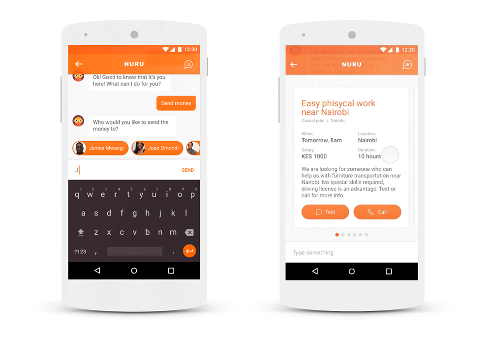
Nuru is a chatbot concept that helps with day-to-day problems in Africa. Starting to design it as a pure chat application, we soon discovered the limits of text-only conversational interfaces.
For basic communication, chat is more effective than traditional user interfaces (UIs). In Africa, for example, chat can be used to boost local commerce. Sellers and buyers can find each other and negotiate different deals. In this case, chat is optimal because of the one-on-one communication. But when it comes to more sophisticated interaction, like comparing many different job postings, we need a more advanced UI. In this case, we added cards to the chat interface, which users can swipe through.
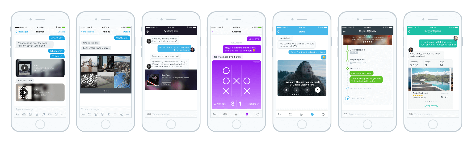
Some other companies, such as China’s Tencent, went even further and let developers build mini-apps that run within its chat app, WeChat. This inspired Western designers to imagine a conversational interface in which every single message could contain a different app, each with its own rich interface. For example, you caould play little games together with your chat partner, like we did 15 years ago in MSN Messenger. This is also an attempt to enhance the simple conversational interface that people love with rich UI functions.
Self-Driving Cars With Mixed Interfaces
A year ago, our team imagined the interface of a self-driving car as a pure exercise in multi-modal design. We imagined the whole process and tried to optimize the interaction at each step.
To order a car, you would push a button on your phone. This is the most simple interaction, and it’s enough to order a car. Obviously, there’s no need to talk on the phone if just pushing a button is enough.
Then, once you enter the car, you would spend some time with getting comfortable, placing your belongings and fastening your seatbelt. Following that, verbal communication would be easier, so the car asks you where to go. It is also faster to say the place, rather than typing the location on a touchscreen. In order for this to work properly, the car would have to understand any ambiguous instruction you give it.
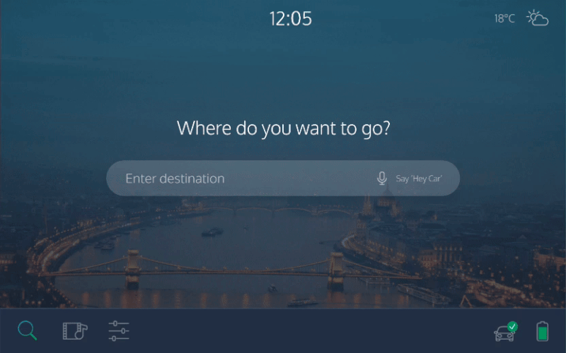
Trust is an important issue in self-driving cars. When we are on the road, we want to see whether we are headed in the right direction and whether our self-driving car is aware of the bicycle in front of us. Having to ask the car every time for its status would be impractical, especially if you’re travelling with others. A tablet-like interface, visible to all occupants, would solve this issue. It would always show what the car detects in its surroundings, as well as your position on the map. The fact that it’s always there would build trust. And, of course, showing map information would be easier visually than in any conversational form.
In this example, you could order a car using a touchscreen, give voice commands, receive auditory feedback, as well as check the status on a screen. The car always uses the most convenient medium.
Home Entertainment And Digital Assistants
The Xbox console with the Kinect controller is another example of a mixed interface. You can control its GUI with both voice and hand gestures. In the video below, you can see that the gesture-recognition technology is not perfect yet, but it will certainly get better in the future. The voice recognition is also a bit awkward because you always have to say the magic word, “Xbox,” before every command.
Despite the technical flaws, it is a good example of how a machine can gives continual visual feedback to voice and gesture commands. When you use your hand as a control, you can see a small hand on the screen as a cursor, and as you move it above different content tiles, it always highlights the current one below your cursor, to show which one you are about to activate. When you say the word “Xbox” to give a command, the console displays a command word on each tile with green, so that you know what to say to select an item.
Of course, the goal here is to help you voice-control an interface that was really designed for voice in the first place. In the future, more accurate voice-recognition and language-processing will help people to say commands in their own words. That is an important and necessary step to make mixed interfaces more mainstream.
Amazon is without a doubt one of the great pioneers of voice interfaces and “no GUI” interfaces. But even it added a screen to its new generation of Echo device, after an arguably failed attempt to push the GUI into an app on the user’s phone.
The freedom that a voice UI gives you is truly fascinating, especially the first time you try it. For example, standing in the kitchen and saying “play Red Hot Chili Peppers” is easier than scrolling through Spotify albums with dirty hands.
But after a while, when you want to use it for more advanced tasks, it just doesn’t work. In one video review, a user pointed out how weird it is that once you start a kitchen timer, you have to ask the device for the status, because no screen exists. Now, with the Echo Show, you can see multiple timers on the same dashboard.
And what’s more important for Amazon than shopping? With the old Echo, you could add things to your shopping list, but then you had to open up the mobile app to actually purchase something. Hearing Alexa read out long product names and descriptions from the Amazon store was just a terrible experience. Now, you can handle these tasks on the Echo easily, because it shows you products and you can choose the ones you like.
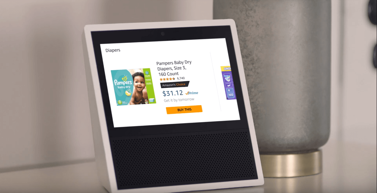
Unlike the Xbox with the Kinect, the Echo Show is a voice-first device. Its home screen is not loaded with app icons. But when you issue an initial voice command, the screen shows you all related information. It is very simple: When you need to know more, you just look at the screen. It’s a bit like how a person works in the kitchen: We can maintain a basic conversation while we focus on cooking, but when an important or complex question arises, we stop and look at our partner’s face. This is why the Echo Show’s direction towards a multi-modal interface is more natural.
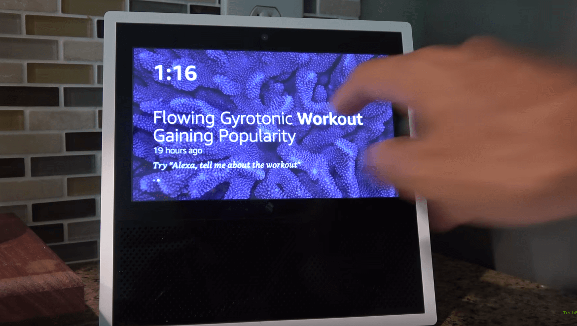
Here’s another design detail. On the home screen, the Echo will display a news headline and highlight a word in the headline in bold, making it the command word you would say if you wanted to hear the full story. In this way, the capabilities of the products are clear, and it’s obvious how you would use it. The Echo effectively sets expectations and gives tips through its visual interface.
One of the main advantages of Google Home, Echo’s main competitor, is that you can ask follow-up questions. After ask, “How many people live in Budapest?,” you could also ask, “What’s the weather like there?” Google Home will know that you’re talking about the same place. Context-awareness is a great feature and will be a must-have in future products.
When we’re designing an interface, if we know the context, we can remove friction. Will the product be used in the kitchen when the user’s hands are full? Use voice control; it’s easier than a touchscreen. Will they use it on a crowded train? Then touching a screen would feel far less awkward than talking to a voice assistant. Will they need a simple answer to a simple question? Use a conversational interface. Will they have to see images or understand complex data? Put it on a screen. To improve interaction, we can ask questions, such as which screen is closer to them, or which one would be more convenient to use given the situation.
One thing that is still missing from Google Home is multiuser support. Devices like this will be used by many different people, bringing us back to the shared computer phenomenon of the early PC age. Switching between users seamlessly will be a tough challenge. Security and UX are not easy to align. Imagine that at one moment you are talking to your virtual assistant, with access to all of your apps and data, then a second later someone else enters the room and does the same.
Both Amazon Echo and Google Home give nice visual feedback when they are listening to you or searching for an answer. They use LED animation. For multi-modal interfaces, keeping the voice and visual outputs in sync is essential; otherwise, people will get easily confused. For instance, when talking to someone, we can easily look at their face to see if they are getting the message. We would probably want to be able to do the same when talking to a product.
Healthcare Products
EyeMeasure is an app to measure pupillary distance for people who wear prescription glasses. It is a good example of syncing and combining visual and voice interfaces.
Any customer needs to know their pupillary distance in order to purchase glasses online. If they don’t know, then they’d have to go to a retail store and measure there. A measurement tool that is available to anyone at home would open up a huge market for online optics.
With EyeMeasure, the customer stands in front of a mirror and takes a photo of themselves, keeping their phone in a particular position, following precise instructions. The app then automatically calculates their pupillary distance using an advanced internal algorithm. It is precise enough to make ordering glasses online possible.
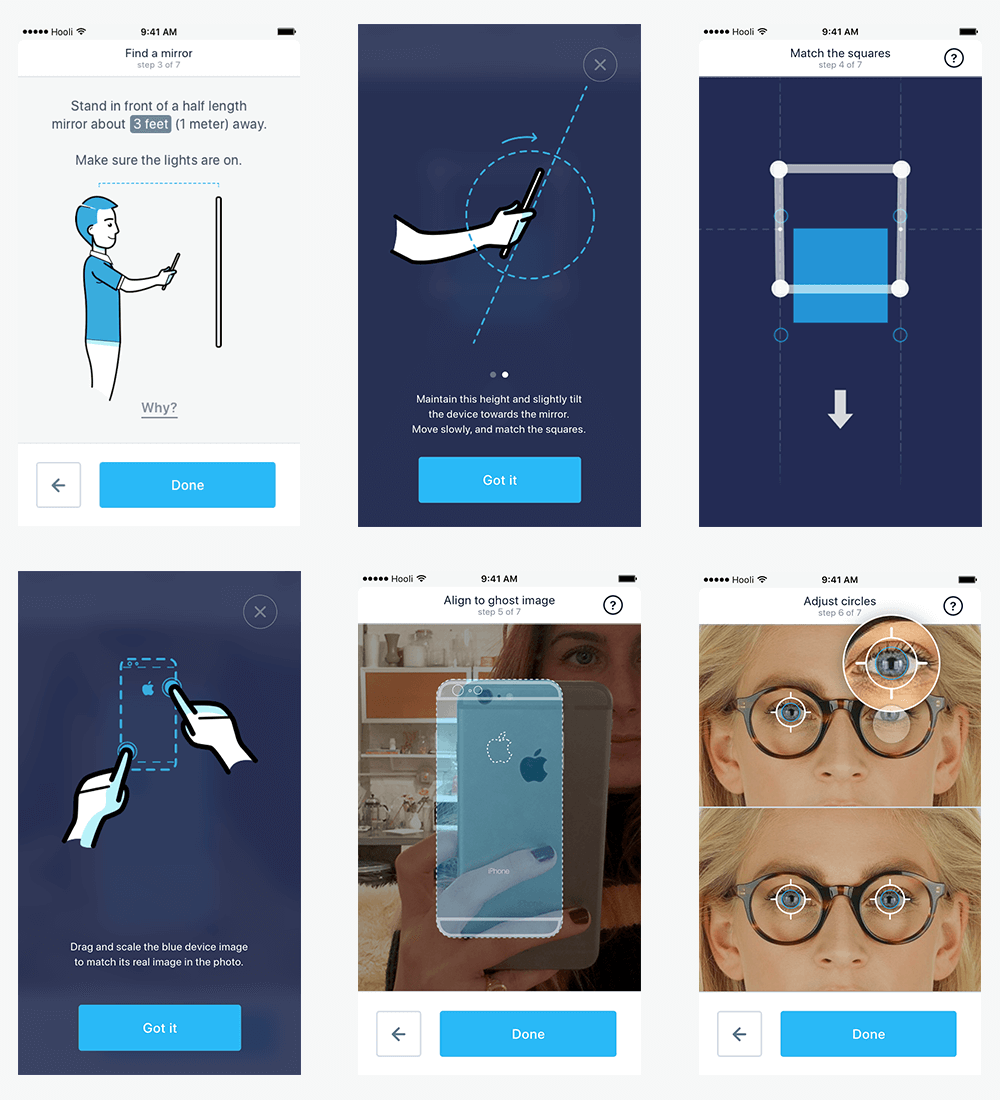
EyeMeasure’s UI is a combination of animated illustrations on the screen, which show you how to hold your phone, and voice instructions, which tell you what to do. The user has to move their hands to the right position, and the app will uses its sensors to give feedback when they are there. When the app finally takes the right image, it provides the user with auditory feedback (a bell rings). This way, the user gets used to the confirmation sound and will take each subsequent measurement more efficiently.
During the prototyping phase, we conducted a lot of user tests, and it turns out that people are more likely to follow voice instructions than visual ones.
In this example, visual and voice interfaces work together: The animated illustrations show you how to hold the phone, while the voice instruction helps you to get in the perfect position.
Examples From Publishing
Back in 2013, a company named Volio experimented with mixed interfaces. One of its flagship clients was Esquire magazine, which created an interactive experience in which people could talk with Esquire’s columnists. As you can see in the video below, this was a series of videos, and you could choose the next one based on the answer you gave to the question in the current video. Of course, you could just choose from a few predefined answers, but the interaction still felt like a live conversation. It also had a good combination of media: voice as input for commands and the screen to display the content.
Many people think of today’s multi-screen world as separate output channels for our content. Mixed interfaces will be much more than that. People will be able to use your app on different devices simultaneously, at the same time (for example, using the Alexa for voice input, while seeing the data on their tablet).
Combining voice and GUI in that way is not necessary either. A sports-streaming app we designed recently enables people to comment on a football game and talk with other fans while watching the match live on their smart TV. The two screens perfectly complete each other.
Such advanced interfaces offer functionality available through many different devices and media simultaneously. This is redundant, which programmers and designers don’t really like. But it also has advantages, because it gives people backup options, in case the main option is not available. It also helps disabled people who can’t use voice or visual interfaces.
How To Choose The Primary Mode?
Having discussed trends and some current products, let’s summarize when to use voice and when to use a visual user interface.
Visual user interfaces work better with:
- lists with many items (where reading all items out loud would take too long);
- complex information (graphs, diagrams and data with many attributes);
- things you have to compare or things you have to choose from;
- products you would want to see before buying;
- status information that you would want to quietly check from time to time (the time, a timer, your speed, a map, etc.).
Voice user interfaces work better for:
- commands (i.e. any situation in which you know exactly what you want, so you can skip the navigation and just dictate your command);
- user instructions, because people tend to follow voice instructions better than written instructions;
- audio feedback for success and error situations, with different signals;
- warnings and notifications (because the reaction time to voice is faster);
- simple questions that needs relatively simple answers.
What’s Next?
When I asked my designer friends what mixed interfaces they know about, some of them mentioned the legendary MIT Media Lab video from 1979, “The Put That There.” Nostalgia aside, it is shocking that this technology had a working prototype 38 years ago. Is our super-fast progress just an illusion?
Voice recognition still has some obvious challenges today, and just a few major players provide platforms for products based on voice recognition, including apps such as WeChat and hardware devices such as the Amazon Echo.
A good start would be to develop a mini-app or bot that integrates with these systems. Here are some tips from our own experience of working with multi-modal interfaces:
- Speed and accuracy are deal-breakers.
- Sync voice and visual interfaces. Always have visual feedback of what’s happening.
- Show visual indicators when the device is listening or thinking about an answer.
- Highlight voice-command words in the graphical interface.
- Set the right expectations with users about the interface’s capabilities, and make sure the product explains how it works.
- The product should be aware of the physical and social context of the device and the conversation, and should respond accordingly.
- Think about the context of the user, and identify which medium and device would reduce friction and make it easier to perform a task.
- Give users options to access a function through alternative devices or media. This will help in situations where something breaks, and it will also make your product more accessible to disabled people.
- Don’t ignore security and privacy. Enable people to turn off components (for example, the microphone), and build trust by being transparent. Don’t be too pushy, or else you will frighten everyone away (for example, voice spam is very annoying).
- Don’t read out long audio monologues. If it cannot be summarized in a few words, display it on a screen instead.
- Take time to understand the specifics of each platform, and choose the right one to build on.
Before starting out, though, keep in mind that, compared to other digital designs, multi-modal interfaces are still quite an unexplored area.
First, we don’t really have a general-purpose language or programming framework to describe mixed interfaces. Such a language could make it possible to define voice and GUI elements in one coherent code base, making it easier to design and develop these interfaces. It would also support multiple output and input options, enabling us to design omni-channel, multi-screen or multi-device experiences.
Secondly, designers have to come up with new design patterns to support the special needs of multi-modal interfaces. (For example, how would you give visual and audio feedback at the same time?)
Although the future looks exciting, and it will happen fast, we still need to reach the tipping point in voice recognition and language processing: where the usability of the voice medium will reach a level of quality that would indeed make it the best option in a range of applications. We will also need better tools to design and code multi-modal interfaces.
Once we accomplish these goals, then nothing will be holding these natural interfaces back, and they will become mainstream.
History Repeats Itself: Be A Part Of It
Humans have multiple senses. Technology and interfaces that use more than just one have a better chance of facilitating strong human-computer interaction.
A similar multi-modal evolution happened before. Radio and silent movies were combined into the movies, which were further enhanced with 3D and so on. I’m positive that this process will happen in the interactive digital world, too. Exciting times, indeed.
Further Reading
- Inspiring Everyday Graphic Design
- 33 Tempting E-Commerce Icons For Free
- Breaking Out Of The Box: Design Inspiration
- Modern Art Movements To Inspire Your Logo Design


