Minimalistic Design With Large Impact: Functional Minimalism For Web Design

Email Newsletter
Weekly tips on front-end & UX.
Trusted by 182,000+ folks.
 Celebrating 10 million developers
 Custom Web Forms for Angular, React, & Vue. Your backend.


In this article, I will discuss some examples of minimalism in web design, things to consider when designing minimalist interfaces, and explain why sometimes “less is more”. If you’d like to get more creative with your own designs, you can download and test Adobe XD, and get started right away.
Selecting An Effective Color Scheme
When designing a new app, it’s often difficult to decide on a color scheme that works well, as there are an infinite number of possible color combinations out there. Read a related article →
A Short History Of Minimalist Design
Some web designers mistakenly think of minimalism as a primarily aesthetic choice. To avoid the pitfall of focusing only on aesthetics, let’s be clear about the roots of minimalist design.
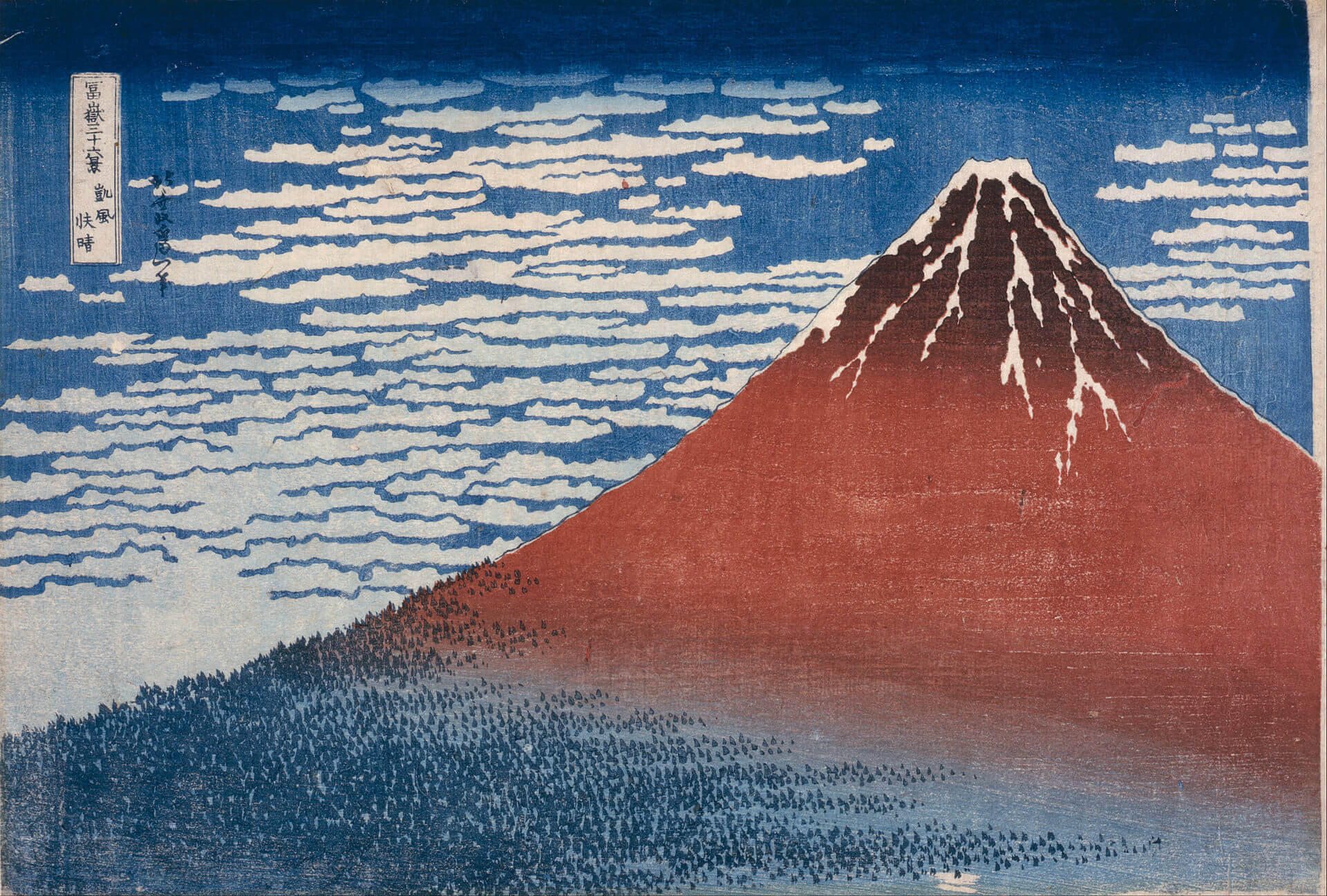
While it might be a newer trend in web design, the underlying ideas have been around for much longer. When discussing minimalist design, a person might naturally think of traditional Japanese culture. Japanese culture values balance and simplicity. Japanese architecture, interior design, art, and graphic design have long employed minimalist aspects.
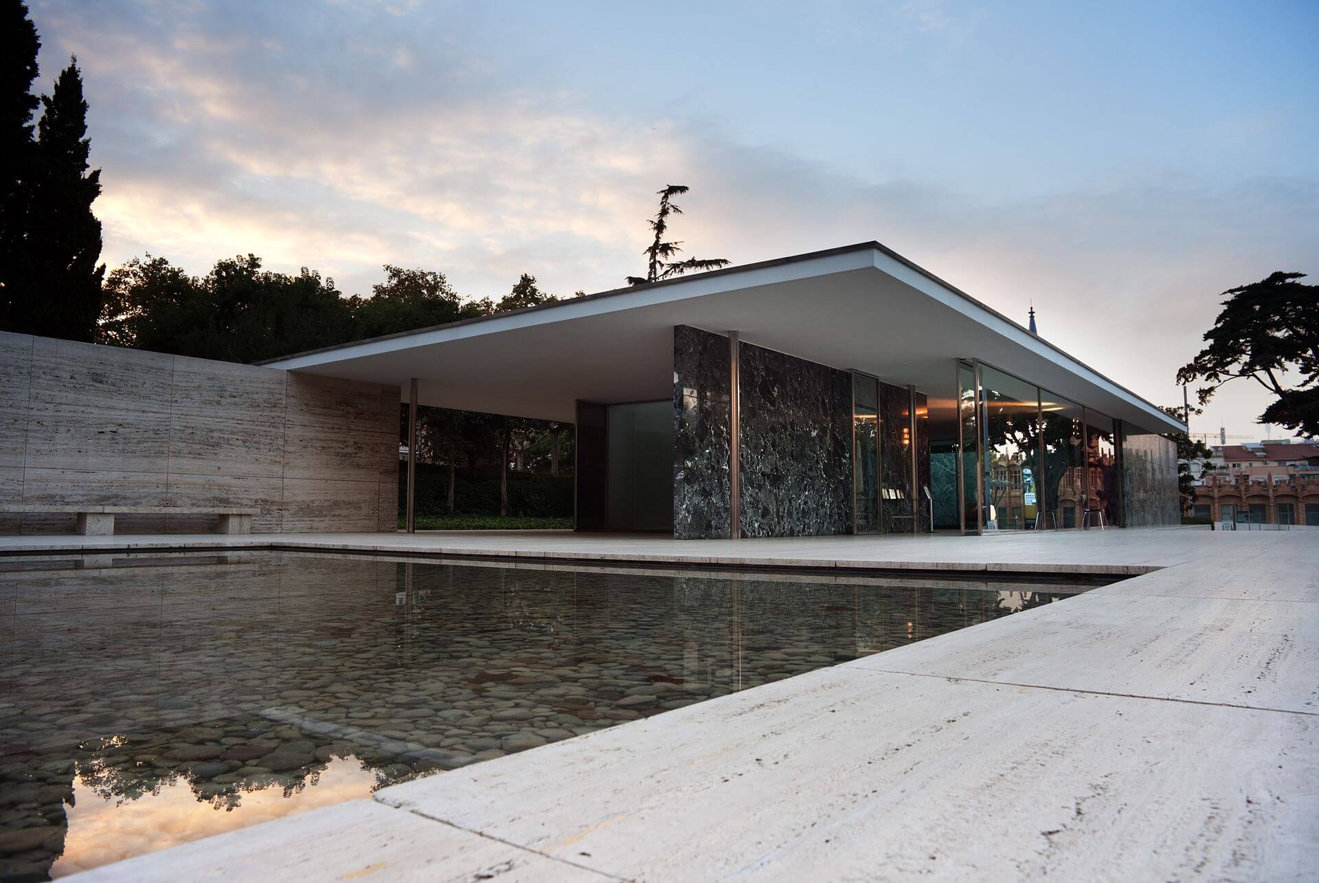
As a Western movement, minimalism began early in the 20th century. Influenced by the introduction of modern materials, such as glass and steel, many architects began to employ minimalist designs in their buildings. Ludwig Mies Van der Rohe, the German-American architect, was one of the pioneers of the minimalist movement. He is credited with first applying the phrase “less is more” to architectural design.
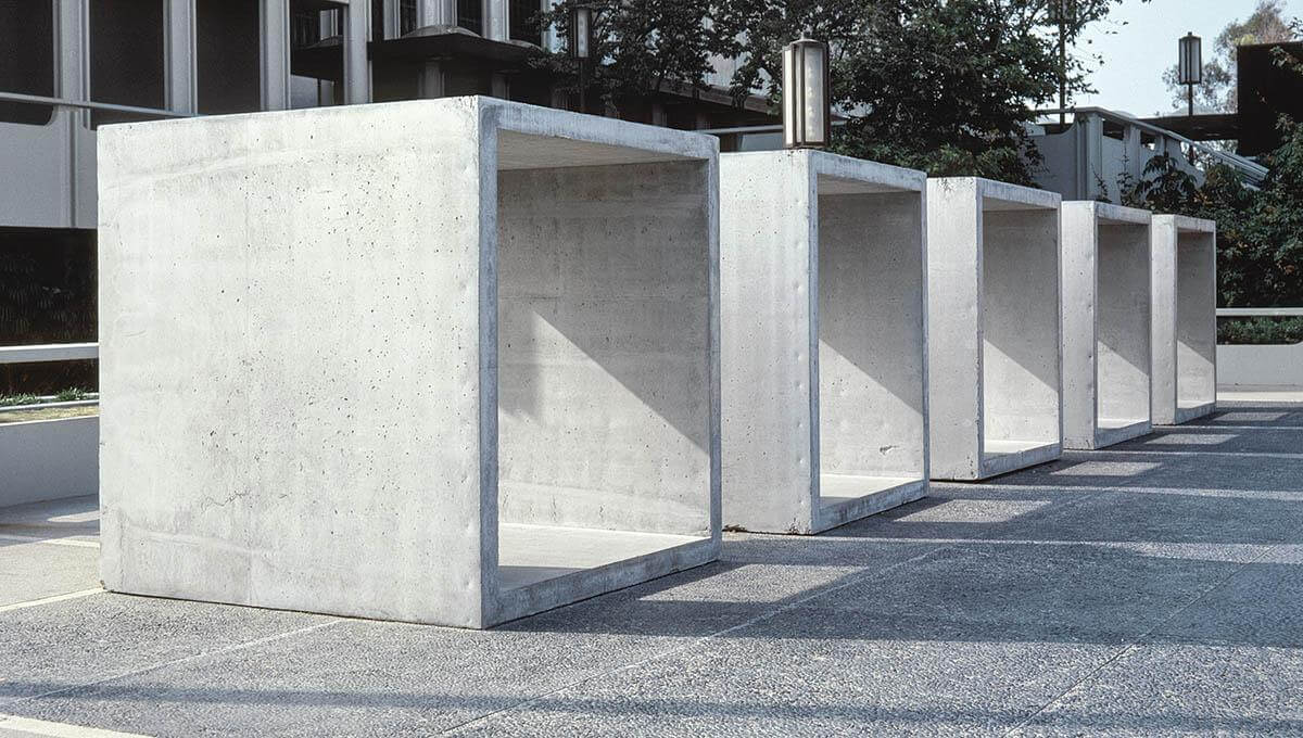
The less-is-more attitude quickly moved from architecture to other arts and industries: interior and industrial design, painting, and music. As a direction of visual design, minimalism became popular in the 1960s, when artists moved toward geometric abstraction in painting and sculpture. The artistic movement found its impression in the artwork associated with the Bauhaus school. One well-known minimalist artist who influenced the movement was Donald Judd, whose artwork is full of simple shapes and color combinations.
In diverse spheres of visual arts, a key principle of minimalism was leaving only the essential part of a feature, in order to focus the recipient’s attention as well as to enhance the overall elegance. As Donald Judd said, “A shape, a volume, a color, a surface is something itself. It shouldn’t be concealed as part of a fairly different whole. The shapes and materials shouldn’t be altered by their context.”
What Is Minimalist Web Design?
Today, minimalism has reemerged as a powerful technique in modern web design. It became popular as a reaction to a trend of increasing complexity in web design. (Visual complexity has been shown to affect a user’s perception of a website: The more elements a design has, the more complex it will look to the user.) Applied correctly, minimalism can help us focus our designs in order to simplify user tasks. A study conducted by EyeQuant suggests that clean design results in lower bounce rate. Minimalism has brought additional benefits to websites, in faster-loading times and better compatibility between screen sizes.
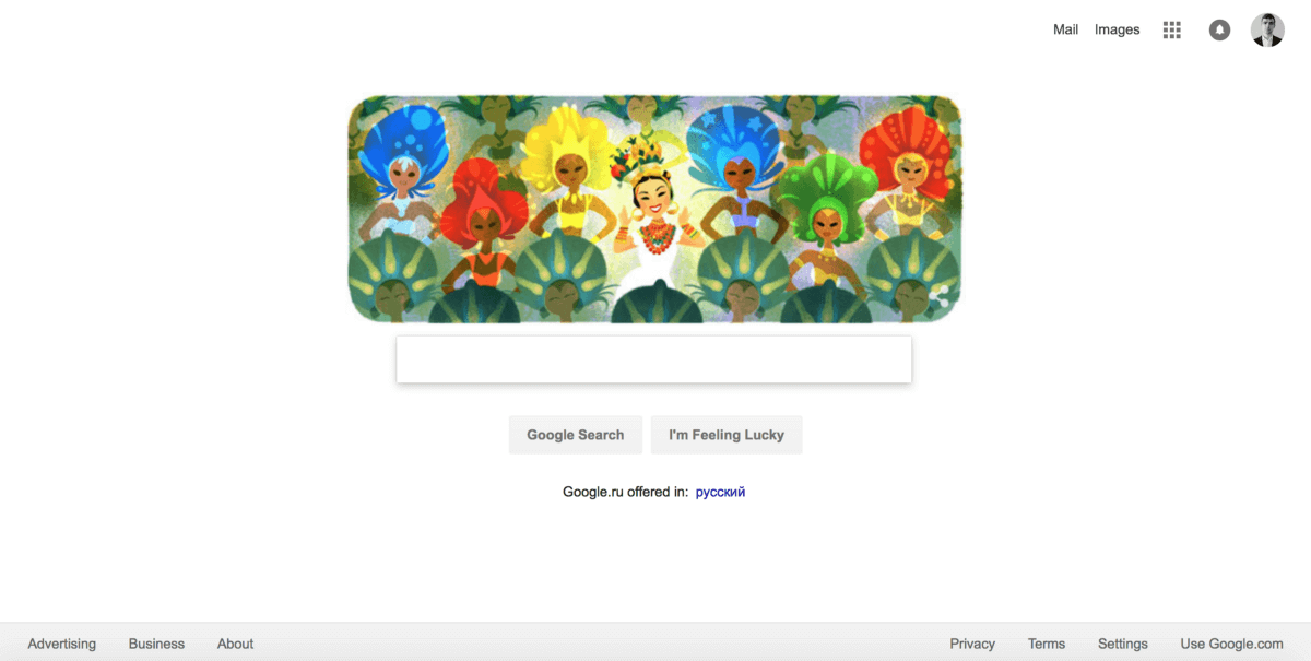
Perhaps one of the most well-known examples of minimalism in web design is Google Search. Google has prioritized simplicity in its interfaces ever since its beta offering in the 1990s. The home page is designed entirely around its central search function. Anything unnecessary to the function, other than branding, was avoided.
Its simplicity might lead one to believe that minimalism is uncomplicated, but under the surface lies far more than just “less is more.” Let’s define characteristics of minimalism.
Only The Essentials
A minimalist strategy in web design is one that seeks to simplify interfaces by removing elements and content that do not support user tasks. To create a truly minimalist interface, a designer has to prioritize elements rigorously, showing only those elements of the highest importance and stripping away everything that would distract users from what’s important (such as superfluous decorative elements). Every item in a design, whether an image or copy, should have a purpose; it shouldn’t be included unless it’s necessary to make the message clear. As Joshua Becker mentions in the book The More of Less, “You don’t need more space. You need less stuff.”
At the same time, be sure that you aren’t making your users’ primary tasks more difficult by removing or hiding content that they need. The idea is to make the message more clear, not more hidden. Thus, design around the content, and leave just enough visible elements (such as primary navigation) so that users don’t get confused.
Negative Space
It should be no surprise that the most common element in minimalism is no element at all. Negative (or white) space is the most important feature of minimalism and gives it much of its power. Negative space is just the empty space between visual elements. More empty space means more emphasis on existing elements. In Japanese culture, it’s known as the ma principle: treating the space between objects as a means to emphasize the value of those objects.
While negative space is often called white space, it doesn’t have to be white. Some websites use full-color backgrounds to energize a blank canvas.

Visual Characteristics
In a minimalist design, every detail has significance. What you choose to leave in is vital:
- Flat texture
Minimalist interfaces often use flat textures, icons and graphic elements. Flat interfaces don’t make use of any of the obvious highlights, shadows, gradients or other textures that would make UI elements look glossy or 3D.

- Vivid photography and illustration
Images are the most prominent form of artwork in minimalist design; they enable an entire world of emotional connection and set an atmosphere. But a photo or illustration has to follow the principles of minimalism. A wrong image (such as a busy photograph full of distracting elements) would negate the benefits of the surrounding minimalist interface and ruin the integrity of the layout.

- Limited color scheme
Color has great potential in web design because it’s able to set both informative and emotional connections between the product and the user. Color can add visual interest or direct attention without needing any additional design elements or actual graphics. Designers aiming for minimalism tend to squeeze the maximum from just a few selected colors, and it’s not that rare to use just a single color (a monochrome color scheme).
- Dramatic typography
In addition to color, typography is a core visual element. Bold typography brings immediate focus to the words and content, while helping to craft a much larger intriguing visual.
- Contrast
Because the goal of minimalist design is ease of use and efficiency, high-contrast copy or graphic elements might be a good choice. High contrast can direct the user’s attention to important elements and make text more readable.
Best Practices
Because a minimalist design demands the same level of clarity and functionality as a “normal” design, but with fewer elements, it can be a challenge for designers to create.
Have A Single Focal Point Per Screen
The minimalist philosophy centers on the idea of designing around the content: Content is king, and the visual layout salutes the king. The aim is to make the message clearer not just by stripping away distractions, but also by keeping focus on what’s important. Because minimalism involves stripping away elements that are unnecessary, a strong focal area is important.
Set Great Expectations With The Top Area Of The Screen
What is visible on the page without requiring any action is what will encourage users to explore the website. To make sure that people do that, you need to provide content that keeps them interested. Thus, place high-level content with ample negative space at the top of the screen, and then increase the content density as the scroll deepens.
Write Crisp Copy
In their book The Elements of Style, Strunk and White advise, “Omit needless words.” This is true for minimalism. Edit your copy to include only the bare minimum needed to adequately explain your message.
Simplify (But Don’t Hide) The Navigation
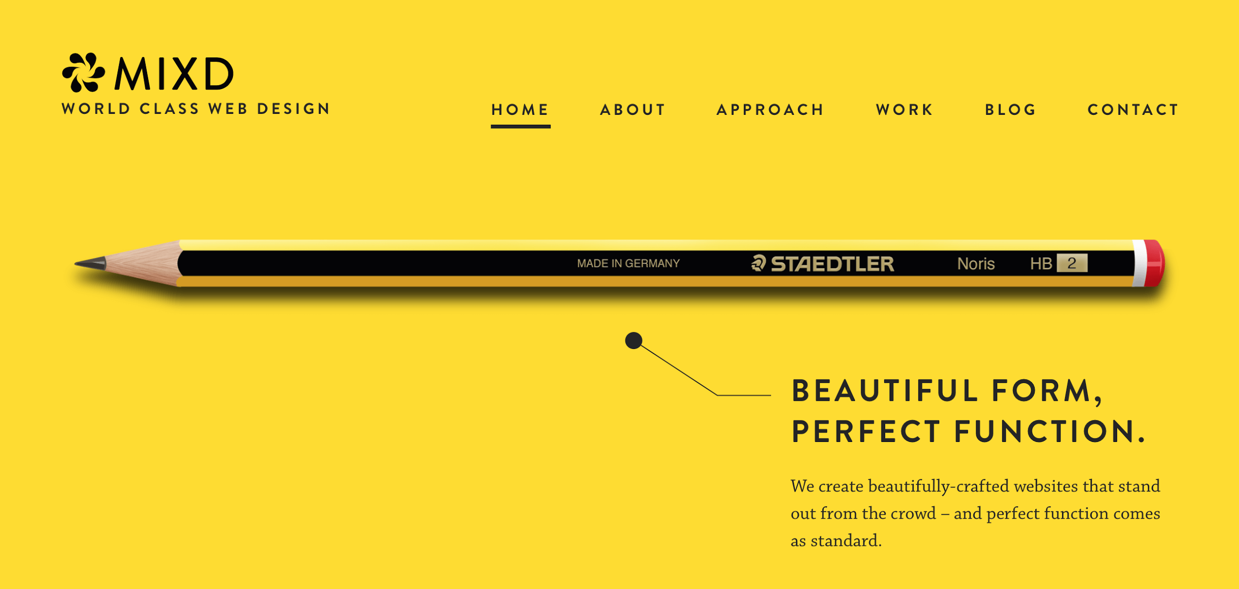
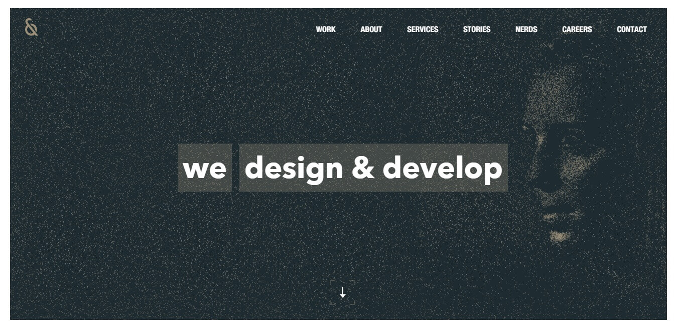
While simplicity and minimalism aren’t the same, minimalism should be simple. One thing that simplifies the user’s experience is being able to accomplish tasks easily and without distraction. The biggest contributing factor to this kind of simplicity is intuitive navigation. But navigation in a minimalist interface presents a significant challenge: In an attempt to remove all unnecessary elements and streamline the content, designers often hide some or all of the navigation. A menu icon that expands to a full list of items remains a popular design choice, especially in minimal web design and mobile UIs. This often results in lower discoverability of navigation items. Take this website’s hidden navigation:
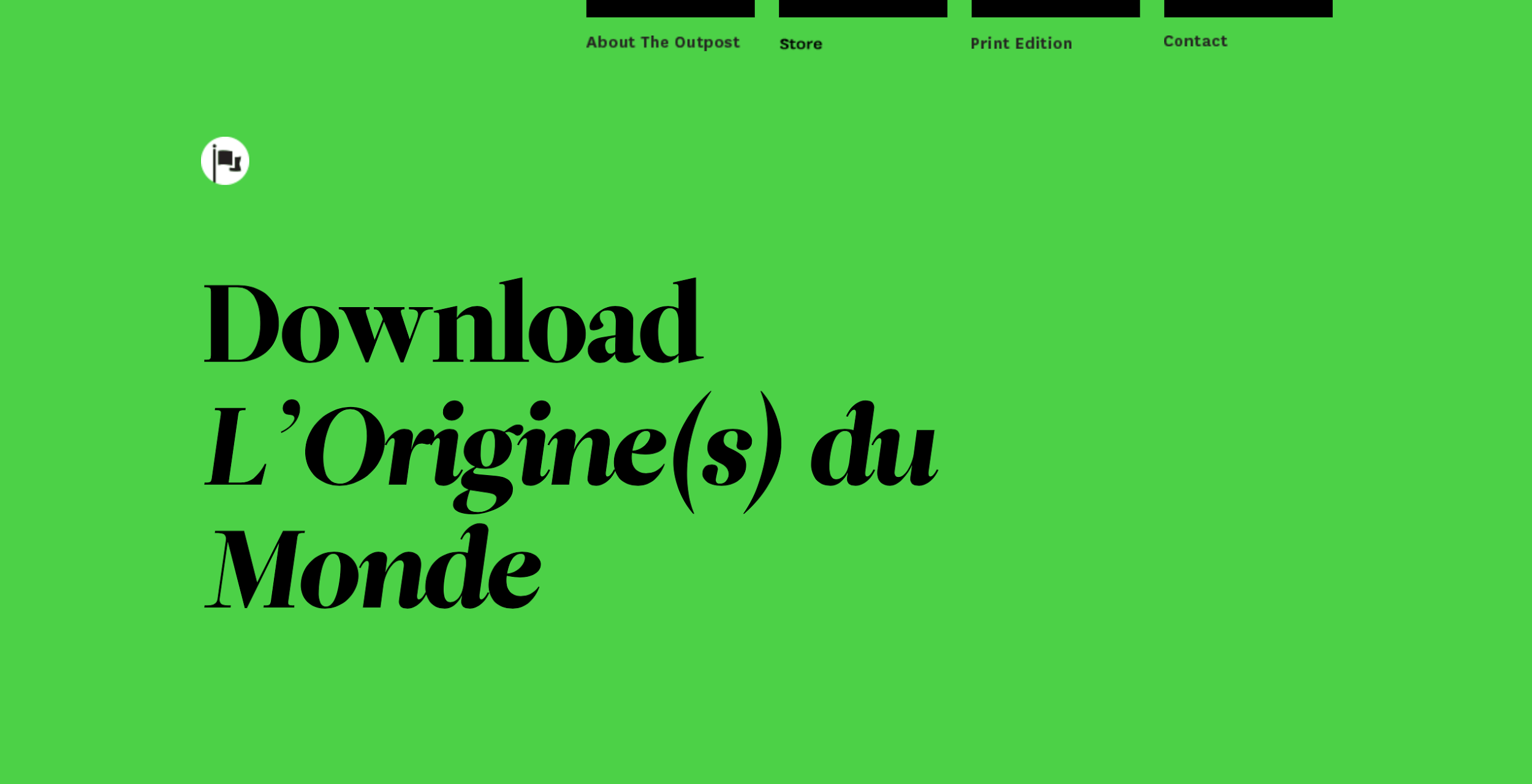
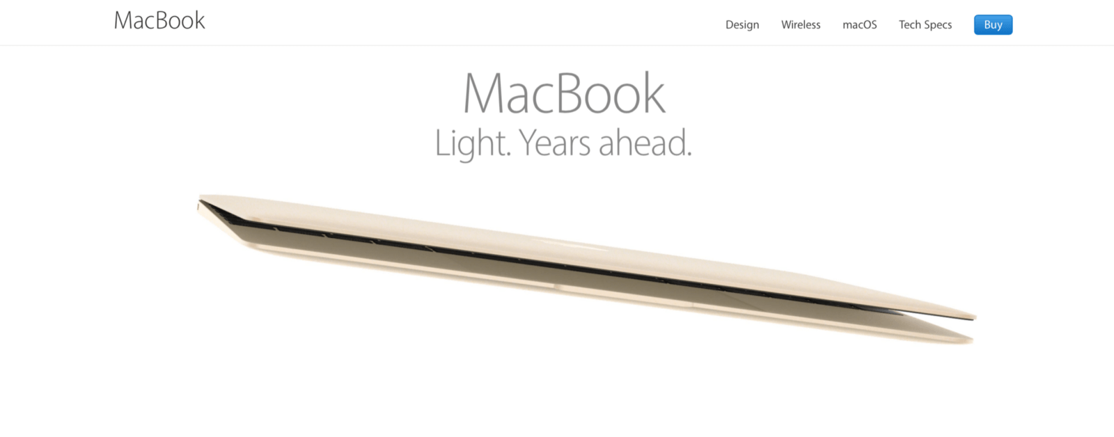
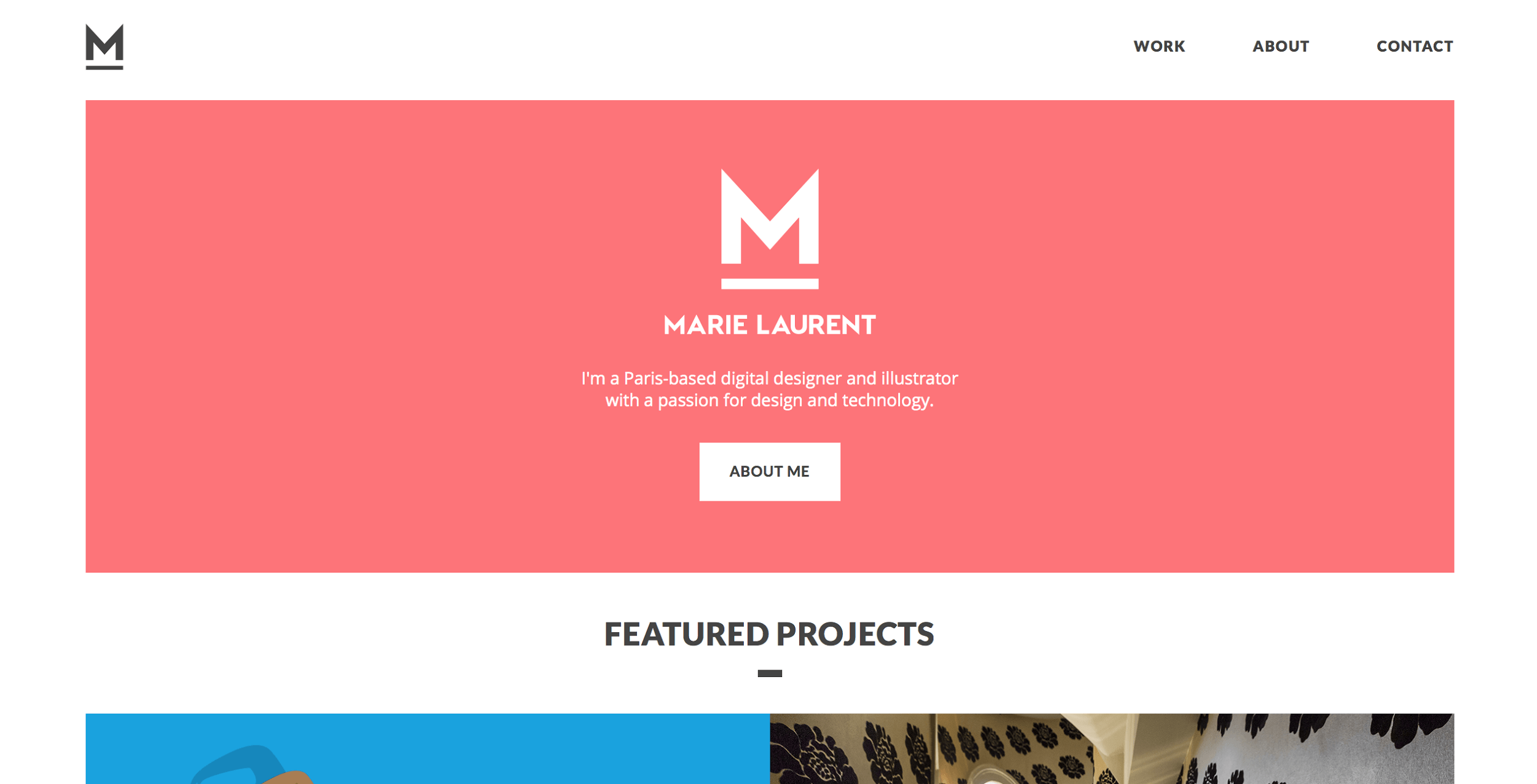
Compare that to this website’s permanently visible navigation:
Remember that easy navigation is always one of the top goals of web design. If you design minimalist websites, ensure that visitors can find what they need easily.
Incorporate Functional Animation
Like any other element, animation should follow the principles of minimalism: subtle and only what is essential. Good UI animation has a purpose: It is meaningful and functional. For example, you could use animation to save screen space (revealing hidden details on hover). The animation in the example below adds a level of discoverability, making an otherwise mundane task feel a bit more fun.

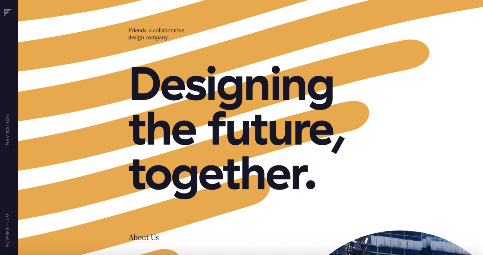
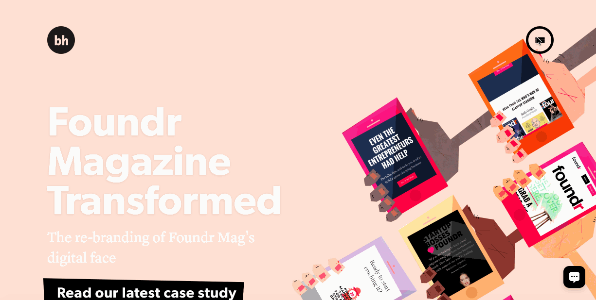
Use Minimalism For Landing Pages And Portfolios
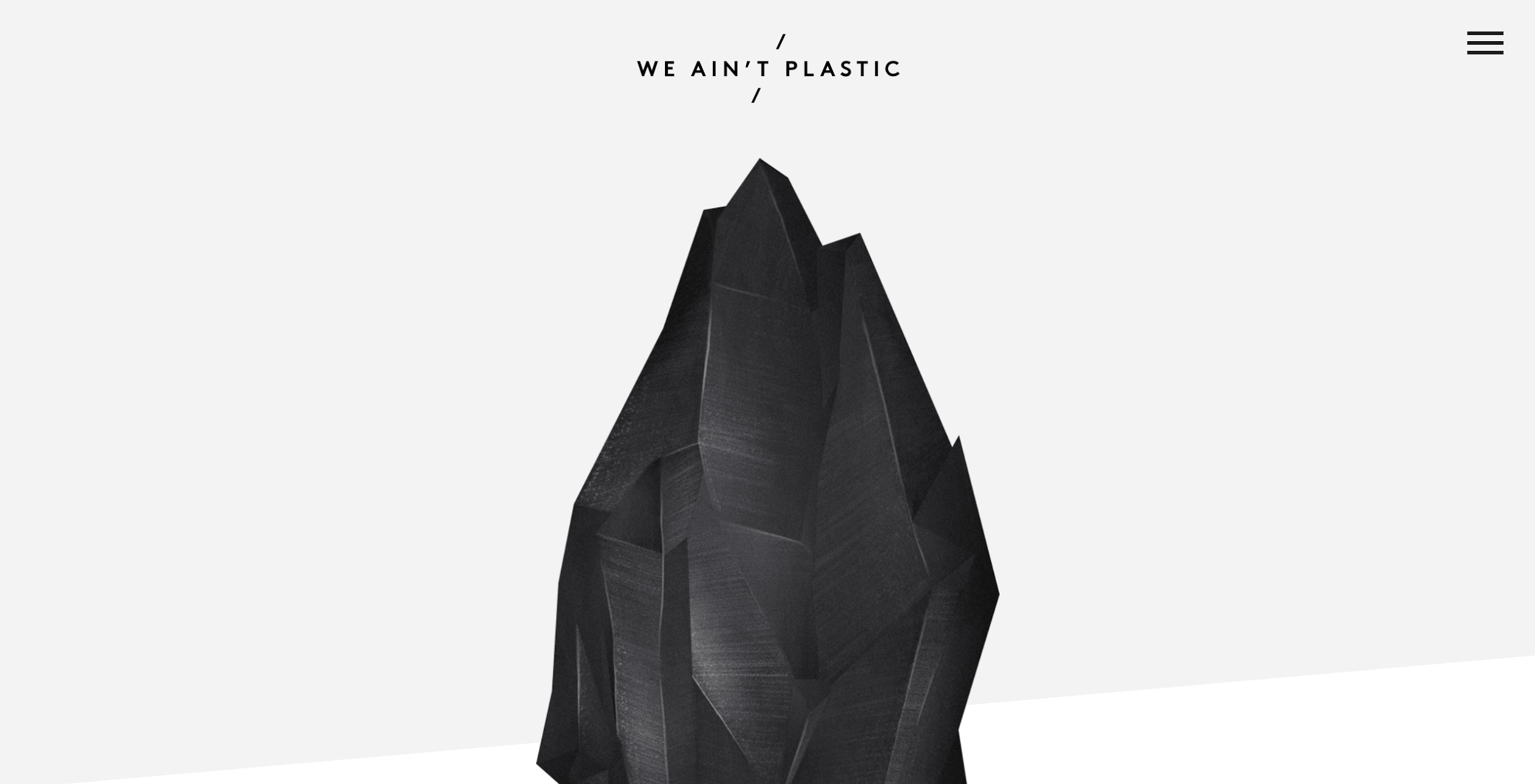
While the minimalist philosophy behind content-driven design applies to every website, a minimalist aesthetic might not always be appropriate. Minimalism is well suited to portfolio websites and landing pages, like in examples below, which have fairly simple goals and relatively little content.

At the same time, applying minimalism effectively to a more complex website can be much more difficult. A lack of elements can be harmful to a content-rich website (low information density forces the user to scroll more for content). A better option might be to create a minimalist landing page that leads to more detailed pages.
Conclusion
Minimalist websites simplify interfaces by removing unnecessary elements and paring down content that does not support user tasks. What makes such websites inspiring is the combination of usability and great aesthetics: An easily navigable, beautiful website is a powerful vehicle of communication.
Resources And Tools
- Adobe Color CC
These minimalist color palettes deviate from the standard black on white. - “Color Contrast Checker,” WebAIM
Enter your background and foreground colors to calculate the ratio of contrast, to create the most accessible color combination.
"This article is part of the UX design series sponsored by Adobe. Adobe XD tool is made for a fast and fluid UX design process, as it lets you go from idea to prototype faster. Design, prototype and share — all in one app. You can check out more inspiring projects created with Adobe XD on Behance, and also sign up for the Adobe experience design newsletter to stay updated and informed."
Further Reading
- The UX Of Flight Searches: How We Challenged Industry Standards
- Sustainable Design Toolkits And Frameworks
- UX At Scale 2017: Free Webinars To Get Scaling Design Right
- Building A Cross-Platform WebGL Game With Babylon.js


