Building A Large-Scale Design System For The U.S. Government (Case Study)

Email Newsletter
Weekly tips on front-end & UX.
Trusted by 182,000+ folks.
 Register for Free
 Celebrating 10 million developers


 Custom Web Forms for Angular, React, & Vue. Your backend.
Today, there are nearly 30,000 U.S federal websites with almost no consistency between them. Between the hundreds of thousands of government employees working in technology, there’s nothing in common with how these websites are built or maintained.
As a result, the government is spending considerable resources on services that aren’t meeting the needs of their users. Federal websites are the front door to government services: it’s the first thing someone encounters when interacting with the government. According to research from the Federal Front Door initiative, as government interfaces erode, so does the public’s trust in those services.
I was part of a team of designers and developers who unified a complex system with numerous rules to serve users from all corners of the country. I’ll shed some light on how we built tools to leverage industry-standard best practices and produce a design system with reusable components. You’ll also see how our system is helping agency teams in the federal government create simple, efficient, consistent experiences quickly and at reduced cost.
The Problem: Inconsistent User Experiences Across Government Websites
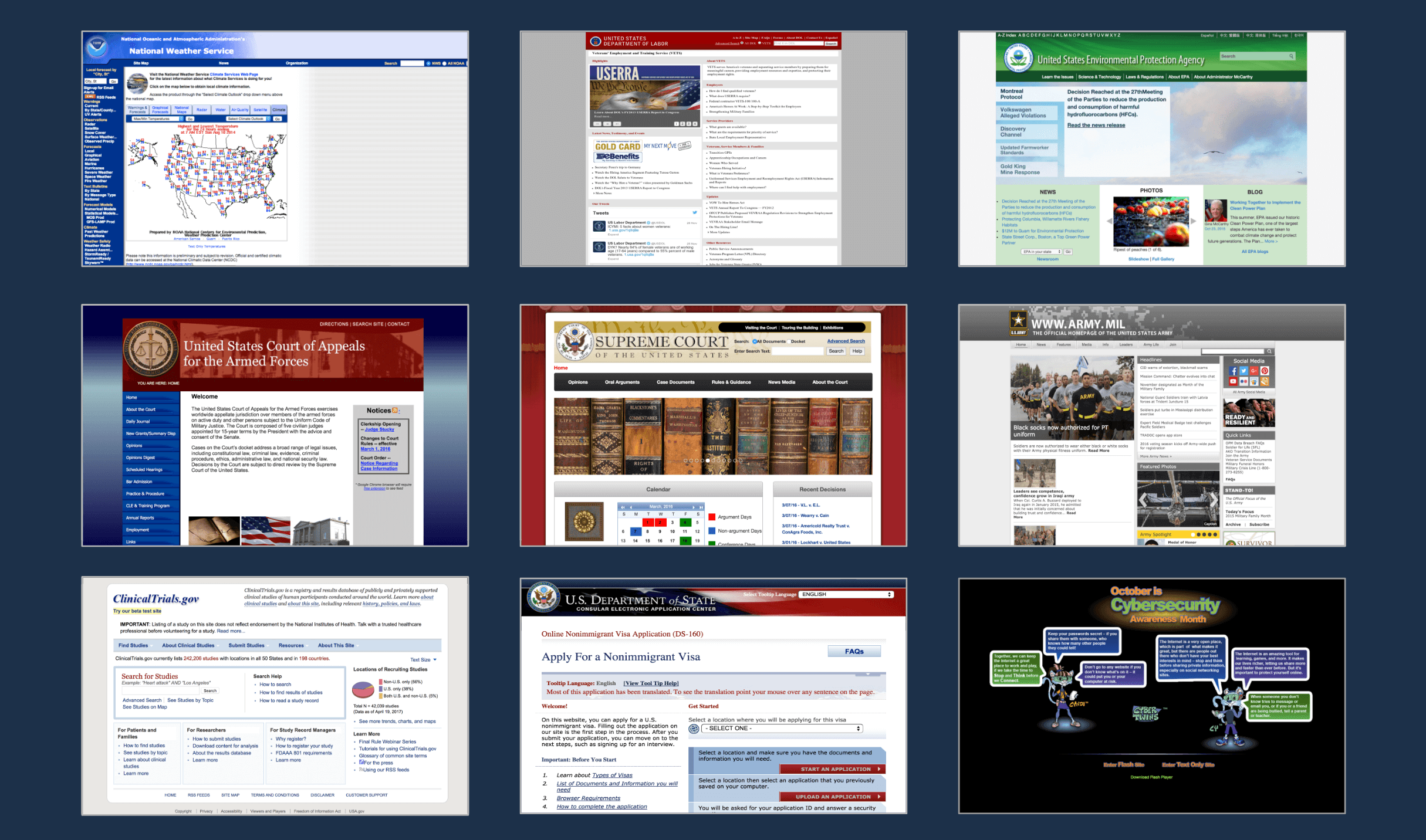
When the American people go online to access government services, they’re often met with confusing navigation systems, an array of visual brands, and inconsistent interaction patterns. Websites intended to help people access information and services, like a veteran looking for help to go back to college, are splintered off of various agencies and organizations.
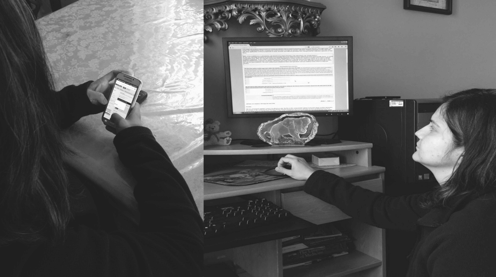
For example, consider what it’s like for a young veteran looking to apply for federal student loans to help her cover the cost of attending college. Let’s call this person Joanne. Joanne had to wade through multiple agency websites to access the federal programs that could help her afford college. Joanne was confused. She was overwhelmed by how hard these tools were to use, missed opportunities she was eligible for, and felt frustrated and isolated. The system that was supposed to help her stood in her way. Creating consistency between these systems will help people (like Joanne) more effectively access the services they need and increase their trust in the government.
Why It’s Like This: Limitations To Consistent User Experiences In Government
Dedicated federal workers want to build helpful digital tools for everyone. They want to be able to develop quick prototypes and sites. They choose resources with minimal documentation that allow them to get up and running quickly.
Other one-off designers or front-end developers in an agency are trying to do the right thing but without a lot of time or support. They need tools to cut down on design and development time, and a way to advocate for best practices to higher ups.
Therefore, the question in front of us became:
Could we create a shared set of tools to provide consistent, effective, and easy-to-use government websites?
We think the answer is yes.
The Team
In the summer of 2015, a team from 18F and the U.S. Digital Services formed to work on these tools. We asked ourselves: how do we bring together thousands of public websites into a common design language?
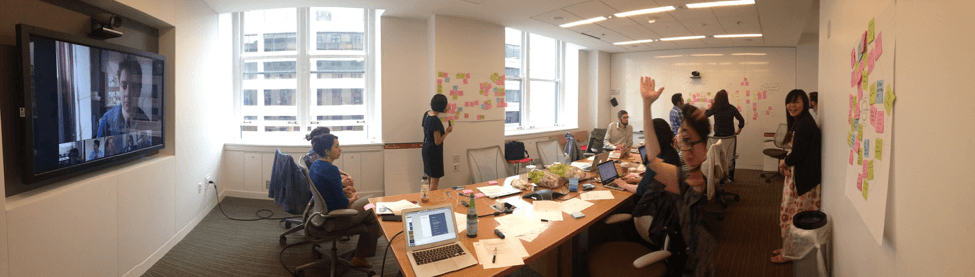
To answer this question, twenty designers and developers working on digital services in government gathered in Washington, DC to work on this problem.
Joining us were visual designers working with the Department of Education and U.S. Citizens and Immigration Services, developers from the Consumer Financial Protection Bureau and U.S. Department of Agriculture, and a program manager from USA.gov, and several more folks beaming in remotely. Our websites couldn’t be more different. It’s not hard to wonder: what could we even have in common?
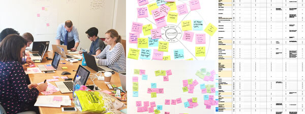
The first question we asked ourselves was: what are the components and patterns we’re looking for in a pattern library? What are the elements that could help us build a library of patterns and systems of styles? We wrote down all the parts that make up our websites and what we would want in a system. We stuck these ideas on a wall and grouped them together to find what was universal across our systems. We then looked for patterns, taking note of what were the most common. Some of the simplest things kept coming up again and again: color, typography, grids, and buttons.
During our meetings, the team mentioned other components. For instance, people also asked about unique components like data visualizations and calendar widgets. However, by limiting components to the basic building blocks, we could get it in the hands of designers and developers as quickly as possible and see for ourselves what was clicking and what wasn’t.
Building a library to create consistency is similar to playing with Lego bricks as opposed to say mud. When you give people a handful of mud and tell them to build a house, each house will look different: a little lopsided and squishy. When you give those same people five kinds of Lego bricks, they can create a million different houses. Each house looks consistent, not uniform.
Building The System
We started to explore how we could bring consistency across interactions, user experiences, and behavior across those websites. Joanne wants to understand she’s on a government site. She wants it to feel familiar and be intuitive, so she knows what to do and can accomplish her task. A consistent look and feel with common design elements will feel familiar, trustworthy, and secure — and people like Joanne will be able to navigate government websites more easily because of a common palette and design.

Interface Inventory
We used analytics.usa.gov to look at the top visited .gov domains to surface common colors and component styles. We wondered: “Do we need 32 different shades of blue?” We were surprised by so many different button styles on government website. Do we really need 64 types of buttons? Surfacing and categorizing components across government websites allowed us to see the inconsistencies between government websites as well as what components they had in common.
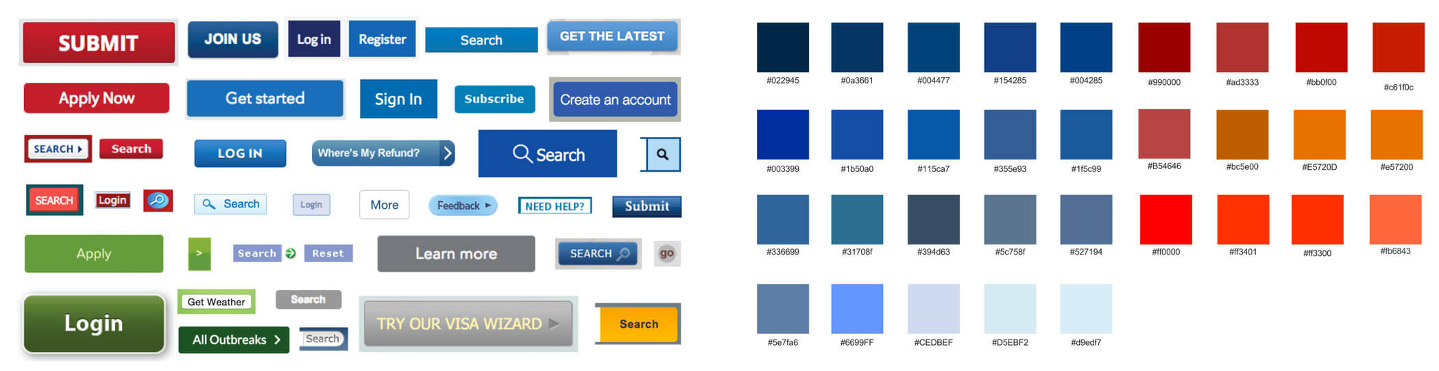
The interface inventory and results from our workshop were combined and prioritized with the help of government designers. Once we had our list of components to start with, our user researchers began researching, creating wireframes, and conducting user testing of the components and design system website.
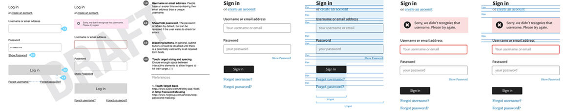
The user experience team members researched, created wireframes, and tested components like this sign-in form. Visual designers created higher fidelity designs based on the wireframes, which were later developed in code.
Mood Boarding
Our visual designers began to explore what it would look and feel like. We knew we wanted the system to feel simple, modern, accessible, approachable, and trustworthy. They created three mood boards, which looked at various typography and color samples as well as inspirational design imagery.
The three styles we looked at were:
- Clean and Classic
- Inspiring and Empowering
- Modern American
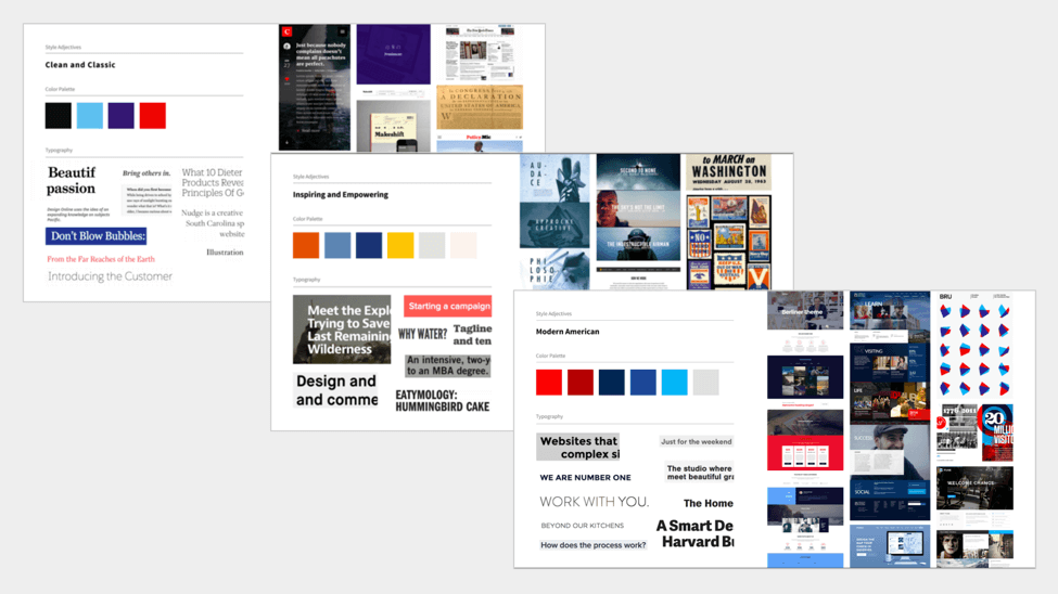
Our team’s designers worked with visual designers across government and conducted a feature-voting exercise surfacing what they liked about each mood board. We put these three directions up on GitHub to solicit feedback from a range of government digital service employees, where we could fine-tune the direction. In the end, people liked the bold, saturated colors of Modern American and the typography of Clean and Classic, which incorporated a sans-serif font and a serif typeface.
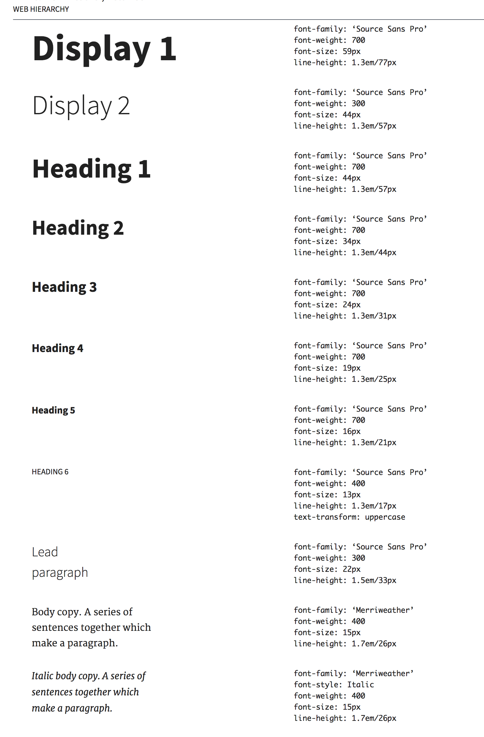
Typography
Once the style was defined, our visual designers started to explore which typefaces to use. We needed to find a font that was legible, communicated trust and credibility, and was open source. Since paid fonts would have created additional burdens around licensing, we needed to find fonts that were free and open source to make it easy for government designers to use the font.
To promote legibility, we looked at fonts that had a large x-height, open counters, and a range of font weights. In order to provide the greatest flexibility for government designers, we wanted to find a sans-serif font for its clean, modern aesthetic that’s highly legible on interfaces and a serif font, for a traditional look that could be used for text-dense content or added contrast between headings.
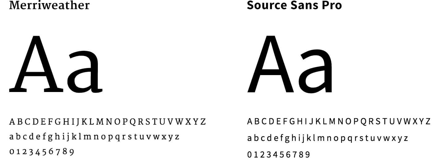
Our visual designers tested typography pairings by replacing fonts on actual government websites with these choices to find the fonts that would meet these needs. By omitting the name of the typeface, designers weren’t influenced by what font it was and could focus on how it read. Then we tested these fonts with government designers to identify which font was the most legible and matched our desired aesthetic. In the end, the fonts we chose were Source Sans Pro and Merriweather.
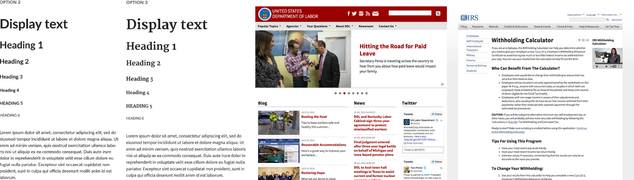
Source Sans Pro is an open-source sans serif typeface created for legibility in UI design. With a variety of weights that read easily at all sizes, Source Sans Pro provides clear headers as well as highly readable body text. Inspired by twentieth-century American gothic typeface design, its slender but open letters offer a clean and friendly simplicity.
Merriweather is an open-source serif typeface designed for on-screen reading. This font is ideal for text-dense design: the letterforms have a tall x-height but remain relatively small, making for excellent readability across screen sizes while not occupying extra horizontal space. The combination of slim and thick weights gives the font family stylistic range, while conveying a desirable mix of classic, yet modern simplicity. Merriweather communicates warmth and credibility at both large and smaller font sizes.
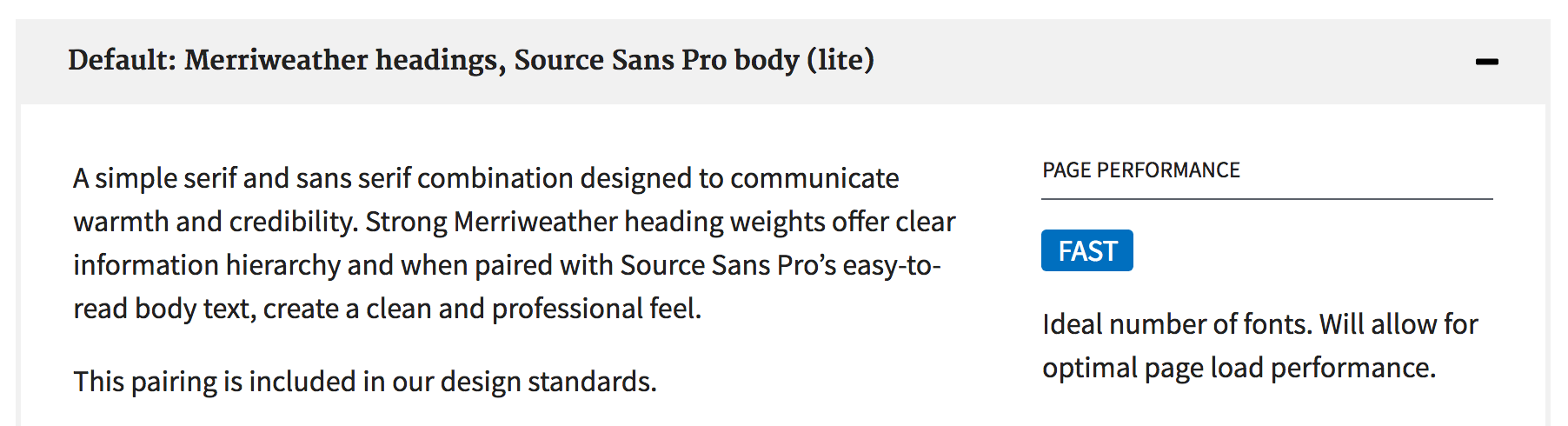
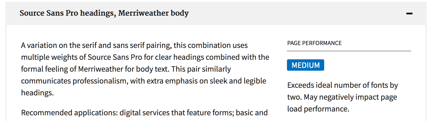
From a technical standpoint, we needed to ensure the fonts we provide would perform quickly for users. While our visual designers wanted an array of weights, our developers reminded everyone that this would create a burden on users that have to load extra font families. To compromise, we created different font pairings: a robust option with more font weights and a trimmed down version for quicker load times. Armed with this knowledge, government designers can weigh the options themselves to find which would suit their design and performance needs.
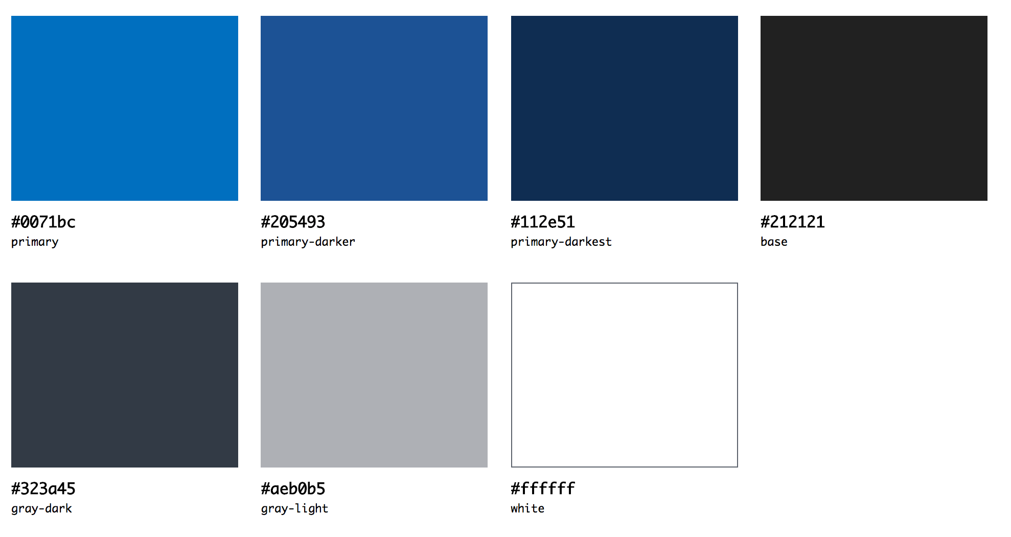
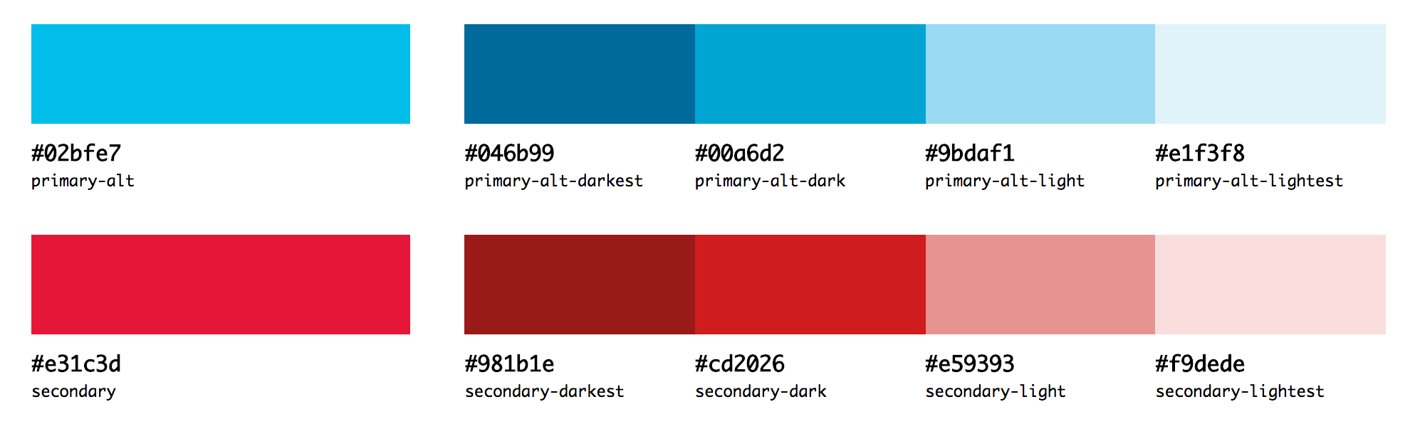
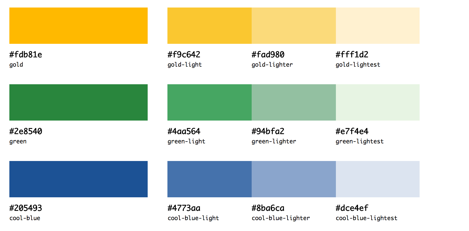
Colors
The repeated use of colors found in the interface inventory of government websites informed our color palette. A simple, minimalist palette of cool blue and gray provides a neutral backdrop for brighter shades of red and blue to contrast against. This creates a clean and engaging palette, leaving people feeling like they’re in good hands. The colors are divided by primary, secondary, background, and tertiary colors.
Primary colors are blue, gray, and white. Blue weaves through buttons, links, and headings to bring a sense of calmness, trust, and sincerity through the interface. Clean white content areas allow the typography to “pop” on the page.
Secondary colors are the accent colors of bright blue and red are used sparingly on specialized elements to add lightness and a modern flair. They may be used to highlight important features on a page, like a call to action, or for visual design elements like illustrations.
Background colors are shades of gray used for background blocks of large content areas.
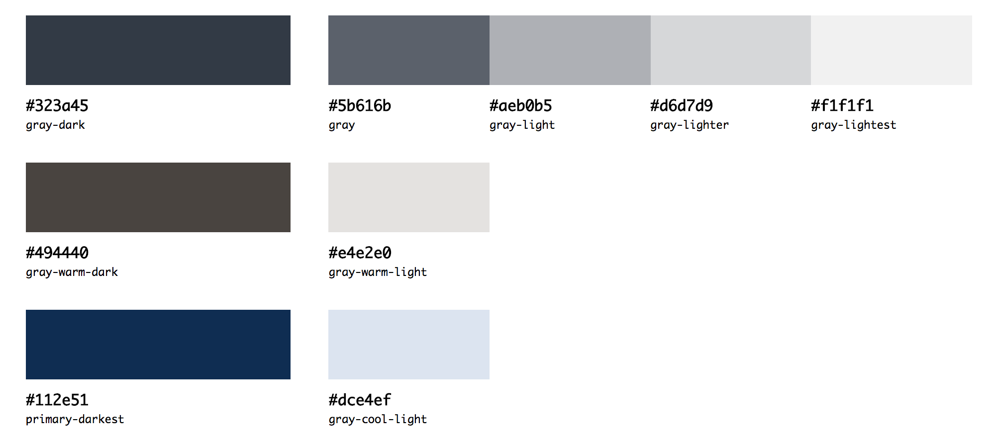
Tertiary colors are used for content-specific needs and are used sparingly, such as in alerts or illustrations.
The range of colors in the palette can be flexibly applied to support a range of distinct visual styles. For example, by abstracting color names, such as primary and secondary, we can support agencies that need to conform the palette to their unique brand’s needs. A change once in the color value spreads throughout the system across buttons, accents, and headings.
Because government sites must be accessible to anyone with a disability, in conformance with Section 508, the Standards ensures there is enough contrast between text and its background color. Following WCAG 2.0 guidelines, the Standards provide combinations where the contrast between the text and background is greater than or equal to 4.5:1.
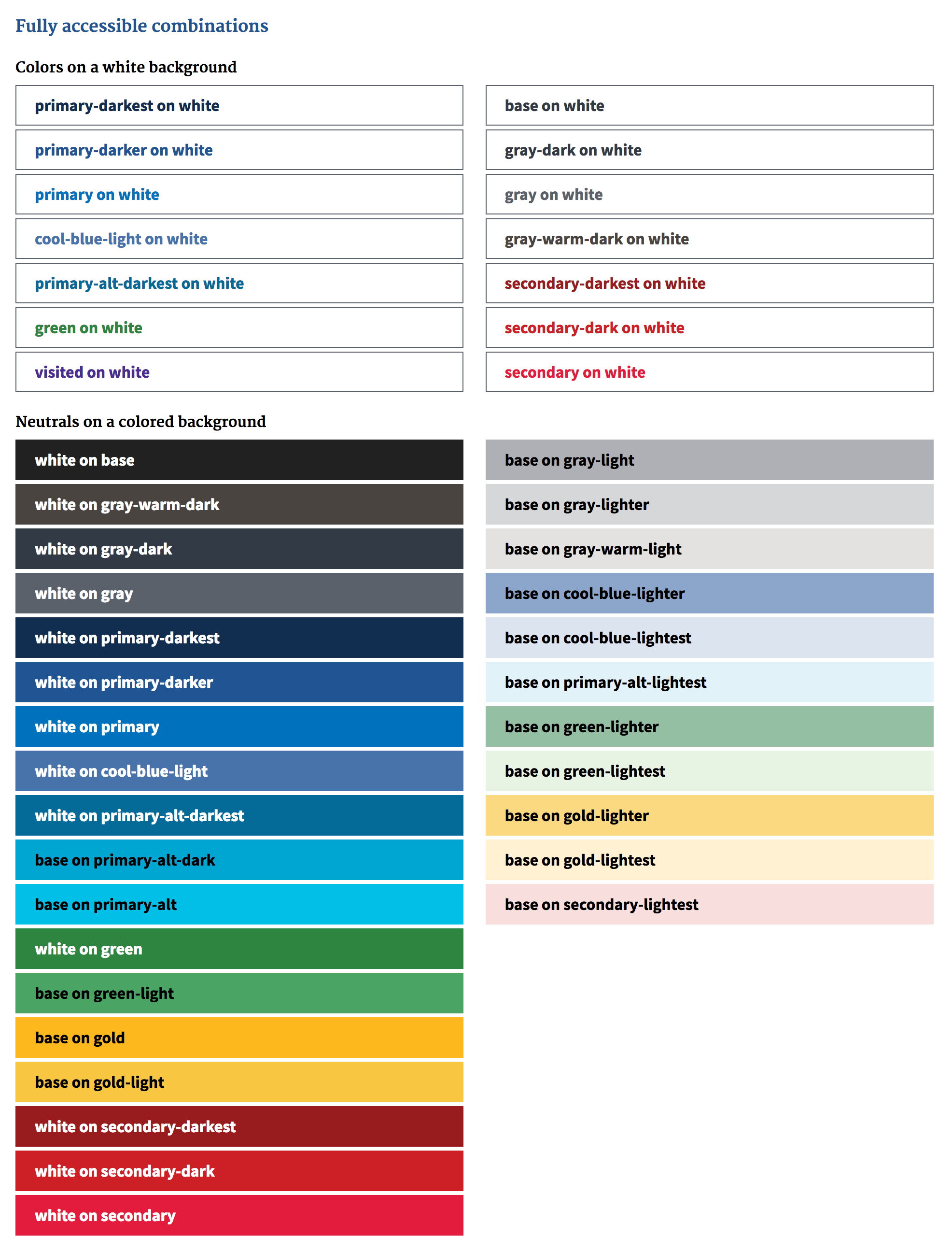
By using bright saturated tints of blue and red, grounded in sophisticated deeper shades of blues and grays, we could communicate warmth and trustworthiness, support a range of distinct visual styles, and meet the highest accessibility standards and color contrast requirements.
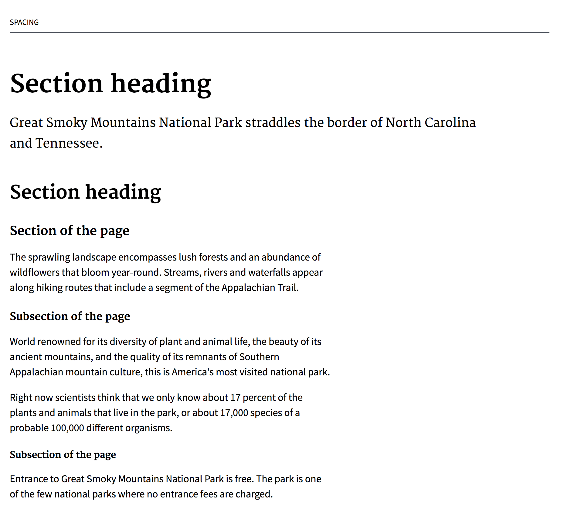
Space
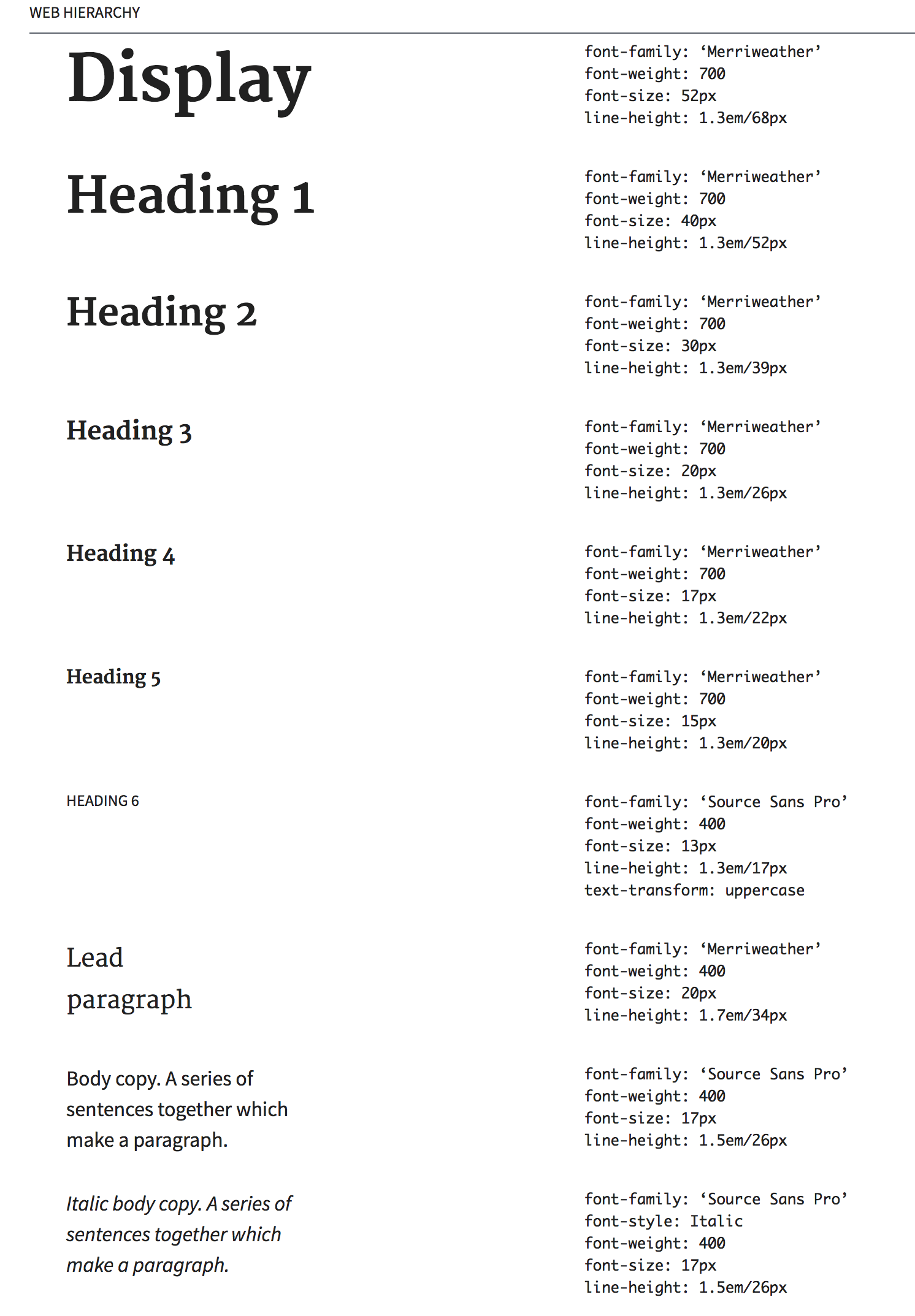
The last piece in the building blocks of the design system is how these elements flow in space and provides structure. We provide balanced spacing throughout the type system by placing adequate margins above and below heading elements and paragraph text. By using em’s or relative units, white space is proportionate to the font size and automatically distributes the correct ratio throughout the system. If an agency needs to change a font size, spacing will automatically adjust.
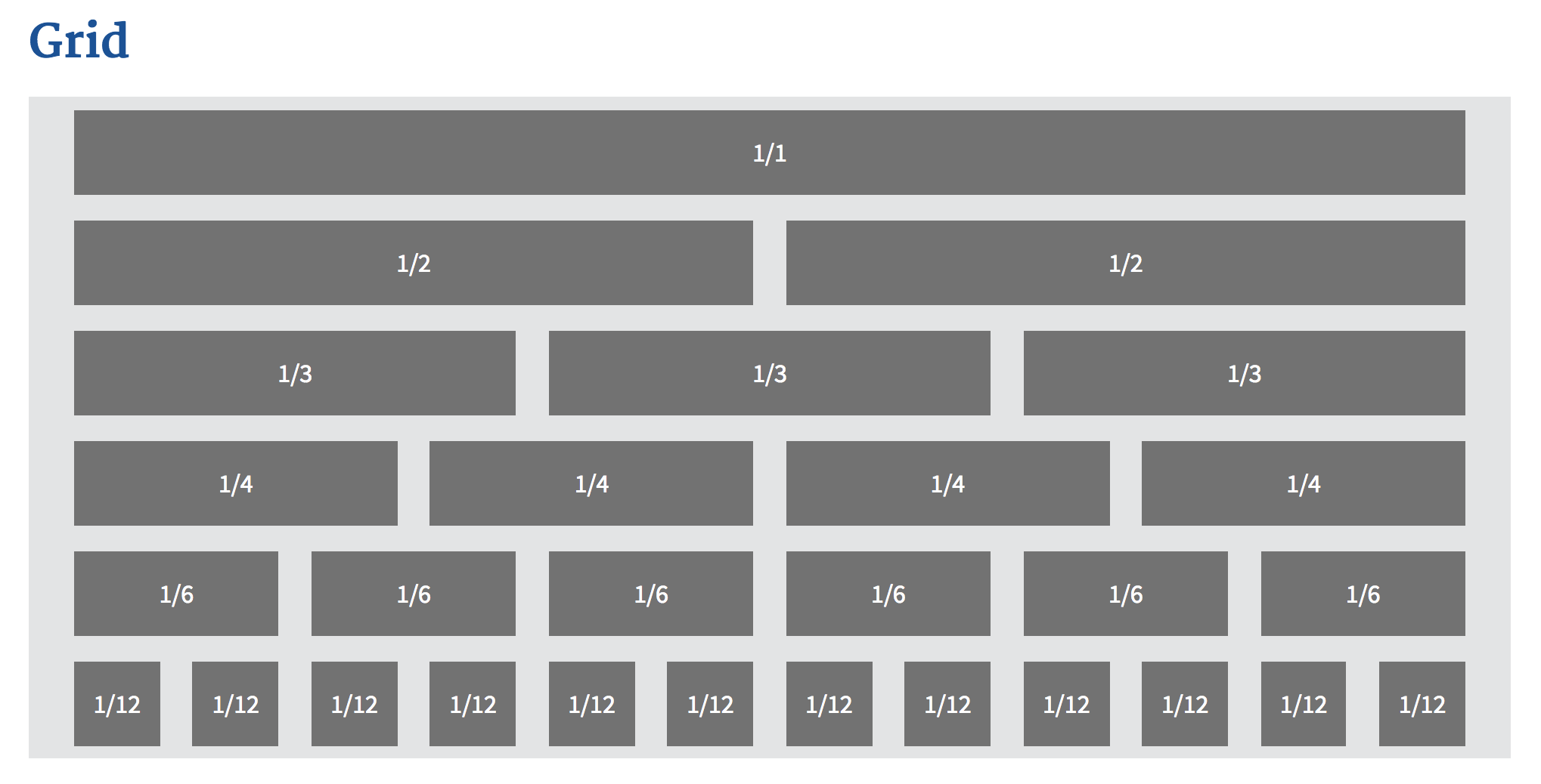
To hold the structure of the content, we provide a 12-column grid system using Neat, a flexible and lightweight Sass grid by thoughtbot. We provide an easy-to-use grid system comprised of a grid container to contain the content centered in the page and sections of halves, thirds, quarters, sixths, and twelfths to lay out content. Simple classes, like usa-grid and usa-width-one-half allow developers to quickly mock up page layouts. We provide three breakpoints, which allows the grid to reflow at smaller sizes, and people may always fine tune the breakpoints to suit their content. A flexible grid system allows visitors to quickly read the page.
Typography, colors, and space form the foundation of the design system, which is used to build components like buttons, forms, and navigation.
Complicated Tasks, Ambitious Goals
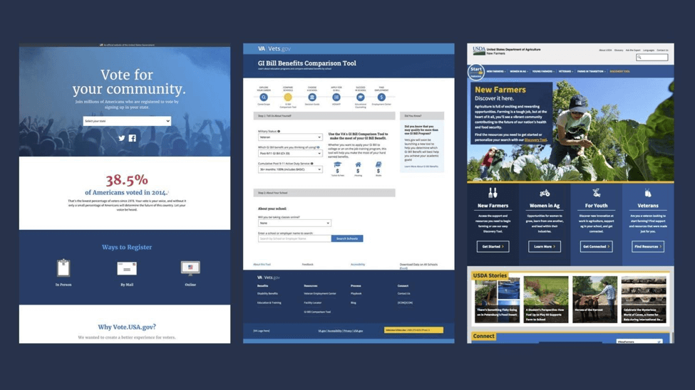
The U.S. Web Design Standards launched in September 2015 as a visual style guide and UI component library with the goal of bringing a common design language for government websites all under one hood. In the two years since we were tasked to unify the design and look of all U.S. government websites, over 100 government projects have adopted the standards, helping it evolve, reshape, and move forward in ways we couldn’t imagine. From the Department of Veterans’ Affairs to the U.S. Department of Agriculture, government teams are coming together to set a new bar for federal government websites. In this short time, we’ve begun seeing consistency and better user experiences across government websites. While the goal was to unify a government design language, the unique expression of it has been multifaceted and boundless. And just like building a house out of Lego blocks, expression within the meaningful constraints of a modular design system creates diverse products that are consistent, not uniform.
By providing designers and developers with easy-to-use tools to deliver the highest quality government websites to the American people, the design system is helping create connections across disciplines and move government designers and developers forward — user research, human-centered design, visual design, front-end, and accessibility best practices all come together.
Lessons Learned: Drafting Your Own Standards Within Your Company
Whether you’re a small company or one of the largest governments in the world, you can create your own standards to solve your unique needs. Every pattern library should be different because it should serve the specific needs of the group creating them.
Talk to the people: You’ll need to find out where the problems are and whether or not these problems can be solved by design patterns. Find out if there are common needs across groups. What aspects of what you’re building are required for you to do your job?
Look for duplication of efforts: Where are you repeating yourselves? Where are you wasting time? What takes the longest or is the most challenging when building out websites? Where does friction arise?
Know your values: What your design system will end up looking like will also depend on what’s important to you. What are your values? What principles can guide how you build things?
Empower your team: You need a dedicated group charged with working on this and support from leaders to give you the air cover to do this work. It should be as important as any other project. You’ll need a multidisciplinary team with expertise from user experience research and design, visual design, and front-end development. You’ll need someone to fulfill the role of project manager and product owner to guide the project forward toward the right goals.
Start small and iterate: Figure out what your core needs are, build those out, test them, and listen to what people are asking for. That’s how you’ll find out what is missing. Starting with a limited set of components will save time and give you real answers right away when you start putting it out in the world and in people’s hands.
Don’t work in a vacuum: You’ll need to build consensus, understand what people need, and learn how they build websites, so find people that will use the system. Let that guide your decisions. While you may be more isolated getting the initial system setup, get it out there so you can begin testing and learning. As you build out products with your system and test them with real users, you’ll have the information you need to keep making improvements.
Reuse and specialize: It’s great to see how others have solved problems, and reuse when you can, but know that their solutions are solving their problems. Your problems may need a unique approach. Don’t fall into the trap of “this is what a pattern library should look like” just because someone else is doing it that way.
Promote your system: Get people excited about what you’re doing by talking about the value they’ll get for free by using it: consistent, beautiful, user friendly design with accessible interfaces that will save them time and money.
Be flexible: People don’t like things that are forced on them. Give them opportunities to learn about it and ask questions. Give them permission to make it their own.
Conclusion
When building out a large-scale design system, it can be hard to know where to start. By focusing on the basics, from core styles to coding conventions to design principles, you can create a strong foundation that spreads to different parts of your team. These building blocks can be stacked in many ways to support a multitude of needs and use cases. By building flexibility into the system, users can easily adapt the patterns and designs to support the diverse scope and needs of digital services. Signaling that things can be customized invites people to participate in the system and make it their own. Only when people have a stake in the system will they feel invested to use it and contribute back, making it more robust, versatile, and able to stand the test of time.
It takes a lot of blocks and a lot of time to build these kinds of large design systems, and it’s important to keep people like Joanne in mind. The people on the other side who are scrolling through your designs, clicking your buttons, and filling out your forms so they can access the critical services they need. A solid, usable design system can make all the difference to people like Joanne.
Resources
- Conducting An Interface Inventory
- KJ Method (may be used to help team members identify common patterns)
- The Language Of Modular Design
- From Pages to Patterns
- The Component Cut-Up Workshop
Further Reading
- Using Friction As A Feature In Machine Learning Algorithms
- The Complex But Awesome CSS border-image Property
- The State Of Usability In 2023 🎊
- Designing Web Design Documentation
 (vf, ah, il, mrn)

