Stop Designing For Only 85% Of Users: Nailing Accessibility In Design

Email Newsletter
Weekly tips on front-end & UX.
Trusted by 182,000+ folks.
 Celebrating 10 million developers
 Custom Web Forms for Angular, React, & Vue. Your backend.


The World Health Organization (WHO) identifies 4% of the global population as being visually impaired, 4% as having low vision and 0.6% as being blind. That’s a total of over half a billion people who cannot use your product if it isn’t appropriately accessible. We’ve reached something of a watershed moment for accessibility in 2017. This is thanks, in part, to litigation — over 240 US businesses have been sued over website accessibility since 2015 (Wall Street Journal, paywall) — while diversity and inclusion, broadly, have become a priority in many of the biggest organizations. Your company wants to make sure it is serving the widest possible audience. As a designer, you care about users — call it empathy in design or call it being a human.
The visual interface is an obvious place to begin digging into accessibility. In this article, we’ll discuss some of the most common visual impairments, focusing on color-blindness to explain how you can make small changes to your workflow and products to ensure you’re not alienating users.
Improving Color Accessibility
Designing for color-blind people can be easily forgotten because most designers aren’t color-blind. There are a number of principles that you can use to make your design easy to use for everyone, including people who are color-blind. Read a related article →
Accessibility Affects All Users
It isn’t just the 8.6% of the population with visual impairments who benefit from accessibility. Good design is good design. Many websites and apps are overly complicated, and everyone finds at least some interfaces difficult to use: when we’re tired, when we’re awkwardly trying to check something while walking down a street, when we’re squinting at a screen in the dark, or when we’ve got a shopping basket in one hand and our phone in the other.
Even the bulk of the population with standard eyesight experience color in different ways. So, accessibility isn’t just about those suffering from impaired vision; everyone has their own constraints, physical and mental, and we can help significantly simply by being more thoughtful when we work. While designing for accessibility will sometimes mean making an accommodation, keeping best practices and accessibility in mind as you work will often mean you create a product that nails both.
How Do Visual Impairments Change The Experience?
To create a properly accessible product, we first need to understand how someone with a visual impairment sees things.
According to the WHO, refractive errors (nearsightedness, farsightedness, astigmatism and presbyopia) account for 43% of visual impairments, cataracts for 33% and glaucoma for 2%. Color-blindness alone affects approximately 4.5% of the population and can vastly impact the way a user experiences design.
Let’s look at a simulation of how this manifests:
There are three main types of color-blindness:
- Monochromacy (total color-blindness)
While uncommon, people with this condition cannot see color at all. So, for example, bright or pastel interfaces with subtle gradients that rely on hues to differentiate features will be very difficult for the user to navigate. Action buttons might be hard to find. - Dichromacy (two-color vision)
For people with dichromacy, what is intended to be a broad color palette might appear to be made up of different shades of the same hue. If the app uses colors to denote different labels or channels, the user won’t necessarily be able to benefit from that design feature. - Anomalous trichromacy (deficient color vision)
With deficient color vision, one of the three cones in the eye malfunction to varying degrees of severity. This ranges from near-normal color vision to two-color vision in severe cases. Users with anomalous trichromacy might find your logo or design to be less compelling if color is a major factor — especially problematic if you’re relying on the same fonts and icons for your buttons.
The key point is that you cannot assume users will all see the same thing. So, how do we use design to optimize the experience for everyone?
Color As A Tool But Not A Magic Key
Color not only plays a large role in determining how an interface looks, but also helps in systematizing content, defining hierarchy and informing interface behaviors and flows. It’s a powerful design tool, but to use it efficiently, you need to understand its capabilities and limitations. Some key rules that we’ll discuss below are:
- keeping color-blindness in mind when picking and implementing color palettes, as we will demonstrate below;
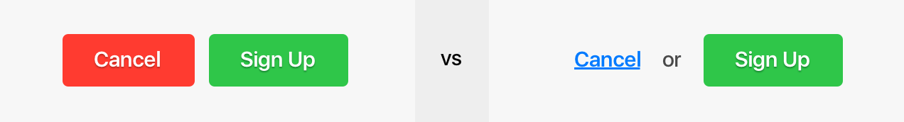
- never relying on color alone for anything important — clarify color information with icons and, ideally, text;
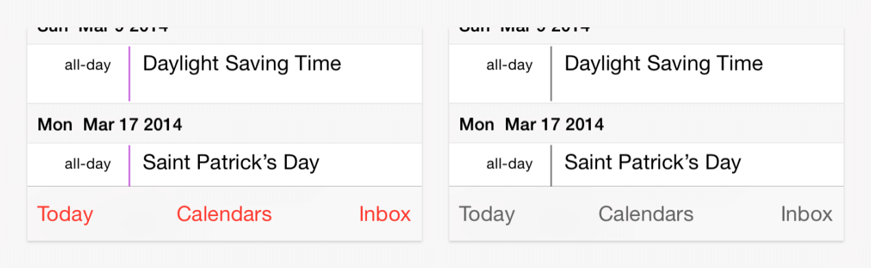
- ensuring text links stand out from the surrounding content.
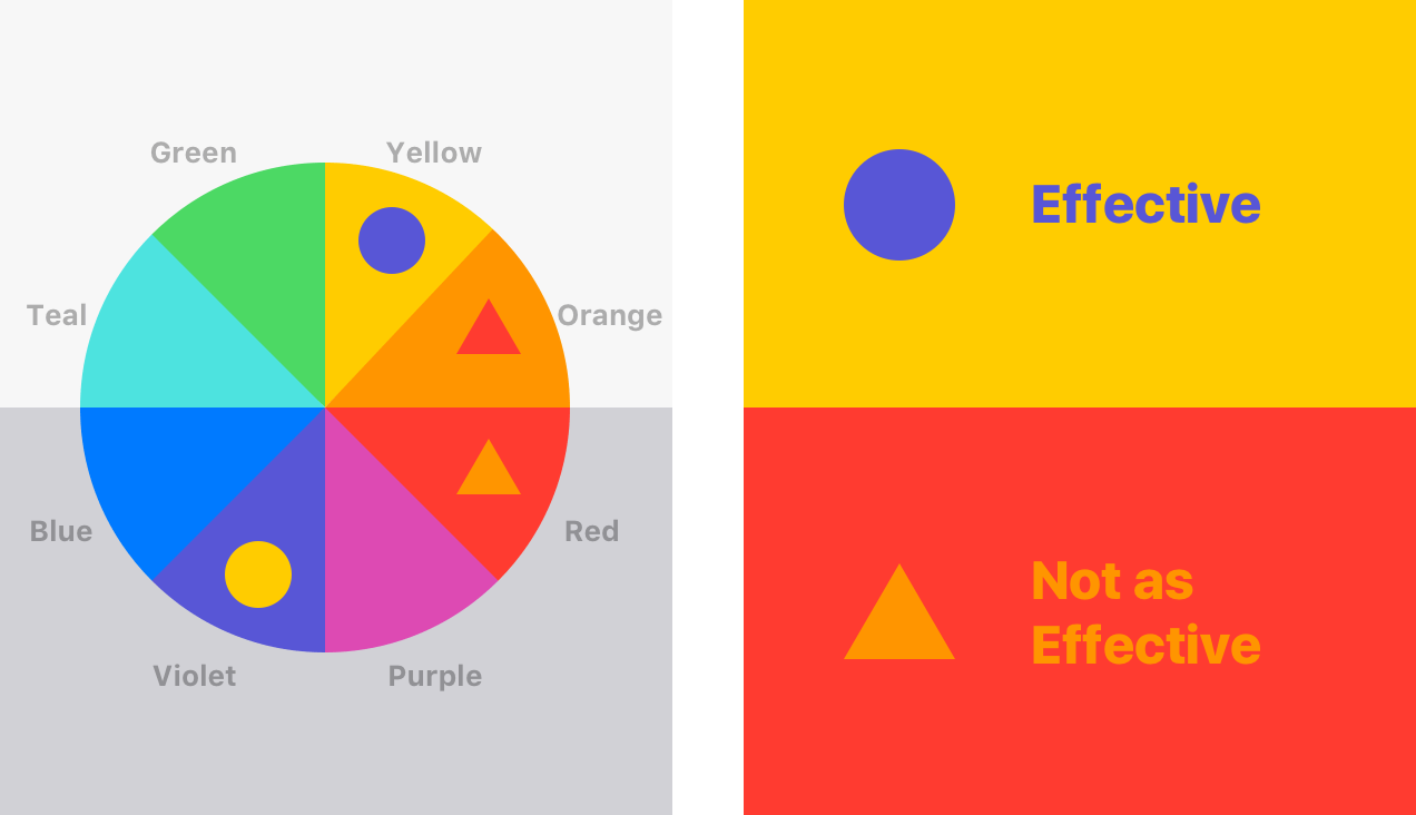
Because the most common difficulty that visually impaired users have is identifying particular hues of color, try to rely more on brightness contrast to differentiate elements and to make them legible.
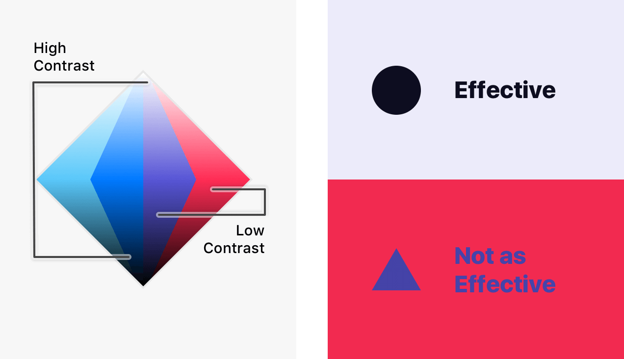
The color wheel below gives you an easy guide to finding high-contrast colors. A dark color from the hues in the lower half set against a light color from the upper half will provide strong contrast. Avoid relying on the contrast between light colors from the bottom half and dark colors from the top half.
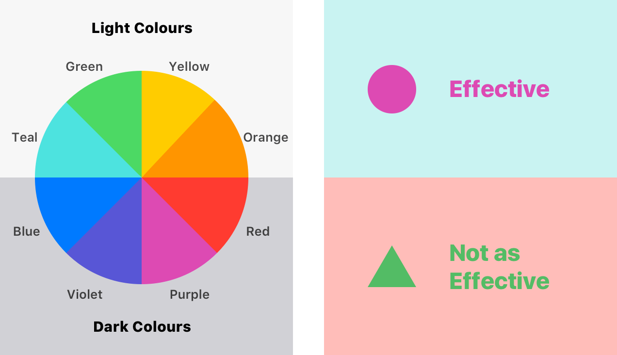
Avoid contrasting hues from adjoining parts of the circle if those colors do not contrast in lightness.
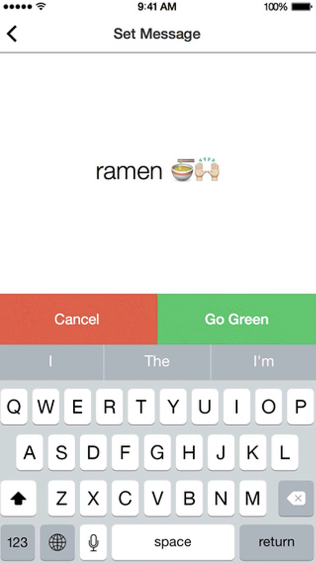
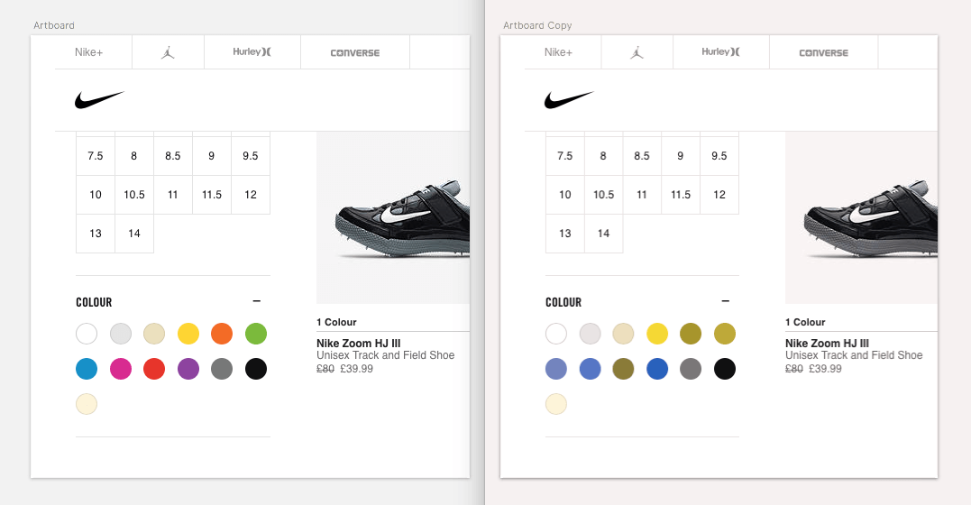
Don’t rely on color alone to convey a message. Nike’s search bar is an example of how a lack of descriptions of the colors could be misleading. Adding color names to the swatches would remove the need to repeatedly hover to confirm you have selected the right model.
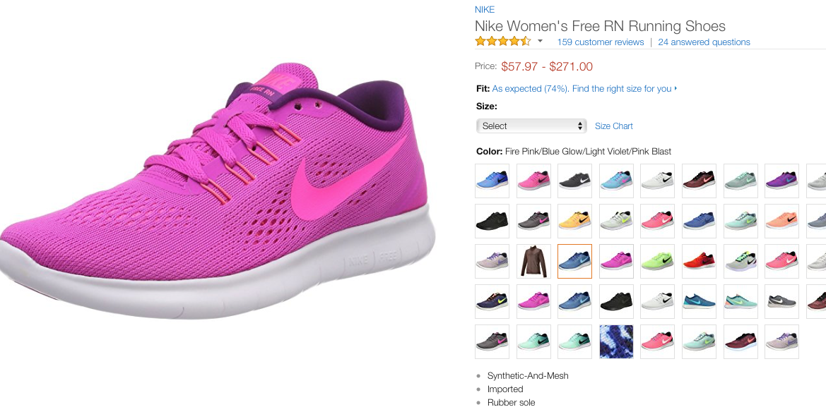
Amazon does a better job of this by adding the color’s name on top of each thumbnail when the user hovers over it.
Avoid using color as the only indication of what to do or of the information you are trying to get across. Instead, use color only as a hint to the user.
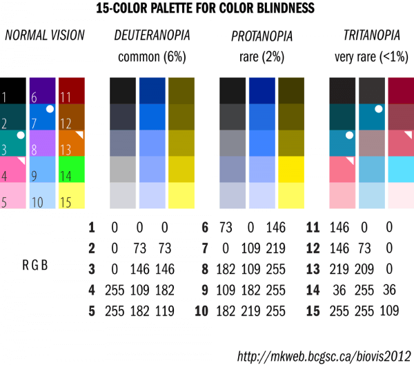
The broader the color palette you design, the greater the opportunity to confuse hues, so limit your color palette. The 15-color palette below provides good discrimination for common color-blindness types. Individuals with tritanopia cannot distinguish between hue pairings marked with the bullet (●) as well as pairings marked with the triangle (◥) in the graphic below.
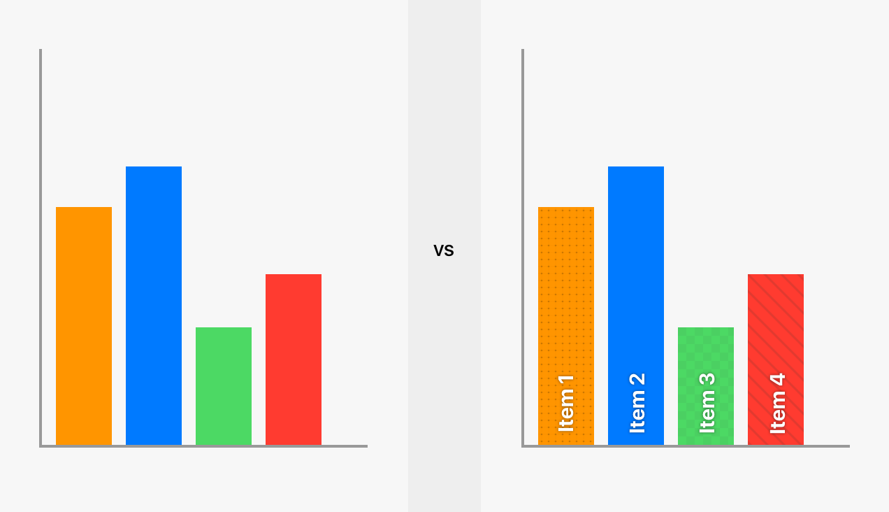
Use texture and patterns to emphasize contrast. For example, it might be difficult for color-blind users to interpret graphs and charts. In this case, use contrasting patterns and, where possible, embed text instead. (Of course, the question of whether to code the bars in different colors will depend on the data series you are showing.)
When creating buttons that call the user’s attention and require their direct interaction, avoid using color combos that are easily confused by color-blind users (red and green, or blue and yellow).
Also, make sure that these elements contain clear and visible text or iconography that makes the goal clear.
Creating Accessible UI Design
Stripping color out of your design can also be a good test of its functionality. If it’s completely reliant on color, there are likely bigger issues with the logic. For example, minimal interfaces can be very poor for accessibility if stripped of visual features, but stark minimal design can be very clear when using shapes, color and contrast to draw attention to key elements.
Use subtle drop shadows to create contrast while keeping true to a brand’s colors and identity.
Divert effort from developing fancy, impractical UIs into decorating functional UIs — adding things like hover (for non-touch devices), tap, active and error states, as well as icons to accompany color and text — some of which can be done by using more standard components or conventional design patterns.
As an example of an impractical UI, the interface below becomes a cloud of text bubbles when viewed in monochrome.
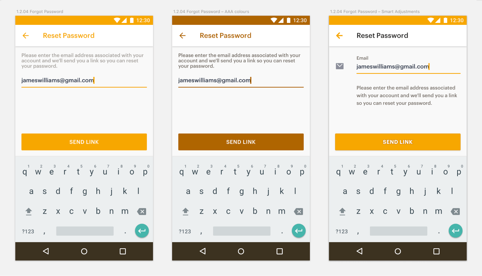
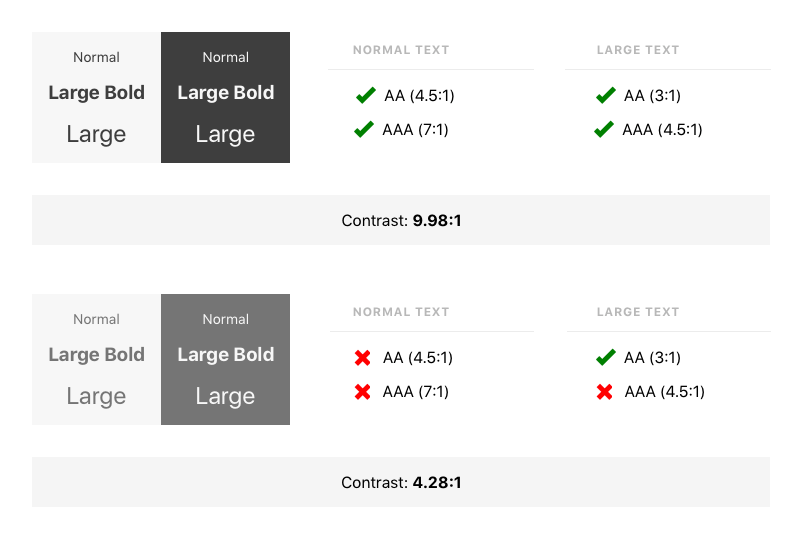
For website content, the W3C’s Web Content Accessibility Guidelines 2.0 (WCAG 2.0) detail a number of recommendations for making the web more accessible. Level A is the minimum requirement, Level AA asks for audio and video captions, and Level AAA is the rating indicating the highest level of accessibility.
Many components are simple: using alt text for images, or retaining form information after an authenticated session has expired. One of the most important but basic recommendations made by the WCAG 2.0 has to do with contrast, especially concerning the contrast ratio between text and its background.
“But Dribbble Won’t Like It!”
As designers, we want to make the most creative solutions possible, right?
Well, of course, catering for accessibility does add some constraints to your designs, but you already design within a framework of many constraints, all of which are key parts of a functional product. This is just one of those constraints.
Accessibility isn’t just about people with visual impairments; everyone benefits from accessible content. Design imagines a better world and has an underpinning of function, whether or not the designer has loftier aesthetic goals. Designing for accessibility not only is largely straightforward, but it’s important for you, your bosses, your clients and your users. With the fundamentals of accessibility on hand, along with our list of best practices, you should be able to keep even your Dribbble shots widely accessible.
Helpful Tools For Designers
Understanding how others see your designs is key to providing the best experience for everyone. Luckily, there are some easy ways to stay on top of the WCAG 2.0 guidelines to ensure your designs are accessible.
Sketch
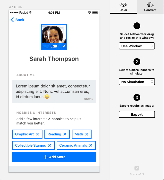
Stark is an excellent Sketch plugin that provides a windowed simulation of the various types of color-blindness. It also provides contrast ratios between two selected layers.
Use Sketch’s built-in and nested symbols system to create a sticker sheet of your UI elements, to make it easy to check all variants and states in situ; it can be easy to forget about certain scenarios.
Photoshop
Photoshop has built-in color-blindness-checking utilities via the color profiles feature.
Web
- Tanaguru
Give this contrast-finder tool a color pairing, and it will calculate the contrast ratio to generate similar colors that would improve accessibility. - Colorblind Web Page Filter
This tool will simulate different types of color-blindness on a web page. - NoCoffee
This “vision simulator” add-on identifies problems on a web page such as low acuity, low contrast and color reliance.
iOS
The Colorblindness App was developed by Felipe Elioenay and is one of our favorites. The user hovers their phone camera over everyday objects, and the app describes the color of that object on screen with a super-simple interface.
Miscellaneous
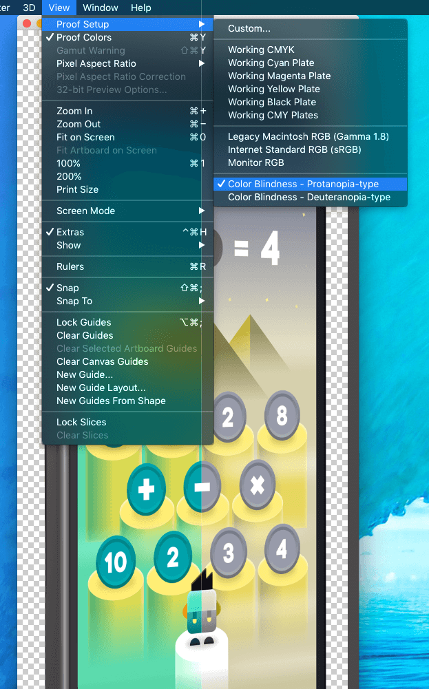
Color Oracle is a useful macOS utility app that previews your current screen in the various types of color-blindness.
Hard-Coding An Accessible Experience: Tips For Developers
Good design and a good user experience go a very long way toward making a website more accessible, but sometimes we need to go a step further and consider development.
Semantic HTML
Assistive technology such as screen-reader software is sometimes necessary to write semantic, standards-compliant HTML in order to improve accessibility.
HTML5 elements are semantic HTML; they provide meaning to the structure of the page. A blind person using a screen reader needs to be able to skip through to different sections of the page, rather than reading the whole page from start to finish. Using heading levels appropriately (h1 through h6) makes this a lot easier. The user can listen to all of the section headings and then decide which part of the page they are interested in.
Keeping the content and presentation layers separated is also incredibly important. HTML is for content and structure, and CSS is for presentation and layout.
Images
For a user with a visual impairment, images will need alt tags that explain what the image shows, as well as captions and labels to fill in missing context. When you're inputting this information, describe the function of the graphics. “Go to Portfolio” is more useful than “Photo of a briefcase.”
Video And Audio
Using HTML5 video and audio tags lets the browser know what content is there and, by default, uses the system’s playback UI, which is likely already both familiar and accessible to the user.
Forms
Forms can cause problems for people using screen readers if you don’t ensure they can access all of the information they need to fill out the form.
Those using a screen reader need to know what is supposed to be entered in each field, because they’re unable to see the label next to the field. There’s already a solution to this one: the label element, which associates label text with a form field.
New in HTML5 is the ability to specify the data type of an input field. By marking expected data types, the browser will provide the best input type for that data type (for example, a number pad for a numeric figure, or a date-picker for a date).
iOS And Android
Apple has long been supportive of accessibility, with features like Display Zoom, but over the past few years it’s taken it up a notch by orchestrating iOS features such as Dynamic Type, Auto-Layout, and UIStackView, which come together to form the foundation for a highly responsive UI — and all developers can easily take advantage.
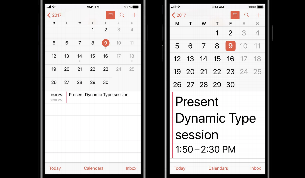
At the 2017 Worldwide Developer Conference, Apple urged third-party developers to support Dynamic Type if they weren’t already, having added support for custom fonts to adhere to the user’s Dynamic Type size preference in iOS 11.
Android has its own responsive layout and dynamic type solution. You can specify measurements in dp (density-independent pixel) and sp (scaleable pixels) for type to automatically adjust based on the user’s settings.
Design Best Practices And Accessibility Toolkit
- Color contrast is a powerful design tool and a pillar of AAA design.
- Don’t just rely on colors and icons. Text labels ensure users know what they’re choosing.
- Filled icons are clearer than thin-line icons (Apple agrees). If you must, then thick strokes are easier to detect than thin strokes.
- Contrasting patterns give a sense of texture and help users to differentiate between elements.
- Provide enough white space around click and tap targets for users to locate and hit them.
- Recognizable icon silhouettes outperform circles with symbols inside.
- Precise language, such as verbs on button tiles, let the user know they can “continue,” rather than presenting them with a suite of “yes” and “no” options.
- Fonts with small x-heights are easier to read (Brandon Grotesque is a good one), but otherwise avoid decorative fonts (sorry, Lobster).
- Ensure text links stand out by using a clear callout, such as an underline.
- Make sure your JavaScript and CSS techniques don’t block highlighting, which many users do to increase contrast.
- Familiarity and consistency gives users a head start. Know when to use established design patterns, common interactions and native components.
- Icons and buttons need to be tappable, but they don’t have to be obnoxiously large. Add a low-contrast container or white space around them to create visual balance and suitable tap targets.
- Random A11Y is a crowd-sourced effort to generate high-contrast color palettes that aren’t ugly.
References
- “Visual Impairment,” Wikipedia
- “Color Blindness,” Wikipedia
- “Prevalence,” Colour Blindness
- “Tips for Designing for Colorblind Users,” Design Shack
- “Designing for Color Blindness,” Understanding Graphics
- “Accessible Interface Design,” UX Planet
- “Designing for and as a Color-Blind Person,” Envato Tuts+
- “Improving UX for Color-Blind Users,” Smashing Magazine
- We Are Colorblind
- “Designing Colorblind-Friendly Websites,” Template Monster
- “How to Design for Color Blindness,” Usabilla
- “Website Design for Color Blind,” Go Daddy
- “10 Free Screen Readers for Visually Impaired Users,” Usability Geek
- “Design for Visually Impaired,” Mashable
- “Design Website for Blind Users,” Hobo Web
- “Accessibility Basics,” Envato Tuts+
- “Making Your HTML Accessible for the Visually Impaired,” EConsultancy
- “Creating Accessible Websites,” AFB
- “Types of Colour Blindness,” Colour Blind Awareness
Further Reading
- A Guide To Modern CSS Colors With RGB, HSL, HWB, LAB And LCH
- Color Mechanics In UI Kits
- Everything I Know About UX Research I First Learned From Lt. Columbo
- CSS And Accessibility: Inclusion Through User Choice
 (da, vf, yk, al, il, mrn)

