Building Accessible Menu Systems

Email Newsletter
Weekly tips on front-end & UX.
Trusted by 182,000+ folks.
 Register for Free


 Celebrating 10 million developers
 Custom Web Forms for Angular, React, & Vue. Your backend.
Editor’s Note: This article originally appeared on Inclusive Components. If you’d like to know more about similar inclusive component articles, subscribe to the RSS feed. By supporting inclusive-components.design on Patreon, you can help to make it the most comprehensive database of robust interface components available.
There are lots of different types of menu on the web. Creating inclusive experiences is a question of using the right menu patterns in the right places, with the right markup and behavior.
Classification is hard. Take crabs, for example. Hermit crabs, porcelain crabs, and horseshoe crabs are not — taxonomically speaking — true crabs. But that doesn’t stop us using the “crab” suffix. It gets more confusing when, over time and thanks to a process called carcinisation, untrue crabs evolve to resemble true crabs more closely. This is the case with king crabs, which are believed to have been hermit crabs in the past. Imagine the size of their shells!
In design, we often make the same mistake of giving different things the same name. They appear similar, but appearances can be deceptive. This can have an unfortunate effect on the clarity of your component library. In terms of inclusion, it may also lead you to repurpose a semantically and behaviorally inappropriate component. Users will expect one thing and get another.
The term “dropdown” names a classic example. Lots of things “drop down” in interfaces, including the set of options from a select element, and the JavaScript-revealed list of links that constitute a navigation submenu. Same name; quite different things. (Some people call these “pulldowns”, of course, but let’s not get into that.)
Dropdowns which constitute a set of options are often called “menus”, and I want to talk about these here. We shall be devising a true menu, but there’s plenty to be said about not-really-true menus along the way.
Let’s start with a quiz. Is the box of links hanging down from the navigation bar in the illustration a menu?
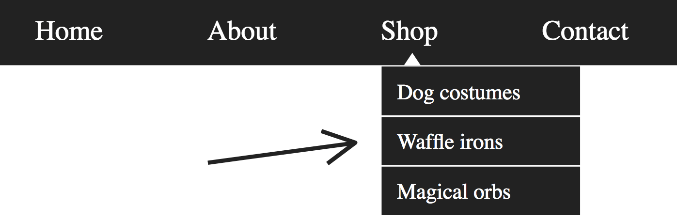
The answer is no, not a true menu.
It’s a longstanding convention that navigation schemas are composed of lists of links. A convention nearly as longstanding dictates that sub-navigation should be provided as nested lists of links. If I were to remove the CSS for the component illustrated above, I should see something like the following, except colored blue and in Times New Roman.
Semantically speaking, nested lists of links are correct in this context. Navigation systems are really tables of content and this is how tables of content are structured. The only thing that really makes us think “menu” is the styling of the nested lists and the way they are revealed on hover or focus.
That’s where some go wrong and start adding WAI-ARIA semantics: aria-haspopup="true", role="menu", role="menuitem" etc. There is a place for these, as we’ll cover, but not here. Here are two reasons why:
- ARIA menus are not designated for navigation but for application behavior. Imagine the menu system for a desktop application.
- The top-level link should be usable as a link, meaning it does not behave like a menu button.
Regarding (2): When traversing a navigation region with submenus, one would expect each submenu to appear upon hovering or focusing the "top level" link ("Shop" in the illustration). This both reveals the submenu and places its own links in focus order. With a little help from JavaScript capturing focus and blur events to persist the appearance of the submenus while needed, someone using the keyboard should be able to tab through each link of each tier, in turn.
Menu buttons which take the aria-haspopup="true" property do not behave like this. They are activated on click and have no other purpose than to reveal a secreted menu.
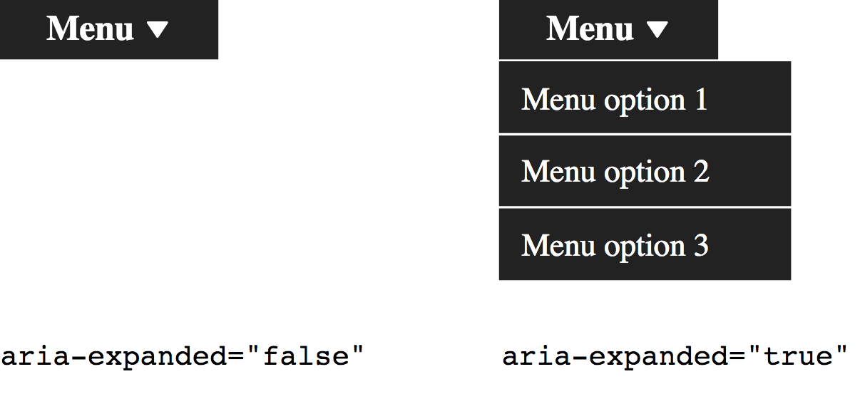
As pictured, whether that menu is open or closed should be communicated with aria-expanded. You should only change this state on click, not on focus. Users do not usually expect an explicit change of state on a mere focus event. In our navigation system, state doesn’t really change; it’s just a styling trick. Behaviorally, we can Tab through the navigation as if no such show/hide trickery were occurring.
The Problem With Navigation Submenus
Navigation submenus (or "dropdowns" to some) work well with a mouse or by keyboard, but they’re not so hot when it comes to touch. When you press the top-level "Shop" link in our example for the first time, you are telling it to both open the submenu and follow the link.
There are two possible resolutions here:
- Prevent the default behavior of top-level links (
e.preventDefault()) and script in full WAI-ARIA menu semantics and behavior. - Make sure each top-level destination page has a table of contents as an alternative to the submenu.
(1) is unsatisfactory because, as I noted previously, these kinds of semantics and behaviors are not expected in this context, where links are the subject controls. Plus users could no longer navigate to a top-level page, if it exists.
Sidenote: Which Devices Are Touch Devices?
It’s tempting to think, “this isn’t a great solution, but I’ll only add it for touch interfaces”. The problem is: how does one detect if a device has a touch screen?
You certainly shouldn’t equate "small screen" with "touch activated". Having worked in the same office as folks making touch displays for museums, I can assure you that some of the largest screens around are touch screens. Dual keyboard and touch input laptops are becoming increasingly prolific too.
By the same token, many but not all smaller devices are touch devices. In inclusive design, you cannot afford to make assumptions.
Resolution (2) is more inclusive and robust in that it provides a "fallback" for users of all inputs. But the scare quotes around the fallback term here are quite deliberate because I actually think in-page tables of content are a superior way of providing navigation.
The award winning Government Digital Services team would appear to agree. You may also have seen them on Wikipedia.
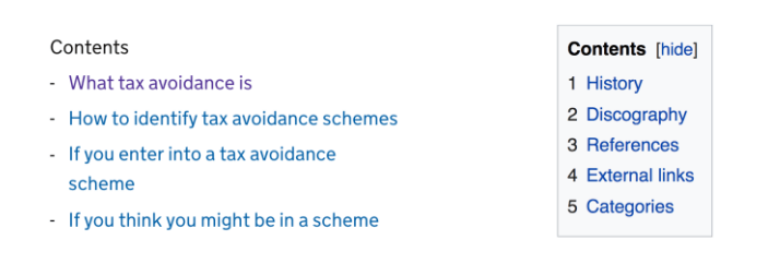
Tables Of Content
Tables of content are navigation for related pages or page sections and should be semantically similar to main site navigation regions, using a `
<nav aria-labelledby="sections-heading">
    <h2 id="sections-heading">Products</h2>
    <ul>
        <li><a href="/products/dog-costumes">Dog costumes</a></li>
        <li><a href="/products/waffle-irons">Waffle irons</a></li>
        <li><a href="/products/magical-orbs">Magical orbs</a></li>
    </ul>
</nav>
<!-- each section, in order, here -->
Notes
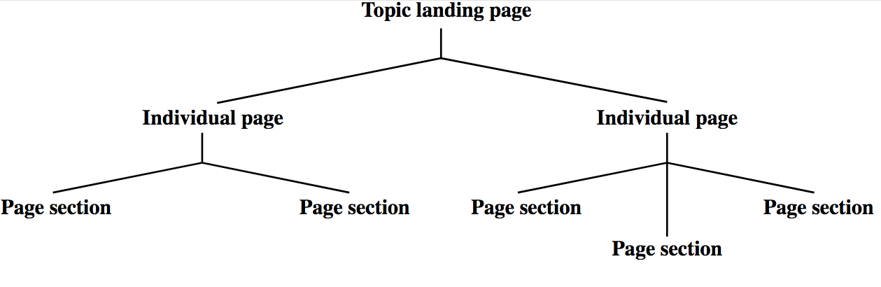
- In this example, we’re imagining that each section is its own page, as it would have been in the dropdown submenu.
- It’s important that each of these "Shop" pages has the same structure, with this "Products" table of content present in the same place. Consistency supports understanding.
- The list groups the items and enumerates them in assistive technology output, such as a screen reader’s synthetic voice.
- The `
All On One Page
If you can fit all the sections onto one page without it becoming too long and arduous to scroll, even better. Just link to each section’s hash identifier. For example, href="#waffle-irons" should point to id="waffle-irons".
<nav aria-labelledby="sections-heading">
    <h2 id="sections-heading">Products</h2>
    <ul>
        <li><a href="#dog-costumes">Dog costumes</a></li>
        <li><a href="#waffle-irons">Waffle irons</a></li>
        <li><a href="#magical-orbs">Magical orbs</a></li>
    </ul>
</nav>

<!-- dog costumes section here -->
<section id="waffle-irons" tabindex="-1">
<h2>Waffle Irons</h2>
</section>
<!-- magical orbs section here -->(Note: Some browsers are poor at actually sending focus to linked page fragments. Placing tabindex=“-1” on the target fragment fixes this.)
Where a site has a lot of content, a carefully constructed information architecture, expressed through the liberal use of tables of content “menus” is infinitely preferable to a precarious and unwieldy dropdown system. Not only is it easier to make responsive, and requires less code to do so, but it makes things clearer: where dropdown systems hide structure away, tables of content lay it bare.
Some sites, including the Government Digital Service’s gov.uk, include index (or “topic”) pages that are just tables of content. It’s such a powerful concept that the popular static site generator Hugo generates such pages by default.
Information architecture is a big part of inclusion. A badly organized site can be as technically compliant as you like, but will still alienate lots of users — especially those with cognitive impairments or those who are pressed for time.
Navigation Menu Buttons
While we’re on the subject of faux navigation-related menus, it’d be remiss of me not to talk about navigation menu buttons. You’ve almost certainly seen these denoted by a three-line "hamburger" or "navicon" icon.
Even with a pared down information architecture and only one tier of navigation links, space on small screens is at a premium. Hiding navigation behind a button means there’s more room for the main content in the viewport.
A navigation button is the closest thing we’ve studied so far to a true menu button. Since it has the purpose of toggling the availability of a menu on click, it should:
- Identify itself as a button, not a link;
- Identify the expanded or collapsed state of its corresponding menu (which, in strict terms, is just a list of links).
Progressive enhancement
But let’s not get ahead of ourselves. We ought to be mindful of progressive enhancement and consider how this would work without JavaScript.
In an unenhanced HTML document there’s not a lot you can do with buttons (except submit buttons but that’s not even closely related to what we want to achieve here). Instead, perhaps we should start with just a link which takes us to the navigation?
<a href="#navigation">navigation</a>
<!-- some content here perhaps -->

<nav id="navigation">
    <ul>
        <li><a href="/">Home</a></li>
        <li><a href="/about">About</a></li>
        <li><a href="/shop">Shop</a></li>
        <li><a href="/content">Content</a></li>
    </ul>
</nav>
There’s not a lot of point in having the link unless there’s a lot of content between the link and the navigation. Since site navigation should almost always appear near the top of the source order, there’s no need. So, really, a navigation menu in the absence of JavaScript should just be… some navigation.
<nav id="navigation">
    <ul>
        <li><a href="/">Home</a></li>
        <li><a href="/about">About</a></li>
        <li><a href="/shop">Shop</a></li>
        <li><a href="/content">Content</a></li>
    </ul>
</nav>
You enhance this by adding the button, in its initial state, and hiding the navigation (using the hidden attribute):
<nav id="navigation">
    <button aria-expanded="false">Menu</button>
    <ul hidden>
        <li><a href="/">Home</a></li>
        <li><a href="/about">About</a></li>
        <li><a href="/shop">Shop</a></li>
        <li><a href="/contact">Contact</a></li>
    </ul>
</nav>
Some older browsers — you know which ones — don’t support hidden, so remember to put the following in your CSS. It fixes the problem because display: none has the same affect of hiding the menu from assistive technologies and removing the links from focus order.
[hidden] { display: none; }Doing one’s best to support older software is, of course, an act of inclusive design. Some are unable or unwilling to upgrade.
Placement
Where a lot of people go wrong is by placing the button outside the region. This would mean screen reader users who move to the `
<nav id="navigation">
</nav>
Here’s how we might toggle state:
var navButton = document.querySelector('nav button');
navButton.addEventListener('click', function() {
    let expanded = this.getAttribute('aria-expanded') === 'true' || false;
    this.setAttribute('aria-expanded', !expanded);
    let menu = this.nextElementSibling;
    menu.hidden = !menu.hidden;
});
Aria-Controls
As I wrote in Aria-controls Is Poop, the aria-controls attribute, intended to help screen reader users navigate from a controlling element to a controlled element, is only supported in the JAWS screen reader. So you simply can’t rely on it.
Without a good method for directing users between elements, you should instead make sure one of the following is true:
- The expanded list’s first link is next in focus order after the button (as in the previous code example).
- The first link is focused programmatically upon revealing the list.
In this case, I would recommend (1). It’s a lot simpler since you don’t have to worry about moving focus back to the button and on which event(s) to do so. Also, there’s currently nothing in place to warn users that their focus will be moved to somewhere different. In the true menus we’ll be discussing shortly, this is the job of aria-haspopup="true".
Employing aria-controls doesn’t really do much harm, except that it makes readout in screen readers more verbose. However, some JAWS users may expect it. Here is how it would be applied, using the list’s id as the cipher:
<nav id="navigation">
<button aria-expanded="false" aria-controls="menu-list">Menu</button>
<ul id="menu-list" hidden>
    <li><a href="/">Home</a></li>
    <li><a href="/about">About</a></li>
    <li><a href="/shop">Shop</a></li>
    <li><a href="/contact">Contact</a></li>
</ul>
</nav>
The Menu And Menuitem Roles
A true menu (in the WAI-ARIA sense) should identify itself as such using the menu role (for the container) and, typically, menuitem children (other child roles may apply). These parent and child roles work together to provide information to assistive technologies. Here’s how a list might be augmented to have menu semantics:
<ul role="menu">
    <li role="menuitem">Item 1</li>
    <li role="menuitem">Item 2</li>
    <li role="menuitem">Item 3</li>
</ul>
Since our navigation menu is beginning to behave somewhat like a “true” menu, should these not be present?
The short answer is: no. The long answer is: no, because our list items contain links and menuitem elements are not intended to have interactive descendants. That is, they are the controls in a menu.
We could, of course, suppress the list semantics of the li`s using role="presentation" or role="none" (which are equivalent) and place the menuitem role on each link. However, this would suppress the implicit link role. In other words, the example to follow would be announced as “Home, menu item”, not “Home, link” or “Home, menu item, link”. ARIA roles simply override HTML roles.
<!-- will be read as "Home, menu item" -->
<li role="presentation">
<a href="/" role="menuitem">Home</a>
</li>
We want the user to know that they are using a link and can expect link behavior, so this is no good. Like I said, true menus are for (JavaScript driven) application behavior.
What we’re left with is a kind of hybrid component, which isn’t quite a true menu but at least tells users whether the list of links is open, thanks to the aria-expanded state. This is a perfectly satisfactory pattern for navigation menus.
Sidenote: The select Element
If you’ve been involved in responsive design from the beginning, you may remember a pattern whereby navigation was condensed into a select element for narrow viewports.
As with the checkbox-based toggle buttons we discussed, using a native element that behaves somewhat as intended without additional scripting is a good choice for efficiency and — especially on mobile — performance. And select elements are menus of sorts, with similar semantics to the button-triggered menu we shall soon be constructing.
However, just as with the checkbox toggle button, we’re using an element associated with entering input, not simply making a choice. This is likely to cause confusion for many users — especially since this pattern uses JavaScript to make the selected `option` behave like a link. The unexpected change of context this elicits is considered a failure according to WCAG’s 3.2.2 On Input (Level A) criterion.
True Menus
Now that we’ve had the discussion about false menus and quasi-menus, the time has arrived to create a true menu, as opened and closed by a true menu button. From here on in I will refer to the button and menu together as simply a “menu button”.
But in what respects will our menu button be true? Well, it’ll be a menu component intended for choosing options in the subject application, which implements all the expected semantics and corresponding behaviors to be considered conventional for such a tool.
As mentioned already, these conventions come from desktop application design. ARIA attribution and JavaScript governed focus management are needed to imitate them fully. Part of the purpose of ARIA is to help web developers create rich web experiences without breaking with usability conventions forged in the native world.
In this example, we’ll imagine our application is some sort of game or quiz. Our menu button will let the user choose a difficulty level. With all the semantics in place, the menu looks like this:
<button aria-haspopup="true" aria-expanded="false">
Difficulty <span aria-hidden="true">▾</span>
</button>
<div role="menu">
<button role="menuitem">Easy</button>
<button role="menuitem">Medium</button>
<button role="menuitem">Incredibly Hard</button>
</div>Notes
- The
aria-haspopupproperty simply indicates that the button secretes a menu. It acts as warning that, when pressed, the user will be moved to the “popup” menu (we’ll cover focus behavior shortly). Its value does not change — it remains astrueat all times. - The `` inside the button contains the unicode point for a black down-pointing small triangle. This convention indicates visually what
aria-haspopupdoes non-visually — that pressing the button will reveal something below it. Thearia-hidden="true"attribution prevents screen readers from announcing “down pointing triangle” or similar. Thanks toaria-haspopup, it’s not needed in the non-visual context. - The
aria-haspopupproperty is complemented byaria-expanded. This tells the user whether the menu is currently in an open (expanded) or closed (collapsed) state by toggling betweentrueandfalsevalues. - The menu itself takes the (aptly named)
menurole. It takes descendants with themenuitemrole. They do not need to be direct children of themenuelement, but they are in this case — for simplicity.
Keyboard And Focus Behavior
When it comes to making interactive controls keyboard accessible, the best thing you can do is use the right elements. Because we’re using `button` elements here, we can be assured that click events will fire on Enter and Space keystrokes, as specified in the HTMLButtonElement interface. It also means that we can disable the menu items using the button-associated disabled property.
There’s a lot more to menu button keyboard interaction, though. Here’s a summary of all the focus and keyboard behavior we’re going to implement, based on WAI-ARIA Authoring Practices 1.1:
| Enter, Space or ↓ on the menu button | Opens the menu |
| ↓ on a menu item | Moves focus to the next menu item, or the first menu item if you’re on the last one |
| ↑ on a menu item | Moves focus to the previous menu item, or the last menu item if you’re on the first one |
| ↑ on the menu button | Closes the menu if open |
| Esc on a menu item | Closes the menu and focuses the menu button |
The advantage of moving focus between menu items using the arrow keys is that Tab is preserved for moving out of the menu. In practice, this means users don’t have to move through every menu item to exit the menu — a huge improvement for usability, especially where there are many menu items.
The application of tabindex="-1" makes the menu items unfocusable by Tab but preserves the ability to focus the elements programmatically, upon capturing key strokes on the arrow keys.
<button aria-haspopup="true" aria-expanded="false">
Difficulty <span aria-hidden="true">▾</span>
</button>
<div role="menu">
<button role="menuitem" tabindex="-1">Easy</button>
<button role="menuitem" tabindex="-1">Medium</button>
<button role="menuitem" tabindex="-1">Incredibly Hard</button>
</div>The Open Method
As part of a sound API design, we can construct methods for handling the various events.
For example, the open method needs to switch the aria-expanded value to “true”, change the menu’s hidden property to false, and focus the first menuitem in the menu that isn’t disabled:
MenuButton.prototype.open = function () {
    this.button.setAttribute('aria-expanded', true);
    this.menu.hidden = false;
    this.menu.querySelector(':not(\[disabled])').focus();
    return this;
}
We can execute this method where the user presses the down key on a focused menu button instance:
this.button.addEventListener('keydown', function (e) {
    if (e.keyCode === 40) {
        this.open();
    }
}.bind(this));
In addition, a developer using this script will now be able to open the menu programmatically:
exampleMenuButton = new MenuButton(document.querySelector('\[aria-haspopup]'));
exampleMenuButton.open();
Sidenote: The Checkbox Hack
As much as possible, it’s better not to use JavaScript unless you need to. Involving a third technology on top of HTML and CSS is necessarily an increase in systemic complexity and fragility. However, not all components can be satisfactorily built without JavaScript in the mix.
In the case of menu buttons, an enthusiasm for making them “work without JavaScript” has led to something called the checkbox hack. This is where the checked (or unchecked) state of a hidden checkbox is used to toggle the visibility of a menu element using CSS.
/* menu closed */
[type="checkbox"] + [role="menu"] {
    display: none;
}

/* menu open */
[type="checkbox"]:checked + [role="menu"] {
    display: block;
}
To screen reader users, the checkbox role and checked state are nonsensical in this context. This can be partly overcome by adding role="button" to the checkbox.
<input type="checkbox" role="button" aria-haspopup="true" id="toggle">Unfortunately, this suppresses the implicit checked state communication, depriving us of JavaScript-free state feedback (poor though it would have been as “checked” in this context).
But it is possible to spoof aria-expanded. We just need to supply our label with two spans as below.
<input type="checkbox" role="button" aria-haspopup="true" id="toggle" class="vh">
<label for="toggle" data-opens-menu> Difficulty <span class="vh expanded-text">expanded</span>
<span class="vh collapsed-text">collapsed</span>
<span aria-hidden="true">▾</span>
</label>These are both visually hidden using the visually-hidden class, but — depending on which state we’re in — only one is hidden to screen readers as well. That is, only one has display: none, and this is determined by the extant (but not communicated) checked state:
/* class to hide spans visually */
.vh {
    position: absolute !important;
    clip: rect(1px, 1px, 1px, 1px);
    padding: 0 !important;
    border: 0 !important;
    height: 1px !important;
    width: 1px !important;
    overflow: hidden;
}

/* reveal the correct state wording to screen readers based on state */

[type="checkbox"]:checked + label .expanded-text {
    display: inline;
}

[type="checkbox"]:checked + label .collapsed-text {
    display: none;
}

[type="checkbox"]:not(:checked) + label .expanded-text {
    display: none;
}

[type="checkbox"]:not(:checked) + label .collapsed-text {
    display: inline;
}
This is clever and all, but our menu button is still incomplete since the expected focus behaviors we’ve been discussing simply cannot be implemented without JavaScript.
These behaviors are conventional and expected, making the button more usable. However, if you really need to implement a menu button without JavaScript, this is about as close as you can get. Considering the cut-down navigation menu button I covered previously offers menu content that is not JavaScript dependent itself (i.e. links), this approach may be a suitable option.
For fun, here’s a codePen implementing a JavaScript-free navigation menu button.
See the Pen Navigation menu button example no JS by Heydon (@heydon) on CodePen.
(Note: Only Space opens the menu.)
The “Choose” Event
Executing some methods should emit events so that we can set up listeners. For example, we can emit a choose event when a user clicks a menu item. We can set this up using CustomEvent, which lets us pass an argument to the event’s detail property. In this case, the argument (“choice”) would be the chosen menu item’s DOM node.
MenuButton.prototype.choose = function (choice) {
    // Define the 'choose' event
    var chooseEvent = new CustomEvent('choose', {
        detail: {
            choice: choice
        }
    });
    // Dispatch the event
    this.button.dispatchEvent(chooseEvent);
    return this;
 }
There are all sorts of things we can do with this mechanism. Perhaps we have a live region set up with an id of menuFeedback:
<div role="alert" id="menuFeedback"></div>Now we can set up a listener and populate the live region with the information secreted inside the event:
exampleMenuButton.addEventListener('choose', function (e) {
    // Get the node's text content (label)
    var choiceLabel = e.details.choice.textContent;

    // Get the live region node
    var liveRegion = document.getElementById('menuFeedback');

    // Populate the live region
    liveRegion.textContent = 'Your difficulty level is ${choiceLabel}';
});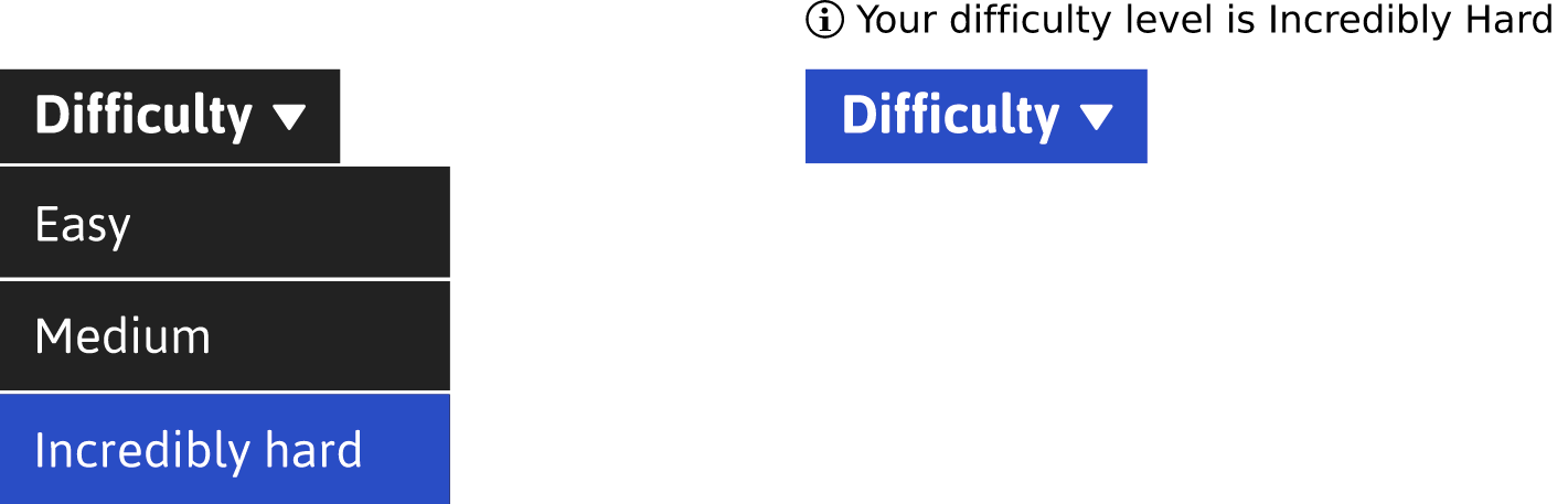
When a menu item is selected, the screen reader user will hear, “You chose [menu item’s label]”. A live region (defined here with the role=“alert” attribution) announces its content in screen readers whenever that content changes. The live region isn’t mandatory, but it is an example of what might happen in the interface as a response to the user making a menu choice.
Persisting Choices
Not all menu items are for choosing persistent settings. Many just act like standard buttons which make something in the interface happen when pressed. However, in the case of our difficulty menu button, we’d like to indicate which is the current difficulty setting — the one chosen last.
The aria-checked="true" attribute works for items that, instead of menuitem, take the menuitemradio role. The enhanced markup, with the second item checked (set) looks like this:
<button aria-haspopup="true" aria-expanded="false"> Difficulty
<span aria-hidden="true">▾</span>
</button>
<div role="menu">
<button role="menuitemradio" tabindex="-1">Easy</button>
<button role="menuitemradio" aria-checked="true" tabindex="-1">Medium</button>
<button role="menuitemradio" tabindex="-1">Incredibly Hard</button>
</div>Native menus on many platforms indicate chosen items using check marks. We can do that with no trouble using a little extra CSS:
[role="menuitem"] [aria-checked="true"]::before {
content: '\2713\0020';
}
While traversing the menu with a screen reader running, focusing this checked item will prompt an announcement like “check mark, Medium menu item, checked”.
The behavior on opening a menu with a checked menuitemradio differs slightly. Instead of focusing the first (enabled) item in the menu, the checked item is focused instead.
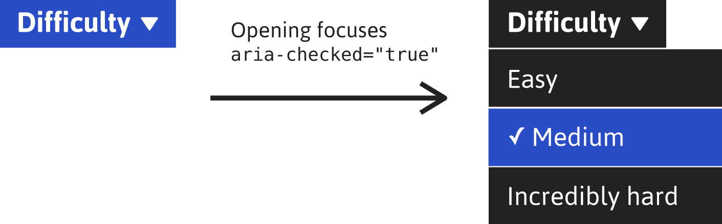
What’s the benefit of this behavior? The user (any user) is reminded of their previously selected option. In menus with numerous incremental options (for example, a set of zoom levels), people operating by keyboard are placed in the optimal position to make their adjustment.
Using The Menu Button With A Screen Reader
In this video, I’ll show you what it’s like to use the menu button with the Voiceover screen reader and Chrome. The example uses items with menuitemradio, aria-checked and the focus behavior discussed. Similar experiences can be expected across the gamut of popular screen reader software.
Inclusive Menu Button On Github
Kitty Giraudel and I have worked together on creating a menu button component with the API features I have described, and more. You have Hugo to thank for many of these features, since they were based on the work they did on a11y-dialog — an accessible modal dialog. It is available on Github and NPM.
npm i inclusive-menu-button --saveIn addition, Kitty has created a React version for your delectation.
Checklist
- Don’t use ARIA menu semantics in navigation menu systems.
- On content heavy sites, don’t hide structure away in nested dropdown-powered navigation menus.
- Use
aria-expandedto indicate the open/closed state of a button-activated navigation menu. - Make sure said navigation menu is next in focus order after the button that opens/closes it.
- Never sacrifice usability in the pursuit of JavaScript-free solutions. It’s vanity.
Further Reading
- When Words Cannot Describe: Designing For AI Beyond Conversational Interfaces
- The View Transitions API And Delightful UI Animations (Part 2)
- A Roundup Of WCAG 2.2 Explainers
- Addressing Accessibility Concerns With Using Fluid Type
 (il, mrn)

