A Comprehensive Guide To Web Design

Email Newsletter
Weekly tips on front-end & UX.
Trusted by 182,000+ folks.
(This is a sponsored post). Web design is tricky. Designers and developers have to take a lot of things into account when designing a website, from visual appearance (how the website looks) to functional design (how the website works). To simplify the task, we’ve prepared this little guide.
In this article, I’ll focus on the main principles, heuristics, and approaches that will help you to create a great user experience for your website. I’ll start with global things like the user journey (how to define the “skeleton” of the website) and work down to the individual page (what should be considered during web page design). We’ll also cover other essential aspects of design, such as mobile considerations and testing.
Designing The User Journey
Information Architecture
People often use the term “information architecture” (IA) to mean the menus on a website. But that’s not correct. While menus are a part of IA, they are only one aspect of it.
IA is all about the organization of information in a clear and logical way. Such organization follows a clear purpose: helping users to navigate a complex set of information. Good IA creates a hierarchy that aligns with user’s expectations. But good hierarchy and intuitive navigation don’t happen by chance. They are a result of proper user research and testing.
There are a number of ways to research user needs. Often, an information architect will take an active part in user interviews or card sorting, where they would hear of user expectations directly or see how prospective users would categorize a variety of information groups. Information architects also need access to the results of usability tests to see whether users are able to navigate efficiently.
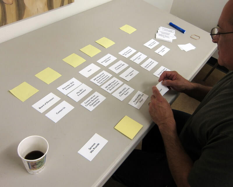
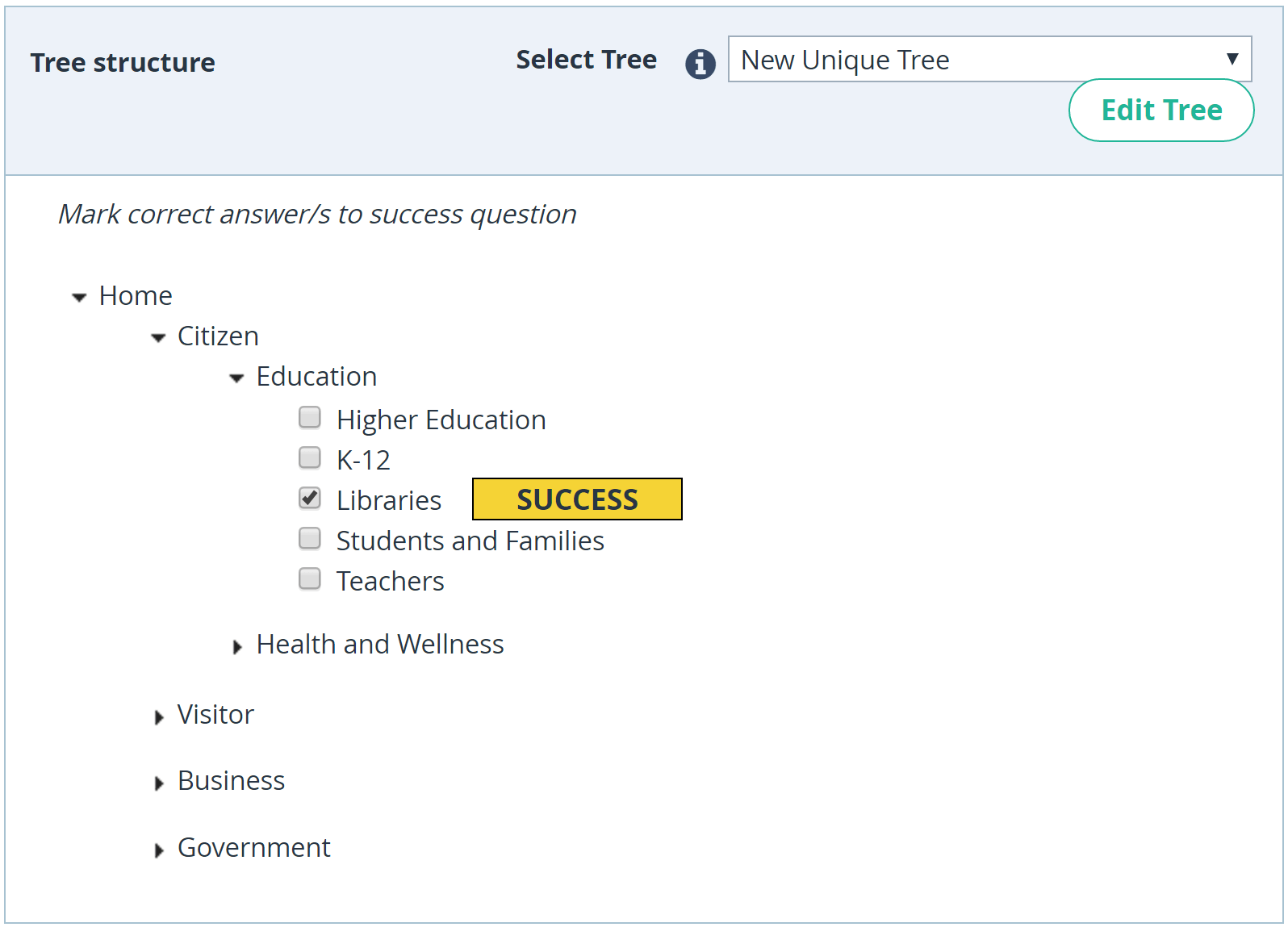
A menu structure would be created based on the results of user interviews, and card sorting would be tested for whether it satisfies the user’s mental model. UX researchers use a technique called “tree testing” to prove that it will work. This happens before designing the actual interface.
Global Navigation
Navigation is a cornerstone of usability. It doesn’t matter how good your website is if users can’t find their way around it. That’s why navigation on your website should adhere to a few principles:
- Simplicity Navigation should be designed in a way that gets visitors where they want to go with the fewest clicks possible.
- Clarity There shouldn’t be any guessing about what each navigation option means. Every navigation option should be self-evident to visitors.
- Consistency The navigation system should be the same for all pages on the website.
Consider a few things when designing navigation:
- Select a navigation pattern based on the user’s needs. Navigation should accommodate the needs of the majority of your app’s users. A given target group expects a particular type of interaction with your website, so make these expectations work in your favor. For example, avoid hamburger-menu navigation if the majority of your users aren’t familiar with the meaning of the icon itself.
- Prioritize navigation options. One simple way to prioritize navigation options is to assign different priority levels (high, medium, low) to common user tasks, and then give prominence in the layout to paths and destinations with high priority levels and frequent use.
- Make it visible. As Jakob Nielsen says, recognizing something is easier than remembering it. Minimize the user’s memory load by making all important navigation options permanently visible. The most important navigation options should be available at all times, not just when we anticipate that the user will need them.
- Communicate the current location. “Where am I?” is a fundamental question to which users need an answer in order to effectively navigate. Failing to indicate the current location is a common problem on many websites. Think about location indicators.
Links And Navigation Options
Links and navigation options are key factors in the navigation process and have a direct effect on the user journey. Follow a few rules with these interactive elements:
- Recognize the difference between internal and external links. Users expect different behavior for internal and external links. All internal links should open in the same tab (this way, you’ll allow users to use the “back” button). If you decide to open external links in a new window, you should provide an advanced warning before automatically opening a new window or tab. This might take the form of text added to the link text stating “(opens in a new window)”.
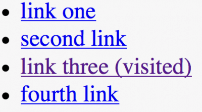
- Change the color of visited links. When visited links don’t change color, users could unintentionally revisit the same pages.
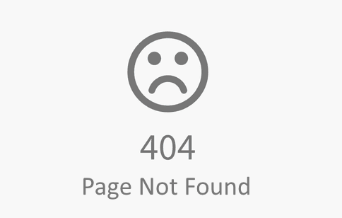
- Double-check all links. A user can easily get frustrated by clicking a link and getting a 404 error page in response. When a visitor is searching for content, they expect every link to take them where it says it will, not to a 404 error page or another place they weren’t expecting.
“Back” Button In Browser
The “back” button is perhaps the second-most popular UI control in the browser (after the URL input field). Make sure the “back” button works according to user expectations. When a user follows a link on a page and then clicks the “back” button, they expect to return to the same spot on the original page. Avoid situations in which clicking “back” brings the user to the top of the initial page, instead of where they left off, especially on pages. Losing their spot forces the user to scroll through content they have already seen. It’s no surprise that users get frustrated quickly with no proper “back to position” functionality.
Breadcrumbs
Breadcrumbs are a set of contextual links that function as a navigation aid on websites. It’s a secondary navigation scheme that usually shows the user’s location on a website.
While this element doesn’t require a lot of explanation, a few things are worth mentioning:
- Don’t use breadcrumbs as a substitute for primary navigation. The main navigation should be the element that leads the user, whereas breadcrumbs should only support the user. Relying on breadcrumbs as a primary method of navigation, rather than an extra feature, is usually an indication of poor navigation design.
- Use arrowheads, not slashes, as separators. Separate each level clearly. A more-than sign (>) or right-pointing arrow (→) is recommended, because these symbols signal direction. A forward slash (/) isn’t recommended as a separator for e-commerce websites. If you’re going to use it, be certain that no product category will ever use a slash:

Search
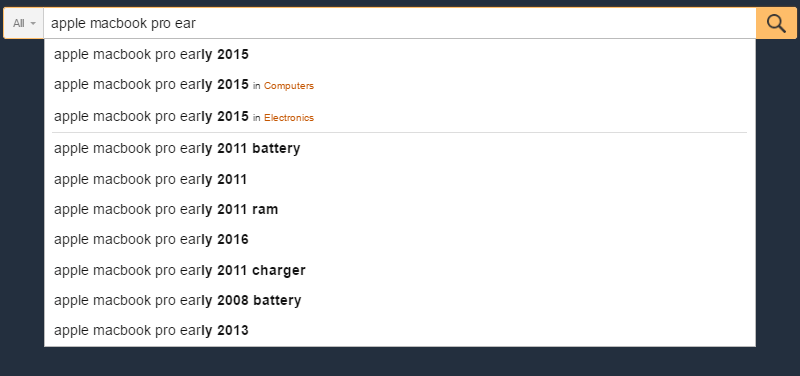
Some users come to a website looking for one particular item. They don’t want to use the navigation options. They want to type text in a search box, submit their search query and find the page they’re looking for.
Take these few basic rules into account when designing the search box:
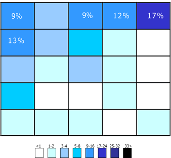
- Put the search box where users expect to find it. The chart below was created based on a study by A. Dawn Shaikh and Keisi Lenz. It shows the expected location of the search field, according to a survey of 142 participants. The study found that the most convenient spot is the top left or top right of every page on a website. Users can easily find it using the common F-shaped scanning pattern.
If search is an important function on your website, display it prominently, because it can be the fastest route to discovery for users.
Making the input field too short is a common mistake among designers. Of course, users can type a long query into a short field, but only a portion of the text will be visible at a time, which is bad for usability because seeing the entire query at once won’t be possible. In fact, when a search box is too short, users are forced to use short, imprecise queries, because longer queries would be hard and inconvenient to read. Nielsen Norman Group recommends a 27-character input field, which would accommodate 90% of queries.
Show the search box on every page, because if users cannot navigate to the content they are looking for, they will try to use search regardless of where they are on the website.
Designing Individual Pages
Content Strategy
Perhaps the most important thing about content strategy is to focus the design on page objectives. Understand the goal of the page, and write content according to the goal.
Here are a few practical tips to improve content comprehension:
- Prevent information overload. Information overload is a serious problem. It prevents users from making decisions or taking action because they feel they have too much information to consume. There are some simple ways to minimize information overload. One common technique is chunking — breaking content into smaller chunks to help users understand and process it better. A checkout form is a perfect example. Display at most five to seven input fields at a time, and break down the checkout into pages, progressively disclosing fields as necessary.
- Avoid jargon and industry-specific terms. Each unknown term or phrase that appears on the page will increase the cognitive load on users. A safe bet is to write for all levels of readers, and pick words that are clearly and easily understandable to all groups of users.
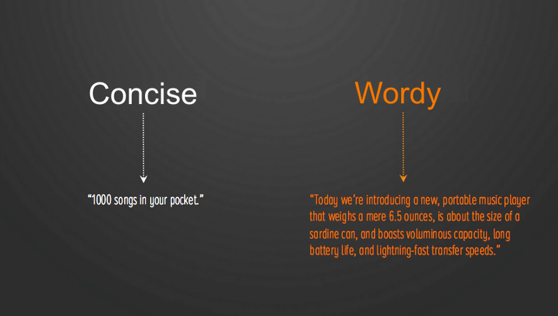
- Minimize long content sections with a lot of detail. In line with the point about information overload, try to avoid long blocks of text if the website isn’t geared to major information consumption. For example, if you need to provide details about a service or product, try to reveal details step by step. Write in small, scannable segments to facilitate discovery. According to Robert Gunning’s book “How to Take the Fog Out of Business Writing”, for comfortable reading, most sentences should be 20 words or less.
- Avoid capitalizing all letters. All-caps text — that is, text with all letters capitalized — is fine in tiny doses, such as for acronyms and logos. However, avoid all caps for anything longer (such as paragraphs, form labels, errors, notifications). As mentioned by Miles Tinker in his book Legibility of Print, all caps dramatically reduces the speed of reading. Also, most readers find all capitals to be less legible.
Page Structure
A properly structured page makes it clear where each user interface element is located in the layout. While there are no one-size-fits-all rules, there are a few guidelines that will help you create a solid structure:
- Make the structure predictable. Align your design to user expectations. Consider websites from a similar category to find out which elements to use on the page and where. Use patterns that your target audience is familiar with.
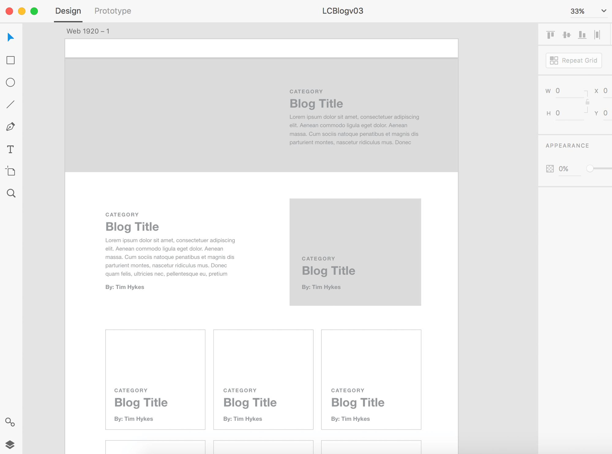
- Use a layout grid. A layout grid divides a page into major regions, and defines the relationships between elements in terms of size and position. With the help of a grid, combining different parts of a page together in a cohesive layout becomes much easier.
- Use a low-fidelity wireframe to cut out clutter. Clutter overloads an interface and reduces comprehension. Every added button, image and line of text makes the screen more complicated. Before building the page with real elements, create a wireframe, analyze it, and get rid of anything that isn’t absolutely necessary.
Visual Hierarchy
People are more likely to quickly scan a web page than to read everything there. Therefore, if a visitor wants to find content or complete a task, they are going to scan until they find where they need to go. You, as a designer, can help them with that by designing good visual hierarchy. Visual hierarchy refers to the arrangement or presentation of elements in a way that indicates importance (that is, where their eyes should focus first, second, etc.). A proper visual hierarchy makes it easy to scan the page.
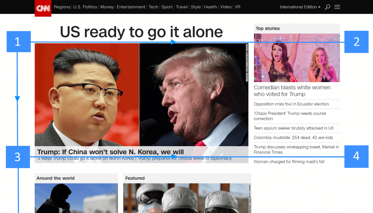
- Use natural scanning patterns. As designers, we have a lot of control over where people look when they’re viewing a page. To set the right path for the visitor’s eyes to follow, we can use two natural scanning patterns: the F-shaped pattern and the Z-shaped pattern. For text-heavy pages, such as articles and search results, the F pattern is better, whereas the Z pattern is good for pages that aren’t text-oriented.
- Visually prioritize important elements. Make screen titles, log-in forms, navigation options and other important content focal points, so that visitors see them right away.
- Create mockups to clarify the visual hierarchy. Mockups enable designers to see what a layout will look like when it’ll have a real data. Rearranging elements in a mockup is much easier than doing it when the developer is building the web page.
Scrolling Behavior
A persistent myth among web designers is that people don’t scroll. To be clear: Today, everybody scrolls!
Improving scrolling behavior is possible with a few tips:
- Encourage users to scroll.
Despite the fact that people usually start scrolling as soon as the page loads, content at the top of the page is still very important. What appears at the top sets the impression and expectation of quality for visitors. People do scroll, but only if what’s above the fold is promising enough. Thus, put your most compelling content at the top of the page:
- Offer a good introduction. An excellent introduction sets the context for the content and answers the user’s question, “What’s this page about?”
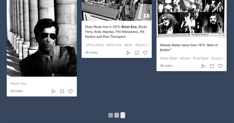
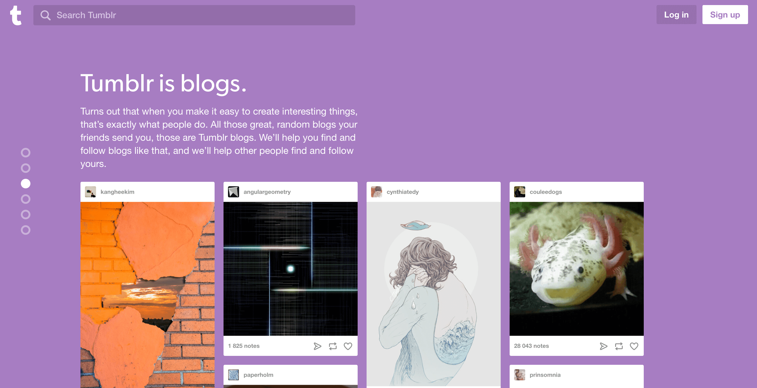
- Use engaging imagery. Users pay close attention to images that contain relevant information.
- Persist navigation options. When you create lengthy pages, keep in mind that users still require a sense of orientation (of their current location) and a sense of navigation (other possible paths). Long pages can make navigation problematic for users; if the top navigation bar loses visibility when the user scrolls down, they will have to scroll all the way back up when they’re deep within the page. The obvious solution to this is a sticky menu that shows the current location and that remains on screen in a consistent area at all times.
- Provide visual feedback when loading new content. This is especially important for web pages where content loads dynamically (such as news feeds). Because content-loading during scrolling is supposed to be fast (it shouldn’t take longer than 2 to 10 seconds), you can use looped animation to indicate that the system is working.
- Don’t hijack scrolling. Hijacked scrolling is one of the most annoying things because it takes control away from the user and makes the scrolling behavior completely unpredictable. When you design a website, let the user control their browsing and movement through the website.
Content Loading
Content loading is worth additional clarification. While an instant response is best, there are occasions when your website will need more time to deliver content to visitors. A bad Internet connection could cause a slow reaction, or an operation could take a bit more time to complete. But no matter the cause of such behavior, your website should appear fast and responsive.
- Make sure regular loading doesn’t take long. The attention span and patience of web users is very low. According to Nielsen Norman Group research, 10 seconds is about the limit for keeping the user’s attention on a task. When visitors have to wait for a website to load, they will become frustrated and likely leave if the website doesn’t load quickly enough for them. Even with the most beautifully designed loading indicator, users will still leave if loading takes too long.
- Use skeleton screens during loading. Many websites use progress indicators to show that data is loading. While the intention behind a progress indicator is good (providing visual feedback), the result can be negative. As Luke Wroblewski mentions, “Progress indicators by definition call attention to the fact that someone needs to wait. It’s like watching the clock tick down — when you do, time seems to go slower.” There is an excellent alternative to progress indicators: skeleton screens. These containers are essentially a temporarily blank version of the page, into which information is gradually loaded. Rather than showing a loading indicator, designers can use a skeleton screen to focus users’ attention on actual progress and create anticipation for what’s to come. This creates a sense that things are happening immediately, as information is incrementally displayed on the screen and people see that the website is acting while they wait.
Buttons
Buttons are vital to creating a smooth conversational flow. It’s worth paying attention to these basic best practices for buttons:
- Ensure that clickable elements look like ones. With buttons and other interactive elements, think about how the design communicates affordance. How do users understand the element as a button? Form should follow the function: the way an object looks tells users how to use it. Visual elements that look like links or buttons but aren’t clickable (such as underlined words that aren’t links or elements that have a rectangular background but aren’t buttons) can easily confuse users.
- Label buttons according to what they do. The label on any actionable interface element should always tie back to what it will do for the user. Users will feel more comfortable if they understand what action a button does. Vague labels such as “Submit” and abstract labels like in the example below don’t provide enough information about the action.
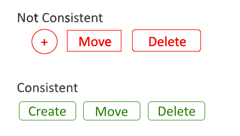
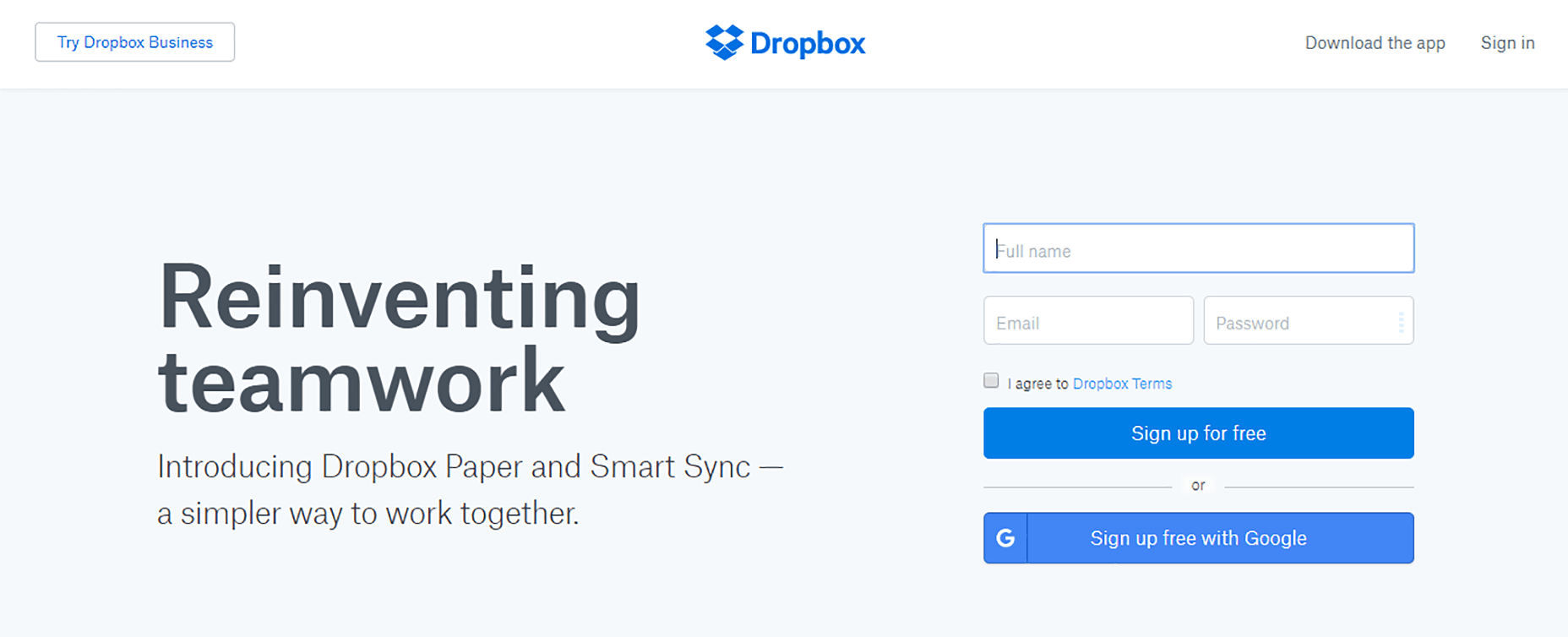
- Design buttons consistently. Users remember details, whether consciously or not. When browsing a website, they’ll associate a particular element’s shape with button functionality. Therefore, consistency will not only contribute to a great-looking design, but will also make the experience more familiar to users. The image below illustrates this point perfectly. Using three different shapes in one part of an app (such as the system toolbar) is not only confusing, but sloppy.
Imagery
As the saying goes, a picture is worth a thousand words. Human beings are highly visual creatures, able to process visual information almost instantly; 90% of all information that we perceive and that gets transmitted to our brains is visual. Images are a powerful way to capture the user’s attention and to differentiate a product. A single image can convey more to the viewer than an elaborately designed block of text. Furthermore, images cross language barriers in a way that text simply can’t.
The following principles will help you integrate imagery in your web design:
- Make sure images are relevant. One of the biggest dangers in design is imagery that conveys the wrong message. Select images that strongly support your product goals, and ensure that they are relevant to the context.

- Avoid generic photos of people. Using human faces in design is an effective way to engage users. Seeing faces of other humans makes viewers feel like they are connecting with them, and not just being sold a product. However, many corporate websites are notorious for using generic stock photos to build a sense of trust. Usability tests show that such photos rarely add value to the design and more often impair rather than improve the user experience.

- Use high-quality assets with no distortion. The quality of assets of your website will have a tremendous impact on the user’s impression and expectations of your service. Make sure images are appropriately sized for displays across all platforms. Images shouldn’t appear pixelated, so test resolution sizes for various ratios and devices. Display photos and graphics in their original aspect ratio.

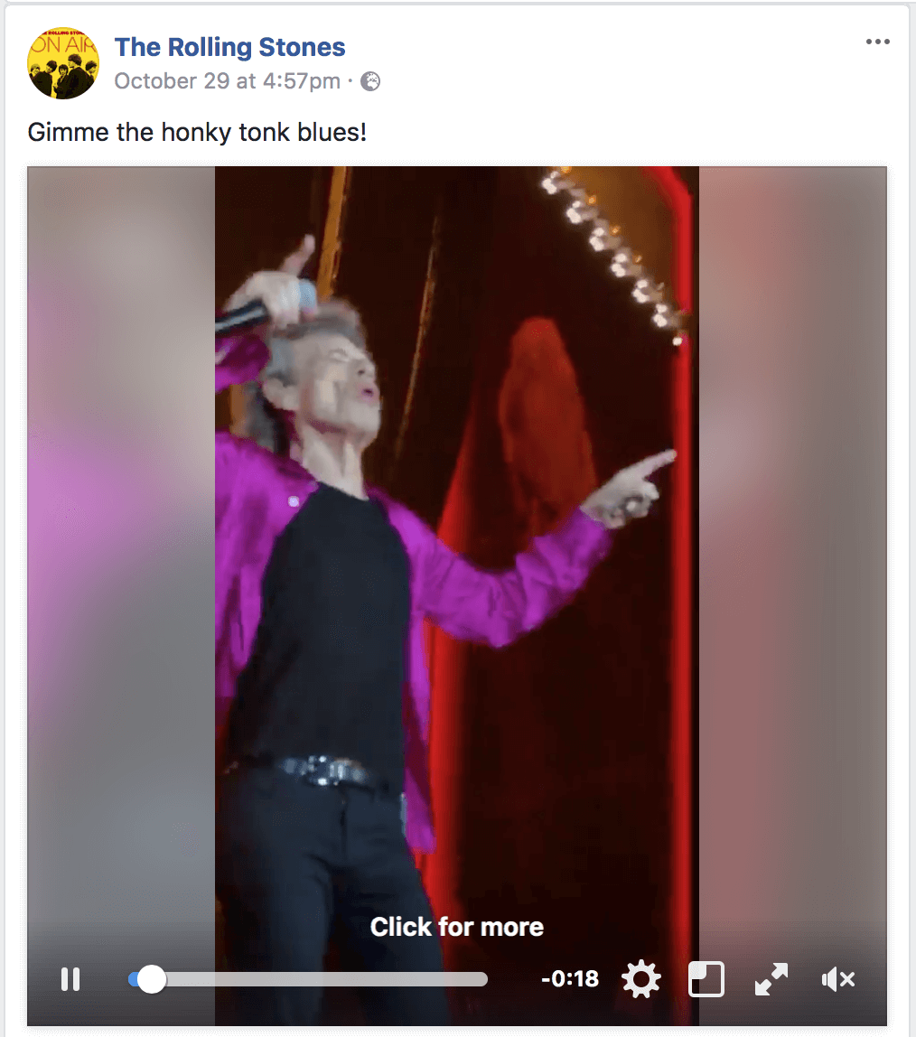
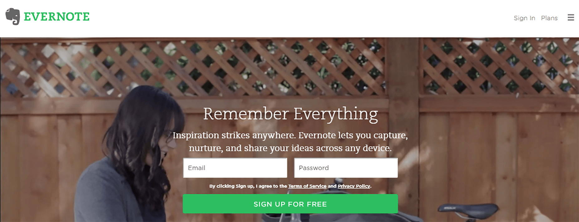
Video
With increasing Internet speeds, videos are becoming more popular, especially considering that they extend time spent on site. Today, video is everywhere. We’re watching it on our desktops, tablets and phones. When used effectively, video is one of the most powerful tools available for engaging an audience — it conveys more emotion and really gives people a feel for a product or service.
- Set audio to off by default, with the option to turn it on. When users arrive on a page, they don’t expect that it will play any sound. Most users don’t use headphones and will be stressed because they’ll need to figure out how to turn the sound off. In most cases, users will leave the website as soon as it plays.
- Keep promo video as short as possible. According to the research by D-Mak Productions, short videos are more appealing to the majority of users. Thus, keep business videos in the range of two to three minutes.
- Provide an alternative way to access content. If a video is the only way to consume content, this can limit access to the information for anyone who cannot see or hear the content. For accessibility, include captions and a full transcript of the video.

Call-To-Action Buttons
Calls to action (CTA) are buttons that guide users towards your conversion goal. The whole point of a CTA is to direct visitors to a desired course of action. Some common examples of CTAs are:
- “Start a trial”
- “Download the book”
- “Sign up for updates”
- “Get a consultation”
Take a few things into account when designing CTA buttons:
- Size The CTA should be large enough to see from a distance, but not so large as to detract attention from other content on the page. To confirm that your CTA is the most prominent element on the page, try the five-second test: View a web page for five seconds and then write down what you remember. If the CTA is on your list, then congrats! It’s sized appropriately.
- Visual prominence The color you choose for CTAs has a tremendous impact on whether it will be noticeable. With color, you can make certain buttons stand out more than others by giving them more visual prominence. Contrasting colors work best for CTAs and make for striking buttons.

- Negative space The amount of space around a CTA is important, too. White (or negative) space creates essential breathing room and separates a button from other elements in the interface.
- Action-oriented text Write text for the button that will compel visitors to take action. Begin with a verb like “Start,” “Get” or “Join.”
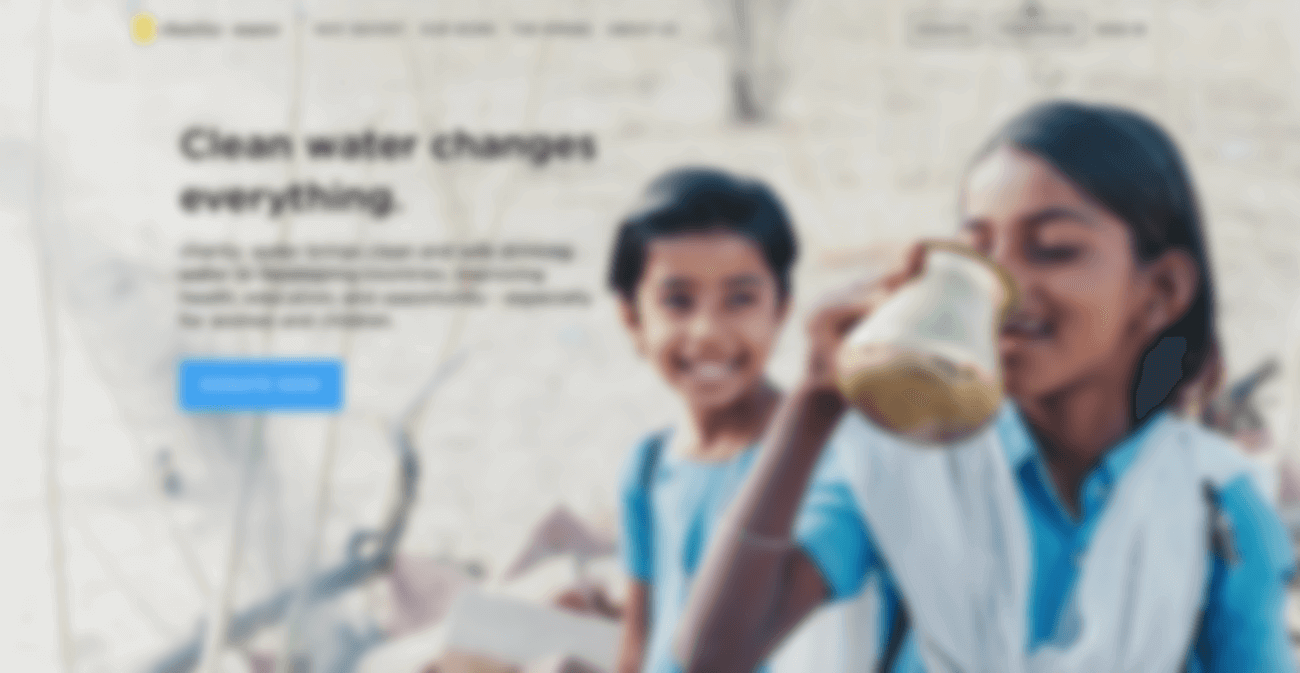
Tip: You can quickly test a CTA using a blur effect. A blur test is a quick technique to determine whether the user’s eye will go where you want it to go. Take a screenshot of your page and apply a blur effect in Adobe XD (see the example on Charity Water below). Looking at the blurred version of your page, which elements stand out? If you don’t like what’s being projected, revise.
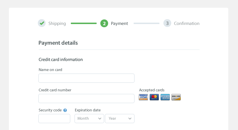
Web Forms
Filling a form remains one of the most important types of interaction for users on the web. In fact, a form is often considered the final step in the completion of a goal. Users should be able to complete forms quickly and without confusion. A form is like a conversation, and like any conversation, there should be logical communication between two parties: the user and the website.
- Ask only what’s required. Ask for only what you really need. Every extra field you add to a form will affect its conversion rate. Always think about why you’re requesting certain information from users and how you will be using it.
- Order the form logically. Questions should be asked logically from the user’s perspective, not from the application or database’s perspective. For example, asking for someone’s address before their name would be incorrect.
- Group related fields together. Group related information into logical blocks or sets. The flow from one set of questions to the next will better resemble a conversation. Grouping related fields together also helps the user make sense of the information.
Animation
More and more designers are incorporating animation as a functional element to enhance the user experience. Animation is no longer just for delight; it is one of the most important tools for effective interaction. However, animation in design can enhance the user experience only if it’s incorporated at the right time and place. Good UI animation has a purpose; it is meaningful and functional.
Here are a few cases in which animation can enhance the experience:
- Visual feedback on user action Good interaction design provides feedback. Visual feedback is helpful when you need to inform users about the result of an operation. In case an operation isn’t performed successfully, functional animation can provide information about the problem in a fast and easy way. For example, a shake animation can be used when a wrong password is entered. It’s easy to understand why the shake is a fairly universal gesture to communicate “no,” because a simple head shake is so prevalent in interpersonal communication.
- Visibility of system status One of Jakob Nielsen’s 10 heuristics for usability, visibility of system status remains among the most important principles in user interface design. Users want to know their current context in a system at any given time, and an app shouldn’t keep them guessing — it should tell the user what’s happening via appropriate visual feedback. Data uploading and downloading operations are great opportunities for functional animation. For example, an animated loading bar shows how fast a process is going and sets an expectation for how fast the action will be processed.
- Navigational transitions Navigational transitions are movements between states on a website — for example, from a high-level view to a detailed view. State changes often involve hard cuts by default, which can make them difficult to follow. Functional animation eases users through these moments of change, smoothly transporting users between navigational contexts and explaining changes on the screen by creating visual connections between states.
- Branding Suppose you have dozens of websites that have the same exact features and help users to accomplish the same tasks. They might all offer a good user experience, but the one that people really love offers something more than just a good user experience. It establishes an emotional connection with users. Branding animation plays a key role in engaging users. It can support a company’s brand values, highlight a product’s strengths and make the user experience truly delightful and memorable.
Mobile Considerations
Today, almost 50% of users access the web from mobile devices. What does this mean for us web designers? It means that we must have a mobile strategy for every website we design.
Practice Responsive Web Design
It’s essential to optimize your website for the vast landscape of desktop and mobile browsers, each of which has a different screen resolution, supported technologies and user base.
- Aim for a single-column layout. Single-column layouts usually work best on mobile screens. Not only does a single column help with managing the limited space on a small screen, but it also easily scales between different device resolutions and between portrait and landscape mode.
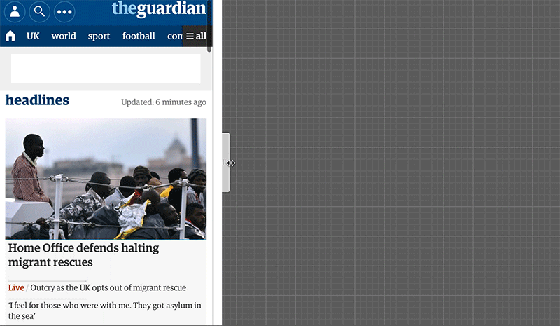
- Use the Priority+ pattern to prioritize navigation across breakpoints. Priority+ is a term coined by Michael Scharnagl to describe navigation that exposes what’s deemed to be the most important elements and hides away less important items behind a “more” button. It makes use of available screen space. As space increases, the number of exposed navigation options increases as well, which can result in better visibility and more engagement. This pattern is especially good for content-heavy websites with a lot of different sections and pages (such as a news website or a large retailer’s store). The Guardian makes use of the Priority+ pattern for its section navigation. Less important items are revealed when the user hits the “All” button.
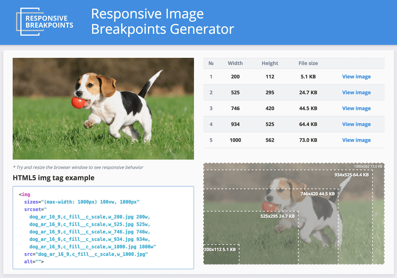
- Make sure images are sized appropriately for displays and platforms. A website must adapt to look perfect on all of the different devices and in all of the various resolutions, pixel densities and orientations. Managing, manipulating and delivering images is one of the main challenges web designers face when building responsive websites. To simplify this task, you can use tools such as Responsive Image Breakpoints Generator to generate breakpoints for images interactively.
Going From Clickable To Tappable
On the mobile web, interaction is done via finger taps, not mouse clicks. This means that different rules apply when you’re designing touch targets and interactions.
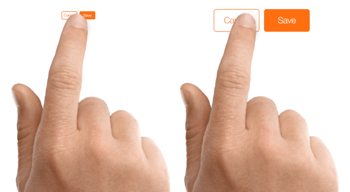
- Properly sized touch targets. All interactive element (such as links, buttons and menus) should be tappable. While the desktop web lends itself well to links whose active (i.e. clickable) area is small and precise, the mobile web requires larger, chunkier buttons that can be easily pressed with a thumb. When a tap is used as a primary input method for your website, refer to the MIT Touch Lab’s study to choose a proper size for your buttons. The study found that the average size of finger pads are between 10 and 14 millimeters and that fingertips range from 8 to 10, making 10 × 10 millimeters a good minimum touch target size.
- Stronger visual signifiers of interactivity. On the mobile web, there is no hover state. While on a desktop, it’s possible to provide additional visual feedback when a user hovers the mouse over an element (for example, revealing a dropdown menu), a mobile user would have to tap to see that response. Thus, users should be able to correctly predict how an interface element will behave just by looking at it.
Accessibility
Today’s products must be accessible to everyone, regardless of a person’s abilities. Designing for users with impairments is one way that designers can practice empathy and learn to experience the world from someone else’s perspective.
Users With Poor Eyesight
A lot of websites use low contrast for text copy. While low-contrast text may be trendy, it’s also illegible and inaccessible. Low contrast is especially problematic for users with low vision and who struggle with contrast sensitivity.
Low-contrast text is hard to read on a desktop, but it becomes even more difficult on mobile. Imagine trying to read low-contrast text on a mobile device while walking in bright sunlight. This is a good reminder that accessible visual design is better visual design for all users.
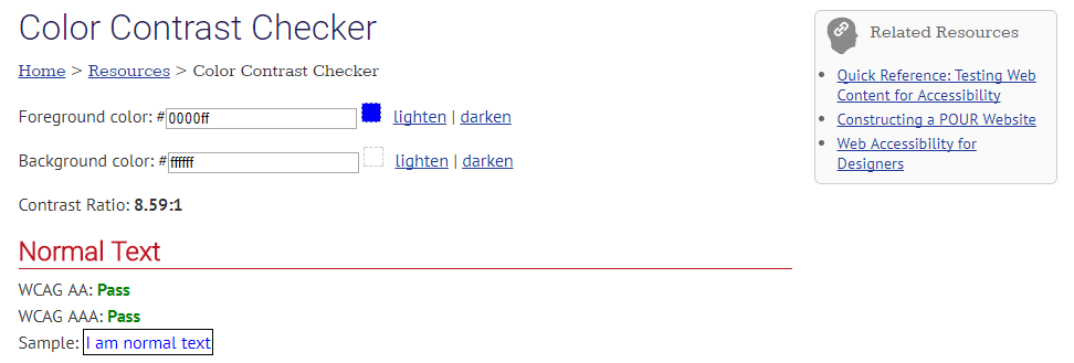
Never sacrifice usability for beauty. The most important characteristic of text and other vital elements on a website is readability. Readability requires sufficient contrast between text and background. To ensure that text is readable by people with visual impairments, the W3C’s Web Content Accessibility Guidelines (WCAG) has a contrast-ratio recommendation. The following contrast ratios are recommended for body text and image text:
- Small text should have a contrast ratio of at least 4.5:1 against its background. A ratio of 7:1 is preferable.
- Large text (at 14-point bold and 18-point regular and up) should have a contrast ratio of at least 3:1 against its background.


You can use WebAIM’s Color Contrast Checker to quickly find out whether you’re within the optimal range.
Color Blind Users
It’s estimated that 4.5% of the global population experience color blindness (that’s 1 in 12 men and 1 in 200 women), 4% suffer from low vision (1 in 30 people), and 0.6% are blind (1 in 188 people). It’s easy to forget that we design for this group of users because most designers don’t experience such problems.
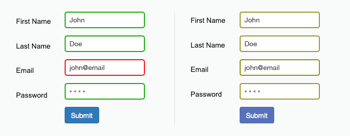
To make design accessible for these users, avoid using color alone to convey meaning. As the W3C states, color shouldn’t be used “as the only visual means of conveying information, indicating an action, prompting a response, or distinguishing a visual element.”
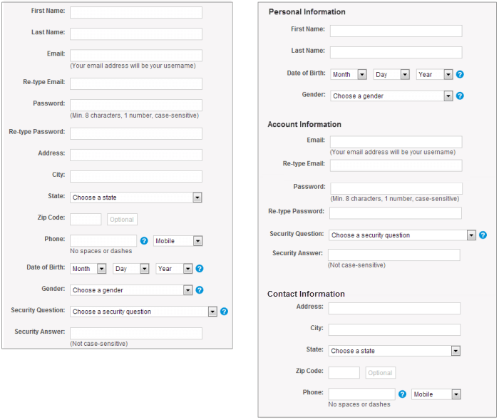
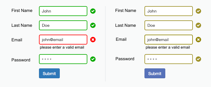
One common example where color is used as the sole means of conveying information is alerts in forms. Success and error messages are often colored green and red, respectively. But red and green are the colors most affected by color-vision deficiency — these colors can be difficult to distinguish for people with deuteranopia or protanopia. Most probably, you’ve seen error messages like, “The fields marked in red are required.” While it might not seem like a big deal, this error message appearing in a form like the one below can be extremely frustrating for people with a color-vision deficiency. Designers should use color to highlight or complement what is already visible.
In the form above, the designer should give more specific instruction, like, “The email address you entered is not valid.” Or at least display an icon near the field that requires attention.
Blind Users
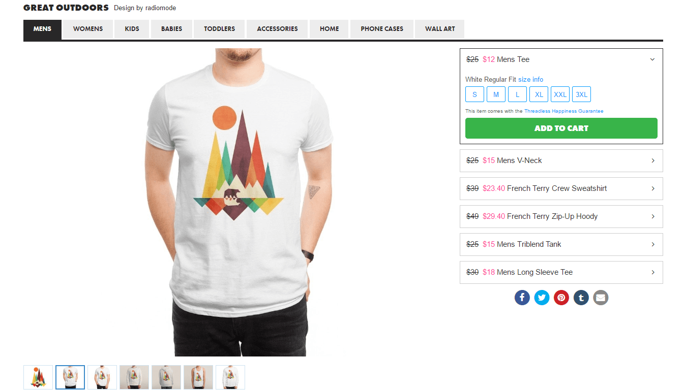
Images and illustrations are a significant part of the web experience. Blind people use assistive technologies such as screen readers to interpret websites. Screen readers “read” images by relying on alternative text attributed to the image. If that text is not present or is not descriptive enough, they won’t be able to get the information as intended.
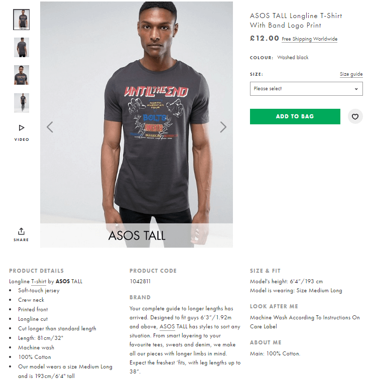
Consider two examples — first, Threadless, a popular t-shirt store. This page doesn’t say much about the item being sold. The only text information available is a combination of price and size.
The second example is from ASOS. This page, selling a similar shirt, provides accurate alternative text for the item. This helps people who use screen readers to envision what the item looks like.
When creating text alternatives for images, follow this guideline:
- All “meaningful” images require descriptive alternative text. (A “meaningful” photo adds context to the information being conveyed.)
- A text alternative isn’t needed if an image is purely decorative and provides no useful information to the user to aid them in understanding the content of the page.
Keyboard-Friendly Experience
Certain users navigate the Internet using their keyboard, rather than a mouse. For example, people with motor impairments have difficulty with the fine motor movements required for using a mouse. Make interactive and navigation elements easily accessible to this group of users by enabling interactive elements to be focused with the Tab key and by displaying a keyboard-focus indicator.
Here are the most basic rules for keyboard navigation:
- Check that keyboard focus is visible and obvious. Some web designers remove the keyboard focus indicator because they think it’s an eyesore. This hinders keyboard users from properly interacting with the website. If you don’t like the default indicator provided by the browser, don’t remove it altogether; instead, design it to satisfy your taste.
- All interactive elements should be accessible. Keyboard users must be able to access all interactive elements, not just the main navigation options or primary calls to action.
You can find detailed requirements for keyboard interaction in the “Design Patterns and Widgets” section of the W3C’s “WAI-ARIA Authoring Practices” document.
Testing
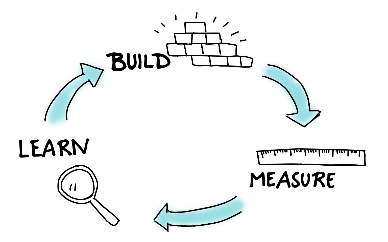
Iterative Testing
Testing is an essential part of the UX design process. And like any other part of the design cycle, it is an iterative process. Gather feedback early on in the design process, and iterate throughout.
Test Page-Loading Time
Users hate slow-loading web pages. That’s why response time is a critical factor on modern websites. According to Nielsen Norman Group, there are three response-time limits:
- 0.1 second This feels instant for users.
- 1 second This keeps the user’s flow of thought seamless, but the user will sense a slight delay.
- 10 seconds This is about the limit for keeping the user’s attention focused on the operation. A 10-second delay will often make users leave the website immediately.
Obviously, we shouldn’t make users wait 10 seconds for anything on our websites. But even a few seconds of delay, which happens regularly, makes an experience unpleasant. Users will be annoyed with having to wait for the operation.
What usually causes slow loading time?
- Heavy content objects (such as embedded video and slideshow widgets),
- Unoptimized back-end code,
- Hardware-related issues (infrastructure that doesn’t allow for fast operations).
Tools like PageSpeed Insights will help you to find the causes of slow times.
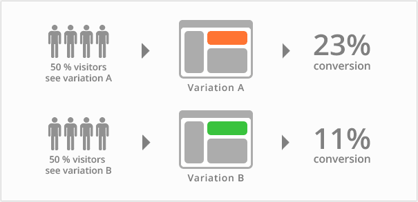
A/B Testing
An A/B test is ideal when you’re struggling to choose between two versions of a design (such as an existing version and a redesigned version of a page). This testing method consists of showing one of two versions randomly to an equal number of users and then reviewing analytics to see which version accomplished your goal more effectively.
Developer Handoff
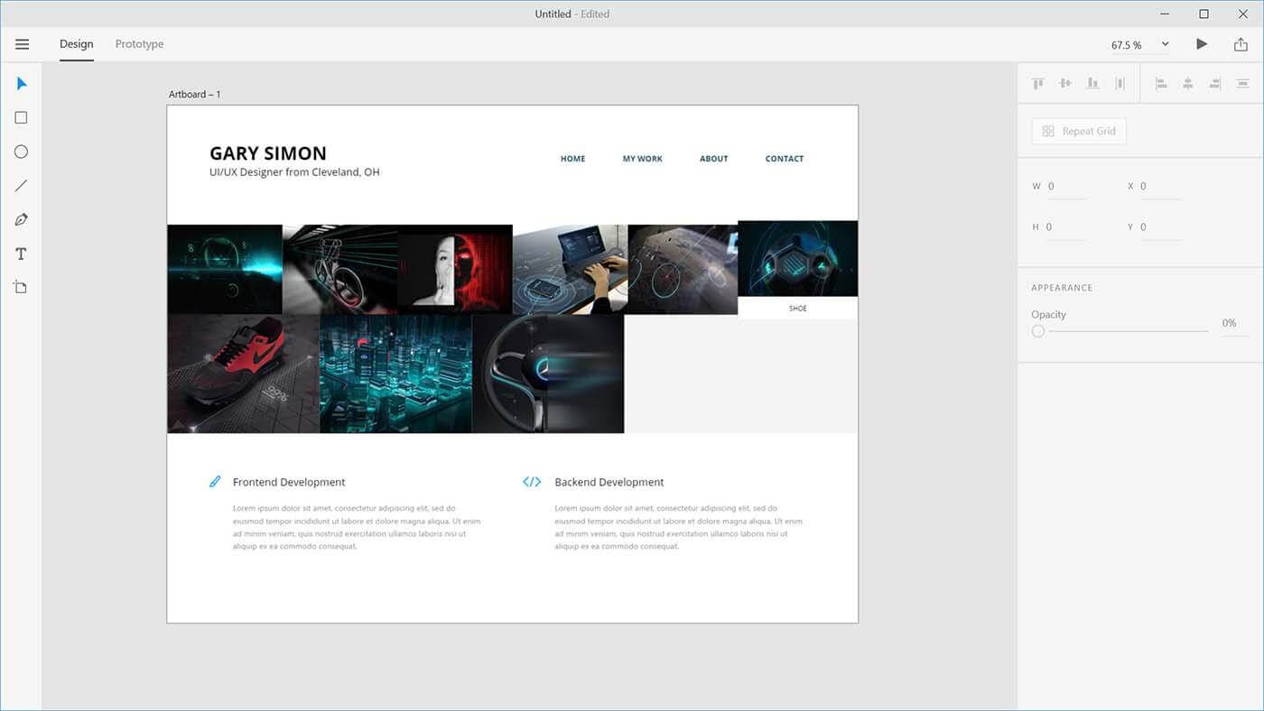
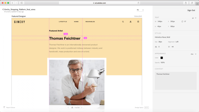
A UX design process has two important steps: prototyping the design and developing a working solution. The step that connects the two is called a handoff. As soon as the design is finalized and ready to be moved to development, designers prepare a specification, which is a document that describes how the design should be coded. A specification ensures that the design will be implemented according to the original intention.
Precision in the specification is critical because, with an inaccurate specification, the developers will have to either rely on guesswork when building the website or go back to the designer to get answers to their questions. But assembling a specification manually can be a headache and usually takes significant time, depending on the complexity of the design.
With Adobe XD’s design specs feature (in beta), designers can publish a public URL for developers to inspect flows, grab measurements and copy styles. Designers no longer have to spend time authoring specifications to communicate positioning, text styles or fonts to the developer.
Conclusion
As with any aspect of design, the tips shared here are just a start. Mix and match these ideas with your own for best results. Treat your website as a continually evolving project, and use analytics and user feedback to constantly improve the experience. And remember that design isn’t just for designers — it’s for users.
"This article is part of the UX design series sponsored by Adobe. Adobe XD tool is made for a fast and fluid UX design process, as it lets you go from idea to prototype faster. Design, prototype and share — all in one app. You can check out more inspiring projects created with Adobe XD on Behance, and also sign up for the Adobe experience design newsletter to stay updated and informed on the latest trends and insights for UX/UI design."
Further Reading
- Inspiring Everyday Graphic Design
- 33 Tempting E-Commerce Icons For Free
- Breaking Out Of The Box: Design Inspiration
- Modern Art Movements To Inspire Your Logo Design
 (ra, ms, al, il, mrn)