Mobile Interface Myths You Should Throw Out The Window

Email Newsletter
Weekly tips on front-end & UX.
Trusted by 182,000+ folks.
 Celebrating 10 million developers
 Custom Web Forms for Angular, React, & Vue. Your backend.


Having white-labeled design and marketing work for ad agencies for a few years, I’ve heard the following statements boldly proclaimed as unquestionable truths more times than I can count. From my experience with ad teams and client meetings, these are the most frequent myths I think we need to put to bed, or at least remember to evaluate case by case. Let’s take some time to cover five mobile interface myths you’ve probably been sold on (and why that might be a bad thing).
If anything’s clear in 2017, it’s that lying is back in fashion (if it ever left us at all). From the heated fake news debate to the false data provided by Facebook, lying is all the rage these days. A white lie here and there is no big deal. We’re all guilty of it. The problem arises when lies turn into full-grown myths, then become accepted as truths.
In an era of digital chaos, we understandably gravitate to our trusted sources of information. For us designers, this usually means guidelines as defined by juggernauts such as Google and Apple.
Recommended reading: Touch Gesture Controls For Mobile
With the impending switch to a mobile-first search engine world, myths about mobile interfaces are on the rapid rise. As we transition to a mobile-first world, I’d like to remind designers to see guidelines for what they are: guidelines. Somehow, many mobile concepts have evolved into biblical truths, when their intent might rather be case by case.
Having white-labeled design and marketing work for ad agencies for a few years, I’ve heard the following statements boldly proclaimed as unquestionable truths more times than I can count. From my experience with ad teams and client meetings, these are the most frequent myths I think we need to put to bed, or at least remember to evaluate case by case.
Let’s take some time to cover five mobile interface myths you’ve probably been sold on (and why that might be a bad thing).
Myth 1: Mobile Users Are Always In A Hurry
The prevailing wisdom about mobile users is that they’re always in a rush.
They’re easily distracted, they hate tapping, they have bad taste, and they’re overwhelmingly suspicious of anything laid out in front of them.
While these ideas are rooted deep and might have pieces of truth, they’re not the full picture. Furthermore, one-size-fits-all statements don’t make much sense in an increasingly niche-audience Internet. What works for some webmasters doesn’t necessarily hold true for others.
The Truth: Get To Know Your Real Users
There’s no question that mobile speed is key, and Google’s AMP project serves as a strong reminder of the importance of website-loading time.
What’s less discussed is that you’ll never know which (if any) of these stereotypes apply to your website unless you get to know your target audience.
Take the following company. We could argue over this screenshot all day, but let’s not dive too deep into the analytics. Just compare the website’s “Device Category” column with the “Average Session Duration” column on the far right:
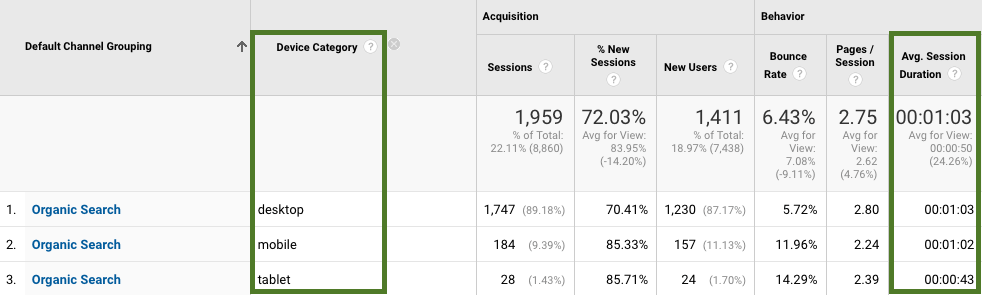
You’ll notice almost no difference in time spent on site when comparing desktop and mobile session durations. In this company’s case, most website visitors come from organic search, so this screenshot is fairly representative of the website’s overall traffic.
In this case, mobile users don’t seem to be in a hurry. Should we assume that all websites have analytics like these? Of course not. Should we assume that session duration is the perfect and only indicator of conversions? No.
Take a longer look at this screenshot and you could accurately find that the bounce rate is higher on mobile and that the percentage of sessions skews heavily towards desktop, as well as a number of other interesting discrepancies. My point is not that session duration means everything, but that each website’s audience behaves differently and that you need to understand your unique audience. Then, optimize accordingly.
Here’s what you should do to better understand your audience:
- Know the goals of your website.
Do you plan on using the website or app as a new revenue stream? Do you want to outdo your competitors by showing how innovative you are? - Find out who your target audience is.
A buyer persona might come in handy for this. Get inside their heads. What do they need? What are they looking for? What problems are they trying to solve? Are they ready to sit and read long posts? Do they prefer a quick video? - Test your ideas.
Before rolling out any changes, make it a point to gain customer feedback. Do not hesitate to test. Knowing what works and what doesn’t ahead of time will facilitate your design and development process.
Spend time reviewing your own website’s analytics, and work to understand your audience’s intent, which is hiding behind the raw numbers.
Myth 2: Mobile Websites Require Fewer Features
I’m sure we all remember how we typically used the Internet nearly 10 years ago — we were primarily looking for time-sensitive content. Back then, our needs were rather immediate and specific.
People on mobile websites had little to no intent to explore or purchase anything. Data connections were slow and expensive. It made sense to design mobile websites for pared-down tasks, offering the bare minimum. Publishers adopted an “if in doubt, leave it out” mentality, and if users wanted to view the full website, they’d need to hop onto their PC or Macintosh.
This just isn’t the case anymore.
The Truth: Prioritize And Maximize Mobile Capabilities
According to Pew Internet, smartphone dependency has increased. In fact, 1 in 10 US adults use their smartphones as their primary means to connect to the Internet, and that number is growing rapidly. While overall Internet usage has risen, broadband service at home has plateaued in recent years.
Nowadays, when someone visits a website on their mobile device, they expect to see everything that the desktop version offers. The practical way to accomplish this is to prioritize and maximize the capabilities of mobile features, including:
- taking advantage of mobile sensors’ superpowers, something that desktops don’t have;
- adding more content and features to a mobile website — depending on your user’s goals, this could mean adding share buttons pinned to the bottom of the screen or quick-tap functionality to return to the top of the page;
- building your website or blog to adapt to the particular needs of each device type.
The idea is to get rid of the thought that a smaller screen indicates less intent among users to explore. Instead of eliminating features on mobile, prioritize them.
Layout
Offer users the same useful features that you would on your desktop website, while keeping in mind the screen-size limitations.
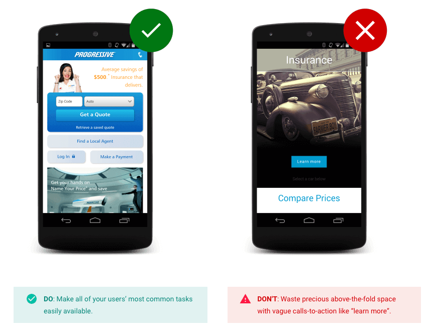
Interstitials
Common wisdom (and probably your experience) tells you that popups are annoying and that you should delete them immediately. Here’s the problem with this advice: You still need to encourage signups, downloads and so on for mobile visitors.
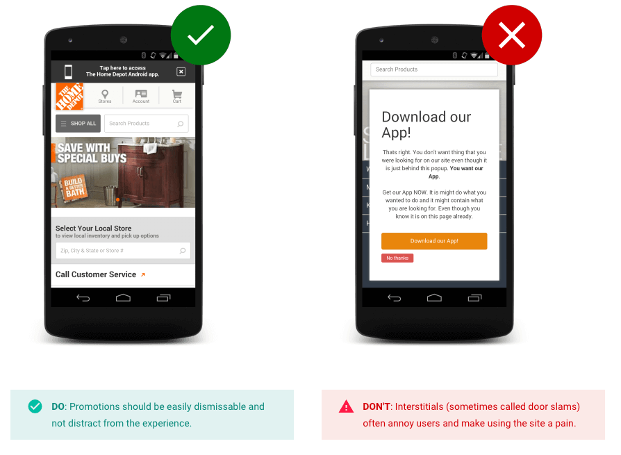
The key is to prioritize this content, not eliminate its purpose.
Myth 3: Simplicity Is Good, Complexity Is Bad
Closely related to myth 2, the next myth is one of the most widely held beliefs in the industry. When it comes to websites and apps, “less is more,” right?
This myth states that mobile applications should be the “light version” of a desktop website. This comes from the principle that the organic interface has to be as close to zero as possible.
Marissa Mayer famously discussed the two-tap rule: The fewer the clicks needed to achieve a goal, the better.
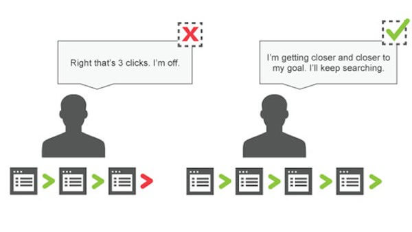
A ton of designers tend to treat mobile and desktop as two different creatures, with opposing needs. Yes, there are significant limitations to a mobile device’s capabilities (namely, screen size). However, the intent of a user doesn’t drastically change, whether they’re using their mobile device or a desktop computer.
So, why should the mobile interface be simpler?
The Truth: Embrace Complexity
Depending on your website or app’s users, this myth could ring true.
Could you imagine needing eight taps to send snaps on Snapchat? Me neither.

The point is more that mobile users don’t want a dumbed-down version of a website. People simply need complexity presented in a way that’s uncomplicated. It all boils down to giving a good user experience. Consider the following:
- Have one big idea per screen.
- Instead of sending elements to secondary pages, you could put more content under properly labeled display elements.
- Requiring more taps on a screen isn’t necessarily a bad thing. The idea is to make the website’s screen clear and easily digestible, rather than cluttered and dense. If a click has a goal to it, it can stay.
Take Circlebox Creative:
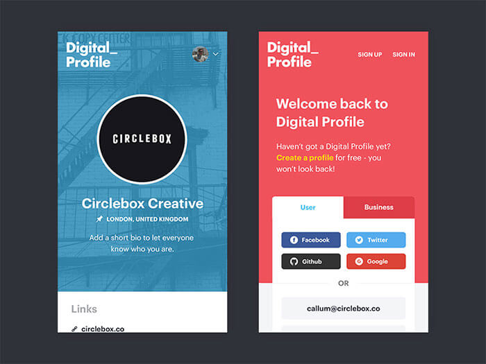
A lot is involved in creating a profile. Is this a personal user? Is it a business profile? Will you choose social login? Email login? This signup process incorporates a lot of information but doesn’t feel overwhelming because it’s easily digestible.
Complexity is not the bane of mobile design. When you build your website, you just need to make it enticing and user-friendly.
Myth 4: Guidelines Cannot Be Broken

Most designers treat guidelines as gospel, and for a decent reason.
Many times, guidelines are incredible resources, to be followed as instructed. Google’s material design is a great resource for understanding how to craft digital experiences using a consistent set of principles.
Designers often hold that applications created for iOS should follow Apple’s guidelines and that apps made for Android should follow Google’s guidelines, and that if an app needs to be accessible on both operating systems, then the designs should be entirely different from each other.
The problem arises when designers find themselves stuck between a rock and a hard place, where they envision a design that conflicts with the guidelines.
Should they follow guidelines? Or can they trust their design instincts for each unique case?
The Truth: Treat Guidelines As Recommendations
The dictionary defines a guideline as a “general rule, principle, or piece of advice.” A guideline is intended to serve as a loose guide or as helpful suggestions, not a strict mandate to obey.
“Design is an exploration to discover what works best.”
— Google Design
If your intended design severely clashes with conventional guidelines, you’ll need to weigh whether this is an indicator to rethink your layout approach or whether you’re simply designing with your unique users’ needs and intentions in mind.
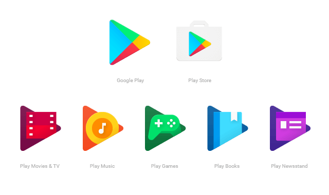
To put this myth to bed, Google even ignores its own material design guidelines (on occasion). Take its icons:
To paraphrase Android Authority, Google’s icons fly in the face of product-icon anatomy. The guideline states that you shouldn’t crop elevated material elements within another shape, meaning that the uppermost layer shouldn’t have its boundaries defined by the lower layer.
The icons for Movies, Music, Games, Books and Newsstand all are beautifully designed, while defying this straightforward guideline. These icons have also done away with the 45-degree light source that is commonly encouraged for all icons.
On the whole, Apple and Android guidelines are a tremendous gift. However, don’t treat them as hard and fast rules. Always design with your users in mind, even if that means bending some of the guidelines.
Myth 5: The Designer And The User Think The Same
This myth is more of a commonly held belief carried out in practice, rather than an actual myth. Of course, the first rule of user-centered design is that you are not the user. But, so often, clients and designers fall for the “we know what’s best” approach.
It’s tempting to think that everybody thinks just like you.
Often, designers fall into the trap of thinking like their client or thinking of themselves when approaching design. “Would I like this feature if I implemented it?” or “Would my client tap on this button if I placed it here?” are questions that fall under this umbrella.
The problem with this is that you lose sight of who you’re designing for: the user.
The Truth: Users Have Experiences Unique From Yours
It’s possible that the demographics of your users include yours or your client’s. However, you’ll need to look at design from the perspective of your visitors, not of your client.
This is true for a couple of reasons:
- Users only want what’s beneficial for them.
You, as a designer, are able to come up with ideas to present a product in a way that you think would engage the user. However, these ideas will only matter as long as they are beneficial to the user. If the user doesn’t find value in it, they won’t enjoy engaging with the content you produce. - Users only want their problems to be solved.
The client knows more about the business than the user. They immerse themselves in the industry, studying it, learning its ins and outs. This data isn’t of interest to the user, who only wants their problems to be solved. The client is all about gaining profit; the user is all about finding solutions. Sometimes these interests overlap, but keep your eye on user needs first and foremost.
If you’re struggling to see things from your users’ point of view, read up on and start employing mobile usability testing (Lyndon Cerejo offers a summary).
I’m hardly a usability testing expert, but I’ve been thinking about how my team could use a significantly simplified version of user testing for an upcoming website redesign. Here’s the basic outline of user testing I have in mind:
- Gather an unbiased group of individuals.
- Do not disclose which website is being tested, to avoid bias. Instead, show several websites sequentially, including our website and competitor websites.
- For each website, walk individuals through each page, discussing the intended user flow, mission, etc.
- Let each individual test how they would achieve the tasks, while providing no indication of how you think the goals should be completed.
- Test on various devices and connections, to compare between devices.
- Ask each individual to write down any issues they run up against, while trying to achieve the stated purpose for each page.
- Ask each participant to grade each website, asking for their feedback on accessibility, speed, UX, navigation, readability, the overall score, etc.
- Repeat these observations over time to identify new recommendations.
This is not a perfect scenario, but it enables us to define a preliminary report of usability issues and observations, and to pinpoint key recommendations for our work moving forward.
Summary
If I had to encapsulate the sections above, along with what I’ve learned at my web design and marketing agency, it would be this: Test, test, test. And then test again.
Takeaways
- Understand your audience and purpose.
Determine the goals of your website, find out who your target audience is, and test your ideas to gain useful data about your visitors. - Maximize mobile capabilities.
Take advantage of the superpowers of mobile sensors, add mobile-specific features, and adapt to the specific needs of each device and mobile operating system. - Embrace complexity.
Have one big idea per screen. Put content under properly labeled display elements, instead of on secondary pages. And make sure the screen is clear and easily digestible, rather than cluttered and dense. - Treat guidelines as useful recommendations, not mandates.
Guidelines can serve as helpful suggestions. But, ultimately, design is an exploration to discover what works best. - Work to understand your audience’s unique points of view.
Try employing mobile usability testing to better understand your visitors’ needs.
Make time to track and analyze the analytics for how your audience responds to your company’s split-testing efforts. Don’t take anybody’s word for it (including mine).
Observe what your visitors are doing, anticipate their needs, and design for their approval and convenience. Over time, you’ll gain a deeper understanding of your unique audience and will naturally attract a growing number of visitors eager to engage with you and your business.
Additional Insights
- “Why User Experience Always Has to Come First,” Michael Schrage, Harvard Business Review
- “Mobile Fact Sheet,” Pew Research Center
- “Getting Mobile Site Videos Right,” Adriel Tey, L2
- “Google is Cracking Down on Intrusive Mobile Pop-Ups: Here’s What Marketers Need to Know,” Amanda Zantal-Wiener, Hubspot
- “Always On: A Global Perspective of Mobile Consumer Experience,” Interactive Advertising Bureau
Further Reading
- Picture Perfect: Meet Pixo, A Photo Editor For Your End Users
- A Guide To Accessible Form Validation
- Precise Timing With Web Animations API
- How To Design Powerful Narratives On Mobile
 (da, yk, ra, al, il, mrn)

