Building Better UI Designs With Layout Grids

Email Newsletter
Weekly tips on front-end & UX.
Trusted by 182,000+ folks.
 Register for Free
 Custom Web Forms for Angular, React, & Vue. Your backend.


 Celebrating 10 million developers
(This is a sponsored post.) Designers of all types constantly face issues with the structure of their designs. One of the easiest ways to control the structure of a layout and to achieve a consistent and organized design is to apply a grid system.
A grid is like invisible glue that holds a design together. Even when elements are physically separated from each other, something invisible connects them together.
While grids and layout systems are a part of the heritage of design, they’re still relevant in this multiscreen world we live in. Technology devices have fundamentally changed the way we search for information and how we function in our daily lives. Today, 90% of all media interactions are screen-based, where content is viewed across mobile phones, tablets, laptops, TVs and smart watches. Multiscreen behavior is quickly becoming the norm, and designing for multiple screens has become integral to businesses. As designers, we want to provide delightful and enjoyable experiences to people who use our products — and grids can help us do that.
Grids help designers to build better products by tying different design elements together to achieve effective hierarchy, alignment and consistency, with little effort. If executed properly, your designs will appear thoughtful and organized.
In this article, I’ve put together a lot of information about grids, such as:
- what grids are,
- a brief history of the grid,
- a basic theory of grids,
- four types of layout grids,
- layout grids in interactive design.
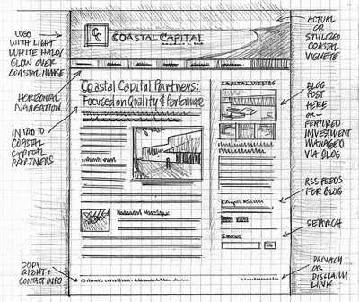
What Is A Grid?
In the most basic terms, a grid is a structure comprising a series of lines (vertical or intersecting) that divide a page into columns or modules. This structure helps designers to arrange content on the page. While the lines of a grid themselves are not necessarily visible (although in some designs, they are), the structure helps you to manage the proportions between the elements to be aligned on the page. This grid would serve as the framework for the page’s layout. Think of it as a skeleton on which a designer can organize graphic elements (for example, text sections, images and other functional or decorative elements) in an easy-to-absorb way.
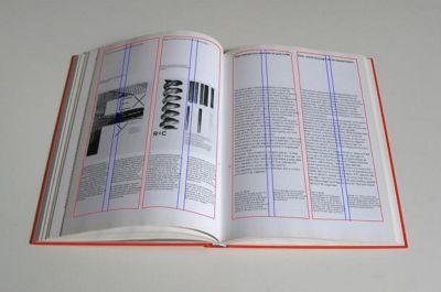
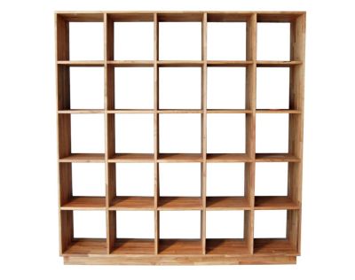
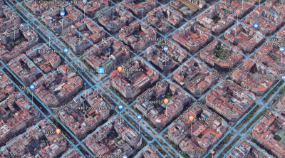
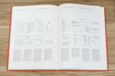
The grid system originates in print design but has been applied to many disciplines. In fact, if we look around, we’ll see that a lot of things we use daily were designed using a grid:
Brief History Of The Grid
Before we dive into details on layout grids and how they can be applied to digital products, it’s essential to step back and look to the past to understand the basics. This knowledge will help us better design for digital experiences. To learn more about the historical context of grids, be sure to check out Lucienne Roberts’ article “A Brief History of Grids.”
Grid And Early Book Design
Grids are closely tied to typography. As a system, grids were first used to arrange handwriting on paper, and then were applied to manuscript layout. Since the early days of book design, the grid has helped designers arrange page layouts to aid the user in the act of reading.

Renaissance Era And Harmonious Design
Paintings in the Renaissance era had a significant impact on the development of grid systems. Artists strived to create a perfect geometry, which resulted in centered and symmetrical canvas layouts, and it characterizes the work of artists in that period.
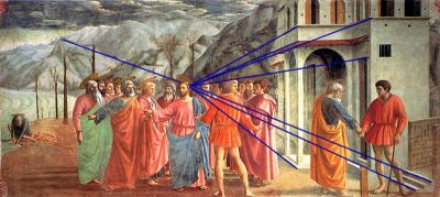
In the 13th century, French architect Villard de Honnecourt created a diagram in an attempt to achieve “harmonious design”. The diagram merged the grid system with the golden ratio in order to produce page layouts with margins based on fixed ratios. The technique is still used today, with the majority of designers of printed books and magazines using Villard de Honnecourt’s diagram to create balanced designs.
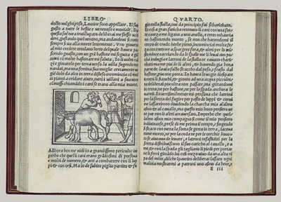
Grid And Print Design
From the beginnings of print (mid-15th century) until the Industrial Revolution (late-18th century), the book was the primary output of printing. With rare exceptions, type was generally set in one justified column per page and placed symmetrically on the spread.
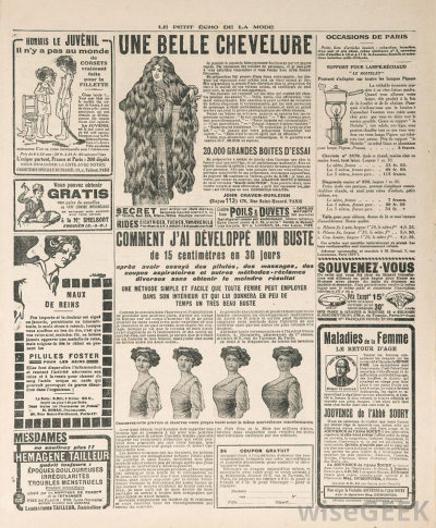
Industrial Revolution And Competition For Attention
The Industrial Revolution marked the beginning of mass production. The rise of print products such as newspapers, posters, leaflets and advertising of all kinds, put print designers in high demand. Designers had to solve two problems: communicate diverse messages to various groups of people and allow for natural scanning behavior, while preventing different sections from competing for the reader’s attention.
Swiss School
The grid as we know it today is tied to Swiss typography. At the time of World War I, Switzerland, which had maintained neutrality, became a meeting ground for creative people from all over Europe. Because printed publications had to be set in the three official languages — German, French and Italian — designers needed a new grid system that would allow for that. Typographers such as Jan Tschichold and Herbert Bayer addressed it with a modular approach. For the first time, white space was used as a dynamic component in layout design, and this led to the development of complex grid systems.
A Basic Theory Of Grids
Whether you work in print or in web and mobile design, you need to understand the basics of grid theory.
Anatomy Of A Grid
Whether simple or complex, all grids have some common parts:
- Format
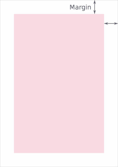
The format is the area in which the design is placed. In a paper book, the format is the page. On the web, the format is the size of the browser window. - Margins
Margins are the negative space between the edge of the format and the outer edge of the content.
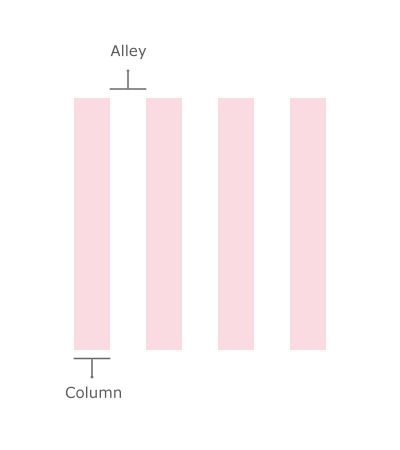
- Columns and alleys
In its the most basic form, a grid is made up of two main components: columns and alleys. Columns are the building blocks of grids. The space between columns is referred to as alleys. Together, columns and alleys take up the horizontal width of the screen.
- Modules
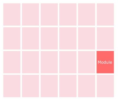
Modules are individual units of space created from the intersection of columns and rows (i.e. the horizontal equivalents of columns).
Four Types Of Layout Grids
Columns, modules, alleys and margins can be combined in different ways to form distinct types of grids. Below are four standard layout grids:
- manuscript grid,
- column grid,
- modular grid,
- baseline grid.
Let’s go over when you might use each.
Manuscript Grid
A manuscript grid (or a single-column grid, as it’s often called) is the simplest grid structure. It’s essentially a large rectangular area that takes up most of the space inside a format. Manuscript grids are good for continuous blocks of text. However, they aren’t limited to text; images can be used to fill the block.
Given the name, people naturally associate manuscript grids with the printed page. Manuscript grids are traditionally used in books and are a good layout for presenting continuous blocks of text.
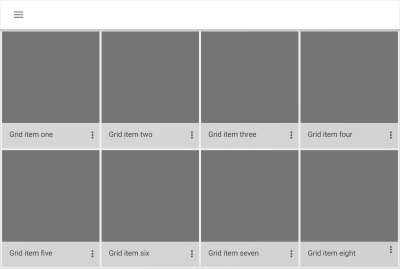
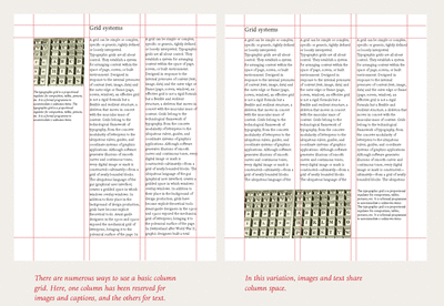
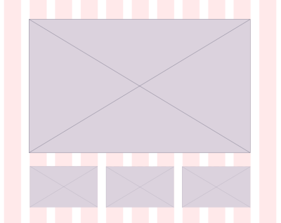
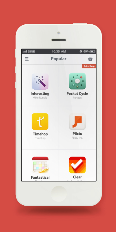
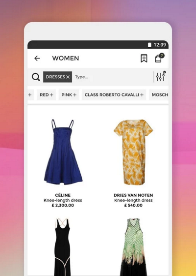
Multicolumn Grid
As the name suggests, a multicolumn grid has a few columns. Remember this simple rule: The more columns you create, the more flexible your grid becomes.
Column grids are useful for layouts that contain discontinuous information. When you use a multicolumn grid, it’s possible to create zones for different kind of content. For example, you can use a particular column just for an illustration.
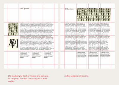
Modular Grid
While a multicolumn grid splits a page vertically into a number of columns, a modular grid subdivides a page both vertically and horizontally into modules. The columns and rows and the alleys between them create a matrix of cells, or modules.
Modular grids are good when you require more control over a complex layout than a column grid can offer. A modular grid provides flexible formats for pages and allows you to create a complex hierarchy. Each module in the grid can contain a small chunk of information, or adjacent modules can be combined to form blocks.
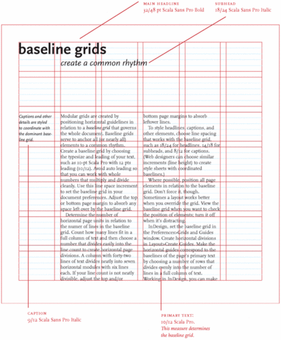
Baseline Grid
A baseline grid is an underlying structure that guides the vertical spacing in a design. It’s used primarily for horizontal alignment and for hierarchy. Similar to how you would use columns and modules as guides in your design, you can use a baseline grid to build consistency in your layout. Using this type of grid is akin to writing on a ruled piece of paper — the grid ensures that the bottom of each line of text (its baseline) aligns with the vertical spacing. This makes a baseline grid not only an excellent typographic tool, but also extremely helpful when you’re laying out elements on the page because you can quickly check whether something on the page is missing a row of space.
Layout Grids In Interaction Design
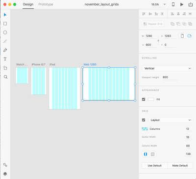
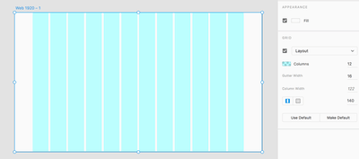
Interaction design changed the way we think about grids. Interaction design is fluid and doesn’t have a fixed size because people are using different types of devices to interact with the product, from the tiny screens of smartwatches to ultra-wide TV screens. When using a product, people often move between multiple devices to accomplish a single task with that product. Despite screen size, designers must organize content in the most intuitive and easy-to-follow way. One approach to achieving this is to use a layout grid system. A layout grid is preferable for interactive design because it defines the underlying structure of a design and how each component responds to different breakpoints. This type of grid is faster and easier to design for multiple screens and resolutions.
Grid systems in digital product design organize elements on the page and connect spaces. A grid system improves the quality of a design (functionally and aesthetically) and the efficiency of the design process in several ways:
- Creates clarity and consistency
A grid is the foundation for order in a design. Proportion, rhythm, white space and hierarchy are all design characteristics that directly affect cognitive speed. Grids create and enforce consistency of these elements throughout an interface. An effective grid guides the eye, making it easier and more pleasant to scan objects on the screen. This is especially important in digital products because they are functional, meaning that people use the products to complete specific tasks, such as sending a message, booking a hotel room or hailing a car ride. Consistency helps the viewer understand where to find the next piece of information or what step to take next. - Improves design comprehension
The human brain makes judgments in a fraction of a second. A design that is poorly put together will make the product seem less usable and trustworthy. Grids connect and reinforce the visual hierarchy of the design by providing a set of rules, such as where elements should go in the layout. - Makes responsive
Responsive design is no longer a luxury, but rather a necessity because people experience apps and websites on devices with a broad range of screens. This means that designers can no longer build for a single device’s screen. The multidevice landscape forces designers to think in terms of dynamic grid systems, instead of fixed widths. Using a grid creates a consistent experience across multiple devices with different screen sizes. - Quickens the design process
Grids enable designers to manage the proportions between UI elements, such as spacing and margins. This helps to create pixel-perfect designs from the start and avoid timely reworking caused by incorrect adjustments. - Makes the design easier to modify and reuse
Unlike print production, digital products are never finished — they’re constantly changing and evolving. Grids provide a solid foundation because when everything conforms to a grid, previous solutions can be easily reused to create a new version of the design. A grid is a skeleton that can be used to produce completely different looks. - Facilitates collaboration
Grids make it easier for designers to collaborate on designs by providing a plan for where to place elements. Grid systems help to decouple work on interface design because multiple designers can work on different parts of the layout, knowing that their work will be seamlessly integrated and consistent.
Grids Are A Fundamental Part Of Style Guides
Implementation of most design projects involves collaboration between designers and developers. Nothing is worse for a UI designer than submitting a pixel-perfect design mockup and finding that it looks completely different in production.
Grids are a framework that speeds up the designer-to-developer workflow by allowing developers to pre-set classes in their code that correspond to column sizes. This prevents inconsistent implementation and reduces the number of hours required to build a website. For more tips on how designers and developers can better work together, check out “Design Specifications: Speeding Up the Design to Development Workflow and Improving Productivity.”
Best Practices For Layout Grids
While layout grids help designers to achieve a consistent, organized look in their designs and to manage the relationships and proportions between elements, there are a number of things to keep in mind when designing with a grid.
Select The Grid You Really Need
“How many columns?” is the first question designers ask when starting to work with a grid.
Many popular frameworks use a grid system of 12 equal-widths column. The number 12 is the most easily divisible among reasonably small numbers; it’s possible to have 12, 6, 4, 3, 2 or 1 evenly spaced columns. This gives designers tremendous flexibility over a layout.
While the 12-column grid is a popular choice among many designers, it’s not a one-size-fits-all solution. When you choose a grid, select one with the number of columns you really need for your design. There’s no point in using a 12-column grid if your layout needs only 8 columns.
How do you know how many columns to use? Before deciding on the number of columns, sketch out your possible layouts (a paper sketch is fine). This means you’ll need to know what content will be on the screen. The content will define the grid, not the other way around. With the sketches in hand, you’ll be better informed on the number of columns you need.
Consider Your Constraints
When designing a grid, consider the constraints on your design. For example, a majority of your users might be using a particular type of device (such as a phone). This means that all design decisions (including the grid) need to consider this constraint. Learning to design with constraints is a skill that will help you focus on what’s really important to your users.
Frame Important Objects
Direct the user’s attention to important elements by adding more visual weight to them. Tip: Items that stretch across multiple columns are visually more important than items that fill only one column.
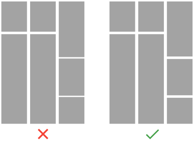
Don’t Be Afraid To Step Outside The Grid
A grid column (not an ally) is where each block of content should begin and end. This rule is simple and easy to follow; nevertheless, designers often intentionally break grid columns in order to increase visual interest or emphasize certain elements. By breaking elements out of the grid, you’ll be highlighting them because the viewer will quickly see those breaks and be drawn to them.
If you decide to break the grid, know what you’re doing. Taking things out of columns can break the visual hierarchy and impair the user experience.
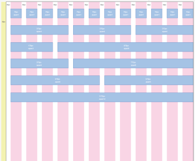
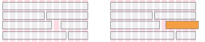
Pay Attention To Both Horizontal And Vertical Spacing
Laying out a grid requires attention to horizontal and vertical rhythms, which are equally important. Consider the difference between the following examples. In the first example, the grid is consistent with the column width and horizontal spacing, but the varied vertical spacing creates visual noise. In the second example, both the horizontal spacing (i.e. the space between content blocks) and the vertical spacing (between columns) are consistent, which makes the overall structure cleaner and the content easier to visually consume.
Use A Baseline Grid To Align Elements
As mentioned, a baseline grid can be used for horizontal alignment and hierarchy. Aligning UI design elements (text, images and content containers) to a baseline means you’ll need to make their heights a multiple of the baseline value. For example, if you choose 8 pixels as a baseline value and want to align the text, you will need to make the line height of the typeface a multiple of the baseline value, which means the line height could be 8, 16, 24, 32, etc. Note that the font size doesn’t have to be a multiple of the baseline, only the line height.
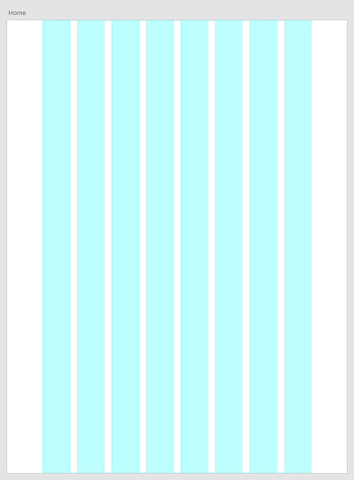
Optimize Grids For Mobile
Mobile grids have limited space, making a multicolumn layout not really possible. Mobile content is typically limited to one or two columns. When designing for mobile, consider using a tile layout grid, in which the column and row heights are the same. This will give a look of square tiles across the design.
On mobile, users have limited screen space and can only view a small amount of content at a time before having to scroll. Thus, when designing a grid layout, make images large enough to be recognizable yet small enough to allow more content to be seen at a time.
Test It
Your grid isn’t set in stone. Like any part of a design, a grid should be tested and iterated on according to the results of those tests.
Conclusion
By now, you should have a good understanding of grid systems, what they are and how they can be applied to your design process. Understanding how to use grids will come from practical experience.
To quote Josef Muller-Brockmann, “The grid system is an aid, not a guarantee. It permits a number of possible uses and each designer can look for a solution appropriate to his personal style. But one must learn how to use the grid; it is an art that requires practice.”
"This article is part of the UX design series sponsored by Adobe. Adobe XD tool is made for a fast and fluid UX design process, as it lets you go from idea to prototype faster. Design, prototype and share — all in one app. You can check out more inspiring projects created with Adobe XD on Behance, and also sign up for the Adobe experience design newsletter to stay updated and informed on the latest trends and insights for UX/UI design."
Related Articles
- “A Brief History of Grids,” Lucienne Roberts, Graphics
- “The Secret Law of Page Harmony,” Retinart
- “Five Simple Steps to Designing Grid Systems,” Mark Boulton
- “Designing Grids,” Mark Boulton
Further Reading
- In Search Of The Ideal Privacy Icon
- Creating Accessible UI Animations
- How To Establish Your Grid In Photoshop
- Smarter Grids With Sass And Susy
 (ra, al, il, mrn)

