How To Iterate Your Way To A Winning Content-Driven Website

Email Newsletter
Weekly tips on front-end & UX.
Trusted by 182,000+ folks.

 Celebrating 10 million developers
 Custom Web Forms for Angular, React, & Vue. Your backend.

If, like me, you spend most of your days working on content-driven websites, you can feel left out of the cool kid's party. Best practice like Agile, continual iteration, and user feedback don’t sit quite as well when serving up lots of information, rather than a killer web app.
When I talk about a content-driven site, I am referring to any website whose primary aim is to convey information, rather than complete tasks. Typically these are marketing driven websites, but they could offer customer support or have an academic or journalistic role. They do allow users to complete some tasks, such as signing up for a newsletter, but that is only a small part of their purpose.
Unfortunately, the way many of us create content-driven websites isn't quite optimal, and we need to do something about it.
The Problem With How We Build Content Driven Websites
These sites typically start from the wrong premise. We begin by asking ourselves, "What do we want to say?" rather than "What does the user want to know?" This mentality originates from creating content for other channels. Channels where it is necessary to grab a person's attention and hold it for as long as possible, but when designing websites the premise is different. People have chosen to visit the site and so have already, to some degree, expressed an interest. The emphasis is then on answering their questions to their satisfaction rather than grabbing their attention.
But that is not the only problem with how we tend to approach content-driven websites. In many cases, they are still created using a process more akin to waterfall than agile.
- We create designs and get them signed off.
- We build design templates within a content management system.
- We add content into the CMS.
Often the designs are created before we even see any content and so there is little relationship between the two. Content is essentially just poured into design buckets!
The more diligent among us refuse to start design until we have some real content to work with, but that often leads to others rushing copy to prevent the project getting delayed.
Of course, then there is usability testing. Often it is neglected as we are still adding content until the day of launch. But even if it does happen, it tends to be towards the end of the project when nobody wants the hassle and cost of changing things.
If all of this is sounding suspiciously familiar, do not lose heart. In recent years I have been trying a different approach, and for the most part, it seems to work. It is an approach that develops design and content together in partnership, while at the same time allowing regular testing throughout the process.
Kicking Off The Development Of A Content-Driven Website
I tend to kick off content-driven website projects pretty much as you would expect. I begin by establishing a prioritized list of business objectives for the site so that we can measure success and be clear about what its role should be. But after that point things quickly deviate from the standard waterfall process I so often encounter.
Instead of immediately jumping into design and discussions about brand messaging, I prefer to focus on better understanding the people who will visit the website. Admittedly, doing upfront user research is far from revolutionary. But it is surprising how little it happens in many organizations — even in 2017.
What may be slightly more unusual is that my research typically focuses heavily on establishing the questions that users have when they visit the website. Questions both from first-time visitors and those returning.
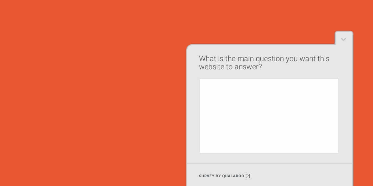
Collecting these questions is relatively straightforward. We start by interviewing users. However, there is a limit to the number of users you can talk with. Another approach is to run a survey on your existing website asking users what questions they have. Finally, speaking to customer-facing staff such as those in call centers will yield a significant number of questions that they repeatedly hear.
The chances are the final list of questions will be extensive, but that is okay. However, some of those questions will be more important than others. We need to identify these to ensure they are easy to find and don’t get lost among the plethora of less critical queries.
That is where Gerry McGovern’s top task analysis can help. It is a simple process that survey’s users to understand which questions or tasks they care about the most. Gerry has written an excellent article on A List Apart covering the process so I won’t repeat it here.
What that top task analysis will leave you with is a prioritized list of questions users have. That can become the core of the site’s content and help us iterate towards a useful website.
Iterate Through Fidelity In Content And Design
Before we can start iterating towards our completed site, we first need to establish its information architecture. Our questions can be the basis for determining that structure.
We can use the questions as the basis for a card-sorting exercise where users organize the top questions into groups that make sense to them. These groupings can then help inform us as we develop the sites information architecture, making sure the site reflects the users mental model, rather than organizational structure.
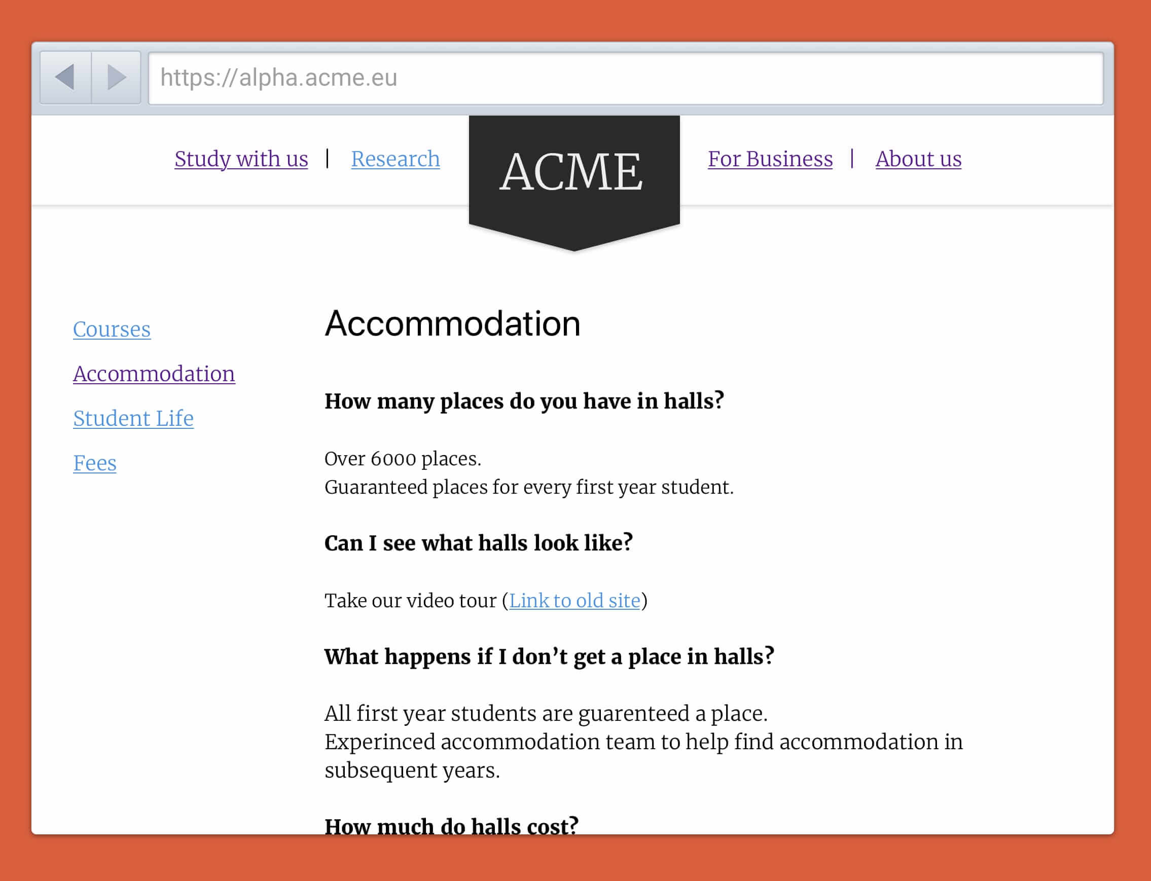
Once we have an initial draft of our information architecture, we can start building our site and testing it, even though we have established no design and written no copy.
Content-driven websites are almost always built on a content management system so while we were researching user questions, the developers can put an out-of-the-box installation on a staging server somewhere.
We can now start building blank pages on this CMS reflecting the information architecture. All the pages need on them is a method of navigating between pages (navigational links) and bullet points of what questions we anticipate answering on each page.
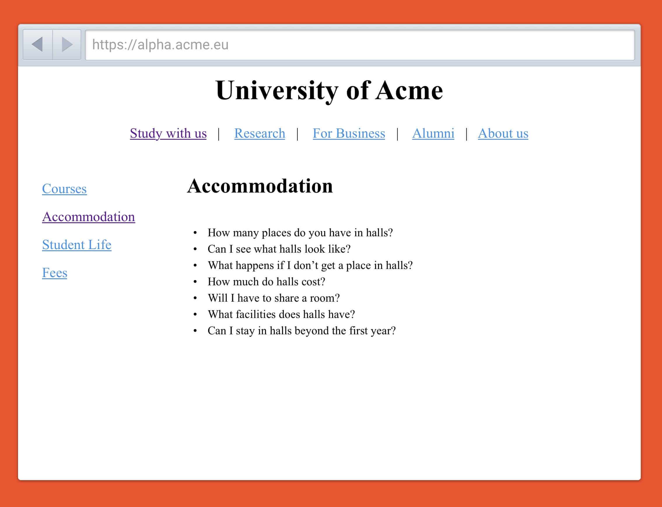
That immediately gives us something tangible to test. Even with no design and no content, we can still check the information architecture. Can users find the questions they want answering? Does the structure make sense to them?
With this established, now we can start increasing the fidelity. The designer can start introducing some basic typography and layout to critical pages. Meanwhile, the content writers can begin fleshing out pages with a few preliminary bullet points answering the questions on pages, or where appropriate temporarily cross-linking to pages on the existing site that answer the questions.
At this point, we can carry out further testing. We can see if the visual hierarchy established by the designer allows users to spot essential content. Equally, we can test the content linked to on the old site to see if it answers user questions before we start mindlessly migrating from the former website.
In the next round of iteration, the copywriters can begin adding in rough copy site-wide, while the designers can start refining the design with improved typography, color, and other stylistic elements. Again, this can be tested with real users to make sure the new copy answers questions, and the design improvements are aiding, rather than distracting.

So the process continues, round after round, adding more fidelity to the copy and design, moving the site ever closer to something that is an improvement on the existing one. At this point, we can push it live. But even then, further rounds of iteration can continue to evolve and improve the performance of essential pages.
Of course, this all sounds good in principle, but it does require a shift in thinking.
A Shift In Thinking
For a start, it does require different thinking for designers. Many designers still use Sketch or Photoshop to design hi-fidelity mockups. This approach suggests they iterate towards a final design in the browser.
That said, I don’t believe that the two approaches need to be mutually exclusive. There is nothing wrong with experimenting with more refined design solutions early on in Sketch, as long as it is understood these will change based on user feedback. That design can then be slowly rolled out and tested on the staging server.
Another change in attitude will be around content migration. Typically there will be an assumption that we will migrate content from the previous website across to the new one en masse. The idea of creating all new content can seem insurmountable.
In reality that is not what I am proposing. We can migrate a degree of content where that content answers user questions. But this should not happen en masse or blindly.
Also, you will find it is unnecessary to rewrite anywhere near as much content as you think. You will almost certainly discover that a significant amount of the copy you believe needs migrating can be retired because it doesn’t answer a users question. The advantage of this is that you are left with considerably less content to maintain.
However, probably the most significant shift in thinking is in showing work in progress. Whether designers or content specialists, many of us still suffer from this desire to make everything perfect before we let others see it. But this approach puts content and design out there early exposing it to criticism. That is a challenging mental shift to make, but imperative.
You might be thinking that letting stakeholders and clients see work in progress is a recipe for disaster, but it is not. In fact, in my experience, they respond favorably to seeing a site emerge before their eyes. Instead of waiting weeks (or even months!) before they see anything, they will start to see the skeleton of a website within days of kicking off the project. Psychologically, that makes a huge difference.
Also, by seeing the website develop step-by-step, they feel more engaged with the project and learn about the process behind its development. That makes stakeholders less likely to reject the final solution.
Finally, if they do have objections, these are identified earlier in the process when they are easy to fix. Surely this is preferable than waiting until the last minute when things are difficult to change.
Take A First Step Today
I'm not suggesting that evolving a content-driven website in this way is a perfect solution, but I have found that iterating towards a final site by systematically increasing the fidelity of design and content leads to better results and less internal resistance.
Still, don’t take my word for it — try it for yourself. Start small. Jumping into a major redesign of your entire website might be too big a step for all concerned. Perhaps you can try this approach on a new microsite or a section of your site that you are updating.
Alternatively, try implementing just a part of the process I have outlined. Maybe just start a project by collecting user questions rather than starting with the messages your organization wants to push out. Or perhaps you could try a small amount of prototyping rather than producing pixel perfect design comps.
My point is that you can pick and choose what works for you and you don’t need to change overnight. What matters is that you start to allow user feedback to influence the design and content of your site.
Further Reading
- A Smashing Guide To The World Of Search Engine Optimization
- Developer Decisions For Building Flexible Components
- Creating And Maintaining A Voice Of Customer Program
- Crafting A Killer Brand Identity For A Digital Product


