How To Use Underlined Text To Improve User Experience

Email Newsletter
Weekly tips on front-end & UX.
Trusted by 182,000+ folks.


 Celebrating 10 million developers
 Custom Web Forms for Angular, React, & Vue. Your backend.
(This article is supported by Adobe.) An underline is a horizontal line immediately below a portion of text. In our everyday experience, we underline to emphasize key sections of text, sometimes drawing an underline by hand below printed text. But underlines have their own place in the world of digital design. In fact, underlined text has become one of the most common, most recognizable features of our online experience. When we see an underlined word or sentence on a web page, we immediately assume it’s a link.
In this article, I’ll explain the concept of underlining and provide a few tips on how to use it to improve the web experience.
Historical Context
Text has been underlined way before the web was invented. It was used by print designers to emphasize important parts of a text:
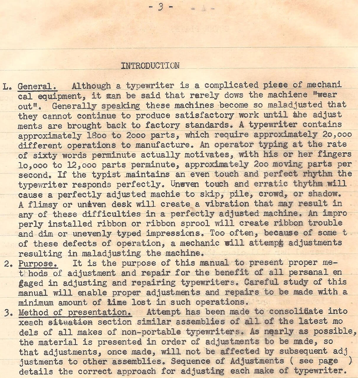
It has been used in advertising:
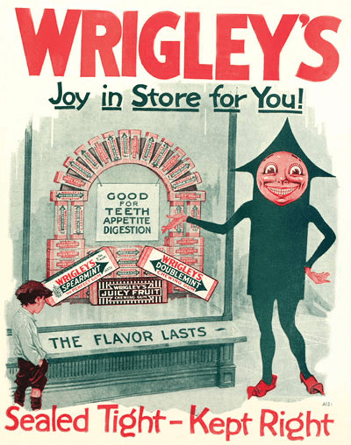
We even find it in our immediate environment:

Today, designers usually don’t underline text for emphasis because such styling is considered distracting.
Underlining Links
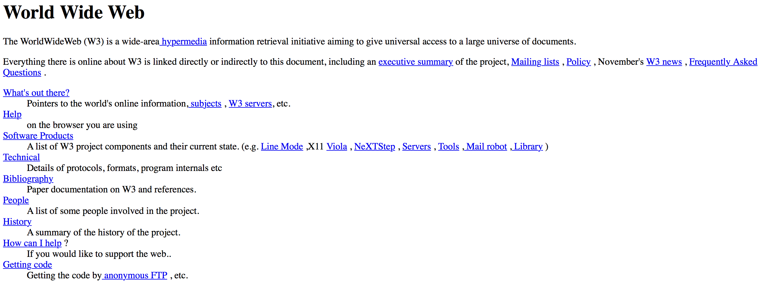
When Tim Berners-Lee initially presented the concept of the World Wide Web in 1991, he stated: “The [World Wide Web] consists of documents, and links.” Since then, links have become a fundamental element of the online experience, the glue that holds the web together.
The toolbox of the earliest web designers was way too limited — only simple typefaces and a limited number of colors (colored monitors displayed only 16 colors, and many were just black and white). But emphasizing links with a different style was essential, so that early adopters could figure out which elements on the page were important. The simplest solution was to underline. Since then, underlining text has become the standard decoration of HTML hyperlinks. And while designers have tried different styles for links for the last 30 years, underlining remains favored by many web designers.
Underlined links have a few major benefits:
- Familiarity
The underline is one of the most widely understood conventions on the web. Underlines provide a strongly perceived affordance of clickability — the vast majority of users understand that underlined text is a link. - Scannabilty
Underlined text is a great visual cue that guarantees link visibility when scanning text. As we scan pages vertically, any horizontal line will cut right through our line of sight. Underlining guides users to important information as they skim. - Accessibility
When color alone is used to differentiate clickable elements, some groups of users (such as color-blind people) might have problems identifying links. According to the WCAG 2.0, color shouldn’t be the only visual indicator of a potential action. If you want your website to be accessible, you’ll have to add another visual cue to links, and underlining is a logical choice.
Despite all of its advantages, underlining can hinder the user experience in some ways:
- Readability
The interruptive nature of an underline is excellent for skimming, but it can affect readability. A study by the University of Hamburg shows that underlining has a detrimental impact on text readability. Based on the study, avoid underlines when the main goal of the content is comprehension. - Aesthetics
Underlines add visual noise to text and the overall design. A lot of underlining spread throughout a block of text can make for a busy look.
Designing The Perfect Underline
Before we dive into the details of how to design the perfect underline, it’s worth defining our goal. We want to create a visible yet unobtrusive underline. Users should be able to understand that the element is interactive — when they see it, they should immediately know that it’s a link — but it shouldn’t draw too much attention to itself or stand apart.
Don’t Underline Text That Isn’t A Link
Don’t underline any text that’s not a link (even if your links aren’t underlined). Underlines provide a strongly perceived affordance of clickability, and users will be confused and frustrated if underlined text doesn’t match their expectations. If you need to emphasize certain words or sentences, using italics or bold is much safer.
Keep It Short
Try to keep linked phrases short, three to five words. Anything more will clutter the text.
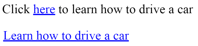
Make Anchor Text Meaningful
Anchor text is the clickable text in a link. It should be descriptive — users should be able to predict what they’ll get when they click a link. For this reason, avoid anchor text like “click here” because that says almost nothing about the content behind the link and forces users to hunt for more information on what exactly they will be clicking on. “Click here” links also make a website less accessible for people who use screen readers. Most screen readers say “link” before each link. For example, a “cars” link would be read as “link cars” by JAWS. Thus, you can expect that JAWS would read a “click here” link as “link click here,” which is utterly uninformative.
According to Google’s “Search Engine Starter Guide,” putting words that anticipate the target page at the start of the link text is critical.
Design Links Consistently
Consistency is the key to teaching users what links look like on your website. There shouldn’t be a situation in which some of the links on your website are underlined and some aren’t. Different visual signifiers being used on different pages can easily confuse visitors. Pick a link design and stick to it.
Design consistency is important not only for small websites. For example, different sections of CNN’s website have different styles for links. CNN Style uses underlined text:
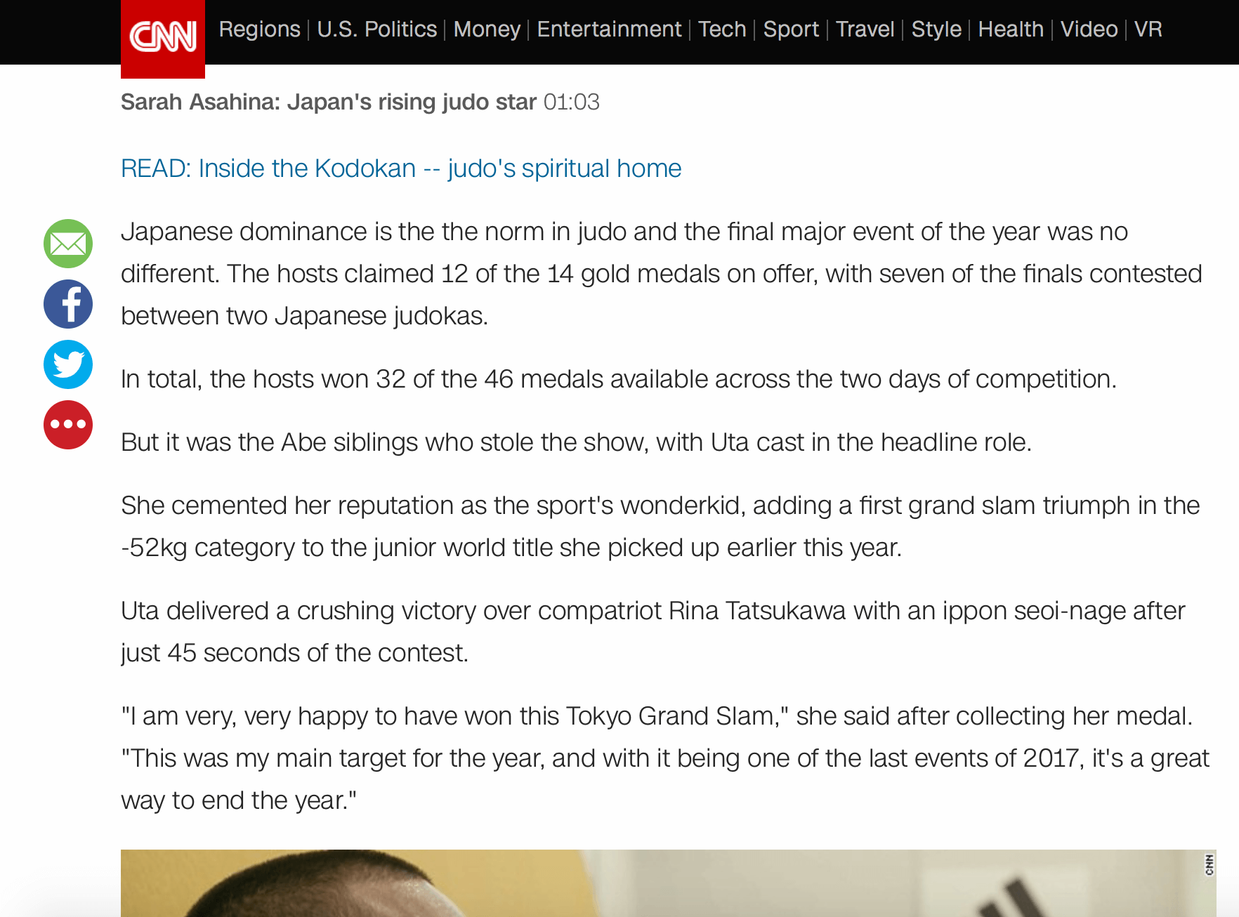
CNN Sport, meanwhile, uses color to visually distinguish links:
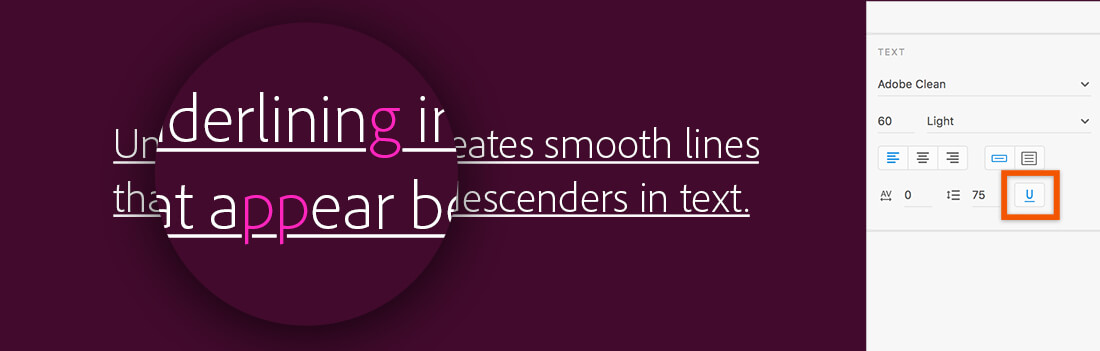
Avoid Descender Crashes
Descender crashing is perhaps the second most significant issue caused by underlines (after clutter). This happens when characters containing descenders (such as lowercase p, g, j, y and q) aren’t taken into account and the underline touches the letterforms. This can cause a cluttered, ugly look and make the text less legible.

A good underline is positioned below the baseline and skips descenders. Hiding the underline below certain characters not only will improve legibility but also will look more refined:
How do you prevent the descender crash issue. Links on the web are styled with the text-decoration: underline CSS property by default. Unfortunately, this property doesn’t take descenders into account.
Among the solutions that address this problem, the simplest is the text-decoration-skip CSS property. It specifies which parts of an element’s content should be skipped over by text decoration. It controls all text decoration lines drawn by an element and also any text decoration lines drawn by its ancestors.
The text-decoration-skip property isn’t supported in all browsers yet. Alternatives (such as box-shadow) would be worth exploring if your text is hard to read without it.
Update: On Nov. 8, 2017, the property has been renamed to/superseded by text-decoration-skip-ink:, with auto as an initial value in Chrome 64.

text-decoration-skip property, you’ll notice that the descenders here (like y and p) have a little white space around them.Color
Color is a powerful tool in the designer’s toolkit. It can be used to distinguish links from other text.
Avoid Coloring Non-Interactive Text
Avoid coloring text unless it’s a link because visitors can easily confuse colored text as being a link.
Should Links Be Blue?
Not necessarily. According to Jakob Nielsen, “Shades of blue provide the strongest signal for links, but other colours work almost as well.” However, if you are free to select a color for links, blue is always best. It is still the color with the strongest perceived affordance of clickability — an experienced web user associates “blue and underlined” with links. And the color has one significant advantage over others: It’s the most accessible for people with color deficiencies (people who suffer from protanopia and deuteranopia can see it).
Tip: Because blue is strongly associated with clickability, avoid it for non-link text, even if blue is not your chosen link color. Blue text that is not clickable leads to frustration.
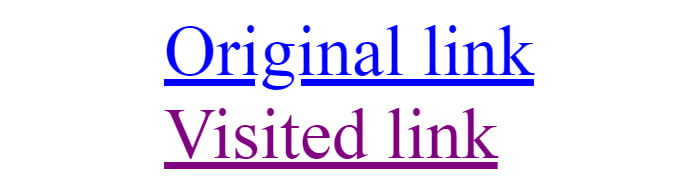
Use Different Colors For Visited And Unvisited Links
Visually differentiating visited and unvisited links will make the user’s journey easier because users will be able to keep track of what they’ve seen. The two colors should be variants or shades of the same color, so that they’re clearly related. The color for unvisited links should be more saturated, and the color for visited links a bit duller.
Don’t Underline Lists Of Links
For lists in which every item is a link, not underlining is OK. In this case, the layout clearly indicates the area’s function.
Mobile Considerations
Today, almost 50% of users access the web from a mobile device. Optimizing the web experience for mobile users is a top priority for web designers.
Avoid Links In Mobile Apps
Do not use underlined links in mobile apps. Underlined links are a part of the website model, not a part of the app model. Apps should have buttons, not links.
Make Links Big Enough
Using a thumb to tap links can be painful, especially when you have trouble spotting a link and then have to zoom in to tap it. On a touchscreen, the sizes of objects are critical. Make interactive elements big enough to be both easy to see and easy to interact with.
Conclusion
Links make the Internet what it is. In his classic book on usability, Don’t Make Me Think, Steve Krug writes, “Since a large part of what people are doing on the web is looking for the next thing to click, it’s important to make it obvious what’s clickable and what’s not.” A robust visual design is essential to making the user journey joyful. While underlining has its downsides, it remains one of the most explicit ways to indicate the presence of a link. Underlining text makes links both easy to find and easy to understand for visitors.
Related Articles
- “Crafting Link Underlines on Medium,” Marcin Wichary, Medium
- “Styling Underlines on the Web,” John Jameson, CSS-Tricks
"This article is part of the UX design series sponsored by Adobe. Adobe XD tool is made for a fast and fluid UX design process, as it lets you go from idea to prototype faster. Design, prototype and share — all in one app. You can check out more inspiring projects created with Adobe XD on Behance, and also sign up for the Adobe experience design newsletter to stay updated and informed on the latest trends and insights for UX/UI design."
Further Reading
- Everything I Know About UX Research I First Learned From Lt. Columbo
- When Words Cannot Describe: Designing For AI Beyond Conversational Interfaces
- Five-Second Testing: Taking A Closer Look At First Impressions (Case Study)
- A Roundup Of WCAG 2.2 Explainers


