Air Lookout Is The Side Project That Changed My Design Process Forever

Email Newsletter
Weekly tips on front-end & UX.
Trusted by 182,000+ folks.


 Custom Web Forms for Angular, React, & Vue. Your backend.
 Celebrating 10 million developers
In February of 2015, I began working on an iOS app called Air Lookout. The goal of the app was to simplify and remove any obfuscation of air quality information. After over a year of working nights and weekends, the total net income since it launched in 2016 has been less than $1,000. Even with those numbers, I would relive every hour of work.
The one thing that I can’t place a monetary value on is how the experience of creating Air Lookout has completely changed my mind on the process of design and development for every project I have worked on since.
A Brief Note On Air Quality
Air quality around the world is a serious issue. It doesn’t matter if you live in a metropolis filled with cars and buses spewing exhaust or a small town where trees outnumber people. Air quality will affect your life. Living in Salt Lake City, we experience an inversion in the winter. An inversion is a layer of hot air that traps cold air, including any airborne pollutants produced. This creates a layer of smog in the Salt Lake valley. These inversions can sometimes last for days or weeks, and depending on the weather, can change every day.
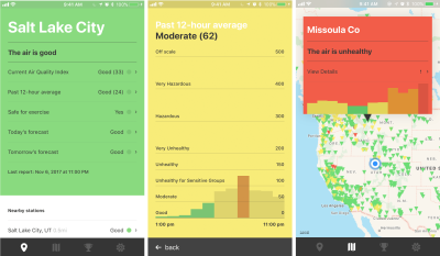
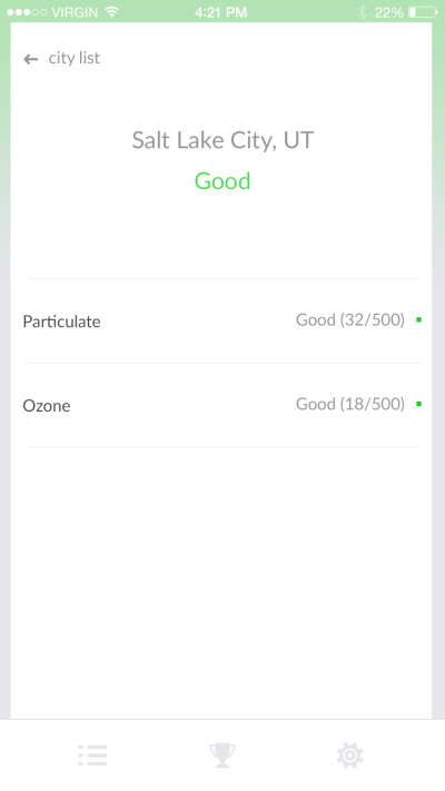
Before launching the finished app, shown above, I had a million questions that I had to understand before I could even begin to build a design based on solutions and a minimal amount of assumptions.
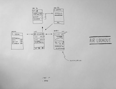
The overall task of creating an air quality app was daunting. However, when I broke it down into smaller pieces, it didn’t seem as horrifying. In fact, the first step: to create a quick design that could help me understand the organization of information, appeared fairly straightforward. I had executed this initial process a hundred times before for many different clients. Every project starts with a whiteboard wireframe, and the designer works to create an initial design from that. At least, that’s what my habits told me.
The number of assumptions I made in the above wireframe and initial designs that I proved wrong during the entire process is astounding.
Fake It Until You (Literally) Make It
I uploaded the few static designs I made — after I created my wireframe sketch — to InVision. With that, I could open the fake app throughout my day. What did it feel like to use the app while I was waiting for dinner to cook? While I was getting into my car? Very quickly I noticed that there were a lot of recurring questions that I had. What do the colors mean again? Orange is worse than yellow, right? But the Air Quality Index (AQI) goes from 0–500. Why? And, above all, the questions I always had were: How does this affect my day? Can I exercise outside?
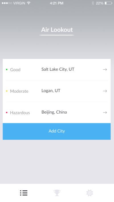
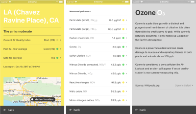
Based on a lot of the reoccurring questions I had around pollutants and how they could impact my day, I started to add fake screens in Invision that could act as “cheat sheets.” What started out as a simple pollutant definition, only meant to help remind me while designing and developing the app ended up getting added to the app as a final feature. Now, in the current app, tapping on a pollutant name will bring a user to a definition with a list of information sources and links to more information (that flow is shown below in the current app screenshots). I discovered that sometimes information that is useful to the designer or developer is also useful to a user.
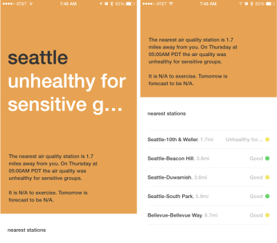
Naturally, as shown in the wireframe sketch earlier, I gravitated towards a UI to add and manage locations through zipcode. But, after using the fake prototype, I found that process to be arduous. Why bother having the user go through that entire flow? What if I drove to Park City for a day of skiing? Or Antelope Island for trail running? The Salt Lake City, air quality station, wouldn’t be the closest anymore.
On a daily basis, I found that I only cared about the air quality at my current location, not necessarily my home location. And, luckily for me, iPhones come with a fairly good consumer grade GPS and location services API. Therefore, I removed the entire location Create/Read/Update/Delete UI and flow from the app. I decided that a current location overview would be the fastest and most useful for all. The only users I could imagine this would frustrate were power users checking multiple locations. But a reminder of my original goal—to simplify air quality—added confidence to my decision.
In order to test this, I made more fake screens to test in InVision. Instead of tapping through a fake UI and view flow, I set the prototype to go through the automated steps of my fake GPS location updating with timed transitions. Then, when I went to a coffee shop in North Salt Lake or drove up to Park City, I would open my fake app and watch it update and show me new data for the different location.
The first time I used this new prototype, I could tell it was a huge improvement. When a device has certain built-in features, using those features can result in a better user experience by designing less of an interface. It would have been hard for me to reach this conclusion if I never left Photoshop and didn’t imagine that I had a real air quality app on my phone.
Starting With Code
On a lot of client projects I have recommended and supervised user testing. For Air Lookout, that was not an option. I already knew there would be a slim amount of profit and user testing was assuredly outside of my budget. I also knew that I’d have users and feedback once I launched the app. Anything I could do to simplify the app would speed this up. In my mind, I would rather launch a simpler well-made app and get user feedback instead of belaboring for a long time over a very complicated application with the wrong assumptions.
My habits told me the next step after using the InVision prototype should have been design iteration. This would have been the process for any client project of this nature. However, I had a lot of questions about the quality of the data and concerns if I was capable of getting the data reliably onto my iPhone using UIKit. Instead of returning to Photoshop I opened up Xcode.
In order to accomplish my desired functionality, I made a very simple (and mostly broken) one view iOS app that would display real data. Initially, the app didn’t even refresh on its own. I had to manually kill the app and re-open it if I wanted new data. But, at least it had up to date and relevant data (including my location!).
…And Back Into Design
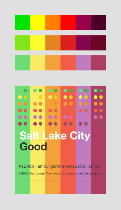
There were a lot of design decisions that I made in code while making this crude prototype that ended up staying. Most noticeable is the large color block showing the AQI color and the large location text. I had never worked in a way where the development process informed a visual design like this. But, I’m not sure I would have discovered this while working in a traditional design tool such as Photoshop or Sketch. After all, I only changed the background color because I was too lazy to create another UIView to represent the AQI color.
From here on, it was easy enough to bring a screenshot into Photoshop and further refine it. It was much faster to play with spacing and type sizes in Photoshop instead of waiting for the app to recompile after every change (especially considering this was back in the Swift 2 days).
The design iteration process for many of the subsequent views ended up following a very similar pattern to this. I would create a crude working prototype—making quick design improvisations in code—use it for a few days or weeks and then recreate and modify the view in Photoshop. Since I’ve already used a prototype before any static design took place, I was an expert on what the view needed or didn’t and where the priorities and hierarchy should be.
One of the biggest surprises for me, from this process, was being required to build a working prototype that displayed the data and readings correctly. I ended up having an understanding of the data before even beginning the static design phase. As a designer, how could I even begin to act like an expert in explaining the complexities of air quality if I myself don’t fully understand how it works. Creating and using these crude prototypes gave me that experience and expertise in a short amount of time.
…Forever
Many nights, I would go back and forth between Photoshop and Xcode numerous times. Eventually, it felt comfortable to use whatever tool felt the fastest for whatever problem I was working on solving. Sometimes that was code, and sometimes it was a traditional design tool like Photoshop. Interesting enough, Photoshop wasn’t always the fastest tool for finding visual design solutions especially if it dealt with dynamic data.
Postmortem
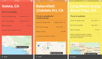
After launching Air Lookout, it’s hard to tell if my decisions were right. I have had a few emails from users complaining that the traditional way of searching and adding locations is missing. I am, however, glad that I went with this simpler approach. Location search is always a feature that I can add to the app later if enough user feedback requests it. I feel confident that my conclusion—drawn from regularly using my fake prototype—was the right decision.
Similarly, there were lots of design decisions that I ended up making in code that ended up in the final app. Without the color blocks (and many other decisions like this), there’s a good chance that my app would look like every other air quality app available.
If I was to do this process over again, it would be worthwhile to build an interactive wireframe prototype with stock UIKit components. Essentially skipping the InVision prototype and beginning with a code prototype. From there, it would be much easier to start static design knowing where the UIKit components are worthwhile or lackluster and having a comprehensive understanding of the data and data relationships I need to work with. Then, instead of tapping around a fake InVision prototype, I could have a more realistic app experience with real data sooner.
Reality And Application
In the past, especially when I used to work at an agency, I would have recommended thorough design exploration and iteration before wasting a developer’s already limited time with building something based on early assumptions (especially anything that likely would need to be changed or improved later). However, now, I am more intrigued by the possibility of designers and developers working together to create a tappable wireframe app prototype made with native components to test and validate any early assumptions or ideas.
Perhaps a team could be built out of individuals capable of both design and development to facilitate this part of the process (and further remove the semantic barrier between the two roles). I am confident this is a more efficient process for design and development that will give the design fundamentals of any interactive project a much stronger foundation.
Now, the challenge for me is figuring out how to sell clients on this unconventional process.
Note: Air Lookout was launched in 2016 and can be downloaded from the App Store.
Further Reading
- Inspiring Everyday Graphic Design
- 33 Tempting E-Commerce Icons For Free
- Breaking Out Of The Box: Design Inspiration
- Modern Art Movements To Inspire Your Logo Design


