Offboarding In The Online World

Email Newsletter
Weekly tips on front-end & UX.
Trusted by 182,000+ folks.
 Celebrating 10 million developers
 Custom Web Forms for Angular, React, & Vue. Your backend.


By now, we’ve all heard about onboarding — the beginning of a relationship between a company and a user — but what about offboarding? Both go hand in hand as being two of the most important interactions you can have with a user, but offboarding gets much less publicity and sometimes is even altogether ignored. So, what exactly is it, and why is it so important?
Offboarding is usually described as the interaction between a company and their customer at the end of the customer journey. Whether a user is permanently ending their relationship with a company, or they are just finishing a single transaction, offboarding should be acknowledged as the last impression a user has of your business.
The Importance Of Offboarding
While a good offboarding experience may not always reap immediate rewards, that doesn’t mean the process should be ignored. In fact, the loss taken from a bad offboarding experience or the lack of an offboarding experience entirely can be significant.
But is offboarding more important than its counterpart, onboarding? In most cases, yes it is. You could have an amazing onboarding experience, and still lose a customer due to a bad offboarding experience. In addition to that, many people are willing to overlook a bad onboarding experience provided they have received good feedback from other users, but a bad offboarding experience usually leaves people with a sour taste in their mouth that makes them unwilling to come back or recommend a business.
This is because by the time a user would encounter an offboarding experience, they are likely to have already given information or money to a company, and therefore would be concerned about how that information or money is being handled. This is why offboarding is closely related with customer service — it’s up to you to leave the user feeling like their information will not be shared with a third party, and that their money is being well-spent.
When To Use Offboarding
When you apply the concept of offboarding to the online world, it doesn’t stop being about good customer service — but you do need to start incorporating elements seen in onboarding, such as user experience design, creative copy, and marketing strategies. Without those elements, there is nothing to tell the user that they have been successfully offboarded and that their transaction with your company has ended.
Additionally, you have to think about what interactions might be considered the end of a customer journey. While some activities may mark the last interaction with a website, such as submitting a form or completing a purchase, they aren’t usually the end of a customer journey. Even though these interactions also should have their own form of offboarding, there are others that should be considered first.
The following examples are online interactions that may be the end of the relationship between a company and its client, and therefore should be the first places offboarding is applied to online.
Leaving A Website
Leaving a website is almost like the online version of leaving a store — sometimes the site didn’t have what you were looking for, but it doesn’t mean that you won’t return at some point. However, it’s difficult to have a real offboarding policy for an action that you can’t predict, and has no direct steps — you can hit the back button, type in a new web address, or even close your browser to leave a webpage, none of which usually require any further interaction with a website to do.
Some websites, however, do have a way to bring offboarding to the process, by using an exit intent pop-up. Exit intent pop-ups show up when a user tries to navigate away from a website and attempt to give reasons to stay — usually by offering some sort of coupon or discount for the website’s product or through a platform like Couponobox.
Some might argue that including a pop-up is bad offboarding no matter how it’s done since it disrupts a process that the user would have given no thought to otherwise — a thought that Google seems to confirm by penalizing mobile websites with intrusive pop-ups. However, an exit intent pop-up is not considered to be intrusive by Google’s standards, since it appears only when leaving a page. So, when done right, they can be an effective way to hold onto a customer who may have given up on your website.
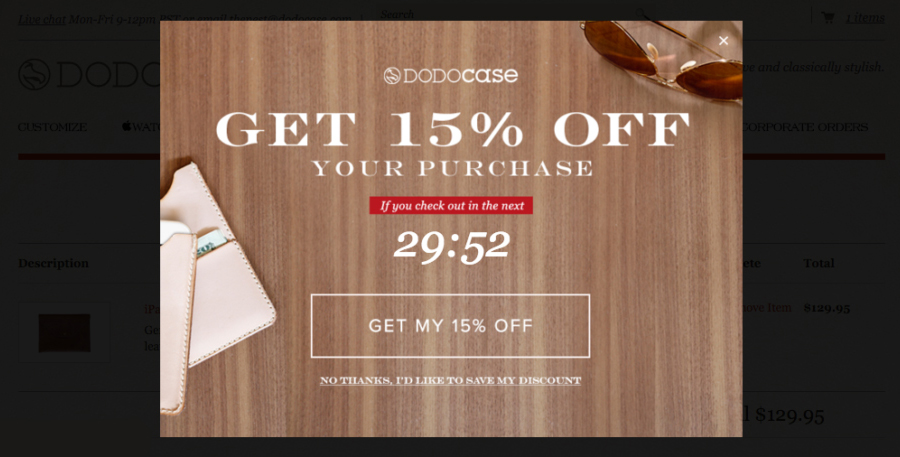
If you were shopping at DODOcase and decided to stop midway through a purchase, their discount delivered via pop-up might be enough to make you change your mind. Not only do they offer you 15% off your purchase, which helps if the reason you were leaving was due to cost, but they give you a timer so that you know exactly how long you have to use the offer and two clear call-to-actions allowing you to either claim your discount or save it for later.

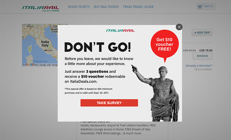
However, a similar notification from ItaliaRail probably wouldn’t be quite as welcome. The call-to-action is inviting you to take a survey, so it’s easy to miss the $10 voucher being offered in exchange for answering questions. Because the pop-up is more intent on gathering feedback than getting the customer to finish the checkout process, this isn’t helpful offboarding for either party.

Cancelling A Service
There are a lot of different reasons that someone might cancel a service. Maybe they have decided to get the service from a different provider, maybe your service was too expensive for them, or maybe they just don’t have a need for that particular service anymore. However, regardless of the reason, this usually signifies the end of a user’s association with your company.
While canceling a service is typically a multi-step process, all of which is a big part of offboarding in this situation, one of the more controversial steps is a survey commonly included at the end. While the information collected in these surveys can be critical to the success of a company, as the answers can assist with changing their business model to retain more customers in the future, it also risks the loss of a repeat customer if done incorrectly.
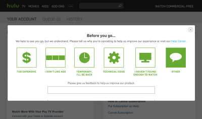
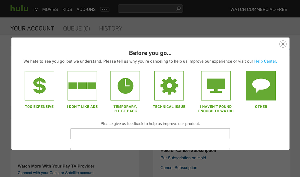
For Hulu, having a survey is definitely worth the risk. With such an easy-to-understand interface, it doesn’t cost users a lot of time to answer the question — and by putting it at the very end of the process, taking it is optional anyway. However, the thing that really makes it a good offboarding process is the subtle reminder that customers are welcome to come back at any time, hidden in the survey as an option that says Temporary, I’ll Be Back.
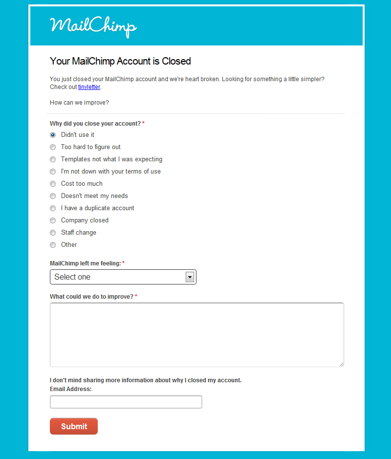
MailChimp takes a bit more of a risk with their survey, included as a non-optional step in the cancellation process. While the survey isn’t actually that long, with only three mandatory questions, due to the number of options presented and the requirement for comments, it can look daunting to a user who just wants to know their account was successfully canceled. In addition to this, the results of the survey could easily end up skewed due to having a radio button stating Didn’t use it pre-selected.
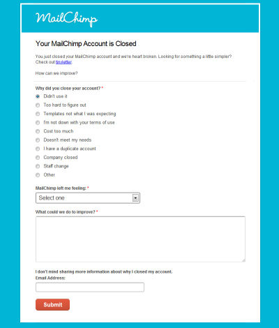
However, one thing MailChimp has in their survey that Hulu doesn’t is an optional field for an email address, allowing them to get back to a customer who has taken the time to provide information. While some customers might prefer not to be contacted, others would, especially if they are genuinely interested in helping your business become more successful. So regardless of if you have received positive or negative feedback, it’s important to follow up with these users.
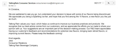
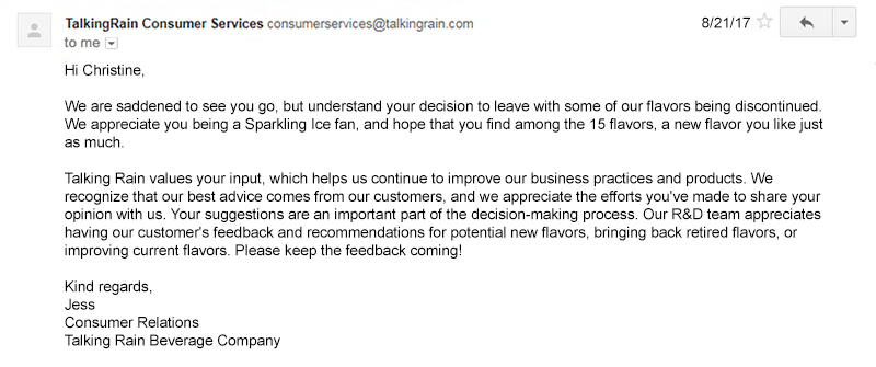
This example from Talking Rain shows the appropriate way to respond to a customer. The email addresses the customer by name and is sent from an individual at the company rather than the company themselves — allowing users to see a business as more than just an impersonal entity. Additionally, the email mentions comments that were provided in the survey, letting the customer know that their feedback is being taken into account for any future improvements to the service. By showing users that your value their feedback, and giving them a real person to connect with, you build loyalty that could result in regaining an active customer.
Unsubscribing From An Email
Similar to leaving a website, unsubscribing from an email doesn’t always mean it’s the end of a relationship with a company — and similar to canceling a service, unsubscribing from an email usually involves taking a short survey. But there is one thing that makes it unique, which is that offboarding starts from the moment you open that email.
When someone decides to unsubscribe from an email, the first question is always: how easy is it to find the unsubscribe button? The harder it is to locate, the more determined they are to find it — which is why it should be placed towards the bottom of an email and clearly labeled as an unsubscribe link.
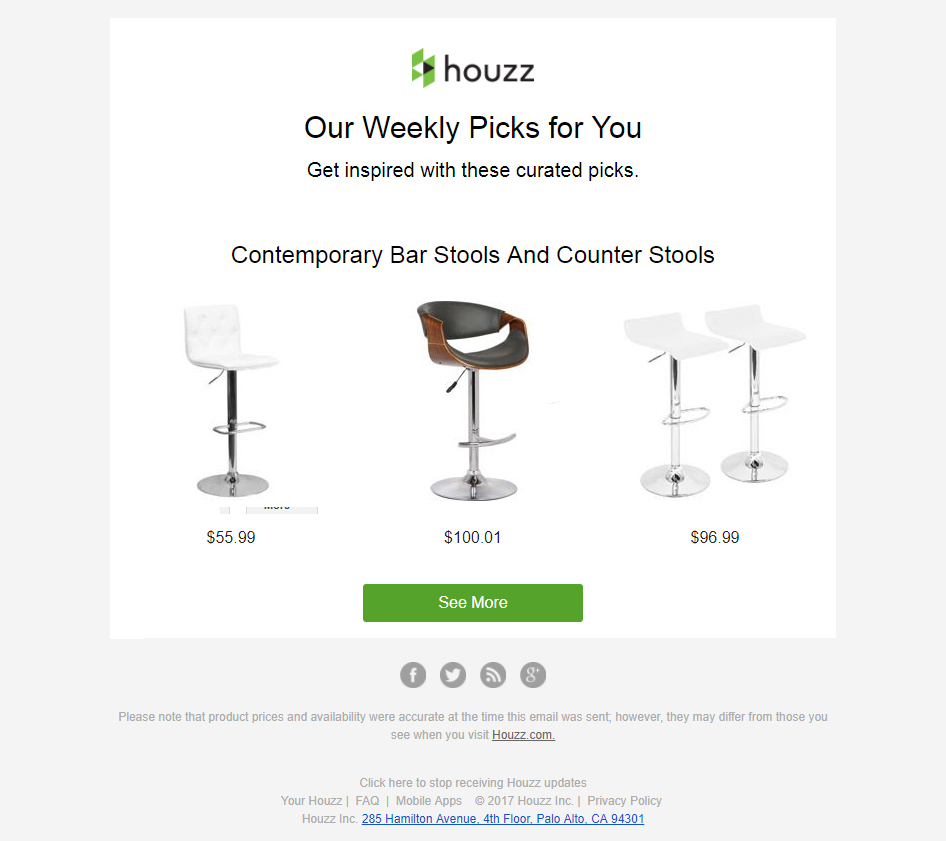
While Houzz places their link at the bottom of their emails, they don’t use the word unsubscribe. This difficulty in determining where the link is might convince some customers that it’s easier just to keep getting emails than to locate the unsubscribe link, labeled click here to stop receiving Houzz updates, but it’s more likely just to frustrate anyone determined to unsubscribe.

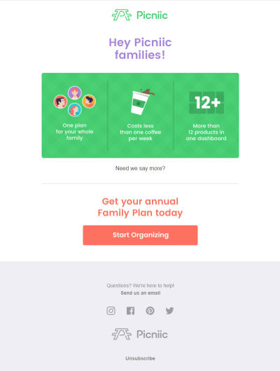
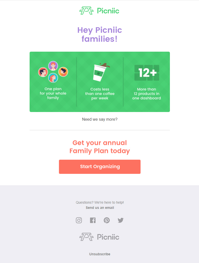
Picniic places their unsubscribe link in the same location, but they clearly label it unsubscribe — making it much easier for users to find it if they want to click on it. Another thing that contributes to its ease of use is that instead of having to locate it among a set of other links or information, it is a stand-alone link.
What about when a user isn’t reading your email, though? As much as you don’t want someone actively looking at your emails to unsubscribe, if your emails are being ignored it wastes time and money for your company to send them. In the interest of list cleaning, in this case, it is better to ensure that inactive users unsubscribe.
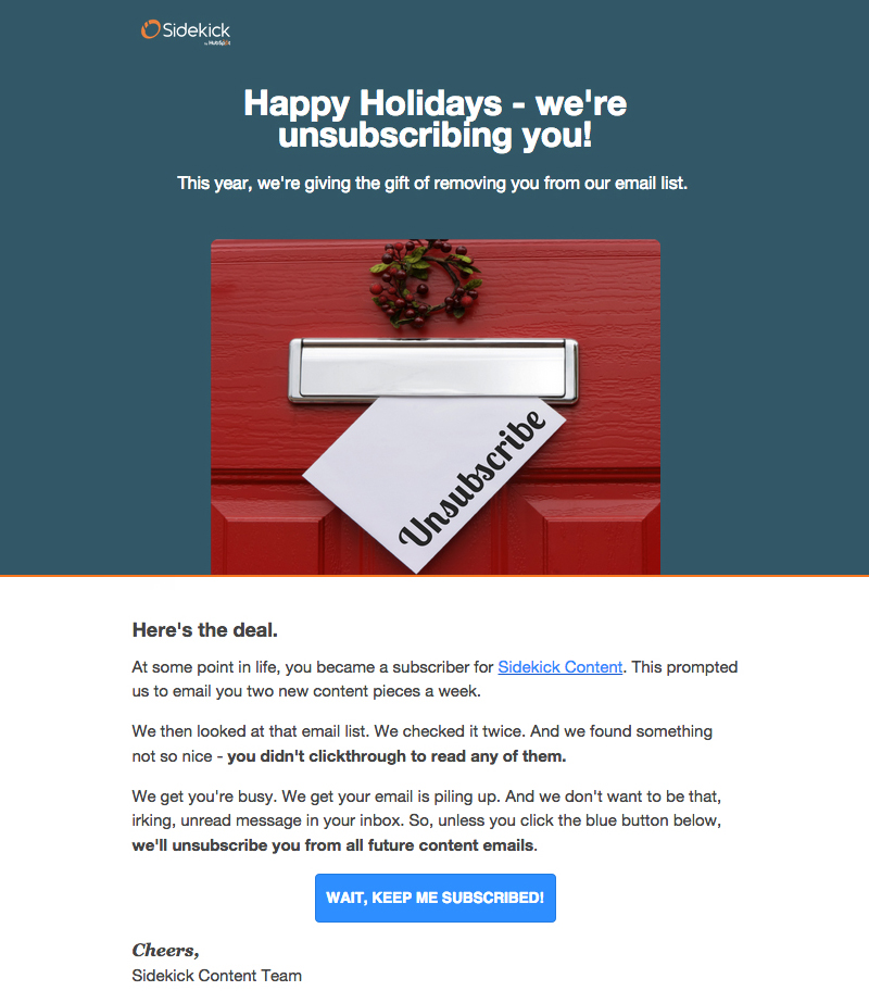
An extreme example is Sidekick Content’s holiday gift to seemingly inactive customers — an automatic unsubscribe. In contrast to the other examples, you have to click through in order to remain subscribed. While there is a risk of losing more active customers with this email, the risk is relatively small as it would only be sent to users with a low open rate for these emails anyway. Should the user open the email, they might be moved enough by the message to stay subscribed — but if they don’t open it and become automatically unsubscribed, then it’s a win for everyone involved.

Implementing Good Offboarding
Part of the difficulty in implementing an offboarding procedure is that the quality of the experience is subjective. What makes one user more likely to recommend a company or return to their services could be the reason another user decided to end their customer journey in the first place.
Still, that isn’t to say that there aren’t some general rules to follow when it comes to offboarding — it just means that there are different interpretations of the rules. By going through a hypothetical situation involving an online purchase, we can summarize the following guidelines for implementing a good offboarding experience for all users.
Clearing Up Ambiguity
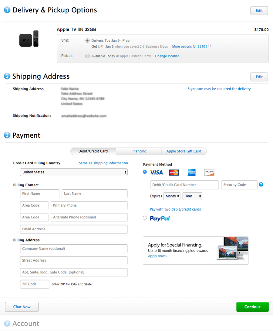
Imagine that you are making a purchase online, and once you reach the payment step, you are unable to locate a field for a discount code and see a simple continue button leading you to the next step, much like what Apple has.
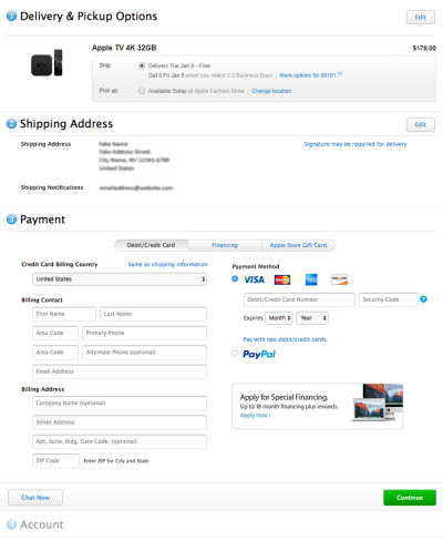
What happens when you click the button? Will you be given the option to log into your account or change account settings, as the preview seems to imply? Or will clicking that button actually complete your purchase, with the account step being an option after that? When you’re not sure exactly what the next step entails, you’re less likely to go there — especially if you’re trying to do something before spending money, such as saving a favorite order or applying a coupon code.
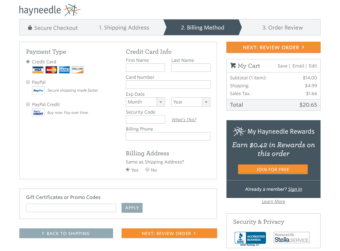
Hayneedle provides a much different checkout experience. Not only are the steps all on completely different screens, but the next step is clearly labeled as Next Step: Review Order, so you know that you won’t be making your final purchase by clicking the button.

By making sure the user knows exactly where in the checkout process they are, there’s a higher chance that they’ll see it through to the end. By making sure all the steps are clearly labeled and that all options can be easily found, you will be able to clear up any ambiguity a user might have about the process, which is the first step to implementing good offboarding.
Validating The User
Unfortunately, even if you order something through an unambiguous checkout process, that doesn’t mean the entire purchase will go smoothly. If an order of yours from GameStop was canceled, you might get a message like this:
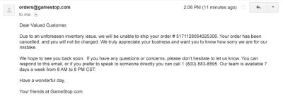
Any communication is better than no communication, but it’s important to address the two main concerns of the customer; what is happening to their money now, and why is their product no longer available? With no answer of what to do if you are charged for some reason, and no explanation about why the order was canceled, users might feel they have made a bad decision to associate with your company.
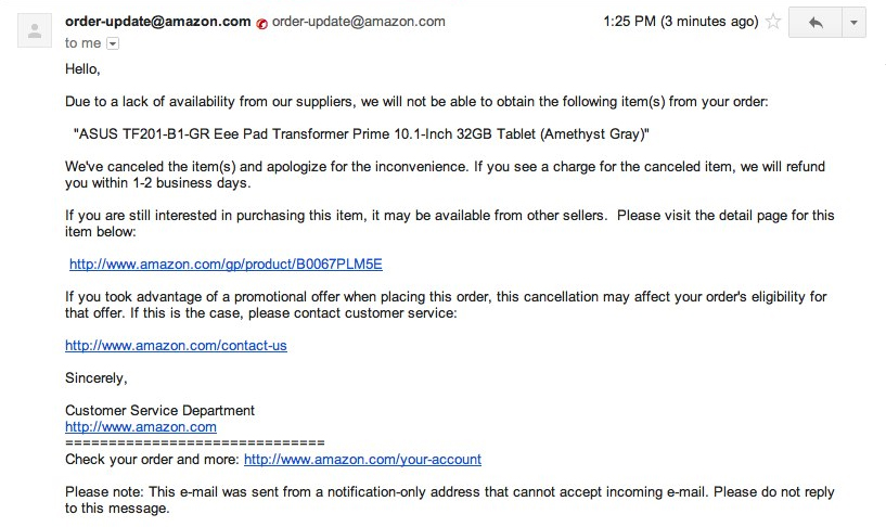
On the other hand, if an order from Amazon gets cancelled, you’re more likely to receive an email with the following information:
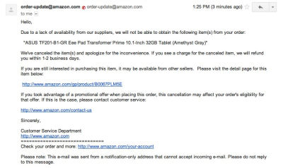
Not only does this email address the two main concerns by saying that there was an inadequate supply of the product and that if a charge appears it will be refunded, but it also offers several options to choose from as a next step. There an alternative to obtaining the item in question with a link to see the availability, and a link to customer support has been provided in case the user has additional concerns.
A response like this validates the user and their choice to order from your company. Even though their purchase might not have gone as planned, the company has taken responsibility for the incident and done all they can to rectify the situation, so the customer would most likely be willing to purchase from them again — one of the hallmarks of a good offboarding experience.
Providing Confirmation
Once a purchase has been placed (or canceled), it’s not uncommon for customers to want to reach out to the company with questions, concerns, or requests — something they typically do by way of a contact us form on the company’s website.
The easiest way to provide confirmation is through the use of a thank you page, which is the page that comes up when a user submits a form on a website letting them know their submission has been received and thanking them for their time. Here is an example from Brafton:
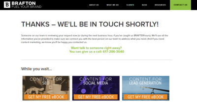
Not only does the user know that their submission has been received and that they can expect a response shortly, but they are also provided with a phone number to call in case they need an answer to their question sooner, and are shown material they may be interested in reading while they wait for a response.
The reason all of these things are great to include when providing confirmation is that it takes care of both clearing up ambiguity and validating the customer at the same time, and overall is the conclusion that a user is looking for at the end of their customer journey.
Your Very Own Offboarding Experience
As seen in the examples above, offboarding is something a user comes into contact with every time they complete a transaction online, and sometimes even experience in small steps throughout their customer journey. However, the user is not typically aware of it, which is because it has yet to be fully acknowledged in the online world.
If you want to learn more about how to apply offboarding principles to your online processes, a good place to start is by comparing online experiences to similar offline experiences. After all, many companies do business both online and offline, and the level of customer service provided at the end of a customer journey should not change regardless of whether a customer decides to interact with that company.
In the end, an offboarding experience is all about making the user feel good, so that you increase the chance of them returning to your website, making a second purchase, or subscribing to your emails — or in this case, sticking around and reading more. Put yourself in the user’s place, and ask yourself what you would want — that’s the same experience that you should be providing to every user.
Further Reading
- Rebuilding A Large E-Commerce Website With Next.js (Case Study)
- Designing Better Error Messages UX
- What Leonardo Da Vinci Can Teach Us About Web Design
- Designing Better Links For The Web


