Designing Friction For A Better User Experience

Email Newsletter
Weekly tips on front-end & UX.
Trusted by 200,000+ folks.


In experience design, friction is anything that prevents users from accomplishing their goals or getting things done. It’s the newsletter signup overlay covering the actual content, the difficult wording on a landing page, or the needless optional questions in a checkout flow. It’s the opposite of intuitive and effortless, the opposite of “Don’t make me think.”
Having said that, friction can still be a good thing sometimes. In game design, for example, friction is actually required. The right amount of friction at the right time is what makes a game challenging enough.
But it’s not just game design where friction can come in handy. In this article, I’ll show a few use cases where friction can be an efficient part of the UX designers’ toolkit to help with understandability or even improve the user experience.
Slowing Down To Prevent Errors
Confirming Actions With Severe Consequences
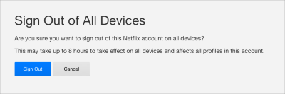
Error prevention is a basic usability principle, and the most common use of friction in product design is to make it hard to do something by mistake (especially when it comes to nonreversible actions):
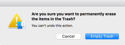
Depending of the severity of the action, some dialogs might even require extra effort from the user, such as typing in a specific command. This solution not only makes it harder to mistakenly confirm deletion but also slows down users, forcing them to read the overlay message for a thorough understanding of what’s happening.
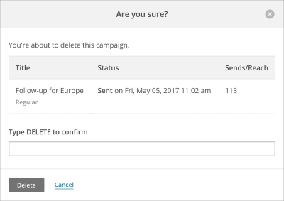
From the user’s perspective, such confirmation is an extra step in the process (a friction, actually) but at the same time, they are assured that they will not accidentally perform an action that is hard to undo.
Anticipating Possible Errors
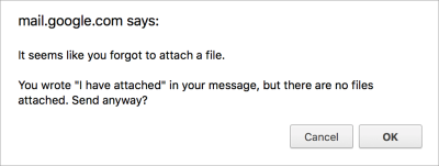
Error prevention also entails validating user input as soon as possible. Smart validation not only checks that the input format is right, but also takes the broader context into consideration and warns whether something might cause a problem later on.
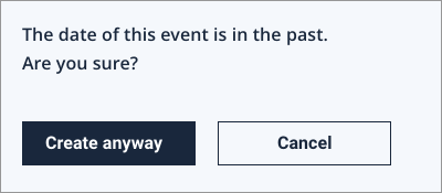
Obviously, such predictions cannot always be correct, and there’s a chance that a seemingly invalid value was given intentionally and that the warning dialog is just a roadblock for the user. Still, in the majority of cases, smart validation is an efficient tool for preventing error.
Delaying Important Actions To Let You Reconsider Them
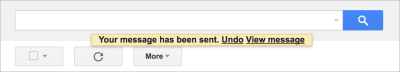
Many email clients have a handy feature where you can “unsend” an email right after sending it. What this feature does is basically wait a few seconds after you’ve clicked the “Send” button to give you a timeframe to cancel it and fix any possible issues with the email. This means that the email delivery process lasts a few seconds longer, but at the same time your outbox gets insurance.
Extra Steps To Enhance Security
Preventing Accidental Transactions
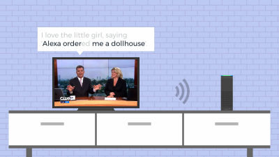
There is a captivating story about Amazon’s voice assistant: Echo devices started to automatically place orders one day because a sentence spoken on a local TV station triggered them. This happened because the default setting of the devices did not require any confirmation from the user’s end to place an order. That is, if you said, “Alexa, order me a dollhouse,” the order would be placed instantly (interestingly, without even clarifying which exact product should be ordered). This is an example of an extremely frictionless shopping experience in which placing an order was simply too easy and an accidental purchase ruined the user experience.
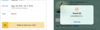
A typical e-commerce checkout process, in contrast, requires at least one explicit confirmation before placing the order. On mobile devices, it might even be a particular gesture or a fingerprint approval to prevent accidental purchases. This kind of friction is usually needed in a checkout process so that the user feels in control.
Multi-Step Authentication
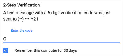
Security measures might sometimes feel like friction to users. Many applications, for example, require a second factor of authentication (such as using Google Authenticator, receiving a validation text or something similar) before logging in or making a significant transaction (such as transferring money from your bank account). For the user, this means an extra step in the authentication process, but this extra effort represents an extra layer of protection on their account and data.
Double Authentication Before Significant Actions
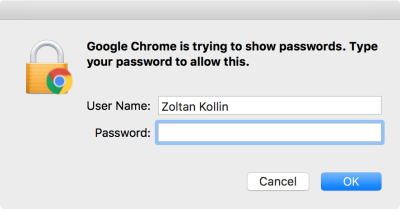
It’s not uncommon that you have to log in again before executing a sensitive action, especially one involving personal data. The classic example is if you want to change your password, you first need to enter your current one (even if you’re already logged in).
Showing your saved password might be even more sensitive. Google Chrome, for example, can store your log-in credentials, but you can only read the stored passwords if you enter your computer’s password, so that your data is better protected.
This pattern of logging in again also exists on mobile. Even if your phone supports unlocking with your fingerprint (a pattern designed to be an explicitly frictionless), sometimes, like after restarting the device, you still need to enter your passcode for extra security.
Making Long Processes Seem Shorter
Keeping Users Busy While Waiting
There’s an instructive case study related to Houston’s airport, where the airport managed to end passenger complaints about the long waits at baggage claim in a really unexpected way. When examining the complaints, the aiport’s executives found that, although it only took one minute for passengers to get from the arrival gate to the baggage claim area, they then had to spend seven minutes there waiting to get their bags.
The airport tried a surprising solution: It rearranged the area so that passengers had to walk much more to get to the baggage claim. This way, they had to wait there less, and complaints ended immediately. The lesson is that, if you keep your users busy, they will not notice if a process takes longer than they would normally expect.
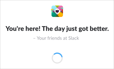
Slack leverages the same principle by showing built-in and customized quotes during loading. Reading these snippets reduces the perceived waiting time a bit (not to mention, it adds a nice human touch to the product).
Making The Loading Process More Gradual And Transparent
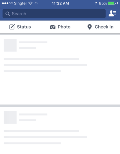
Many websites show a progress indicator or, even better, a page skeleton during loading, gradually unveiling the actual content as it’s being loaded. Showing the content piece by piece, continuously, gives a feeling that the loading process is fluid (and quicker).
Covering The Pain Of Waiting With Animation
Loading indicators in general are designed to let users know that the loading process is happening and that everything is under control. From a user interface standpoint, such animations could be considered unnecessary or even distracting because they don’t add much direct value. However, when designed well enough, they can be a nice tool to keep the user’s eyes busy and make the waiting process go by unnoticed.
Prolonging Actions To Build Credibility
Slowing Down A Process Could Improve The Perceived Quality Of The Outcome
There’s an anecdote about Coinstar machine, a device that is used to change coins to banknotes. When the machine was introduced, it was able to count coins almost instantly, but customers felt that it was not reliable — they thought it couldn’t possibly calculate the correct amounts in such a short time. Designers then changed the user experience so that even though the calculation was fast, the result was displayed with a significant delay. Because of this change, people started to trust the machine because the calculation now seemed thorough enough.
Adding Extra Delay For A Better Sense Of Security
According to another anecdote, Well’s Fargo developed an eye-scan-based log-in to its mobile banking app that worked really quickly. The user’s eyes were scanned and processed, and the user was logged in in milliseconds. In fact, the log-in experience was too fast for users; they felt that they had been logged in without their eye patterns being thoroughly validated, and they reported that they would not continue using such an unreliable log-in method. So, in the next iteration, designers simply added a few seconds of delay to the authentication process, and customers immediately started to claim that the log-in process was thorough and secure.
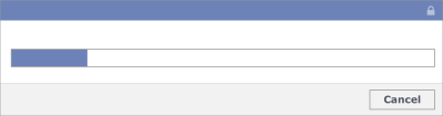
The Power Of A Fake Progress Bar
Slowing down a process is sometimes not enough to change perception. Allegedly, Facebook did some experimenting on a security checkup process, in which examining the privacy and security settings took only a few milliseconds for the user and wasn’t considered thorough enough. To improve the perception, Facebook added some delay, along with a fake progress bar, so that users could get a better understanding about the thoroughness of this process.
Educating And Changing Users’ Behavior
Making People More Conscious
A smart piece of friction is designed into the process of withdrawing money from an ATM. Originally, the procedure for withdrawing money was to insert the card, enter the PIN first, select an amount to withdraw, get the money and, finally, get the card back. However, this process made a lot of people forget to take their cards back, because as soon as they got their money, they unconsciously thought “mission accomplished” and left. Because leaving a credit card at the ATM is a huge risk not just for the customer, but also for the bank, the process had to be redesigned. That’s why most ATMs now give back your card first, and only after a short delay are you given the money. This procedure might last a bit longer than necessary, but banks can now make sure that people don’t forget their credit card.
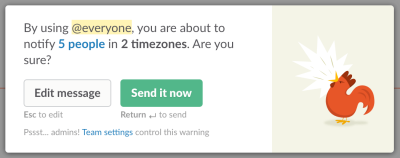
Teaching Responsibility
Sometimes the consequences of a user’s decision are hard to foresee, especially when it affects other users. In such cases, a confirmation makes sure not only that the action was taken intentionally, but also that it’s used responsibly.
Slack, for example, has a smart warning before sending out push notifications to a group. This way, it not only makes the user aware of the direct consequences of such an action, but also educate them to use this option carefully.
Nudging
Nudging is a concept in behavioral science that refers to small tricks to change people’s behavior (for the better), without limiting the options available. One of the most frequently cited examples of a nudge is the etching of an image of a housefly in a men’s room urinal to “improve aim.”
Nudging often entails adding friction to an unfavorable but preferable option, so that people are inclined to take it. Consider an elevator in an office building that only comes every 60 seconds. Employees might have to wait up to a minute after pressing the button. This trick makes people take the stairs instead of waiting for the elevator — opting for the healthier and preferable option.
In his brilliant book Work Rules, Laszlo Bock shares how Google used nudging to make employees choose healthier snacks in company kitchens. One of its tricks was to hide candy in opaque containers, while storing fruit visibly in glass containers. This intentional friction changed employees’ behavior; they started choosing the healthier snacks. It goes without saying that such methods should only be used to benefit people; otherwise, they’re just another form of dark patterns.
Leveraging Friction In Product Management
Selling With Friction
Friction is often used by marketers and growth hackers to improve conversions and generate leads. Consider push notifications promoting upgrade options, or newsletter signup popups covering the very content that users are trying to read. Although it’s easy to measure the effectiveness of such methods by looking at their conversion rates, make sure that this distraction does not frustrate users.
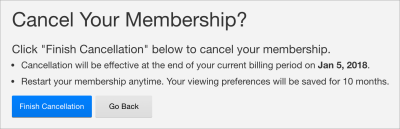
Finding the right amount of friction is important to the offboarding process, too. When users try to cancel a membership or unsubscribe from a newsletter, asking for extra confirmation and clearly communicating the consequences of their action might be helpful for them, but, needless to say, adding too much friction to the cancellation flow is a dark pattern to be avoided.
Targeting The Right Users
For services that are built on user-generated content, it’s a fairly standard technique to add friction to the onboarding process, to make sure that only committed users post and share content and to fight spam and low-quality content. On Product Hunt, for example, you can’t join discussions until you become a contributor, by completing some onboarding tasks.
Sometimes friction is there to target the right users and only the right ones. There is a popular opinion about Snapchat that, if you’re not a Millennial, you will probably find its interface counterintuitive and unusable. That is by design. To target its app to teens, Snapchat deliberately made it “very hard for parents to embarrass their children”. In other words, it added friction to its UI to filter out an unwanted audience.
Using friction to identify the most committed prospects is a well-known technique for high-value services as well. Inquiry forms in industries such as real estate and finance, for example, are often long, containing extra fields and specific questions to filter out users who are not really interested in the service. The providers would rather collect fewer but more qualified leads.
Creating Value With Friction
Sometimes friction can really make a difference — in a positive way. When Twitter launched, many people had a hard time understanding the concept of the microblog service, where posts were restricted to 140 characters. Users had to learn how to communicate in such short tweets to leverage this product, but at the same time Twitter remained consistently concise and easy to digest, even on mobile, which was the main differentiator from other social media platforms. (And Twitter did not loosen the restrictions for years.)
Friction is often used in subscription-based products to differentiate between the plans and to urge people to upgrade. Such friction typically involves fewer features or less storage for low-end plans. Spotify’s free plan, for example, plays ads between songs, to push people to upgrade for a better (and frictionless) listening experience.
IKEA is known for selling furniture products that requires assembly. One benefit of this business model is that it can keep their prices low, but studies also find that people value self-built products (including such furniture) disproportionately high, something called the IKEA effect. This means that the friction of having to assemble your own furniture before using it actually increases its perceived value.
Conclusion: Eliminate Unwanted Friction, Embrace Good Friction
The general rule of thumb for designers is to minimize the cognitive load on users as much as possible. People in general want to get things done as effortlessly as possible, so always identify and fight unwanted friction, such as:
- too many steps in a process,
- unnecessary decisions to make and questions to answer,
- unclear navigation,
- unfamiliar design patterns,
- too much information and visual noise on the screen,
- and any similar issues your user research suggests.
Still, when used reasonably, friction can be a really efficient UX design tool for the scenarios described in this post. Whether it’s about slowing down people before a weighty action, taking the time to explain what’s happening or slightly nudging users, don’t be afraid to think outside the box and leverage a little friction if the context demands it and if it will make the overall user experience better.
Other Resources
- “3 Ways Friction Can Improve Your UX,” Dina Chaiffetz, Invision Blog
- “How to Game Friction for Better UX,” Clint Schnee, UX Magazine
Further Reading
- Using Gradients In User Experience Design
- Practical Design Tips And Guidelines For Beginner Designers
- Five-Second Testing: Taking A Closer Look At First Impressions (Case Study)
- Better Context Menus With Safe Triangles


