Using Gradients In User Experience Design

Email Newsletter
Weekly tips on front-end & UX.
Trusted by 182,000+ folks.
 Register for Free
 Celebrating 10 million developers


 Custom Web Forms for Angular, React, & Vue. Your backend.
(This is a sponsored article.) Color has the potential to make or break product. Today you’ll learn how to use gradients for a website in Adobe XD through a very useful tutorial. In the last Adobe XD release, radial gradients were added so that designers can easily create unique color effects by simulating a light source or applying a circular pattern. Designers can add, remove and manipulate color stops with the same intuitive interface as linear gradients.
But, hey, why gradients?
Web design trends have changed rapidly in recent years, with some things disappearing for a while and then making a gradual comeback. That’s the case with gradients. Gradients are making a comeback, and the multi-tone effects are driving modern design in a big way. We’re seeing this trend show up on many websites, such as Spotify.
In the age of flat design, gradients were totally gone, but we have seen them back again in Google’s material design and, just last year, in Instagram’s logo.
What Are Gradients?
A gradient is the gradual blending from one color to another. It enables the designer to almost create a new color.
It makes objects stand out by adding a new dimension to the design and adding realism to the object. In simple terms, gradients add depth.
On the other hand, a gradual blending from a color to white or black (and playing with opacity) can mimic distance from or proximity to a light source. Gradients are more faithful to the real world because real life isn’t made of flat colors.
Why Are Gradients Valuable To Designers?
As mentioned, gradients are coming back, and we’re seeing them more and more — including in branding, illustration, typography and UI. Gradients make more colors available because they create more color tones. Gradients are eye-catching and memorable because they’re colorful and playful and make for visuals we’re not used to seeing. We don’t even have the right words to define color gradients yet. And in step with the trends for 2018, we can use gradients to create awesome digital and graphic designs.
But always keep in mind: Don’t overdo it.
Best Practices
- Don’t overdo it. The best way to create a pleasant gradient is to use two colors, and not more than three.
- Avoid conflicting colors. Adobe Color CC can help you find analogous, monochromatic, triad, complementary, compound and shade colors using a color wheel.
- Always decide on a light source. This will help you decide which are the lighter and darker areas in the gradient.
- Do you need inspiration to find colors that match really well together? Take a look at uiGradients. It will help you find the perfect colors for your gradients.
- This article will give you an idea on how colors work in design, how to choose them and what they communicate.
- Use a linear gradient for a square or polygonal area.
- Use a radial gradient for round areas.
- Always have separate shapes for the fill color and gradient color. This way, you will be able to apply a gradient over an existing color, playing with opacity to create different effects.
- Work with the opacity to let color blend into fill areas.
Examples
Where are we seeing gradients making a comeback? Definitely in backgrounds, image overlays, illustrations, logos, icons and more.
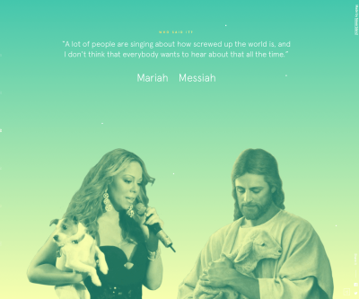
Mariah or Messiah is an online quiz where you have to guess the source of quotes, Mariah or the Messiah. It uses beautiful gradient backgrounds that change between awesome transition effects.
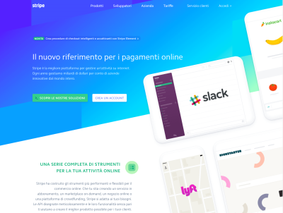
Stripe is a website that accepts payments online and in mobile apps. It uses background gradients all over. This emphasizes the message they want to send, and the page looks clean and pleasant.

Instagram completely changed its logo, switching from a skeuomorphic icon to a flat icon with a purple-orange-pink gradient. Because its app began a social phenomenon, its design changed to look simple and to keep up with times. You can read more about their choice on this blog post.
What We’ll Cover In This Tutorial
In this tutorial, you will learn how to create a very simple web layout in Adobe XD. To follow along, please download the latest version of Adobe XD in order to be able to view and edit the files properly.
- Download the XD template, icons and logo (ZIP, 62.7 MB)
This tutorial is useful for beginners because the examples are explained step by step and are really simple to follow. But it’s useful for experts, too, because new features from Adobe XD will be explained. For tips on using colors on apps and websites, make sure to read “Playing With Color: Vibrant Options for Apps and Websites.”
Let’s get started!
1.1. Prepare Your Layout
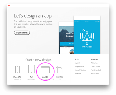
Launch Adobe XD, and create a new layout. For this tutorial, we’re going to choose “Web 1920”, as you can see in the image below.
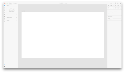
After creating it, you can see your new layout. Give it a name and save it.
Let’s apply a grid to our layout. Go into the “Grid” section and click on “Layout.” If you cannot see the section, ensure you have clicked on the artboard to maintain its selected state.
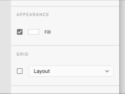
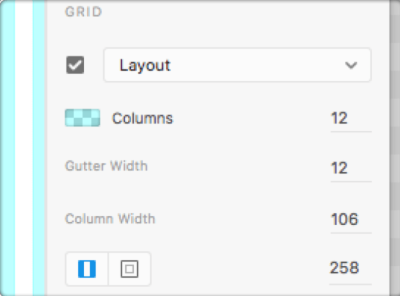
I set values like 106 for the column width and 258 for right and left margins, to get a layout of about 1400 pixels (1406, to be precise).
Our layout will be higher when we put content in it, so I can say it’s all set to begin the fun stuff!
1.2. An Overview
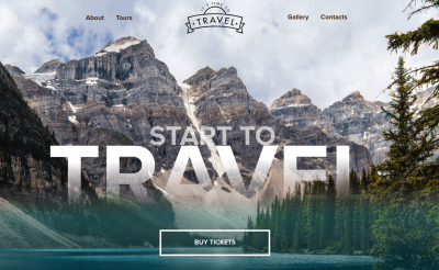
To give you an idea of what we will be working on, here is the layout we will get at the end of our work.
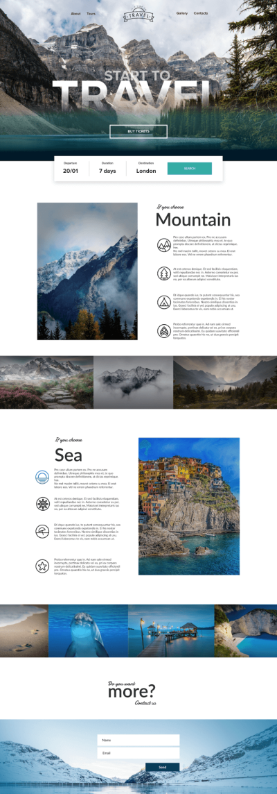
In the header and hero sections, I used linear gradients for both the big picture and text. I also used a gradient from color to transparency for all pictures, and applied a colored gradient to an icon to show how it looks and works.
1.3. Header And Hero Section
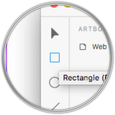
Let’s create a rectangular shape, in which to insert our picture. Click on the Rectangle tool ®.
Go to the artboard, and click and drag to draw your rectangle. It doesn’t matter which color it is, just that you cover the entire width of the artboard.
Set a height of 500 pixels for now. Later you are free to adjust it, depending on how you want the picture to come out.
To set the width and height of your shape, you can do it manually or put dimensions in the corresponding box.
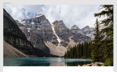
Now, let’s insert a picture in the box. Take a picture (the one I used is from PEXELS), drag and drop it on the rectangle, and it will take the shape perfectly.
In this step, you can switch off the grid for a while. We will turn it on again later. Just click on “Layout” to uncheck it and disable the grid.
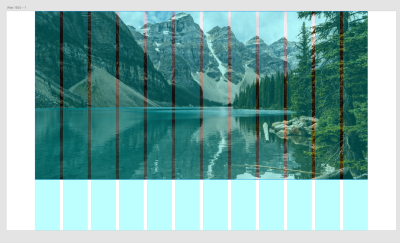
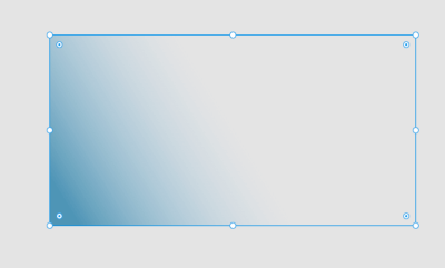
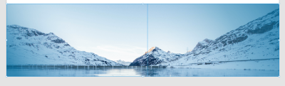
If we need to adjust the size of our picture, you will see that it might go outside the initial shape if we make it bigger (see image below).
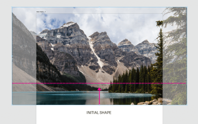
We can confine our image to the shape by creating a mask with shape.

Create another Rectangle ® like the one we did earlier, put it on the image, and select both of them.
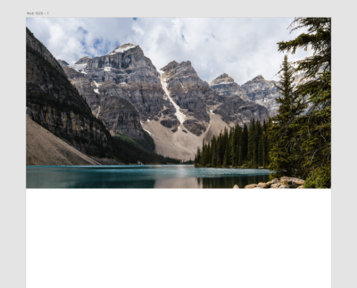
Now, go on Object and click on “Mask With Shape.” You result will be this (image below).
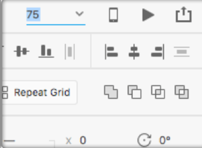
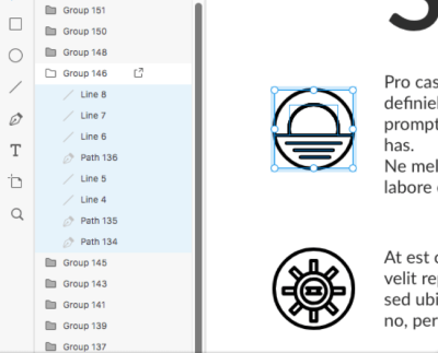
Let’s see how our layers look so far. Go to View → Layers (Cmd + Y → Crtl + Y), or just click on the little layers icon in the bottom left:
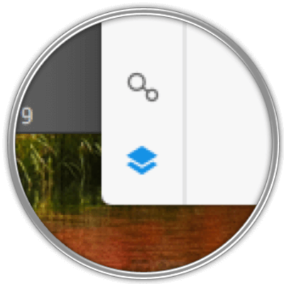
Your layers will appear on the left side of the window. You can open a group by clicking on its left icon (image below)
1.4. Beginning To Work With Gradients
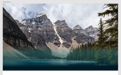
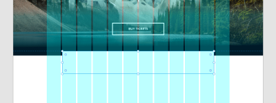
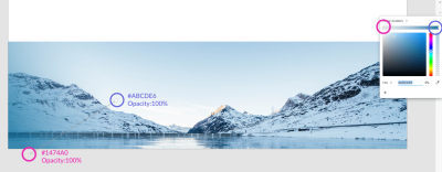
Now we will cover the hero image with a linear gradient, to give a colored effect to the bottom part of the picture, to put the hero text there and to make it readable.
Grab the Rectangle tool again, and draw one on the bottom of the image, as shown below. The second step is to click the Fill tool on the right side.
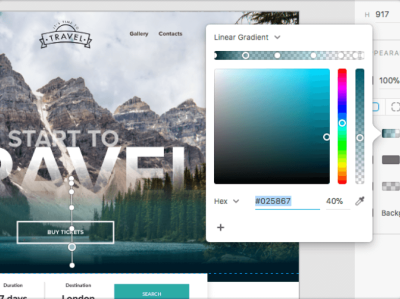
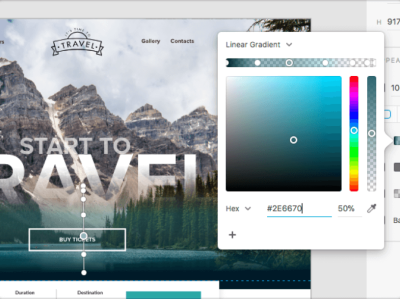
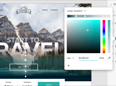
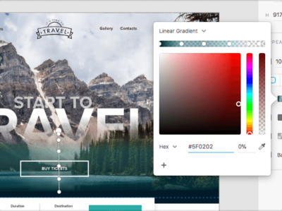
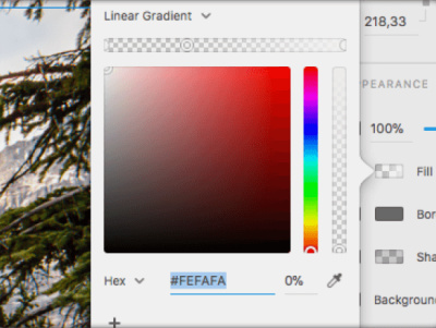
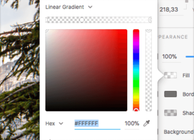
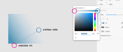
We will not use a solid color, but a gradient instead. You can enable it by clicking on the little arrow on the right of the menu.
Once you set a gradient, you will be able to set how many color points you want, and you can set an opacity for every one of them. Click in the gradient line to set a new point, and give it a color and opacity.
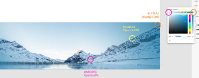
Below you will find all color HEX and opacity for the linear gradient I set:
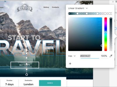
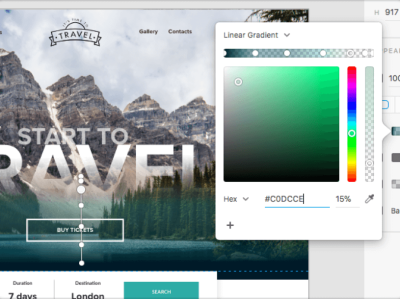
Here is the result:
1.5. Logo And Navigation
For this tutorial, I created a simple logo that you can use. Open it with Adobe Illustrator, and then just copy and paste it in XD directly.
Put it in the center of the layout by selecting both the logo and image and then clicking on Align Center (Horizontally):

Then, click on the Text tool (T) and write the navigation on both sides of the logo.

Now, let’s create our hero text. Grab the Text (T) tool again and write “START TO TRAVEL” on two separate lines.
You can set the text size by clicking and drawing like this:

Or you can simply set the size in the text section, on the right:
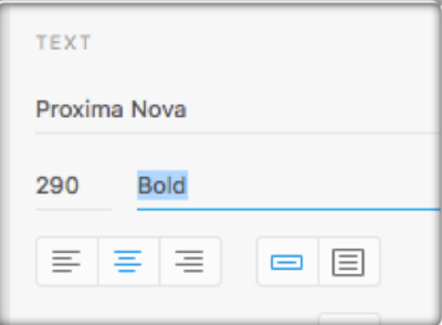
As you can see, I used the Proxima Nova font (you can find it here). Also, if you are new to Typekit, you can find instructions about how to install and use it over here. Of course, you are free to use any font you want; the important thing is to set it in bold for our title.
The sizes for the text are 100 pixels for the little and 325 for the big.
To apply a gradient to the text, we need to convert it to path. Select the text and go to Object → Path → Convert to Path.
Select the “Start to” text, and lower its opacity to 66%.
Select the “Travel” text and apply a linear gradient to it. Unlike before, this gradient has two colors and ends in a transparency:
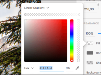

Drag your gradient downward a little, to give the text that disappearing effect.
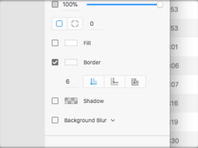
Finally, create a button with the Rectangle tool (R), setting no fill and a white outline:
Put text in the button, and place it under the hero text.
We’ve completed step 1!
2.1. Middle Section
Let’s carry on with our template.
Now we need to create a simple date-selection menu, and we will put it in the final space of the hero section.
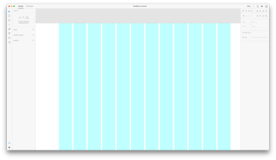
Click on the Rectangle tool (R), and drag and drop to create a rectangle. Turn your grid on, and make the rectangle 10 columns wide. By turning on Layout Grids, we can see the exact position of the elements we’ve created so far. In this case, the rectangle we are creating will cover 10 columns and will be put in the center.
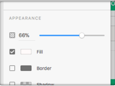
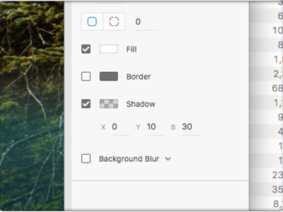
Align the rectangle in the center (horizontally), and give it a light shadow, setting the values as in the image below.
Create some text and a button.

We’re going to expand our layout. In order to have extra space and make our artboard higher, just double-click on the artboard and drag the central handle downwards.
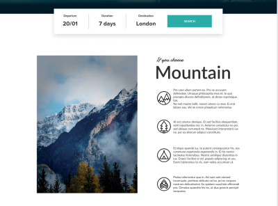
2.2. Mountain Section
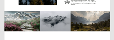
In the new space you just created, put an image on the left (696 wide by 980 pixels high) and some paragraph text on the right. You can find the icons in the download pack (available in vector format). Just open the pack, copy and paste the icons into the XD file, as shown in the image below.
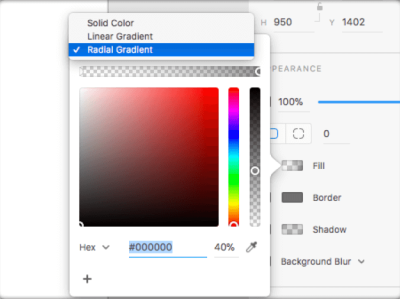
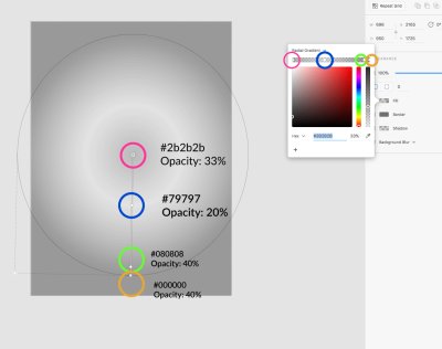
We will now apply a radial gradient to the image on the left.
Grab the Rectangle tool (R), and draw a rectangle the same size as the picture. Put the rectangle on the picture.
Click on Fill in the Appearance section, and choose Radial Gradient under Solid.
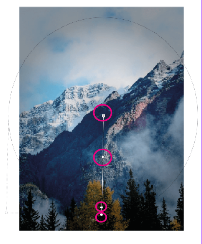
Put the radial gradient the way shown in the image above, and make it bigger than the picture.
If you click on the line of the gradient, new points will be added. From the center to the outer point, these will be the colors and their opacities:
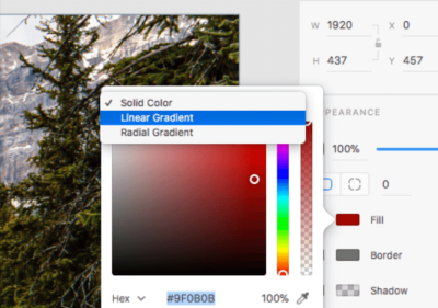
After that, place other two pictures under this section. Then, create another rectangle (R) with a linear gradient.
Create three points in the linear gradient, with the following colors and opacities (from top to bottom):
#010101, 50%#0F0E0E, 0%#1D1C1C, 50%
Now that we’ve gone through all of these steps, create a similar section but for mountains.
For the pictures, create the same radial gradient for the big one and one linear Gradient for the group. Or simplify everything by just copying and pasting the gradients that we prepared before.
Pro Tip: You can copy/paste appearance of one linear gradient rectangle onto another.
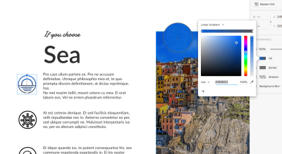
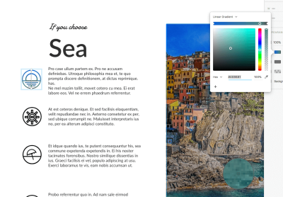
2.3. Sea Section
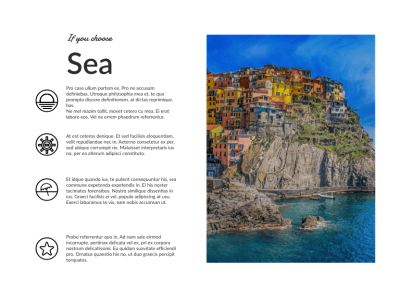
For this section (the sea section), just repeat all points from the mountain section.
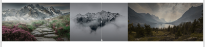
Finally, add a last picture at the bottom of your layout. This time, we will apply a linear gradient again, but in a different way. Create a rectangle (R) over the picture, and apply a linear gradient with colors:
Now we will apply two linear gradients on the same picture, moving them diagonally.
Let’s create the first gradient (see image below):
Copy the gradient and paste it on the image:
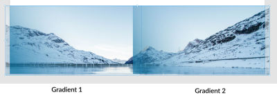
Now set the second gradient we just pasted as shown in the picture below:
This way, we apply two linear gradients to the same picture:
3. Icons
The last tip of this tutorial is about using gradients with icons. It’s possible to apply linear and radial gradients to icons. Here we’ll look at how to apply a radial gradient to an icon.
We’ve inserted icons in the correct way in our layout, because we copied and pasted them directly from Illustrator. That means, they are vectors.
Vectors work very well in XD, and we will see them in action with gradients.
To apply a gradient, you have to select an icon. You will see that the icon contains a group of different pieces. Be sure to select all of them (checking the layers panel will help).
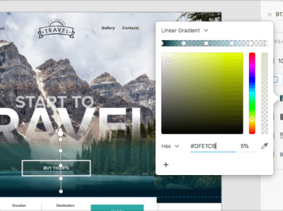
Now that your icon is selected, click on Fill in the Appearance panel, and then choose Linear Gradient.
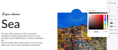
For the initial and final colors of the gradient, I took colors from the picture on the side, using the Eyedropper tool (see images below).

We are done! Here’s a summary of what we covered in this tutorial:
- Use and apply linear gradients;
- Use and apply radial gradients;
- Use and apply linear gradients as diagonal gradients;
- Apply gradients to icons.
Font Used
As design is ever changing, so is the human perception of color. And because color is one of the most powerful design elements, it’s important to always look at how design evolves and trends change. Now, let’s have some fun with gradients in Adobe XD!
This article is part of a UX design series sponsored by Adobe. Adobe XD is made for a fast and fluid UX design process, as it lets you go from idea to prototype faster. Design, prototype and share — all in one app. You can check out more inspiring projects created with Adobe XD on Behance, and also sign up for the Adobe experience design newsletter to stay updated and informed on the latest trends and insights for UX/UI design.
Further Reading
- A Practical Guide To Designing For Children
- How Accessibility Standards Can Empower Better Chart Visual Design
- Universal Principles Of User Experience Design
- Designing Friction For A Better User Experience


