How Big Is That Box? Understanding Sizing In CSS Layout

Email Newsletter
Weekly tips on front-end & UX.
Trusted by 182,000+ folks.
 Custom Web Forms for Angular, React, & Vue. Your backend.


 Celebrating 10 million developers
A key feature of Flexbox and Grid Layout is that they can deal with distributing available space between, around and inside grid and flex items. Quite often this just works, and we get the result we were hoping for without trying very hard. This is because the specifications attempt to default to the most likely use cases. Sometimes, however, you might wonder why something ends up the size that it is. Or, you might want to do something different to the default behavior. To do so, you need to know something of how the underlying algorithms figure out how to distribute space.
In this article, I’m going to share with you some interesting things about sizing boxes in CSS. I’ve picked out a few things from the specifications that I believe are vital in terms of understanding exactly how big that box is. Take some time to read through, and I think you’ll find sizing in Grid a lot less mysterious!
Taking A Closer Look At BFC
If you’ve ever made a layout with CSS, you probably know what BFC is. Understanding why it works and how to create one is useful and can help you to understand how layout works in CSS. Read a related article →
Length Units
We can start with the sizing which is likely to be most familiar. The length units described in the CSS Values and Units module specification. If you see <length> as an allowed value for a CSS property, then it means one of the values listed here. These values are all distances, and will typically consist of an integer, plus the unit identifier - for example 12px or 1em. If the value is 0 the unit identifier may be omitted. Also, length units are split into relative and absolute lengths.
Relative Lengths
A relative length takes sizing relative to some other thing, and therefore the final size of something defined using a relative length may be different if the thing it is relative to changes.
The complete set of relative units is as follows. The first four units are font relative, while the last four are viewport relative.
emexchremvwvhvminvmax
As these values are relative to something, it is important to identify exactly what they are relative to. For the font relative unit rem then this is always relative to the size of the root element which is an HTML document is the html element.
In the first example below, I have set the html element to have a font-size of 20 pixels. 1rem is therefore 20 pixels. If I then give an element a width of 10rem, it will become 200 pixels wide (as 20px multiplied by 10 is 200).
When the other font relative units (em, ex, and ch) are used for the length of an element, they are relative to the font size as applied to that element. In the second example (the width of the box is 10em), the em unit looks at the font applied to the element which it is sizing and calculates based on that. So, this box becomes 300 pixels wide as the font-size of the box is 30px.
See the Pen Sizing with rems and ems by Rachel Andrew (@rachelandrew) on CodePen.
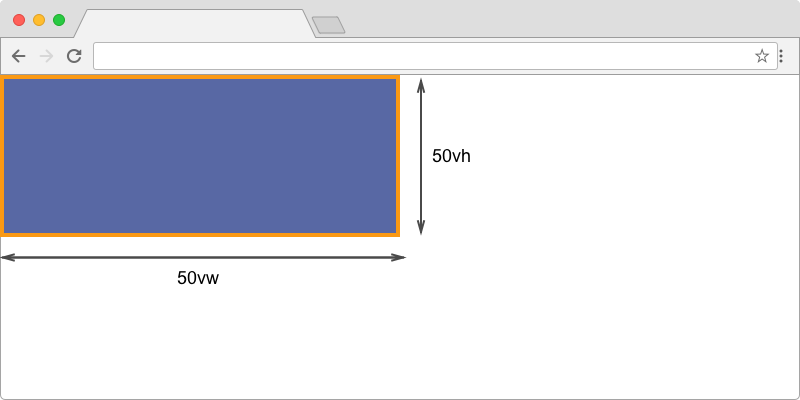
Where font relative units are calculated from font size, the viewport relative units are calculated in relation to a rectangle known as the initial containing block. On a screen, this has the dimensions of the viewport. The vw unit is 1/100 of the width of the viewport and vh 1/100 of the height. A box which has a width of 50vw and a height of 50vh should be half the width and half the height of the viewport.
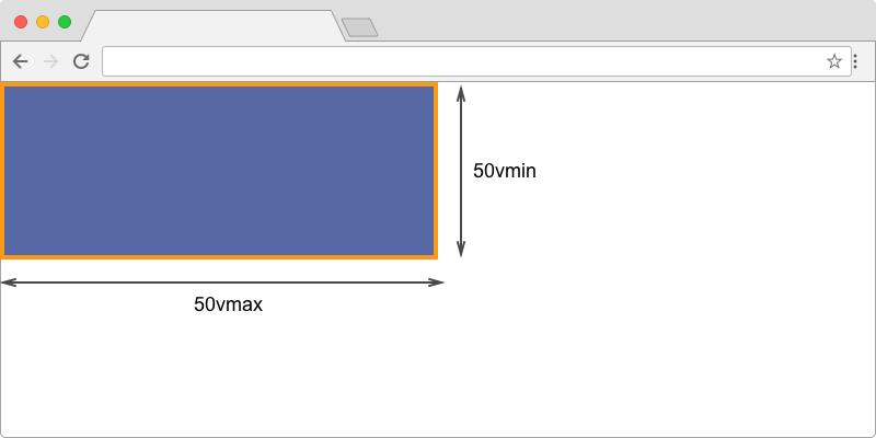
vh and vw units, represent 1/100 of the viewport height and width.The vmin and vmax units are useful because they allow you to size something relative to the larger or smaller dimension of the viewport. This means that you can make something 50% of the longest side of the viewport for example. This is especially helpful when someone might hold a device in landscape or portrait mode. The vmin unit always resolves to the small or vw or vh and vmax to the larger of vw or vh. Therefore, if you want a width to always be 20% of the longest side of the device, you can use 20vmax. If the device is held in portrait mode then 20vmax would be the same as 20vh. If the device is held in landscape mode, it would be the same as 20vw.
The example below compares a block sized with vw and vh with one sized using vmin and vmax. On a desktop computer, or a phone in landscape mode, both boxes should appear the same size. Switch a phone to portrait mode or drag your window so that the width becomes smaller than the height, and you will see how the second block changes the dimension from which it takes the calculation.
See the Pen vw and vh, vmin and vmax by Rachel Andrew (@rachelandrew) on CodePen.
vmax and vmin units: In landscape format, vmax uses the width while vmin uses the height.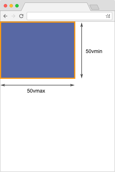
vmax and vmin units: In portrait format, vmax uses the height while vmin uses the width.Absolute Units
The absolute units map to physical dimensions and do not scale relative to other things on the screen. Therefore, they are most useful when the output environment is known.
The list below shows the allowed absolute units in CSS:
cmmmQinpcptpx
As you can see, many of these make little sense in a screen context, however, if you are creating CSS for print then using pt or in might make a lot of sense when you know your paper size.
The pixel is classed as an absolute length unit, and as anyone who has created images for retina devices will know, a pixel in terms of length is not the same as a device pixel. CSS uses the concept of the reference pixel, and the spec recommends that the pixel unit refers to the whole number of device pixels that best approximates the reference pixel.
"The reference pixel is the visual angle of one pixel on a device with a pixel density of 96dpi and a distance from the reader of an arm’s length. For a nominal arm’s length of 28 inches, the visual angle is therefore about 0.0213 degrees. For reading at arm’s length, 1px thus corresponds to about 0.26 mm (1/96 inch)." — "CSS Values and Units Module Level 3", W3C
Percentages
In most cases, you can use a percentage rather than a length unit for size. This percentage will then need to be calculated in relation to something, in the same way that a relative length unit is resolved, and the specification for the layout method you are using will indicate what the percentage should be a percentage of.
In a specification, where you see <length-percentage> as an allowable value for a length, this means that the percentage will be resolved to a length before being used. In the below example, the outer element has a width of 400 pixels, and the first child element a width of 50%. This then resolves to 200 pixels - 50% of 400.
The second child element has a width which uses calc, to add 50 pixels to 50%, making that block 250 pixels wide. The 50% is therefore resolved to a length and then used in the calculation.
See the Pen length-percentage by Rachel Andrew (@rachelandrew) on CodePen.
Those of us who have worked on the web through the era of responsive design have become accustomed to using percentages in order to create layouts which look as though they are laid out on a grid. Working in percentages gives us some degree of control, control that we need to start to give up in order to fully utilize the power of Grid and Flexbox!
CSS Intrinsic And Extrinsic Sizing
So far, we’ve looked at how we can give boxes a size, set their width and height in a variety of ways, as well as how to use length units and percentages. However, boxes on your webpage have a size — even if you haven’t given them one. It’s important to understand how elements are laid out on the page and that size becomes increasingly important when using flexbox and Grid layout. A lot of the inbuilt flexibility in Grid and flexbox comes because they manage situations where there is more space than needed to display items, or items need to fit into less space than they would take up if space was infinite.
The module that defines what size things are, and gives you additional ways to control that size, is the CSS Intrinsic and Extrinsic Sizing Module. In this next section, we will take a look at what this module defines, and why it is vital to your understanding of layout in flexbox and grid.
Sizing Keywords
The abstract for the module says:
"This module extends the CSS sizing properties with keywords that represent content-based "intrinsic" sizes and context-based "extrinsic" sizes, allowing CSS to more easily describe boxes that fit their content or fit into a particular layout context."
The keywords can be used for any of the properties that normally take a length. For example width, height, min-width and so on, in addition to being specified for use in Grid Layout track sizing, and flexbox flex-basis. The keyword values as defined in the current Editor’s Draft of the Level 3 Core Specification are:
max-contentmin-contentfit-content(<length-percentage>)
Let’s have a look at how some of these keywords behave if we use them for the width of a div. A div is a block level element, and so, if you don’t give it a width, it will stretch out to be as wide in the inline dimension as it can. Either until it reaches the edge of the viewport or the containing block.
If a string of text is longer than the space allowed, it will wrap inside the div, and the box will become taller to accommodate it. To give the div a width other than the space allowed by the containing block, you could use any of the length units discussed previously. The text would then start to wrap as soon as it hits that length.
Instead of constraining the box using a length or by way of it hitting the edges of the containing block, you might want to allow the content to dictate the size. This is where these new content-based sizing keywords come in.
min-content
Use width: min-content on the div, and the div now becomes only as large as it needs to be with the content becoming as small in the inline direction as possible. With a string of text this means that the text takes all of the soft-wrapping opportunities it can.
See the Pen min-content by Rachel Andrew (@rachelandrew) on CodePen.
This is the min-content size of this element. The smallest it can get without any content overflowing in some way.
max-content
The opposite behavior happens if we use width: max-content. Now the box becomes larger enough to contain the content if it gets as larger in the inline dimension as possible. Our string of text now stretches out and does no wrapping at all. This will cause overflows should it become wider than the available width this div has to grow into.
See the Pen max-content by Rachel Andrew (@rachelandrew) on CodePen.
These content keywords are shipping into browsers, you can use them in Chrome and also prefixed in Firefox as a value for width and height. You can use them for track sizing in Grid Layout as we will explore below, as yet they are unimplemented for flex-basis in flexbox. However, the real reason to look at these now is to understand that min-content and max-content exist, as things having a minimum and a maximum content size is important once we start to look at how space is distributed in Flexbox and Grid.
Content-Based Sizing In CSS Grid Layout
CSS Grid Layout has a solid implementation of the content keywords that we have just explored, used to size grid tracks. This means that you can cause the content to dictate track sizing on the grid. The important thing to remember with grid is that it is a two-dimensional layout model. If you are asking a column track to become min-content sized then the track will size based on the widest thing in the track.
min-content
In the next example, I have a three-column track grid. The columns are sized using the min-content keyword. One of the cells contains more content, and you can see how the content wraps where it is able to. The size needed to display this content at min-content size becomes the size of the entire track.
See the Pen min-content in Grid Layout by Rachel Andrew (@rachelandrew) on CodePen.
max-content
If we look at the same example as for min-content but change the columns to each use max-content, you can see how the track which contains an item with a lot of text has grown to accommodate the text. This has caused the tracks to be wider than the size of the element we have defined our grid on, so it has overflowed.
See the Pen max-content in Grid Layout by Rachel Andrew (@rachelandrew) on CodePen.
fit-content
A keyword that we haven’t looked at yet and which has been implemented in Grid Layout is fit-content. This keyword takes a length or percentage as a value. When you use fit-content for track sizing, the track will act like max-content until it gets to the size of the value you passed in. Once it hits that size, the track will stop growing, and the content will wrap.
All three column tracks in the example below are sized using fit-content(10em). If the track would be narrower than 10em, it acts like max-content. The center track which would run longer stops growing once it reaches 10em.
See the Pen fit-content in Grid Layout by Rachel Andrew (@rachelandrew) on CodePen.
Note: I’ve created a short video tutorial to demonstrate these content sizing keywords.
Auto-Sized Tracks
Before digging deeper down the rabbit hole of track sizing, it’s also important to understand what auto means when used for track sizing. Implicit grid tracks are created with auto sizing, and you will typically understand this when you start to use Grid. You specify column tracks, but then place content into rows without an explicit definition. The row tracks grow to contain the content because auto looks at the content size and creates a track tall enough to contain it.
However, auto has a specific meaning in specifications. In the case of Grid and flexbox, if you use auto for a track size or as the value of flex-basis, it will look to see if there is any size on the item (or on any item in that track for Grid) and use that size as the base track size or as the value of flex-basis. You can see this happening in the below CodePen. The first example is a Grid Layout, the second a Flex layout. The Grid Layout has three column tracks all auto sized, each item in the Flex layout can grow and shrink from a flex-basis of auto.
In both layouts, the final item has a width of 200px. You can see how that width is being used when working out track sizing. It becomes flex-basis as the last item, and the base size for the grid tracks. For the other Grid tracks and flex items, there is no width, and so the algorithm uses the content size.
See the Pen Grid tracks and flex-basis of auto by Rachel Andrew (@rachelandrew) on CodePen.
We will return to the way that auto behaves, and how it can be useful in combination with other track sizing methods after moving onto yet another way to size grid tracks.
fr Units
All of the length units discussed at the beginning of this article can also be used for track sizing in grid layouts. We also have an additional unit in the fr unit. This only applies to grid layout and therefore is detailed in the grid specification rather than in any of the modules relating to sizing. The fr unit is a flexible length or `
The fr unit is not a length and it cannot be used with calc() in the same way that a percentage or length unit can.
You will often see a demo like the one below, where we have created three equal sized tracks using the fr unit. The space in the grid container has been split into three and assigned to each track equally.
See the Pen The fr unit by Rachel Andrew (@rachelandrew) on CodePen.
The fr unit here is acting much like Flexbox behaves if your flex-basis is 0. Grid is taking all of the space in the grid container and handing one part to each track. However, Grid will not cause a track to overflow when doing this. This behavior can be confusing if you are under the impression that three tracks of 1fr will always be three equal sized tracks.
If we add a very long word into our middle track, which cannot soft wrap, for example Supercalifragilisticexpialidocious, then we do not get three equal width columns.
See the Pen The fr unit 2 by Rachel Andrew (@rachelandrew) on CodePen.
Grid is only sharing out the available space after ensuring that the tracks are big enough to contain the items. Grid looks at the size the track would be if we used min-content. If that size is less than the size that will be handed to the track via the fr unit, then the content is not taken into consideration. If that min-content size is more than the track would be given by the fr unit, then the min-content size is used for that track before the remaining space is shared out.
Therefore, the fr unit acts like flexbox does with a flex-basis of 0 unless the min-content size of that track is larger, then it acts more like flexbox using a flex-basis of auto. Just as in our example of auto in the previous section. It is worth remembering this if your equal width tracks aren’t looking very equal. The likely reason is that there is something in one of the tracks which has a min-content size larger than would be handed to it.
Making Equal Tracks With minmax
We now know why the fr unit might create tracks larger than we wanted. However, we can control the way this behaves by bringing in another grid specific method of sizing — the minmax() function. In the example above (the long word in one track forcing a larger min-content size), Grid is acting as if we were using the following track sizing definition.
.grid {
  display: grid;
  grid-template-columns: minmax(auto,1fr) minmax(auto,1fr) minmax(auto,1fr);
}
Grid is looking at the auto size which is resolving to the content size, and using that as the base size for the track before sharing out any leftover space.
If you would like Grid, in the example above, to forcibly make the middle track an equal share of the width in the grid container even if this would cause any overflow, you can do so by making 0 the first value in minmax(). As you can see in the next example, this will cause an overflow.
See the Pen The fr unit and minmax by Rachel Andrew (@rachelandrew) on CodePen.
You can see why the specification defaults to the behavior that it does. In general, we don’t want overflows happening if there is space for the content to display, however, you have the ability to force the matter and cause the overflow if you need to.
The minmax() function is also very useful when sizing rows to prevent a row from collapsing down to zero height when empty, but still allowing it to grow to a size that will allow for any content that is added. In the next example, I have grid-auto-rows set to minmax(50px, auto). Tracks in the implicit grid will always be 50 pixels tall, however you can see that the second row is taller because of the amount of content in one cell of that row.
See the Pen minmax with a max of auto by Rachel Andrew (@rachelandrew) on CodePen.
Percentages In Grid Layout
While we have the fr unit, content-based sizing and our usual length units in Grid Layout, you might also still wish to use percentages for some sizing requirements. In most cases, the fr unit will be a better choice, however, sometimes you may want to take control of the exact percentage size yourself. One reason to do so is if you are lining up elements laid out using Grid in a design that also uses other layout methods which rely on percentage sizing.
The majority of the time, percentage sizing will work as you expect. A grid track sized using a percentage will calculate the percentage from the grid container width. You can also use percentages for the gap properties, and these will also calculate based on the grid container width. The example below has three column tracks each of 30%, plus grid-gaps of 5% between the tracks.
See the Pen Percentage tracks and gaps by Rachel Andrew (@rachelandrew) on CodePen.
The place where care needs to be taken is when using percentages for vertical margins and padding. In both Flexbox and Grid, a longstanding issue means that the way vertical percentage margins and padding are calculated will differ between browsers.
You can read more about this issue in my post "How should we resolve percentage margins and padding on grid and flex items", however, my advice and that of the specification is to avoid using percentages for margin and padding top and bottom for the time being, as results will be inconsistent.
Alignment And Sizing In Grid Layout
Use of the box alignment properties in Grid Layout can also change the size of areas in your grid. Consider the following layout with four 100 pixel column tracks, three 50 pixel row tracks, and 20 pixel gaps. The grid tracks do not take up the full area of the grid container and so align themselves to start on both axis. Items which span more than one track become a size that is the total of all the tracks and gaps that they span.
See the Pen Grid tracks align and justify to start by Rachel Andrew (@rachelandrew) on CodePen.
If I now use the Box Alignment properties align-content and justify-content with values of space-between, the tracks spread out as the gaps increase to absorb the extra space. Now, any item which spans more than one track has become larger as it contains the space from the now enlarged gap.
See the Pen Grid tracks align-content and justify-content space-between by Rachel Andrew (@rachelandrew) on CodePen.
Space Distribution In Flexbox And Grid Compared
The reason I think that understanding concepts such as min-content and max-content is so important when dealing with layout, is that they enable you to start to dig into the finer details of layout. I’m going to wrap up this article with a good example of that, something we discover by comparing what happens in flexbox and Grid when we need to fit items into a container.
The example shows a flex container with four flex items; below it is a grid container with four grid items. This content is identical, but the layout slightly different, despite these being roughly comparable layouts. The flex items have a flex-basis of auto and are allowed to shrink. The grid definition defines four tracks all with a size of auto.
See the Pen Space distribution in flexbox and grid by Rachel Andrew (@rachelandrew) on CodePen.
In the flexbox example, the shorter items have collapsed down to their min-content size, and the larger item has been given more space.
In the Grid example, the smaller items display at their max-content size, so the longer item has less room to display. When I first saw this behavior, I was puzzled. The reason for the difference comes down to the algorithms that work out the size of items in the layout methods. In Flexbox, the item starts at max-content size; since flex-shrink is a positive value, space starts to be taken away from each item. Once the smaller items get to min-content size, flexbox stops taking away space to prevent them from vanishing or overflowing.
Grid, however, starts with the items at min-content size and then adds space. Our items quickly get to max-content size at which point grid stops assigning them space as we have a larger item which can fill the remaining space. Now that you know about min-content and max-content, you will be able to spot when tracks or items display in this way which will give you a starting point to dig in and figure out what is going on.
Size Matters!
While working out percentage sizes in order to line things up was never fun, it was at least something we all understood. It gave us a lot of control, even though it meant we had to do all of the work. It can be frustrating when beginning to use Flexbox and Grid, just to find that sometimes we don’t get the layout we’ve expected. It can be tempting to run right back to doing the work for ourselves and using percentages for our flex-basis or track sizing.
However, spending some time playing with sizing, until you become comfortable with what happens in various situations, will repay you in the end. You will find you need fewer Media Queries and can rely on the inherent flexibleness of the layout methods.
To help you start with your own explorations, I’ve tried to keep the examples in this article as simple as possible so that you can fork and experiment with them. Most of the things I have shared in this article are a result of me wondering what will happen if I try something different, i.e., trying it and working out why it works as it does! So, if you are left with more questions than answers post a comment with a link to a demo, and I’ll try to point to the part of the spec that explains.
Further Reading
- CSS Blurry Shimmer Effect
- How To Draw Radar Charts In Web
- Solving Media Object Float Issues With CSS Block Formatting Contexts
- Useful DevTools Tips and Tricks
 (il, mrn)

