A Comprehensive Guide To Mobile App Design

Email Newsletter
Weekly tips on front-end & UX.
Trusted by 182,000+ folks.
 Celebrating 10 million developers
 Custom Web Forms for Angular, React, & Vue. Your backend.


(This is a sponsored article.) More than ever, people are engaging with their phones in crucial moments. The average US user spends 5 hours per day on mobile. The vast majority of that time is spent in apps and on websites.
The difference between a good app and a bad app is usually the quality of its user experience (UX). A good UX is what separates successful apps from unsuccessful ones. Today, mobile users expect a lot from an app: fast loading time, ease of use and delight during interaction. If you want your app to be successful, you have to consider UX to be not just a minor aspect of design, but an essential component of product strategy.
There are many things to consider when designing for mobile. In this article, I’ve summarized a lot of practical recommendations that you can apply to your design.
Minimize Cognitive Load
Cognitive load refers here to the amount of brain power required to use the app. The human brain has a limited amount of processing power, and when an app provides too much information at once, it might overwhelm the user and make them abandon the task.
Decluttering
Cutting out the clutter is one of the major recommendations in “10 Do’s and Don’ts of Mobile UX Design.” Clutter is one of the worst enemies of good design. By cluttering your interface, you overload users with too much information: Every added button, image and icon makes the screen more complicated.
Clutter is terrible on desktop, but it’s far worse on mobile (simply because we don’t have as much real estate on mobile devices as we do on desktops and laptops). It’s essential to get rid of anything in a mobile design that isn’t absolutely necessary because reducing clutter will improve comprehension. The technique of functional minimalism can help you deal with the problem of a cluttered UI:
- Keep content to a minimum (present the user with only what they need to know).
- Keep interface elements to a minimum. A simple design will keep the user at ease with the product.
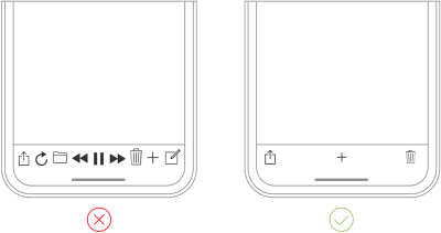
- Use the technique of progressive disclosure to show more options.
Offload Tasks
Look for anything in the design that requires user effort (this might be entering data, making a decision, etc.), and look for alternatives. For example, in some cases you can reuse previously entered data instead of asking the user to type more, or use already available information to set a smart default.
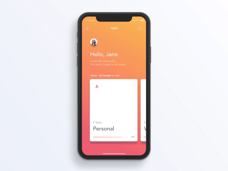
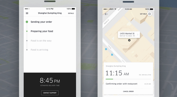
Break Tasks Into Bite-Sized Chunks
If a task contains a lot of steps and actions required from the user’s side, it’s better to divide such tasks into a number of subtasks. This principle is extremely important in mobile design because you don’t want to create too much complexity for the user at one time. One good example is a step-by-step checkout flow in an e-commerce app, where the designer breaks down a complex checkout task into bite-sized chunks, each requiring user action.
Chunking can also help to connect two different activities (such as browsing and purchasing). When a flow is presented as a number of steps logically connected to each other, the user can more easily proceed through it.
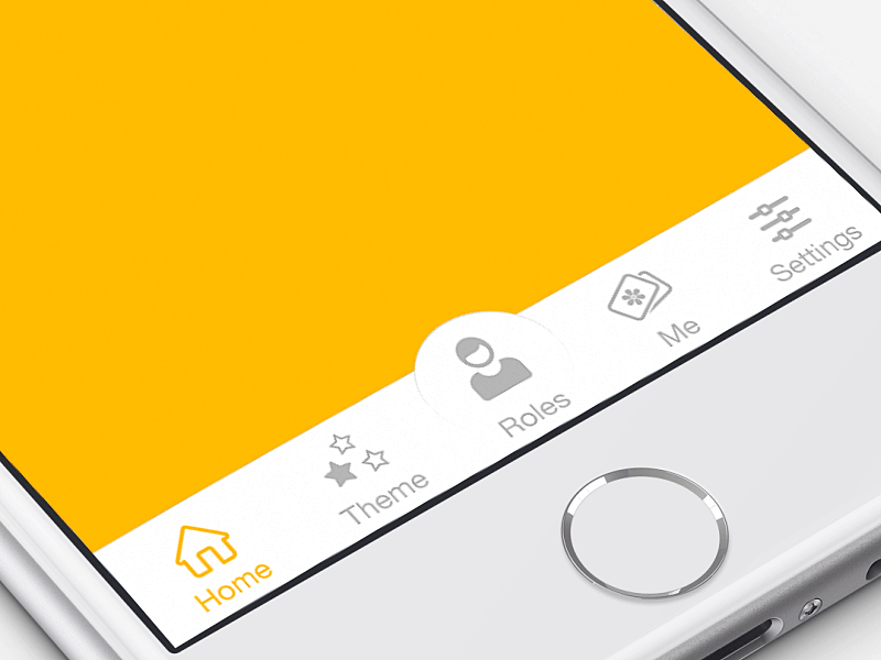
Use Familiar Screens
Familiar screens are screens that users see in many apps. Screens such as “Gettings started,” “What’s new” and “Search results” have become de facto standards for mobile apps. They don’t require additional explanation because users are already familiar with them. This allows users to use prior experience to interact with the app, with no learning curve.
Consider reading “Basic type of screens for mobile UI design.” for more information on familiar screens.
Minimize User Input
Typing on a small mobile screen isn’t the most comfortable experience. In fact, it’s often error-prone. And the most common case of user input is filling out a form. Here are a few practical recommendations to make this process easy:
- Keep forms as short as possible by removing any unnecessary fields. The app should ask for only the bare minimum of information from the user.
- Provide input masks. Field masking is a technique that helps users format inputted text. A mask appears once a user focuses on a field, and it formats the text automatically as the field is being filled out, helping users to focus on the required data and to more easily notice errors.
- Use smart features such as autocomplete. For example, filling out an address field is often the most problematic part of any registration form. Using tools like Place Autocomplete Address Form (which uses both geo-location and address prefilling to provide accurate suggestions based on the user’s exact location) enables users to enter their address with fewer keystrokes than they would have to with a regular input field.
- Dynamically validate field values. It’s frustrating when, after submitting data, you have to go back and correct mistakes. Whenever possible, check field values immediately after entry so that users can correct them right away.
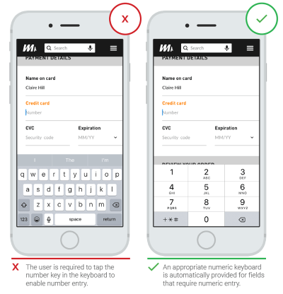
- Customize the keyboard for the type of query. Display a numeric keyboard when asking for phone number, and include the @ button when asking for an email address. Ensure that this feature is implemented consistently throughout the app, rather than only for certain forms.
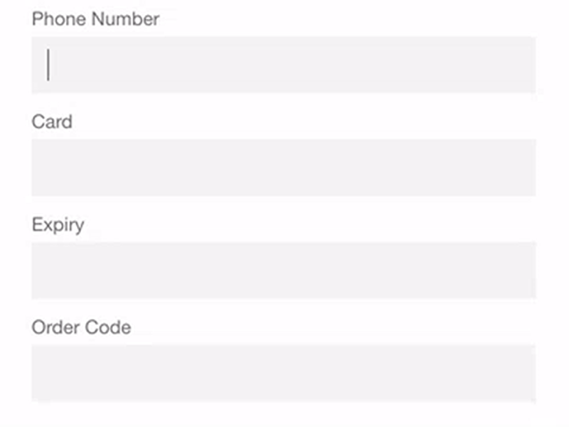
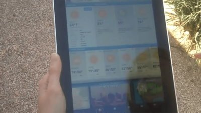
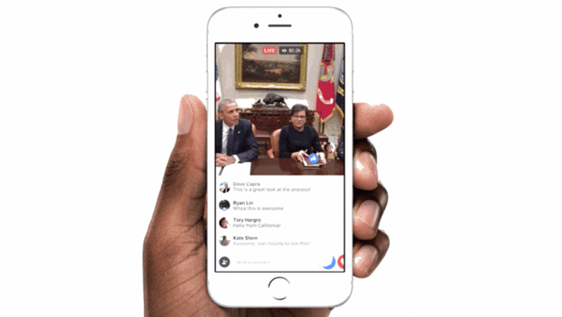
Anticipate Users Needs
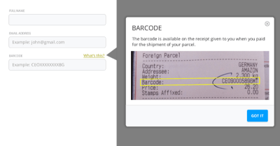
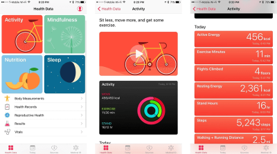
Proactively look for steps in the user journey where users might need help. For example, the screenshot below shows a part where users need to provide specific information.
Use Visual Weight To Convey Importance
The most important element on the screen should have the most visual weight. Adding more weight to an element is possible with font weight, size and color.
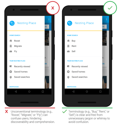
Avoid Jargon
Clear communication should always be a top priority in any mobile app. Use what you know about your target audience to determine whether certain words or phrases are appropriate.
Make The Design Consistent
Consistency is a fundamental principle of design. Consistency eliminates confusion. Maintaining an overall consistent appearance throughout an app is essential. Regarding mobile app, consistency means the following:
- Visual consistency
Typefaces, buttons and labels need to be consistent across the app. - Functional consistency
Interactive elements should work similarly in all parts of your app. - External consistency
Design should be consistent across multiple products. This way, the user can apply prior knowledge when using another product.
Here are a few practical recommendations on how to make a design consistent:
- Respect platform guidelines.
Each mobile OS has standard guidelines for interface design: Apple’s Human Interface Guidelines and Google’s Material Design Guidelines. When designing for native platforms, follow the OS’ design guidelines for maximum quality. The reason why following design guidelines is important is simple: Users become familiar with the interaction patterns of each OS, and anything that contradicts the guidelines will create friction. - Don’t mimic UI elements from other platforms.
As you build your app for Android or iOS, don’t carry over UI elements from other platforms. Icons, functional elements (input fields, checkboxes, switches) and typefaces should have a native feel. Use native components as much as possible, so that people trust your app. - Keep the mobile app consistent with the website.
This is an example of external consistency. If you have a web service and a mobile app, make sure that both of them share similar characteristics. This will allow users to make frictionless transitions between the mobile app and the mobile web. Inconsistency in design (for example, a different navigation scheme or different color scheme) might cause confusion.
Put The User In Control
Keep Interactive Elements Familiar And Predictable
Predictability is a fundamental principle of UX design. When things work in the way users predict, they feel a stronger sense of control. Unlike on desktop, where users can use hover effects to understand whether something is interactive or not, on mobile, users can check interactivity only by tapping on an element. That’s why, with buttons and other interactive elements, it’s essential to think about how the design communicates affordance. How do users understand an element as a button? Form should follow function: The way an object looks tells users how to use it. Visual elements that look like buttons but aren’t clickable will easily confuse users.
The “Back” Button Should Work Properly
An improperly created “back” button can cause a lot of problems for users. Prevent situations when tapping the “back” button in a multi-step process would take users all the way back to the home screen.
A good design makes it easier for users to go back and make corrections. When users know that they can take a second look at data they’ve provided or options they’ve selected, this allows them to proceed with ease.
Meaningful Error Messages
To err is human. Errors occur when people engage with apps. Sometimes, they happen because the user makes a mistake. Sometimes, they happen because the app fails. Whatever the cause, these errors and how they are handled have a huge impact on the UX. Bad error handling paired with useless error messages can fill users with frustration and could be the reason why users abandon your app.
Take an error-state screen from Spotify as an example. It doesn’t help users understand the context and doesn’t help them find the answer to the question, “What can I do about it?”
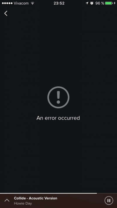
Don’t assume users are tech-savvy enough to figure things out. Always tell people what’s wrong in plain language. Each error message should tell users:
- what went wrong and possibly why,
- what’s the next step the user should take to fix the error.
Consider reading “How to Design Error States for Mobile Apps” for more information on error handling.
Design An Accessible Interface
Accessible design allows users of all abilities to use products successfully. Consider how users with vision loss, hearing loss and other disabilities can interact with your app.
Be Aware Of Color-Blindness
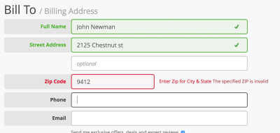
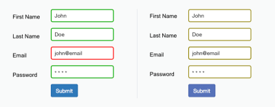
4.5% of the global population experience color-blindness (that’s 1 in 12 men and 1 in 200 women), 4% suffer from low vision (1 in 30 people), and 0.6% are blind (1 in 188 people). It’s easy to forget that we’re designing for this group of users because most designers don’t experience such problems.
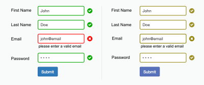
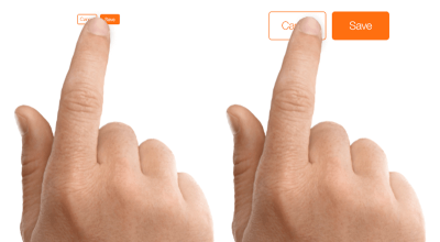
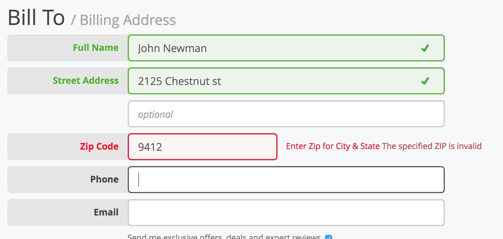
Let me give you a simple example. Success and error messages in mobile forms are often colored green and red, respectively. But red and green are the colors most affected by color-vision deficiency (these colors can be difficult to distinguish for people with deuteranopia or protanopia). Most probably you’ve seen the following error message when filling out a form: “The fields marked in red are required”? While it might not seem like a big thing, this error message combined with the form in the example below can be an extremely frustrating experience for people who have color-vision deficiency.
As the W3C’s guidelines state, color shouldn’t be used as the only visual means of conveying information, indicating an action, prompting a response or distinguishing a visual element. It’s important to use other visual signifiers to ensure that users will be able to interact with an interface.
Make Animations Optional
Users who suffer from motion sickness often turn off the animated effects in their OS settings. When the option to reduce motion is enabled in accessibility preferences, your app should minimize or eliminate its own animations.
Make The Navigation Simple
Helping users navigate should be a high priority for every app. All the cool features and compelling content that your app has won’t matter if people can’t find them; also, if it takes too much time or effort to discover how to navigate your product, chances are you’re just going to lose users. Users should be able to explore the app intuitively and to complete all primary tasks without any explanation.
Use Standard Navigation Components
It’s better to use standard navigation patterns, such as the tab bar (for iOS) and the navigation drawer (for Android). The majority of users are familiar with both navigation patterns and will intuitively know how to get around your app.
For more information on navigation patterns, read the article “Basic Patterns for Mobile Navigation: Pros and Cons.”
Prioritize Navigation Options
Prioritize navigation based on the way users interact with your app. Assign different priority levels (high, medium, low) to common user tasks. Give prominence in the UI to paths and destinations with high priority levels and frequent use. Use those paths to define your navigation. Organize your information structure in a way that requires a minimum number of taps, swipes and screens.
Don’t Mix Navigation Patterns
When you choose a primary navigation pattern for your app, use it consistently. There shouldn’t be a situation in which part of your app has a tab bar, while another part has a side drawer.
Make Navigation Visible
As Jakob Nielsen says, recognizing something is easier than remembering it. Minimize the user’s memory load by making actions and options visible. Navigation should be available at all times, not just when we anticipate that the user needs it.
Communicate Current Location
Failing to indicate the current location is a very common problem of many mobile app menus. “Where am I?” is one of the fundamental questions users need to answer in order to successfully navigate. People should know where they are in your app at any moment.
Use Functional Animation To Clarify Navigational Transitions
Animation is the best tool to describe state transitions. It helps users comprehend a state change in the page’s layout, what has triggered the change and how to initiate the change again when needed.
Be Careful With Using Gestures In The UI
Using gestures in interaction design can be tempting. But in most cases, it’s better to avoid this temptation. When gestures are used as a primary navigation option, they can cause a terrible UX. Why? Because gestures are hidden controls.
As Thomas Joos points out in his article “Beyond the Button: Embracing the Gesture-Driven Interface,” the biggest downside of using gestures in a user interface is the learning curve. Every time a visible control is replaced with a gesture, the app’s learning curve goes up. This happens because gestures have lower discoverability — they are always hidden, and people need to be able to identify these options in order to use them. That’s why it’s essential to use only widely accepted gestures (the ones that users expect in your app).
When it comes to using gestures in a UI, follow a few simple rules:
- Use standard gestures.
By “standard,” I mean gestures that are most natural for the app in your category. People are familiar with the standard gestures, so no extra effort is required to discover or remember them. - Offer gestures as a supplement to, not a replacement for, visible navigation options.
Gestures might work as shortcuts for navigation, but not as a complete replacement for visible menus. Thus, always offer a simple, visible way to navigate, even if it means a few extra actions.
For more information on using gestures in your UI, consider reading “In-App Gestures and Mobile App User Experience.”
Focus On The First-Time Experience
The first-time experience is a make or break part of mobile apps. You only get one shot at a first impression. And if you fail, there’s a huge probability that users won’t launch your app again. (Research by Localytics shows that 25% of users never return to an app after the first use.)
Avoid Sign-In Walls
A sign-in wall is mandatory registration before using an app. It is a common source of friction for users and one of the reasons why users abandon apps. The number of users who abandon the process of registration is especially significant for apps with low brand recognition or those in which the value proposition is unclear.
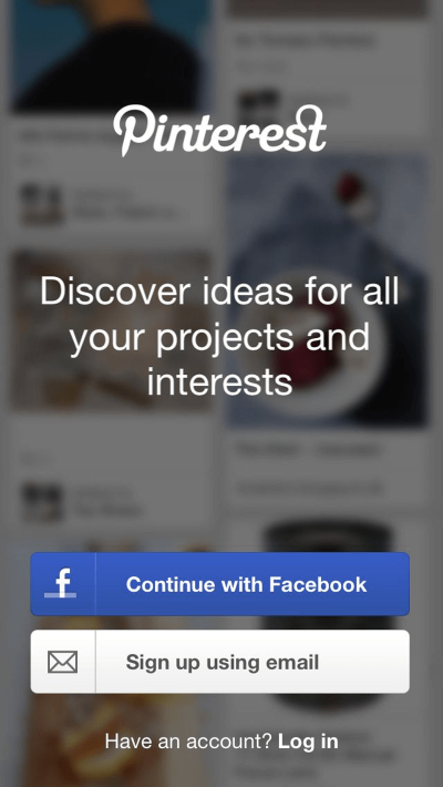
As a rule of thumb, only ask users to register if it’s essential (for example, if core features of your app are available only when users complete registration). And even in this case, it’s better to delay sign-in as long as possible — allow users to experience the app for a little while (for example, take a tour), and only then gently remind them to sign up. This will give your users a taste of the experience, and they will be more likely to commit to it.
Design A Good Onboarding Experience
In the context of the mobile UX, delivering an excellent onboarding experience is the foundation for retaining users. The goal of onboarding is to show the value your app provides.
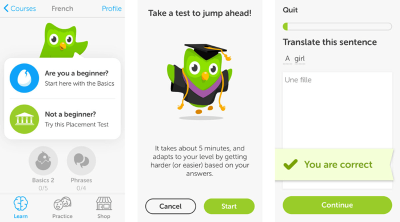
Among the many strategies for onboarding, one is especially effective: contextual onboarding. Contextual onboarding means that instructions are provided only when the user needs them. Duolingo is an excellent example. This app pairs an interactive tour with progressive disclosure to show users how the app works. Users are encouraged to jump in and do a quick test in their selected language. This makes learning fun and discoverable.
Another thing that can be very helpful during onboarding is an empty state. An empty state is a screen whose default state is empty and requires users to go through one or more steps to populate it with data. Besides informing the user of what content to expect on the page, an empty state can also teach people how to use an app. Even if the onboarding process consists of just one step, the guidance will reassure users that they are doing the right thing.
Consider reading “The Role of Empty States in User Onboarding” for more information on onboarding.
Don’t Ask For Set-Up Information Up Front
A mandatory set-up phase creates friction and can lead to abandonment of the app. When users launch an app, they expect it to just work. Thus, design your app for the majority of users, and let the few who want a different configuration adjust their settings to meet their needs any time they want.
Tip: Try to infer what you need from the system. If you need information about the user, device or environment, query the system for that whenever possible, instead of asking the user.
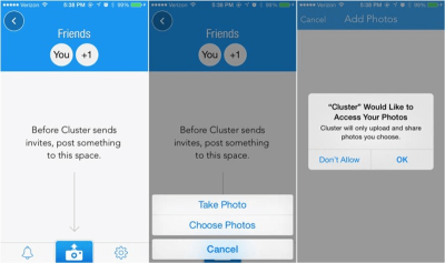
Avoid Asking For Permissions Right At The Start
Avoid a situation in which the first thing a user sees when launching the app is a dialog requesting permission. Similar to a sign-in wall or up-front set-up phase, requesting permission at launch should be done only when it’s necessary for your app’s core function. Users won’t be bothered by this request if it’s evident that your app depends on that permission in order to operate (for example, it’s clear why a photo editor would request access to photos).
But for any other cases, ask for permissions in context. Users are more likely to grant permission if asked during a relevant task.
Tips:
- Ask only for what your app clearly needs.
Don’t ask for all possible permissions. It would be suspicious if an app requests something that it has no obvious need for. For example, an alarm clock app asking for permission to access your list of contacts would be suspect. - Explain why your app needs the information, if it’s not obvious.
Sometimes you need to provide more context for your request. For this reason, you can design a custom alert to request permission.
Make Your App Appear Fast And Responsive
Loading time is extremely important for the UX. As technology progresses, we get more impatient, and today, 47% of users expect a page to load in 2 seconds or less.
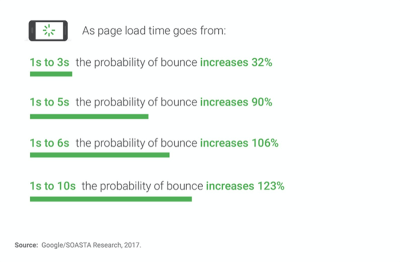
If a page takes more time to load, visitors might become frustrated and leave. That’s why speed should be a priority when building a mobile app. But no matter how fast you make an app, some things will take time to process. A slow response could be caused by a bad Internet connection, or an operation could be taking a long time. But even if you can’t shorten the line, at least try to make the wait more pleasant.
Concentrate On Loading Content In The Visible Area Of The Screen
Load just enough content to fill the screen when a page opens. Content available on scroll should continue to load in the background. The benefit of this approach is that users will be engaged in reading the initial content and, in some cases, won’t even notice that content is still loading.
Make It Clear When Loading Is Occuring
A blank or static screen that users see when content is loading can make it seem like your app is frozen, resulting in confusion and frustration, and potentially causing people to leave your app. At a minimum, show a loading spinner that makes it clear that something is happening. For a longer wait time (more than 10 seconds), it’s essential to display a progress bar so that the user can gauge how long they’ll be waiting.
Consider reading “Best Practices for Animated Progress Indicators” for more information on loading indicators.
Offer A Visual Distraction
If an app gives users something interesting to look at while waiting, users will pay less attention to the wait itself. Thus, to ensure people don’t get bored while waiting for something to happen, offer them a distraction. A fine animated waiting indicator can retain users’ attention while they wait.
Tip: Keep longevity in mind. Even good animation can be annoying when it’s overused. When designing an animation, ask yourself, “Will the animation get annoying on the hundredth use, or is it universally clear and unobtrusive?”
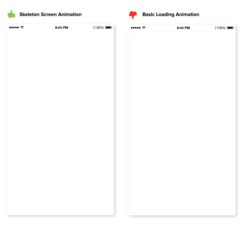
Skeleton Screens
Skeleton screens (i.e. temporary information containers) are essentially a blank version of a page into which information is gradually loaded.
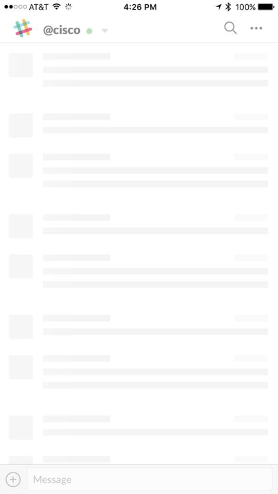
A skeleton screen would appear the moment your app starts loading data, giving users the impression that your app is fast and responsive. Unlike a loading indicator, which just conveys that something is happening, a skeleton screen focuses on actual progress.
Optimize Content For Mobile
Content plays a significant role in design. In most cases, the primary reason why people use an app is the content it provides. But it’s not enough just to have clear, well-crafted content. The content has to be easy to digest.
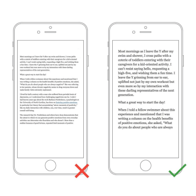
Make Text Readable And Legible
When we think about content, in most cases we mean typography. As Oliver Reichenstein states in his essay “Web Design Is 95% Typography”:
“Optimizing typography is optimizing readability, accessibility, usability(!), overall graphic balance.”
The key to mobile typography is readability and legibility. If users can’t read your content, there’s no point in offering content in the first place.
First, a few practical recommendations on legibility:
- Font size
Generally, anything smaller than 16 pixels (or 11 points) is challenging to read on any screen. - Font family
Most users prefer a clear, easy-to-read font. A safe bet is the system’s default typeface (Apple iOS uses the San Francisco font; Google Android uses Roboto). - Contrast
Light-colored text (such as light gray) might look aesthetically appealing, but users will have a hard time reading it, especially against a light background. Make sure there is plenty of contrast between the font and the background for easy readability. The WC3’s web content accessibility guidelines provide contrast ratio recommendations for images and text.
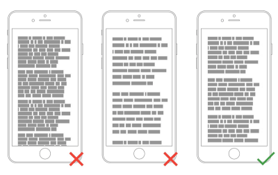
And now, a few recommendations for readability:
- Avoid all caps.
All caps text — meaning text with all letters capitalized — is fine in contexts that don’t involve attentive reading (such as acronyms and logos), but avoid it when your message requires heavy reading.

- Limit the length of text lines.
A good rule of thumb is to use 30 to 40 characters per line for mobile.
- Don’t squeeze lines.
Adding space between text aids the user in reading and creates a feeling that there isn’t so much information to take in.
HD-Quality Images And The Right Aspect Ratio
The rise of devices with high-resolution screens sets a bar for the quality of images. Images shouldn’t appear pixelated on HD screens.
Images should always appear in the right aspect ratio, so that they don’t look distorted. Images that are stretched too wide or too long just to fit in a space will look unappealing and out of place.
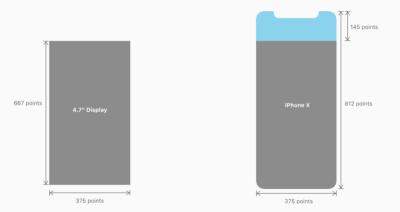
The latest challenge many mobile designers face is optimizing the UX for the iPhone X. Designing for the iPhone X requires a different size of artboard that any other iPhone (you’ll need 375 x 812-point resolution images at 3x).
Video Content Is Optimized For Portrait Mode
Video is quickly becoming a standard method of content consumption for many users. According to YouTube, mobile video consumption grows by 100% every year. By 2020, over 75% of global mobile data traffic will be video content. This means that it’s essential to optimize video content for portrait mode.
According to ScientiaMobile, 94% of users use their mobile device in portrait mode. If your app provides video content, it should be optimized to allow users to watch it in portrait mode.
Design For Touch
Designing for touch has a goal of reducing the number of incorrect inputs and making interaction with an app more comfortable.
Design For Fingers, Not Cursors
When you’re designing actionable elements in a mobile interface, it’s vital to make targets big enough so that they’re easy for users to tap. Mistaken taps often happen due to small touch controls.
When designing a touch target, you can rely on the MIT Touch Lab’s study (PDF) to choose a proper size for interactive elements. This study found that the average size of finger pads are between 10 and 14 mm and fingertips are 8 to 10 mm, making 10 by 10 mm a good minimum touch target size.

Not only is the size of the target important, but it’s also essential to have the right amount of space between targets. If multiple touch targets are near each other (for example, “Agree” and “Disagree” buttons), ensure that there is good amount of space between them.

Consider Thumb Zone
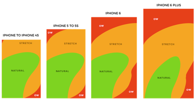
Designing for thumbs isn’t only about making targets big enough, but also about considering the way we hold our devices. A lot of users hold their phone with one hand. Only a part of the screen would be a genuinely effortless territory for their thumbs. This territory is called the natural thumb zone. Other zones require finger stretching or even changing the grip to reach them. Below, you can see what the safe zone looks like on a modern mobile device.
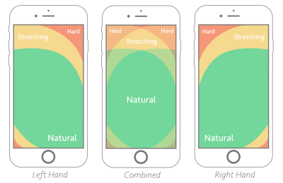
The bigger the display, the more of the screen is less easily accessible.
Consider all zones when designing for mobile:
- The green zone is the best place for navigation options or frequent interactive actions (such as call-to-action buttons).
- The red zone is the best place for potential danger options (such as “Delete” or “Erase”). Users are less likely to trigger this option accidentally.
Feedback On Interaction
In the physical world, objects respond to our interaction. People expect a similar level of responsiveness from digital UI controls. You’ll need to provide instant feedback on every user interaction. If your app doesn’t provide feedback, the user will wonder if it has frozen or if they missed the target. The feedback could be visual (highlighting a tapped button) or tactile (a device vibration on input).
Humanize The Digital Experience
UX isn’t only about usability; it’s mostly about feelings. And when we think about what makes us feel great, we often think about well-crafted design.
Personalized Experience
Personalization is one of the most critical aspects of mobile apps today. It’s an opportunity to connect with users and provide the information they need in a way that feels genuine.
There are countless ways to improve the mobile UX by incorporating personalization. It’s possible to offer personalized content depending on the user’s location, their past searches and their past purchases. For example, if your users prefer to purchase particular groups of products each month, an app might track that and offer them special deals on those types of products.
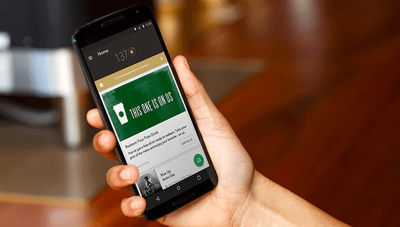
Starbucks’ mobile app is an excellent example that follows this approach. The app uses information provided by users (for example, the type of coffee they usually order) to craft special offers.
Delightful Animation
Unlike functional animation, which is used to improve the clarity of a user interface, delightful animation is used to make an interface feel human. This type of animation makes it clear that the people who crafted the app care about their users.
Optimize Push Notifications
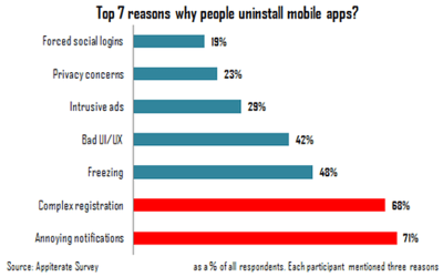
Annoying notifications are the number 1 reason people uninstall mobile apps (according to 71% of respondents).
Don’t send push notifications just because you can. Each notification should be valuable and well timed.
Push The Value
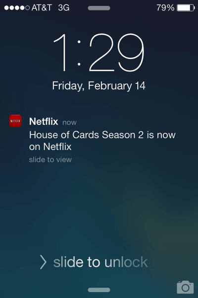
When a user starts using your app, they won’t mind getting notifications, as long as the value they get is sufficiently greater than the interruption. Almost 50% of users are grateful for notifications that interest them. Personalizing content to inspire and delight is critical. Netflix is an excellent example of a company that “pushes the value.” It carefully uses viewing data to present recommendations that feel tailor-made.
Avoid Sending Many Notifications In A Short Period Of Time
Too many notifications delivered in a short period of time can lead to the situation known as notification overkill — where a user can’t process the information and simply skips it. Limit the total number of notifications by combining different messages.
Time Your Notifications
Not only is what you say important, but also when you say it. Don’t send push notifications at weird hours (such as in the middle of the night). The best time for push notifications is peak hours of mobile usage: from 6:00 pm till 10:00 pm.
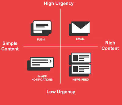
Consider Other Channels To Deliver Your Message
Push notifications aren’t the only way to deliver a message. Use email, in-app notifications and news feed messaging to notify users about important events, according to the level of urgency and type of content you would like to share.
Optimize For Mobile
Design For Interruption
We live in a world of interruption. Something is constantly trying to distract us and direct our attention elsewhere. Not to mention, a lot of mobile sessions happen when users on the go. For example, users might use your app while waiting for the train. Such sessions can be interrupted at any time. Users can be easily frustrated when an app forgets their current progress as soon as they close it.
When an interruption occurs, your app should save the current state (context) and allow users to continue where they left off. This will make it easier for users to re-engage with the app when they return to it after the interruption.
Take Advantage Of The Device’s Capabilities
Mobile devices have a lot of sensors (camera, location tracking, accelerometer) that can be used to improve the UX. Here are just a few features that you can use to do that:
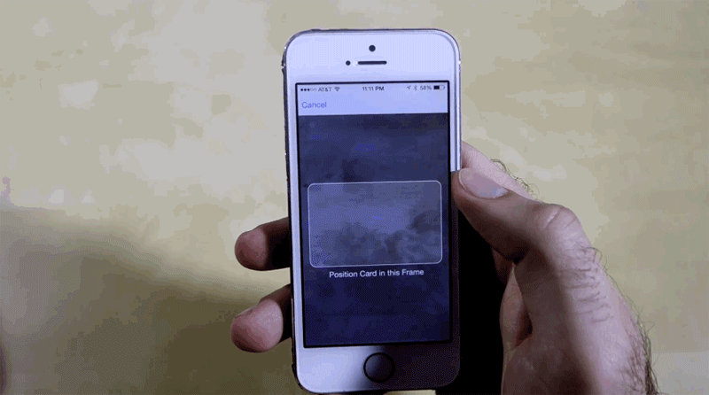
- Camera
It’s possible to simplify data input operations by using a camera. For example, you could use the digital camera to read credit card numbers automatically.
- Location awareness
Apps can use a device’s location data to provide content relevant to the user’s location or to simplify certain operations. For example, if you’re designing an app for food delivery, instead of asking the user to provide an address for delivery, you can auto-detect their current location and ask the user to confirm that they want to receive a delivery to that location.
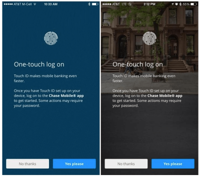
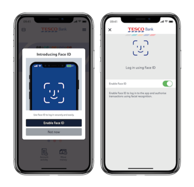
- Biometric authentication
It’s possible to minimize the number of steps required to log in to an app using features like fingerprint touch login or facial identification.
Strive To Create A Multi-Channel Experience
Don’t think of your mobile app as an isolated experience. When it comes to creating a user journey, the ultimate goal is to create a seamless experience, across all devices. Users should be able to switch to a different medium and continue the journey.
According to Appticles, 37% of users do research on mobile but switch to desktop to complete a purchase. Thus, if you’re designing an e-commerce app, mobile users should be able to switch to their desktop or laptop to continue the journey. Synchronization of user progress across devices is a key priority for creating a seamless experience. It makes users feel that their workflow isn’t interrupted.
Adapt Mobile Design To Emerging Markets
According to Google, a billion new users are expected to come online in the next couple of years. And the vast majority of them will be from emerging markets (or so-called mobile-first countries, like India, Indonesia, Brazil and Nigeria). They will gain access through a mobile phone. These users will have very different experiences and expectations from those who are in the US and Europe.
If you’re interested in going global, it’s important to consider their experiences.
Poor Internet Connectivity
In the US and Europe, users are accustomed to ubiquitous connectivity. But that certainly isn’t true worldwide. Products in emerging markets have to be able to perform over slow or intermittent connectivity. Depending on a person’s location, the network might switch from Wi-Fi to 3G to 2G to no connectivity at all, and your product has to accommodate that.
If you plan to design for such market, consider the following:
- Make sure your product works when it isn’t connected to the Internet at all. Allow caching of data.
- Optimize your product for fast loading. Minimize page size by keeping images and other weighty content to a minimum; and reduce the size of that content.
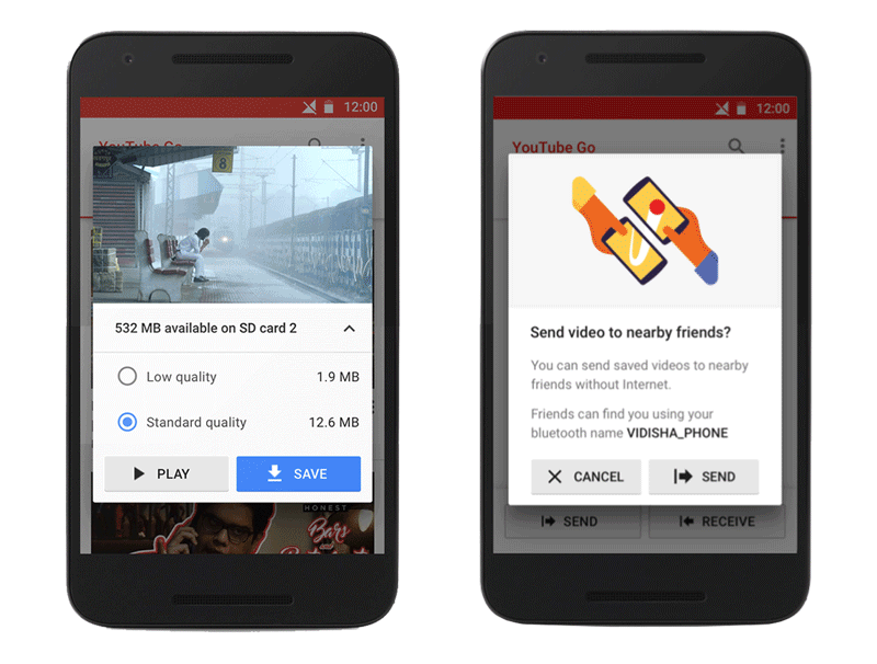
YouTube Go is an excellent example of a mobile app designed around connectivity constraints. The app was designed to be offline-first (meaning that it’s usable even when it isn’t connected to the Internet). The app lets users preview videos first and allows them to select a video’s file size before saving it offline to watch later. It also has a great feature that lets users share videos easily with friends and family nearby, without using any data.
Google News & Weather is another great example of an app that was designed around bad connections. The app has a feature called “Lite mode” for people on low-bandwidth connections. When this mode is activated, it trims content down to its essentials, so that the app loads more quickly. According to Google, this mode uses less than one third of the normal data, and it activates automatically when the app detects a slow network.
Limited Data
In about 95% of emerging markets, people rely almost entirely on expensive prepaid mobile data. People buy a fixed amount of data, and many can only afford something like 250 MB of data per month.
These users appreciate transparency when it comes to understanding their data consumption. They also value the ability to control whether a product downloads over Wi-Fi or uses data.
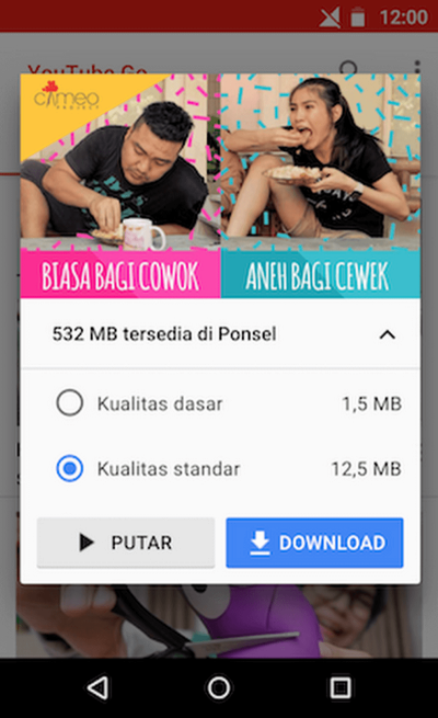
Below, you can see another example from YouTube Go. After selecting a video, users can choose the quality of the video. The app lets them know up front how much data they’ll spend before committing to an action.
Limited Device Capabilities
Smartphones in mobile-first countries have dramatically different capabilities from the Pixels and iPhones popular in the US. Most emerging-market devices cost below $100 and might come with limited storage and processing power. Make sure that the product you design works with older, low-end devices and software.
Local Aesthetics
Minimalist design, which is popular in the Western world today, might be considered too bare for other cultures. If you want your product to succeed in emerging markets, pay attention to the cultural aesthetics. You can get inspiration from regionally popular products or hire local designers who are familiar with user preferences. Designing according to local aesthetics will make your product feel more relatable.
Specifics of Region
When Google adapted Google Maps for India, it considered that India is the largest two-wheeler market in the world, and the millions of motorcycle and scooter riders have different needs than drivers of automobiles. It released two-wheeler mode in Maps. This mode shows trip routes that use shortcuts, not accessible to cars and trucks.
Testing And Feedback
All of the principles you’ve just read can help you design a better experience for mobile, but they won’t replace the need for user research and testing. You’ll still need to test your solution with real users to understand which parts of the UI require improvement.
Feedback Loop
Encourage user feedback at every opportunity. In order to collect valuable feedback, you need to make it easy for users to provide it. Thus, build a feedback mechanism right into your product. This could be as simple as a form marked “Leave feedback.” Just make sure that it works seamlessly for your users.
Design Is A Never-Ending Process
It’s fair to say that design is a process of continual improvement. As product designers, we use analytics and user feedback to improve the experience continually.
Helpful Tools And Resources For Designers
Color Contrast Checker
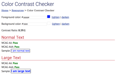
It’s surprising how many mobile apps don’t pass the AA test. Don’t be one of them! It’s essential to check the accessibility of your color contrast. Use WebAIM’s Color Contrast Checker to test color combinations.
UI Kits For Adobe XD
A well-designed user interface will make your app shine. It’s great when you can design your UI not from scratch, but using a solid foundation such as a UI kit. Adobe XD has five UI kits that you can download absolutely for free.These kits will boost your creativity and help you deliver visually interesting UI designs.
Conclusion
A great design is the perfect combination of beauty and functionality, and that is exactly what you should be aiming for when building an app. But don’t try to build a perfect app right on the first attempt. It almost impossible. Instead, treat your app as a continually evolving project, and use data from testing sessions and user feedback to constantly improve the experience.
This article is part of the UX design series sponsored by Adobe. Adobe XD is made for a fast and fluid UX design process, as it lets you go from idea to prototype faster. Design, prototype, and share — all in one app. You can check out more inspiring projects created with Adobe XD on Behance, and also sign up for the Adobe experience design newsletter to stay updated and informed on the latest trends and insights for UX/UI design.
Further Reading
- Picture Perfect: Meet Pixo, A Photo Editor For Your End Users
- Using AI To Detect Sentiment In Audio Files
- When Words Cannot Describe: Designing For AI Beyond Conversational Interfaces
- Getting Started With Neon Branching
 (ra, al, il, mrn)

