A Comprehensive Guide To UI Design

Email Newsletter
Weekly tips on front-end & UX.
Trusted by 182,000+ folks.

 Celebrating 10 million developers
 Custom Web Forms for Angular, React, & Vue. Your backend.

(This is a sponsored article.) With the big picture established — mapping user journeys and defining your design’s look and feel — my fifth article in this series of ten articles dives into the details of designing user interface components.
UX, IA, UI: All of these abbreviations can be confusing. In reality, as designers, we’ll often be working across these different specialisms: designing the overall user experience (UX), organizing information logically as we consider information architecture (IA), and considering the granular design of the user interface (UI).
In my guide to UX design, I explored the need to understand users’ needs and consider user journeys, the need to design with human behavior in mind, and the need to establish an overall aesthetic. In this article, I’ll be exploring the detail, how we design interfaces that are consistent and scalable. Our goal at this phase of the design process is to apply what we’ve learned to our user interface design by:
- Using benchmarking to develop interface inventories that ensure your user interface is considered in a cohesive and consistent manner;
- Building a pattern library, informed by your interface inventory, to ensure that what you design is both cost-effective and consistent; and
- Embracing animation as a way of communicating with users, improving our design at the levels of both function and delight.
In short, this article is intended to help you develop a systematic approach towards user interface design that is widely applicable across a range of projects, and that is scalable. By building a framework for design, we can apply lessons learned from others, thus improving our designs and resulting in a better outcome for our users.
User interface design (UI) is a vast topic so consider this article a short primer, but — as in my previous articles — I’ll provide some suggested reading to ensure you’re well covered.
Get Started With An Interface Inventory
You might be starting from a clean slate with a new product or revisiting an existing product, but it helps to start by establishing an interface inventory. Just as a content inventory helps to ensure content (i.e. words, images and other types of content) is consistent, an interface inventory also ensures that user interfaces are developed consistently within a comprehensive and considered framework.
Spending a little time on this upfront will save a lot of time in the long run by establishing design systems that are consistent across team members and that are easily scalable. Building an interface inventory helps you to focus your time and effort on the elements you need at this moment in time, but — just like a style guide — it should be a living document that is extensible, growing as your product grows.
So, what exactly is an “interface inventory”? Well, the term was coined and popularized by Brad Frost. It takes the idea that underpins content inventories and maps it over to the world of user interface design. As Frost summarizes:
"An interface inventory is similar to a content inventory, only instead of sifting through and categorizing content, you’re taking stock and categorizing the components making up your website [or product]. An interface inventory is a comprehensive collection of the bits and pieces that make up your interface."
— Interface Inventory, Brad Frost
If you’re redesigning an existing product, an interface inventory starts by mapping out all of your components — no matter how large or small — so that they are systematically documented. If you’re embarking on a new project, you might like to map out a competitor’s product, undertaking an analysis of others’ work. This helps you to get a feel for the different interface components you’ll need to consider.
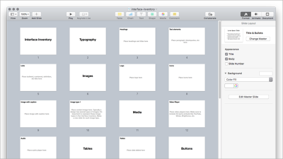
The first stage in the process is to systematically take screenshots of everything you’ve designed. This will be time-consuming, but it’s important. It’s at this stage — especially if you have a sizeable design team — that you might start to see inconsistencies in how different elements have been designed. Your interface inventory will help you identify these elements, which you can then fix.
Consider all the different components that comprise your user interface, including:
- Typography
- Headings and Sub-Headings
- Text Elements (Standfirsts, Paragraphs)
- Lists
- Images and Media
- Logos
- Iconography
- Images
- Forms
- Text Inputs
- Radio / Checkbox Inputs
- Select Menus
If you’re anything like the old me (before I knew better!), you may well have designed these different components as and when the need arose, without any systematic approach. The idea of an interface inventory is to impose an order onto this process ensuring everything is consistent.
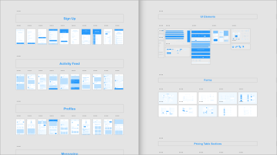
The second phase of the process, categorizing everything, is intended to impose some order upon the screenshots you’ve taken. You can organize your screenshots using all manner of tools, but I’d suggest organizing everything using Keynote or PowerPoint, that way you can present the work when it’s complete to your team. Ever-helpful Brad Frost has provided a template that you can use (ZIP).
With the above work undertaken, it’s a good idea to get together as a team or with the client and run through everything. This discussion will lead to a better understanding of the different components you need to design. It is also likely to lead to some streamlining of your different components by identifying shared patterns — a big win for efficiency.
Build A Pattern Library
With your interface inventory undertaken and all of your components organized, it’s important to start to identify common design patterns and build around these. Your interface inventory is likely to have revealed stark inconsistencies in your design, now is the point in the design process that you address these by rebuilding your UI in a modular manner. I find it’s helpful to think of this approach as being somewhat like LEGO.
With LEGO, you can (by using small components) build incredibly complicated things. Interfaces are similar. Although at first glance an interface might be incredibly complex, it is essentially made up of smaller components. These components are where pattern libraries come in. So, what is a pattern library?
A pattern library identifies and classifies design patterns that are recurring solutions to typical design problems. These might be:
- Calendar Pickers
- Breadcrumb Trails
- Carousels
A pattern library breaks an interface down into smaller elements that can then be used as reusable building blocks. The benefits of this approach include:
- Consistency in your design
By building complex user interface elements using smaller, reusable components you ensure that all of your user interface elements are consistent because they’re all built from the same simple components. - A visual vocabulary that you can share across team members
By establishing a pattern library for your product, everyone in your team builds using that as a basis, rather than building their own ad-hoc elements. - Efficiency over time as your designs develop
Even if your product grows over time it’s efficient to maintain because it’s built on a core pattern library.
When designing your user interface, it’s helpful to refer to others’ design patterns to see what works — and equally — what doesn’t. UI Patterns is an excellent resource for doing this, gathering a wealth of design patterns.
By using your interface inventory as a starting point to identify common design patterns, you’re one step away from establishing the components you need to create to establish a design system. This will help ensure your UI is consistent and scalable.
Embracing Atomic Design
Before diving a little deeper and exploring atomic design principles, it’s important to give a little credit where credit’s due. Andy Clarke has been writing and talking about “designing systems, not pages” for quite some time now.
Clarke’s insight — that we need to stop designing pages in isolation and instead focus on the creation of the systems out of which those pages are built — has informed much of the writing that has arisen around the importance of focusing on design patterns.
We’re fortunate that a number of designers have taken the baton and explored this line of thinking in depth. Brad Frost’s book on Atomic Design and Alla Kholmatova’s book on Design Systems are both overflowing with useful advice and should be required reading. I’d strongly recommend them both.
Stressing the importance of adopting a methodical approach towards the design of interfaces, Frost states:
"[I'm] interested in what our interfaces are comprised of and how we can construct design systems in a more methodical way.
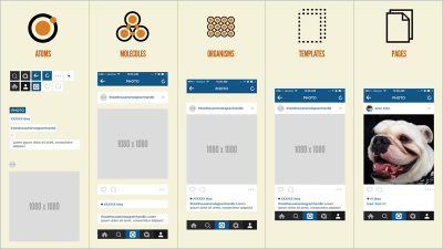
In searching for inspiration and parallels, I kept coming back to chemistry. […] All matter is comprised of atoms. Those atomic units bond together to form molecules, which in turn combine into more complex organisms to ultimately create all matter in our universe.
Similarly, interfaces are made up of smaller components. This means we can break entire interfaces down into fundamental building blocks and work up from there. That’s the basic gist of atomic design."
— Atomic Design, Brad Frost
Frost’s methodology establishes five distinct levels that comprise atomic design: atoms, molecules, organisms, templates, and pages. By building from the atom up, we create fundamental building blocks of design that allow us to build anything.
Chemistry was never my strong point, but essentially:
- Atoms come together to form molecules;
- These molecules combine to form organisms;
- These organisms are then used as the basis for the creation of (distinctly non-chemical) templates and pages.
In short, we create small interface building blocks and then put these together to create progressively more complicated interface elements. The benefits of atomic design are that you can ensure consistency by combining elements at a granular level and then build up from these.
Getting A Head Start With UI Kits
As designers working — for the most part — on the web, we’re incredibly fortunate to be a part of a community that celebrates a shared approach towards the work we do. We’ve seen an explosion of UI Kits — systematically designed sets of user interface components — over the last few years, helping to make our lives a little bit easier.
There’s no sense in wasting time redrawing common UI components when a UI Kit can you save you this time and effort. A well designed UI Kit can form the cornerstone of a digital product, be it a website or an app, ensuring it has a consistent look and feel, and visual identity.
Adobe has partnered up with a series of world-renowned designers to create some fantastic Adobe XD UI Kits, which are well worth exploring. They have also provided some great tutorials on starting your design with UI Kits to get you up-and-running.
In addition to offering a number of free icon sets (designed by Lance Wyman, Büro Destruct, and Anton & Irene), they have also created a comprehensive set of free UI Kits with pre-built templates for both web and mobile projects.
UI Kits are incredibly helpful and can save you a considerable amount of time by saving you from redrawing commonly used elements. A note of caution, however, as with any generic kit, there’s a danger of falling into a template-driven approach in which one design looks very much like another. It’s important to use your kit as a starting point, onto which you layer the look and feel you established when creating your element collages.
Designing Interactions And Animations
One of the key differentiators between designing for screen and print is that when we design for screen, we are designing for a fluid medium. This is a critical difference between interaction design and graphic design.
As interaction designers we are not designing static collections of pages, we are considering how these pages, and elements within these pages, interact. This is a critical distinction and one that is often overlooked by a subset of graphic designers who believe that their role is simply to designs sets of pages which will then be passed on and ‘stitched together’ by ‘someone technical.’
At the risk of unleashing the ‘designers must code’ can of worms that perennially rears its head, it’s critical for designers working in this medium to understand how the medium works. To truly design memorable experiences, it’s important to spend some time learning about animation principles. Thankfully, tools like Adobe XD abstract a great deal of the code one would have had to grapple with in the past to design immersive interactive experiences.
When designing for screens — inherently fluid media — it’s critical to consider how the user will interact with what you’re designing, considering how transitions are handled from screen to screen and providing valuable feedback within user interface components. We need to consider both macro-interactions (at the page level) and micro-interactions (at the object level).
Getting From A To B
In my previous article, I explored how we could use user stories to begin to map pathways through your design at a high level. At this point in the process, we need to focus on how users move between these screens, traversing from A → B → C.
In the past, we might have simply moved between screens with little or no animation at all, limited by the devices we used at the time. As processing power in our desktop and mobile devices has increased, however, so too have the number of opportunities afforded to us to design more immersive experiences.
Of course, we need to use these newfound powers with restraint, but the hardware at our users’ disposal now provides us with the opportunity to design delightful interactions. This is why we’ve seen a rise in interest in animation over the last few years. As designers, we respond to the tools at our disposal; as those tools evolve, so too must our designs.
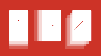
When designing transitions between screens, we need to consider a number of factors, including:
- How the user triggers the transition to move from page to page
By clicking on a button or by swiping on screen. - What kind of transition we use
Dissolves, wipes, scales or other effects. The transition we choose will communicate to the user, so it’s important to choose it with care. - How long the transition lasts for
Is it fast or is it slow?
As we design the journey from A → B → C, the choices we make (i.e. triggers, transitions, and timings) will affect the narrative, so it’s important to put some thought into them. As with any journey, it passes more smoothly if it’s enjoyable.
The type of content we are designing will also impact on these decisions. In some cases, we’d like a user to move a little more slowly through a narrative by using transitions and timings to pace things. In other cases, we’d like to get out of the way by speeding up the transitions.
When Apple first launched iBooks, its page transition when reading a book (a ‘page curl’ effect) slowed readers down. The ‘page curl’ was delightful at first glance, but once you had seen it hundreds of times — when all you wanted to do was to read a book — it became incredibly frustrating. The microseconds used on every page turn all added up to a frustrating experience.
When designing transitions between screens, it’s important not to lose sight of the underlying functionality. At the end of the day, our goal is to delight our users, not to frustrate them.
Animation can be delightful, of course, but not if it’s at the expense of functionality. Sophie Paxton writes about this very topic in an excellent article titled Your UI isn’t a Disney Movie, which highlights how gratuitous animation and overly animated user interfaces can, if we’re not careful, frustrate users. It’s well worth reading.
Interacting With Objects
With our macro-interactions, at the page level defined, it’s time to turn our attention to micro-interactions at the object level.
Just as we need to consider all of the factors that add up to ease users from page to page, it’s also important to pay attention to easing users’ interactions with specific objects within our pages. These might include buttons, form fields, and other elements where a little judicious animation can help provide feedback to our users.
Providing visual feedback is extremely important in user interface design: It puts users’ minds at rest by providing a signal that their actions have been acknowledged. When I click a light switch in the ‘real world,’ I receive feedback by hearing a satisfying click as well as the result of the light switching either on or off. This feedback lets me know what’s happening.
We can improve our user interface designs by applying these lessons from the real world to the world of screens. A well-designed user interface should respond to a user’s actions, letting them know that their actions have the desired effect, putting their mind at ease. This is where animation can play an important role.
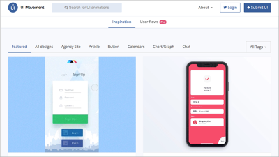
Sites like UI Movement provide a wealth of inspiration, showcasing effective examples of animation applied to user interfaces. It’s important to consider how you provide feedback and in what context, for example:
- When you’re asking for a password, it’s helpful to indicate the password’s strength or weakness as the user is entering the information (finding out only later that a password is too weak is frustrating).
- When a user interacts with a button, it helps to provide feedback, letting the user know that their actions have been acknowledged.
- When interacting with date pickers and calendars, there’s considerable scope to provide helpful feedback.
The above scenarios are just the tip of the iceberg. Anywhere your user is being asked to interact with elements on a page is an opportunity to consider using animation to provide helpful feedback. Of course, as I noted above, your user interface isn’t a Disney movie, so don’t go overboard!
Finally, it’s worth noting that animation isn’t for everyone and can — for some people — cause problems. For users with vestibular disorders, motion can cause dizziness or nausea, so it’s important to consider accessibility when using animation.
It might be an idea to offer users a choice, and it’s great to see sites like CodePen World’s Fair alerting users to its use of animation and offering them a choice to continue to the site with or without animation. This kind of consideration is great to see: Bravo for accessibility!
In Closing
When designing your user interface, it helps to have a system in place. This ensures that whatever you build is considered and consistent. Starting with an interface inventory — especially when you’re revisiting an existing product as part of a redesign — will help you to identify the points where your interface needs work. Over time, it’s only natural that inconsistencies can creep in; this tool offers an ideal way to pinpoint these.
When it’s time to build your interface spend some time to establish a considered design system. Not only does this ensure that your design is consistent, but it also helps keep your team on the same page and provides any freelancers working on the project with all the guidance they need in one central location.
Lastly, it’s important to consider the design of your interactions and animations. As designers working for screens, it’s important that we consider how what we design responds to users’ interactions. We are, after all, designing for a malleable medium, let’s use that malleability in our favor! Tieing all of the above together, you’ll have the foundations of a solid user interface approach that will stand the test of time.
Suggested Reading
There are many great publications, offline and online, that will help you on your adventure. I’ve included a few below to start you on your journey.
Alla Kholmatova has written an excellent book on Design Systems, which I strongly recommend. It explores how building effective design systems can empower teams to create great digital products.
Brad Frost has written at length about the process of conducting interface inventories. He has also written a very good book, Atomic Design, which focuses creating effective interface design systems. Frost is a smart cookie, and I’d strongly recommend bookmarking his blog.
If you’re interested in learning more about designing interactions and animations, I’d strongly recommend Val Head’s Animation and UX Resources. Head runs workshops and has an excellent email newsletter, too.
If the web is your medium and you’re new to animation, drop everything and sign up for Donovan Hutchinson’s CSS Animation course. It’s an excellent course, and Hutchinson’s teaching style is second-to-none.
This article is part of the UX design series sponsored by Adobe. Adobe XD is made for a fast and fluid UX design process, as it lets you go from idea to prototype faster. Design, prototype, and share — all in one app. You can check out more inspiring projects created with Adobe XD on Behance, and also sign up for the Adobe experience design newsletter to stay updated and informed on the latest trends and insights for UX/UI design.
Further Reading
- Everything I Know About UX Research I First Learned From Lt. Columbo
- Creating Accessible UI Animations
- Mobile Accessibility Barriers For Assistive Technology Users
- How Accessibility Standards Can Empower Better Chart Visual Design
 (ra, il, mrn)

