Designing A Perfect Configurator UX

Email Newsletter
Weekly tips on front-end & UX.
Trusted by 182,000+ folks.

 Celebrating 10 million developers


 Custom Web Forms for Angular, React, & Vue. Your backend.
Here’s a little challenge for you. How would you design a responsive interface for a custom car configurator? The customer should be able to adjust colors, wheels, exterior details, interior details and perhaps accessories — on small and large screens. Doesn’t sound that difficult, does it? We have all seen such interfaces before. Essentially, they are just a combination of some navigation, iconography, buttons, accordions and a real-time 3D preview. But how often are they actually engaging and helpful? And how often do they feel like a series of tedious steps in a never-ending wizard UI? Or, to make the question easier to quantify: How often do customers end up with their perfect configuration in a single session?
More often than not, all of these so delightfully pixel-crafted interfaces betray us. As designers, we might try to make our configurators advanced and sophisticated, but too often we overwhelm customers with too many non-trivial options. As developers, we might want to achieve a perfect visualization and rendering of choices, but then the configurator will feel extremely sluggish and unresponsive, even on fast connections. The interaction doesn’t seem that complicated to us, but for a customer, getting to the result while commuting on a bus or waiting in line often turns out to be an almost impossible task.
In this article, following detailed dive-ins into perfect accordions, date/time pickers, sliders and comparison tables, we’ll look into how to design a perfect responsive configurator. We’ll explore tiny configurators for bikes and strollers, as well as ones for custom guitars, chairs, cars, tailored suits, shoes, watches and engagement rings, all the way up to advanced shelf configurators and kitchen planners.
The article also includes a checklist of everything worth keeping in mind when designing or building one of these beauties. Ready? Let’s dive in!
Part Of: Design Patterns
- Part 1: Perfect Accordion
- Part 2: Perfect Responsive Configurator
- Part 3: Perfect Date and Time Picker
- Part 4: Perfect Feature Comparison
- Part 5: Perfect Slider
- Part 6: Perfect Birthday Picker
- Part 7: Perfect Mega-Dropdown Menus
- Part 8: Perfect Filters
- Part 9: Disabled Buttons
- Subscribe to our email newsletter to not miss the next ones.
An Adventurous Story Of An (Un)Spectacular User Journey
Whatever the nature of a configurator, usually it exists for two reasons: to inspire customers to explore a product, or to help them configure an existing product to match their needs. The former doesn’t necessarily matter only for undecided customers, and the latter doesn’t necessarily serve only customers who have already committed to a purchase. Sometimes, customers find themselves in between these two states; so, although they might not want to purchase an item at the beginning of the user journey, they might choose to buy it when they start customizing it.
For example, a customer might have wanted to purchase a bike for quite some time, and they’ve also been looking for a particular kind of bike — perhaps one with a special gear for enduring road trips but also light enough for regular city trips. Once landing on a website — through a search engine or a friend’s recommendation — they first want to be certain that they can trust the manufacturer. So, they start browsing. They might sink into an inspiring and authentic story about how bikes are produced or used, and how much thought and experience the company brings to its products. At this point, some sort of a “big picture” configurator, displaying different kinds of bikes, might inspire them to play with various presets or variations of bikes, thus helping them engage with the product. In this context, highlighting strong features of a bike with vivid photography and video segments would be more purposeful than an endless list of available accessories.
If the customer is convinced about the product’s value, they might be encouraged to choose a meaningful preset or base to start from — a sport bike, a city bike or perhaps a high-end gear bike. The next step would be to dive into a “small details” configurator, where they could literally build the bike of their dreams, with all of the fine details and features they could ever wish for. Here, a list of all available accessories presented just in time would be infinitely more helpful than in the previous situation.
Finally, if the customer gets through the ins and outs of the configurator, the final build looks good, the manufacturer seems trustworthy and the price is reasonable, they might purchase the item spontaneously that evening, or the next day, or a week later.
Here’s the catch: Like many other product builders, a bike configurator is inherently complex and multi-faceted, and so, for a customer, choosing a “perfect” configuration will require quite some work, not just because of the sheer number of options to go through, but also because every available option requires the customer to make a (potentially complex) decision.
Now, unless the experience is perfectly smooth, swift, predictable and obvious all along the entire user journey, the customer might drop off merely due to a loss of trust in the interface. Of course, they might leave due to a loss of interest at any point, too, but if the interest is there, that’s a valuable proposition, and so the interface should be there to support and attend to that interest, rather than failing painfully on behalf of the company.
Should customers not have the technical details or knowledge at hand, they will be locked in choice paralysis, and the configurator will have failed them. Should the interface not respond to the users’ adjustments swiftly enough, they will abandon the purchase because the interface is just too slow and annoying to use. Should the interface not provide meaningful enough guidance when the customer is struggling between two options, they won’t proceed due to unresolved decisions. In all of these cases, the drop-off ratio will go through the roof, and the interface will carry the cost of lost sales (unless the product is unique and very much in demand, of course).
The task that we, as designers, then have is to design an engaging experience that helps the customer to customize the product meaningfully, while at no point in the process getting stuck or annoyed. Unfortunately, most configurators out there aren’t particularly great at this task. More often than not configurators aren’t very engaging nor helpful in terms of user experience, and they aren’t particularly resilient to technical challenges. Too often, they are just tedious web form wizards with a bunch of generic input fields and tiny radio buttons. And in the case of a bike configurator, a good ol’ web form wizard could easily end up with 15 to 25 form elements!
Now, how often do you happily fill in an online form with so many form elements? It just feels like mundane, unnecessary work. This is especially critical on narrow screens, where the interaction with such an interface is nothing short of an annoyance. Surely, we can do better than that. But to get there, we need to understand the problem we are solving.
What Problem Are We Solving?
In your project, do you want the configurator to primarily inspire or actually customize — or both? Is a configurator really the best option to achieve this goal? How deep do you want to go in terms of customization options? Where would be the entry point for the configurator? Should it be a standalone tool, or should it be integrated within a landing page or a product page? The answers depend on the goal you are trying to achieve.
Now, while a primary use for a configurator might appear to be in inherently sophisticated, complex products, such as kitchen arrangements, suits and cars, it could in fact be used for pretty much everything. A configurator could help customers choose a custom insurance policy, a mobile data plan, a salad, a pizza, a cake, a pair of shoes, trousers, watches, bags, bikes, skateboards, cars, yachts, guitars, lamps, books, knifes and even… a muzzle.
It doesn’t mean that your particular set of products needs customization, of course. In fact, a configurator won’t automatically improve sales, but a well-designed configurator might make decision-making slightly easier, hence making it easier to commit to a sale. It won’t help if a product isn’t particularly convincing, though.
The important question to ask yourself is how critical and helpful customization would be for your product, and the answer to this question could be best uncovered in customer support logs, user tests and user interviews. So, before diving deep into the intricacies of the UI, we need to make sure that a configurator would help customers understand the features and differences between the options accessible through it. Sometimes a configurator can cause more confusion than assistance.
Once the idea is validated, we can explore the level of customization that would actually be relevant to the customer. “Inspiring” configurators usually won’t need many customization options, and “builders” will need to provide a level of personalization that goes way beyond a few general options. In the latter case, it means that designing and building a configurator won’t be a quick fun weekend exercise. The sheer amount of team effort it requires might quickly instill an understandable reluctance among the team.
“But Who Would Buy A Car On A Phone Anyway?”
Some of you might have been there, too. The company might be releasing a brand new family of products — let’s say a new car model — and this new family has to be prominently highlighted and advertised. Now, because the specs across the new family don’t differ that much, you suggest to provide some customization options for the main representative builds of the product, perhaps in the form of a configurator.
Lucky you: Your argument is well supported, and it seems that everybody is on board with your idea. Eventually, designers start planning and sketching and designing, producing a visually stunning 3D car configurator, and of course, because the entire website is responsive, the configurator is mocked up in various sizes as well. Even better: The mobile mockups are already laid out and ready to be prototyped. Yet, eventually, developers start getting concerned about the implementation timeframe and the configurator’s performance on low-end devices.
At some point, somebody comes up with an idea to build the configurator in only one view — obviously for large screens only. After all, “Who would really build and buy a car on a phone anyway”? In fact, analytics validate that statement as well — there is some mobile traffic to the website, but only a few occasional outliers end up actually buying a car on mobile. Due to tight deadlines and budgets, eventually the scope is reduced to “desktop-only,” and a few months later the project goes live with a beautifully crafted warning prompting mobile customers to check the website on a desktop screen.
In my experience, this exact argument keeps appearing all the time in very different conversations about very different products with very different teams. The catch, though, is that, as it turns out, data doesn’t always give us a full picture. If you run interviews with customers who are considering an expensive purchase, you’ll find out that many of them need a good number of “exploration” sessions. These are often lengthy website visits when the customers meticulously explore the product, its features and its variants, including videos and photo carousels and user reviews. They need time in order to be convinced that purchasing such an expensive product is a sound decision and a good investment.
The final purchasing decision needs time to mature. In fact, for many people, buying a car might be one of the most expensive investments they’ve ever made, and so being able to play with the idea of owning that car, perhaps within a stunning 3D car configurator, is a wonderful way to elicit excitement about that product. These customers are likely to entertain the idea of purchasing the item for weeks or months, sometimes even years, before committing to it. And when exactly do they do that? Well, when they have time: during “in-betweens.”
In-betweens happen during commutes, in boring meetings, while waiting in a queue, before heading to sleep, or in the restroom. Frankly, it’s unlikely that customers will pull out a laptop in any of these scenarios (or at least few people would confess to that in user interviews!), but snatching a mobile phone from a pocket or fetching a tablet from a bedside table doesn’t require much effort. That’s where an inspiring mobile configurator can — slowly but surely — drive the customer towards a commitment and, eventually, a sale.
However, this behavior will never show up in analytics because these customers are indeed unlikely to buy a custom build of a car on their phone on the spur of the moment. They are way more likely to configure that perfect car of their dreams in a dedicated, well-arranged session with friends or parents, probably on a desktop because it’s more convenient, and then head to a local car seller to test drive a comparable car and actually make that long-awaited purchase. Few would admit to looking at cars in a security queue one day and then finally deciding to get one the next day. Many of us don’t think of our decisions in this way, and because the user journey might span a very long, non-linear timeframe, boiling it down to a user session on mobile or tablet just isn’t an accurate representation of the entire decision-making process. The full picture can be surfaced only through user interviews.
For your project, there is a high chance that the configurator you are about to create would benefit from being responsive. The more expensive the items are, the more likely it is that your customers will need time to play with something like a configurator to explore their options. Many of them will do it during in-betweens, when they have time — and quite often that will mean on phones, tablets and phablets. For the rest of this article, we’ll explore patterns and techniques for configurators that are indeed responsive; most of them would come in handy even if you’ve decided to build a desktop-only (or mobile-only) configurator.
Where Configurators Live
Good news! The entire team is on board, and it’s about time to wander into a painful, elaborate exercise in pixel pushing and content squishing — finding just the right spots on the website where a configurator could be available to customers. Naturally, a well-deserved spot would be a product page, but the configurator could also be prompted through category pages, landing pages or the almighty home page. If the focus of the website lies in only a few specific kinds of products, it makes sense to prominently highlight the configurator in the main navigation, too. In the latter case, the configurator would usually start with an overview of base options or presets, while in the former case, this decision would be made by the choice of a product or category page where the configuration has been prompted.
A configurator is a great tool to increase engagement. So, if the price points for your items lie on the higher end, consider shifting the focus away from an overview of available products towards the configurator, and measure the outcome. In almost every test we ran, we noticed an increase in time spent on the website and time spent interacting with the product line.
Now, by their nature, configurators are usually quite tall and wide, partly due to the spacious 3D view they are likely to contain. In fact, on mobile, it’s very difficult to allocate anything but the screen’s entire width to them; and, with navigation, prices and configuration controls to operate, a configurator view usually takes up the entire screen. On desktop, we could shuffle the controls horizontally, but even then a lengthy paragraph of text is very unlikely to appear anywhere near the configurator. That’s why a configurator usually lives on a standalone page.
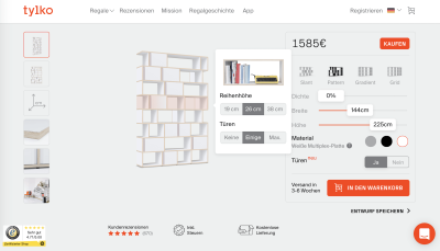
If a configurator contains only a few customizable options, it could be displayed right on the product page. For example, Tylko, a company that provides tailored shelves and furniture, provides a configurator for every kind of selected shelf type right on the product page. Because only a few options are available to choose from, there is no need to offload the configurator to a separate standalone page.
Keep in mind that if a configurator is embedded on a product page, some customers might think that the options displayed there are the only customizable options, which isn’t necessarily true. That’s why a clearly visible “More options” button might be necessary. That button would then obviously lead to a separate view, with all configuration options in place — using the selected model as a baseline, of course. It should also take over all adjustments that the customer has made to the initial view, of course.
Obviously, if a product requires specific customer-tailored settings (for example, for bespoke suits, custom cakes or tailored shelves), displaying them prominently on the product page is a good call — after all, that’s the point of the page in the first place. However, if the product contains dozens of options to choose from, consider disclosing that complexity progressively (for example, with a prominent “Build your own bike” button).
Interestingly enough, user interviews show two distinct behaviors among customers who encounter a configurator. On the one hand, pretty much every interactive element in the configurator — such as a slider or a 3D view or those mysterious, pulsing, floating bubbles — gets the customer’s attention in abundance, and engagement time increases.
On the other hand, it doesn’t necessarily result in higher conversion rates. While playing with a visual representation of a product is obviously fun, it alone doesn’t necessarily mean that customers will be more inclined to buy the product on the spot. Configurators clearly helped build a stronger awareness of the product and its features, but the impact on sales depended heavily on how the configurator was designed — or, specifically, how options were framed and whether an interface provided guidance and support in decision-making.
Choosing Presets: Half Empty Or Half Full?
Configurators rarely come empty-handed. The interaction usually starts with a selection of a predefined presets for the product, be it a car model, a type of glasses or a distinctive style of a tailored suit. It’s worth thoroughly considering these presets, because the more well rounded and convenient they are, the better the interface will lift potentially complex decisions off customers’ shoulders.
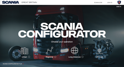
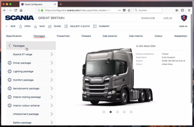
For example, Scania’s truck configurator provides a two-level preset selection: Once the customer has selected where they’re operating (urban, regional, long distance, off road), they can choose one of the 14 already configured presets, predesigned for particular kinds of tasks. There is still a good deal of customization to go through, but it would be much more complex if the presets weren’t available.
Before prompting the customer to confirm a preset, we could ask them a few simple yes-no-maybe questions, and then, based on answers, nudge them towards the most suitable, “recommended” preset. Once that preset has been selected, we could then further guide the customer through premade packages designed for that particular preset — thus avoiding mundane or difficult decisions along the way. Both questions in the beginning and the choice of premade packages should be optional, though, because the customer might know exactly what they want or might have already gone through the trouble of providing answers in the past.
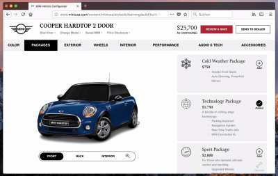
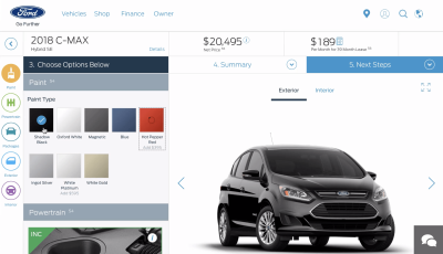
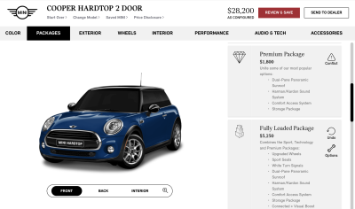
On Mini USA, for example, one of the first options a customer can choose from in the configurator (after selecting the ‘base car’) are ‘Packages’ (‘Cold Weather Package’, ‘Technology Package’, ‘Sport Package’ and others), with already predefined features, such as front seats, wheels and tires. Once that’s chosen, a number of steps can be skipped altogether, resulting in a ready-to-be-bought model. Notice that every package also contains the ‘Options’ button for making further adjustments. All of these decisions in between can be changed if the customer wants to go through all steps manually, but they don’t have to be made manually.
While presets usually represent very distinct and, therefore, obvious types of a product (for example, a car model or a type of stroller), ‘packages’ are essentially bundles of features applicable for a selected preset.
Sounds wonderful, isn’t it? Well, there is a catch. While the interface would provide a quick shortcut to the final result, if all configuration options were reduced to presets alone, it wouldn’t give the user enough room to play with the available options. In fact, the word “play” came up quite a lot in user interviews, almost as if customers were expecting some sort of gamification in their interaction. The Mini USA configurator above keeps all options available even with a preset selected, which helps with gauging interest and attention while providing a quick way out if necessary.
This brings us to a little dilemma. For customers, staring at a blank canvas feels like a lot of work, but having to undo some of the adjustments (i.e. presets) made on their behalf feels quite annoying. So what should we start with then? An empty state or an “almost-complete” state?
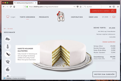
In the cake configurator on Biskitty, the initial state is empty by default, except for a few minor examples in the “Inspiration” section. The customer can change the size of the cake, its flavor, color and texture and can add a badge to it.
A blank state might not be engaging enough if the product is slightly more complicated than a cake. Italia Veloce (with 12 options), for instance, provides a LEGO-like configuration experience, where customers literally build a custom bike piece by piece. In this case, well-chosen presets (not provided on the website) would be as helpful as a preview of the actual product.
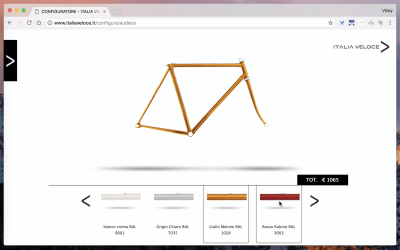
Choosing a handle without seeing the bike might make sense for seasoned professionals, but not necessarily for everybody else. Besides, because there are many ways to design a pretty bad bike just by putting seemingly matching components together, without proper guidance, the entire interaction might not lead to the desired outcome: The final product just won’t be as functional or appealing as it should be. A blank start wouldn’t work here.
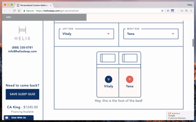
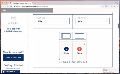
When the number of options is slightly more overwhelming or the choices are slightly more nuanced, reducing the scope of options can immensely reduce the complexity of the configuration. For instance, if we are selling mattresses, like Helixsleep does, we could ask a few questions about the customer’s preferences and sleep habits, such as the level of softness and the inner material, and then provide some recommendations based on that. Admittedly, this is not really a configurator, but rather a questionnaire, but it could be used as a step before selecting a preset in the configurator.
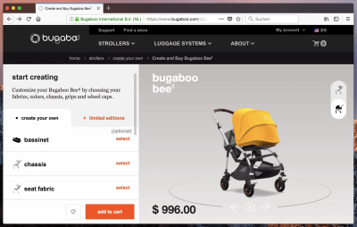
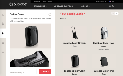
With more non-trivial options in play, you might be better off avoiding the blank state. For example, Bugaboo Configurator (with 6 to 10 options) gets everything just right. The initial state of the configuration provides an attractive starting point, with some recommended options and some optional features (mostly trivial and color-related) — both can be skipped or adjusted.
And then there are labels. A common way to break down product lines into presets is by breaking them down into “levels,” such as “Standard”, “Premium” and “Ultimate”. While it clearly communicates the level of experience to expect with that preset, it’s quite abstract and not particularly descriptive. For example, this classification would assume that “Ultimate” contains pretty much everything, and so configuring it would be about removing too-fancy features, rather than adding helpful features.
If there are only a handful of options to choose from, a blank canvas might work, but for anything slightly more advanced, that might be utterly uninspiring. Define a reasonable starting point that encourages exploration.
In most cases, configuration would happen the other way around: A customer would start with a good-enough base and then enhance it with nifty add-ons. It’s also more enjoyable that way. On the other hand, compared to other options, “Standard” sounds quite sad and unexciting. So many customers would jump to “Premium,” which isn’t necessarily what they need. Being more particular about the skill or setting that each product targets would make it more relatable: “Novice”, “Advanced,” “Expert” is as helpful as “Family”, “Business”, “Sport.”
For a car configurator, naturally, some options will be tied to price ranges, but we could complement options “Model X”, “Model Z” and “Model W” with clear labels such as “Business choice”, “Family choice” or “Sports choice”. Obviously, the presets should also display the actual product and the price point, but, if applicable, also the year of release, availability and expected delivery.
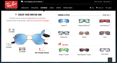
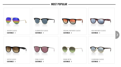
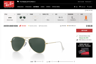
Ray-Ban’s glasses customizer provides a quick overview of available styles, as well as an overview of “most popular” choices, which are essentially presets. The customer doesn’t have to start from scratch and can use existing “reliable” options and build on top of them.
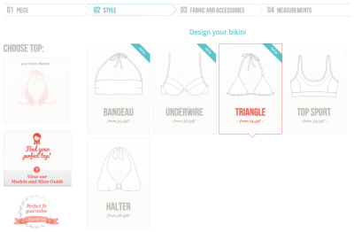
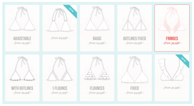
Surania allows the visitor to design a custom bikini. It highlights popular choices and provides multiple levels of presets to limit the number of options in the actual configurator.
In other words, presets matter, as do the premade decisions they represent, so spend enough time considering them before jumping into the intricacies of the UI. Rather than providing an empty initial state or a fully preconfigured initial state, think about designing a half-empty or a half-full configurator experience — an experience that still gives the customer some room to play with. Filters or distinct options with distinct labels — or any other explanation of differences between options — could serve as guidance to choose one of the presets, and a separate “inspiration” section with more predesigned options could be a shortcut to a quick and painless custom purchase. Sometimes, asking a few questions about preferences can help limit the scope of choice and recommend an option to customers.
Spreadsheets Rule The World
What does it all — placements, initial states, presets, labels — mean for your particular product, and where would you even start designing it? Well, first things first. We need to understand the scope of available options. To get there, set up a spreadsheet, list all customizable options there, and mark the ones that might be slightly more time-consuming to decide upon, or just slightly more difficult to understand. For instance, you could group the attributes by aesthetics and comfort (generally faster to choose, such as colors and shapes) and technical specs and materials (potentially slower to choose, such as watch crowns and safety enhancements), among other things. More often than not, the spreadsheet matrix will go beyond the UI and even UX, because some of the decisions will have to involve business logic and marketing.
But once it’s in front of you, the spreadsheet can help you identify options that could be bundled into premade packages, or uncover some of the attribute dependencies that could then be suggested in the interface early on. Both strategies will help you avoid incompatible configurations and narrow down difficult decisions. We could then look into providing guidance and recommendations, or highlighting differences between less obvious options. Some attribute dependencies could be made clear right away, or hidden from sight altogether.
Now it’s time to set up a strategy. At this point, we know where the configurator would live and how it would be accessible. We also have an overview of customizable attributes and dependencies between them. All interdependent options could work well as a package, and so we could bundle them. And because we have even grouped similar attributes, each group could be represented as a standalone step.
Everything outlined above might sound like an extremely long introduction to the essence of the problem, but it just lays out the necessary foundation on top of which the configurator UI will serve its purpose well. The only thing left now is to figure out how to craft an engaging interface and what information we need to display at all times.
The Building Blocks Of A Configurator
If we think about the building blocks of a configurator, we’d probably think of an advanced web form — with a series of inputs required to get to the result. Indeed, by its nature, every configurator isn’t much more exciting than that, but these inputs don’t have to be perceived as such. We could look at a configurator as an interface to explore a product in steps (rather than inputs), with exchangeable and customizable components.
What are configurator’s building blocks then? A configurator always contains an initial state and a series of steps. Customers usually start with presets of a product, and then allow for custom refinements to be added by following some sort of a navigation. In that light, a configurator would need to contain the product’s visual, some sort of navigation between previous and next steps, customization options for the current step, and a price tag. It doesn’t sound particularly overwhelming, but many decisions have to be made along the way. Let’s dive into them in detail.
By the way, previously, this article mentioned interaction for car and bike configurators, but they don’t have to be tied to a technically complex product. In fact, pretty much every single form could be turned into some sort of a configurator. A sign-up process on a dating website, for example, could contain a series of steps with a real-time preview of the user’s profile. As the customer provides more details, the preview profile — initially not more than a skeleton screen — could get filled in with more details until the shiny new user profile page is ready to go.
Pretty much every single e-commerce product can be configured, and pretty much every configurator could follow the same set of design patterns. Keep in mind that because configurators follow a series of steps, every interface that can be broken down into predictable steps could serve as inspiration — for example, a UI for following cooking recipes.
Product Visual
Obviously, not all components will be equally important. The main focus of the interaction will always be to circle around a visual of the configured product, and the navigation will always be merely a tool to continue that interaction flawlessly. Therefore, it makes sense to prioritize the visual components over everything else, perhaps with a minimum size threshold for the space allocated for the product visual. How big is big enough, though?
In many configurators, the visual indeed takes a leading role, and often it’s complemented with zoom in/out functionality or a separate full-screen view. We looked into when and why customers tend to use these options, and how it changes depending on the size of the product preview.
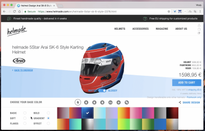
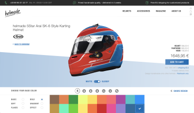
Helmade’s helmet configurator, for example, displays the 3D rendering of a helmet in the middle of the page, but it gets a bit lost with all of the text and navigation around it. Zooming in and out isn’t possible either, so exploring the fine details in a large view is a bit annoying. The product visual takes up most of the available space on narrow screens, though. In our tests, despite smooth rendering and bouncy animations, customers felt a bit annoyed at times because they couldn’t see as much detail as they wanted.
It was interesting to find out that customers tend to prefer direct manipulation of the object, and they use additional controls when they feel that the interface is letting them down. It happens when they can’t see a particular detail or they can’t reliably navigate to details, or both — and, as a result, they fall back to zooming in and dragging out or switching views. All of it adds a lot of unnecessary friction to the interaction. These options weren’t helping customers achieve their goal quickly: to see the configured product or some of its parts in sufficient detail.
On the other hand, customers didn’t use these controls that often if the actual product preview was good enough — unless they wanted to see the texture on a button of a tailored suit, for example. On narrow screens, “good enough” seems to be full-screen width and 65 to 75% of available vertical space; on larger screens, it’s at least 45 to 50% of horizontal space. This allocation leaves enough space for the good ol’ header, title, details and customization controls to be displayed around the visual. Obviously, this rule of thumb won’t work for every product, but it’s reasonable sizing to aim for unless you have extremely wide or extremely tall products (for example, a wide bookshelf or a tall lamp).
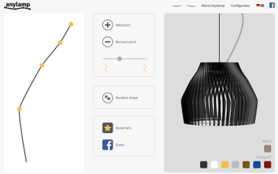
Anylamp doesn’t need much horizontal space to display its products. Instead, the adjustments are prioritized, while vertical space is used to show the product. Notice that all navigation options are kept together, while a preview is clearly separated.
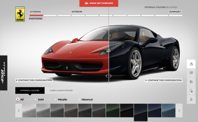
Ferarri’s car builder, on the other hand, goes all the way. The configurator contains 11 steps required to configure the car of your dreams. For every step, the configurator shows the designed component in detail, with large supporting full-width photos and sometimes even a zoom in/out magnifying glass (which appears to be not very responsive at times). The customer doesn’t see the final visual of the car all the time, but only what’s relevant to see at a given moment. It’s usually enough, but having a quick switch to view the entire car would be helpful, too.
The bottom line: The more space you can dedicate to the product’s visual while keeping the customization controls easy to tap and access, the better. It’s a good sign if the product is clearly visible and its parts clearly accessible without the user having to zoom in or requiring a separate full-screen view. Once that happens, we can start to think about how to lay out decent navigation.
Navigation
The nature of a configurator requires the customer to choose a part of the product they’d like to customize and then use some sort of a picker to choose one of the available options. The simplest way to arrange this kind of experience would be by adding some sort of multi-level navigation around the product’s visual. The navigation would contain at least two levels: the first level for the selection of a component to adjust (for example, the interior design of a car) and the second for the actual change of that component (for example, leather or wood).
Translated into our commonly used interface patterns, this leaves us with a couple of options to choose from. For example, we could use a dropdown with a sub-dropdown, but it wouldn’t make all options visible at once, making the experience quite slow — and it’s probably the opposite of the engaging experience we are after. Instead, we could use a set of accordions or tabs, or a “previous/next” stepper, or some sort of a slider to swipe through available options. All of these patterns would probably work, and they aren’t that difficult to sprinkle around the product’s visual, but there are a few things to keep in mind while doing so.
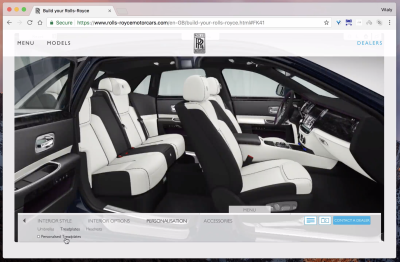
The navigation in Rolls-Royce’s builder, for example, is difficult to use. Selecting one of the steps is painfully slow because you have to carefully slide left and right — plus, the radio buttons in the second-level navigation are tiny and painfully difficult to hit. The interface doesn’t really encourage any kind of engagement.
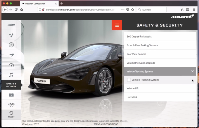
In McLaren’s car configurator (available only in the US version), the main navigation and the customization options are spaced out. This creates a lot of friction because the transition between steps is slow and requires a lot of moving around. Also, the hamburger icon shows and hides second-level navigation, probably to enable customers to see the car at full size. It’s a good idea to keep all navigation close, though.
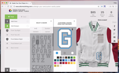
Turning to the tabs in use on Reform Clothing, the configurator contains three levels of navigation. While sliding out horizontally works on larger screens, on narrow screens it would need to happen vertically. Unfortunately, the interface isn’t responsive.
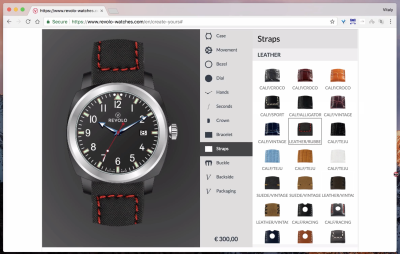
Revolo Watches uses shapes in the first-level navigation, with the tabs acting horizontally. On mobile, text labels are reduced and second-level navigation is displayed as an overlay. It’s a good idea to display the product at all times or integrate the choice of a component in it somehow, but sometimes it’s very hard to do so.
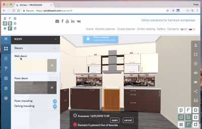
Let’s look at a similar idea but a different implementation. Prodboard Kitchen’s planner places icons on the right and has navigation sliding from left to right. Third-level navigation appears as a sliding panel next to the second panel.
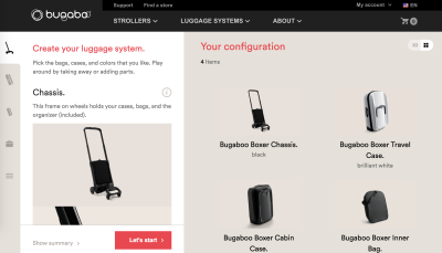
Bugaboo’s luggage configurator uses horizontal tabs on large screens, which then turn into vertical tabs on narrow screens. Again, iconography is in place, and it’s a good idea if it’s clear what the icons stand for. That’s the issue that usability tests will surface.
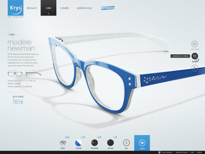
Krys (which has since changed) nicely integrated current choices right in the navigation menu at the bottom. The price was broken down into all sub-components and displayed in the navigation as well. Well done.
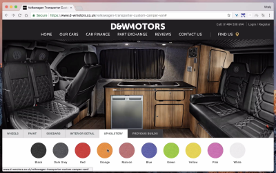
D&W Motors’ implementation isn’t particularly exciting, but it gets many things just right. Updates happen in real time, and the transitions between states are seamless. A few downsides: To see the price, customers have to scroll down (even on large screens). Also, on mobile, the price bar appears at the bottom as the user starts scrolling down, and it isn’t visible at all above it. That behavior is slightly unexpected.
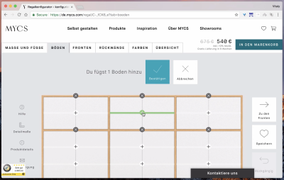
Using tabs at the bottom on mobile is indeed a good idea, but only if the navigation options at the bottom are relevant for the interaction. MYCS’ shelf configurator includes “About us,” “Chat,” “Favourites” and “Shopping Cart” as tabs. Instead, they could be replaced with customization options.
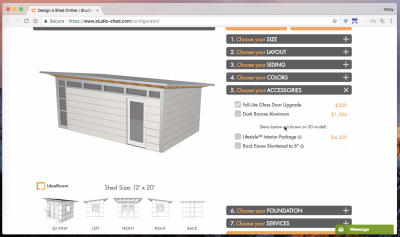
Probably not as exciting, but slightly better, Studio Shed uses tabs to switch between the 3D view, options and the summary of all changes. Saving should probably be done automatically, and customization options could be displayed right away, perhaps as a scrolling panel.
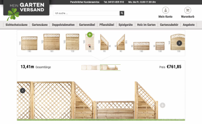
For very wide or very tall products, consider adding big-view navigation to allow customers to quickly jump to a point of interest. Zaunplaner is a tool for designing and ordering fences for a property. Because the fences can be quite long, a big-view map under the list of available shapes and forms aids with jumping to specific parts of the fence.
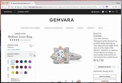
Gemvara’s ring configurator uses a mini-overlay for every component of the ring. Instead of sliding in and out, the options are neatly packed in a panel that lives above the other options. That’s a good option that avoids too much visual noise. On mobile, all options are indeed presented as an accordion, but once you scroll to these options, the visual isn’t visible any longer. Tabs could be well worth considering here.
Scania’s truck configurator uses the off-canvas pattern to enable customers to navigate between different options. The sheer number of options is overwhelming, to say the least, and it’s difficult to keep track of what’s already been selected in the navigation. Moving away from off-canvas towards something slightly simpler, like tabs or an accordion, could help here. Having more than three levels of navigation just feels a bit too complex.
On mobile, Shoes of Prey uses navigation similar to Scania’s, and in this case an accordion might again be a slightly simpler solution. On desktop, instead of using a navigation drawer, the interface displays all steps as plain text on the side. The problem is that the customer has to traverse more space between the selection and the navigation, which might not be necessary.

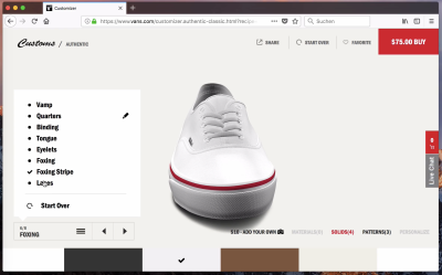
Van’s shoes customizer: where a navigation drawer meets a stepper. The configurator always displays the current step, but also provides a navigation drawer for quick jumps, along with a “previous/next” stepper. In many ways, this pattern seems to work best across a wide range of customizable products. On narrow screens, all options are listed horizontally, and to choose one, the customer swipes left or right.
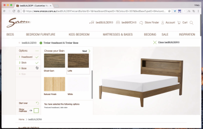
Not all interfaces highlight the progress in the navigation, and not all configurators actually highlight the current step. Snooze’s bedBUILDER does. The interface highlights the current step, already checked off states, and the work that still has to be done. Nothing fancy — simple and straightforward. Unfortunately, the interface isn’t responsive.
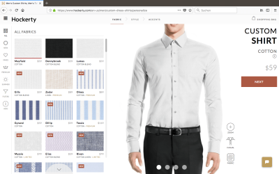
Hockerty keeps the product preview always in view so that customers see the result of their selection immediately. On mobile, customers need to tap the “View changes” button to return to the preview, though, which causes quite some friction. Rather than loading bitmap images for every change, the product preview is adjusted by loading adjusted components alone and placing them on the image. It benefits overall performance. The desktop experience is pretty straightforward. Suitopia uses the same technique to display changes quickly.
Timbuk2’s customizer contains both the navigation drawer, which acts as an overlay on click, and a “previous/next” stepper navigation in the upper-right corner. A stepper isn’t necessary for every configurator, but it creates a predictable navigation pattern that customers can easily follow through.
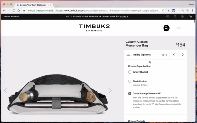
A stepper essentially seems to break down the entire set of options into small manageable chunks that customers can “check off” one after another. With it in place, customers would often start from the beginning, consistently following all available steps and then finishing at the last step. Nothing groundbreaking, isn’t it? However, without a stepper, many customers would jump back and forth a lot and sometimes double-check that they haven’t missed anything. The “prev/next” pattern just seems to be a bit more predicable and easy to deal with, and in fact, the interaction seems to be significantly faster with interfaces that do contain it.
This brings up the question of what the default values for every step should be. Ideally, the customer should be able to just tap through all of the steps quickly to get to some meaningful outcome, and that means that no step should require some sort of active selection. E.g. prompting the customer to choose one of the options in a radio button group adds friction to the experience. Instead, all steps should contain “smart” preselected defaults, or just recommended options that work best for the given product. Essentially, the customer should be able to just choose a base preset and quickly click through the “next” button to get to the final result — without interruption, warnings or errors.
Another interesting thing to notice is that, if there is a “next” button, there should always be a “previous” button as well. In fact, in almost every third user session, we could see people jumping around between steps quite a lot, and just like “next” button is predictable in navigating forward, “back” button is predictable in navigating backwards.
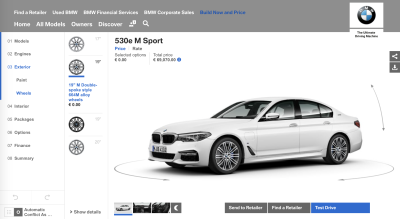
BMW’s configurator is a great example of a “previous/next” navigation working well. The configurator generously reserves a lot of space to highlight the car. As you resize the screen, the focus always stays on the car, while the navigation and configuration options float around the main product. Now, that’s a sophisticated responsive configurator done very well; it serves very well as a tool to build a custom car, but it’s not very engaging beyond that. The “previous/next” navigation is missing on large screens, but it’s conveniently located at the bottom of the screen on mobile. Notice that customization options (for example, the position of the wheel selector) changes significantly from one viewport to another. The visual is always in focus there.
Many of the examples listed above use familiar interface design patterns to integrate navigation via some sort of a menu button that prompts the navigation view. However, if a configurator isn’t particularly sophisticated, perhaps with just three or four steps, you can just keep all options accessible by default.
177milkstreet’s recipes split the screen into halves: one for the navigation, one for the video preview. “Previous/next” buttons are located at the bottom of the navigation split screen, while single steps are laid out vertically. The reset button at the bottom brings the user back to the initial screen. For your configurator, the button could serve another purpose: for example, to rotate items with a delay, or to save the current design or bring up the navigation if necessary. An interface done well.

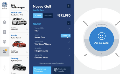
Are “previous/next” buttons necessary on both narrow and wide screens? Probably not, but they can make the interaction a bit faster as the customer doesn’t have to keep track of their progress. When using the button, include it close to the product’s visual on larger screens, and measure the impact. Volkswagen does just that.

In the previous variant of its design, Volkswagen used circular navigation with sliding panels on the left and right and funky transitions between states. The design looks wonderful from a visual standpoint, but apparently it was refined or replaced. Not every navigation has to use (rounded) rectangles.
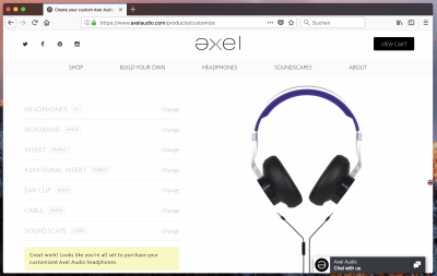
Instead of using the “previous/next” pattern, Axel’s headphones configurator automatically moves the customer from one step to the next with every made selection. Going back requires a tap on the option the customer wants to revert to. It’s an interesting option to consider if there are only a few options to customize.
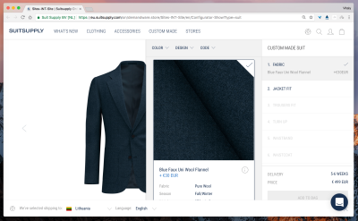
SuitSupply also automatically moves the customer from one component to the next. The selection is supported with filters that limit the scope of options. On desktop, the navigation panes slide in horizontally. The main issue is mobile experience though: in our tests, customers were confused as they just didn’t know how to choose one of the options: on mobile, they are prompted on tap, and not displayed automatically.
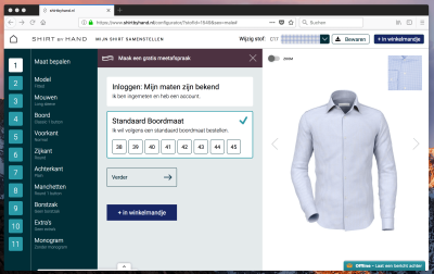
Shirt by Hand displays the “next” button for every component, guiding the customer back and forth through the components. No need to actively select an option. Notice how the initially chosen preset (fabric) is always accessible within a drop-down in the right upper corner. Rather than making customers go all the way to switch to another preset, you could keep them accessible at all times. Downside: unfortunately, the option isn’t available on narrow screens.
What does this all mean for your configurator? One way or another, you are likely to have at least two levels of navigation. Horizontal and vertical tabs could work as well as accordions, and a consistently located “previous/next” stepper would be a great enhancement for quick navigation. It’s a good idea to highlight the current step and some sort of breadcrumbs to indicate the work done and the work left, and also to use meaningful defaults for every step. Sometimes you can even lead the customer automatically from one step to the next.
Good enough? Well, we aren’t quite there yet. There are also ways to provide a slightly richer visual experience while hiding the navigation drawer altogether.
Interaction
If we are looking at the configurator as an option to engage and inspire customers, we could explore ways on how to create a richer, and perhaps slightly more captivating visual experience. In fact, it would be quite difficult to find any racing game that contains dozens of select dropdowns for choosing a fancy racing car. The configuration instead happens through gamification, and usually it’s a very sophisticated interactive experience. Admittedly, not every product can afford a game-alike interface, but it doesn’t necessarily have to be that involved.
In the previous section, we saw Timbuk2’s configurator, where a customer could tap on the component they are interested in and a navigation drawer would pop up — with available options to adjust that component. This gets us much closer to gamification of the entire experience; so, what if we adopted it broadly?
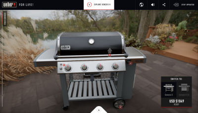
Weber doesn’t really have a configurator, but it gets close to that idea. The central area is well deserved for the 3D rendering of the product, which can be rotated and interacted with, along with a background and audio settings that set the context for the product. Bouncy transitions keep the interaction interesting, and at any point the customer can tap on a pin and be brought to the area of interest that highlights a particular feature. This experience is much heavier in terms of performance, but it’s infinitely more enjoyable and could be applied to many configurators.
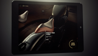
You can see a similar idea implemented differently in Yamaha’s configurator. The customer can tap any component of a bike and, rather than having to swipe through options as a set of radio buttons, can swipe through the actual previews to get to the right one. It really doesn’t get more engaging and enjoyable than that.
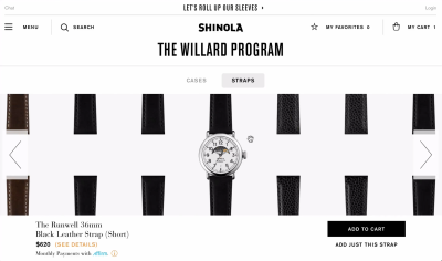
On Shinola, the watch configurator follows the same idea as Yamaha’s bike configurator. Instead of choosing a strap separately, the customer can swipe through options and see the preview right there. A quick little trick for a slightly more interactive experience.
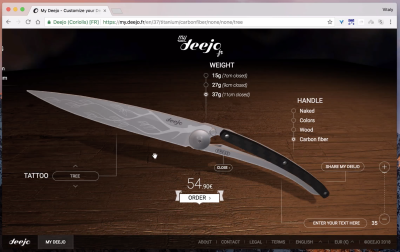
Deejo’s knife configurator displays a 3D rendering of a knife, with options floating around it. As you tap on some components of the knife (and there aren’t that many), floating navigation appears. Admittedly, the navigation controls are quite tiny and a bit difficult to use, but it puts the actual product at the center of… well, everything, and it’s indeed more engaging than good ol’ off-canvas navigation or accordions or anything in between.
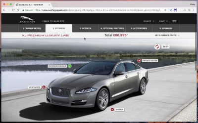
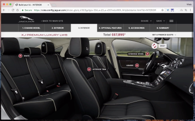
Sometimes it can be difficult to highlight certain components on top of an existing product visual. For example, in a car configurator, customers should also be able to adjust interior components. That’s where you can use labels or floating pins to indicate the options. Jaguar’s AR configurator does just that. Granted, it might not be the most exciting visual design, but it shows that a separate drawer for navigation might not be necessary at all.
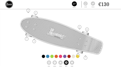
Penny Austrlia’s skateboard configurator might not be the most appealing, but it does everything right. The 3D rendering of the skateboard is fast and responsive (though it needs quite a bit of time to load initially), the pins are accessible, and both levels of navigation are listed at the bottom, with customizable components basically being tabs. Again, no sliding left and right is necessary here. The only downside: perhaps there are a few too many pins displayed at a time.
Axess’ configurator also uses floating pins to indicate that some parts of the device can be customized. Bouncy animation and a funky selector add a bit of excitement to a seemingly unexciting product. Well done!
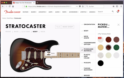
Fender’s guitar customizer (available only in the US) doesn’t provide any pins, but as the customer hovers over some areas, these areas can be activated and acted upon. Adding small floating bubbles might help here — however, with a 3D rendering in place and the sheer number of customization options, it could make the interface too busy. That’s a fine line we need to walk here. Toggling the display of floating bubbles on and off might be a good compromise here.
Ruff Cycles’ configurator takes the interaction one step further. Once the customer has clicked or tapped on one of the components of a bike, the focus shifts to that component (similar to Weber’s experience), and it gets highlighted while other parts are grayed out. On mobile, all individual components are listed horizontally and act as tabs, and customers can swipe through them.
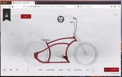
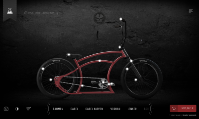
How does this configurator deal with the fact that floating bubbles might distort the product’s visual? Well, it allows customers to turn the hotspots on and off. Also notice the presentation mode, which shows the product in different settings, the dark night view and the detailed info boxes provided for every component of the bike. Well done.
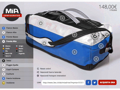
In fact, you might not need to pull out a sidebar panel at all, because the selection of an option could happen inline. Mia’s configurator mockup by Michele Giorgi uses a circular wheel displayed right next to the floating pin.
HurraHelden’s book customizer also uses floating bubbles to indicate customizable parts of the illustration. But instead of placing them onto the illustration, they reside next to it. The interactive controls don’t have any labels, but because there are only four of them, the interface seems to get away with it. In your case, a way to remove noise would be to push the pins a bit away from the visual.
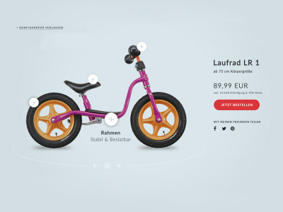
Finally, the floating bubbles could be combined with a 3D view and a magnifying glass (although the latter should probably have slightly higher contrast). Point in case: Laufrad.
The product view could also be complemented with thumbnails or a photo slider that displays the product from a different angle on hover or tap. Using bitmap photos to display the product might be a good alternative to a heavy 3D view. And sometimes thumbnails can be shortcuts for customers to jump to a point of interest without having to move a 3D model precisely.
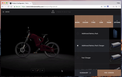
Trefecta’s bike configurator has a slider to navigate through photos of the configured bike. There is noticeable lag when using the slider, but smooth and calm transitions keep the interaction in the flow. The initial images in the slider could have been preloaded.
To make the interaction slightly more engaging, consider bringing the product to the forefront and using bouncy transitions and animations to add some motion to the experience. Floating bubbles could serve as a good enhancement for a configurator with standalone steps, but rarely as a replacement for them. A 3D view definitely has an impact on performance, but it makes the experience more engaging. Talking about performance though: there are also a few other things worth noting of how to keep the customer in the “flow”.
Real-Time Updates Matter
Imagine spending weeks working on an elaborate, sophisticated configurator, only to see your ideas mercilessly crushed by usability tests. It’s easy to get charmed by a beautiful interface with nifty, useful features, but we need to remind ourselves that customers are quick to abandon an interface if it doesn’t respond swiftly to their actions.
When we tested some of the more presentable configurators listed above on a throttled 3G network, we quickly realized how impatient most customers have become over the years. Almost every customer gives the configurator the benefit of a doubt — reloading the page once or, at most, twice if a response isn’t perceived within a few seconds. However, they rarely proceed beyond the third (and sometimes even the second) step if there is noticeable lag between their adjustment and the updated product preview.
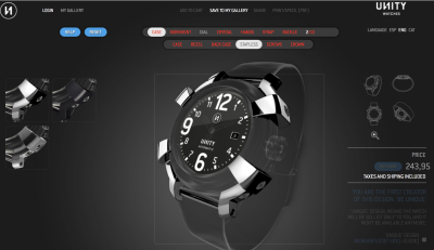
Unity Watches’ configurator, for example, is painfully slow even on blazingly fast connections. No wonder: The preview images are generated with a script running jQuery 1.7.1, sometimes taking 3 second to be delivered and weigh around 400 to 500 KB each. The lag between steps is significant: It doesn’t invite exploration.
Furthermore, some customers expect that adjustments they’ve made will persist after the page has reloaded. They also expect that the interface will provide some sort of visual feedback confirming that the requested change is being applied. In fact,we could display a loading animation and black out the entire screen or disable next steps. Ideally, changes could be made asynchronously, keeping the customer busy with a small “update is happening” indicator while all requests are being processed.
Another technique that seems to be working best is adding smooth transitions and animations between steps. In tests, interfaces with smooth transitions and animations seemed to be perceived as being slightly snappier.
During interaction, customers obviously often switch back and forth between the product view and the customization options, but they also briefly glance at the price tag before proceeding with their next change, basically verifying that they are still on the right track. Therefore, for one, it’s a good idea to display the price next to the product’s rendering to avoid unnecessary jumps. Besides, it’s important to keep the price updated in real-time as well to avoid confusion or duplicate clicks.
The problem is that often an accurate and real-time re-rendering of a product’s visual requires quite a bit of work, both from the application and from the hardware on the user’s device. The delivery of high-quality images especially to high-resolution screens on flaky connections ain’t an easy task. Usually re-rendering the entire product every time would be way too slow, so one obvious solution would be to re-render only the adjusted component at a time.
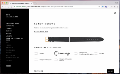
Camile Fournet’s watch band configurator loads steps and options on demand, as they are required. Instead of blocking the entire interaction while all assets are being downloaded, it shows as many options as are available at a given time. If a user chooses to click on one of the already available options, the watch band preview is updated right away because the preview has been preloaded already.
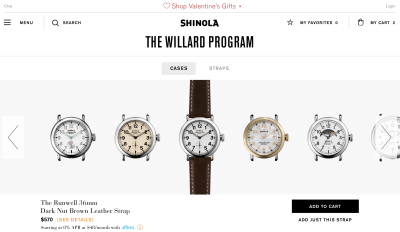
Shinola preloads a large palette of product previews — overall, 120 combinations — to ensure a smooth real-time update. It works, but it comes at a significant cost of initial downloading of over 10 MB of high-resolution bitmap images. As the customer slides horizontally, more options are downloaded. That’s a big price to pay for fast re-rendering — and it takes quite some time for all combinations to be downloaded before the configurator has even launched. With SVG or WebGL, changes could be incremental and small.
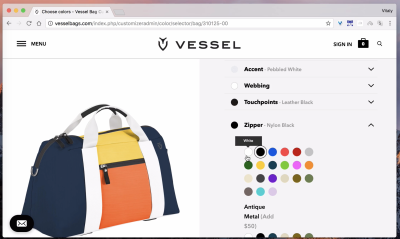
Vessel Bags uses bitmap images and different angle previews for every product. On a fast connection, the experience is wonderful because the interface is quite straightforward. But on a slower connection, the experience is unbearable. For the entire configurator of a golf bag to be downloaded and initiated, it takes around 292 HTTP requests and 11 MB of data, which translates into 2 minutes 58 seconds to see the initial preview of a configured product on slow 3G.
On Helmade, the product preview is generated via Three.js. The configurator is quite heavy by all means, with 290 HTTP requests and 2 MB of data, but it pretty much covers all required assets. No further resources are dowloaded as the customer adjusts the parts of the helmet. Because no network is really used, the response time is immediate. In fact, because it’s essentially a client-side application, it keeps working just fine if the customer is commuting or even offline. However, CPU usage is significantly higher.
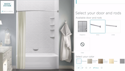
Bath’s Fitter has an immediate bathroom preview. All images are preloaded at the very beginning as the configurator loads and then displayed immediately on request. That costs bandwidth but results in a fast and responsive user experience.
Essentially, a decision on loading strategy is a double-edged sword: You’ll abuse either the bandwidth or the user’s hardware. If you are targeting low-end machines as well, consider providing an alternate view altogether. Instead of re-rendering the product with every change, Bugaboo allows you to see sub-components of the configuration separately. No 3D rendering is initiated in that case.
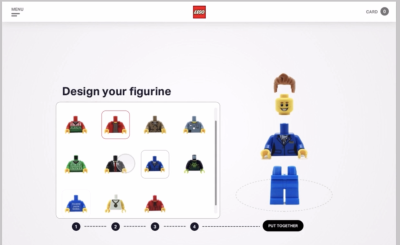
Sometimes, instead of re-rendering the model, you can just separate components and bring them together visually. The sub-parts of a LEGO figurine are presented as standalone parts and so are easy to replace visually. Bouncy animations add playfulness to the interaction.
It’s a good call to assign responsibilities of different components of the preview to different technologies. For fixed parts, such as the background and structural parts of the product, you could use bitmap images. For flexible parts, such as colors, shapes and overlays, you could use SVG or WebGL. For shades and lightning, we could even use canvas to apply lighting to color choices.
Ideally, the configurator would provide real-time updates for the rendering and for the pricing. Preloading assets works best, but instead of bitmap images, think about storing standalone component assets and loading them conditionally. If quick rendering is difficult to achieve due to the number of components, consider adding alternate views with smaller thumbnails and photos. Also, let users interact with the configurator while queueing tasks asynchronously — if the entire interface is blocked, the user will have no choice but to wait for every item to be updated.
Context-Sensitive Inspiration
When a customer can’t make a decision, we can help them avoid deadlock by providing examples of a configuration in a particular setting. However, general or abstract examples aren’t very helpful if a customer is struggling with a particular choice. Therefore, for every step, we could define a couple of recommended options or premade configurations and display them upon request.
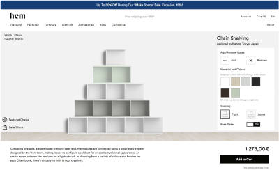
For example, Hem’s chain system configurator by Daniel Liss features sample configurations in the bottom-left corner. For every single step, the configurator provides a photo gallery with examples of which configurations might work well. Even more than that, every option contains elaborate details of what makes it different from other options. It’s a fantastic example of an advanced configurator done well. Good presets, quick undo and redo options on the product itself, an accessible slider for a 3D view, and helpful explanation and previews. Well done.
Many configurators for high-end products go to extremes by providing a “night” view for their products. You can find it among many car configurators, but bike configurators also contain the preview sometimes. Ferrari’s configurator is one of them.
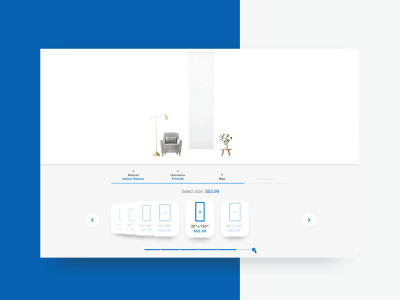
The Banner configurator by Denise Salvador visualizes a banner size right in the context of how it could be placed or used. It’s a great little idea that immediately conveys dimensions and proportions that customers can relate to.
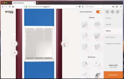
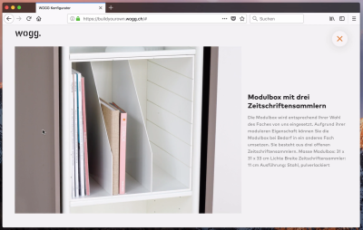
For every single shelf module, Wogg contains an example of what a module could look like in real life and what it would typically contain — including some hints of when it would work best. On narrow screens, the navigation is displayed at the bottom as a sliding panel. On large screens, it floats to the right edge of the screen. 3D rendering and smooth transitions make the interface really stand out. It’s a great simple example, worth looking up every now and again.
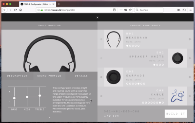
The inspiration doesn’t have to be visual. Aiaiai’s headphones configurator provides not only a general description but an actual sound profile for every combination of earpads, speaker units, headbands and cables, as well as genres recommended for that particular configuration.
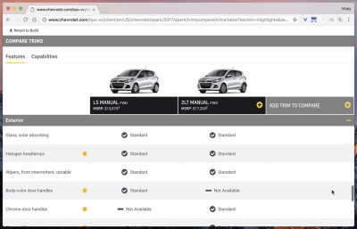
Chevrolet uses a slightly different strategy to help customers make a decision for components. The interface integrates a feature comparison table for advanced attribute-by-attribute comparisons — for example, for engines and configurations that the customer has already created. Toyota has a similar feature as well.
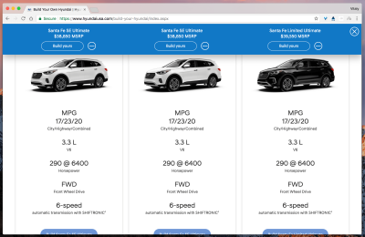
Hyundai also uses a feature comparison for trims. All spec details are grouped and broken down into accordions which are then displayed on tap or click. It might be interesting to explore common feature comparison design patterns at this point as well. Also, notice that a 360 degrees view is loaded conditionally, on request.
Without a doubt, adding relevant photo and video references or a feature-comparison table to every configurable component would be quite a bit of work. However, just adding simple recommendations might play a critical part in turning undecided visitors into thankful customers. It’s not necessary to invest heavily in extensive visuals that cover the entire spectrum of products. You could study the most complicated attributes in the configurator and look into adding some context-sensitive examples for each particular attribute. A little bit of guidance can go a long way.
Show And Resolve Dependencies
It can be quite frustrating to build the configuration of your dreams only to find out in the final summary that some of the components aren’t compatible or that the product can’t be produced due to stock availability. Track dependencies lined out in the initial spreadsheet, and inform the customer right away that the current choice isn’t compatible with a previous choice, prompting them to resolve the issue on spot.
For every configuration option, Mini’s vehicle configurator keeps track of attribute dependencies, which is what the “Conflict” icon stands for. The overlay explains what seems to be the problem, what’s going to happen if the customer continues, and how the conflict can be resolved if the customer wants to keep the previous selection.
Notice that the previous examples contain an “undo” button that allows customers to reverse their action on spot. Because by its nature a configurator is a playful experience, our interface should enable going back and forth with various options. Of course, this means instant visual feedback, but it also means allowing customers to make mistakes and correcting these mistakes seamlessly.
Usually, the experience of refining an adjustment is quite tedious: The visitor has to switch back to the option they just adjusted and pick another option that is better than the one they’ve just chosen. However, especially if the options reside in a technical domain, some customers might not remember their initial choice. After a couple of attempts to get to a “good” previous state, they give up and refresh the entire configurator altogether.
That’s where undo and reset buttons can come in handy. While the former allows the customer to move back through their adjustments step by step, the reset button restores the initial state of a standalone step or the entire configuration. Additionally, they could (and probably should) also be accessible via the “remove” button in a summary view.
Summary View
The product preview and price tag get, without a doubt, the most attention from customers, but as they move through steps, another important feature customers keep looking for is a detailed summary view of all adjustments. It has to do with the way the interaction usually plays out: In the initial steps, most customers include all of the features they find interesting or useful, just to see how steep the price gets, and then they start removing “too fancy” features to get back to a reasonable price. Further down the line, they start using the summary view more and more often. In that summary view, they expect to be able to see all changes, but also a price tag clearly mapped to every change, as well as an option to remove or cancel it and to decrement or increment the number of items (for example, for accessories).
It almost leaves a bitter taste to observe that most users don’t have much trust in the wonderful interfaces we all so carefully craft. The UIs often fail them, crashing, slowing them down or just not doing exactly what they expect. After four to six adjustments, many customers almost mysteriously shift their attention to the summary view to copy and paste all of the changes they’ve made. Why? “Just so all the changes I’ve just made don’t get lost when the browser crashes or something,” said one of the interviewees. That’s also why the longer a customer interacts with a customizer, the less likely they are to refresh the browser window — even if the interface is painfully slow. They are just too afraid to lose all the work they’ve done. In fact, it’s more likely that they will open another browser tab and replicate all of the changes made there.
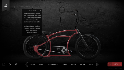
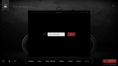
How can we as designers deal with this? Consider including a “save”, “copy” or “share” button in the summary view, so customers can seamlessly back up their hard work with one tap. Also, automatically save all adjustments under a given ID and expose it. Ruff-Cycles, for example, provides a unique “Ruff-DNA” to the active configuration and saves it automatically. It also allows customers to look up any previous “builds”.
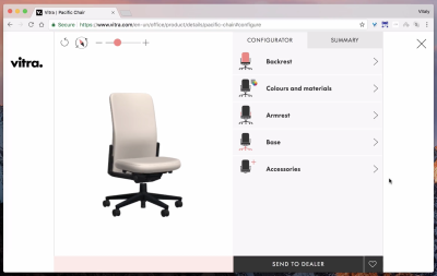
In Vitra’s chair configurator, the interaction with the first-level, second-level and sometimes third-level navigation requires quite a bit of back and forth. Especially on mobile, sliding out the items vertically, instead of using the off-canvas pattern, might make the interaction a bit snappier. The interface contains a prominent “Summary” tab; however, when reconfiguring items, the customer has to manually return to “Summary” to examine other changes. That’s a bit tiring.
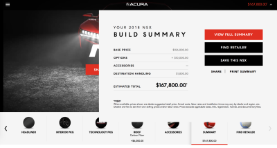
The summary is often located in the upper-right corner as a dropdown. Acura’s car configurator, for example, has a price tag in the upper-right corner prompting a “Summary” overlay on click. Not every customer will spot it at first, but once they did, not many customers had any issues understanding it. Having a clear button stating “Summary” with a chevron icon would be slightly better. The “options” row in the summary could be an accordion as well, opening and collapsing on tap. Here’s a nice touch: The customer can save up to 10 configurations and print out a beautifully laid-out summary of all changes. Bonus: Notice the integrated slide-in navigation, which shows both levels of navigation with one bar, and which highlights already customized options with a checkmark icon.
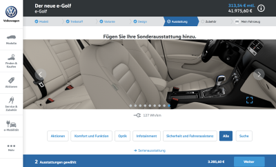
Volkswagen uses an “i” icon next to the price tag in the upper-right corner to prompt a “full summary” overlay. The summary is very detailed and contains a button for editing the selection. For accessories, it could include a “remove” option instead of prompting the customer to go through the selection again. Also, notice that once the overlay is open, the “information” icon is replaced with the “close” icon at exactly the same spot. It’s helpful for customers who just want to quickly toggle views and continue the interaction.
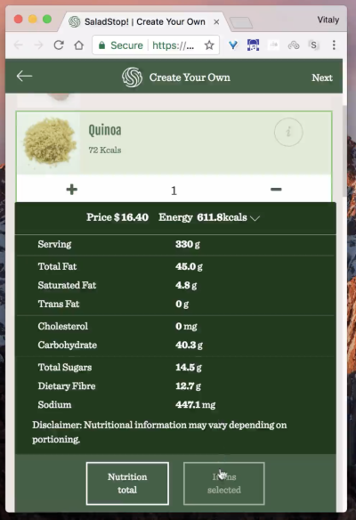
On narrow screens, SaladStop pulls out the summary of all added salad ingredients in a bottom-up accordion overlay — always easily accessible on tap. The “next” button is in the upper-right corner, and the arrow pointing back is in the bottom-left corner. It would be worth testing all of these navigation options lined out on the bottom bar together.
Summary view matters, and it’s a good idea to keep close to the point of interaction. On narrow screens, it could be located in a bottom bar (think about 177milkstreet’s UI, with a summary button in the middle of the bar), and on large screens, it could be displayed next to the product’s visual and the price tag. On click, it would prompt an overlay that takes up the entire screen or part of it, with the icon turning into a “close” icon at exactly the same spot. You can’t do much wrong by doing so.
It’s obvious but worth stating nevertheless: Because customers are likely to move a lot between the different steps of the configuration, make sure to include a “finish” or “proceed to checkout” button in the summary panel as well.
Responsive Behavior
All of the components we’ve looked at so far seem quite predictable in their behavior. A product visual is going to get smaller on narrow screens. The navigation will be reshuffled a bit, jumping to the bottom of the screen. The price label will be floating next to the product’s visual. And a summary button might be placed at the bottom of the screen as well. So far, so good.
However, keep in mind that if a 3D rendering of your product has pins placed on it, make sure that the floating bubbles (or pins) are large enough for comfortable tapping. This means that these pins would usually get slightly larger on narrow screens.
Once a pin is tapped, should the customization options appear above or below the pin? If there isn’t enough vertical space to display the options at full size above the pin, they should be displayed below the pin; however, in most cases, the experience would be better off with the options displayed above it. Why? On mobile, many customers will be using a thumb to navigate through the options, but on tap, their thumb would potentially be covering the options displayed under the pin. It would never be covering them if the options are displayed above or to the right of the pin.

Another interesting trick is to keep critical details such as the “summary view” button or the view switcher not in the upper-right corner, but around 40 to 50 pixels below the upper-right edge of the screen. Why? On many mobile devices, hitting the corner gets quite tiring because it requires the customer to reposition their hand to access it. Pushing it a bit down brings it closer and makes it easier to access without getting in a way of interaction. The Guardian’s example above, with the navigation icon pushed a bit down from the upper-right edge of the screen is a good example of just that.
Conversational UI
You might be wondering at this point if it’s absolutely necessary to design a sophisticated interface with a ton of buttons and toggles and accordions and tabs if one could just use a simple conversational interface instead. Conversational UIs can indeed be very engaging and can feel much more personal than any set of buttons could ever be.
Thinking about the configurator, the interface can essentially be seen as a conversation, and customers could receive little nuggets of advice or one recommendation at a time before moving on to the next step. In such an interface, keeping the visual preview of the product and the price tag visible at all times still matters, but beyond that, the interface just has to be resilient to the customer going back and forth and changing their mind. It should also understand commands such as “change wheel” or “change texture.” Unfortunately, typing lengthy commands on mobile is usually way too slow for a frictionless and engaging experience. If you can reduce typing to a set of quick decisions made one after another, then a conversation could work just fine.
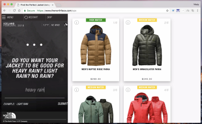
Northface uses IBM Watson’s Personal Shopper to help customers choose the best clothing for a particular situation. After asking a few questions, it prompts a selection of recommendations. Allowing the customer to adjust a few high-level details in this way might be a great option for a configurator, but when it comes to selection of color, texture and other fine details, going back and forth in a conversation can quickly becoming tiring and slow. However, it might be a good idea to use a wizard instead of a configurator in the first place, and suggest the best recommendation based on customer’s input.
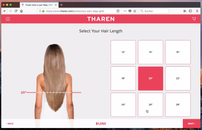
Tharen provides custom-crafted hair extensions, and customers are asked a series of questions to arrive at a perfect recommended solution. Instead of re-rendering the input on every step, it provides context-sensitive illustrations to simplify the choice.
HelixSleep asks a dozen questions before recommending an option. It frames the questions in a nice, polite and friendly way, trying to embed the personality of the couple in the final product. Indeed, sometimes even a sophisticated, multi-functional configurator would be way more boring than a simple wizard.
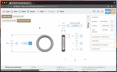
Baumann Sprinconfigurator is a slightly more technical configurator. It’s quite difficult to imagine this configurator being replaced with a friendly conversational interface.
Almost every configurator could also be transformed into some sort of a wizard or conversational interface. Every component could be addressed and inquired independently, but the interface still has to provide a way to see the real-time product visual and price. Typing lengthy phrases might be a bit of hassle though which would make going back and forth between steps of the configurator too slow and annoying.
Accessibility
Although a configurator is usually a heavily visual experience, keeping it accessible is not particularly difficult. Essentially, there are a few major issues to keep in mind. Obviously, the entire experience should be keyboard-accessible, so make sure to keep the product’s visual, price tag, “previous/next” buttons, navigation and summary button focusable. It also means making sure that whenever a change is requested in the summary panel, it’s also confirmed by the screen reader. If your configurator is heavily focused on pins and floating bubbles living in the product’s visual, make sure that they are keyboard-friendly as well.
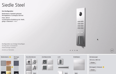
Siedle Steel’s configurator uses drag and drop to allow customers to design their communication system visually. However, the system isn’t keyboard-accessible. And even with a mouse, the drag and drop requires very precise input. Being able to choose components from a panel of options might have been slightly easier.
Another useful thing to keep in mind is to describe colors in text, complementing color swatches. All colors that can be configured should also be labeled. Making those text labels visible would also be helpful for people with colorblindness issues.
Every change made in a component, as well as its impact on the price and the current position in the configuration process, should be announced by a screen reader (you might want to use ARIA-live regions there). If you’re using a 3D rendering of the product, make sure to include a keyboard-friendly slider to allow for manipulation of the product’s visual. (A huge thanks to Marcy Sutton for helping out!)
Better Configurator = Higher Conversion?
That’s a hell of a $1 billion dollar question. Unfortunately, it’s remarkably difficult to answer. We clearly observed customers abandoning slow, poorly designed configurators, and we also clearly saw people spending more time with well-designed ones. However, most products in those configurators were quite pricey, so purchasing decisions are unlikely to happen on spot anyway. However, the assets that elicited the most engagement seemed to be the speed of the interface as well as its predictability. Not many customers complained about too many steps or too few options, but they did complain about “switching back and forth” and the “slow, laggy” experience. So, this gives us a target to aim for when designing our next configurator.
The interfaces that incorporate the recommendations outlined above did lead to more people getting to the final build quite quickly, but unfortunately we weren’t able to measure or compare the impact of an improved configurator on the conversion rate in the context of a large-scale e-commerce website. We would love to see if some of these patterns have helped you, and we’d be happy to see a case study published here on Smashing Magazine or anywhere else.
Responsive Configurator Design Checklist
Phew! That was quite a journey! Getting from basic presets to the final configuration requires quite some effort from designers and developers indeed. Even if you aren’t working on a configurator at the moment, hopefully this article has provided you with an idea of the scope of complexity you are likely to deal with here. As usual, below is a checklist of many important design ad development decisions to make when working on the perfect responsive configurator interface.
Design
- Are we designing for inspiration or customization or both?
- What’s the entry point to the configurator?
- How many presets, and how to define them?
- Do we provide recommendations or labels with presets?
- Do we ask for some preferences before suggesting a preset?
- How do we design a selection of presets?
- Do we need to integrate search or filtering?
- Have we defined smart defaults?
- Is the product always visible, on mobile and desktop?
- Do we always display the current price?
- Do we use a 3D view of the product?
- Do we use thumbnails or add a preview on hover or tap?
- Should it be possible to change the view between 3D and photos?
- How do we design navigation, with pins (floating bubbles) or the “previous/next” pattern?
- Is it possible to jump from the current step to a previous one?
- Do we highlight the current step and already finished steps — and, if so, how?
- Is it clear how to undo a change or feature?
- Do we use animations and transitions for rotation, a change in price or a re-rendering of components?
- Do we complement the 3D view with thumnbails or photo slider acting as shortcuts to jump to a particular angle?
- How do we design the addition or removal of a choice (color, icon, overlay)?
- For every step, do we need to group some options to limit scope?
- For every step, do we display the effect of a selected feature on the price?
- For every step, do we explain and highlight dependencies (for example, if some options are mutually exclusive)?
- Do we provide context-sensitive inspiration to simplify a choice?
- Do we display dependencies (for example, if some options are mutually exclusive)?
- Do we make recommendations to nudge a user towards a choice?
- Do we integrate a feature-comparison table at some steps?
- Do we have a full-screen view for the product rendering or zooming in and out?
- Do we provide extra details (for example, financing, leasing, reservations, sharing)?
- Do we integrate a chat bot or conversational UI?
Interaction
- Is it possible to jump from the current step to a previous one?
- Is the “next” step never empty, but rather contains a smart default value?
- Should the user automatically move to the next step when finished with the current one?
- For every step, do we show the effect of a selected feature on the price immediately?
- Should the user automatically move to the next step when finished with the current one?
- Is it possible to save or label the current snapshot of the configuration?
- Does checkout contain a link to edit, change or adjust the configured model?
- Are we using drag and drop functionality?
Performance
- Is visual feedback of the product preview instant on 3G?
- Do we store choices automatically? What happens upon page refresh?
- Are we lazy-loading assets (and options!) for performance?
Accessibility
- Are all critical elements (“previous/next” buttons, summary, visuals) focusable?
- Are all UI controls labeled for screen reader users?
- Are icons intuitive to all users, or do they include visible text labels for usability?
- Is the 3D slider fully accessible?
- Are changes announced via the screen reader?
- For every step, is the summary of all changes always accessible?
- Is color contrast bright enough to make text stand out on top of backgrounds?
- Are headings and landmarks used to convey hierarchy and semantic structure?
Wrapping Up
Designing a configurator UI isn’t a particularly simple task. The simplest first step is to set up a spreadsheet and identify smart presets and address complicated questions first. Both will help you limit the scope of options and reduce the complexity of the interface. Think of customizable attributes and existing dependencies. Group them, label them, and think about the layout of the configurator on narrow and large screens.
Designing the actual navigation through the available set of options isn’t going to take much time, but making sure that the visual feedback and pricing update are instant might require quite some effort. Use “previous/next”-navigation consistently, and consider moving the customer from one component to the next automatically. Pins placed on the product’s visual are probably going to be more engaging than a list of steps, as would be a 3D rendering of the product.
For better performance, break down the product into replaceable mini-components and load them conditionally instead of regenerating the entire bitmap image. Most importantly, think about guidance at points where the customer might be stuck — with context-sensitive photos, or popular examples or recommended options. Everything else is just an exercise in testing, measuring the outcome and refining the UI.
If you need more inspiration for your perfect responsive configurator, Configurator Database contains over 1250 examples of interfaces, sorted by industry, country and product name. It should cover most of your needs fairly well.
A quick shameless plug: This article is part of an ongoing series about responsive design patterns here on yours truly, Smashing Magazine. Interested in a (printed) book covering all of the patterns, including this one? Let us know in the comments — perhaps we can look into combining all of these patterns into a single book and publishing it on Smashing Magazine. Keep rockin’!
Further Reading
- Inspiring Everyday Graphic Design
- 33 Tempting E-Commerce Icons For Free
- Breaking Out Of The Box: Design Inspiration
- Modern Art Movements To Inspire Your Logo Design
 (ra, al, yk, il, mrn)

