Styling Empty Cells With Generated Content And CSS Grid Layout

Email Newsletter
Weekly tips on front-end & UX.
Trusted by 182,000+ folks.


 Custom Web Forms for Angular, React, & Vue. Your backend.
 Celebrating 10 million developers
A common Grid Layout gotcha is when a newcomer to the layout method wonders how to style a grid cell which doesn’t contain any content. In the current Level 1 specification, this isn’t possible since there is no way to target an empty Grid Cell or Grid Area and apply styling. This means that to apply styling, you need to insert an element.
In this article, I am going to take a look at how to use CSS Generated Content to achieve styling of empty cells without adding redundant empty elements and show some use cases where this technique makes sense.
Taking A Closer Look At BFC
If you’ve ever made a layout with CSS, you probably know what BFC is. Understanding why it works and how to create one is useful and can help you to understand how layout works in CSS. Read a related article →
Why Can’t We Style Empty Areas Already?
The opening paragraph of the Grid Specification says,
“This CSS module defines a two-dimensional grid-based layout system, optimized for user interface design. In the grid layout model, the children of a grid container can be positioned into arbitrary slots in a predefined flexible or fixed-size layout grid.”
The key phrase here is “children of a grid container.” The specification defines the creation of a grid on the parent element, which child items can be positioned into. It doesn’t define any styling of that grid, not even going as far as to implement something like the column-rule property we have in Multi-column Layout. We style the child items, and not the grid itself, which leaves us needing to have an element of some sort to apply that style to.
Using Redundant Elements As A Styling Hook
One way to insert something to style is to insert a redundant element into the document, for example, a span or a div. Developers tend to dislike this idea, despite the fact that they have been adding additional redundant “row wrappers” for years in order to achieve grid layouts using floats. Perhaps that obviously empty element is more distasteful than the somewhat hidden redundancy of the wrapper element!
Completely empty elements become grid items and can have backgrounds and borders added just like an element that contains content, as this example demonstrates.
See the Pen Empty elements become Grid Items by Rachel Andrew (@rachelandrew) on CodePen.
Eric Meyer, in his A List Apart article Faux Grid Tracks, advocates for using the b element as your redundant element of choice, as it confers no semantic meaning, is short and also fairly obvious in the markup as a hook.
Inserting an additional few div or b elements is unlikely to be the greatest crime against good markup you have ever committed, so I wouldn’t lose any sleep over choosing that approach if needed. Web development very often involves picking the least suboptimal approach to getting the job done until a better solution is devised. I do prefer however to keep my styling in one place if possible, safely in the stylesheet. If nothing else, it makes it easier to reuse styles, not needing to worry about the additional required markup. It is for this reason, I tend to look to generated content, something I’m very familiar with from the work I’ve done formatting books with CSS, where you spend most of your time working with this feature.
Using Generated Content As A Styling Hook
CSS Generated Content uses the ::before and ::after CSS pseudo-classes along with the content property to insert some kind of content into the document. The idea of inserting content might lead you to think that this is for inserting text, and while this is possible, for our purposes we are interested in inserting an empty element as a direct child of our Grid Container. With an element inserted we can style it.
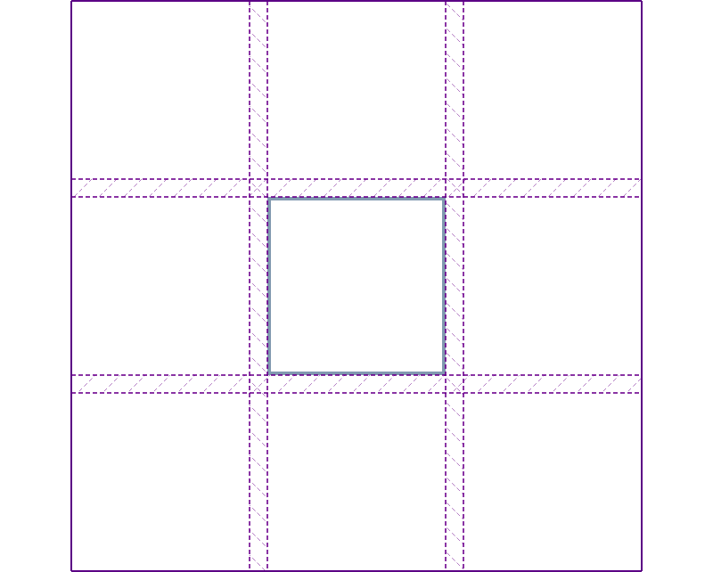
In the below example I have a containing element, which will become my Grid Container, with another element nested inside. This single direct child will become a Grid Item. I’ve defined a three column, three-row grid on the container and then positioned the single item using Grid Lines, so it sits in the middle Grid Cell.
<div class="grid">
    <div class="item"></div>
</div>
.grid {
    display: grid;
    grid-template-columns: 100px 100px 100px;
    grid-template-rows: 100px 100px 100px;
    grid-gap: 10px;
}

.grid > * {
    border: 2px solid rgb(137,153,175);
}

.item {
    grid-column: 2;
    grid-row: 2;
}
If we take a look at this example, using the Firefox Grid Inspector to overlay the Grid Lines, we can see how the other empty cells of the grid exist, however, to add a background or border to them we would need to add additional child elements. Which is exactly what Generated Content enables.
In my CSS I add an empty string, ::before and ::after my Grid Container. These will immediately become Grid Items and stretch to fill their container. I then add the styling I need for the boxes, in this case adding a background color, and position them as I would any regular Grid Item.
.grid::before {
    content: "";
    background-color: rgb(214,232,182);
    grid-column: 3;
    grid-row: 1;
}

.grid::after {
    content: "";
    background-color: rgb(214,232,182);
    grid-column: 1;
    grid-row: 3;
}
In the document we still only have one child element, the redundant styling elements are contained within the CSS, which seems perfectly reasonable as they are only there for styling purposes.
Limitations Of The Generated Content Approach
The obvious issue with this approach will become apparent if you decide you would like to also style the top right and bottom left Grid Cells. You can only apply one piece of generated content to the top and one to the bottom of the container, multiple ::before and ::after pseudo elements are not allowed. The method isn’t going to work if you want to create yourself a CSS Grid chequerboard! If you find that you do need to do a lot of empty cell styling then for the foreseeable future, the “Filler B’s” approach explained above is likely to be your best bet.
The generated content method could also confuse a future developer working on your project. As we are targeting the container, if you reuse that class elsewhere it will bring along the generated content, this is useful if that is what you want. In the next example, we have added decorative lines either side of a heading, it would be reasonable that every instance of an h1 would have those lines. It would, however, be very confusing if you were not aware this was going to happen! A comment line above the container rules will help here. I tend to work these days in a pattern library, which really does help these components neatly in one place, making it more obvious what happens when a class is applied to an element.
Fancy Headings
One of my favorite generated content tricks is to style headings. In the past, I had to push back on heading styles that would require additional wrappers and absolute positioning tracks to achieve. When content comes from a CMS, it is often impossible to add those redundant wrappers.
With Grid and generated content, we can add a line either side of our heading without adding any additional markup. The line will grow and shrink according to available space and will fall back elegantly to a plain centered header when Grid is not available in browsers.
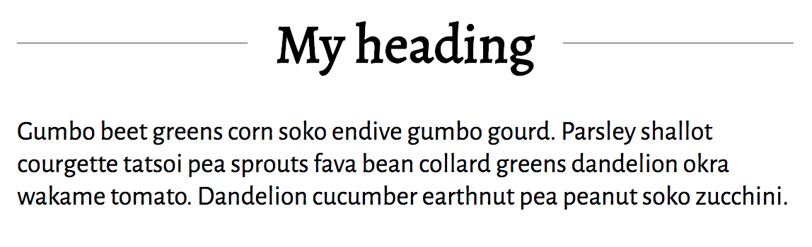
Our markup is a simple h1.
<h1>My heading</h1>
In the rules for the h1 I create a three column grid. The value of grid-template-columns gives a track of 1fr then one of auto and a final track of 1fr. The two 1fr tracks will share the available space left over after the heading has taken the space it needs to be sat inside the auto sized track.
I added the text-align property with a value of center in order than my heading is entered in browsers without grid.
h1 {
    text-align: center;
    display: grid;
    grid-template-columns: 1fr auto 1fr;
    grid-gap: 20px;
}
We now add our generated content, to add a line before and after the heading text. I wrap these rules in a Feature Query, so we don’t get any weird generated content in browsers without grid layout.
The line itself is a border on the generated item.
@supports (display: grid) {
    h1:before,
    h1:after {
        content: "";
        align-self: center;
        border-top: 1px solid #999;
    }
}
That’s all you need to do! You could use the same technique to add any styling, or even an icon on both sides of an element, above or below the element. By placing your item into a separate track you know there is no chance that the item could end up overlapping your heading text, which tended to be the problem when trying to do this kind of thing with absolute positioning. You also have the benefit of the precise ways items can be aligned against each other in grid.
See the Pen Generated Content heading example by Rachel Andrew (@rachelandrew) on CodePen.
This is a nice example of an enhancement possible using grid layout which you could take advantage of even if you are not ready to head right into a major redesign using grid yet. It falls back very nicely to a straightforward heading, people with supporting browsers get the extra touch, and everyone gets the content. A similar approach was taken by Eric Meyer, using generated content to add easily styleable and positionable quotes to a blockquote element.
With these small features, I often don’t start out thinking that I’m going to use Grid Layout. It is as I start to figure out how to implement my design I realize it is the layout method to choose. It’s for this reason that I encourage people not to think of Grid as being for page layout over components if you do so you might miss plenty of opportunities where it can help.
Adding Backgrounds And Borders To Areas Of Your Design
We can also use generated content to stack up items; the fact is, more than one item can occupy a particular grid cell. This can include those items inserted with generated content.
In the next example, I have a design with two sections of content and a full-width item. Behind the content is a background which also runs underneath the full-width item.
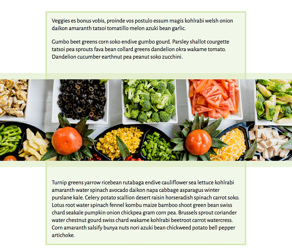
The markup has a container with the sections and full-width element as direct children, and I’m using line-based placement to place my items onto the grid.
<article class="grid">
    <section class="section1">
        <p>…</p>
    </section>
    <div class="full-width">
        <img src=“placeholder.jpg” alt=“Placeholder”>
    </div>
    <section class="section2">
        <p>…</p>
    </section>
</article>
.grid {
    display: grid;
    grid-template-columns: 1fr 20px 4fr 20px 1fr;
    grid-template-rows: auto 300px auto;
    grid-row-gap: 1em;
}

.section1 {
    grid-column: 3;
    grid-row: 1;
}

.section2 {
    grid-column: 3;
    grid-row: 3;
}

.full-width {
    grid-column: 1 / -1;
    grid-row: 2;
    background-color: rgba(214,232,182,.5);
    padding: 20px 0;
}
This gives me the layout with the full-width image and two sections of content placed; however, if I add the background to the sections, it will stop above the row-gap between section and the full-width image.
.section {
    background-color: rgba(214,232,182,.3);
    border: 5px solid rgb(214,232,182);
}
If we removed the grid-row-gap and used padding to make the space, it still wouldn’t enable the effect of the background running underneath the full-width panel.
This is where we can use generated content. I add generated content ::before the grid container and give it a background color. If I do nothing else, this will position the content in the first cell of the grid.
.grid::before {
    content: "";
    background-color: rgba(214,232,182,.3);
    border: 5px solid rgb(214,232,182);
}
I can then position the content using line-based positioning to stretch over the area that should show the background color.
.grid::before {
    content: "";
    background-color: rgba(214,232,182,.3);
    border: 5px solid rgb(214,232,182);
    grid-column: 2 / 5;
    grid-row: 1 / 4;
}
You can see the complete example in this CodePen.
See the Pen Generated Content background example by Rachel Andrew (@rachelandrew) on CodePen.
Controlling The Stack With z-index
In the example above, the generated content is inserted with ::before. This means that the other elements come after it, it is at the bottom of the stack and so will display behind the rest of the content which is where I want it. You can also use z-index to control the stack. Try changing the ::before selector to ::after. The generated content background now sits on top of everything, as you can see from the way the border runs over the image. This is because it has now become the last thing in the grid container, it is painted last and so appears “on top.”
To change this, you need to give this element a lower z-index property than everything else. If nothing else has a z-index value, the simplest thing to do is to give your generated content a z-index of -1. This will cause it to be the first thing in the stack, as the item with the lowest z-index.
.grid::after {
    z-index: -1;
    content: "";
    background-color: rgba(214,232,182,.3);
    border: 5px solid rgb(214,232,182);
    grid-column: 2 / 5;
    grid-row: 1 / 4;
}
Adding backgrounds in this way doesn’t need to be limited to dropping a background completely behind your content. Being able to pop blocks of color behind part of your design could create some interesting effects.
Is This Something That The Specification Might Solve In The Future?
Adding backgrounds and borders does feel like a missing feature of the CSS Grid specification and one which the Working Group have discussed along with many members of the community (the discussion thread is on GitHub).
If you have use cases not easily solved with generated content, then add your thoughts to that thread. Your comments and use cases help to demonstrate there is developer interest in the feature and also ensure that any proposal covers the sort of things that you need to do.
More Examples, Please!
If this article encourages you to experiment with generated content or, if you already have an example, please add it to the comments. Everyone is new to using Grid in production, so there are plenty of, “I never thought of that!” moments to be had, as we combine Grid with other layout methods.
Further Reading
- How To Build An Expandable Accessible Gallery
- CSS Container Queries: Use-Cases And Migration Strategies
- Useful DevTools Tips and Tricks
- How To Draw Radar Charts In Web
 (il, mrn)

