The Current State Of Email Marketing Programming: What Can And Can’t Be Used

Email Newsletter
Weekly tips on front-end & UX.
Trusted by 182,000+ folks.

 Celebrating 10 million developers

 Custom Web Forms for Angular, React, & Vue. Your backend.
Many people want to create the best email campaigns possible, and this goal can be realized by following best practices for email design and coding and by implementing advanced techniques correctly. This comprehensive guide, for novices and pros alike, delves deep into the nitty gritty of email marketing.
Here’s what you’ll learn:
- best practices for email design, from creating a theme to designing the footer;
- how to add images and incorporate rich media (GIFs, cinemagraphs, video) in your emails;
- how to design responsive emails for a better user experience;
- email client support for responsive mobile emails;
- finally, advanced techniques in email design.
Introduction
Emails have transformed from being an ordinary text-based personal communication tool into a future-proof marketing channel. We have moved into a world of visually attractive HTML emails that have the feel of microsites in the inbox.
Getting acquainted with the best practices of email coding is, therefore, imperative if you want to avoid a broken user experience and instead improve user engagement. Moreover, as the digital world becomes more mobile, creating responsive emails is the need of the hour.
In this article, we shall delve deeper into best practices to follow for all email clients, as well as advanced techniques you can include for email clients that support interactive elements.
Let’s start with the basic structure of an email.
Basic Email Structure
As Leonardo da Vinci said, ”Simplicity is the ultimate sophistication.” Accordingly, keep the design of your email simple.
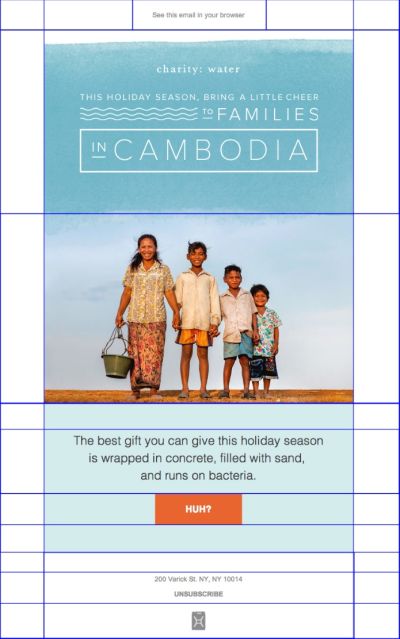
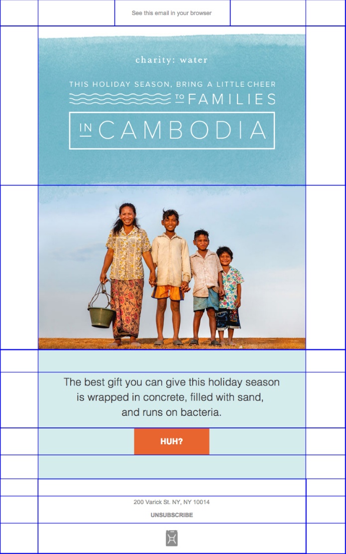
Check out the email design below by Charity: Water. Simple yet engaging.

Developers have been coding emails using <table> layouts for a long time now. So, it is recommended that you place your email elements in a grid-based layout, rather than arbitrarily placed. Moreover, any element that might overlap needs to be added to a different layer.
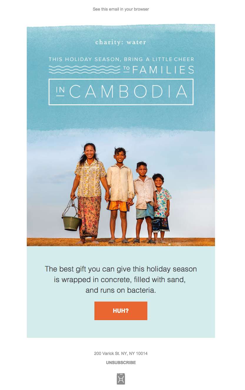
The email shown above by Charity: Water looks like this when exported to a tabular layout:
Email design is made up of different subelements. Let’s explore them now.
1. Email Theme
The logo is not the only element that reflects your brand’s personality. The overall theme of your email, including the fonts, color scheme and imagery, should be in sync with branding guidelines.
2. Width And Height Of Email Template
Because your subscribers use diverse email clients and devices, your email should be appropriately visible in the preview pane of all email clients. Keep in mind that the email will be displayed according to the display pane of the email service provider or client. Only certain email clients, such as Thunderbird, Apple Mail and native mobile email clients, will display email at full width.
For other email clients, the display boxes have variable sizes. Many service providers, such as MailChimp, go over the basics of HTML email, by recommending, for example, 600 to 800 pixels as a width, so that the full email gets displayed. Remember, that most subscribers never use the horizontal scroll bar in an email.
The height of your email template should usually be long enough to accommodate your copy within two scroll lengths. You can certainly have a longer email template if you have to convey a huge amount of information. However, if your email template gets too long, it might become boring for subscribers, who will be less likely to scroll to the end to check out all of the offers and promotions included.
The height of the preview pane of most email clients (which contains content commonly referred to as “above the fold”) is generally between 300 and 500 pixels. Make the best use of this space, so that the content included above the fold entices the subscriber to scroll down.
Every email developer knows that if an email’s file size exceeds 102 KB, Gmail’s app will clip the email, and they will not be able to track metrics.
Check out the screenshot below to see what an email looks like in Gmail when it is clipped:

To avoid Gmail’s clip, make sure your email does not have unnecessary code and is not over-formatted. Go for a minimalist email design, without any shortened URLs. Note that images will not be embedded in the email and, so, will not increase the file’s size. That being said, removing unnecessary images will help to reduce the email size.
For marketers who use predesigned templates, the height and width will already be taken care of. If you want to use your own design, consider the ideal width and height of an email template.
3. Body Of Email
Emails usually begin with a hero image at the top, followed by the main copy, a call to action and then the footer.
Because most people read on screens positioned about 2 to 3 feet away, your h1 title should be around 16 pixels; if your title is short, it could even go up to 20 pixels. A good idea would be to render the h1 title as text, along with an attractive hero image.
Your descriptive text should not be smaller than 12 pixels. It should be easily readable across all email clients and devices. Moreover, the alignment of paragraphs and paragraph size also play an important role.
4. Call To Action
The primary objective of email marketing is to persuade customers to take action. To do that, your call to action (CTA) should have engaging, actionable verbs. Use convincing and actionable text, like “Start the free trial,” rather than drab phrases like “Click here.”
An interesting study by ContentVerve, “10 Call-to-Action Case Studies With Takeaways and Examples From Real Button Tests”,” shows that use of the first-person perspective in CTAs increase clicks by 90%, regardless of the product. For example, “Get my free copy” converts better than “Get your free copy.”
Create a sense of urgency in CTAs and get higher click-through rates by adding the word “now.”

Campaign Monitor, in one of its guides, “10 Tips to Optimize Your Calls to Action,” emphasizes that a CTA button should always contrast strongly with the background color, so that it doesn’t blend in and that it grabs the subscriber’s attention. Based on your target audience, your industry and the message to be conveyed, including CTAs at regular intervals can increase email conversions and the desired subscriber action. Its height should be at least 30 pixels, and it should be easily tappable with a thumb on mobile devices.
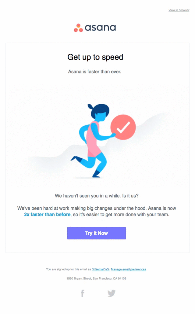
Check out the email below from Asana. It places a CTA strategically above the first fold and also follows the CTA best practices discussed above.
5. Images And Interactive Elements
If you are putting images or rich media in your email, add relevant alternative (alt) text, so that the purpose of the email is preserved even when the visuals are blocked by the email client. This is also greatly helpful with accessibility, because screen readers will be able to read the alternative text and convey your message.
Most email marketers tend to send emails consisting of a single image, which is first of many common HTML mistakes compiled by MailChimp. It recommends a text-to-image ratio of 80 to 20, to make sure that emails do not get trapped in spam filters. According to a recent study by MailChimp, 200 words per image yield a good click-through rate.
Using linked images in your email ensures an optimum file size. Load images from an external server using <img> tags.
The main advantage of this technique is that you can change images even after sending the email. It makes the email light and reduces the time taken to send the email. The disadvantage is that subscribers will have to download the images from the external server, which will incur download costs for those on metered connections, and the images might also get blocked by some email services.
Rich media elements, such as GIFs, cinemagraphs and video, are becoming popular in email these days.
You can add a GIF or cinemagraph in an email simply by uploading the file to the server that stores your images. Then, copy the URL and use the following HTML:
<img src="/wp-content/uploads/thefiletobeinserted.gif">
Test the email to make sure that the GIF works properly.
Embedding video is a very adaptable technique of web development, but unfortunately, it’s not supported in email. Therefore, opt for HTML5 video.
To add a video in email, use the code below:
<video width="400" height="200" controls poster="https://www.art.com/images/blog_images/Imagefiles/2017/html5_video/valentinesday.jpg"><br/><source src="https://www.videofile.com/htmlfiles/movie-14thfeb.mp4" type="video/mp4"><br/><!-- fallback 1 --><br/><a href="https://www.xyz.com" ><br/><img height="200" src=" https://www.art.com/pictures/important/Imagefiles/2017/html5_video/valentinesday.jpg " width="400" /><br/></a><br/></video><br/><br/><br/>
HTML5 primarily supports the MP4, OGG and WebM video formats.
Pro tip: Apple supports the MP4 video format in its email clients and browsers.
Some points to remember:
- Make sure that the server configuration you use can output the right MIME type, so that the email client identifies the correct video format when retrieving the video.
- If you are using an Apache web server, add this entry to the
.htaccessfile:Add Type video/mp4.mp4 m4v.
6. Number Of Email Folds
Your email should have just two folds, as mentioned earlier. The first fold should capture your brand and include the h1 title with a relevant CTA. If your email template exceeds two scrolls, then the third scroll should cross-sell your products. The idea is to change up the content and keep subscribers hooked by providing interesting information.
7. Footer
The footer is the most overlooked part of any email. However, it probably has information that subscribers are looking for, such as the company address, social sharing buttons and contact details. In order for your email to be CAN-SPAM compliant, the footer should have some additional elements.
An “Unsubscribe” link should allow subscribers to opt out of your mailing list easily and will reduce spam complaints.
Your contact details should link back to your company website and should include your postal and email address.
Additionally, you can have ancillary links, such as “Forward to a friend” and “View in Browser.”
As stated in “The Best Practices of Footer Design” by Bee, the fine print of your email should have the following sections:
- Explanation of why the recipient got this email
Your subscribers have probably subscribed to numerous mailing lists. Subtly remind recipients of the reason they received the email, to maintain your reputation as an emailer and to minimize spam complaints. - Copyright
Include the copyright mark, along with the current year and your business name. - Privacy policy
Link to your privacy policy, because subscribers should know where that information is stored. This is critical for e-commerce retailers. - Terms of use
If you are sending out a promotional email highlighting discount offers, share the terms of use that govern the deals.
Designing The Footer
Cramming information into the footer sounds tempting, but you should determine the most important information for your business and restrict the footer to the minimum. Stuffing it with too much information could lead readers to dismiss it entirely because they will not be able to figure out which links to click.
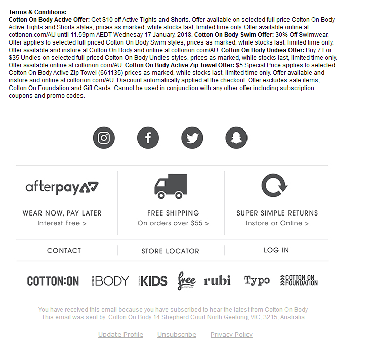
Check out the footer below by Cotton on Body. Although it is well organized, it could be overwhelming for the subscriber who is scanning the email.

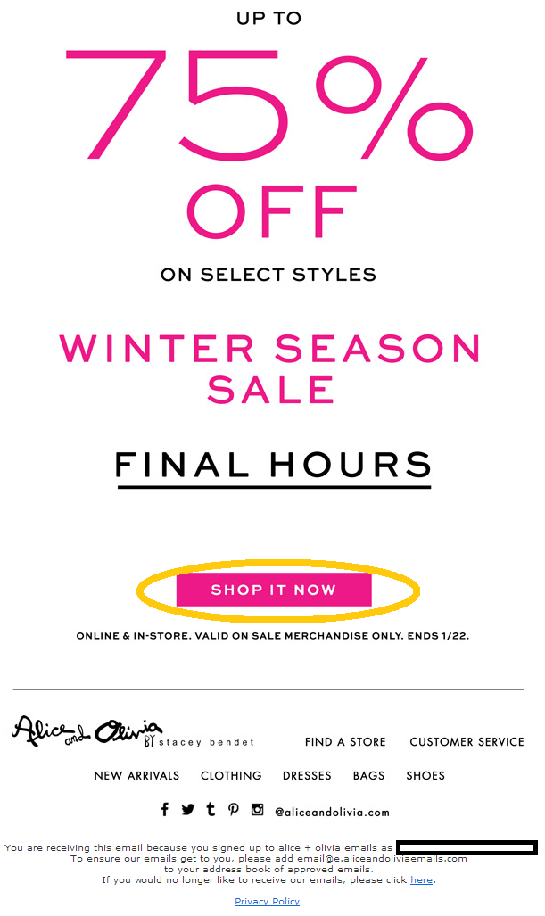
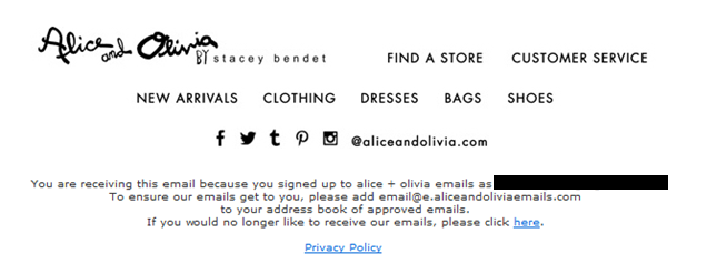
Have a look at the footer below by Alice and Olivia. It is simple, and it maintains a visual hierarchy according to the actions they want subscribers to take.

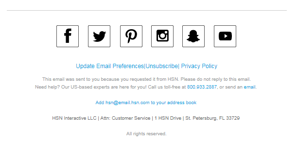
The footer by HSN below is clean and makes good use of padding and white space. It is not overwhelming, yet it conveys important information that readers might be looking for.

Mobile Responsive Emails
Most subscribers will check email on their phone. Owing to this trend, your emails ought to be responsive. Responsive design includes several elements, such as media queries, fluid grids and fluid images, so that users can view the email as intended, regardless of screen size or device. The basics of responsive email design include the table element, easily stackable sections and full-width CTAs.
If your subscriber list consists of many mobile users, then avoid overlapping layouts. Hide non-primary sections, such as navigation and email advertisements, to cater to mobile subscribers. Mobile-specific email elements such as a navigation menu and image sliders can also be used.
Responsive email design is supported in these email clients:
- iOS Mail app
- Windows Phone 7.5
- Android 4.x Email (OEM) app
- BlackBerry Z10
- BlackBerry OS7
- iPhone Gmail app
The following email clients do not support responsive email:
- Android Yahoo Mail app
- iPhone Yahoo Mail app
- BlackBerry OS 5
- Windows Phone 7
- iPhone Mailbox app
- Windows Phone 8
- Android Gmail app
- Windows Mobile 6.1
Responsive design enables you to do the following:
- change hierarchy,
- modify navigation,
- enlarge fonts,
- change layout,
- scale images,
- add padding,
- change or hide content.
Designing Responsive Email
To make their emails responsive, developers use a media query that is commonly referred to as @media. It is a special set of CSS styles, included in the header, that work as conditional statements or dynamic rules.
The point of media queries is to identify the screen size of the device being used and to execute various rules according to that screen size. The challenge is that media queries do not work in all email clients and might need detailed planning and testing compared to other design techniques.
Have a look at the media query below:
@media only screen and (min-width:479px) and (max-width:701px) {
.em_main_table {
     width: 100% !important;
}

.em_hide {
     display: none !important;
}
}
When this email is accessed on a device whose screen is between 479 and 701 pixels wide, the email’s width will be 100%, according to the width: 100% !important; attribute. The !important function forces this attribute in email clients such as Gmail, where it might be ignored.
The styles in the CSS rule block should specify the container or element type that the styles will dictate. Assign these rules in the HTML if you want them to work.
Here is the CSS:
td[class="body-header"]{ font-size: 18px !important; }
And here is the HTML:
<td align="left" class="body-header">
It is important that the element (td) and the class (body-header) added in the CSS and HTML match each other.
Advanced Techniques
With the advent of advanced email clients, such as Apple Mail, which is based on Webkit, email developers can even play around with keyframe animation, interactive elements such as carousels, and live feeds.
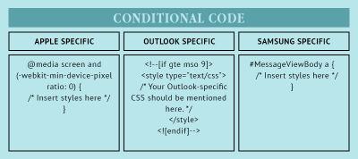
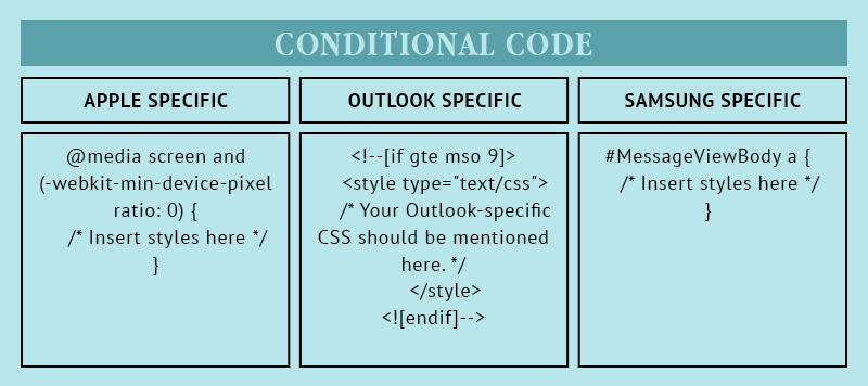
Conditional coding for different email clients (such as for Outlook and for Samsung and Apple devices) has also become possible.
Wrapping Up
If you follow these simple tips, you will surely be able to create awesome email marketing campaigns that convert, whether you are a novice or pro at email programming. In the end, aim to create a good user experience and make subscribers look forward to your emails. Happy emailing!
Further Reading
- How Accessibility Standards Can Empower Better Chart Visual Design
- Responsive Web And Desktop Development With Flutter
- Everything You Need To Know About Transactional Email But Didn’t Know To Ask
- How To Use Heatmaps To Track Clicks On Your WordPress Website
 (da, ra, yk, al, il, mrn)

