Understanding Logical Properties And Values

Email Newsletter
Weekly tips on front-end & UX.
Trusted by 182,000+ folks.
 Register for Free
 Celebrating 10 million developers


 Custom Web Forms for Angular, React, & Vue. Your backend.
In the past, CSS has tied itself to physical dimensions and directions, physically mapping the placement of elements to the left, right and top and bottom. We float an element left or right, we use the positioning offset properties top, left, bottom and right. We set margins, padding, and borders as margin-top and padding-left. These physical properties and values make sense if you are working in a horizontal, top to bottom, left to right writing mode and direction.
They make less sense if you use a vertical writing mode, whether for your entire layout or for some elements. In this article, I’m going to explain how CSS is changing to support writing modes, and in doing so, I’ll clear up some of the things that might confuse you about Flexbox and Grid.
When I first began working with CSS Grid and explaining the new specification to people, I noted that the grid-area property could be used as a one-line shorthand for setting all four lines. Therefore, the three examples below would result in the same item placement. The first uses the longhand properties, the second specifies start and end lines for each dimension, and the third uses grid-area.
.item {
  grid-row-start: 1;
  grid-column-start: 2;
  grid-row-end: 3;
  grid-column-end: 4;
}
.item {
grid-row: 1 / 3;
grid-column: 2 / 4;
}.item {
grid-area: 1 / 2 / 3 / 4;
}The order of the lines when we use grid-area is as follows:
- grid-row-start
- grid-column-start
- grid-row-end
- grid-column-end
The first question I (and many people in my audiences) had was, “why don’t these follow the Top, Right, Bottom, Left order we are used to from everything else in CSS?” They actually go in the reverse order to those values: Top, Left, Bottom, Right! Is the CSS Working Group actively trying to make things difficult?
The answer is that these values have moved away from the underlying assumption that content on the web maps to the physical dimensions of the screen, with the first word of a sentence being top left of the box it is in. The order of lines in grid-area makes complete sense if you had never encountered the existing way that we set these values in a shorthand. We set the two start lines first, then the two end lines.
This means that if we change the writing mode of our document to a vertical one, the position of a block remains relative to the writing mode of the document, rather than the physical properties of the screen. You can try this in the example below, switch the writing-mode value for our layout and see the entire grid rotate.
See the Pen Grid and Writing Modes by Rachel Andrew (@rachelandrew) on CodePen.
Knowing this fact about writing modes also explains why CSS Grid and Flexbox refer to start and end lines rather than mapping the grid to the physical dimensions of top, right, bottom and left as we would use with absolute positioning. In the above example, the first item is positioned using grid-area and line-based positioning.
grid-area: 1 / 2 / 3 / 4;If we were to use the longhand this would look like this:
grid-row-start: 1;
grid-column-start: 2;
grid-row-end: 3;
grid-column-end: 4;
We set both start lines, block axis first, inline axis second then follow the same pattern for the end lines in each dimension. Whichever way the grid is laid out, the start and end lines remain relative to the grid and writing mode of the document.
Block And Inline Dimensions
I have already mentioned something which is key to understanding new layout, the concept of the Block and Inline dimensions. These terms are going to keep coming up as you work with new CSS. The two dimensions are reasonably easy to understand in the context of Grid Layout as we are always working with a block and an inline axis when working in Grid Layout, so I’ll use a Grid demo to explain.
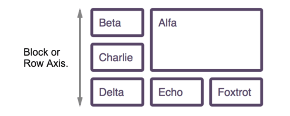
The Block dimension corresponds to the order in which blocks are laid out on the page. If you think about a paragraph of text in English. Each paragraph is laid out one below the other, the direction in which these are laid out is the block dimension, and so in Grid Layout, this is the Block Axis.
In CSS Grid Layout the Block Axis is also referred to as the Row Axis, which is why the Block Axis properties are grid-row-start and grid-row-end.
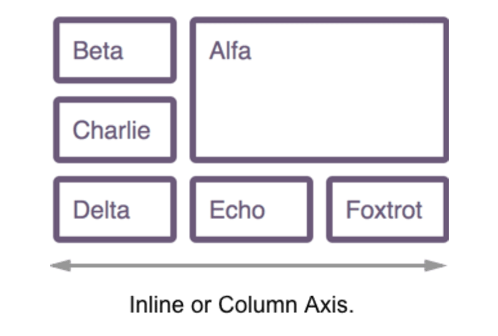
The inline axis, therefore, runs across the block axis, in the direction that words lay out in a sentence. In English, that axis runs left to right. In Grid Layout, the Inline Axis is the Column Axis with the properties grid-column-start and grid-column-end.
If we change the writing mode of our example to vertical-lr the writing mode is now vertical, which means that the block axis runs vertically and the inline axis along the lines (top to bottom).
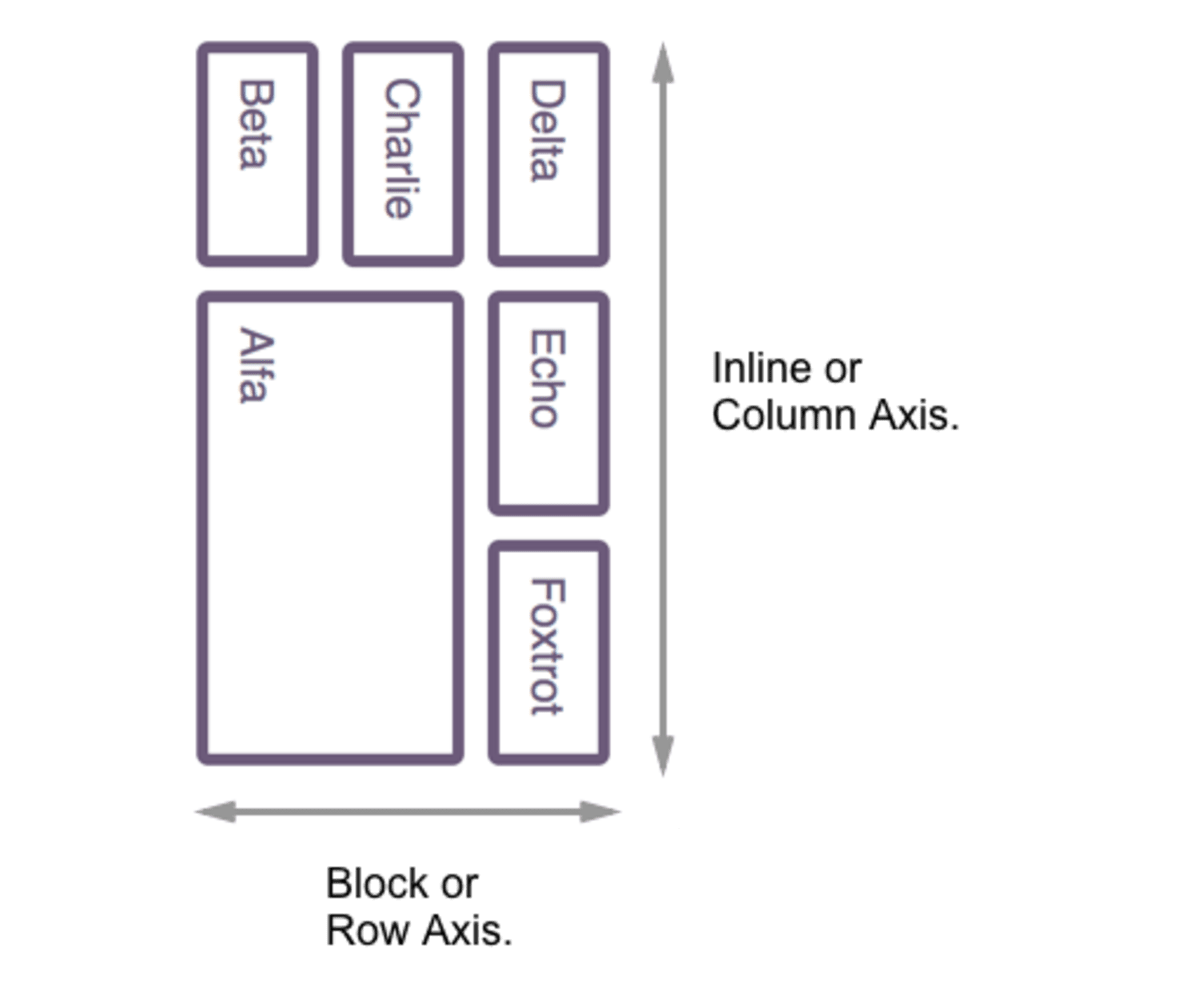
So if we talk about the Block dimension, we are describing the direction in which paragraphs of text would lay out in normal document flow, the Inline dimension being the direction a sentence runs.
Logical Properties
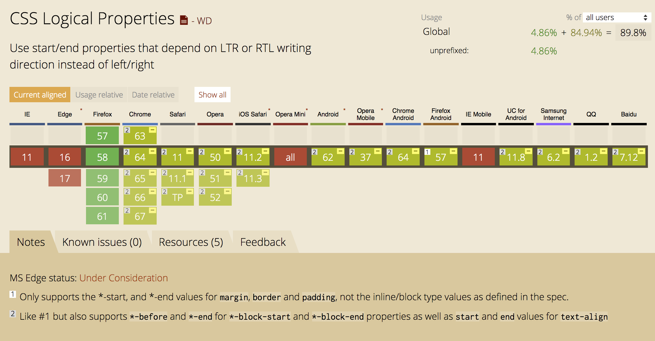
Once you become used to working with Block and Inline dimensions, start and end lines, the link to physical dimensions in the rest of CSS begins to feel awkward. There is, however, a specification which defines logical versions of all of the existing physical properties - The CSS Logical Properties and Values specification which is a First Public Working Draft. Currently the only browser with good support for these properties is Firefox, however understanding how they work can be a good way to think about new CSS, so let us take a look.
I have illustrated each section with CodePen examples, to see these working you will need to use Firefox!
Logical Dimensions
The logical properties define a start and end property for the block and inline dimension. For height and width properties, we instead use block-size and inline-size. We can also set max-block-size, min-block-size, max-inline-size and min-inline-size. If you are working in English, a horizontal top-to-bottom language then block-size refers to the physical height of the block on your screen, inline-size the physical width of the item. If you are working in a language where the blocks run vertically, then as you look at your screen block-size will appear to control the width and inline-size the height.
You can see this in action in the demo below. My block has a block-size of 150 pixels and an inline-size of 250 pixels. Change the writing-mode property to see how the layout adjusts.
See the Pen Block and Inline Size Demo by Rachel Andrew (@rachelandrew) on CodePen.
Logical Borders
We then have properties to control borders which work in the same way. The physical properties for borders are:
border-topborder-top-widthborder-top-styleborder-top-colorborder-rightborder-right-widthborder-right-styleborder-right-colorborder-bottomborder-bottom-widthborder-bottom-styleborder-bottom-colorborder-leftborder-left-widthborder-left-styleborder-left-color
These then have logical mappings which become a little verbose as longhands, but are:
border-block-startborder-block-start-widthborder-block-start-styleborder-block-start-colorborder-inline-startborder-inline-start-widthborder-inline-start-styleborder-inline-start-colorborder-block-endborder-block-end-widthborder-block-end-styleborder-block-end-colorborder-inline-endborder-inline-end-widthborder-inline-end-styleborder-inline-end-color
In the following example, there are two blocks, the first using logical properties to set a border-block-start-color of green, and a border-inline-end-style of dotted. The second block uses the physical properties of border-top-color and border-right. Change the writing-mode to see how these behave.
See the Pen Logical Borders by Rachel Andrew (@rachelandrew) on CodePen.
Margins And Padding
Margins and padding have similar longhands to our border properties, with the physical properties being:
margin-topmargin-leftmargin-bottommargin-rightpadding-toppadding-rightpadding-bottompadding-left
These have logical properties as follows:
margin-block-startmargin-inline-startmargin-inline-startmargin-inline-endpadding-block-startpadding-inline-startpadding-inline-startpadding-inline-end
In this next example, I have set padding-block-start on the first block, and padding-top on the second, change the writing mode to see the difference when the Block and Inline axises are switched.
See the Pen Logical Properties - Padding by Rachel Andrew (@rachelandrew) on CodePen.
Positioning Offsets
Another place where physical properties are used is when positioning things using the position property. After setting position: absolute or another value of position other than the default of static we then can position an item using offsets, either from the viewport or from a parent that has created a new positioning context.
The offset physical properties are:
toprightbottomleft
Following the pattern of our other logical properties we then have:
offset-block-startoffset-inline-startoffset-block-endoffset-inline-end
Try these out in the example below. The box with a border has position: relative and the small purple square position: absolute. In the physical example the square is positioned top: 50px and right: 20px. The logical version has offset-block-start: 50px and offset-inline-end: 20px.
See the Pen Logical Offsets by Rachel Andrew (@rachelandrew) on CodePen.
Logical Values
Another place where we are accustomed to using physical dimensions is when we float or clear things. For float, clear we have some logical versions of the left and right values.
inline-startinline-end
See the Pen Floating with Logical Values by Rachel Andrew (@rachelandrew) on CodePen.
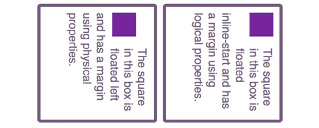
In the demo, I am floating the purple block in the logical version inline-start. I’m also using logical properties for the margin; this ensures that the margin always comes after the block, and before the content which wraps around it. By selecting the vertical-rl value in the drop-down, you can see how in the physical example the margin ends up on the right of the block, rather than being applied in the -end direction.
There are also start and end values for text-align. Aligning something to start will align it to the start of the inline axis, to end to the end of the inline axis, irregardless of whether the writing mode is horizontal or vertical.
Using Logical Properties And Values Today
As already mentioned, there is little browser support at the moment for logical properties and values. However, if you want to start working with them now, and option would be to write your CSS using them and then use a PostCSS plugin to convert the logical properties and values to their physical counterparts. This plugin by Jonathan Neal covers all of the properties and values that I have described in this article.
You can also help to encourage adoption by browser vendors of these properties by starring the Chrome bug, and upvoting these on the Edge Developer Feedback site.
Even if you decide not to use these properties now, understanding how they work is a key piece of understanding for working with a new layout. Describing your Grid or Flex layout as having start and end lines, thinking about block and inline dimensions, these things will make it much easier to understand how layout works.
Other Resources
- The MDN Web Docs have all of the logical properties and values listed with additional examples.
- CSS Grid, logical values and Writing Modes, MDN
- CSS Writing Modes, Jen Simmons, 24 ways
Further Reading
- CSS Blurry Shimmer Effect
- How To Draw Radar Charts In Web
- Solving Media Object Float Issues With CSS Block Formatting Contexts
- Useful DevTools Tips and Tricks
 (il, mrn)

