UX In Contact Forms: Essentials To Turn Leads Into Conversions

Email Newsletter
Weekly tips on front-end & UX.
Trusted by 182,000+ folks.


 Celebrating 10 million developers

 Custom Web Forms for Angular, React, & Vue. Your backend.
Do you like filling out forms? I thought not. It’s not what we want from a service. All the user wants is to buy a ticket, book a hotel room, make a purchase and so on. Filling in a form is a necessary evil they have to deal with. Does this describe you? So, what actually affects a person’s attitude to submitting a form?
- It might be time-consuming.
- Complicated forms are often hard to understand (or you just don’t feel like filling it in).
- The form might ask for personal information that you don't want to share: credit card details, mobile number, home address, etc.
Form fields are actually the most important tool for user-service interaction, no matter what the form is for — whether a newsletter subscription or a step-by-step form for collecting data.
In this article, we'll take a look at the most common questions of design trainees in our company. Below are FAQs and answers on how to make website forms user-friendly, as well as tips to prevent low user interaction.
Is It OK To Place A Form In Two Columns?
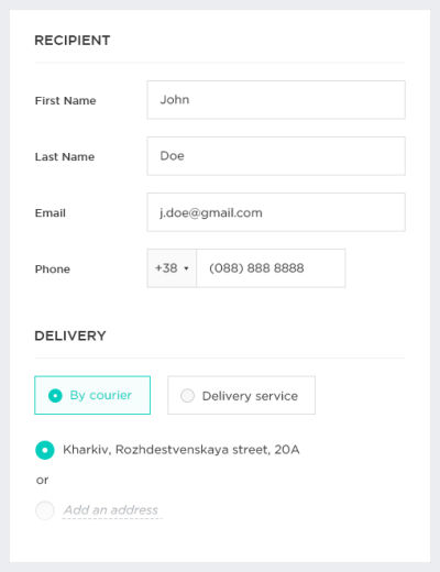
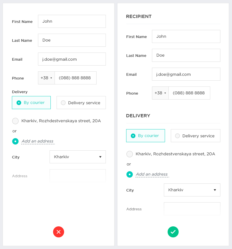
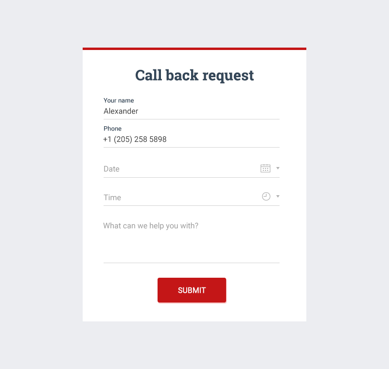
Eye-tracking studies have shown that single-column forms are better than multi-column ones. Why so? The way we scroll down a website is similar to how we fill in a form: going from top to bottom, staying focused on the content. A form with parallel columns can easily lead users astray and distract them. To keep users in the flow and not interrupt the vertical orientation, place fields one below the other in a single column. Sure, every rule has its exceptions. As for the one below, short or logically contiguous fields (mobile number, city, state and area code) can be placed in a line.

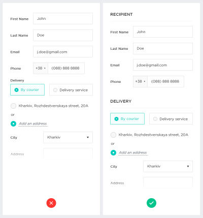
If the form has a pretty complicated structure (such as the checkout stage in an online store or the registration stage in a money-loaning platform), it can be visually divided into semantic groups, with added space or headings between them. This will give users the feeling of making progress through the form without feeling overwhelmed.
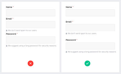
Where Should Labels Be Placed?
Labels tell users what information belongs in a given form field, and they are usually positioned outside the form field. Quite recently, there were just two variants for placement of labels: above the fields and justified left. Some time ago, an alternative appeared: Designers began to animate forms and hide labels in placeholders. There were many disputes about what is the best way to show labels, but still no definitive answer. One thing is clear: Label placement depends on the situation. Let’s take a good look at each option.
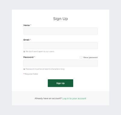
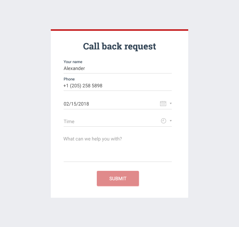
Placing Labels Above The Fields
This is the most common label placement and, as validated by Google’s UX research, for good reason. It adapts better to smartphone sizes, which is essential for responsive markup.
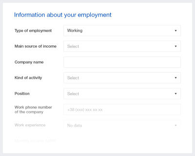
Justifying Labels Left
This might be the best choice if you need to display bigger data-entry fields. Left-justified labels get more attention and won’t blend in with other fields. Moreover, the contact form will take up less space vertically. But keep in mind that such an approach works well only for desktop views; for mobile, size is an issue (the screen is too narrow for both a left-placed label and field). That could cause trouble for users, who might not be able to see input data in full or spot typing errors before submitting the form. To prevent erroneous forms from being submitted, you will have to create additional prototypes to make the website smartphone-friendly.
Placing Labels Inside The Fields (In-Field Top-Aligned Labels)
Interactive labels placed inside the field are becoming more popular with the UX designers for their scannability before filling in. The animation can be different, but the process is the same: After clicking on the field with the label placeholder, the label doesn’t disappear, but moves up to the top of the field, making room for the user to enter the data.
The advantages of this approach are obvious: It saves space, and the animation is understandable to the user. But animation in forms is not always the best solution. It depends on the form’s context. If you working on a form with very few fields (a login or newsletter box), then top-aligned labels are not so necessary because there isn’t much information the user needs to recall. It works better on complex forms with multiple sections. Despite the perks of this method, also think of how dropdown selections will look and suit the animation.

Nevertheless, interactive labels placeholders win by a mile over static ones. When the field is clicked, the label moves up, staying visible, while the static one just disappears.
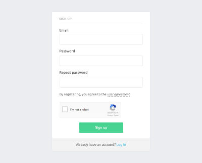
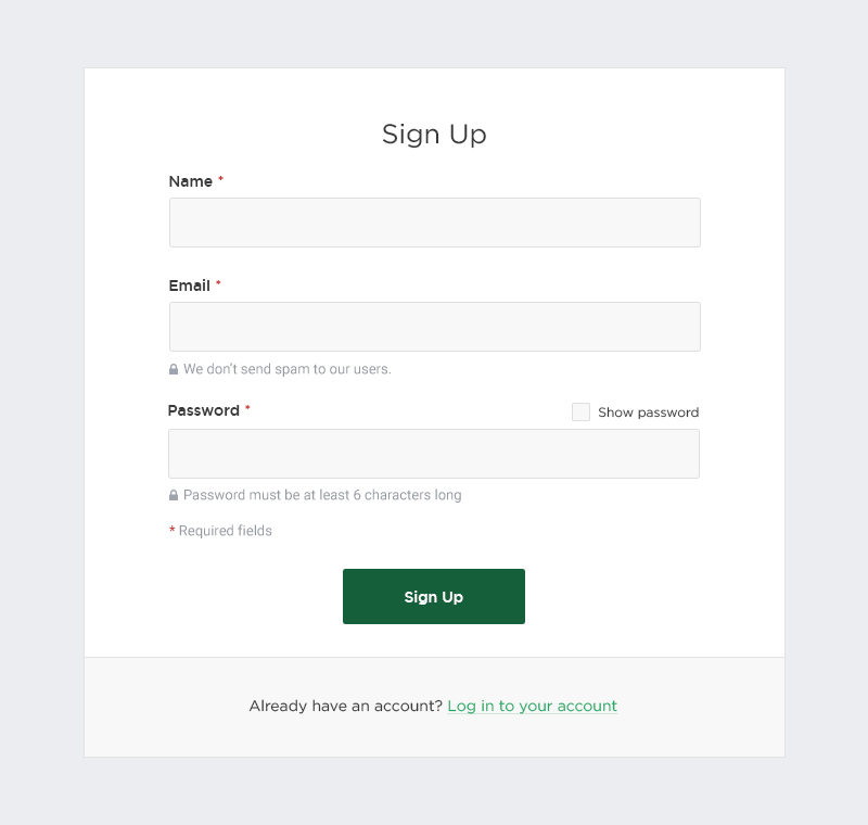
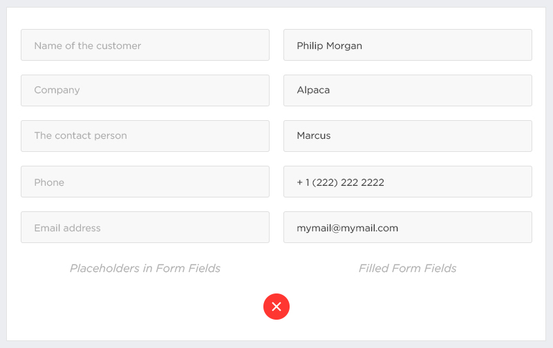
Can We Use Placeholder Text Instead Of A Label?
There are many ways to provide hints; one of them is a common implementation of instructions in form fields. Unfortunately, user testing continually shows that placeholders in form fields often hurt usability more than helps. They can complicate the process of filling a form in a serious way, especially if the form consists of more than a dozen fields. Disappearing placeholder text strains users’ short-term memory. It makes it difficult for people to remember what information belongs in a field, and to check for and fix errors. It also puts an additional burden on users with visual and cognitive impairments.
As we have seen, the difficulty is in keeping the placeholder text out of sight when the user clicks on the field to fill it. Without labels, the user cannot check their work before submitting the form. They could easily forget what data they have to fill in in the current field and whether the previous ones are error-free — there is always a big risk of false information. The user would have to reveal the placeholder text by deleting the text in each field one by one, in order to verify that their input satisfies the description. Actually, many won’t even realize the potential for error, and they won’t make the effort to double-check.
Also, such an approach would not be comfortable for users who move between fields by pressing the Tab key, because they won’t get used to parsing the data in the next field before switching to it. Placeholder text that disappears when the cursor is placed in the form field irritates users who navigate with the keyboard.
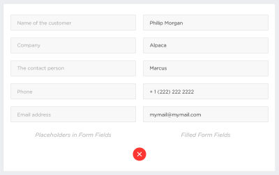
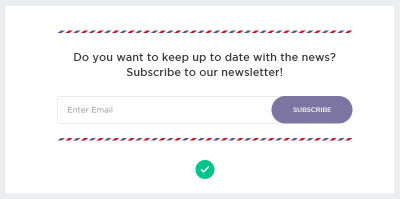
Despite the disadvantages, there are cases where using a label as a placeholder is quite appropriate. For example, for a newsletter subscription, we could fill just the one field, "Email."
How To Lessen The Cognitive Load Of A Form?
Watch Spacing
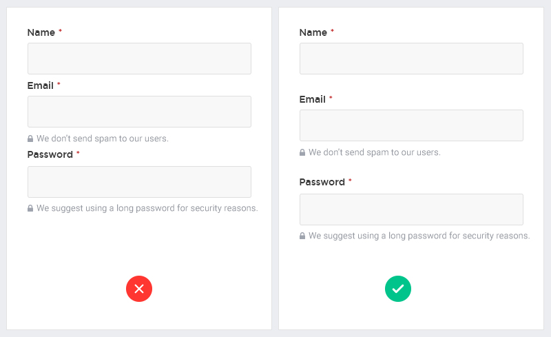
A label and its field should be visually grouped, in order not to confuse users and so that they can understand which label belongs to which field. Also, avoid loose padding, where labels are placed equal distance between two fields.
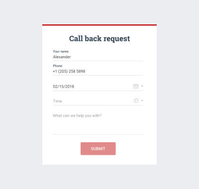
Auto-Focus The First Input Field
Autofocusing guides users to the starting point of the form. We recommend emphasizing the first field with an accent border color, background color or both. By calling the user to fill it, you will quicken registration or purchasing.
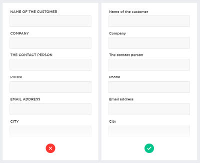
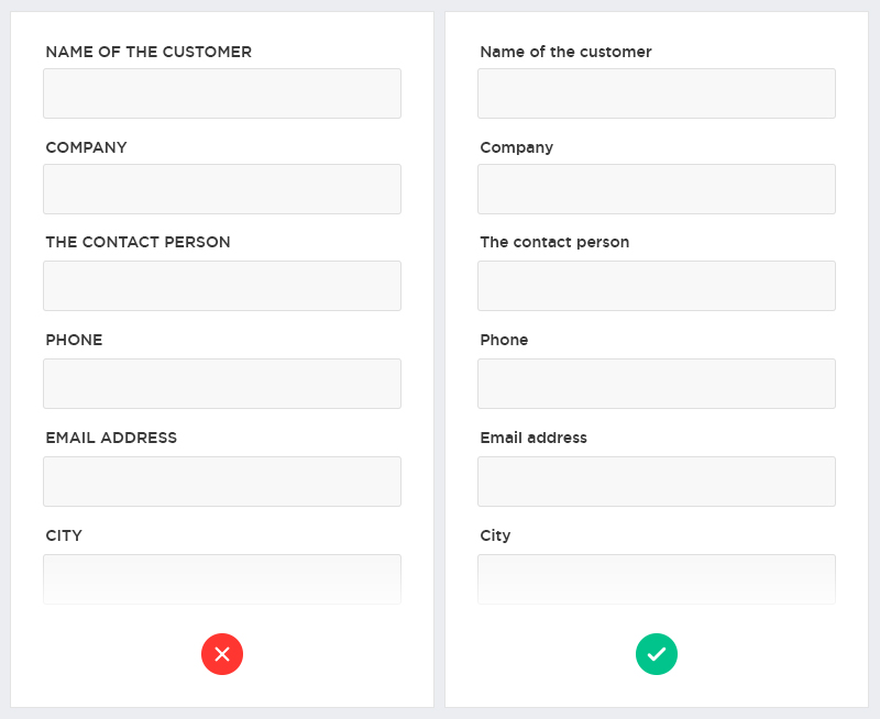
Never Use Caps
Labels written in capitalized letters , especially in forms that include three to four fields. All-capitalized letters are hard to read. Also, they give the appearance of shouting.
Are Buttons Considered Part Of A Form’s UX?
A button is meant to direct users to take an action. That’s why button design should always be about recognition and clarity. Think of your website or app as part of a conversation started by a busy user. The button plays a crucial role in this conversation.
The Button Should Explain The Action To Be Taken
A good dialog box isn’t just about asking users which action they want to perform. It’s also about making each option as clear as possible. That’s why it’s so important to have a distinct label for each option, which serves as "just in time" help, giving users more confidence in their selection of the correct action.
Name the button to explain what it does, rather than using a generic label (like "OK"). BettingExpert received 31.54% more signups by changing a simple verb to a call-to-action phrase. Use a verb whenever possible, instead of "Yes" or "OK," because your buttons will make sense out of context with the explanatory text or title. Keep in mind that your CTA should reflect the user’s intent. For example, if it is registration, then obviously call the button "Register."
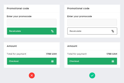
Separate Primary Actions From Secondary Ones
The primary action associated with a form needs to carry stronger visual weight. Secondary actions should have the weakest visual weight, in order to minimize the risk of error and direct people toward a successful outcome. Basic action buttons should be strongly marked, while it is enough to dial down the secondary action buttons.
Use primary and secondary buttons properly. If you have two buttons , a primary and secondary one, visually differentiate them to reduce error. Given that it is more important, the primary button should look more noticeable.
Emphasize Buttons
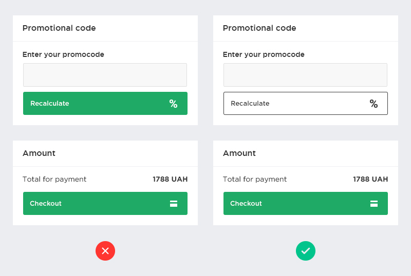
Don’t make the button active until all form fields are completed. This can be a great solution to help the user visually check their data before sending.
Is It Possible To Ease The Process Of Filling A Form?
Add Autofill
Automating the user’s input prevents mistakes by cutting down the fields they need to fill out. Also, according to Google’s research, auto-filling helps people fill out forms 30% faster. If the user is already registered with your service, auto-fill data from their account in the relevant fields at the checkout stage. Also, consider that you can auto-fill city and region text fields based on the area code or geolocation data. Don’t forget to leave these fields available for editing to give users control.
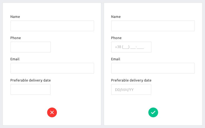
Don’t Forget About Masked Input
This is a plugin that automatically formats a field. Such a solution well suits dates, times, mobile numbers and more. This plugin makes filling a form much easier. Users won’t ask more questions because everything is clear to them.
Be Inventive
Use field length as a hint for the answer. This makes sense for fields that have a limited number of characters, such as the mobile number field, home address and area code.
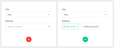
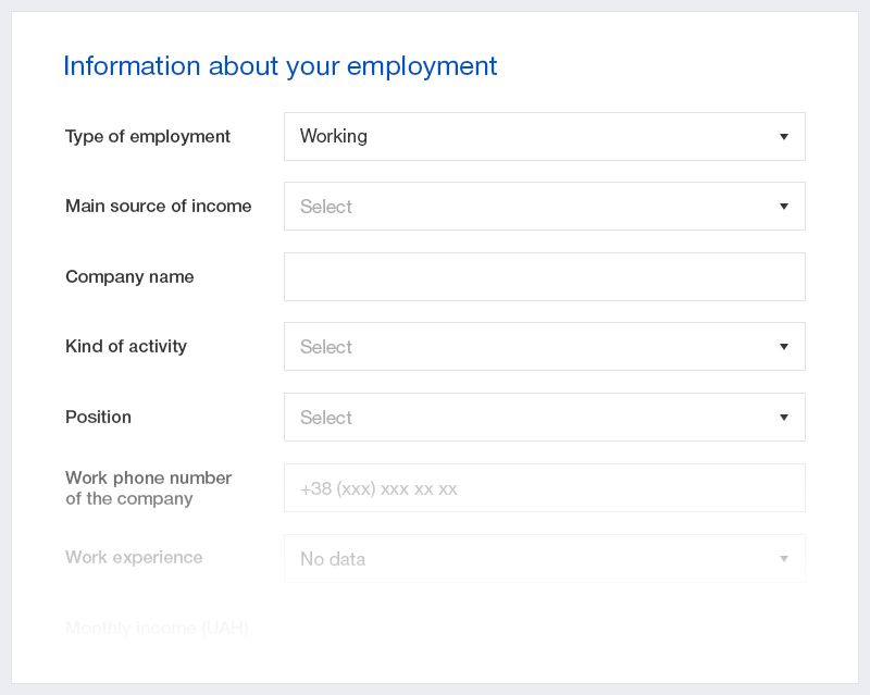
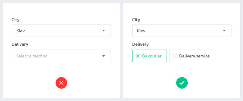
Avoid Dropdown Selections With Just Two Or Three Options
Instead of dropdowns, use radio buttons to get your message across quickly and not slow down the user. Everything has to be clear without extra clicks.
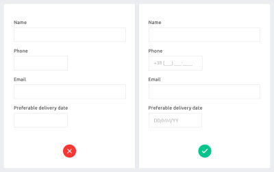
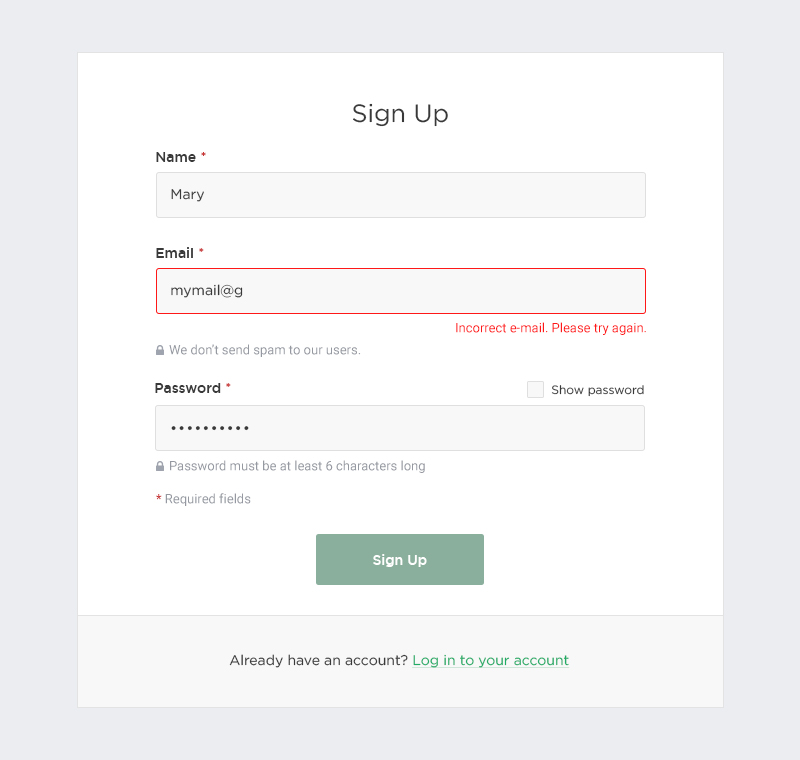
Validate Forms
Form validation is crucial. Distinguish those fields where errors are found and explain why the field didn’t validate.
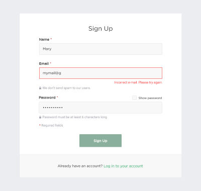
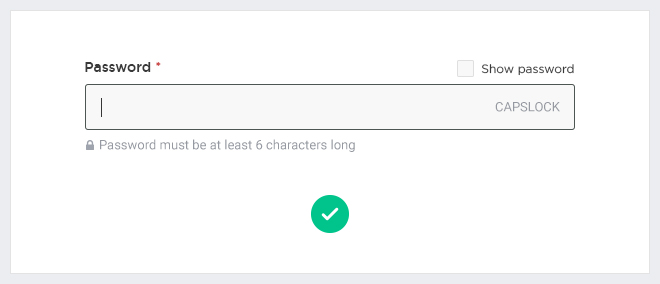
Also, explain all of the requirements for the data and its format. If a user’s password has to include six symbols, mention this. Don’t make users guess. Make the process handy and understandable.
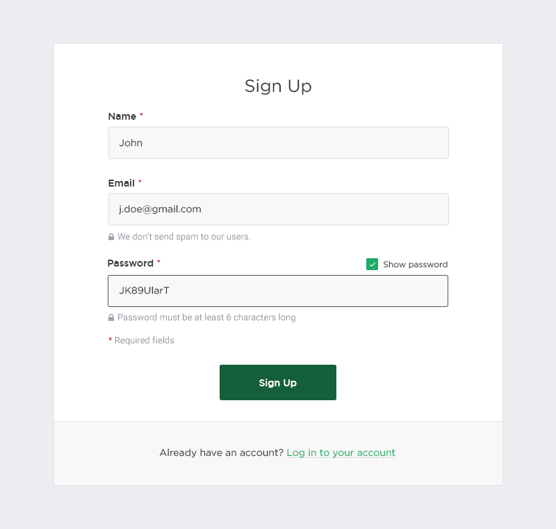
Add Conveniences To Prevent Common Mistakes In The Password Field
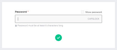
This could be a password preview or another opportunity for users to check their data before sending. Also, if your service has some special requirements for passwords, notify users about them before they fill in the field.
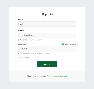
By the way, when filling the password field, quite often, the user will face a known problem — for example, the caps lock is on — and has forgotten about it. We recommend that you notify users about a pressed caps lock button to prevent abandoned forms as well as negative association with the website.
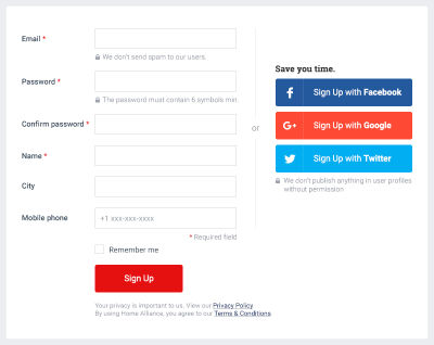
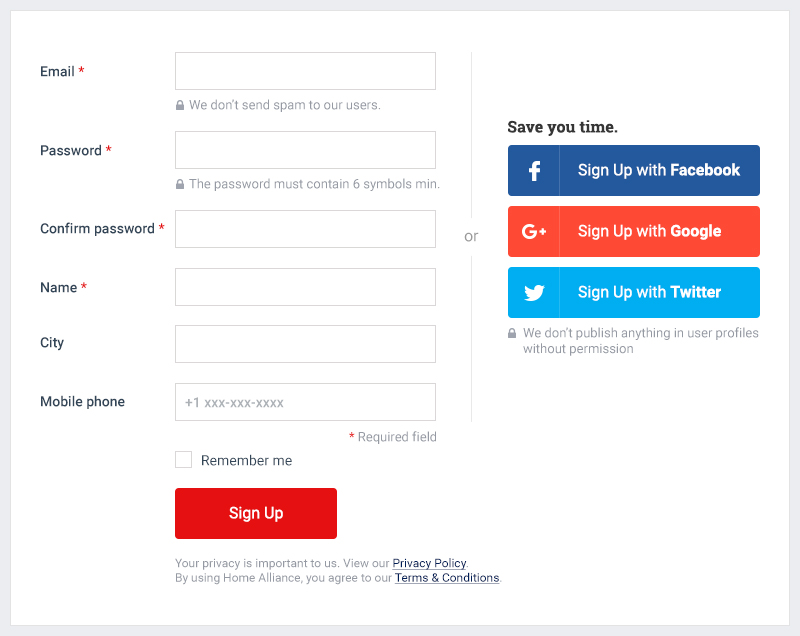
Let Users Authorize Via Social Media
Social signin could be a really powerful tool; it saves users a lot of time. If you offer fast registration using social media, don’t forget to assure people of the security of their social media data and explain exactly what information you need. Also, inform users that you won’t use their data without permission. Just to reinforce their feeling of security, you can add a lock icon. Stay on the user’s side, and take care of their security.
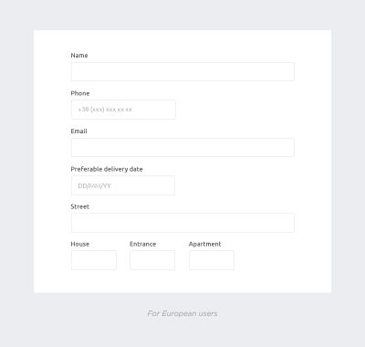
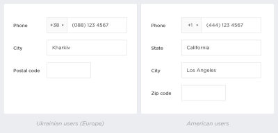
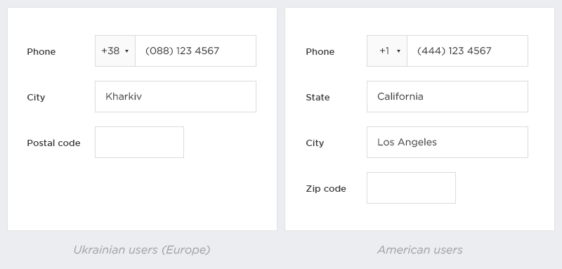
Does The User’s Location Influence A Form’s UX?
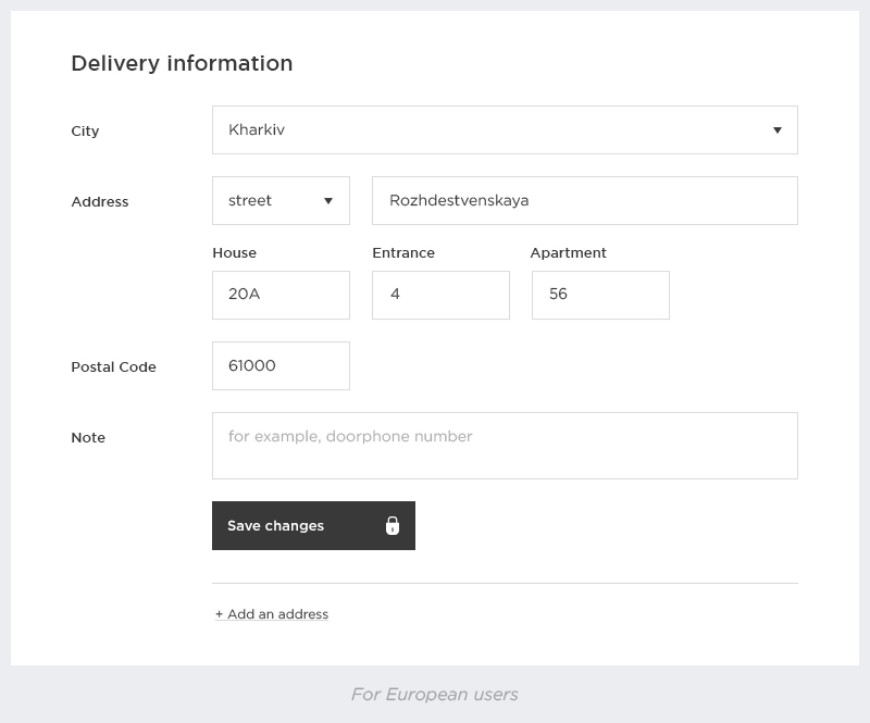
Yes, remember local differences. If a service is designed for two and more local markets (such as the US, Europe and Asia), be sensitive to the variety of differences between them. It’s no surprise that names of fields, hints, inputs and more will vary based on region.
Here are some things to pay attention to:
- Every country has its own number format, which is why input masks should also vary.
- The US says ZIP code, whereas in Europe, it is postal code.
- The "state" field is needed only in the US.
Conclusion
As we can see, designing a good signup form is tricky. UX design does matter. To improve UX, the designer needs to put themselves in the user’s shoes. Don’t risk users getting disappointed or wasting valuable time trying to figure out how your form works. Make your form clear from the start, with visible labels placed outside of empty form fields. Forms are an important part of many conversion goals, so make sure your users can get through them quickly and accurately.
Further Reading
- Inspiring Everyday Graphic Design
- 33 Tempting E-Commerce Icons For Free
- Breaking Out Of The Box: Design Inspiration
- Modern Art Movements To Inspire Your Logo Design
 (da, ra, al, yk, il, mrn)

