What You Need To Know To Increase Mobile Checkout Conversions

Email Newsletter
Weekly tips on front-end & UX.
Trusted by 182,000+ folks.


 Custom Web Forms for Angular, React, & Vue. Your backend.
 Celebrating 10 million developers
Google’s mobile-first indexing is here. Well, for some websites anyway. For the rest of us, it will be here soon enough, and our websites need to be in tip-top shape if we don’t want search rankings to be adversely affected by the change.
That said, responsive web design is nothing new. We’ve been creating custom mobile user experiences for years now, so most of our websites should be well poised to take this on… right?
Here’s the problem: Research shows that the dominant device through which users access the web, on average, is the smartphone. Granted, this might not be the case for every website, but the data indicates that this is the direction we’re headed in, and so every web designer should be prepared for it.
However, mobile checkout conversions are, to put it bluntly, not good. There are a number of reasons for this, but that doesn’t mean that m-commerce designers should take this lying down.
As more mobile users rely on their smart devices to access the web, websites need to be more adeptly designed to give them the simplified, convenient and secure checkout experience they want. In the following roundup, I’m going to explore some of the impediments to conversion in the mobile checkout and focus on what web designers can do to improve the experience.
Why Are Mobile Checkout Conversions Lagging?
According to the data, prioritizing the mobile experience in our web design strategies is a smart move for everyone involved. With people spending roughly 51% of their time with digital media through mobile devices (as opposed to only 42% on desktop), search engines and websites really do need to align with user trends.
Now, while that statistic paints a positive picture in support of designing websites with a mobile-first approach, other statistics are floating around that might make you wary of it. Here’s why I say that: Monetate’s e-commerce quarterly report issued for Q1 2017 had some really interesting data to show.
In this first table, they break down the percentage of visitors to e-commerce websites using different devices between Q1 2016 and Q1 2017. As you can see, smartphone Internet access has indeed surpassed desktop:
| Website Visits by Device | Q1 2016 | Q2 2016 | Q3 2016 | Q4 2016 | Q1 2017 |
|---|---|---|---|---|---|
| Traditional | 49.30% | 47.50% | 44.28% | 42.83% | 42.83% |
| Smartphone | 36.46% | 39.00% | 43.07% | 44.89% | 44.89% |
| Other | 0.62% | 0.39% | 0.46% | 0.36% | 0.36% |
| Tablet | 13.62% | 13.11% | 12.19% | 11.91% | 11.91% |
Monetate’s findings on which devices are used to access in the Internet. (Source)
In this next data set, we can see that the average conversion rate for e-commerce websites isn’t great. In fact, the number has gone down significantly since the first quarter of 2016.
| Conversion Rates | Q1 2016 | Q2 2016 | Q3 2016 | Q4 2016 | Q1 2017 |
|---|---|---|---|---|---|
| Global | 3.10% | 2.81% | 2.52% | 2.94% | 2.48% |
Monetate’s findings on overall e-commerce global conversion rates (for all devices). (Source)
Even more shocking is the split between device conversion rates:
| Conversion Rates by Device | Q1 2016 | Q2 2016 | Q3 2016 | Q4 2016 | Q1 2017 |
|---|---|---|---|---|---|
| Traditional | 4.23% | 3.88% | 3.66% | 4.25% | 3.63% |
| Tablet | 1.42% | 1.31% | 1.17% | 1.49% | 1.25% |
| Other | 0.69% | 0.35% | 0.50% | 0.35% | 0.27% |
| Smartphone | 3.59% | 3.44% | 3.21% | 3.79% | 3.14% |
Monetate’s findings on the average conversion rates, broken down by device. (Source)
Smartphones consistently receive fewer conversions than desktop, despite being the predominant device through which users access the web.
What’s the problem here? Why are we able to get people to mobile websites, but we lose them at checkout?
In its report from 2017 named “Mobile’s Hierarchy of Needs,” comScore breaks down the top five reasons why mobile checkout conversion rates are so low:
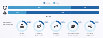
Here is the breakdown for why mobile users don’t convert:
- 20.2% — security concerns
- 19.6% — unclear product details
- 19.6% — inability to open multiple browser tabs to compare
- 19.3% — difficulty navigating
- 18.6% — difficulty inputting information.
Those are plausible reasons to move from the smartphone to the desktop to complete a purchase (if they haven’t been completely turned off by the experience by that point, that is).
In sum, we know that consumers want to access the web through their mobile devices. We also know that barriers to conversion are keeping them from staying put. So, how do we deal with this?
10 Ways To Increase Mobile Checkout Conversions In 2018
For most of the websites you’ve designed, you’re not likely to see much of a change in search ranking when Google’s mobile-first indexing becomes official.
Your mobile-friendly designs might be “good enough” to keep your websites at the top of search (to start, anyway), but what happens if visitors don’t stick around to convert? Will Google start penalizing you because your website can’t seal the deal with the majority of visitors? In all honesty, that scenario will only occur in extreme cases, where the mobile checkout is so poorly constructed that bounce rates skyrocket and people stop wanting to visit the website at all.
Let’s say that the drop-off in traffic at checkout doesn’t incur penalties from Google. That’s great… for SEO purposes. But what about for business? Your goal is to get visitors to convert without distraction and without friction. Yet, that seems to be what mobile visitors get.
Going forward, your goal needs to be two-fold:
- to design websites with Google’s mobile-first mission and guidelines in mind,
- to keep mobile users on the website until they complete a purchase.
Essentially, this means decreasing the amount of work users have to do and improving the visibility of your security measures. Here is what you can do to more effectively design mobile checkouts for conversions.
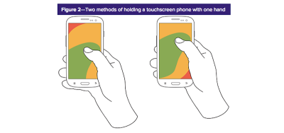
1. Keep The Essentials In The Thumb Zone
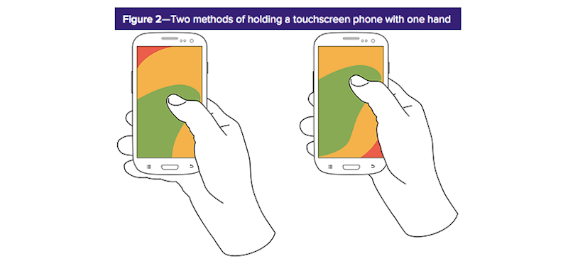
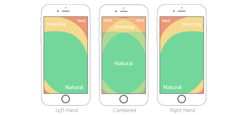
Research on how users hold their mobile phones is old hat by now. We know that, whether they use the single- or double-handed approach, certain parts of the mobile screen are just inconvenient for mobile users to reach. And when expediency is expected during checkout, this is something you don’t want to mess around with.
For single-handed users, the middle of the screen is the prime playing field:
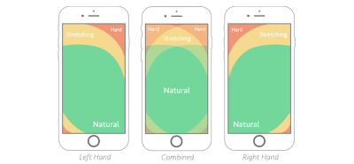
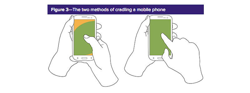
Although users who cradle their phones for greater stability have a couple options for which fingers to use to interact with the screen, only 28% use their index finger. So, let’s focus on the capabilities of thumb users, which, again, means giving the central part of the screen the most prominence:

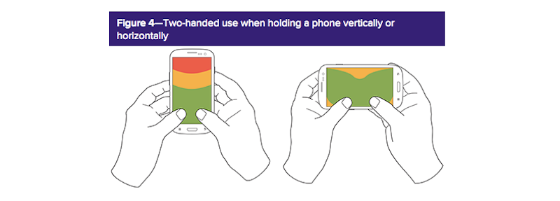
Some users hold their phones with two hands. Because the horizontal orientation is more likely to be used for video, this won’t be relevant for mobile checkout. So, pay attention to how much space of that screen is feasibly within reach of the user’s thumb:

In sum, we can use Smashing Magazine’s breakdown of where to focus content, regardless of left-hand, right-hand or two-handed holding of a smartphone:
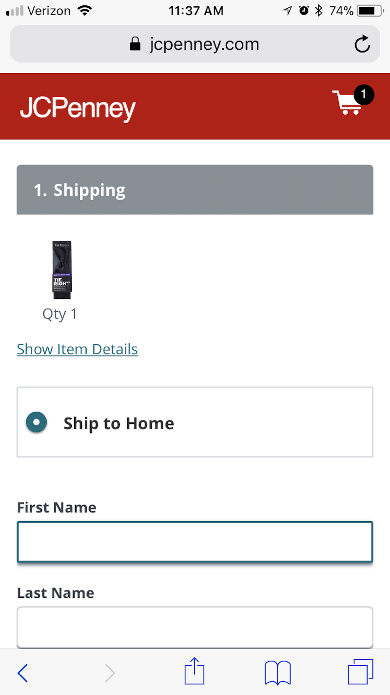
JCPenney’s website is a good example of how to do this:

While information is included at the top of the checkout page, the input fields don’t start until just below the middle of it — directly in the ideal thumb zone for users of any type. This ensures that visitors holding their phones in any manner and using different fingers to engage with it will have no issue reaching the form fields.
2. Minimize Content To Maximize Speed
We’ve been taught over and over again that minimal design is best for websites. This is especially true in mobile checkout, where an already slow or frustrating experience could easily push a customer over the edge, when all they want to do is be done with the purchase.
To maximize speed during the mobile checkout process, keep the following tips in mind:
- Only add the essentials to checkout. This is not the time to try to upsell or cross-sell, promote social media or otherwise distract from the action at hand.
- Keep the checkout free of all images. The only eye-catching visuals that are really acceptable are trustmarks and calls to action (more on these below).
- Any text included on the page should be instructional or descriptive in nature.
- Avoid any special stylization of fonts. The less “wow” your checkout page has, the easier it will be for users to get through the process.
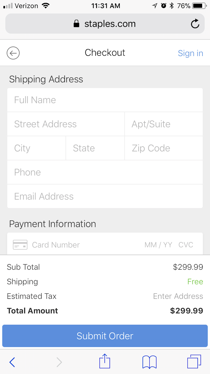
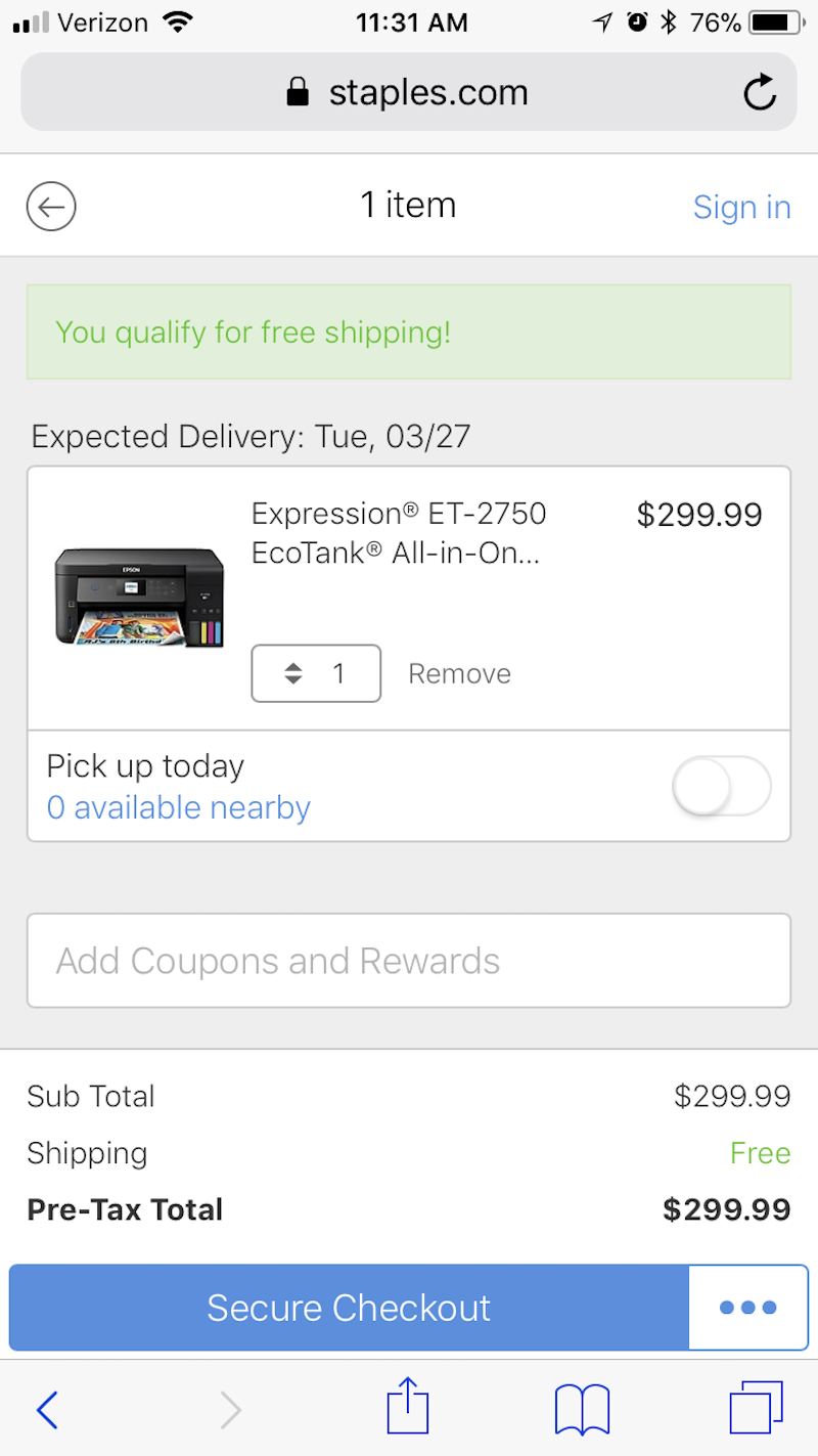
Look to Staples’ website as an example of what a highly simple single-page checkout should look like:
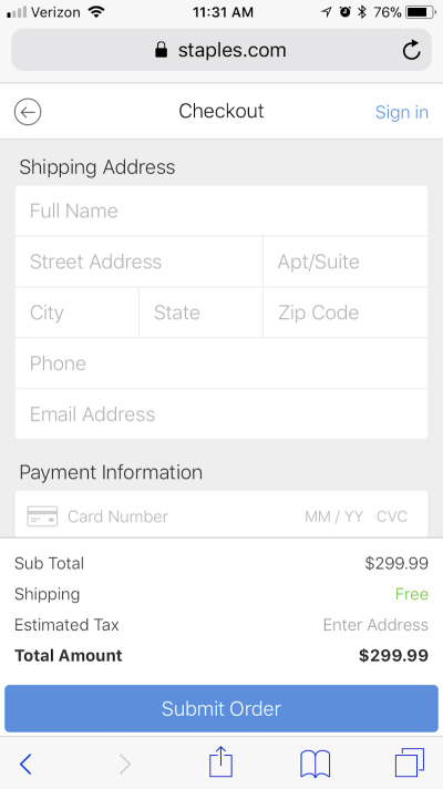
As you can see, Staples doesn’t bog down the checkout process with product images, branding, navigation, internal links or anything else that might (1) distract from the task at hand, or (2) suck resources from the server while it attempts to process your customers’ requests.
Not only will this checkout page be easy to get through, but it will load quickly and without issue every time — something customers will remember the next time they need to make a purchase. By keeping your checkout pages light in design, you ensure a speedy experience in all aspects.
3. Put Them At Ease With Trustmarks
A trustmark is any indicator on a website that lets customers know, “Hey, there’s absolutely nothing to worry about here. We’re keeping your information safe!”
The one trustmark that every m-commerce website should have? An SSL certificate. Without one, the address bar will not display the lock sign or the green https domain name — both of which let customers know that the website has extra encryption.
You can use other trustmarks at checkout as well.
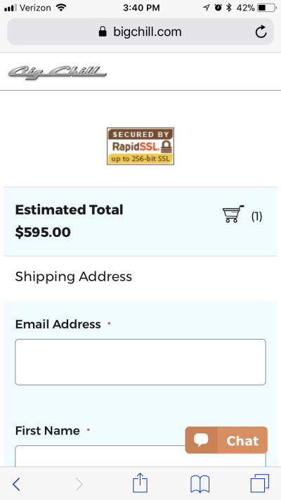
While you can use logos from Norton Security, PCI compliance and other security software to let customers know your website is protected, users might also be swayed by recognizable and well-trusted names. When you think about it, this isn’t much different than displaying corporate logos beside customer testimonials or in callouts that boast of your big-name connections. If you can leverage a partnership like the ones mentioned below, you can use the inherent trust there to your benefit.
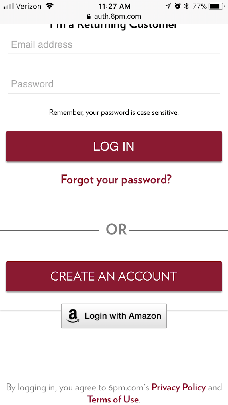
Take 6pm, which uses a “Login with Amazon” option at checkout:

This is a smart move for a brand that most definitely does not have the brand-name recognition that a company like Amazon has. By giving customers a convenient option to log in with a brand that’s synonymous with speed, reliability and trust, the company might now become known for those same checkout qualities that Amazon is celebrated for.
Then, there are mobile checkout pages like the one on Sephora:
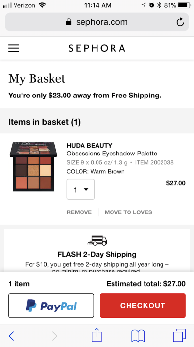
Sephora also uses this technique of leveraging another brand’s good name in order to build trust at checkout time. In this case, however, it presents customers with two clear options: Check out with us right now, or hop over to PayPal, which will take care of you securely. With security being a major concern that keeps mobile customers from converting, this kind of trustmark and payment method is a good move on Sephora’s part.
4. Provide Easier Editing
In general, never take a visitor (on any device) away from whatever they’re doing on your website. There are already enough distractions online; the last thing they need is for you to point them in a direction that keeps them from converting.
At checkout, however, your customers might feel compelled to do this very thing if they decide they want a different color, size or quantity of an item in their shopping cart. Rather than let them backtrack through the website, give them an in-checkout editing option to keep them in place.
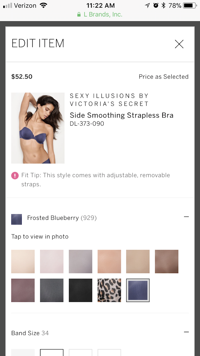
Victoria’s Secret does this well:

When they first get to the checkout screen, customers will see a list of items they’re about to purchase. When the large “Edit” button beside each item is clicked, a lightbox (shown above) opens with the product’s variations. It’s basically the original product page, just superimposed on top of the checkout. Users can adjust their options and save their changes without ever having to leave the checkout page.
If you find, in reviewing your website’s analytics, that users occasionally backtrack after hitting the checkout (you can see this in the sales funnel), add this built-in editing feature. By preventing this unnecessary movement backwards, you could save yourself lost conversions from confused or distracted customers.
5. Enable Express Checkout Options
When consumers check out on an e-commerce website through a desktop device, it probably isn’t a big deal if they have to input their user name, email address or payment information each time. Sure, if it can be avoided, they’ll find ways around it (like allowing the website to save their information or using a password manager such as LastPass).
But on mobile, re-entering that information is a pain, especially if contact forms aren’t optimized well (more on that below). So, to ease the log-in and checkout process for mobile users, consider ways in which you can simplify the process:
- Allow for guest checkout.
- Allow for one-click expedited checkout.
- Enable one-click sign-in from a trusted source, like Facebook.
- Enable payment on a trusted payment provider’s website, like PayPal, Google Wallet or Stripe.
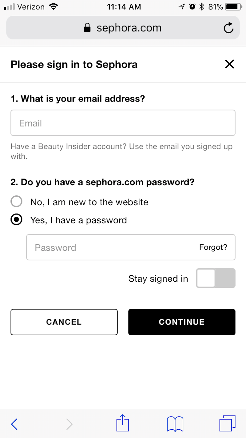
One of the nice things about Sephora's already convenient checkout process is that customers can automate the sign-in process going forward with a simple toggle:
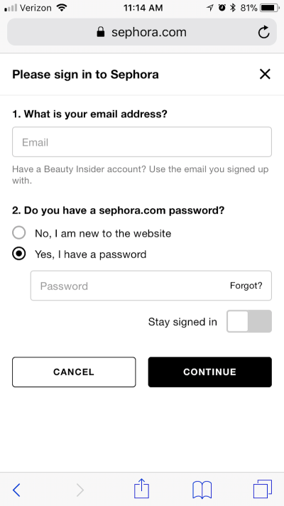
When mobile customers are feeling the rush and want to get to the next stage of checkout, Sephora’s auto-sign-in feature would definitely come in handy and encourage customers to buy more frequently from the mobile website.
Many mobile websites wait until the bottom of the login page to tell customers what kinds of options they have for checking out. But rather than surprise them late, Victoria’s Secret displays this information in big bold buttons right at the very top:
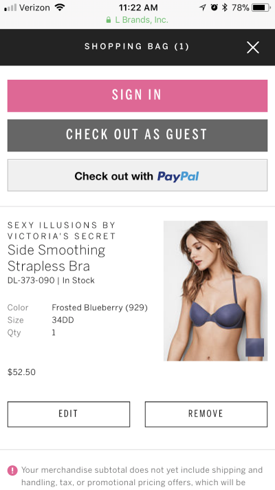
Customers have a choice of signing in with their account, checking out as a guest or going directly to PayPal. They are not surprised to discover later on that their preferred checkout or payment method isn’t offered.
I also really love how Victoria’s Secret has chosen to do this. There’s something nice about the brightly colored “Sign In” button sitting beside the more muted “Check Out as a Guest” button. For one, it adds a hint of Victoria’s Secret brand colors to the checkout, which is always a nice touch. But the way it’s colored the buttons also makes clear what it wants the primary action to be (i.e. to create an account and sign in).
6. Add Breadcrumbs
When you send mobile customers to checkout, the last thing you want is to give them unnecessary distractions. That’s why the website’s standard navigation bar (or hamburger menu) is typically removed from this page.
Nonetheless, the checkout process can be intimidating if customers don’t know what’s ahead. How many forms will they need to fill out? What sort of information is needed? Will they have a chance to review their order before submitting payment details?
If you’ve designed a multi-page checkout, allay your customers’ fears by defining each step with clearly labeled breadcrumb navigation at the top of the page. In addition, this will give your checkout a cleaner design, reducing the number of clicks and scrolling per page.
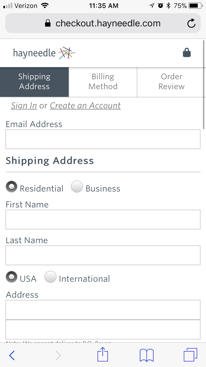
Hayneedle has a beautiful example of breadcrumb navigation in action:
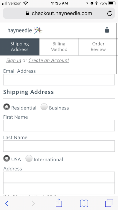
You can see that three steps are broken out and clearly labeled. There’s absolutely no question here about what users will encounter in those steps either, which will help put their minds at ease. Three steps seems reasonable enough, and users will have a chance to review the order once more before completing the purchase.
Sephora has an alternative style of “breadcrumbs” in its checkout:

Instead of placing each “breadcrumb” at the top of the checkout page, Sephora’s customers can see what the next step is, as well as how many more are to come as they work their way through the form.
This is a good option to take if you’d rather not make the top navigation or the breadcrumbs sticky. Instead, you can prioritize the call to action (CTA), which you might find better motivates the customer to move down the page and complete their purchase.
I think both of these breadcrumbs designs are valid, though. So, it might be worth A/B testing them if you’re unsure of which would lead to more conversions for your visitors.
7. Format The Checkout Form Wisely
Good mobile checkout form design follows a pretty strict formula, which isn’t surprising. While there are ways to bend the rules on desktop in terms of structuring the form, the number of steps per page, the inclusion of images and so on, you really don’t have that kind of flexibility on mobile.
Instead, you will need to be meticulous when building the form:
- Design each field of the checkout form so that it stretches the full width of the website.
- Limit the fields to only what’s essential.
- Clearly label each field outside of and above it.
- Use at least a 16-point-pixel font.
- Format each field so that it’s large enough to tap into without zooming.
- Use a recognizable mark to indicate when something is required (like an asterisk).
- Always let users know when an error has been made immediately after the information has been inputted in a field.
- Place the call to action at the very bottom of the form.
Because the checkout form is the most important element that moves customers through the checkout process, you can’t afford to mess around with a tried and true formula. If users can’t seamlessly get from top to bottom, if the fields are too difficult to engage with, or if the functionality of the form itself is riddled with errors, then you might as well kiss your mobile purchases (and maybe your purchases in general) goodbye.
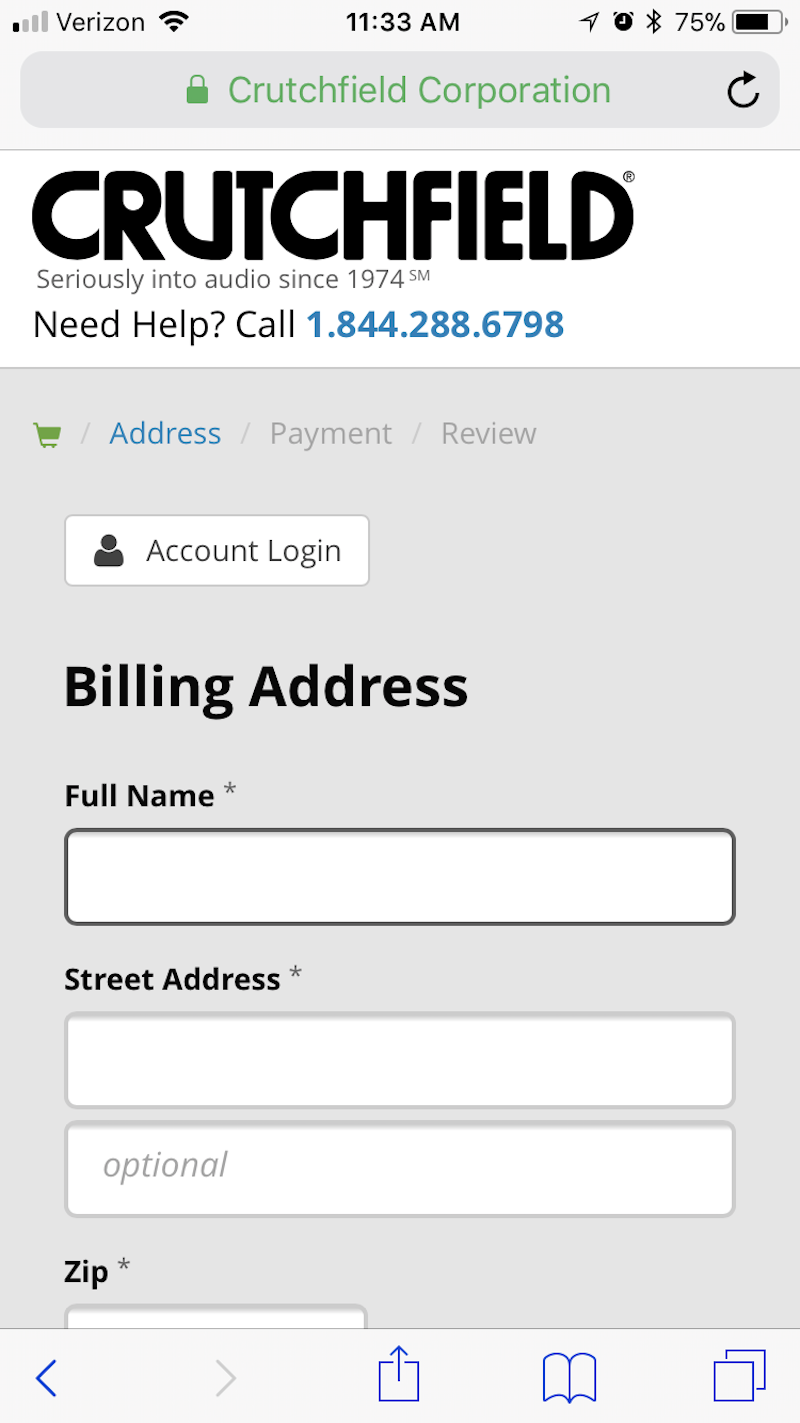
Crutchfield shows how to create form fields that are very user-friendly on mobile:

As you can see, each field is large enough to click on (even with fat fingers). The bold outline around the currently selected field is also a nice touch. For a customer who is multitasking and or distracted by something around them, returning to the checkout form would be much easier with this type of format.
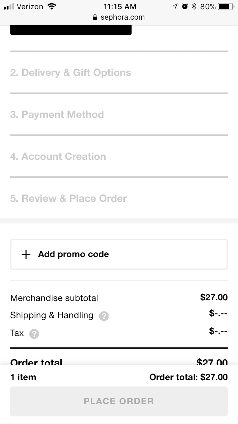
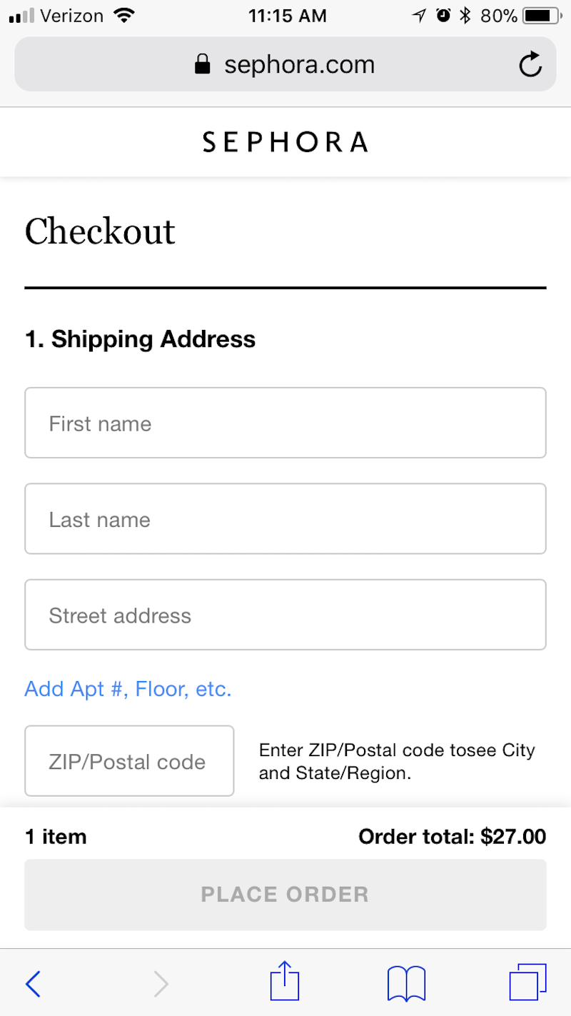
Sephora, again, handles mobile checkout the right way. In this case, I want to draw your attention to the grayed-out “Place Order” button:
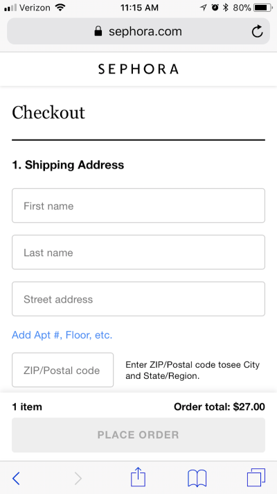
The button serves as an indicator to customers that they’re not quite ready to submit their purchase information yet, which is great. Even though the form is beautifully designed — everything is well labeled, the fields are large, and the form is logically organized — mobile users could accidentally scroll too far past a field and wouldn’t know it until clicking the call-to-action button.
If you can keep users from receiving that dreaded “missing information” error, you’ll do a better job of holding onto their purchases.
8. Simplify Form Input
Digging a bit deeper into these contact forms, let’s look at how you can simplify the input of data on mobile:
- Allow customers to user their browser’s autocomplete functionality to fill in forms.
- Include a
tabindexHTML directive to enable customers to tap an arrow up and down through the form. This keeps their thumbs within a comfortable range on the smartphone at all times, instead of constantly reaching up to tap into a new field. - Add a checkbox that automatically copies the billing address information over to the shipping fields.
- Change the keyboard according to what kind of field is being typed in.
One example of this is Bass Pro Shops’ mobile website:
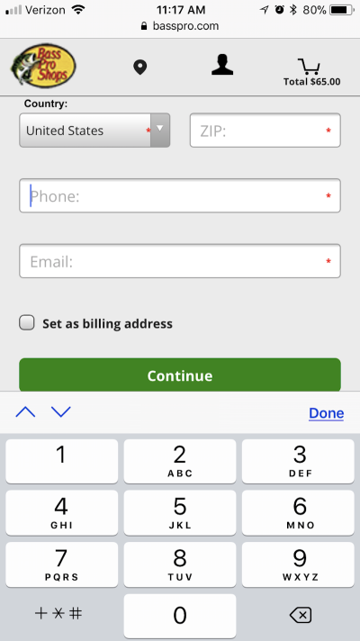
For starters, the keyboard uses tab functionality (see the up and down arrows just above the keyboard). For customers with short fingers or who are impatient and just want to type away on the keyboard, the tabs help keep their hands in one place, thus speeding up checkout.
Also, when customers tab into a numbers-only field (like for their phone number), the keyboard automatically changes, so they don’t have to switch manually. Again, this is another way to up the convenience of making a purchase on mobile.
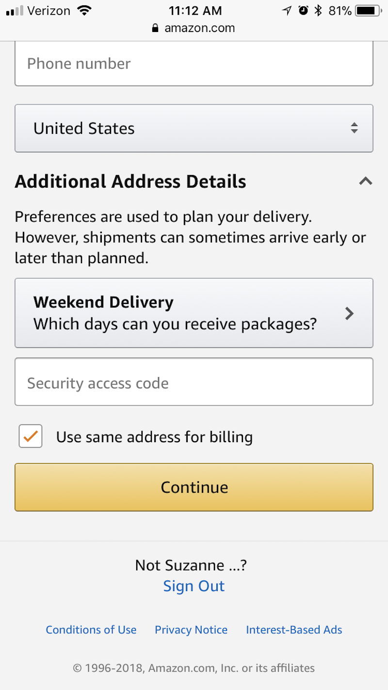
Amazon’s mobile checkout includes a quick checkbox that streamlines customers’ submission of billing information:
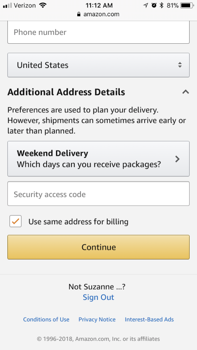
As we’ve seen with mobile checkout form design, simpler is always better. Obviously, you will always need to collect certain details from customers each time (unless their account has saved that information). Nonetheless, if you can provide a quick toggle or checkbox that enables them to copy data over from one form to another, then do it.
9. Don’t Skimp On The CTA
When designing a desktop checkout, your main concerns with the CTA are things like strategic placement of the button and choosing an eye-catching color to draw attention to it.
On mobile, however, you have to think about size, too — and not just how much space it takes up on the screen. Remember the thumb zone and the various ways in which users hold their phone. Ensure that the button is wide enough so that any user can easily click on it without having to change their hand position.
So, your goal should be to design buttons that (1) sit at the bottom of the mobile checkout page and (2) stretch all the way from left to right, as is the case on Staples’ mobile website:

No matter who is making the purchase — a left-handed, a right-handed or a two-handed cradler — that button will be easy reach.
Of all the mobile checkout enhancements we’ve covered today, the CTA is the easiest one to address. Make it big, give it a distinctive color, place it at the very bottom of the mobile screen, and make it span the full width. In other words, don’t make customers work hard to take the final step in a purchase.
10. Offer An Alternate Way Out
Finally, give customers an alternate way out.
Let’s say they’re shopping on a mobile website, adding items to their cart, but something isn’t sitting right with them, and they don’t want to make the purchase. You’ve done everything you can to assure them along the way with a clean, easy and secure checkout experience, but they just aren’t confident in making a payment on their phone.
Rather than merely hoping you don’t lose the purchase entirely, give them a chance to save it for later. That way, if they really are interested in buying your product, they can revisit on desktop and pull the trigger. It’s not ideal, because you do want to keep them in place on mobile, but the option is good for customers who just can’t be saved.
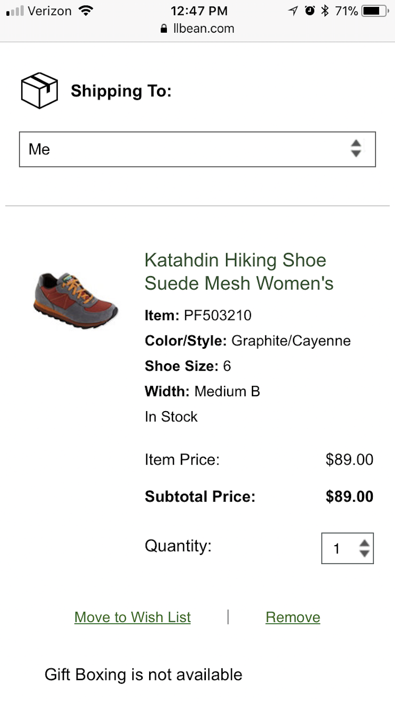
As you can see on L.L. Bean’s mobile website, there is an option at checkout to “Move to Wish List”:
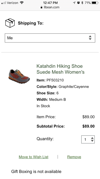
What’s nice about this is that L.L. Bean clearly doesn’t want browsing of the wish list or the removal of an item to be a primary action. If “Move to Wish List” were shown as a big bold CTA button, more customers might decide to take this seemingly safer alternative. As it’s designed now, it’s more of a, “Hey, we don’t want you to do anything you’re not comfortable with. This is here just in case.”
While fewer options are generally better in web design, this might be something to explore if your checkout has a high cart abandonment rate on mobile.
Wrapping Up
As more mobile visitors flock to your website, every step leading to conversion — including the checkout phase — needs to be optimized for convenience, speed and security. If your checkout is not adeptly designed to mobile users’ specific needs and expectations, you’re going to find that those conversion rates drop or shift back to desktop — and that’s not the direction you want things to go in, especially if Google is pushing us all towards a mobile-first world.
Further Reading
- A Complete Guide To Mobile App Marketing
- How To Build An E-Commerce Site With Angular 11, Commerce Layer And Paypal
- How To Build Strong Customer Relationships For User Research
- Better Context Menus With Safe Triangles
 (da, ra, yk, al, il, mrn)

