Are Mobile Pop-Ups Dying? Are They Even Worth Saving?

Email Newsletter
Weekly tips on front-end & UX.
Trusted by 182,000+ folks.


 Custom Web Forms for Angular, React, & Vue. Your backend.
 Celebrating 10 million developers
The pop-up has an interesting (and somewhat risqué) origin. Were you aware of this? The creator of the original pop-up ad, Ethan Zuckerman, explained how it came into being:
"Specifically, we came up with it when a major car company freaked out that they’d bought a banner ad on a page that celebrated anal intercourse. I wrote the code to launch the window and run an ad in it. I’m sorry. Our intentions were good."
Basically, the client was dissatisfied with having their ad placed beside an article discussing this less-than-savory subject. Rather than lose the ad revenue or, worse, the client, Zuckerman and his team came up with a solution: The car company’s ad would still run on the website, but this time would pop out into a new window. Thus, the pop-up gave the advertiser an opportunity to share their offer without the risk of sitting next to a competitor or unsuitable blog content.
Origin story aside, does Zuckerman have anything to apologize for? Is the pop-up in its current state such a bad thing for the user experience? With a few simple searches around the web, you might very well begin to believe that.
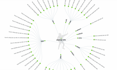
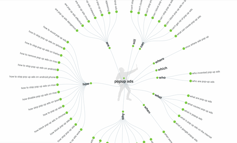
For instance, a search of the term “pop-up ads” in Answer the Public comes up with this disheartening response:
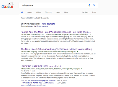
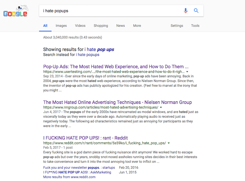
A search for “I hate pop-ups” on Google results in over 3 million pages and responses like this:
With the seemingly abundant negative responses to pop-ups, does this mean the pop-up is dead? Google’s 2017 algorithmic update penalizing certain types of mobile pop-ups could very well spell their doom — though I’m not ready to throw in the towel yet.
So, today, I want to see what the research says.
Are mobile pop-ups dying? Or will they simply undergo another adaptation?
If they continue to remain effective, how should designers make use of them, especially in mobile web design?
Finally, are there alternatives web designers can start using now to prepare for Google’s vision of a more mobile-friendly digital world?
Is The Mobile Pop-Up Dead? What The Experts Say
Pop-ups have come a long way since their founding by Zuckerman in the ’90s.
For the most part, pop-ups don’t force users out of the browser, nor do they surprise them with a desktop cluttered with ads once the browser is closed altogether. It’s a neater and more controlled experience overall. And we’ve seen them in a variety of forms, too:
- full-page interstitials,
- partial modal pop-ups,
- top- or bottom-aligned bars,
- pop-out modules tucked in the corner of the page,
- push notifications,
- inline banners found within the actual content of the page.
Pop-ups can also now appear at various points throughout the journey, thanks in part to big data and AI:
- appearing as soon as the web page loads;
- appearing once the user scrolls down the page;
- appearing once the user moves the cursor to the close button in the browser tab;
- ever-present, sitting off to the side, waiting for engagement.
But this type of pop-up technology doesn’t work all that well with the mobile experience, does it?
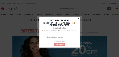
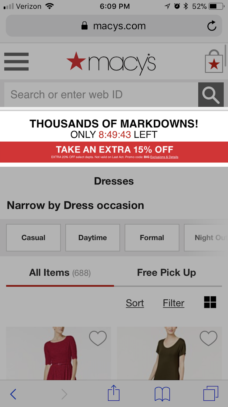
Take Macy’s website. Upon entering it, you’ll encounter this pop-up ad within a few seconds:
When you open the website on mobile, however, you won’t find any trace of that pop-up. Instead, you’ll see a small bar built into the space just below the navigation bar:
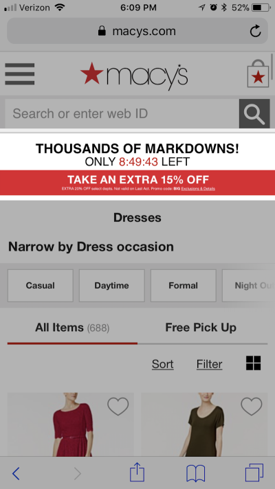
The offer is similar, but with no request for an email address and no pop-up functionality. This is likely because of the change to Google’s algorithm in 2017.
Which brings me to what the experts say about pop-ups. While most are focused on the life expectancy of pop-ups in general, Google has been leading the charge against mobile pop-ups (sort of) for almost a year now:
Let’s start by looking at Google’s announcement regarding mobile-first indexing. This originally came to light in 2016, but it was just talk at the time. It is now over a year later, and Google has begun rolling out this indexing initiative.
Basically, what it does is change how Google’s bots crawl and index a website. Google no longer views the desktop version of a website as the primary experience for users. Going forward, the mobile website will be the primary version indexed.
With Google users increasingly starting on a mobile device instead of desktop, this move makes sense. It’s also why the algorithm change in 2017 that penalizes certain types of mobile pop-ups was another logical move in Google’s mission to make the web a more mobile-friendly place.

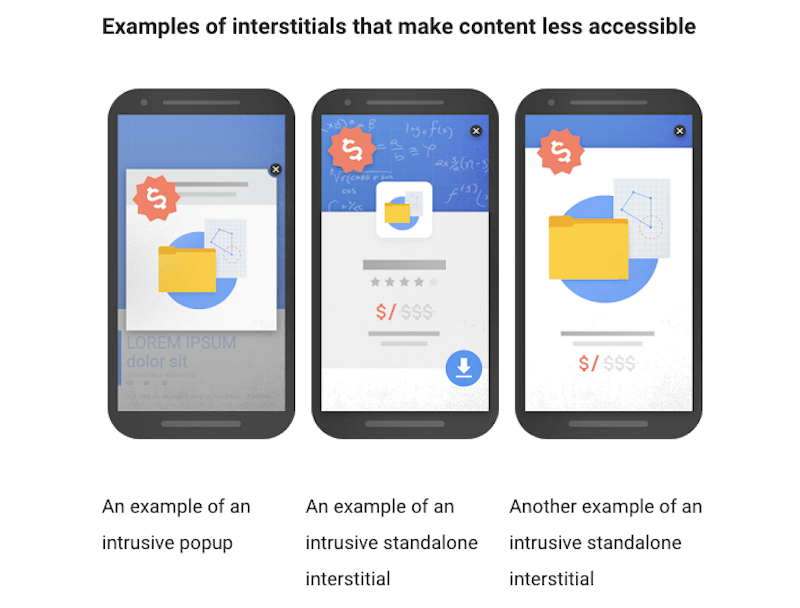
In laying out the details of this change, Google explained that mobile pop-ups deemed disruptive to the user experience would result in ranking penalties for those websites. These kinds of pop-ups fall into three categories:
- interstitial pop-ups that cover the entire screen upon entering the website and that require users to “X” out in order see the actual website;
- pop-ups that cover the entire screen upon entering the website but that require users to know that scrolling past them is the way to bypass the pop-up and see the main content;
- any pop-up that hides the majority of content on the page behind it.
In other words, Google doesn’t believe that traditional pop-ups have any place on mobile because the limited screen space would make the experience too disruptive. That’s likely the reason why you’re seeing popular websites like Macy’s do away with mobile pop-ups altogether. Though there are some traditional modal pop-ups Google doesn’t mind, it’s probably safer to avoid modals and interstitials on mobile in order to avoid the chance of a penalty.
As you can see, pop-ups for legal requirements are still OK, although most of the time you’re going to see publishers relegate them to small bars, as MailChimp has done here:

Nielsen Norman Group
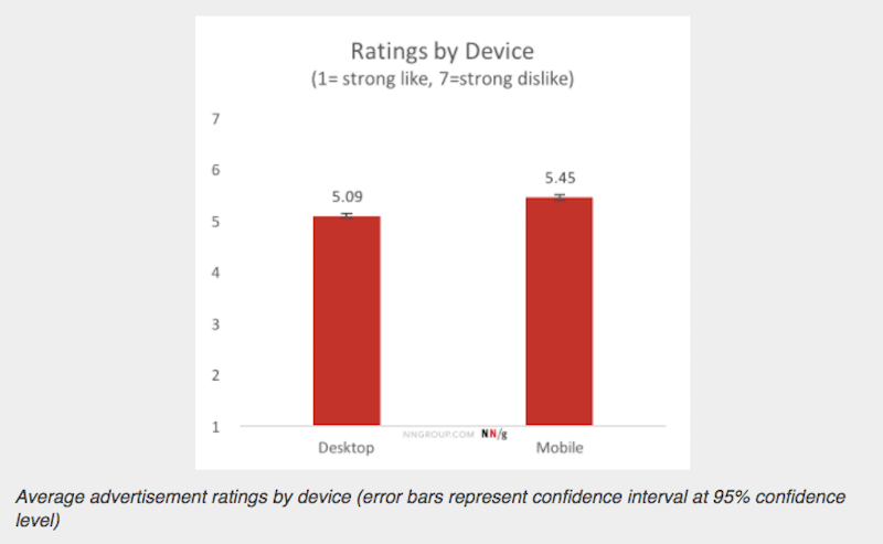
In 2017, Nielsen Norman Group conducted a survey on the most hated advertising techniques. This study encompassed all kinds of website advertising (including video ads, on-page banner ads, etc.), but there was special mention of pop-up ads that make the findings relevant here.
Out of a total score of 7, with 1 being “strongly like” and 7 being “strongly dislike,” respondents gave mobile ads a score of 5.45. Desktop ads weren’t far behind, with 5.09, although the survey results did consistently show that mobile ads were more despised than their desktop counterparts.

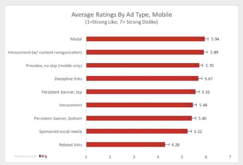
Drilling down, Nielsen Norman Group also found modals (i.e. partially covering pop-ups) to be the most hated type of ad that mobile users encounter:

Why does Nielsen Norman Group believe this to be the case? Well, there’s the aforementioned real estate issue. Mobile phones just don’t have enough room to accommodate modal pop-ups without overwhelming users. According to the authors, though, there may be another reason:
"Additionally, the context of mobile use tends to be “on-the-go” — that is, users are more likely to be distracted by competing stimuli, and the need for efficiency is drastically increased."
Having reviewed Nielsen Norman Group’s research, I do agree that many users will very likely be put off upon encountering a pop-up on a mobile website. That being said, plenty of research provides a valid counter-argument.
While users might be likely to describe their annoyance with pop-ups as high when surveyed about it, some evidence suggests it is short-lived for many of them. As we’ll see in a moment, pop-ups are actually quite effective in driving conversions.
Sumo
Sumo declared in 2018 that pop-ups aren’t dead. While that opinion might be seen as biased, considering it’s in the business of creating and selling list-builder tools such as pop-ups, welcome mats and smart bars, it does have evidence to suggest that pop-ups are still worthwhile if generating leads and conversions is your top priority.
Sumo used data from nearly 2 billion customer pop-ups to make this argument. Sadly, the data doesn’t directly break out anything related to mobile pop-ups and their conversion rates, but I found this particular statistic to be relevant:
"Of the top 10% of pop-ups, only 8% had pop-ups appear in the 0-4 second mark. And the majority of those 8% were on pages where the pop-up was expected to appear quickly — as in sending someone to a download page."
In other words, users don’t want to be rushed into seeing your pop-ups — which is one of the major points Google is trying to make with its algorithm update. (Tests conducted by Crazy Egg mirror this point about delaying pop-ups.) Mobile websites that jump the gun and present visitors with a pop-up message before giving them an opportunity to scroll through the website are just creating an unnecessary disruption.
Another point that Sumo stresses is that pop-ups need to be valuable and presented within context. This is especially important on mobile, where you can’t afford to test visitors’ patience with a video pop-up completely unrelated to the blog post they were trying to read beneath it.
In other words, always think about how a pop-up will add value to the experience that you are (partially) blocking.
Justinmind
Justinmind calls modal pop-ups “complicated,” and for good reason. Even though there was nearly an even split between how users felt about pop-ups (21% said they liked them, while 23% said they didn’t), the research shows that pop-ups have proven to be quite helpful in the conversion process.
That being said, what a lot of this comes down to is how a website uses the pop-up. The University of Alberta, for example, was able to get 12% to 15% more email subscribers by using a pop-up on its website. On the other hand, you have Search Engine Land claiming that the main reason people block websites is because of pop-up ads.
Another thing to think about, according to Justinmind, is the mobile UI. It suggests that even if you do everything else right — deliver a valuable and well-timed offer and compromise an unobtrusive amount of space — there’s still the thumb zone to think about.
While it’s great that designers have built the ever-trusty “X” button into the top-right corner of pop-ups, that’s not the easiest stretch for the mobile user’s thumb. If you want to design ads for the mobile UX, consider another placement of that exit button.
30 Lines
Digital marketing agency 30 Lines claims:
"Our clients who run targeted lead capture pop-ups on their websites typically convert anywhere from 75-250% more leads from their sites than clients who don’t."
Unlike other experts who have shied away from the subject of mobile pop-ups (because it might end in them admitting defeat), 30 Lines took on the topic head on. And this was the point they sought to make:
- Google is not saying that mobile pop-ups are all bad.
- Google, in fact, does want you to generate more conversions on your website — and it acknowledges that pop-ups might play a role in that.
- It’s simply up to you to determine what will lead to the most unobtrusive experience for your visitors.
30 Lines gives a lot of great tips on how to adhere to Google’s principles without doing away with mobile pop-ups altogether. As we move on to discuss ways in which designers can use mobile pop-ups in the future, I’ll be sure to include them for consideration.
What Do Web Designers Do With Mobile Pop-Ups Now?
I’m not going to lie: This is a tough one, because while it would be so easy to just kill pop-ups on mobile websites altogether — and many consumers would be thrilled with that decision — they do still have incredible value in generating conversions. So, what do we do?
Clearly, this is a complicated matter, because you could equally argue both sides and are left choosing between two evils:
- Do you want to run mobile pop-ups in the hope of gaining more subscribers (especially considering that mobile users tend to have lower conversion rates to begin with)?
- Or do you want to put more resources into writing high-converting landing pages and on-page banners to sell and convert mobile visitors?
Do you even know which option mobile visitors would be more receptive to?
Below are questions to think about as you evaluate whether pop-ups make sense for your mobile website now and in the future.
Is It Necessary?
Ask yourself whether a particular message even needs to be in a pop-up format. If it could work just as well integrated in a page, then you might want to skip it entirely (as in the Macy’s example from earlier).
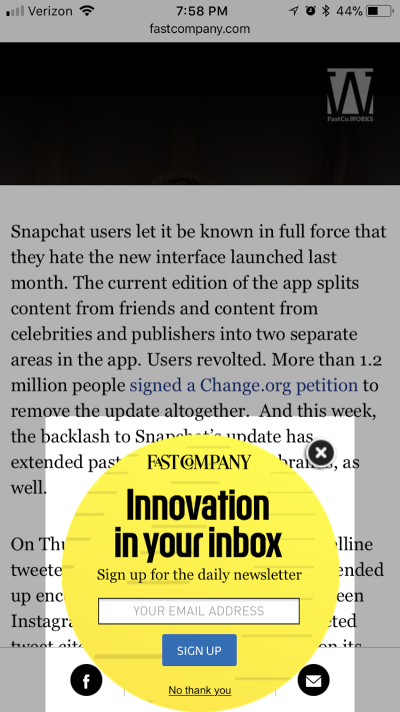
Fast Company uses pop-ups on its mobile website (shown below), but it also integrates its contact forms into on-page banners, like this one:

Different Designs
Create different pop-up designs for desktop and for mobile. So long as the message and offer are still relevant and valuable to mobile users, there’s no reason not to completely start from the ground up when building mobile pop-ups. Just be sure to think about the design, message and trigger rules when reshaping desktop pop-ups for mobile.
Gap is a good example of this. You can see how its offer is displayed on desktop as an on-page banner with expanded details:

Then, on mobile, it is shown as a bottom bar element:

Go Small
Keep pop-ups small on mobile. In general, it’s recommended they take up no more than 15% of the screen. This means staying away from full-page interstitials, even if you’re trying to sneak them in on a second or third page.
Inc has a small and succinct message for mobile users:

Target Mobile Context
Use mobile-targeted messaging. This means be very light on text, and don’t include images or icons that force the pop-up to be larger than it needs to be. You can also create targeted messages for consumers who use your website for research while out and about or even while shopping in house.
Stick To The Bottom
To play it safe, display pop-ups only at the very bottom of a page. This could mean one of two things. First, you could align the pop-up to the bottom of the mobile screen (this could be a traditional modal pop-up or a hello bar). Here’s an example of how Fast Company does it:
The second option is to open the pop-up once the visitor has scrolled all the way to the bottom of the web page.
Delay
Try not to show a pop-up on the first page a visitor sees. By this, I mean the first page that a user is directed to by search or a referral website (which is not necessarily the home page). Also, don’t forget about timing. In general, try not to load a pop-up within the first four seconds of a visitor arriving on a page.
Intuit does this really well:

Visit the first page of the website and you won’t encounter any kind of pop-up messaging. Click through to learn more about pricing, and then you’ll see a relevant and value-adding message pop up at the bottom of the screen.
Easy Exit
If you still want to use a modal pop-up design, make sure it’s easy to exit out of. This means putting an “X” in the bottom-right corner or an exit message beneath the CTA.
Or you could stick with the bottom bar design that many mobile web designers seem to favor right now, like Zumiez:

The New Yorker also does this:

Make It Optional
Create a special CTA or other interactive element on your website that, only when clicked, opens a pop-up. Basically, let mobile users decide whether and when they want to interrupt the on-site experience.
Basic Outfitters does this after you’ve added your first item to the cart:

Consider Alternatives
If you’re nervous about designing a traditional pop-up on your website, fear not. There are alternatives.
Consider push notifications and SMS notifications. They allow you to reach mobile users without having to intrude in the browser or in the mobile device experience without their express permission.
Gated content is another way to collect leads on a mobile website without having to force users into a pop-up to submit their contact information.
Track Preference
You will more likely annoy a mobile user with a repeat pop-up ad than a desktop user. So, if you can use cookies to prevent mobile visitors from being interrupted by the same pop-up message after they’ve dismissed it, that would be ideal.
Remember: You’re not just playing by Google’s rules here. If mobile visitor numbers drop off and Google spots a change in your bounce rate and time-on-site statistics, then your website’s rank will suffer as a result, since Google now prioritizes the mobile website experience over desktop.
The Mobile Pop-Up Doesn’t Need To Die
For now, the best plan is to heed the experts. And what they’re saying is that mobile pop-ups aren’t dying. In fact, they can still play a vital role in signing up more email subscribers and converting more customers from mobile devices. But, as with anything else, you need to play by Google’s rules and always think about how your decisions will affect your users’ experience.
So, use your mobile pop-ups wisely.
Further Reading
- Picture Perfect: Meet Pixo, A Photo Editor For Your End Users
- The Ultimate Guide To Push Notifications For Developers
- How Accessibility Standards Can Empower Better Chart Visual Design
- When Words Cannot Describe: Designing For AI Beyond Conversational Interfaces


