Redesigning A Digital Interior Design Shop (A Case Study)

Email Newsletter
Weekly tips on front-end & UX.
Trusted by 182,000+ folks.


 Celebrating 10 million developers
 Custom Web Forms for Angular, React, & Vue. Your backend.
Good products are the result of a continual effort in research and design. And, as it usually turns out, our designs don’t solve the problems they were meant to right away. It’s always about constant improvement and iteration.
I have a client called Design Cafe (let’s call it DC). It’s an innovative interior design shop founded by a couple of very talented architects. They produce bespoke designs for the Indian market and sell them online.
DC approached me two years ago to design a few visual mockups for their website. My scope then was limited to visuals, but I didn’t have the proper foundation upon which to base those visuals, and since I didn’t have an ongoing collaboration with the development team, the final website design did not accurately capture the original design intent and did not meet all of the key user needs.
A year and a half passed and DC decided to come back to me. Their website wasn’t providing the anticipated stream of leads. They came back because my process was good, but they wanted to expand the scope to give it space to scale. This time, I was hired to do the research, planning, visual design and prototyping. This would be a makeover of the old design based on user input and data, and prototyping would allow for easy communication with the development team. I assembled a small team of two: me and a fellow designer, Miroslav Kirov, to help run proper research. In less than two weeks, we were ready to start.
Kick-Off
Useful tip: I always kick off a project by talking to the stakeholders. For smaller projects with one or two stakeholders, you can blend the kick-off and the interview into one. Just make sure it’s no longer than an hour.
Stakeholder Interviews
Our two stakeholders are both domain experts. They have a brick-and-mortar store in the center of Bangalore that attracts a lot of people. Once in there, people are delighted by the way the designs look and feel. Our clients wanted to have a website that conveys the same feeling online and that would make its visitors want to go to the store.
Their main pain points:
- The website wasn’t responsive.
- There wasn’t a clear distinction between new, returning and potential clients.
- DC’s selling points weren’t clearly communicated.
They had future plans for transforming the website into a hub for interior design ideas. And, last but not least, DC wanted to attract fresh design talent.
Defining The Goals
We shortlisted all of our goals for the project. Our main goal was to explain in a clear and appealing manner what DC does for existing and potential clients in a way that engages them to contact DC and go to the store. Some secondary goals were:
- lower the drop-off rate,
- capture some customer data,
- clarify the brand’s message,
- make the website responsive,
- explain budgets better,
- provide decision-making assistance and become an information influencer.
Key Metrics
Our number-one key metric was to convert users to leads who visit the store, which measures the main goal. We needed to improve that by at least 5% initially — a realistic number we decided on with our stakeholders. In order to do that, we needed to:
- shorten the conversion time (time needed for a user to get in touch with DC),
- increase the form application rate,
- increase the overall satisfaction users get from the website.
We would track these metrics by setting up Google Analytics Events once the website is online and by talking with leads who come into the store through the website.
Useful tip: Don’t focus on too many metrics. A handful of your most important ones are enough. Measuring too many things will dilute the results.
Discovery
In order for us to gain the best possible insights, our user interviews had to target both previous and potential clients, but we had to go minimal, so we picked two potential and three existing clients. They were mostly from the IT sector — DC’s main target group. Given our pretty tight schedule, we started with desk research while we waited for all five user interviews to be scheduled.
Useful tip: You need to know who you are designing for and what research has been done before. Stakeholders tell you their story, but you need to compare it to data and to users’ opinions, expectations and needs.
Data
We could reference some Google Analytics data from the website:
- Most users went to the kitchen, then to the bedroom, then to the living room.
- The high bounce rate of 80%+ was probably due to a misunderstanding of the brand message and unclear flows and calls to action (CTAs).
- Traffic was mostly mobile.
- Most users landed on the home page, 70% of them from ads and 16% directly (mostly returning customers), and the rest were equally divided between Facebook and Google Search.
- 90% of social media traffic came from Facebook. Expanding brand awareness to Instagram and Twitter could be beneficial.
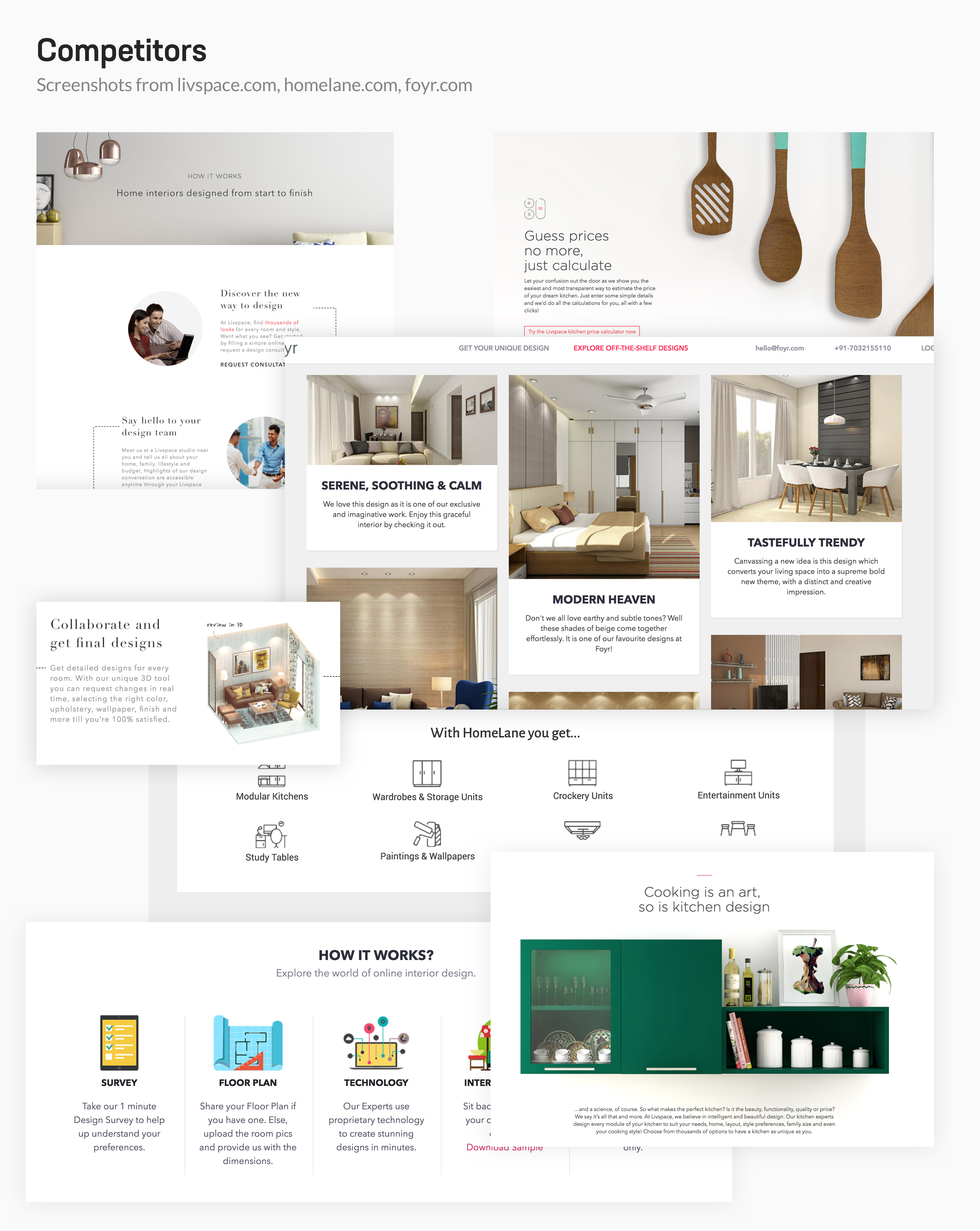
Competitors
There’s a lot of local competition in the sector. Here were some repeating patterns:
- video spots and elaborate galleries showing the completed designs with clients discussing their services;
- attractive design presentations with high-quality photos;
- targeting of group’s appropriate messages;
- quizzes for picking styles;
- big bold typography, less text and more visuals.
Users
DC’s customers are mostly aged between 28 and 40, with a secondary set in the higher bracket of 38 and 55 who come for their second home. They are IT or business professionals with a mid to high budget. They value good customer experience but are price-conscious and very practical. Because they are mostly families, very often the wives are the hidden dominant decision-maker.
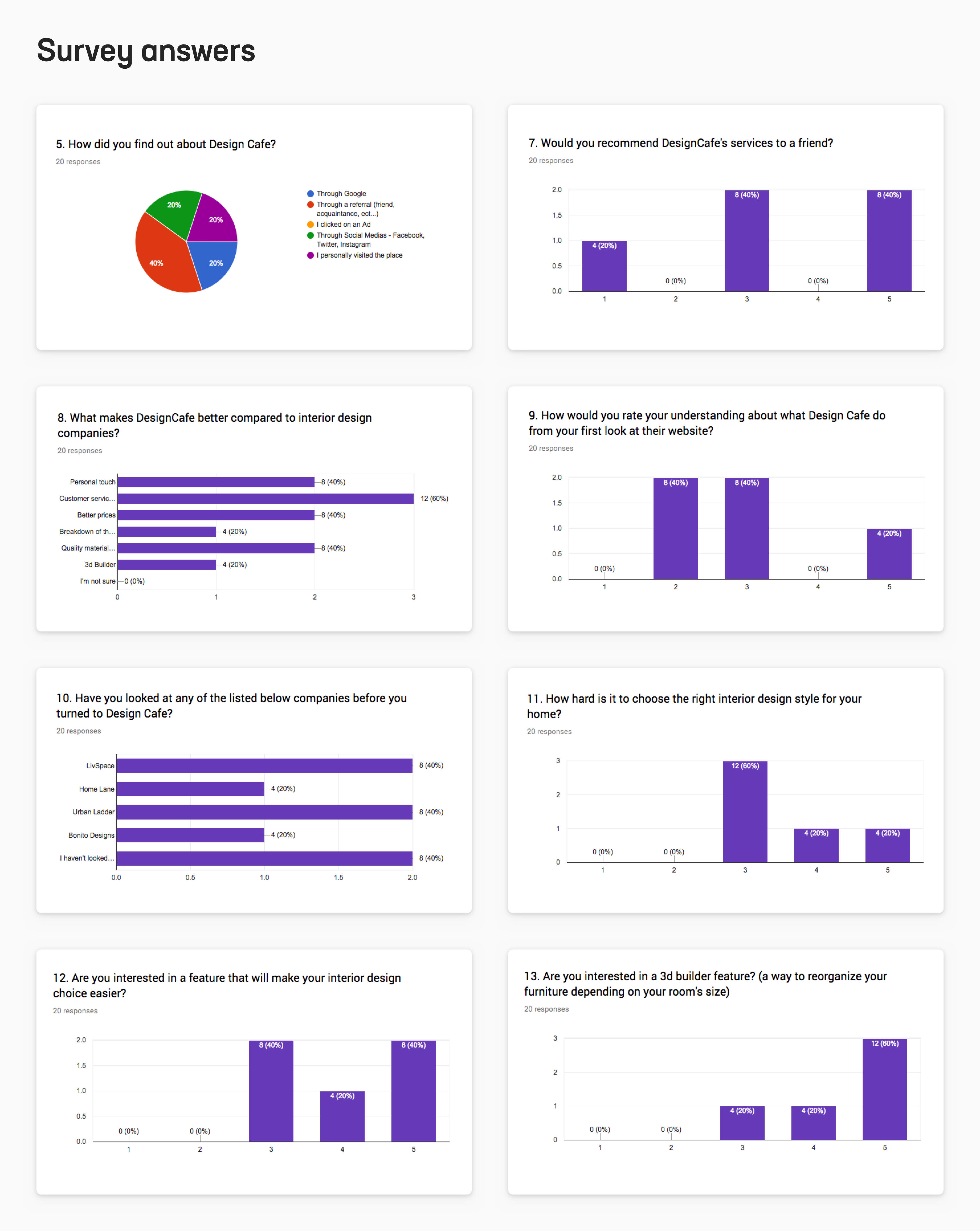
We talked with five users (three existing and two potential customers) and sent out a survey to 20 more (mixing existing and potential customers).
User Interviews
Useful tip: Be sure to schedule all of your interviews ahead of time, and plan for more people than you need. Include extreme users along with the mainstreams. Chances are that if something works for an extreme user, it will work for the rest as well. Extremes will also give you insight about edge cases that mainstreams just don’t care about.
All users were confused about the main goal of the website. Some of their opinions:
- “It lacks a proper flow.”
- “I need more clarity in the process, especially in terms of timelines.”
- “I need more educational information about interior design.”
Everyone was pretty well informed about the competition. They had tried other companies before DC. All found out about DC by either a reference, Google, ads or by physically passing by the store. And, boy, did they love the store! They treated it like an Apple Store for interior design. Turns out that DC really did a great job with that.
Useful tip: Negative feedback helps us find opportunities for improvement. But positive feedback is also pretty useful because it helps you identify which parts of the product are worth retaining and building upon.
Personal touch, customer service, prices and quality of materials were their main motivations for choosing DC. People insisted on being able to see the price of every element on a page at any time (the previous design didn’t have prices on the accessories).
We made an interesting but somehow expected discovery about device usage. Mobile devices were used mostly for consumption and browsing, but when it came to ordering, most people opened their laptops.
Surveys
The survey results mostly overlapped with the interviews:
- Users found DC through different channels, but mainly through referrals.
- They didn’t quite understand the current state of the website. Most of them had searched for or used other services before DC.
- All of the surveyed users ordered kitchen designs. Almost all had difficulty choosing the right design style.
- Most users found the process of designing their own interior hard and were interested in features that could make their choice easier.
Useful tip: Writing good survey questions takes time. Work with a researcher to write them, and schedule double the time you think you’ll need.
Planning
User Journeys Overview
Talking with customers helped us gain useful insight about which scenarios would be most important to them. We made an affinity diagram with everything we collected and started prioritizing and combining items in chunks.
Useful tip: Use a white board to download all of your team’s knowledge, and saturate the board with it. Group everything until you spot patterns. These patterns will help you establish themes and find out the most important pain points.
The result was seven point-of-view problem statements that we decided to design for:
- A new customer needs more information about DC because they need proof of credibility.
- A returning customer needs quick access to the designs because they don’t want to waste time.
- All customers need to be able to browse the designs at any time.
- All customers want to browse designs relevant to their tastes, because that will shorten their search time.
- Potential leads need a way to get in touch with DC in order to purchase a design.
- All customers, once they’ve ordered, need to stay up to date with their order status, because they need to know what they are paying for and when they will be getting it.
- All customers want to read case studies about successful projects, because that will reassure them that DC knows its stuff.
Using this list, we came up with design solutions for every journey.
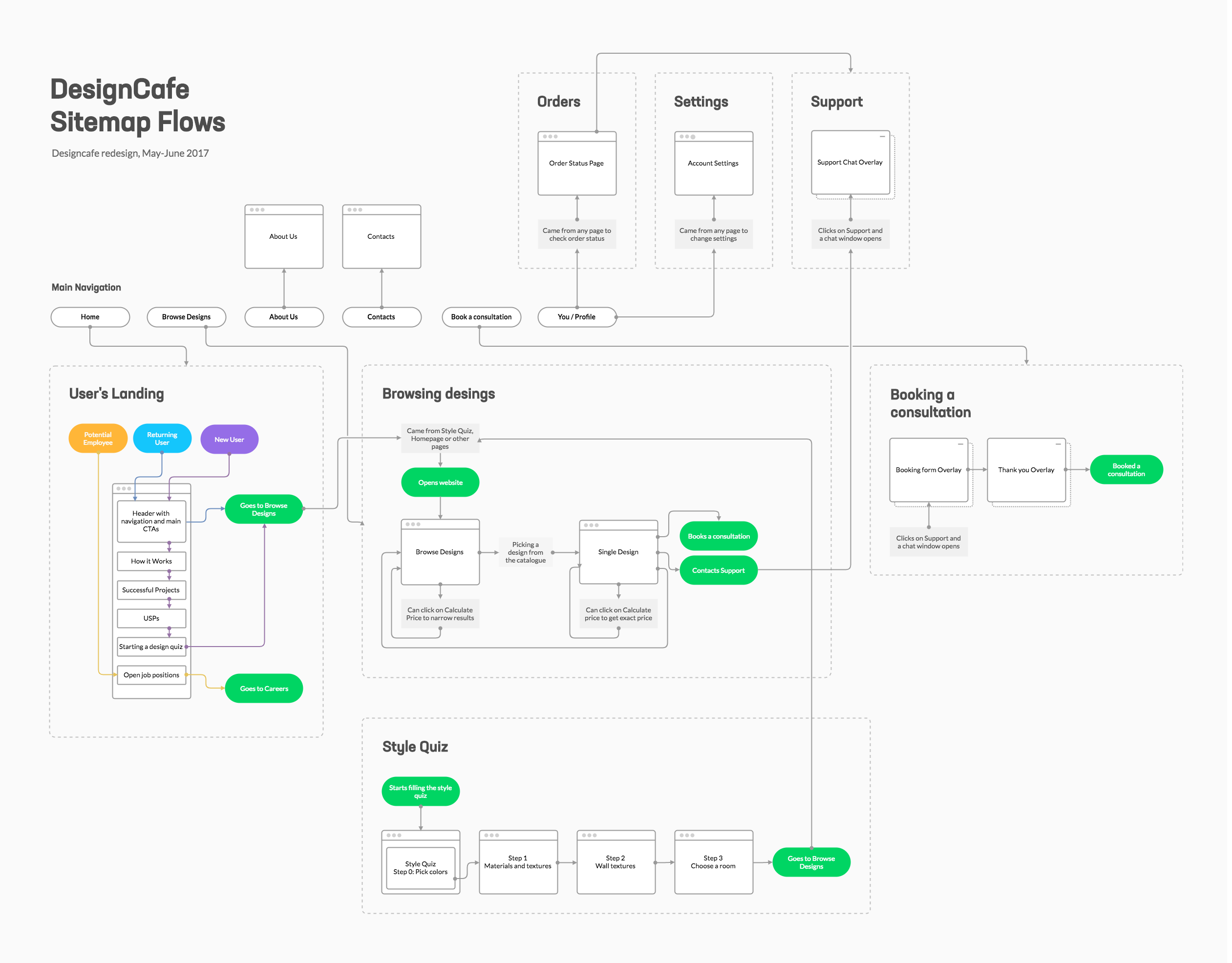
Onboarding
The previous home page of Design Cafe was confusing. It needed to present more information about the business. The lack of information caused confusion and people were unsure what DC is about. We divided the home page into several sections and designed it so that every section could satisfy the needs of one of our target groups:
- For new visitors (the purple flow), we included a short trip through the main unique selling points (USPs) of the service, the way it works, some success stories and an option to start the style quiz.
- For returning visitors (the blue flow), who will most likely skip the home page or use it as a waypoint, the hero section and the navigation pointed a way out to browsing designs.
- We left a small part at the end of the page (the orange flow) for potential employees, describing what there is to love about DC and a CTA that goes to the careers page.
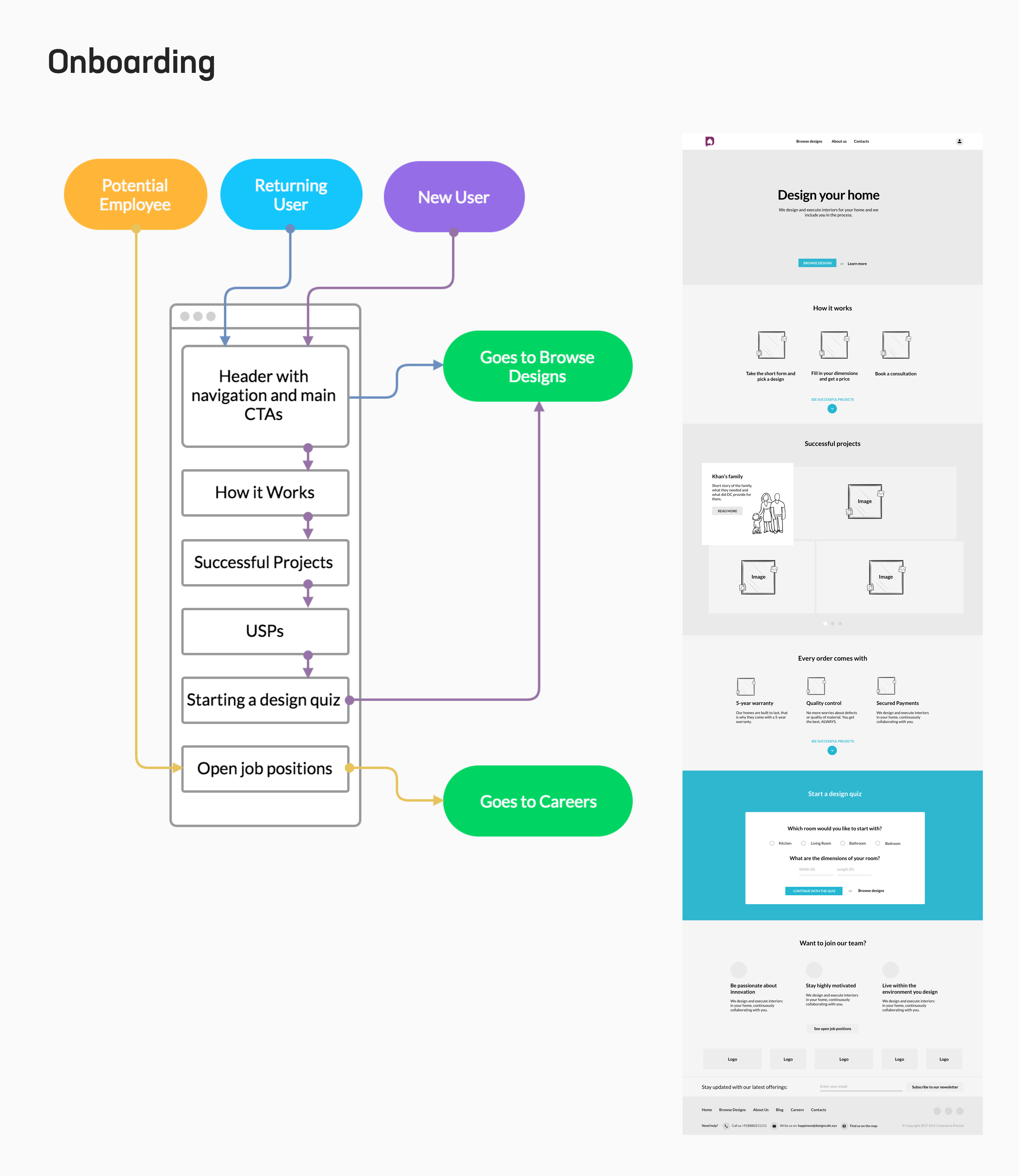
The whole point of the onboarding process was to capture the customer’s attention so that they could continue forward, either directly to the design catalog or through a feature we called the style quiz.
Browsing Designs
We made the style quiz to help users narrow down their results.
DC previously had a feature called a 3D builder that we decided to remove. It allowed you to set your room size and then drag-and-drop furniture, windows and doors into the mix. In theory, this sounds good, but in reality people treated it much like a game and expected it to function like a minified version of The Sims’ Build Mode.
Everything made with the 3D builder was ending up completely modified by the designers. The tool was giving people a lot of design power and too many choices. On top of that, supporting it was a huge technical endeavor because it was a whole product on its own.
Compared to it, the style quiz was a relatively simple feature:
- It starts out by asking about colors, textures and designs you like.
- It continues to ask about room type.
- Eventually, it displays a curated list of designs based on your answers.
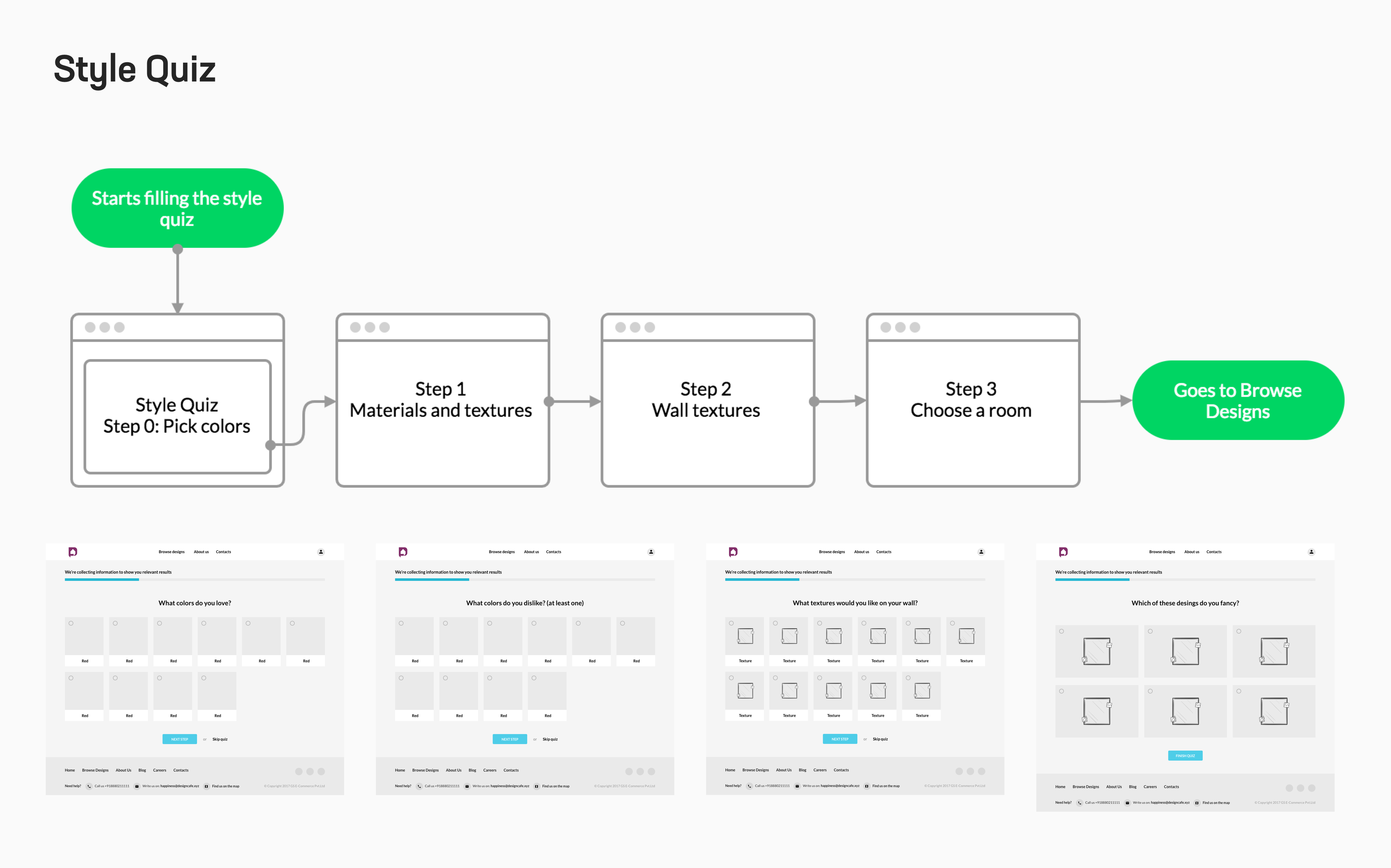
The whole quiz wizard extends to only four steps and takes less than a minute to complete. But it makes people invest a tad bit of their time, thus creating engagement. The result: We’re improving conversion time and overall satisfaction.
Alternatively, users can skip the style quiz and go directly to the design catalog, then use the filters to fine-tune the results. The page automatically shows kitchen designs, what most people are looking for. And for the price-conscious, we made a small feature that allows them to input their room’s size, and all prices are recalculated.
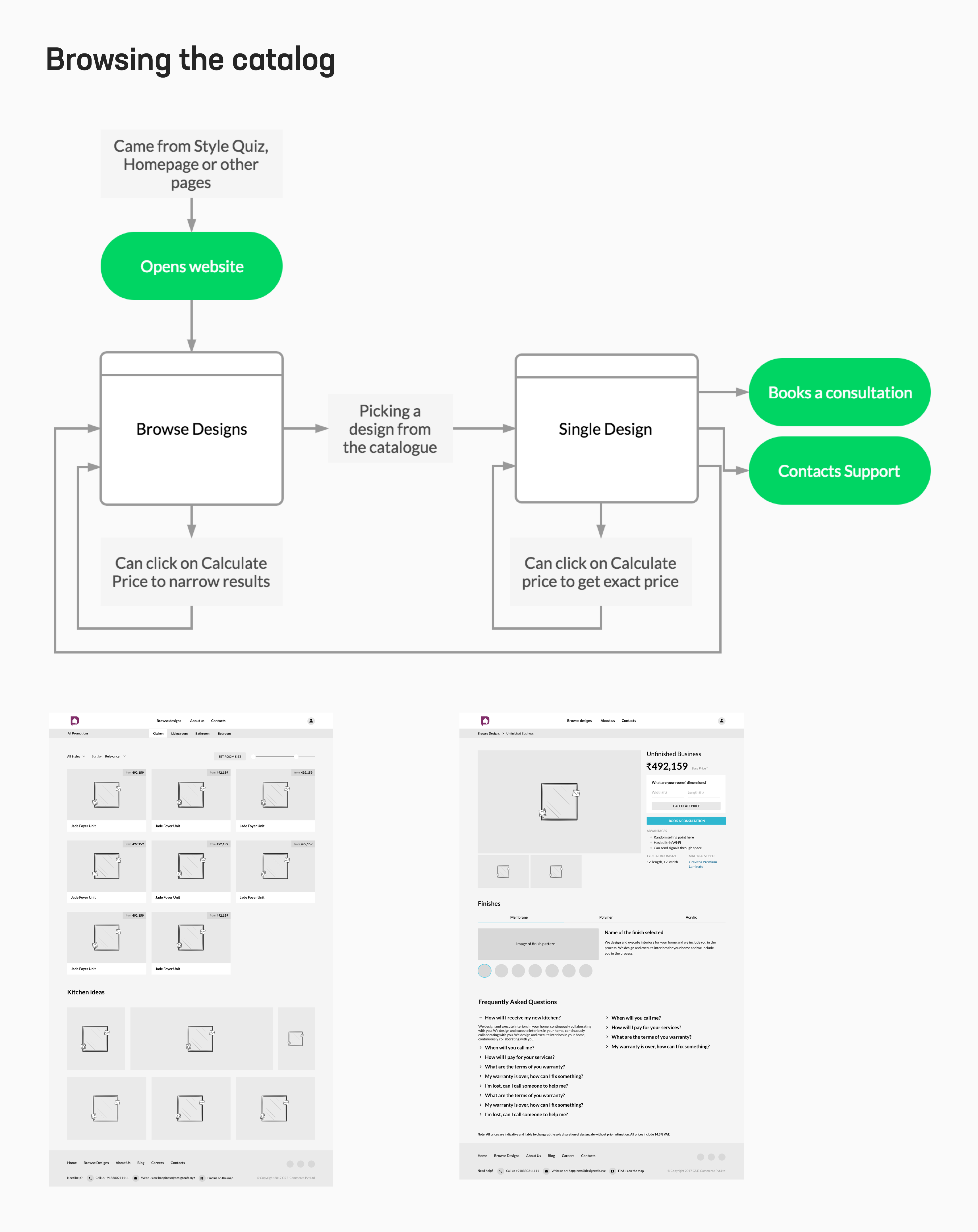
If people don’t like anything from the catalog, chances are they are not DC’s target customer and there’s not much we can do to keep them on the website. But if they do like a design, they could decide to go forward and get in touch with DC, which brings us to the next step in the process.
Getting In Touch
Contacting DC needed to be as simple as possible. We implemented three ways to do that:
- through the chat, shown on every page — the quickest way;
- by opening the contact page and filling out the form or by just calling DC on the phone;
- by clicking “Book a consultation” in the header, which asks for basic information and requests an appointment (upon submission, the next steps are shown to let users know what exactly is going to happen).
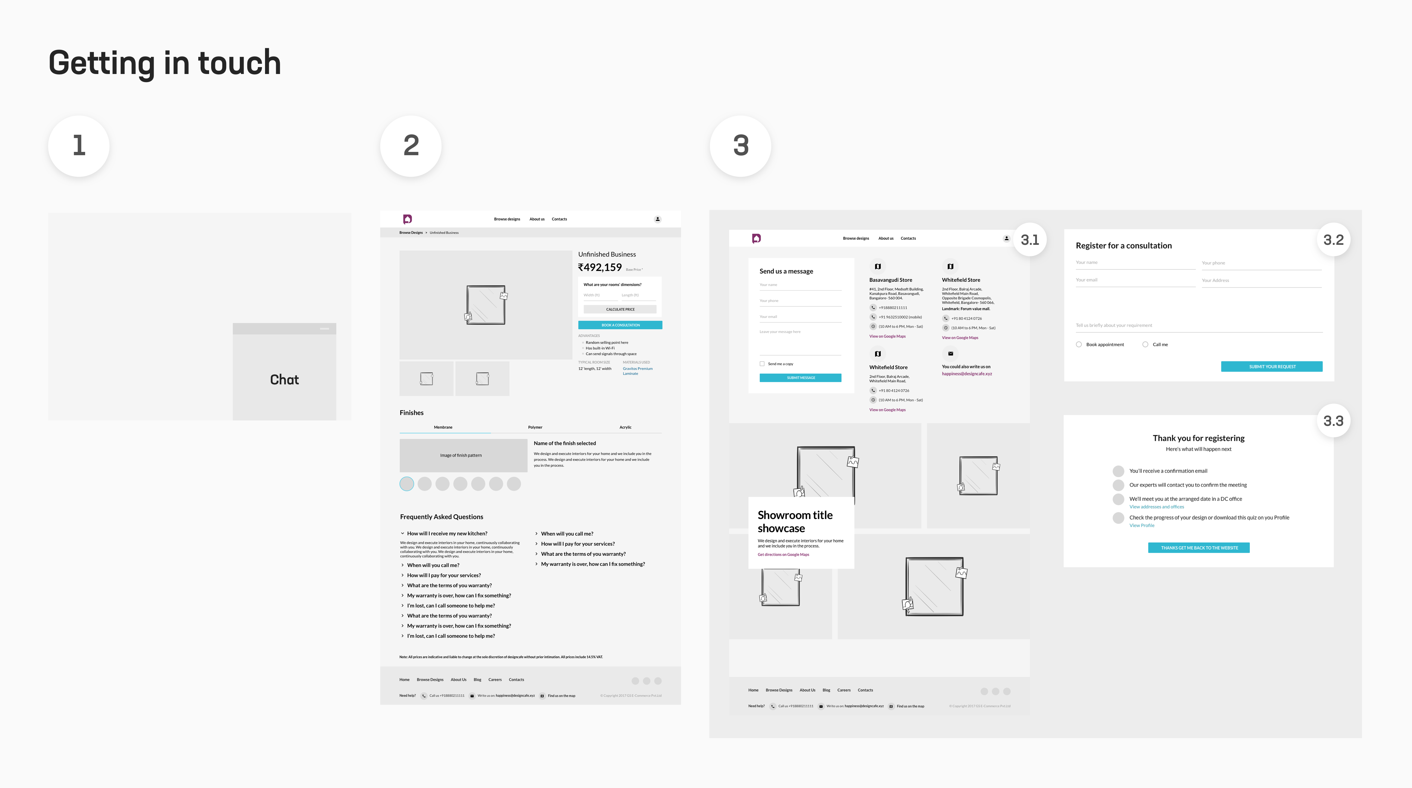
The rest of this journey continues offline: Potential customers meet a DC designer and, after some discussions and planning, place an order. DC notifies them of any progress via email and sends them a link to the progress tracker.
Order Status
The progress tracker is in a user menu in the top-right corner of the design. Its goal is to show a timeline of the order. Upon an update, an “unread” notification pops out. Most users, however, will usually find out about order updates through email, so the entry point for the whole flow will be external.
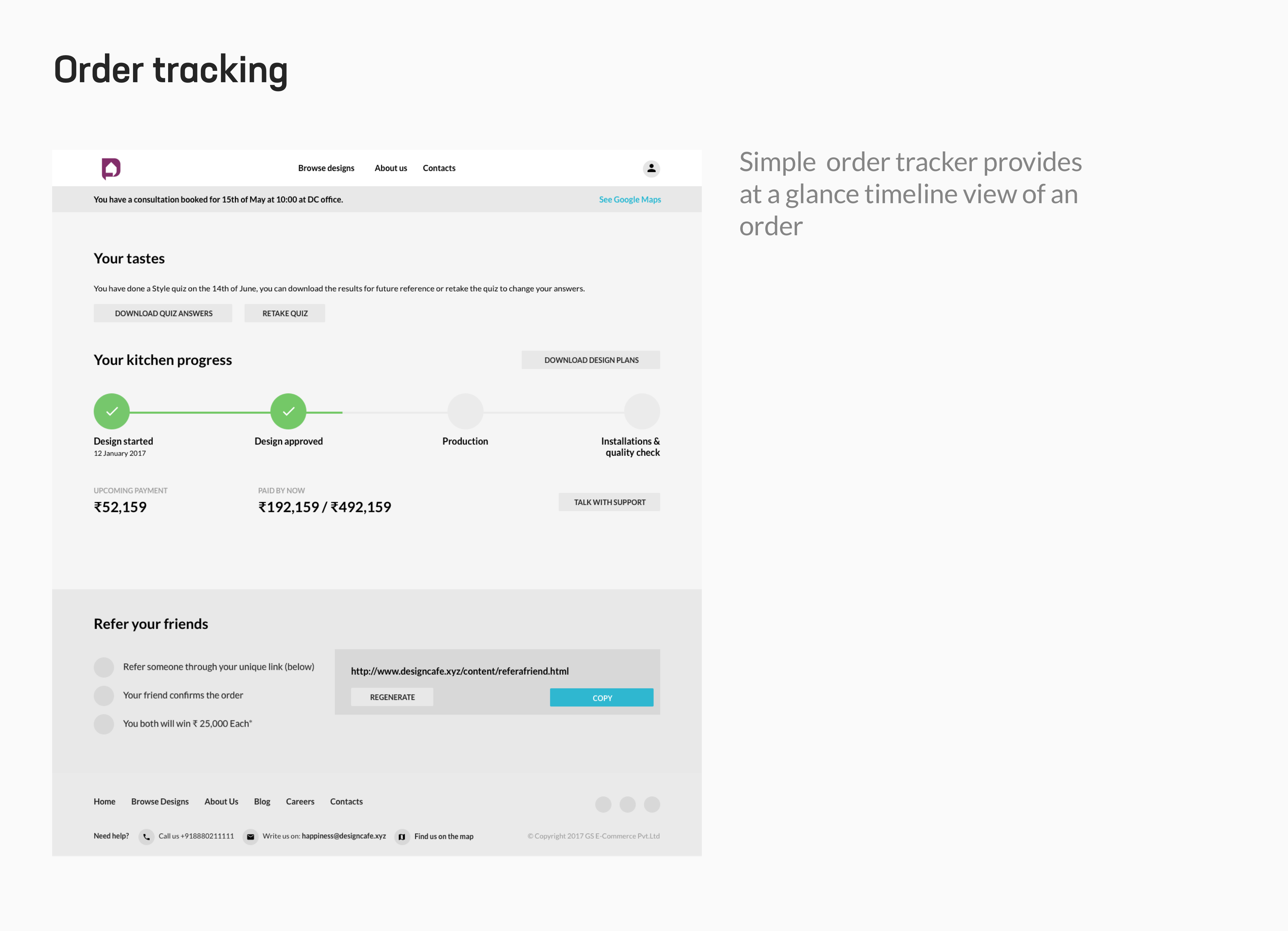
Once the interior design order is installed and ready, users will have the completed order on the website for future reference. Their project could be featured on the home page and become part of the case studies.
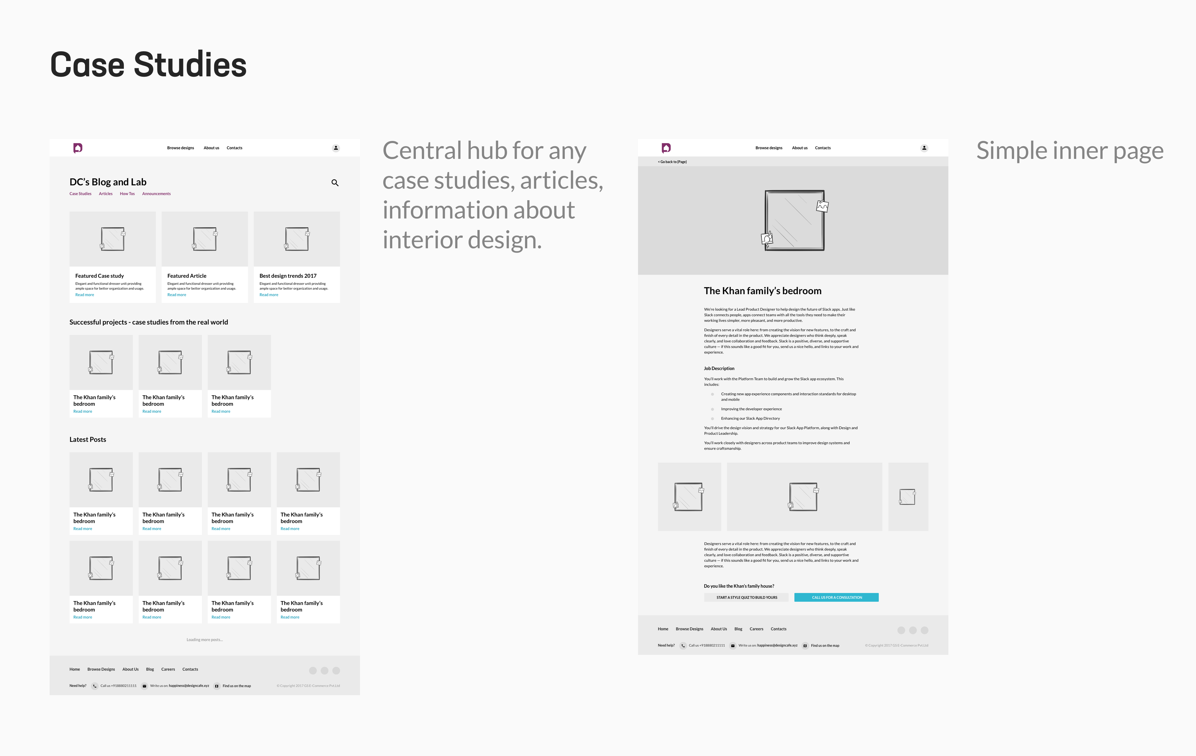
Case Studies
One of DC’s long-term goals is for its website to become an influencer hub for interior design, filled with case studies, advice and tips. It’s part of a commitment to providing quality content. But DC doesn’t have that content yet. So, we decided to start that section with minimal effort and introduce it as a blog. The client would gradually fill it up with content and detailed process walkthroughs. These would be later expanded and featured on the home page. Case studies are a feature that could significantly increase brand awareness, though they would take time.
Preparing For Visual Design
With the critical user journeys all figured out and wireframed, we were ready to delve into visual design.
Data showed that most people open the website on their phones, but interviews proved that most of them were more willing to buy through a computer, rather than a mobile device. Also, desktop and laptop users were more engaged and loyal. So, we decided to design for desktop-first and work down to the smaller (mobile) resolutions from it in code.
Visual Design
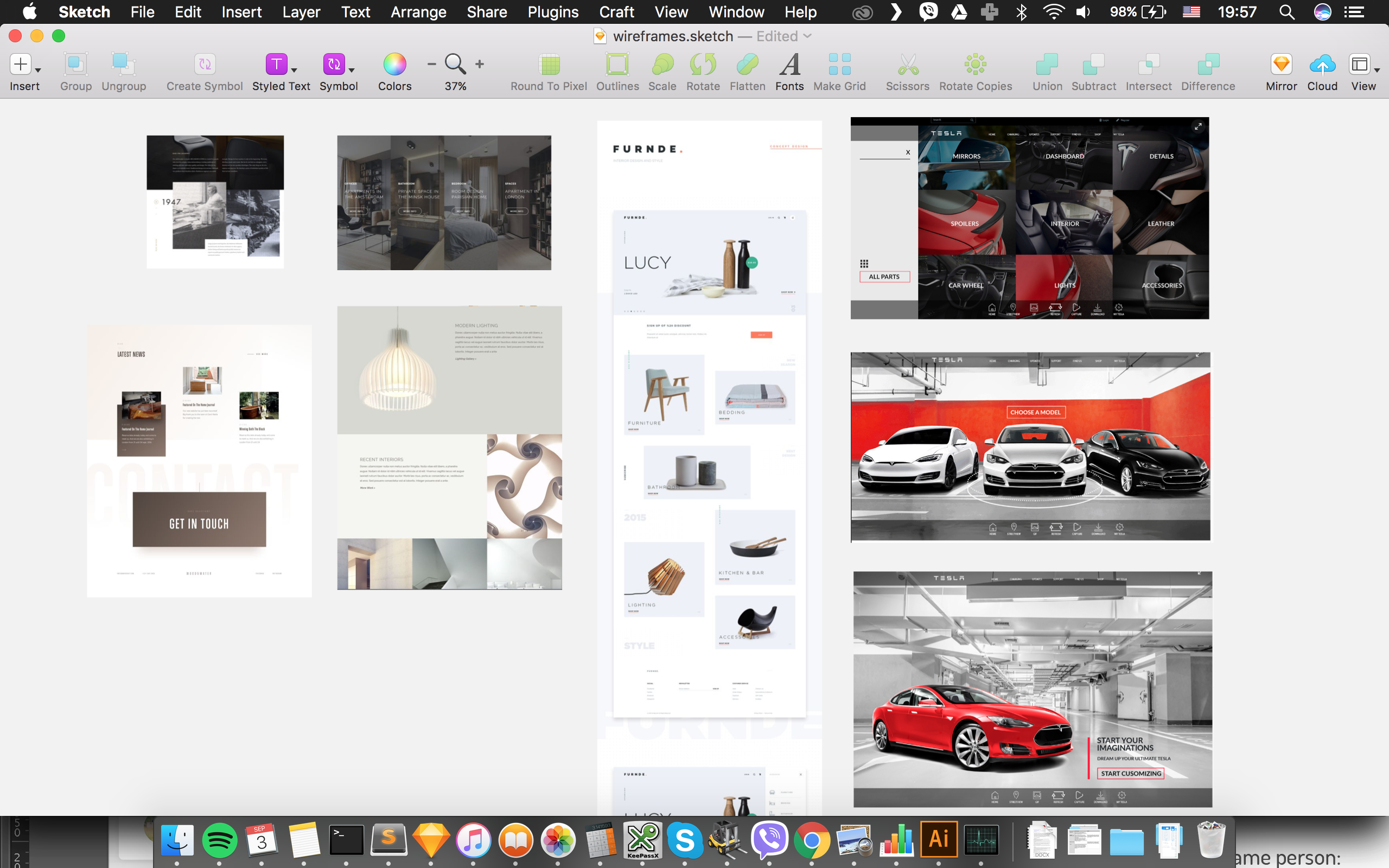
We started collecting visual ideas, words and images. Initially, we had a simple word sequence based on our conversations with the client and a mood board with relevant designs and ideas. The main visual features we were after were simplicity, bold typography, nice photos and clean icons.
Useful tip: Don’t follow a certain trend just because everybody else is doing it. Create a thorough mood board of relevant reference designs that approximate the look and feel you’re going after. This look should be in line with your goals and target audience.
Simple, elegant, easy, modern, hip, edgy, brave, quality, understanding, fresh, experience, classy.
Our client had already started working on a photo shoot, and the results were great. Stock photography would have ruined everything personal about this website. The resulting photos blended with the big type pretty well and helped with that simple language we were after.
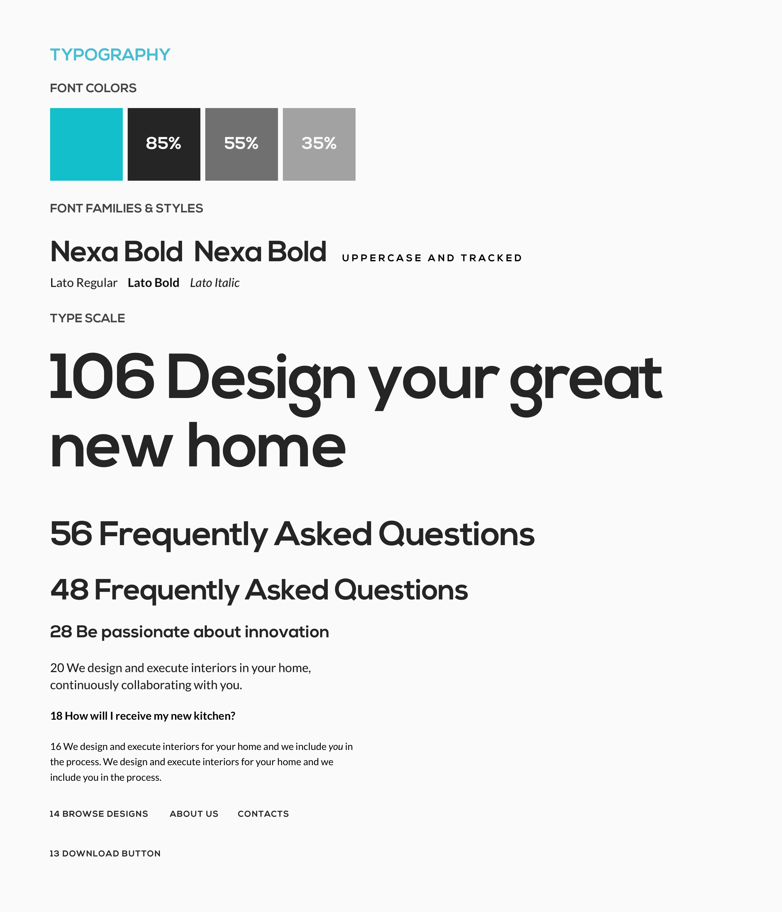
Typography
Initially, we went with a combination of Raleway and Roboto for the typography. Raleway is a great font but a bit overused. The second iteration was Abril Fatface and Raleway for the copy. Abril Fatface resembles the splendor of Didot and made the whole page a lot more heavy and pretentious. It was an interesting direction to explore, but it didn’t resonate with the modern techy feel of DC. The last iteration was Nexa for the titles, which turned out to be the best choice due to its modern and edgy feel, with Lato — both a great fit.
Useful tip: Play around with type variations. List them side by side to see how they compare. Go to Typewolf, MyFonts or a similar website to get inspired. Look for typefaces that make sense for your product. Consider readability and accessibility. Don’t go overboard with your type scale; keep it as minimal as possible. Check out Butterick’s summary of key rules if in doubt.
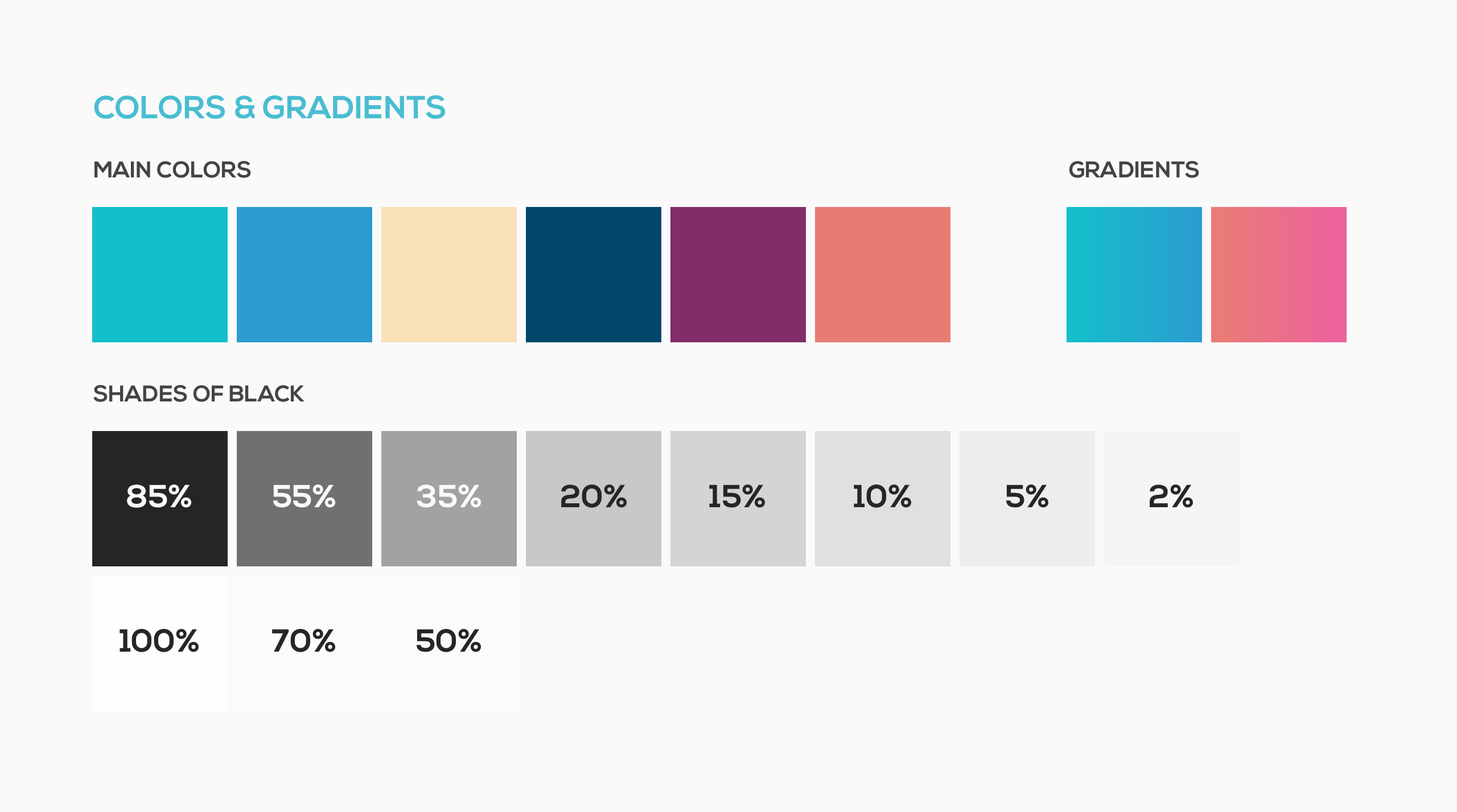
Colors
DC already had a color scheme, but they gave us the freedom to experiment. The main colors were tints of cyan, golden and plum (or, rather, a strange kind of bordeaux), but the original hues were too faded and didn’t blend with each other well enough.
Useful tip: If the brand already has colors, test slight variations to see how they fit the overall design. Or remove some of the colors and use only one or two. Try designing your layout in monochrome and then test different color combinations on an already mocked-up design. Check out some other great tips by Wojciech Zieliński in his article “How to Use Colors in UI Design: Practical Tips and Tools”.
Here’s what we decided on in the end:
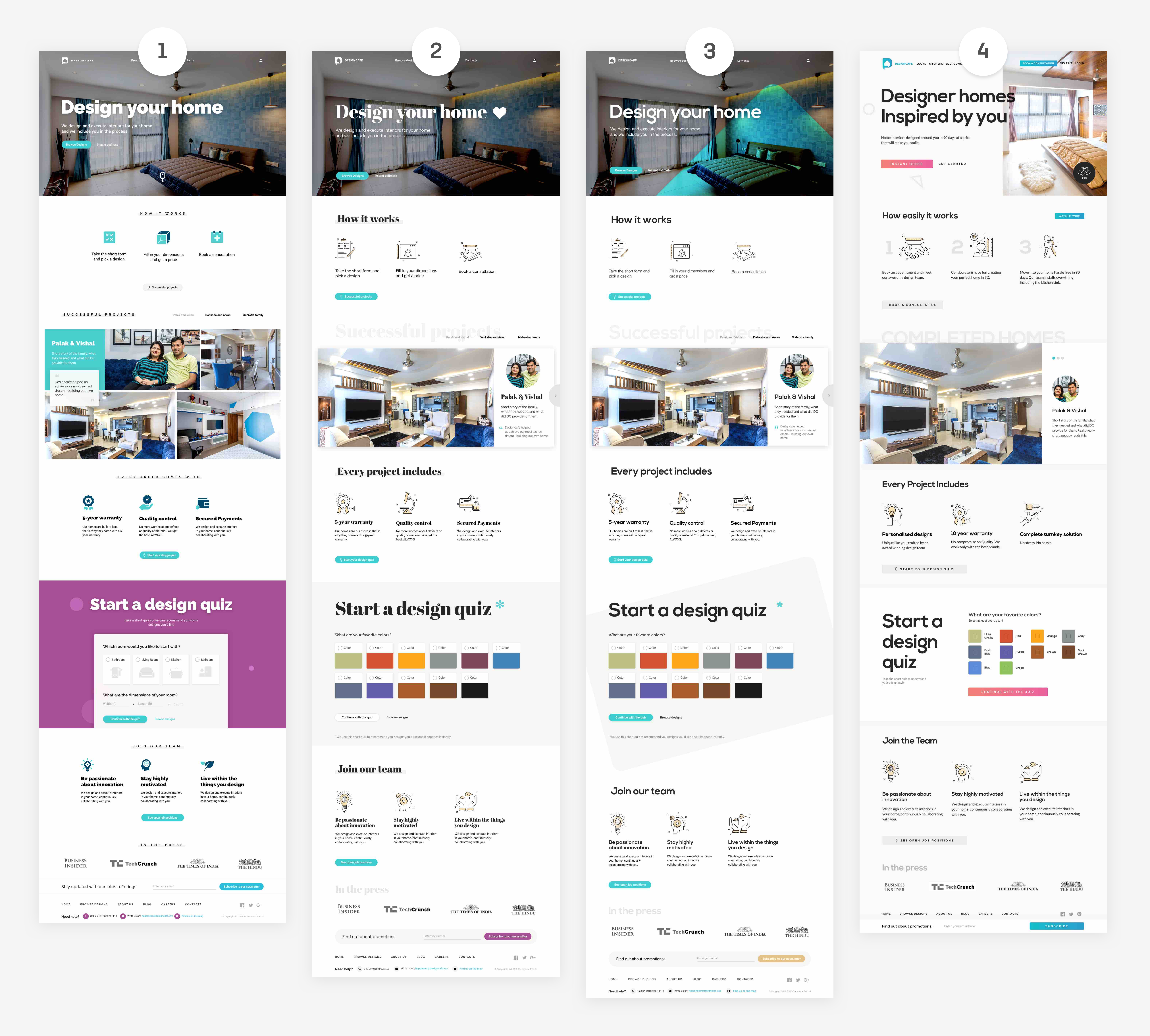
The way we presented all of those type variants and colors was through iterations on the home page.
Initial Mockups
We focused the first visual iteration on getting the main information clearly visible and squeezing the most out of the testimonials and style quiz sections. After some discussion, we figured it was too plain and needed improvement. We made changes to the fonts and icons and modified some sections, shown in iterations 2 and 3 in the image below.
We didn’t have the time to design custom icons, but the NounProject came to the rescue. With the SVG file format, it’s very simple to change whatever you need and mix it with something else. This sped up our work immensely, and with visual iteration number 4, we signed off on the design of the home page. This allowed us to focus on components and use them as LEGO blocks to build the templates.
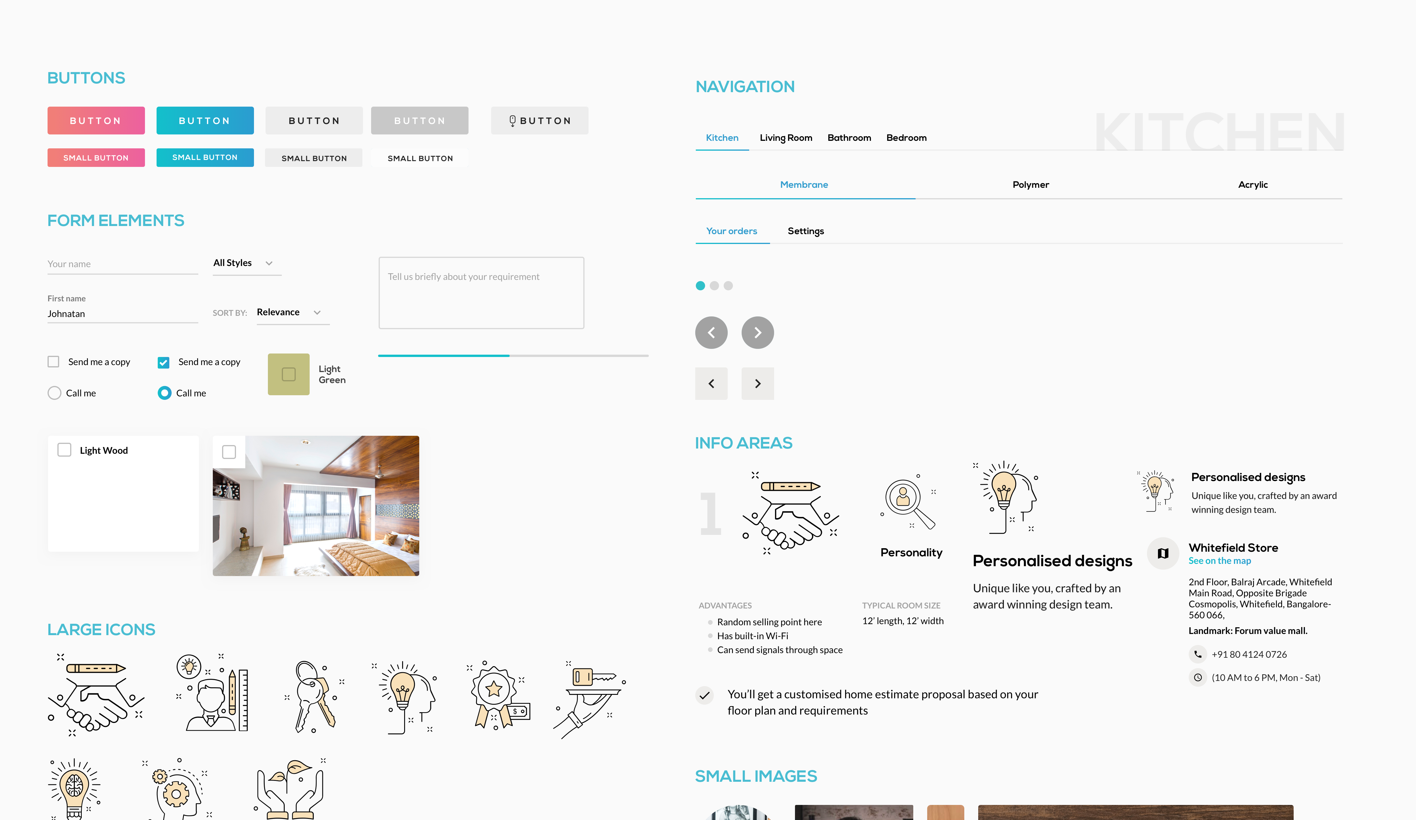
Components System
I listed most components in a Sketch artboard to keep them accessible. Whenever the design needed a new pattern, we’d come back to this page and look for ways to reuse elements. Having a visual system in place, even for a small project like this, kept things consistent and simple.
Useful tip: Components, atoms, blocks — no matter what you call them, they are all part of systematic thinking about your design. Design systems help you gain a deeper understanding of your product by urging you to focus on patterns, design principles and design language. If you’re new to this approach, check out Brad Frost’s Atomic Design or Alla Kholmatova’s Design Systems.
Prototyping With Code
Useful tip: Work on a prototype first. You can make a prototype using basic HTML, CSS and JavaScript. Or you can use InVision, Marvel, Adobe XD or even the Sketch app, or your favorite prototyping tool. It doesn’t really matter. The important thing is to realize that only when you prototype will you see how your design will function.
For our prototype, we decided to use code and set up a simple build process to speed up our work.
Picking Tools And Processes
Gulp automated everything. If you haven’t heard of it, check out Callum Macrae’s awesome guide. Gulp enabled us to handle all of the styles, scripts and templates, and it outputs a ready-to-use minified production version of the code.
Some of the more important Gulp plugins we used were:
- gulp-postcss
This allows you to use PostCSS. You can bundle it with plugins like cssnext to get a pretty robust and versatile setup. - browser-sync
This sets up a server and automatically updates the view on every change. You can set it to fire up upon starting “gulp watch”, and everything will be synced up on hitting “Save”. - gulp-compile-handlebars
This is a Handlebars implementation for Gulp. It’s a quick way to create templates and reuse them. Imagine you have a button that stays the same throughout the whole design. It would be a symbol in Sketch. It’s basically the same concept but wrapped in HTML. Whenever you want to use that button, you just include the button template. If you change something in the master template, it propagates the changes to every other button in the design. You do that for everything in the design system, and thus you’re using the same paradigm for both visual design and code. No more static page mockups!
Components And Templates
We had to mix atomic CSS with module-based CSS to get the most of both worlds. Atomic CSS handled all of the general styles, while the CSS modules handled edge cases.
In atomic CSS, atoms are immutable CSS classes that do just one thing. We used Tachyons, an atomic toolkit. In Tachyons, every class you apply is a single CSS property. For instance, .b stands for font-weight: bold, and .ttu stands for text-transform: uppercase. A paragraph with bold uppercase text would look like this:
<p class="b ttu">Paragraph</p>
Useful tip: Once you get familiar with atomic CSS, it becomes a blazingly fast way to prototype stuff — and a very systematic one, because it urges you to constantly think about reusability and optimization.
A major benefit of prototyping with code is that you can demo complex interactions. We coded most of our critical journeys this way.
Designing Micro-Interactions In The browser
Our prototype was so high-fidelity that it became the front-end basis for the actual product — DC used our code and integrated it in their workflow. You can check out the prototype on https://beta.boyankostov.com/2017/designcafe/html (or live on Design Cafe).
Useful tip: With HTML prototypes, you will have to decide the level of fidelity you want to achieve. That might get pretty time-consuming if you go too deep. But you can’t really go wrong with that either because as you go deeper and deeper into the code and fine-tune every possible detail, at some point you’ll start delivering the actual product.
Sign-Off
Clients, especially small B2C companies, love when you deliver a design solution that they can use immediately. We shipped just that.
Unfortunately, you can’t always predict a project’s pace, and it took several months for our code to be integrated in DC’s workflow. In its current state, this code is ready for testing, and what’s better is that it’s pretty easy to modify. So, if DC decides to conduct some user tests in the future, any changes will be easy to make.
Takeaways
- Collaborate with other designers whenever possible. When two people are thinking about the same problem, they will deliver better ideas. Take turns in taking notes during interviews, and brainstorm goals, ideas and visuals together.
- Having a developer on the team is beneficial because everyone gets to do what they are best at. A good developer will spend as little as a few minutes on a JavaScript issue that I would probably need hours to resolve.
- We shipped a working version of the website, and the client was able to use it right away. If you aren’t able to sign off on the code, try to get as close to the final product as possible, and communicate that visually to your client’s team. Document your design — it’s a deliverable that will be used and abused by everyone, from developers to marketers to in-house designers. Set aside some time to make sure all of your ideas are properly understood by everyone.
- Scheduling interviews and writing good surveys can be time-consuming. You have to plan ahead and recruit more people than you think you will need. Hire an experienced researcher to work with you on these tasks, and spend some time with your team to identify your goals. Be careful when sourcing participants. Your client can help you find the right people, but you’ll need to stick to participants who meet the right demographics.
- Schedule enough time for planning. Project goals, processes, and responsibilities should be clear to everyone on your team. You need time to allow for multiple iterations on prototypes, because prototypes improve products quickly. If you don’t want to mess with code, there are various ways to prototype. But even if you do, you don’t need to write flawless code — just write designer’s code. Or, as Alan Cooper once said, “Sometimes the best way for a designer to communicate their vision is to code something up so that their colleagues can interact with the proposed behavior, rather than just see still images. The goal of such code is not the same as the goal of the code that coders write. The code isn’t for deployment, but for design [and] its purpose is different.”
- Don’t focus on a unique design per se, unless that’s the main feature of your product. Better to spend time on things that matter more. Use frameworks, icons and visual assets where possible, or outsource them to another designer and focus on your core product goals and metrics.
Further Reading
- Creating And Maintaining A Voice Of Customer Program
- CSS Blurry Shimmer Effect
- 5 Ways Google Analytics Helps Web Developers In UI/UX Design
- A Book Release For Click! And A Chance To Rethink Our Routines
 (mb, ra, al,yk, il, mrn)

