Creating The Feature Queries Manager DevTools Extension

Email Newsletter
Weekly tips on front-end & UX.
Trusted by 182,000+ folks.


 Custom Web Forms for Angular, React, & Vue. Your backend.

 Celebrating 10 million developers
Within the past couple of years, several game-changing CSS features have been rolled out to the major browsers. CSS Grid Layout, for example, went from 0 to 80% global support within the span of a few months, making it an incredibly useful and reliable tool in our arsenal. Even though the current support for a feature like CSS Grid Layout is relatively great, not all recent or current browsers support it. This means it’s very likely that you and I will currently be developing for a browser in which it is not supported.
The modern solution to developing for both modern and legacy browsers is feature queries. They allow us to write CSS that is conditional on browser support for a particular feature. Although working with feature queries is almost magical, testing them can be a pain. Unlike media queries, we can’t easily simulate the different states by just resizing the browser. That’s where the Feature Queries Manager comes in, an extension to DevTools to help you easily toggle your feature query conditions. In this article, I will cover how I built this extension, as well as give an introduction to how developer tools extensions are built.
Working With Unsupported CSS
If a property-value pair (e.g. display: grid), is not supported by the browser the page is viewed in, not much happens. Unlike other programming languages, if something is broken or unsupported in CSS, it only affects the broken or unsupported rule, leaving everything else around it intact.
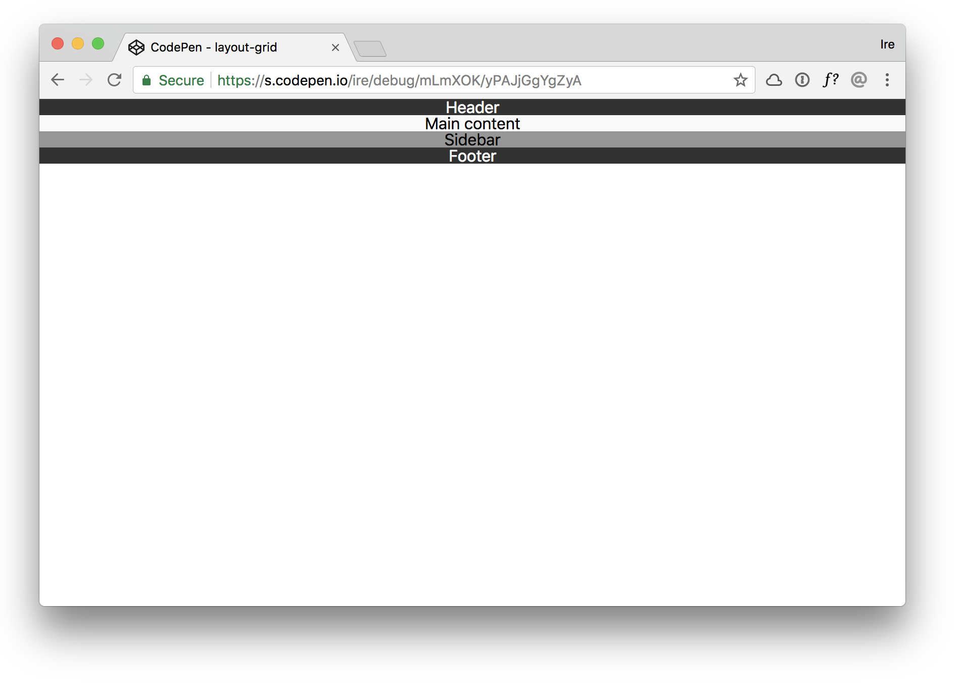
Let’s take, for example, this simple layout:
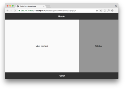
We have a header spanning across the top of the page, a main section directly below that to the left, a sidebar to the right, and a footer spanning across the bottom of the page.
Here’s how we could create this layout using CSS Grid:
See the Pen layout-grid by Ire Aderinokun (@ire) on CodePen.
In a supporting browser like Chrome, this works just as we want. But if we were to view this same page in a browser that doesn’t support CSS Grid Layout, this is what we would get:

It is essentially the same as if we had not applied any of the grid-related styles in the first place. This behavior of CSS was always intentional. In the CSS specification, it says:
“In some cases, user agents must ignore part of an illegal style sheet, [which means to act] as if it had not been there”
Historically, the best way to handle this has been to make use of the cascading nature of CSS. According to the specification, “the last declaration in document order wins.” This means that if there are multiple of the same property being defined within a single declaration block, the latter prevails.
For example, if we have the follow declarations:
body {
  display: flex;
  display: grid;
}
Assuming both Flexbox and Grid are supported in the browser, the latter — display: grid — will prevail. But if Grid is not supported by the browser, then that rule is ignored, and any previous valid and supported rules, in this case display: flex, are used instead.
body { display: flex;display: grid;}
Cascading Problems
Using the cascade as a method for progressive enhancement is and has always been incredibly useful. Even today, there is no simpler or better way to handle simple one-liner fallbacks, such as this one for applying a solid colour where the rgba() syntax is not supported.
div {
    background-color: rgb(0,0,0);
    background-color: rgba(0,0,0,0.5);
}
Using the cascade, however, has one major limitation, which comes into play when we have multiple, dependent CSS rules. Let’s again take the layout example. If we were to attempt to use this cascade technique to create a fallback, we would end up with competing CSS rules.
See the Pen layout-both by Ire Aderinokun (@ire) on CodePen.
In the fallback solution, we need to use certain properties such as margins and widths, that aren’t needed and in fact interfere with the “enhanced” Grid version. This makes it difficult to rely on the cascade for more complex progressive enhancement.
Feature Queries To The Rescue!
Feature queries solve the problem of needing to apply groups of styles that are dependent on the support of a CSS feature. Feature queries are a “nested at-rule” which, like the media queries we are used to, allow us to create a subset of CSS declarations that are applied based on a condition. Unlike media queries, whose condition is dependent on device and screen specs, feature query conditions are instead based on if the browser supports a given property-value pair.
A feature query is made up of three parts:
- The
@supportskeyword - The condition, e.g.
display: flex - The nested CSS declarations.
Here is how it looks:
@supports (display: grid) {
    body { display: grid; }
}
If the browser supports display: grid, then the nested styles will apply. If the browser does not support display: grid, then the block is skipped over entirely.
The above is an example of a positive condition within a feature query, but there are four flavors of feature queries:
- Positive condition, e.g.
@supports (display grid) - Negative condition, e.g.
@supports not (display: grid) - Conjunction, e.g.
@supports (display:flex) and (display: grid) - Disjunction, e.g.
@supports (display:-ms-grid) or (display: grid)
Feature queries solve the problem of having separate fallback and enhancement groups of styles. Let’s see how we can apply this to our example layout:
See the Pen Run bunny run by Ire Aderinokun (@ire) on CodePen.
Introducing The Feature Queries Manager
Since feature queries are dependent on whether a browser supports a feature, there is no easy way to simulate the alternative state. Currently, the only way to do this would be to edit your code to invalidate/reverse the feature query.
For example, if we wanted to simulate a state in which CSS Grid is not supported, we would have to do something like this:
/* fallback styles here */

@supports (display: grrrrrrrrid) {
    /* enhancement styles here */
}
This is where the Feature Queries Manager comes in. It is a way to reverse your feature queries without ever having to manually edit your code.
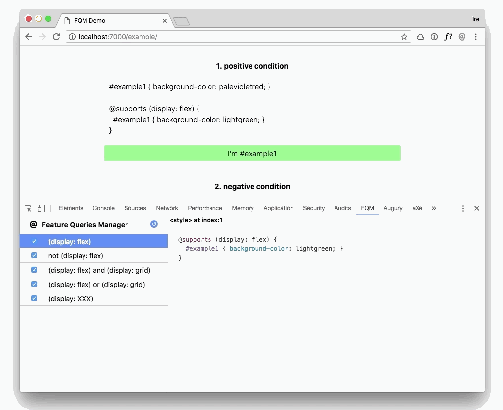
It works by simply negating the feature query as it is written. So the following feature query:
@supports (display: grid) {
    body { display: grid; }
}
Will become the following:
@supports not (display: grid) {
    body { display: grid; }
}
Fun fact, this method works for negative feature queries as well. For example, the following negative feature query:
@supports not (display: grid) {
    body { display: block; }
}
Will become the following:
@supports not (not (display: grid)) {
    body { display: block; }
}
Which is actually essentially the same as removing the “not” from the feature query.
@supports (display: grid) {
    body { display: block; }
}
Building The Feature Queries Manager
FQM is an extension to your browser’s Developer Tools. It works by registering all the CSS on a page, filtering out the CSS that is nested within a feature query, and giving us the ability to toggle the normal or “inverted” version of that feature query.
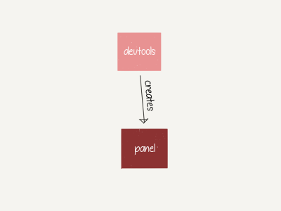
Creating A DevTools Panel
Before I go on to how I specifically built the FQM, let’s cover how to create a new DevTools panel in the first place. Like any other browser extension, we register a DevTools extension with the manifest file.
{
  "manifest_version": 2,
  "name": "Feature Queries Manager",
  "short_name": "FQM",
  "description": "Manage and toggle CSS on a page behind a @supports Feature Query.",
  "version": "0.1",
  "permissions": [
    "tabs",
    "activeTab",
    "<all_urls>"
  ],
  "icons": {
    "128": "images/icon@128.png",
    "64": "images/icon@64.png",
    "16": "images/icon@16.png",
    "48": "images/icon@48.png"
  }
}
To create a new panel in DevTools, we need two files — a devtools_page, which is an HTML page with an attached script that registers the second file, panel.html, which controls the actual panel in DevTools.
First, we add the devtools_page to our manifest file:
{
  "manifest_version": 2,
  "name": "Feature Queries Manager",
  ...
  "devtools_page": "devtools.html",
}
Then, in our devtools.html file, we create a new panel in DevTools:
<!DOCTYPE html>
<html>
<head>
  <meta charset="utf-8"></head>
<body>
<!-- Note: I’m using the browser-polyfill to be able to use the Promise-based WebExtension API in Chrome -->
<script src="../browser-polyfill.js"></script>

<!-- Create FQM panel -->
<script>
browser.devtools.panels.create("FQM", "images/icon@64.png", "panel.html");
</script>
</body>
</html
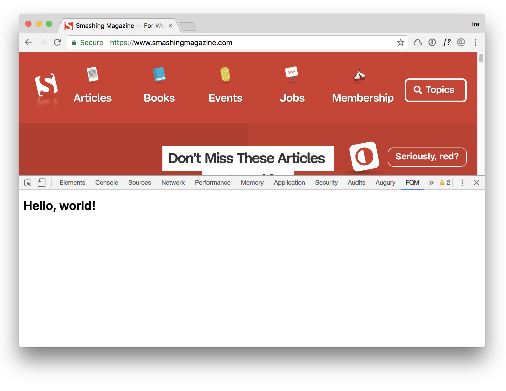
Finally, we create our panel HTML page:
<!DOCTYPE html>
<html>
<head>
  <meta charset="utf-8"></head>
<body>
  <h1>Hello, world!</h1>
</body>
</html>
If we open up our browser, we will see a new panel called “FQM” which loads the panel.html page.

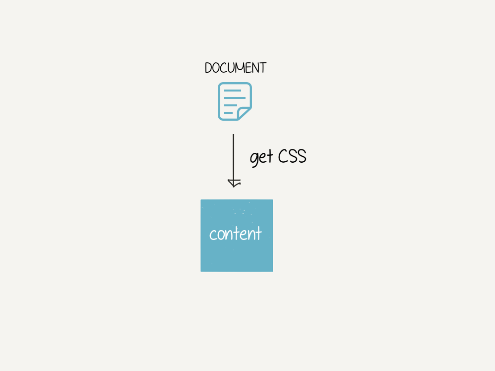
Reading CSS From The Inspected Page
In the FQM, we need to access all the CSS referenced in the inspected document in order to know which are within feature queries. However, our DevTools panel doesn’t have direct access to anything on the page. If we want access to the inspected document, we need a content script.

A content script is a javascript file that has the same access to the html page as any other piece of javascript embedded within it. To register a content script, we just add it to our manifest file:
{
      "manifest_version": 2,
      "name": "Feature Queries Manager",
      ...
      "content_scripts": [{
        "matches": [""],
        "js": ["browser-polyfill.js", "content.js"]
      }],
    }
In our content script, we can then read all the stylesheets and css within them by accessing document.styleSheets:
Array.from(document.styleSheets).forEach((stylesheet) => {
      let cssRules;

      try {
        cssRules = Array.from(stylesheet.cssRules);
      } catch(err) {
        return console.warn(`[FQM] Can't read cssRules from stylesheet: ${ stylesheet.href }`);
      }

      cssRules.forEach((rule, i) => {

        /* Check if css rule is a Feature Query */
        if (rule instanceof CSSSupportsRule) {
          /* do something with the css rule */
        }

      });
    });
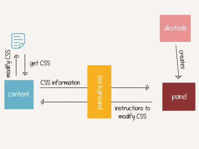
Connecting The Panel And The Content Scripts
Once we have the rules from the content script, we want to send them over to the panel so they can be visible there. Ideally, we would want something like this:
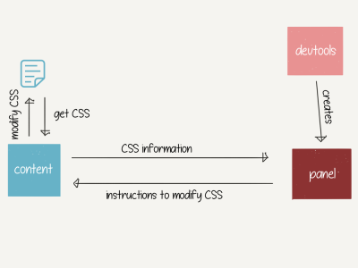
However, we can’t exactly do this, because the panel and content files can’t actually talk directly to each other. To pass information between these two files, we need a middleman — a background script. The resulting connection looks something like this:
As always, to register a background script, we need to add it to our manifest file:
{
  "manifest_version": 2,
  "name": "Feature Queries Manager",
  ...
  "background": {
    "scripts": ["browser-polyfill.js", "background.js"]
  },
}
The background file will need to open up a connection to the panel script and listens for messages coming from there. When the background file receives a message from the panel, it passes it on to the content script, which is listening for messages from the background. The background script waits for a response from the content script and relays that message back to the panel.
Here’s a basic of example of how that works:
// Open up a connection to the background script
const portToBackgroundScript = browser.runtime.connect();

// Send message to content (via background)
portToBackgroundScript.postMessage("Hello from panel!");

// Listen for messages from content (via background)
portToBackgroundScript.onMessage.addListener((msg) => {
  console.log(msg);
  // => "Hello from content!"
});
// backrgound.js

// Open up a connection to the panel script
browser.runtime.onConnect.addListener((port) => {

  // Listen for messages from panel
  port.onMessage.addListener((request) => {

    // Send message from panel.js -> content.js
    // and return response from content.js -> panel.js
    browser.tabs.sendMessage(request.tabId, request)
      .then((res) => port.postMessage(res));
  });
});
// content.js

// Listen for messages from background
browser.runtime.onMessage.addListener((msg) => {

  console.log(msg)
  // => "Hello from panel!"

  // Send message to panel
  return Promise.resolve("Hello from content!");
});
Managing Feature Queries
Lastly, we can get to the core of what the extension does, which is to “toggle” on/off the CSS related to a feature query.
If you recall, in the content script, we looped through all the CSS within feature queries. When we do this, we also need to save certain information about the CSS rule:
- The rule itself
- The stylesheet it belongs to
- The index of the rule within the stylesheet
- An “inverted” version of the rule.
This is what that looks like:
cssRules.forEach((rule, i) => {

  const cssRule = rule.cssText.substring(rule.cssText.indexOf("{"));
  const invertedCSSText = `@supports not ( ${ rule.conditionText } ) ${ cssRule }`;

  FEATURE_QUERY_DECLARATIONS.push({
    rule: rule,
    stylesheet: stylesheet,
    index: i,
    invertedCSSText: invertedCSSText
  });

});
When the content script receives a message from the panel to invert all declarations relating to the feature query condition, we can easily replace the current rule with the inverted one (or vice versa).
function toggleCondition(condition, toggleOn) {
  FEATURE_QUERY_DECLARATIONS.forEach((declaration) => {
    if (declaration.rule.conditionText === condition) {

      // Remove current rule
      declaration.stylesheet.deleteRule(declaration.index);

      // Replace at index with either original or inverted declaration
      const rule = toggleOn ? declaration.rule.cssText : declaration.invertedCSSText;
      declaration.stylesheet.insertRule(rule, declaration.index);
    }
  });
}
And that is essentially it! The Feature Query Manager extension is currently available for Chrome and Firefox.
Limitations Of The FQM
The Feature Queries Manager works by “inverting” your feature queries, so that the opposite condition applies. This means that it cannot be used in every scenario.
Fallbacks
If your “enhancement” CSS is not written within a feature query, then the extension cannot be used as it is dependent on finding a CSS supports rule.
Unsupported Features
You need to take note of if the browser you are using the FQM in does or does not support the feature in question. This is particularly important if your original feature query is a negative condition, as inverting it will turn it into a positive condition. For example, if you wrote the following CSS:
div { background-color: blue; }

@supports not (display: grid) {
  div { background-color: pink; }
}
If you use the FQM to invert this condition, it will become the following:
div { background-color: blue; }

@supports (display: grid) {
  div { background-color: pink; }
}
For you to be able to actually see the difference, you would need to be using a browser which does in fact support display: grid.
I built the Feature Queries Manager as a way to more easily test the different CSS as I develop, but it isn’t a replacement for testing layout in the actual browsers and devices. Developer tools only go so far, nothing beats real device testing.
Further Reading
- How To Draw Radar Charts In Web
- What’s New In DevTools?
- SolidStart: A Different Breed Of Meta-Framework
- Top Front-End Tools Of 2023
 (ra, yk, il, mrn)

