Getting Started With CSS Layout

Email Newsletter
Weekly tips on front-end & UX.
Trusted by 182,000+ folks.


 Custom Web Forms for Angular, React, & Vue. Your backend.
 Celebrating 10 million developers
Over the past couple of years, CSS Layout has dramatically changed as well as the way we develop the front end of our sites. We now have a real choice in terms of the layout methods we use in CSS to develop our sites, which means we often need to make a choice as to which approach to take. In this article, I will run through the various layout methods that you have available to you by explaining the basics of how they are used and what they are used for.
This guide is for you if you are fairly new to CSS and wondering what the best way to approach layout is, but also if you are an experienced developer from elsewhere in the stack who wants to make sure your understanding of layout today is up to date. I have not tried to fully document each layout method here, as that would have created a book and not an article. Instead, I am giving an overview of what is available to you, with plenty of links to find out more.
Normal Flow
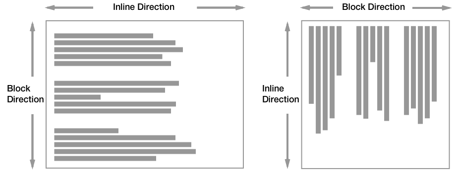
If you take an HTML webpage which has no CSS applied to change the layout, the elements will display in normal flow. In normal flow, boxes are displayed one after another based on the Writing Mode of the document. This means that if you have a horizontal writing mode, one in which sentences run left to right or right to left, normal flow will display the boxes of block level elements one after the other vertically down the page.
If you are in a vertical writing mode, then sentences run vertically so normal flow would lay the blocks out horizontally.
Normal flow is where you begin with any layout: when you create a CSS Layout, you are taking the blocks and causing them to do something other than normal flow.
Structure Your Document To Take Advantage Of Normal Flow
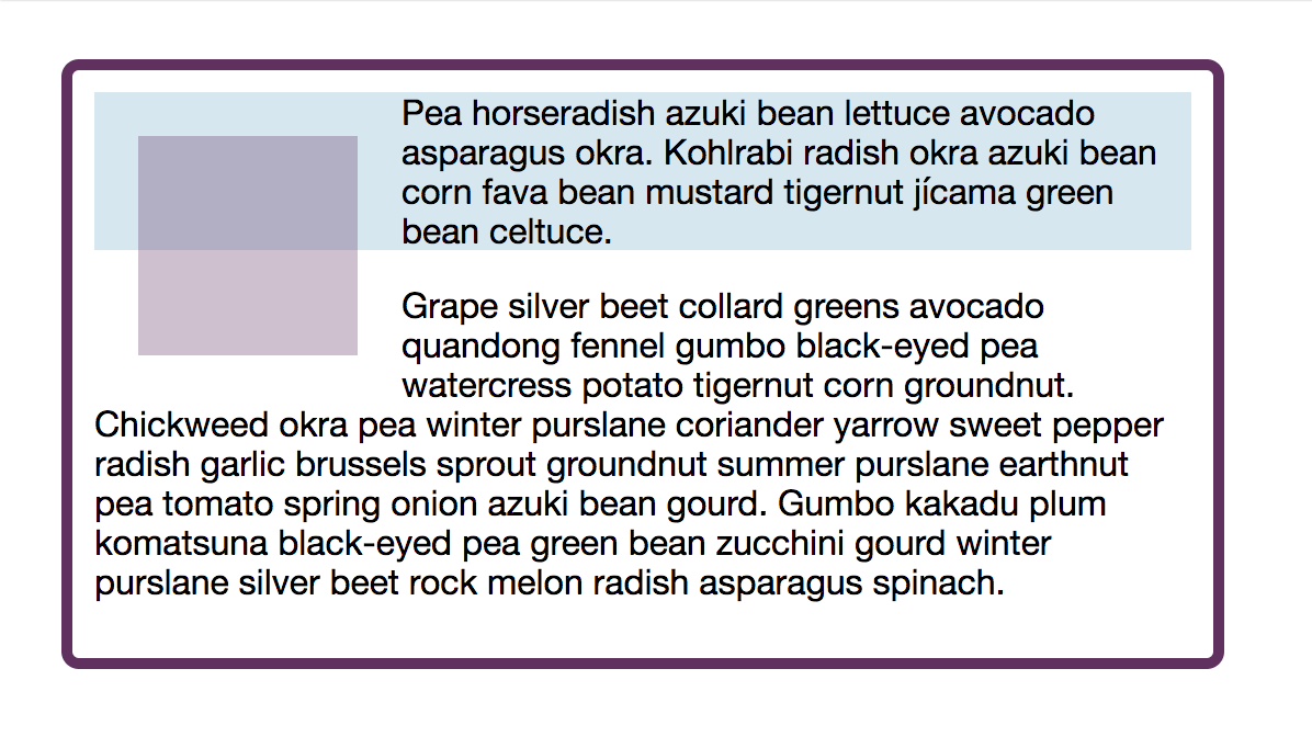
You can take advantage of normal flow by ensuring your document starts out in a well-structured manner. Imagine if — instead of this concept of normal flow — the browser piled all your boxes up in the corner on top of each other until you created a layout. That would mean you would have to place every single thing on the page. Instead, the browser displays our content in an immediately readable way.
If your CSS fails to load, the user can still read the content, and users who don’t get CSS at all (e.g. someone using a screen reader) will have the content delivered to them in the order it is in the document. This makes it important from an accessibility point of view that your HTML document starts life in a good order; however, it will also make your life easier as a web developer. If your content is in the order a user would expect to read it, you won’t need to make massive changes to layout to get it into the right place. With newer layout methods you may be surprised how little you have to do.
Therefore, before thinking about layout, think about document structure and the order you would want your content to be read in from the top of the document to the bottom.
Moving Away From Normal Flow
Once we have a well-structured document, we need to decide how to take that and turn it into our desired layout. This will involve moving away from normal flow, for parts of our document. We have a whole set of layout methods to use. The first method we will take a look at is float, as floats are an excellent demonstration of what it is to take an element out of normal flow.
Floats
Floats are used to shift a box to the left or right, allowing content to display wrapped around it.
In order to float an item, use the CSS property float and a value of left or right. The default value of float is none.
.item {
    float: left;
}
It is worth noting that when you float an item and text wraps around it, that what happens is the line boxes of that content are shortened. If you float an item and the following box containing your text has a background color applied, you can see that this background color will then run underneath the floated item.
As you are shortening the line boxes in order to make space between the float and the wrapping text, you must set a margin on the floated item. A margin on the text would just move the text in from the edge of the container. For an image floated left, you would add a margin to the right and bottom assuming that you want the image flush with the top and left of the container.
See the Pen Smashing Guide to Layout: float by Rachel Andrew (@rachelandrew) on CodePen.
Clearing Floats
Once you have floated an element, all of the following elements will wrap around that floated element until they wrap underneath and normal flow continues. If you want to prevent that, you need to clear the float.
On the element that you want to begin displaying after the float, add the property clear with a value of left to indicate clearing an item floated left, right to clear an item floated right, or both to clear any floats.
.clear {
    clear: both;
}
The above method works if you want an element to start after a float. It won’t help if you find yourself in a situation where you have a floated item inside a box, with some text alongside. If the text is shorter than the floated item, the box will be drawn underneath the content and ignore the float. As we have already learned, floats shorten the line boxes, the rest of the layout continues in normal flow.
To prevent this situation we need to clear something inside the box. We could add an empty element and set that to clear all. This involves sticking empty divs into our document which isn’t ideal and may not be possible if your page is generated by a CMS. So instead, the typical clearing floats method is what is known as a clear fix hack. This method works by adding CSS Generated Content, and setting that to clear both.
See the Pen Smashing Guide to Layout: clearfix by Rachel Andrew (@rachelandrew) on CodePen.
The Block Formatting Context
Another way to clear floats inside a box is to invoke a Block Formatting Context (BFC) on the container. A Block Formatting Context contains everything inside it, which would include floated items which can no longer poke out the bottom of the box. There are a few ways to force a BFC, the most common when clearing floats is to set the overflow property to have a value other than the default visible.
.container {
    overflow: auto;
}
Using overflow in this way will generally work, however, in certain situations you could end up with clipped shadows or unwanted scrollbars on the item. It also can look a little confusing in your stylesheet: Did you set overflow because you wanted scrollbars or just to gain this clearing ability?
To make intent clearer and prevent the creation of a BFC causing unwanted side effects, you can use flow-root as a value of the display property. The only thing that display: flow-root does is to create a BFC, thus clearing your floats with no other problems caused.
.container {
    display: flow-root;
}
Legacy Usage Of Floats
Until the arrival of newer layout methods floats were used to create column layouts, this technique worked by giving a set of items a width and setting them to float up next to one another. Careful management of the percentage size of these floated boxes could create a grid effect.
I would not suggest starting a new design now and using this method. However, it will remain in existing sites for many years to come. Therefore, if you come across a design where almost everything seems to be floated, this is the technique in use.
Resources On Floats And Clearing Floats
- “The Clearfix: Force an Element To Self-Clear its Children,” Chris Coyier, CSS-Tricks
- “
float,” CSS: Cascading Style Sheets, MDN web docs - “
clear,” CSS: Cascading Style Sheets, MDN web docs - “Understanding CSS Layout And The Block Formatting Context,” Rachel Andrew, Smashing Magazine
Positioning
To remove an element from normal flow or shift it around from its place in normal flow, you can use the position property in CSS. When in normal flow, elements have a position of static. The items display one after the other in the Block dimension and if you scroll the page they scroll with it.
When changing the value of position you will typically be also using offset values to move the box around from a particular reference point. The reference point used depends on the value of position you are using.
Relative Positioning
If an item has position: relative then the reference point is the place it would normally be in normal flow. You can then use offset values for the properties top, left, bottom and right to move the box from where it would normally be displayed.
.item {
    position: relative;
    bottom: 50px;
}
Note that other items on the page do not respond to the new position of your element. The place it was positioned in normal flow is reserved, therefore you need to manage any overlaps yourself.
See the Pen Smashing Guide to Layout: relative positioning by Rachel Andrew (@rachelandrew) on CodePen.
Absolute Positioning
Set position: absolute on an item and it will be removed completely from normal flow. The space that was left for it will be removed. The item will then be positioned relative to its containing block which, unless it is nested inside another positioned element, will be the viewport.
Therefore, the first thing that will happen if you set position: absolute on an item is that it typically ends up stuck to the top and left of the viewport. You can then use offset values for the properties top, left, bottom and right to move the box from that position to where you want it to be.
.item {
    position: absolute;
    top: 20px;
    right: 20px;
}
Often you don’t want the box positioned according to the viewport, but in reference to a containing element, it is inside. In which case you need to give that containing element a position value other than the default static.
As setting position: relative does not remove the item from normal flow, this is the usual choice. Give the parent element that you wish to set your offsets from position: relative and then offset the absolutely positioned block from the boundaries of that element.
See the Pen Smashing Guide to Layout: absolute positioning by Rachel Andrew (@rachelandrew) on CodePen.
Fixed Positioning
Something with position: fixed will be positioned in most cases relative to the viewport, and removed from document flow so that no space is reserved for it. When the page is scrolled, the fixed element remains in position relative to the viewport as the rest of the content in normal flow scrolls as usual.
.item {
    position: fixed;
    top: 20px;
    left: 100px;
}
This can be helpful to enable a fixed navigation panel which stays on screen, e.g. while the content scrolls. As with other positioning values, you may cause overlaps when doing this so you should take care that all the content can be read and doesn’t end up behind a fixed item.
See the Pen Smashing Guide to Layout: Fixed positioning by Rachel Andrew (@rachelandrew) on CodePen.
To position a fixed item other than relative to the viewport, you need to have a containing element with one of the transform, perspective, or filter properties set to something other than their default value of none. In this case, that element will become the containing block and your offsets with relate to that block rather than the viewport.
Sticky Positioning
Setting position: sticky on an element will cause the element to scroll with the document just as it would in normal flow, however, once it reaches a certain point in relation to the viewport (using the usual offsets) it “sticks” and starts to act like position: fixed. This is a newer value and is less well supported in browsers than other methods, however, it falls back to just scrolling with the page os is a value nicely used as an enhancement without causing problems if it is not supported.
.item {
    position: sticky;
    top: 0;
}
This is how to create the popular effect of a navigation bar scrolling with the content and then stopping at the top of the viewport to stay onscreen as you scroll the content.
See the Pen Smashing Guide to Layout: sticky positioning by Rachel Andrew (@rachelandrew) on CodePen.
Other Resources On Positioning
- “Positioning,” MDN Learning Area, MDN web docs, Mozilla
- “
position: sticky;,” Chris Coyier, CSS-Tricks - “CSS position:sticky,” Browser support information for sticky positioning, caniuse
Flex Layout
Flexible Box Layout (Flexbox) is a layout method designed for one-dimensional layout. One-dimensional means that you wish to lay out your content in a row, or as a column. To turn your element into a flex layout, you use the display property with a value of flex.
.container {
    display: flex;
}
The direct children of that element become flex items, they will lay out as a row, aligned to the start edge in the inline direction.
See the Pen Smashing Guide to Layout: flex by Rachel Andrew (@rachelandrew) on CodePen.
The Axes Of Flexbox
In the above example, I described out items as being laid out aligned to the start edge of our row in the inline direction, rather than describing them as being aligned to the left. Our items are laid out in a row because the default value of the flex-direction property is row, this creates a row in the inline direction, the direction along which sentences run. As we are working in English, a left-to-right language, the start of a row is on the left and so our items start there. The value of flex-direction thus defines the main axis of Flexbox.
The cross axis, therefore, runs across the main axis at right angles. If your flex-direction is row and your items are displayed in the inline direction, your cross axis runs in the Block direction. If your flex-direction is column so the items are running in the Block direction then your cross axis is along the row.
If you get used to thinking in terms of main and cross axis when working with Flexbox, it will make many things easier.
Direction And Order
Flexbox gives you the ability to change the direction of items on the main axis by using a flex-direction value of row-reverse or column-reverse.
See the Pen Smashing Guide to Layout: flex-direction by Rachel Andrew (@rachelandrew) on CodePen.
You can also change the order of individual flex items with the order property. However, you should take great care when doing so as this can cause a problem for any user who is navigating using the keyboard rather than a mouse or touchscreen as the tab order of the document will follow the order the content is in the source. See the section below on Visual and Document Order for more details.
The Flex Properties
The flex properties are how to control the ratios of flex items along the main axis. The three properties are:
flex-growflex-shrinkflex-basis
These are usually used in their shorthand form of the flex property, the first value being flex-grow, the second flex-shrink and the third flex-basis.
.item {
    flex: 1 1 200px;
}
The value of flex-basis gives a size that the item will have before any growing or shrinking takes place. In the above example, that size is 200 pixels, so we would give each item 200 pixels of space. It is unlikely that our container will neatly divide by 200 pixels and so there will be space leftover or not enough space for all of the items if they each have 200 pixels. The flex-grow and flex-shrink properties allow us to control what happens to the items if there is too much or not enough space for them.
If flex-grow is set to any positive value, then the item is allowed to grow to take up space. Therefore, in our example above, after giving each item 200 pixels, any extra space will be shared out between the items.
If flex-shrink is set to a positive value, then the item can shrink in the situation where an overflow would happen if all of the items were given their flex-basis. If there was not enough space in the container in our example, each item would shrink an equal amount to reduce until all the items fit in the container.
The flex-grow and flex-shrink values can be any positive value. An item with a greater flex-grow value will be given more of the available space in proportion when growing, and with a greater flex-shrink value more will be removed when shrinking.
See the Pen Smashing Guide to Layout: flex properties by Rachel Andrew (@rachelandrew) on CodePen.
Understanding the way that these flex properties work is really the key to understanding Flexbox, and the resources listed below will give you all of the detail. However, consider using Flexbox when you have a bunch of things that you want to stretch and squish into a container in one dimension. If you find yourself trying to line things up in rows and columns, you want a Grid, and in that case Flexbox probably isn’t the tool for the job.
Other Resources For Flex Layout
- “CSS Flexible Box Layout,” A complete guide to the specification, MDN web docs, Mozilla
- “A Complete Guide to Flexbox,” Chris Coyier, CSS-Tricks
- “Flexbox Froggy,” A game for learning Flexbox
- “Flexbugs,” A community curated list of browser bugs relating to Flexbox
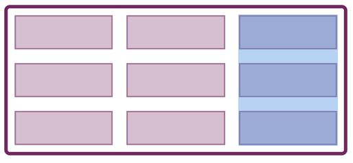
Grid Layout
CSS Grid Layout was designed as a two-dimensional layout method. Two-dimensional means that you wish to lay your content out in rows and columns. As with Flexbox, Grid Layout is a value of display and so to start using Grid you should start with display: grid on your container, and then set up some columns and/or rows using the grid-template-columns and grid-template-rows properties.
.container {
    display: grid;
    grid-template-columns: 200px 200px 200px;
    grid-template-rows: 200px 200px;
}
The above CSS would create a fixed size grid, with completely fixed column and row tracks. This probably isn’t what you want on the web, and Grid has you well covered. The default for any track is auto, which can generally be thought of as “big enough for the content.” If we didn’t create any row tracks, then rows would be created for us to take any content added, and these would be auto sized. A common pattern is to specify column tracks but allow Grid to create rows as required.
While you can set up your column and row tracks using any length unit or a percentage, you can also use the new fr unit, a unit created for Grid Layout. The fr unit is a flex unit, and denotes a share of the available space in the grid container.
Grid can distribute space for you; you don’t need to calculate percentages to ensure things fit into a container. In the example below, we are creating columns using the fr unit and allowing tracks to create automatically. We are also using grid-gap to space out our tracks (see the section on Box Alignment for more details about gaps and grid layout).
See the Pen Smashing Guide to Layout: a simple grid by Rachel Andrew (@rachelandrew) on CodePen.
As with Flexbox and flex-grow or flex-shrink, the fr unit deals with sharing out available space. A higher fr value for one track means it gets more of the available space in proportion. You can also mix fr units and absolute lengths. The space needed for the lengths will be subtracted from the available space before working out the fr units.
See the Pen Smashing Guide to Layout: fr units and absolute lengths by rachelandrew (@rachelandrew) on CodePen.
Grid Terminology
A Grid always has two axes: the Inline Axis runs in the direction that words are laid out on the page and the Block Axis in the direction that blocks are laid out.
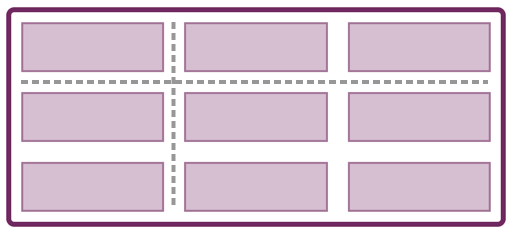
The Grid Container is the element that you have set display: grid on. You then have Grid Lines, created by the column and row tracks you have specified when using grid-template-columns and grid-template-rows. The smallest unit on the grid (between four intersecting lines) is known as a Grid Cell, while a collection of Grid Cells that make up a complete rectangle is called a Grid Area.
Grid Auto-Placement
As soon as you create a Grid, the direct children of your grid container begin to lay themselves out, one in each cell of the grid. They do this according to the grid auto-placement rules. These rules ensure that each item is placed in an empty cell avoiding overlapping items.
Any direct child of the grid container which you have not given a position to will be placed according to the auto-placement rules. In the below example, I have caused every third item to span two-row tracks, while still being auto-placed in terms of the start line.
See the Pen Smashing Guide to Layout: auto-placement by Rachel Andrew (@rachelandrew) on CodePen.
Basic Line-Based Positioning
The simplest way to position items on the Grid is with line-based positioning, giving the item rules to tell it to span from one line of the grid to another. For example, if I have a grid with three column tracks and two-row tracks, I can place an item from column line 1 to column line 3, and row line 1 to row line 3. It will then cover four grid cells in total, spanning two column tracks and two column rows.
.item {
    grid-column-start: 1;
    grid-column-end: 3;
    grid-row-start: 1;
    grid-row-end: 3;
}
These properties can be represented as a shorthand, grid-column and grid-row with the first value being start and the second end.
.item {
    grid-column: 1 / 3;
    grid-row: 1 / 3;
}
Grid Items can occupy the same cells, enabling the creation of designs with overlapping content. Items stack up in the usual way that content stacks on the web, with items lowering down the source appearing on the top of other items. Still, you can use z-index to control this.
See the Pen Smashing Guide to Layout: line-based placement by Rachel Andrew (@rachelandrew) on CodePen.
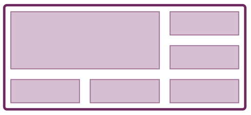
Positioning With Named Areas
You can also position items on your grid by using Named Areas. To use this method you give each item a name, and then describe the layout as the value of the grid-template-areas property.
.item1 {
    grid-area: a;
}

.item2 {
    grid-area: b;
}

.item3 {
    grid-area: c;
}

.container {
    display: grid;
    grid-template-columns: 1fr 1fr 1fr 1fr;
    grid-template-areas:
     "a a b b"
     "a a c c";
}
There are a few rules to remember when using this method. If you want an item to span multiple cells then you should repeat the name. Areas need to form a complete rectangle, no L-shaped or Tetris pieces allowed! The grid must be complete — every cell must be filled. If you want to leave white space then fill that cell with a .. For example, in the below CSS I am leaving the bottom right corner empty.
.container {
    display: grid;
    grid-template-columns: 1fr 1fr 1fr 1fr;
    grid-template-areas:
     "a a b b"
     "a a c .";
}
This is a nice way to work as anyone looking at the CSS can see exactly how the layout will work.
See the Pen Smashing Guide to Layout: grid-template-areas by rachelandrew (@rachelandrew) on CodePen.
Other Resources For Grid Layout
There is much more to CSS Grid Layout than this quick overview has shared, and the resources below will help you to learn the specification. Components and your full page layout alike can be grids, choose Grid Layout if you have a two-dimensional layout to create — no matter how large or small.
- “CSS Grid Layout,” Web technology for developers, MDN web docs, Mozilla
- “Grid by Example,” Everything you need to learn CSS Grid Layout, Rachel Andrew
- “Grid Garden,” A fun interactive game to test and improve your CSS skills
- “Layout Land,” Jen Simmons, YouTube
I’ve also written a number of articles here on Smashing Magazine that can help you dig into various Grid concepts:
- “Best Practices With CSS Grid Layout”
- “Styling Empty Cells With Generated Content And CSS Grid Layout”
- “Using CSS Grid: Supporting Browsers Without Grid”
- “CSS Grid Gotchas And Stumbling Blocks”
- “Naming Things In CSS Grid Layout”
Visual And Document Order
At the beginning of this article, I suggested that you start with your document in an order that makes sense read top to bottom, as this would be helpful both for accessibility and in terms of the way that CSS layout works. From our short introduction to Flexbox and CSS Grid, you can see that it would be possible to move things around quite dramatically away from that order. This has the potential to cause a problem.
Browsers will follow the document source for any non-visual use of the document. Therefore, a screen reader will read out the document order and anyone using a keyboard to navigate will tab through the document in the order it is in the source and not the display order. Many screen readers users are not completely blind, and so may be using the screen reader alongside being able to see where they are in the document. For both of these cases, a display which is jumbled up when compared to the source could cause a very confusing situation indeed.
Be very aware when you are moving elements way from the order they are in the source. If you find yourself rearranging the order of items in CSS, should you really be going back and reorganizing your document? Test to see if you can still tab around your document and the visual order make sense.
Other Resources For Visual And Document Order
- “CSS Grid Layout and Accessibility,” Web technology for developers, MDN web docs, Mozilla
- “HTML Source Order vs CSS Display Order,” Adrian Roselli
- “Flexbox And The Keyboard Navigation Disconnect,” Code Things, Tink
- “The Responsive Order Conflict For Keyboard Focus,” Alastair Campbell
Box Generation
Everything you put on a web page creates a box, and everything in this article describes how you can use CSS to layout those boxes in your design, however, in certain circumstances you may not want to create a box at all. There are two values of the display property that deal with situations where you do not want boxes.
Do Not Generate The Box Or Contents (display: none)
If you want the element and all of the content of that element, including any child items, to not be generated you can use display: none. The element will now not be displayed, and no space will be reserved for where it would have been.
.item {
    display: none;
}
Do Not Generate This Element, But Generate Any Child Elements (display: contents)
A newer value of display is display: contents. Apply display: contents to an element and the box for that element will not be generated but any children will be generated as normal. This can be helpful if you want indirect child elements to become part of a flex or grid layout.
In the example below, the first flex item contains two nested children, yet as it is set to display: contents its box is not rented and the children display as if they were the direct child and become flex items. Remove display: contents from that element to see how the layout changes.
See the Pen Smashing Guide to Layout: display: contents by Rachel Andrew (@rachelandrew) on CodePen.
Other Resources For Box Generation
- “Vanishing Boxes With
display: contents,” Rachel Andrew - How
display: contents;Works,” Ire Aderinokun, - CSS
display: contents,” Browser support information, caniuse
Alignment
Alignment has been something of a tricky subject on the web until recently, with very limited ways to properly align items inside boxes. This is changing with the Box Alignment Module, which currently you will use when controlling alignment in Grid and Flex containers. In the future, other layout methods will also implement these alignment properties. The list of alignment properties detailed in the Box Alignment specification is as follows:
justify-contentalign-contentplace-contentjustify-itemsalign-itemsplace-itemsjustify-selfalign-selfplace-selfrow-gapcolumn-gapgap
As layout models have different features, alignment works slightly differently depending on the layout model in use. Let’s take a look at how alignment works with some simple Grid and Flex Layouts.
The align-items and justify-items properties set the align-self and justify-self properties as a group. These properties align the items inside their Grid Area.
See the Pen Smashing Guide to Layout: align-items, justify-items, align-self, justify-self by Rachel Andrew (@rachelandrew) on CodePen.
The align-content and justify-content properties align the grid tracks, where there is more space in the Grid Container than is needed to display the tracks.
See the Pen Smashing Guide to Layout: align-content, justify-content by Rachel Andrew (@rachelandrew) on CodePen.
In Flexbox, align-items and align-self deal with alignment on the Cross Axis, while justify-content deals with space distribution on the main axis.
See the Pen Smashing Guide to Layout: Flex justify-content, align-items, align-self by Rachel Andrew (@rachelandrew) on CodePen.
On the cross axis, you can use align-content where you have wrapped flex lines and additional space in the flex container.
See the Pen Smashing Guide to Layout: flex align-content by Rachel Andrew (@rachelandrew) on CodePen.
See the resources for some links that discuss Box Alignment in detail across layout methods. It really is worth spending some time understanding how alignment works, as it will make working with Flexbox, Grid and future layout methods far easier.
Row And Column Gaps
A multiple-column layout has the column-gap property, and the Grid Layout spec had — until recently — the properties grid-column-gap, grid-row-gap, and grid-gap. These have now been removed from the Grid specification and added to Box Alignment. At the same time, the grid- prefixed properties were renamed to column-gap, row-gap, and gap. Browsers will alias the prefixed properties to the new renamed ones so you do not need to worry if you are using the better supported old names in your code right now.
The renaming means that these properties can be also applied to other layout methods, the obvious candidate being Flexbox. While no browser supports gaps in Flexbox at the moment, in future we should be able to use column-gap and row-gap to create space between flex items.
Other Resources For Alignment
- “CSS Box Alignment,” CSS: Cascading Style Sheets, MDN web docs, Mozilla
- “Box Alignment in Flexbox,” CSS Flexible Box Layout, MDN web docs, Mozilla
- “Box Alignment in CSS Grid Layout,” CSS Grid Layout, MDN web docs, Mozilla
- “The New Layout Standard For The Web: CSS Grid, Flexbox And Box Alignment,” Rachel Andrew, Smashing Magazine
- “Box Alignment Cheatsheet,” Rachel Andrew
Multi-Column Layout
A multiple-column layout is a layout type that enables the creation of columns, such as you might find in a newspaper. A block is split into columns, and you read down a column in the block direction then return to the top of the next column. While reading content in this way is not always useful in a web context as people don’t want to have to scroll up and down to read, it can be a helpful way to display small amounts of content or to collapse down sets of checkboxes or other small UI elements.
A multiple-column layout can also be used to display sets of cards or products which have differing heights.
Setting A Column Width
To set an optimal column width, and instruct the browser to display as many columns as possible at that width use the following CSS:
.container {
    column-width: 300px;
}
This will create as many as 300 pixel columns as possible, any leftover space is shared between the columns. Therefore, unless your space divides into 300 pixels with no remainder, it is likely that your columns will be slightly wider than 300 pixels.
Setting A Number Of Columns
Instead of setting the width, you could set a number of columns using column-count. In this case, the browser will share the space between the number of columns you have asked for.
.container {
    column-count: 3;
}
If you add both column-width and column-count, then the column-count property acts as a maximum. In the below code, columns will be added until there are three columns, at which point any extra space will be shared between those three columns even if there was enough space for an additional column.
.container {
    column-width: 300px;
    column-count: 3;
}
Gaps And Column Rules
You cannot add margins or padding to individual column boxes, to space out columns use the column-gap property. If you do not specify a column-gap, it will default to 1em to prevent columns bumping up against each other. This is a different behavior to the way column-gap is specified for other layout methods, where it defaults to 0. You can use any length unit for your gap, including 0 if you want no gap at all.
The column-rule property gives you the ability to add a rule between two columns. It is a shorthand for column-rule-width, column-rule-color, and column-rule-style, and acts in the same way as border. Note that a rule does not take up any space of its own. It lays on top of the gap so to increase or decrease space between the rule and the content you need to increase or decrease the column-gap.
See the Pen Smashing Guide to Layout: multicol by Rachel Andrew (@rachelandrew) on CodePen.
Allowing Elements To Span Columns
You can span an element inside the multicol container across all of the columns using the column-span property on that element.
h3 {
    column-span: all;
}
When a column-span happens, the multicol container essentially stops above the spanning element, therefore, the content forms into columns above the element and then remaining content forms a new set of column boxes below the spanning element.
See the Pen Smashing Guide to Layout: multicol span by Rachel Andrew (@rachelandrew) on CodePen.
You can only use column-span: all or column-span: none; it isn’t possible to span some of the columns. At the time of writing, Firefox does not support the column-span property.
Other Resources For Multiple-Column Layout
- “Using Multi-Column Layouts,” CSS Multi-column Layout, MDN web docs, Mozilla
Fragmentation
Multiple-Column Layout is an example of fragmentation. In this case, the content is broken into columns. It is, however, very similar to the way that content is broken into pages when printing. This process is dealt with by the Fragmentation specification, and this specification contains properties to help control the breaking of content.
For example, if you have laid out a set of cards using multicol and you want to make sure that a card never breaks in half, becoming split between two columns you can use the property break-inside with a value of avoid. Due to browser compatibility reasons, you will also want to use the legacy page-break-inside property as well.
.card {
    page-break-inside: avoid;
    break-inside: avoid;
}
If you want to avoid a break directly after a heading, you can use the break-after property.
.container h2 {
    page-break-after: avoid;
    break-after: avoid;
}
These properties can be used when preparing a print stylesheet and also in multicol. In the example below, I have three paragraphs in a multicol container that fragments into three columns. I have given break-inside: avoid to the p element meaning that the paragraphs end up one in each column (even if this makes the columns uneven).
See the Pen Smashing Guide to Layout: multicol fragmentation by Rachel Andrew (@rachelandrew) on CodePen.
Other Resources For Fragmentation
- “A Guide To The State Of Print Stylesheets In 2018,” Rachel Andrew, Smashing Magazine
- “Column Breaks,” QuirksMode.org
Selecting Layout Types: How To Choose?
Most web pages will use a mixture of these layout types, and each spec defines exactly how they interact with each other. For example, you might have a Grid Layout in which some Grid Items are also Flex containers. Some of those flex containers might be a containing block for a positioned item or have an image floated inside. The specifications are written with an expectation that we will be mixing layout models, according to what is best for the content that we are laying out. In this guide, I have tried to give an overview of the basic way that each layout type behaves, in order to help you hone in on what is likely to be the best way to achieve a particular effect.
However, don’t be afraid to play around with different ways of creating the design you have in mind. There are fewer places than you might imagine where you should worry about your choices causing any real problem. Start with a good document structure, and take care that you are not disconnecting the visual display from that order. Much of the rest is just a case of testing that things work as you expect in your target browsers.
Further Reading
- CSS Scroll Snapping Aligned With Global Page Layout: A Full-Width Slider Case Study
- CSS Blurry Shimmer Effect
- A Guide To Hover And Pointer Media Queries
- Getting Started With Neon Branching
 (il, mrn)

