Landing The Concept: Movie High-Concept Theory And UX Design

Email Newsletter
Weekly tips on front-end & UX.
Trusted by 182,000+ folks.


 Celebrating 10 million developers
 Custom Web Forms for Angular, React, & Vue. Your backend.
Steven Spielberg once famously said, “If a person can tell me the idea in 25 words or less, it's going to make a pretty good movie.” He was referring to the notion that the best mass-appeal ‘blockbuster’ movies are able to succinctly state their concept or premise in a single short sentence, such as Jaws (“It’s about a shark terrorizing a small town”) and Toy Story (“It’s about some toys that come to life when nobody's looking”).
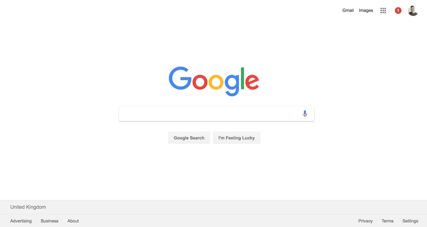
What if the same were true for websites? Do sites that explain their ‘concept’ in a simple way have a better shot at mass-appeal with users? If we look at the super simple layout of Google's homepage, for example, it gives users a single clear message about its concept equally as well as the Jaws movie poster:
Being aware of the importance of ‘high-concept’ allows us — as designers — to really focus on user’s initial impressions. Taking the time to actually define what you want your simple ‘high-concept’ to be before you even begin designing can really help steer you towards the right user experience.
What Does High-Concept Theory Mean For UX Design?
So let’s take this seriously and look at it from a UX Design standpoint. It stands to reason that if you can explain the ‘concept’ or purpose of your site in a simple way you are lowering the cognitive load on new users when they try and understand it and in doing so, you’re drastically increasing your chances of them engaging.
The parallels between ‘High-Concept’ theory and UX Design best practice are clear. Blockbuster audiences prefer simple easy to relate concepts presented in an uncomplicated way. Web users often prefer simpler, easy to digest, UI (User Interface) design, clean layouts, and no clutter.
Regardless of what your message is, presenting it in a simple way is critical to the success of your site’s user experience. But, what about the message itself? Understanding if your message is ‘high-concept’ enough might also be critical to the site’s success.
What Is The Concept Of ‘High-Concept’ In The Online World?
What do we mean when we say ‘high-concept’? For movies it’s simple — it’s what the film is about, the basic storyline that can be easy to put into a single sentence, e.g. Jurassic Park is “about a theme park where dinosaurs are brought back to life.”
When we look at ‘high-concept’ on a website, however, it can really apply to anything: a mission statement, a service offering, or even a new product line. It’s simply the primary message you want to share through your site. If we apply the theory of ‘high-concept’, it tells us that we need to ensure that we convey that message in a simple and succinct style.
What Happens If You Get It Right?
Why is ‘high-concept’ so important? What are the benefits of presenting a ‘high-concept’ UX Design? One of the mistakes we often fall foul of in UX Design is focussing in on the specifics of user tasks and forgetting about the critical importance of initial opinions. In other words, we focus on how users will interact with a site once they’ve chosen to engage with it and miss the decision-making process that comes before everything. Considering ‘high-concept’ allows us to focus on this initial stage.
The basic premise to consider is that we engage better with things we understand and things we feel comfortable with. Ensuring your site presents its message in a simple ‘high-concept’ way will aid initial user engagement. That initial engagement is the critical precursor to all the good stuff that follows: sales, interaction, and a better conversion rate.
How Much Concept Is Too Much Concept?
The real trick is figuring out how much complexity your users can comfortably handle when it comes to positioning your message. You need to focus initially on presenting only high-level information rather than bombarding users with everything upfront. Give users only the level of understanding they need to engage initially with your site and drive them deeper into the journey disclosing more detail as you go.
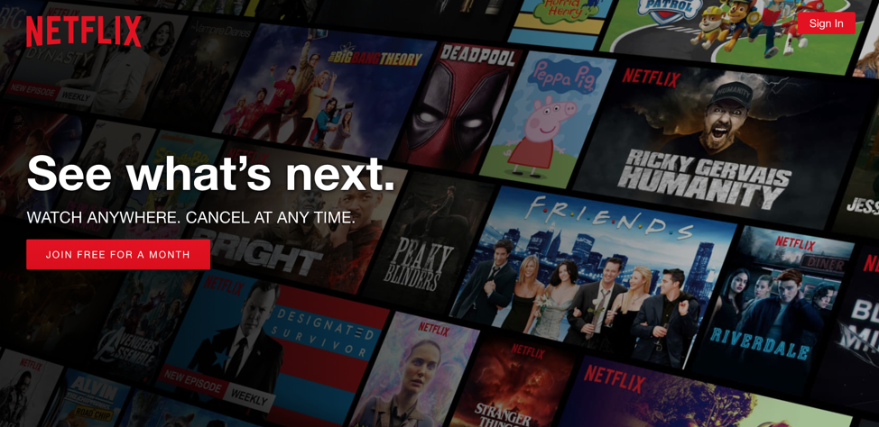
Netflix does a great job at this. The initial view new users are presented with on the homepage screen is upfront with its super high-concept — ‘we do video content’ once users have engaged with this premise they are taken further into the proposition — more information is disclosed, prices, process, and so on.
When To Land Your High-Concept?
As you decide how to layout the site, another critical factor to consider is when you choose to introduce your initial ‘high-concept’ to your users. It’s key to remember how rare it is that users follow a nice simple linear journey through your site starting at the homepage. The reality is that organic user journeys sometimes start with search results. As a result, the actual interaction with your site begins on the page that’s most relevant to the user’s query. With this in mind, it’s critical to consider how the premise of your site appears to users on key entry pages for your site wherever they appear in the overall hierarchy.
Another key point to consider when introducing the message of your site is that in many scenarios users will be judging whether to engage with you way before they even reach your site. If the first time you present your concept to users is via a Facebook ad or an email campaign, then implementation is drastically different. However, the theory should be the same, i.e. to ensure you present your message in that single sentence ‘high-concept’ style way with potential users.
How To Communicate Your High-Concept
Thus far, we’ve talked about how aiming for ‘high-concept’ messages can increase engagement — but how do we do this? Firstly, let’s focus on the obvious methods such as the wording you use (or don’t use).
Before you even begin designing, sit down and focus in on what you want the premise of your site to be. From there, draw out your straplines or headings to reflect that premise. Make sure you rely on content hierarchy though, use your headings to land the concept, and don’t bury messages that are critical to understanding deep in your body copy.
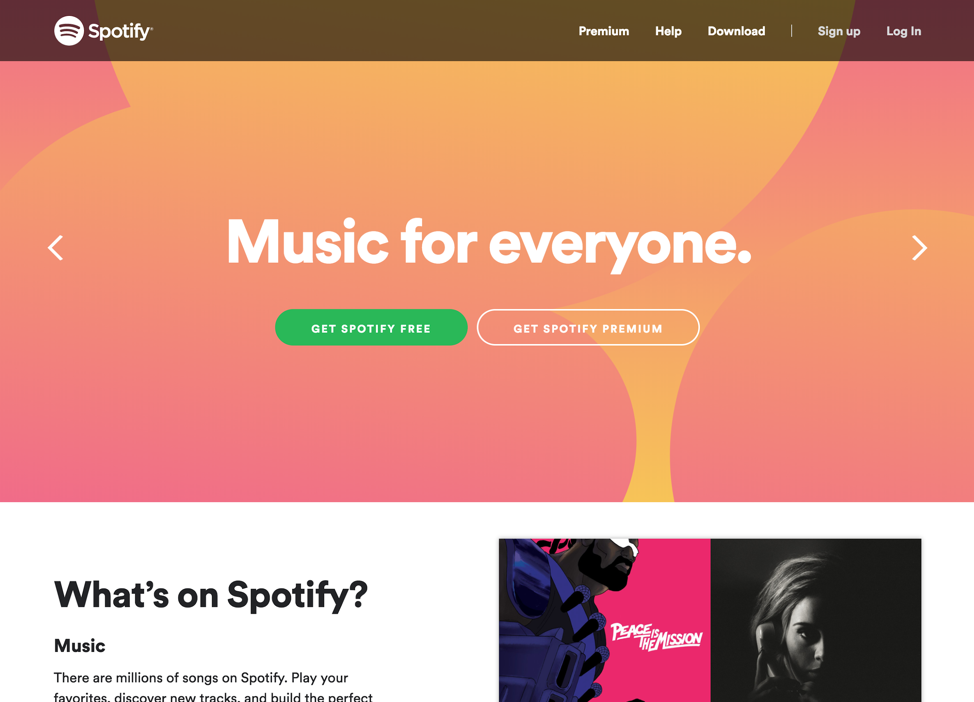
Here’s a nice example from Spotify. They achieve a ‘high-concept’ way of positioning their service through a simple, uncluttered combination of imagery and wording:
Single Sentence Wording
It’s key to be as succinct as possible: the shorter your message is, the more readable it becomes. The true balancing act comes in deciding where to draw the line between too little to give enough understanding and too much to make it easily readable.
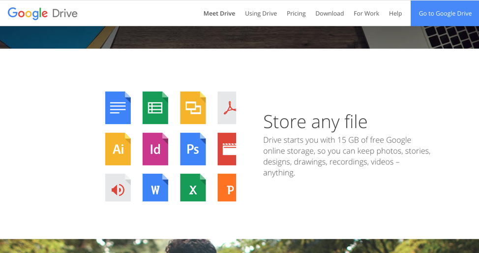
If we take the example of Google Drive — it’s a relatively complex service, but it’s presented in a very basic high-concept way — initially a single sentence that suggests security and simplicity:
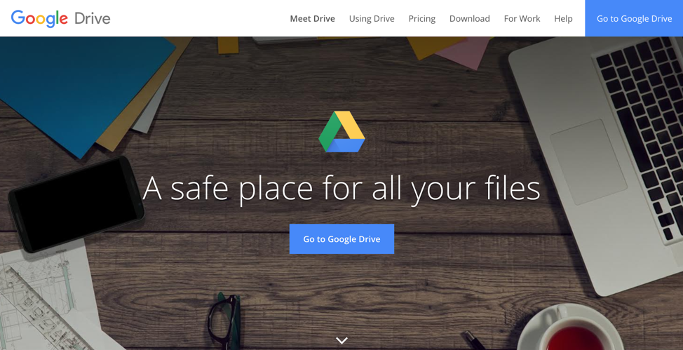
Then the next level of site lands just a little more of the concept of the service but still keeping in a simple single sentence under 25 words (Spielberg would be pleased):
Explainer Videos
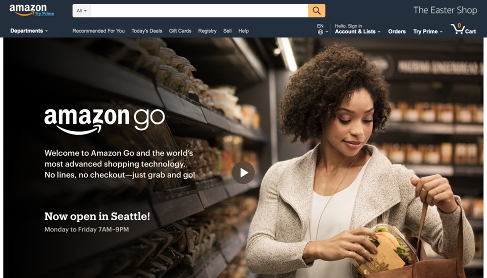
It doesn’t just stop with your wording as there is a myriad of other elements on the page that you can leverage to land your concept. The explainer video is used to great effect by Amazon to introduce users to the concept of Amazon Go. In reality, it’s a highly complex technical trial of machine learning, computer visual recognition, and AI (artificial intelligence) to reimagine the shopping experience. As it’s simply framed on the site, it can be explained in a ‘high-concept’ way.
Amazon gives users a single sentence and also, crucially, makes the whole header section a simple explainer video about the service.
Imagery
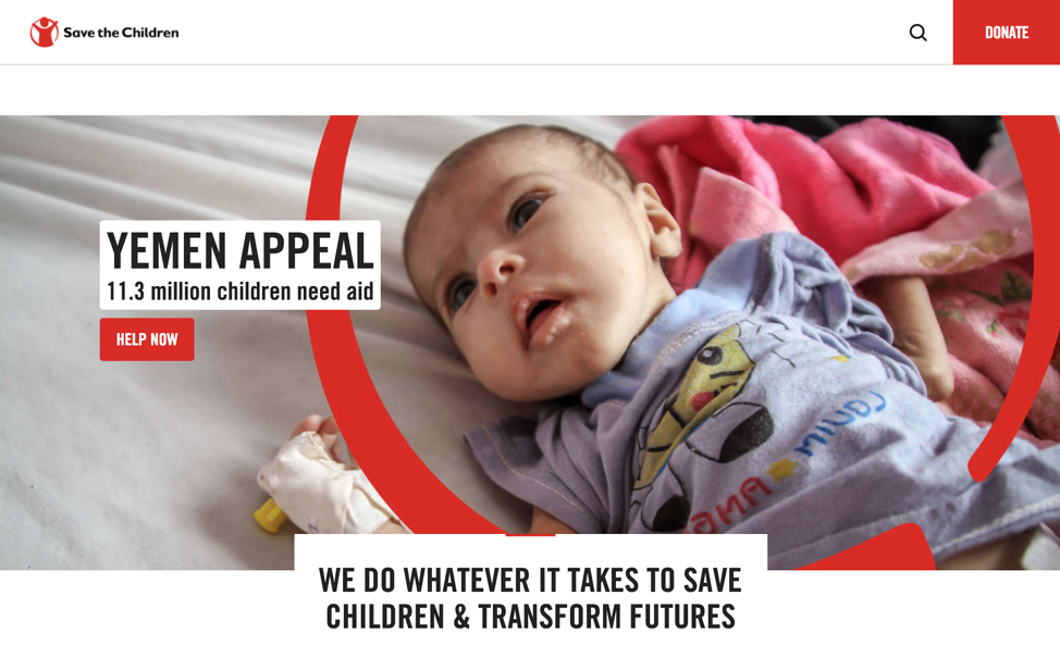
The imagery you use can be used to quickly and simply convey powerful messages about your concept without the need to complicate your UI with other elements. Save the Children use imagery to great effect to quickly show the users the critical importance of their work arguably better than they ever could with wording.
Font And Color
It’s key to consider every element of your site as a potential mechanism for helping you communicate your purpose to your users, through the font or the color choices. For example, rather than having to explicitly tell users that your site is aimed at academics or children you can craft your UI to help show that.
Users have existing mental models that you can appeal to. For example, bright colors and childlike fonts suggest the site is aimed at children, serif fonts and limited color use often suggest a much more serious or academic subject matter. Therefore, when it comes to landing the concept of your site, consider these as important allies to communicate with your users without having to complicate your message.
Design Affordance
So far, we’ve focused primarily on using messaging to communicate the concept to users. Still, what if the primary goal of your page is just to get users to interact with a specific element? For example, if you offer some kind of tool? If that’s the case, then showing the interface of this tool itself is often the best way to communicate its purpose to users.
This ties in with the concept of ‘Design Affordance’ — the idea that the form of a design should communicate its purpose. It stands to reason that sometimes the best way to tell users about your simple tool with an easy to use interface — is to show them that interface.
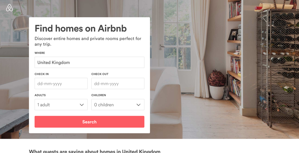
If we look at Airbnb, a large part of the Airbnb concept is the online tool that allows the searching and viewing of results; they use this to great effect on this landing page design by showing the data entry view for that search. Showing users how easy it is to search while also presenting them the with simple messaging about the Airbnb concept.
How To Test You’ve Landed It
Now that you’ve designed your site and you’re happy that it pitches its concept almost as well as an 80s blockbuster — but how can you validate that? It would be lovely to check things over with a few rounds of in-depth lab-based user research, but in reality, you’ll seldom have the opportunity, and you’ll find yourself relying on more ‘guerilla’ methods.
One of the simplest and most effective methodologies to check how ‘high-concept’ your site is is the ‘5 second’ or ‘glance’ test. The simple test involves showing someone the site for 5 seconds and then hiding it from view. Then, users can then be asked questions about what they can recall about the site. The idea being that in 5 seconds they only have the opportunity to view what is immediately obvious.
Here are some examples of questions to ask to get a sense of how well the concept of your site comes across:
- Can you remember the name of the site you just saw?
- What do you think is the purpose of the page you just saw?
- Was it obvious what the site you just saw offers?
- Do you think you would use the site you just saw?
Using this test with a decent number of people who match your target users should give some really valuable insight into how well your design conveys the purpose of your site and if indeed you’ve managed to achieve ‘high-concept’.
Putting It All Into Practice
Let’s try implementing all this knowledge in the real world? In terms of taking this and turning it into a practical approach, I try and follow these simple steps for every project:
- Aim For High-Concept
When you’re establishing the purpose of any new site (or page or ad) try and boil it down to a single, simple, overarching ‘High-Concept.’ - Write It Down
Document what you want that key concept to be in 25 words or less. - Refer Back
Constantly refer back to that concept throughout the design process. From picking your fonts and colors to crafting your headline content — ensure that it all supports that High-Concept you wrote down. - Test It
Once complete use the 5-second test on your design with a number of users and compare their initial thoughts to your initial High-Concept. If they correlate, then great, if not head back to step 3 and try again.
In this article, we have discussed the simple rule of making blockbuster movies, and we have applied that wisdom to web design. No ‘shock plot twist’ — just some common sense. The first time someone comes into contact with your website, it’s vital to think about what you want the initial message to be. If you want mass market appeal, then craft it into a ‘high-concept’ message that Spielberg himself would be proud of!
Further Reading
- When Words Cannot Describe: Designing For AI Beyond Conversational Interfaces
- Design Patterns Are A Better Way To Collaborate On Your Design System
- How To Create A Rapid Research Program To Support Insights At Scale
- How Accessibility Standards Can Empower Better Chart Visual Design


