Things Designers Should Know About SEO In 2018

Email Newsletter
Weekly tips on front-end & UX.
Trusted by 200,000+ folks.


Design has a large impact on content visibility — so does SEO. However, there are some key SEO concepts that experts in the field struggle to communicate clearly to designers. This can create friction and the impression that most well-designed websites are very poorly optimized for SEO.
Here is an overview of what we will be covering in this article:
- Design mobile first for Google,
- Structure content for organic visibility,
- Focus on user intent (not keywords),
- Send the right signals with internal linking,
- A crash course on image SEO,
- Penalties for pop-ups,
- Say it like you mean it: voice search and assistants.
Design Mobile First For Google
This year, Google plans on indexing websites mobile first:
"Our algorithms will eventually primarily use the mobile version of a site’s content to rank pages from that site, to understand structured data, and to show snippets from those pages in our results."
So, How Does This Affect Websites In Terms Of Design?
Well, it means that your website should be responsive. Responsive design isn’t about making elements fit on various screens. It is about usability. This requires shifting your thinking towards designing a consistent, high-quality experience across multiple devices.
Here are a few things that users care about when it comes to a website:
- Flexible texts and images.
People should be able to view images and read texts. No one likes looking at pixels hoping they morph into something readable or into an image. - Defined breakpoints for design changes (you can do that via CSS media queries).
- Being able to use your website on all devices.
This can mean being able to use your website in portrait or landscape mode without losing half of the features or having buttons that do not work. - A fluid site grid that aims to maintain proportions.
We won’t go into details about how to create a remarkable responsive website as this is not the main topic. However, if you want to take a deep dive into this fascinating subject, may I recommend a Smashing Book 5?
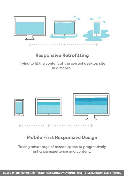
Do you need a concrete visual to help you understand why you must think about the mobile side of things from the get-go? Stéphanie Walter provided a great visual to get the point across:

Crafting Content For Smaller Screens
Your content should be as responsive as your design. The first step to making content responsive for your users is to understand user behavior and preferences.
- Content should be so riveting that users scroll to read more of it;
- Stop thinking in terms of text. Animated gifs, videos, infographics are all very useful types of content that are very mobile-friendly;
- Keep your headlines short enticing. You need to convince visitors to click on an article, and a wall of text won’t achieve that;
- Different devices can sometimes mean different expectations or different user needs. Your content should reflect that.
SEO Tip Regarding Responsive Design:
- Google offers a mobile-friendly testing tool. Careful though: This tool helps you meet Google’s design standards, but it doesn’t mean that your website is perfectly optimized for a mobile experience.
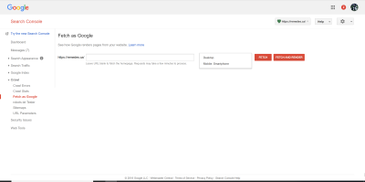
- Test how the Google bot sees your website with the “Fetch and render” feature in Google Search Console. You can test desktop and mobile formats to see how a human user and Google bot will see your site.
Resources:
- “Getting Your Site Ready For Mobile-First Indexing,” Gary Illyes, Webmaster Central Blog
- “Search in 2018: What to Expect,” Michelle Polk, UpBuild
- “Mobile-First Indexing in 2018: 3 Things SEO Professionals Should Do Right Now,” Pius Boachie, Search Engine Watch
Google Crawling Scheme: Making The Bot Smarters
Search engines go about crawling a website in a certain way. We call that a ‘crawling scheme.’ Google has announced that it is retiring its old AJAX crawling scheme in Q2 of 2018. The new crawling scheme has evolved quite a lot: It can handle AJAX and JavaScript natively. This means that the bot can “see” more of your content that may have been hidden behind some code prior to the new crawling scheme.
For example, Google’s new mobile indexing will adjust the impact of content hidden in tabs (with JavaScript). Before this change, the best practice was to avoid hidden content at all costs as it wasn’t as effective for SEO (it was either too hard to crawl for the bot in some cases or given less important by Google in others).
Content Structure For Organic Visibility
SEO experts think of page organization in terms that are accessible for a search engine bot. This means that we look at a page design to quickly establish what is an H1, H2, and an H3 tag. Content organization should be meaningful. This means that it should act as a path that the bot can follow. If all of this sounds familiar to you, it may be due to the fact that content hierarchy is also used to improve accessibility. There are some slight differences between how SEO and accessibility use H tags:
- SEO focuses on H1 through H3 tags whereas accessibility makes use of all H tags (H1 through H6).
- SEO experts recommend using a single H1 tag per page whereas accessibility handles multiple H1 tags per page. Although Google has said in the past that it accepts multiple H1 tags on a page, years of experience have shown that a single H1 tag is better to help you rank.
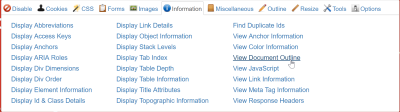
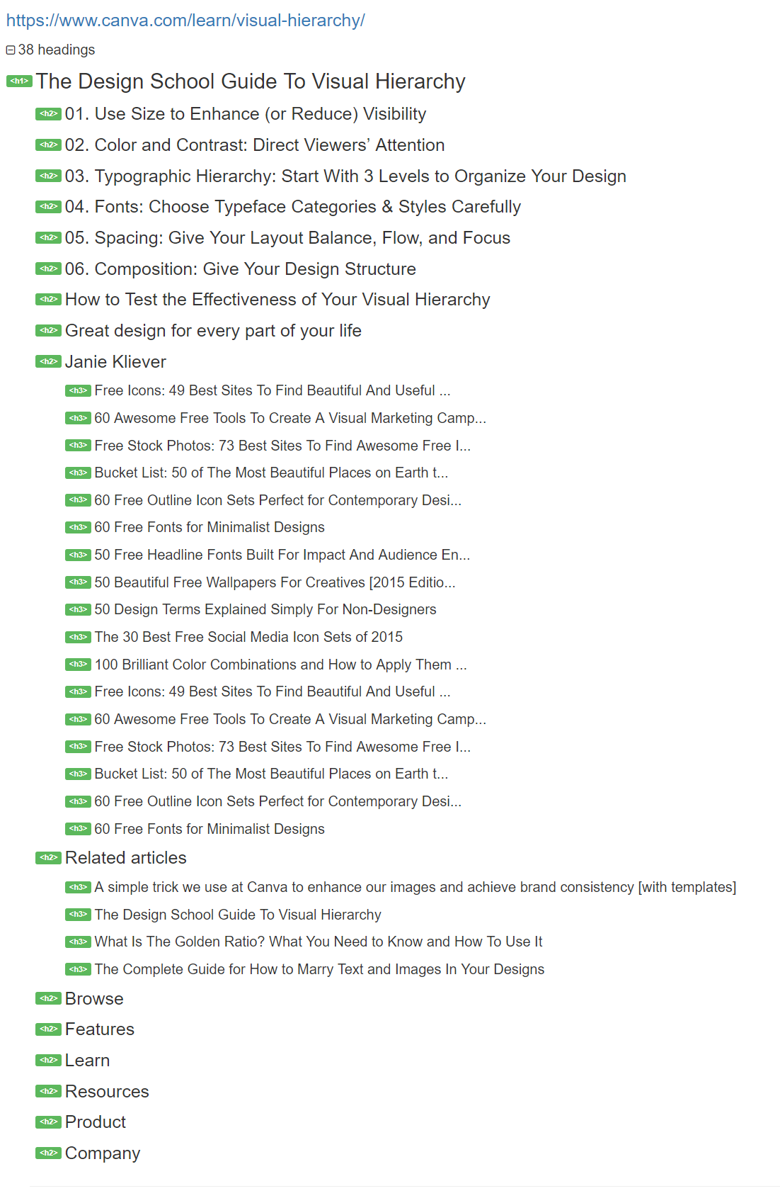
SEO experts investigate content structure by displaying the headings on a page. You do the same type of check quickly by using the Web Developer Toolbar extension (available on Chrome and Firefox) by Chris Pederick. If you go into the information section and click on “View Document Outline,” a tab with the content hierarchy will open in your browser.
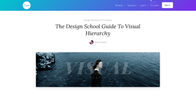
So, if you head on over to The Design School Guide To Visual Hierarchy, you will see a page, and if you open the document hierarchy tab, you will see something quite different.

Bonus: If the content structure of your pages is easy to understand and geared towards common user queries, then Google may show it in “position zero” (a result that shows a content snippet above the first results).
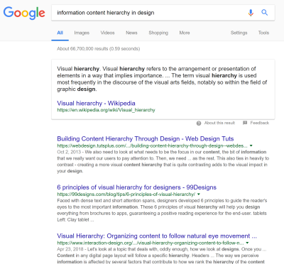
You can see how this can help you increase your overall visibility in search engine result pages below:
SEO Tip To Get Content Hierarchy Right
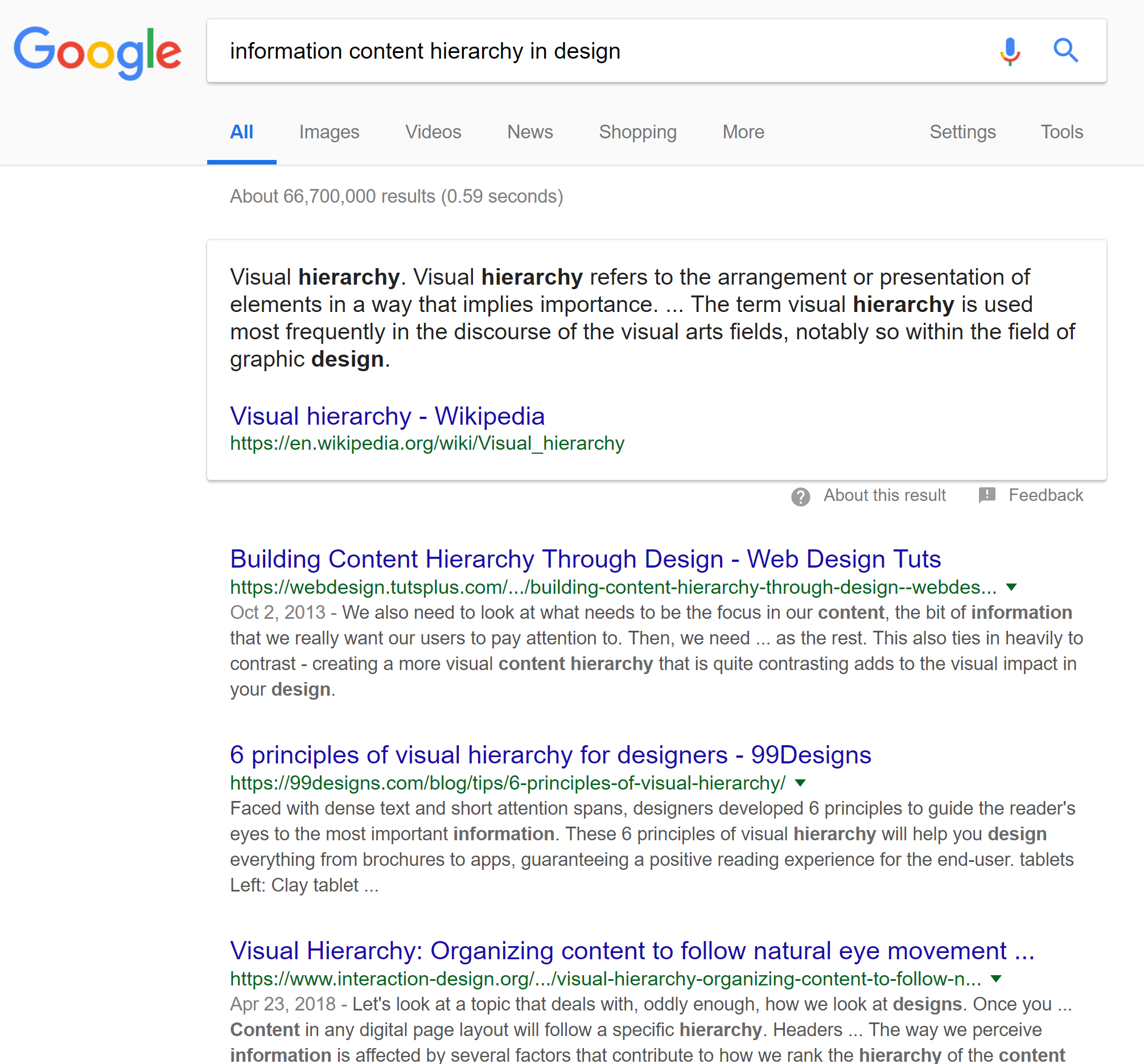
Content hierarchy should not include sidebars, headers or footer. Why? Because if we are talking about a chocolate recipe and the first thing you present to the robot is content from your sidebar touting a signup form for your newsletter, it’s falling short of user expectations (hint: unless a newsletter signup promises a slice of chocolate cake for dinner, you are about to have very disappointed users).
If we go back to the Canva page, you can see that “related articles” and other H tags should not be part of the content hierarchy of this page as they do not reflect the content of this specific page. Although HTML5 standards recommend using H tags for sidebars, headers, and footers, it’s not very compatible with SEO.
Content Quantity Shifts: Long Form Content Is On The Rise
Creating flagship content is important to rank in Google. In copywriting terms, this type of content is often part of a cornerstone page. It can take the shape of a tutorial, an FAQ page, but cornerstone content is the foundation to a well-ranked website. As such, it is a prized asset for inbound marketing to attract visits, backlinks and position a brand in a niche.
In the olden days, 400-word pages were considered to be “long form” content to rank in Google. Today, long-form content that is 1000, 2000 or even 3000 words long outranks short form content very often. This means that you need to start planning and designing to make long-form content engaging and scrollable. Design interactions should be aesthetically pleasing and create a consistent experience even for mammoth content like cornerstone pages. Long form content is a great way to create an immersive and engaging experience.
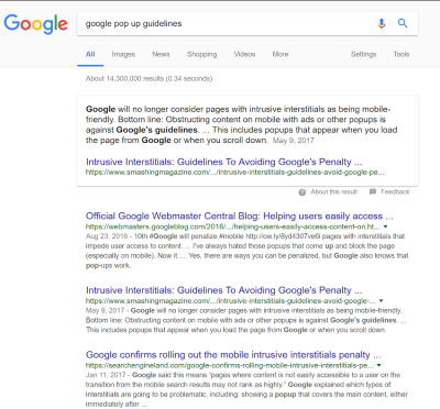
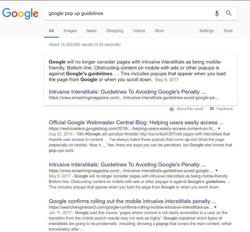
A great example of the power of long-form content tied-in with user search intent is the article about intrusive interstitials on Smashing. Most users will call interstitials “pop-ups” because that is how many of us think of these things. In this case, in Google.com, the article ranks right after the official Google guidelines (and it makes sense that Google should be number 1 on their own branded query) but Smashing magazine is shown as a “position 0” snippet of text on the query “Google pop up guidelines” in Google.com.. Search Engine Land, a high-quality SEO blog that is a pillar of the community is ranking after Smashing (which happens to be more of a design blog than an SEO one).
Of course, these results are ever-changing thanks to machine learning, location data, language and a slew of other ranking factors. However, it is a nice indicator that user intent and long-form content are a great way to get accrued visibility from your target audience.
If you wish to know more, you can consult a data-driven article by Neil Patel on the subject “Why 3000+ Word Blog Posts Get More Traffic (A Data-Driven Answer).”
Resources:
- “How to Create Cornerstone Content That Google Loves,” Brian Clark, Copyblogger
- “How to Design for Long-Form Content,” Carrie Cousins, Design Shack
Tips To Design For Long Form Content
Here are a few tips to help you design for long-form content:
- Spacing is crucial.
White space helps make content be more scannable by the human eye. - Visual clues to help navigation.
Encourage user action without taking away from the story being told. - Enhance content with illustrations or video animation to maintain user engagement.
- Typography is a great way to break up text monotony and maintain the visual flow of a page.
- Intuitive Scrolling helps make the scrolling process feel seamless. Always provide a clear navigation path through the information.
- Provide milestones.
Time indicators are great to give readers a sense accomplishment as they read the content.
Resources:
- “Google Confirmed Again: Content Hidden In Tabs With Mobile-First Index Is Okay,” Barry Schwartz, Search Engine Roundtable
- “Designing Engaging And Enjoyable Long-Form Reading Experiences,” Martha Rotter, Smashing Magazine
User Intent Is Crucial
Search engines have evolved in leaps and bounds these past few years. Google’s aim has always been to have their bot mimic human behavior to help evaluate websites. This meant that Search engine optimization has moved beyond “keywords” and seeks to understand the intent behind the search query a user types in Google.
For example, if you work to optimize content for an Android banking application and do a keyword research, you will see that oftentimes the words “free iPad” come up in North America. This doesn’t make sense until you realize that most banks used to run promotions that would offer free iPads for every new account opened. In light of this, we know that using “free iPad” as a keyword for an Android application used by a bank that is not running this type of promotion is not a good idea.
User intent matters unless you want to rank on terms that will bring you unqualified traffic. Does this mean that keyword research is now useless? Of course not! It just means that the way we approach keyword research is now infused with a UX-friendly approach.
Researching User Intent
User experience is critical for SEO. We also focus on user intent. The search queries a user makes give us valuable insights as to how people think about content, products, and services. Researching user intent can help uncover the hopes, problems, and desires of your users. Google approaches user intent by focusing on micro-moments. Micro-moments can be defined as intent profiles that seek information through search results. Here are the four big micro-moments:
- I want to know.
Users want information or inspiration at this stage. The queries are quite often conversational — it starts with a problem. Since users don’t know the solution or sometimes the words to describe their interest, queries will always be a bit vaguer. - I want to go.
Location, location, location! Queries that signal a local intent are gaining ground. We don’t want any type of restaurant; the one that matters is the one that’s closest to us/the best in our area. Well, this can be seen in queries that include “near me” or a specific city or neighborhood. Localization is important to humans. - I want to do.
People also search for things that they want to do. This is where tutorials are key. Advertising promises fast weight loss, but a savvy entrepreneur should tell you HOW you can lose weight in detail. - I want to buy.
Customers showcase intent to buy quite clearly online. They want “deals” or “reviews” to make their decision.
Uncovering User Intent
Your UX or design strategy should reflect these various stages of user intent. Little tweaks in the words you make can make a big difference. So how does one go about uncovering user intent? We recommend you install Google Search Console to gain insights as to how users find you. This free tool helps you discover some of the keywords users search for to find your content. Let’s look at two tools that can help you uncover or validate user intent. Best of all, they are free!
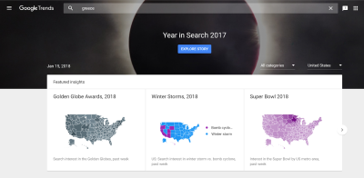
Google Trends
Google Trends is a great way to validate if something’s popularity is on the rise, waning or steady. It provides data locally and allows you to compare two queries to see which one is more popular. This tool is free and easily accessible (compared to the Keyword Planner tool in AdWords that requires an account and more hassle).
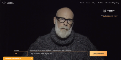
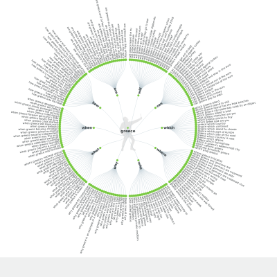
Answer The Public
Answer The Public is a great way to quickly see what people are looking for on Google. Better yet, you can do so by language and get a wonderful sunburst visual for your efforts! It’s not as precise as some of the tools SEO experts use but keep in mind that we’re not asking designers and UX experts to become search engine optimization gurus! Note: this tool won’t provide you stats or local data (it won’t give you data just for England for example). No need for a tutorial here, just head on over and try it out!
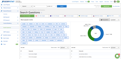
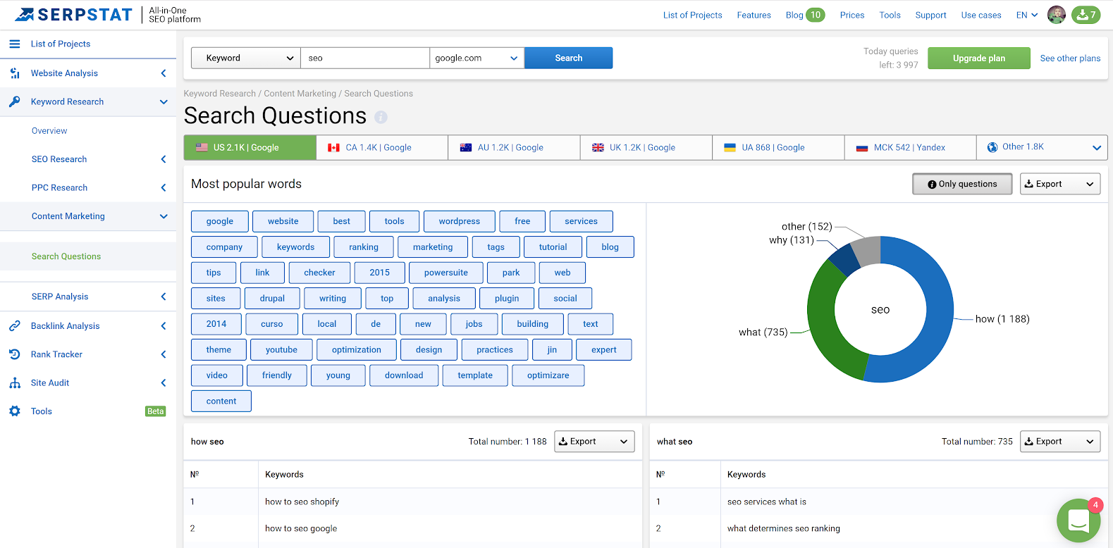
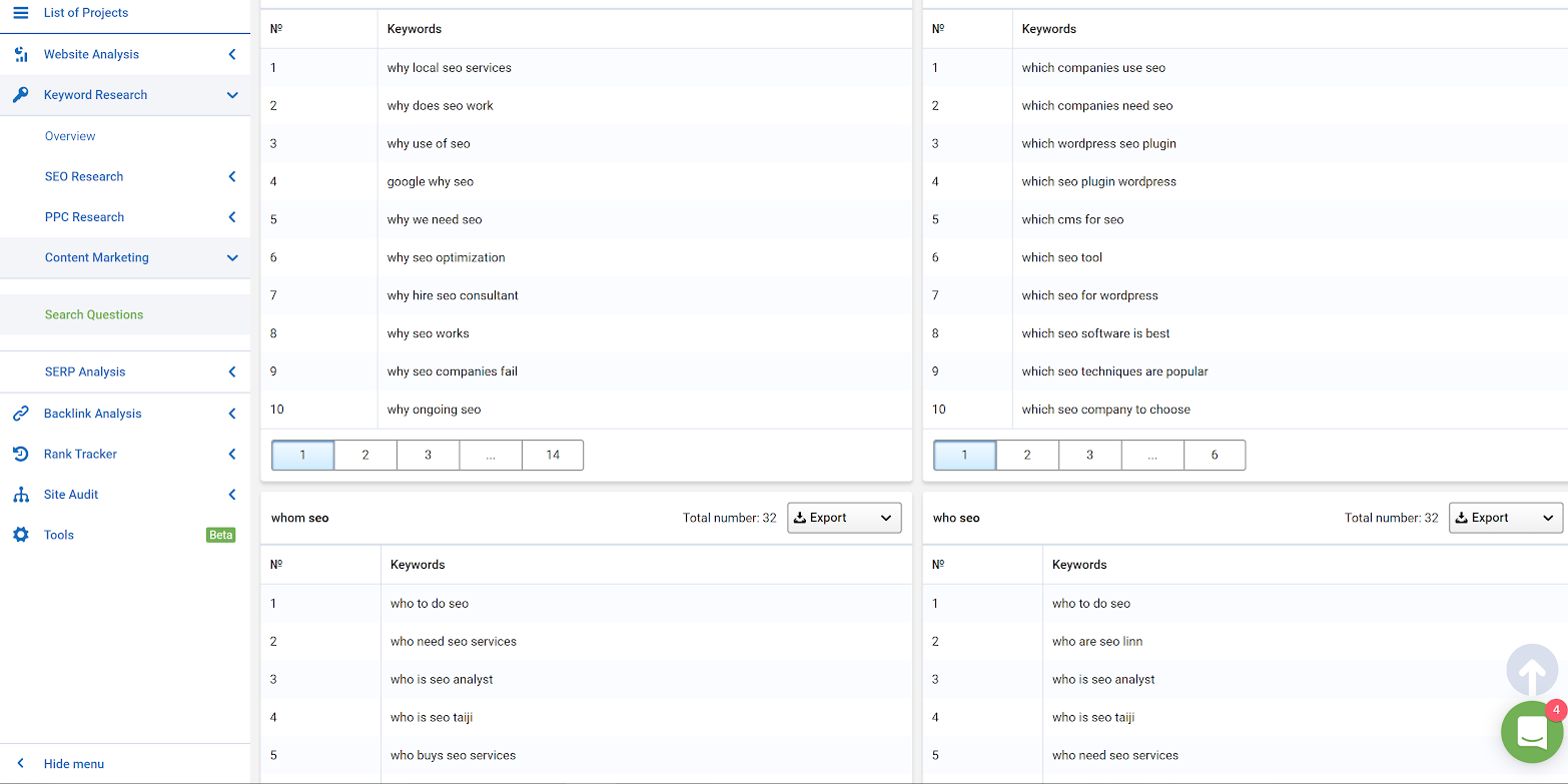
Bonus Tool: Serpstat “Search Questions”
Full disclosure, I use other premium tools as part of my own SEO toolkit. Serpstat is a premium content marketing toolkit, but it’s actually affordable and allows you to dig much deeper into user intent. It helps provide me with information I never expected to find. Case in point, a few months ago, I got to learn that quite a few people in North America were confused about why bathtubs would let light shine through. The answer was easy to me; most bathtubs are made of fiberglass (not metal like in the olden days). It turns out, not everyone is clear on that and some customers needed to be reassured on this point.
If you head on to the “content marketing” section, you can access “Questions.” You can input a keyword and see how it is used in various queries. You can export the results.
This tool will also help you spy on the competition’s content marketing efforts, determine what queries your website ranks on in various countries and what your top SEO pages are.
Resources:
- “Google Will Render AJAX & Stop Using Old AJAX Crawling Scheme,” Barry Schwartz, Search Engine Roundtable
- “The Psychology Of Search Intent: Converting Moments That Matter,” Jim Yu, Search Engine Watch
- “Advocating Love Between UX & SEO,” Myriam Jessier
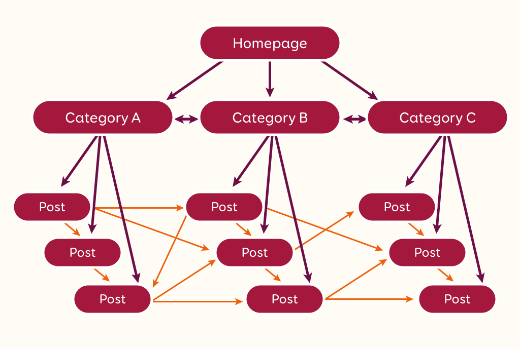
Internal Linking: Because We All Have Our Favorite Pages
The links you have on your website are signaling to search engines bots which pages you find more valuable over others in your website. It’s one of the central concerns for SEOs looking to optimize contents on a site. A well-thought-out internal linking structure provide SEO and UX benefits:
- Internal linking helps organize content based on different categories than the regular navigation;
- It provides more ways for users to interact with your website;
- It shows search engine bots which pages are important from your perspective;
- It provides a clear label for each link and provides context.
Here’s a quick primer in internal linking:
- The homepage tends to be the most authoritative page on a website. As such, it’s a great page to point to other pages you want to give an SEO boost to.
- All pages within one link of the home page will often be interpreted by search engine bots as being important.
- Stop using generic keyword anchors across your website. It could come across as spammy. “Read more” and “click here” provide very little context for users and bots alike.
- Leverage navigation bars, menus, footers and breadcrumb links to provide ample visibility for your key pages.
- CTA text should also be clear and very descriptive to encourage conversions.
- Favor links in a piece of content: it’s highly contextual and has more weight than a generic anchor text or a footer or sidebar link that can be found across the website.
- According to Google’s John Mueller: a link’s position in a page is irrelevant. However, SEOs tend to prefer links higher on a page.
- It’s easier for search engines to “evaluate” links in text content vs. image anchors because oftentimes images do not come with clear, contextual ALT attributes.
Resource:
- “A Data-Driven Guide To Anchor Text (And Its Impact On SEO),” David McSweeney, The Ahrefs Blog
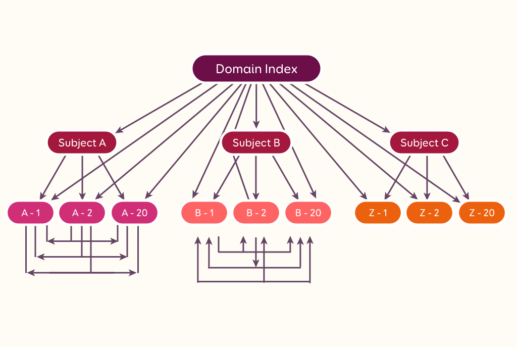
Is there a perfect linking structure at the website level and the page level? The answer is no. A website can have a different linking structure in place depending on its nature (blog, e-commerce, publication, B2B website, etc.) and the information architecture choices made (the information architecture can lead to a pyramid type structure, or something resembling a nest, a cocoon, etc.).
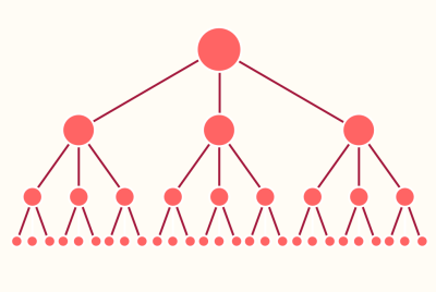


Image SEO
Image SEO is a crucial part of SEO different types of websites. Blogs and e-commerce websites rely heavily on visual items to attract traffic to their website. Social discovery of content and shoppable media increase visits.
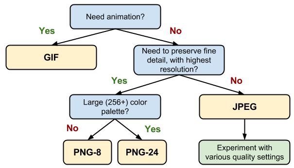
We won’t go into details regarding how to optimize your ALT attributes and file names as other articles do a fine job of it. However, let’s take a look at some of the main image formats we tend to use on the web (and that Google is able to crawl without any issues):
- JPEG
Best for photographs or designs with people, places or things. - PNG
Best for images with transparent backgrounds. - GIF
Best for animated GIFs, otherwise, use the JPG format.

Resource:
- “Image Optimization,” Ilya Grigorik, Web Fundamentals, Google Developers
The Lighter The Better: A Few Tips On Image Compression
Google prefers lighter images. The lighter, the better. However, you may have a hidden problem dragging you down: your CMS. You may upload one image, but your CMS could be creating many more. For example, WordPress will often create 3 to 5 variations of each image in different sizes. This means that images can quickly impact your performance. The best way to deal with this is to compress your images.
Don’t Trust Google Page Speed (A Quick Compression Algorithm Primer)
Not sure if images are dragging your performance down? Take a page from your website, put it through the online optimizer and see what the results are! If you plan on using Google Page Speed Insights, you need to consider the fact that this tool uses one specific algorithm to analyze your images. Sometimes, your images are perfectly optimized with another algorithm that’s not detected by Google’s tool. This can lead to a false positive result telling you to optimize images that are already optimized.
Tools You Can Use
If you want to get started with image compression, you can go about three ways:
- Start compressing images in photo editing tools (most of them have an “export for the web” type of feature).
- Install a plugin or module that is compatible with your CMS to do the work for you. Shortpixel is a good one to use for WordPress. It is freemium so you can optimize for free up to a certain point and then upgrade if you need to compress more images. The best thing about it is that it keeps a backup just in case you want to revert your changes. You can use a service like EWWWW or Short Pixel.
- Use an API or a script to compress images for you. Kraken.io offers a solid API to get the job done. You can use a service like Image Optim or Kraken.
Lossy Vs. Lossless Image Compression
Image compression comes in two flavors: lossy and lossless. There is no magic wand for optimizing images. It depends on the algorithm you use to optimize each image.
Lossy doesn’t mean bad when it comes to images. JPEGS and GIFS are lossy image formats that we use all the time online. Unlike code, you can remove data from images without corrupting the entire file. Our eyes can put up with some data loss because we are sensitive to different colors in different ways. Oftentimes, a 50% compression applied to an image will decrease its file size by 90%. Going beyond that is not worth the image degradation risks as it would become noticeable to your visitors. When it comes to lossy image compression, it’s about finding a compromise between quality and size.
Lossless image compression focuses on removing metadata from JPEG and PNG files. This means that you will have to look into other ways to optimize your load time as images will always be heavier than those optimized with a lossy compression.
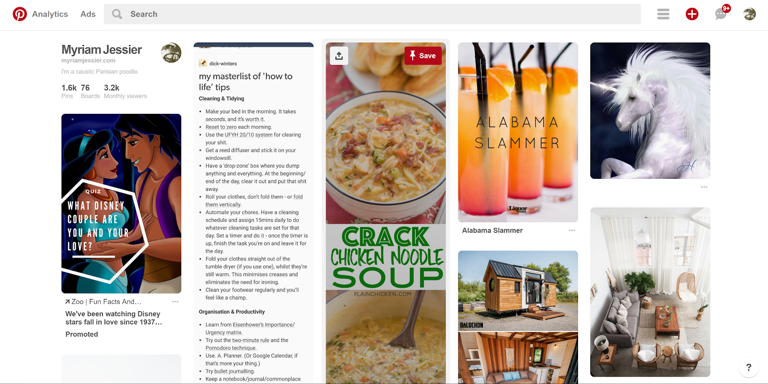
Banners With Text In It
Ever open Pinterest? You will see a wall of images with text in it. The reality for many of us in SEO is that Google bot can’t read all about how to “Crack chicken noodle soup” or what Disney couple you are most like. Google can read image file names and image ALT text. So it’s crucial to think about this when designing marketing banners that include text. Always make sure your image file name and image ALT attribute are optimized to give Google a clue as to what is written on the image. If possible, favor image content with a text overlay available in the code. That way, Google will be able to read it!
Here is a quick checklist to help you optimize your image ALT attributes:
- ALT attributes shouldn’t be too long: aim for 12 words or less.
- ALT attributes should describe the image itself, not the content it is surrounded by (if your picture is of a palm tree, do not title it “the top 10 beaches to visit”).
- ALT attributes should be in the proper language. Here is a concrete example: if a page is written in French, do not provide an English ALT attribute for the image in it.
- ALT attributes can be written like regular sentences. No need to separate the words by dashes, you can use spaces.
- ALT attributes should be descriptive in a human-friendly way. They are not made to contain a series of keywords separated by commas!

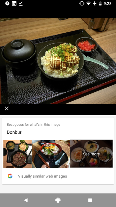
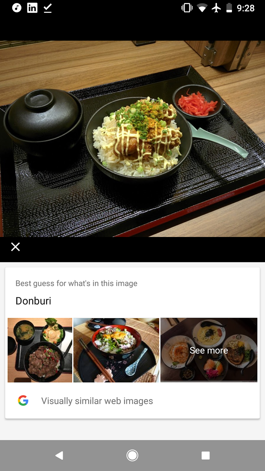
Google Lens
Google Lens is available on Android phones and rolling out to iOS. It is a nifty little addition because it can interpret many images the way a human would. It can read text embedded in images, can recognize landmarks, books, movies and scan barcodes (which most humans can’t do!).
Of course, the technology is so recent that we cannot expect it to be perfect. Some things need to be improved such as interpreting scribbled notes. Google Lens represents a potential bridge between the offline world and the online design experience we craft. AI technology and big data are leveraged to provide meaningful context to images. In the future, taking a picture of a storefront could be contextualized with information like the name of the store, reviews, and ratings for example. Or you could finally figure out the name of a dish that you are eating (I personally tested this and Google figured out I was eating a donburi).
Here is my prediction for the long term: Google Lens will mean less stock photography in websites and more unique images to help brands. Imagine taking a picture of a pair of shoes and knowing exactly where to buy them online because Google Lens identified the brand and model along with a link to let you buy them in a few clicks?
Resource:
- “Google Lens: An Impressive Start For ‘Visual Search’,” Greg Sterling, Search Engine Land
Penalties For Visual Interferences On Mobile
Google has put into place new design penalties that influence a website’s mobile ranking on its results pages. If you want to know more about it, you can read an in-depth article on the topic. Bottom line: avoid unsolicited interstitials on mobile landing pages that are indexed in Google.
SEOs do have guidelines, but we do not have the visual creativity to provide tasteful solutions to comply with Google’s standards.
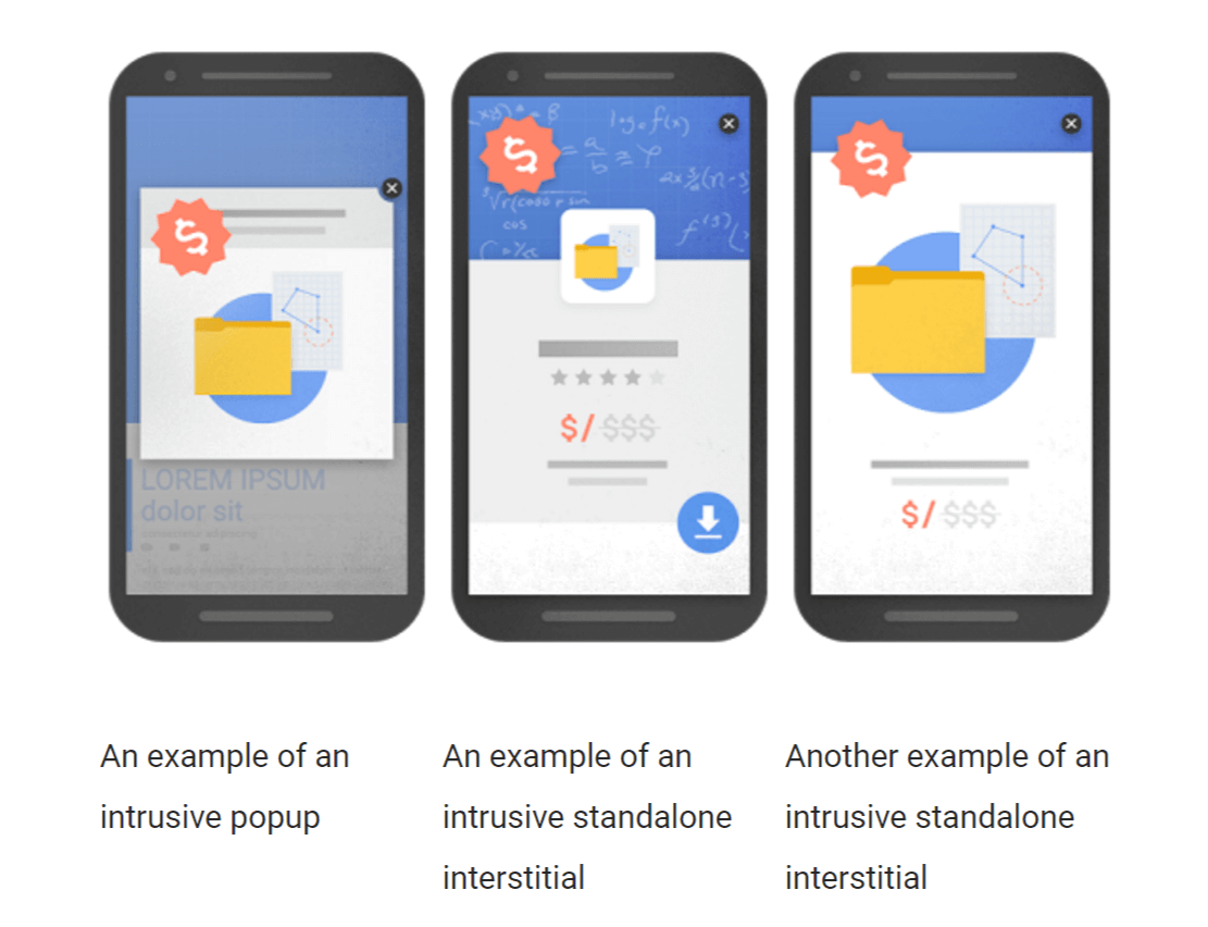
Essentially, marketers have long relied on interstitials as promotional tools to help them engage and convert visitors. An interstitial can be defined as something that blocks out the website’s main content. If your pop-ups cover the main content shown on a mobile screen, if it appears without user interaction, chances are that they may trigger an algorithmic penalty.
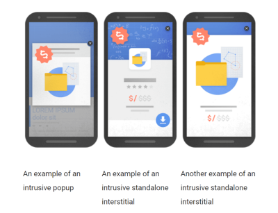
As a gentle reminder, this is what would be considered an intrusive interstitial by Google if it were to appear on mobile:

Tips How To Avoid A Penalty
- No pop-ups;
- No slide ins;
- No interstitials that take up more than 20% of the screen;
- Replace them with non intrusive ribbons at the top or bottom of your pages;
- Or opt for inline optin boxes that are in the middle or at the end of your pages.
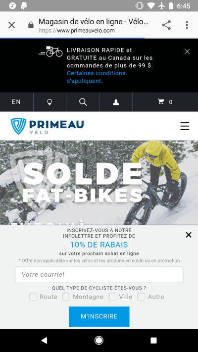
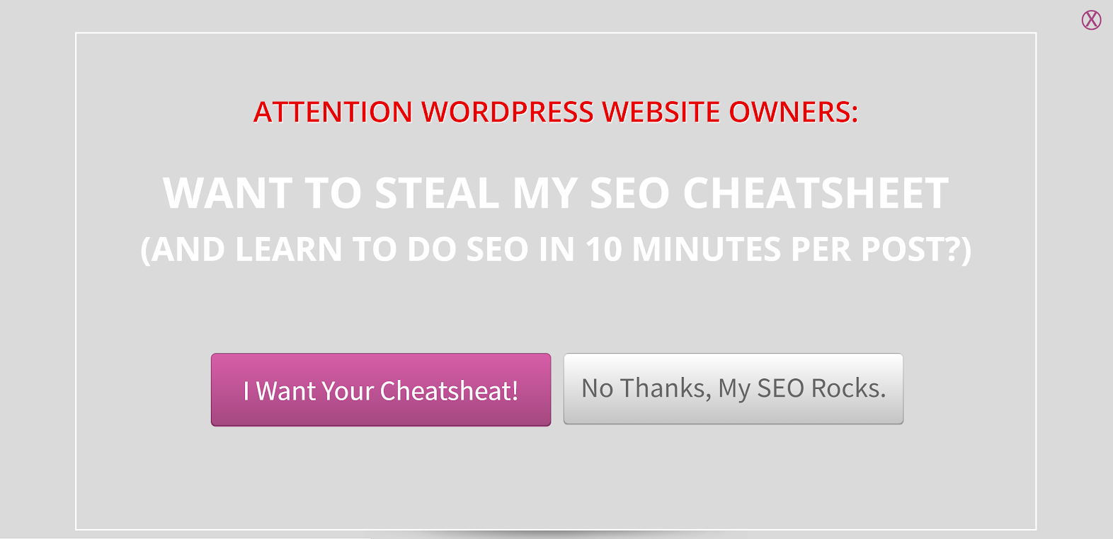
Here’s a solution that may be a bit over the top (with technically two banners on one screen) but that still stays within official guidelines:
Some People May Never See Your Design
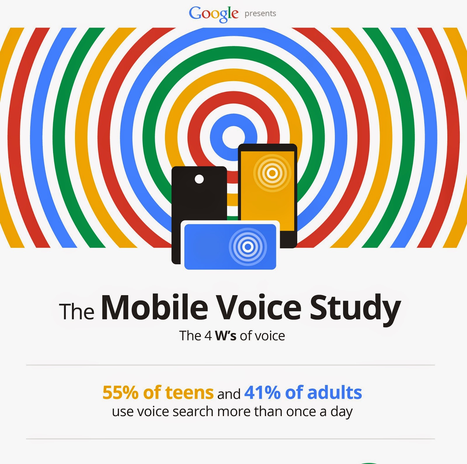
More and more, people are turning to vocal search when looking for information on the web. Over 55% of teens and 41% of adults use voice search. The surprising thing is that this pervasive phenomenon is very recent: most people started in the last year or so.
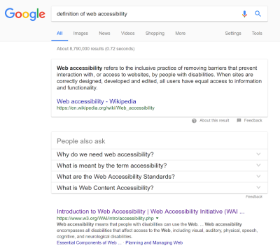
Users request information from search engines in a conversational manner — keywords be damned! This adds a layer of complexity to designing a website: tailoring an experience for users who may not ever enjoy the visual aspect of a website. For example, Google Home can “read” out loud recipes or provide information straight from position 0 snippets when a request is made. This is a new spin on an old concept. If I were to ask Google Home to give me the definition of web accessibility, it would probably read the following thing out loud to me from Wikipedia:
This is an extension of accessibility after all. This time around though, it means that a majority of users will come to rely on accessibility to reach informative content.
Designing for voice search means prioritizing your design to be heard instead of seen. For those interested in extending the design all the way to the code should look into the impact rich snippets have on how your data is structured and given visibility in search engine results pages.
Design And UX Impact SEO
Here is a quick cheat sheet for this article. It contains concrete things you can do to improve your SEO with UX and design:
- Google will start ranking websites based on their mobile experience. Review the usability of your mobile version to ensure you’re ready for the coming changes in Google.
- Check the content organization of your pages. H1, H2, and H3 tags should help create a path through the content that the bot can follow.
- Keyword strategy takes a UX approach to get to the core of users’ search intents to craft optimized content that ranks well.
- Internal linking matters: the links you have on your website are signaling to search engines bots which pages you find more valuable over others on your website.
- Give images more visibility: optimize file names, ALT attributes and think about how the bot “reads” your images.
- Mobile penalties now include pop-ups, banners and other types of interstitials. If you want to keep ranking well in Google mobile search results, avoid unsolicited interstitials on your landing pages.
- With the rise of assistants like Google Home and Alexa, designing for voice search could become a reality soon. This will mean prioritizing your design to be heard instead of seen.
Further Reading
- Mobile Accessibility Barriers For Assistive Technology Users
- How We Improved Our Core Web Vitals (Case Study)
- Improving Core Web Vitals, A Smashing Magazine Case Study
- A Guide To Accessible Form Validation
 (da, lf, ra, yk, il, mrn)


)