Don’t Use The Placeholder Attribute

Email Newsletter
Weekly tips on front-end & UX.
Trusted by 200,000+ folks.


Introduced as part of the HTML5 specification, the placeholder attribute “represents a short hint (a word or short phrase) intended to aid the user with data entry when the control has no value. A hint could be a sample value or a brief description of the expected format.”
This seemingly straightforward attribute contains a surprising amount of issues that prevent it from delivering on what it promises. Hopefully, I can convince you to stop using it.
Technically Correct
Inputs are the gates through which nearly all e-commerce has to pass. Regardless of your feelings on the place of empathy in design, unusable inputs leave money on the table.
The presence of a placeholder attribute won’t be flagged by automated accessibility checking software. However, this doesn’t necessarily mean it’s usable. Ultimately, accessibility is about people, not standards, so it is important to think about your interface in terms beyond running through a checklist.
Call it remediation, inclusive design, universal access, whatever. The spirit of all these philosophies boils down to making things that people—all people—can use. Viewed through this lens, placeholder simply doesn’t hold up.
The Problems
Translation
Browsers with auto-translation features such as Chrome skip over attributes when a request to translate the current page is initiated. For many attributes, this is desired behavior, as an updated value may break underlying page logic or structure.
One of the attributes skipped over by browsers is placeholder. Because of this, placeholder content won’t be translated and will remain as the originally authored language.
If a person is requesting a page to be translated, the expectation is that all visible page content will be updated. Placeholders are frequently used to provide important input formatting instructions or are used in place of a more appropriate label element (more on that in a bit). If this content is not updated along with the rest of the translated page, there is a high possibility that a person unfamiliar with the language will not be able to successfully understand and operate the input.
This should be reason enough to not use the attribute.
While we’re on the subject of translation, it’s also worth pointing out that location isn’t the same as language preference. Many people set their devices to use a language that isn’t the official language of the country reported by their browser’s IP address (to say nothing of VPNs), and we should respect that. Make sure to keep your content semantically described—your neighbors will thank you!
Interoperability
Interoperability is the practice of making different systems exchange and understand information. It is a foundational part of both the Internet and assistive technology.
Semantically describing your content makes it interoperable. An interoperable input is created by programmatically associating a label element with it. Labels describe the purpose of an input field, providing the person filling out the form with a prompt that they can take action on. One way to associate a label with an input, is to use the for attribute with a value that matches the input’s id.
Without this for/id pairing, assistive technology will be unable to determine what the input is for. The programmatic association provides an API hook that software such as screen readers or voice recognition can utilize. Without it, people who rely on this specialized software will not be able to read or operate inputs.
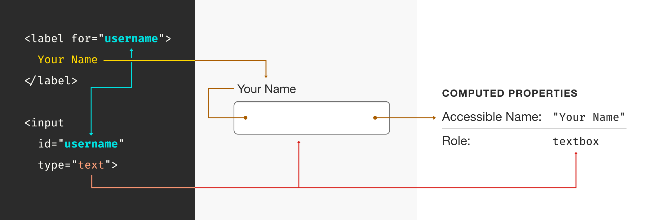
The reason I am mentioning this is that placeholder is oftentimes used in place of a label element. Although I’m personally baffled by the practice, it seems to have gained traction in the design community. My best guess for its popularity is the geometrically precise grid effect it creates when placed next to other label-less input fields acts like designer catnip.
The floating label effect, a close cousin to this phenomenon, oftentimes utilizes the placeholder attribute in place of a label, as well.
A neat thing worth pointing out is that if a label is programmatically associated with an input, clicking or tapping on the label text will place focus on the input. This little trick provides an extra area for interacting with the input, which can be beneficial to people with motor control issues. Placeholders acting as labels, as well as floating labels, cannot do that.
Cognition
The 2016 United States Census lists nearly 15 million people who report having cognitive difficulty — and that’s only counting individuals who choose to self-report. Extrapolating from this, we can assume that cognitive accessibility concerns affect a significant amount of the world’s population.
Self-reporting is worth calling out, in that a person may not know, or feel comfortable sharing that they have a cognitive accessibility condition. Unfortunately, there are still a lot of stigmas attached to disclosing this kind of information, as it oftentimes affects things like job and housing prospects.
Cognition can be inhibited situationally, meaning it can very well happen to you. It can be affected by things like multitasking, sleep deprivation, stress, substance abuse, and depression. I might be a bit jaded here, but that sounds a lot like conditions you’ll find at most office jobs.
Recall
The umbrella of cognitive concerns covers conditions such as short-term memory loss, traumatic brain injury, and Attention Deficit Hyperactivity Disorder. They can all affect a person’s ability to recall information.
When a person enters information into an input, its placeholder content will disappear. The only way to restore it is to remove the information entered. This creates an experience where guiding language is removed as soon as the person attempting to fill out the input interacts with it. Not great!
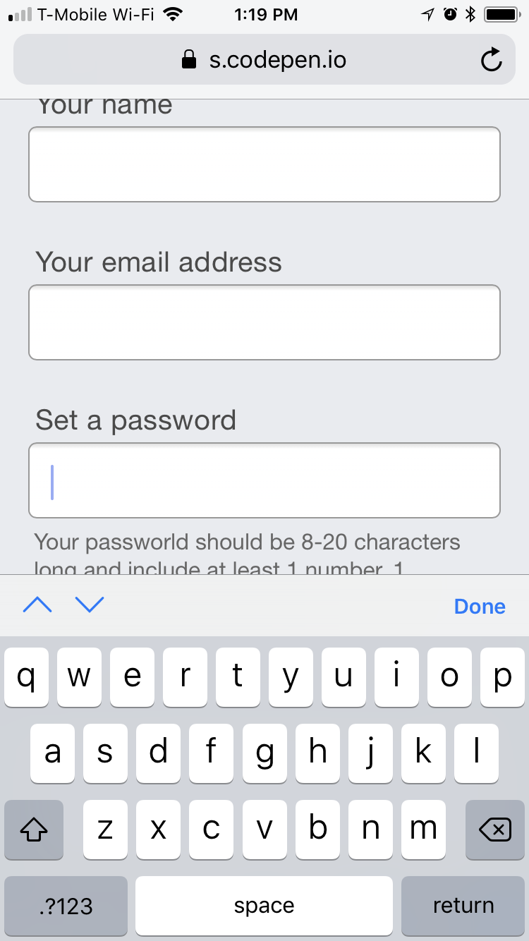
When your ability to recall information is inhibited, it makes following these disappearing rules annoying. For inputs with complicated requirements to satisfy—say creating a new password—it transcends annoyance and becomes a difficult barrier to overcome.
While more technologically-sophisticated people may have learned clever tricks such as cutting entered information, reviewing the placeholder content to refresh their memory, then re-pasting it back in to edit, people who are less technologically literate may not understand why the help content is disappearing or how to bring it back.
Digital Literacy
Considering that more and more of the world’s population is coming online, the onus falls on us as responsible designers and developers to make these people feel welcomed. Your little corner of the Internet (or intranet!) could very well be one of their first experiences online — assuming that the end user “will just know” is simple arrogance.
For US-based readers, a gentle reminder that new may not mean foreign. Access is on the rise for older Americans. While digital literacy will become more commonplace among older populations as time marches on, accessibility issues will as well.
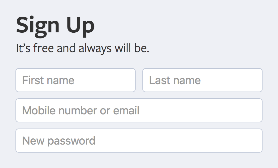
For someone who has never encountered it before, placeholder text may look like entered content, causing them to skip over the input. If it’s a required field, form submission will create a frustrating experience where they may not understand what the error is, or how to fix it. If it’s not a required field, your form still runs the unnecessary risk of failing to collect potentially valuable secondary information.
Utility
Placeholder help content is limited to just a string of static text, and that may not always be sufficient to communicate the message. It may need to have additional styling applied to it, or contain descriptive markup, attributes, images, and iconography.
This is especially handy in mature design systems. The additional styling options created by moving the string of text out of the input element means it can take advantage of the system’s design tokens, and all the benefits that come with using them.
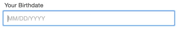
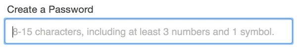
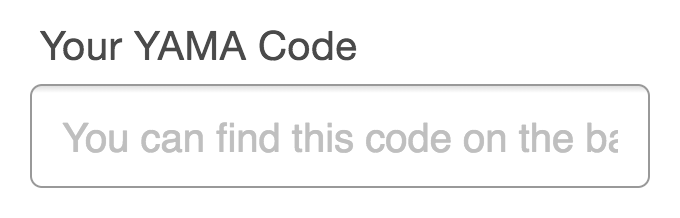
Placeholder text’s length is also limited to the width of the input it is contained in. In our responsive, mobile-first world, there stands a very good chance that important information could be truncated:
Vision
Color Contrast
The major browsers’ default styles for placeholder content use a light gray color to visually communicate that it is a suggestion. Many custom input designs follow this convention by taking the color of input content and lightening it.
Unfortunately, this technique is likely to run afoul of color contrast issues. Color contrast is a ratio determined by comparing the luminosity of the text and background color values; in this case, it’s the color of the placeholder text over the input’s background.
See the Pen Default browser placeholder contrast ratios by Eric Bailey (@ericwbailey) on CodePen.
If the placeholder content has a contrast ratio that is too low to be perceived, it means that information critical to filling out a form successfully may not be able to be seen by people experiencing low vision conditions. For most common input font sizing, the ratio is 4.5:1.
Like all accessibility concerns, low vision conditions can be permanent or temporary, biological or environmental, or a combination. Biological disabilities include conditions like farsightedness, color blindness, dilated pupils, and cataracts. Environmental conditions include circumstances such as the glare of the mid-day sun, a battery-saving low brightness setting, privacy screens, grease and makeup left on your screen by your last phone call, and so on.
This ratio isn’t some personal aesthetic preference that I’m trying to force onto others arbitrarily. It’s part of a set of painstakingly-developed rules that help ensure that the largest possible swath of people can operate digital technology, regardless of their ability or circumstance. Consciously ignoring these rules is to be complicit in practicing exclusion.
And here’s the rub: In trying to make placeholder attributes inclusive, the updated higher contrast placeholder content color may become dark enough to be interpreted as entered input, even by more digitally literate people. This swings the issue back into cognitive concerns land.
High Contrast Mode
The Windows operating system contains a feature called High Contrast Mode. When activated, it assigns new colors to interface elements from a special high contrast palette that uses a limited number of color options. Here’s an example of what it may look like:
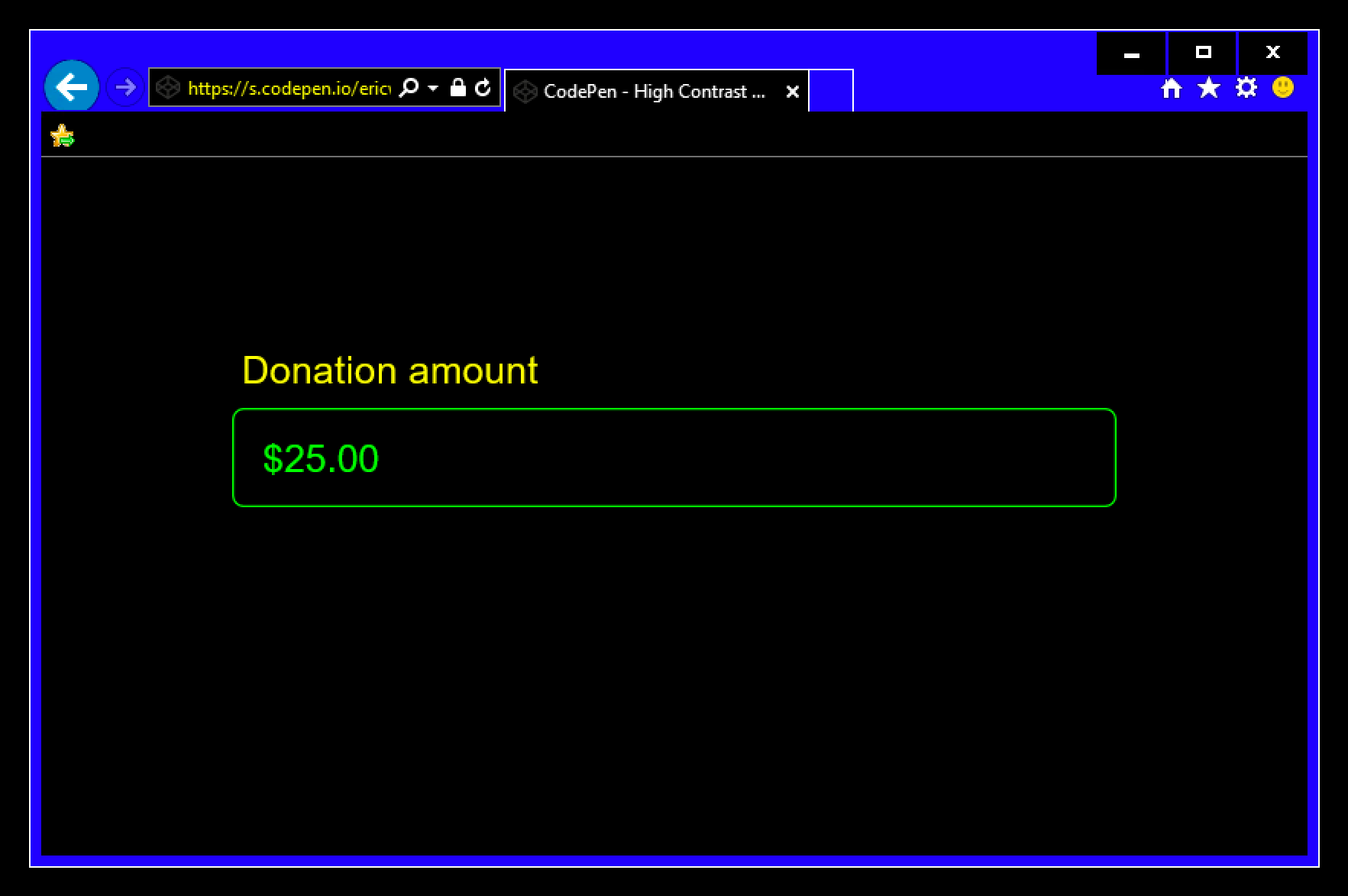
In High Contrast Mode, placeholder content is assigned one of those high contrast colors, making it look like pre-filled information. As discussed earlier, this could prevent people from understanding that the input may need information entered into it.
You may be wondering if it’s possible to update the styling in High Contrast Mode to make a placeholder more understandable. While it is possible to target High Contrast Mode in a media query, I implore you not to do so. Front-end developer Kitty Giraudel said it best:
“High contrast mode is not about design anymore but strict usability. You should aim for highest readability, not color aesthetics.”
The people that rely on High Contrast Mode use it because of how predictable it is. Unduly altering how it presents content may interfere with the only way they can reliably use a computer. In the case of lightening the color of placeholder content to make it appear like its non-High Contrast Mode treatment, you run a very real risk of making it impossible for them to perceive.
A Solution
To recap, the placeholder attribute:
- Can’t be automatically translated;
- Is oftentimes used in place of a label, locking out assistive technology;
- Can hide important information when content is entered;
- Can be too light-colored to be legible;
- Has limited styling options;
- May look like pre-filled information and be skipped over.
Eesh. That’s not great. So what can we do about it?
Design
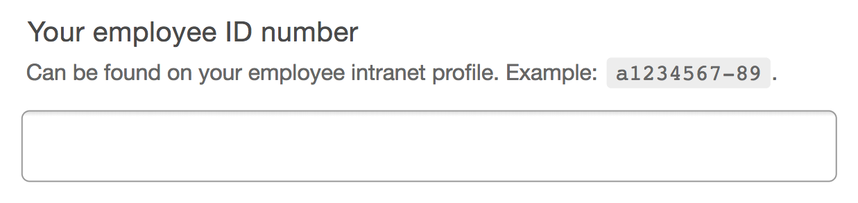
Move the placeholder content above the input, but below the label:
This approach:
- Communicates a visual and structural hierarchy:
- What this input is for,
- Things you need to know to use the input successfully, and
- the input itself.
- Can be translated.
- Won’t look like pre-filled information.
- Can be seen in low vision circumstances.
- Won’t disappear when content is entered into the input.
- Can include semantic markup and be styled via CSS.
Additionally, the help content will be kept in view when the input is activated on a device with a software keyboard. If placed below the input, the content may be obscured when an on-screen keyboard appears at the bottom of the device viewport:

Development
Here’s how to translate our designed example to code:
<div class="input-wrapper">
  <label for="employee-id">
    Your employee ID number
  </label>
  <p
    id="employee-id-hint"
    class="input-hint">
    Can be found on your employee intranet profile. Example: <samp>a1234567-89</samp>.
  </p>
  <input
    id="employee-id"
    aria-describedby="employee-id-hint"
    name="id-number"
    type="text" />
</div>
This isn’t too much of a departure from a traditional accessible for/id attribute pairing: The label element is programmatically associated with the input via its id declaration of “employee-id”. The p element placed between the label and input elements acts as a replacement for a placeholder attribute.
“So,” you may be wondering. “Why don’t we just put all that placeholder replacement content in the label element? It seems like it’d be a lot less work!” The answer is that developer convenience shouldn’t take priority over user experience.
By using aria-describedby to programmatically associate the input with the p element, we are creating a priority of information for screen readers that has parity with what a person browsing without a screen reader would experience. aria-describedby ensures that the p content will be described last, after the label’s content and the kind of input it is associated with.
In other words, it’s what content the input is asking for, what type of input it is, then additional help if you need it — exactly what someone would experience if they look at form input.
User experience encompasses all users, including those who navigate with the aid of screen readers. The help content is self-contained and easy to navigate to and from, should the person using a screen reader need to re-reference it. As it is a self-contained node, it can also be silenced (typically with the Control key) without risking muting other important information.
Including the help content as part of the label makes it unnecessarily verbose. labels should be meaningful, but also concise. Adding too much information to a label may have the opposite of the desired effect, making it too long to recall or simply too frustrating to listen to all the way through. In fact, the Web Content Accessibility Guidelines has rules that specifically address this: Success Criteria 2.4.6 and 3.3.2.
Example
Here is the solution implemented in live code:
See the Pen Don’t use the placeholder attribute by Eric Bailey (@ericwbailey) on CodePen.
And here’s a video demonstrating how popular screen readers handle it:
A Better Solution
“The less an interface requires of its users, the more accessible it is.”
— Alice Boxhall
A final thought: Do you even need that additional placeholder information?
Good front-end solutions take advantage of special input attributes and accommodating validation practices to prevent offloading the extra work onto the person who simply just wants to use your site or app with as little complication as possible.
Good copywriting creates labels that clearly and succinctly describe the input’s purpose. Do a good enough job here and the label cuts through the ambiguity, especially if you test it beforehand.
Good user experience is all about creating intelligent flows that preempt people’s needs, wants, and desires by capitalizing on existing information to remove as many unnecessary questions as possible.
Accommodating the people who use your website or web app means taking a critical eye at what you take for granted when you browse the Internet. By not making assumptions about other people’s circumstances — including the technology they use — you can do your part to help prevent exclusion.
Take some time to review your design and code and see what doesn’t stand up to scrutiny — checking to see if you use the placeholder attribute might be a good place to start.
Standing on the shoulders of giants. Thanks to Roger Johansson, Adam Silver, Scott O’Hara, and Katie Sherwin for their writing on the subject.
Further Reading
- The Fight For The Main Thread
- How Accessibility Standards Can Empower Better Chart Visual Design
- Useful DevTools Tips and Tricks
- A Web Designer’s Accessibility Advocacy Toolkit
 (rb, ra, yk, il, mrn)

