A Reference Guide For Typography In Mobile Web Design

Email Newsletter
Weekly tips on front-end & UX.
Trusted by 182,000+ folks.

 Custom Web Forms for Angular, React, & Vue. Your backend.
 Celebrating 10 million developers

With mobile taking a front seat in search, it's important that websites are designed in a way that prioritize the best experience possible for their users. While Google has brought attention to elements like pop-ups that might disrupt the mobile experience, what about something as seemingly simple as choice of typography?
The answer to the typography question might seem simple enough: what works on desktop should work on mobile so long as it scales well. Right?
While that would definitely make it a lot easier on web designers, that’s not necessarily the case. The problem in making that statement a decisive one is that there haven’t been a lot of studies done on the subject of mobile typography in recent years. So, what I intend to do today is give a brief summary of what it is we know about typography in web design, and then see what UX experts and tests have been able to reveal about using typography for mobile.
Understanding The Basics Of Typography In Modern Web Design
Look, I know typography isn’t the most glamorous of subjects. And, being a web designer, it might not be something you spend too much time thinking about, especially if clients bring their own style guides to you prior to beginning a project.
That said, with mobile-first now here, typography requires additional consideration.
Typography Terminology
Let’s start with the basics: terminology you’ll need to know before digging into mobile typography best practices.
Typography: This term refers to the technique used in styling, formatting, and arranging “printed” (as opposed to handwritten) text.
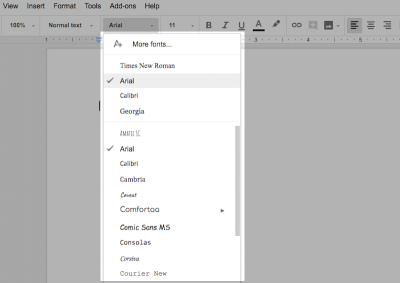
Typeface: This is the classification system used to label a family of characters. So, this would be something like Arial, Times New Roman, Calibri, Comic Sans, etc.
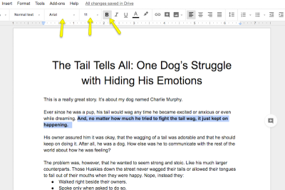
Font: This drills down further into a website’s typeface. The font details the typeface family, point size, and any special stylizations applied. For instance, 11-point Arial in bold.
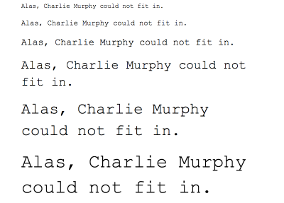
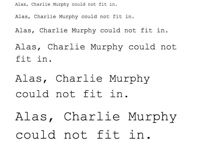
Size: There are two ways in which to refer to the size (or height) of a font: the word processing size in points or the web design size in pixels. For the purposes of talking about mobile web design, we use pixels.
Here is a line-by-line comparison of various font sizes:
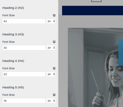
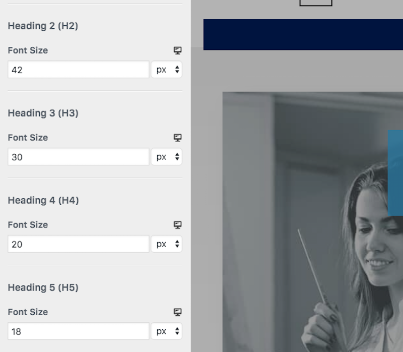
As you can see in WordPress, font sizes are important when it comes to establishing hierarchy in header text:
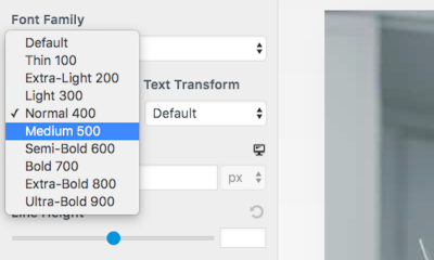
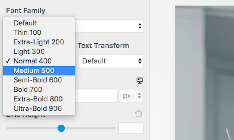
Weight: This is the other part of defining a typeface as a font. Weight refers to any special styles applied to the face to make it appear heavier or lighter. In web design, weight comes into play in header fonts that complement the typically weightless body text.
Here is an example of options you could choose from in the WordPress theme customizer:
Kerning: This pertains to the space between two letters. It can be adjusted in order to create a more aesthetically pleasing result while also enhancing readability. You will need a design software like Photoshop to make these types of adjustments.
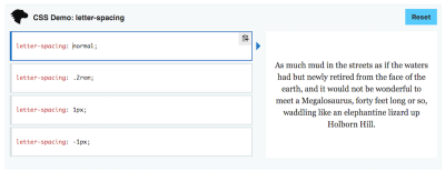
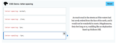
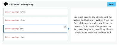
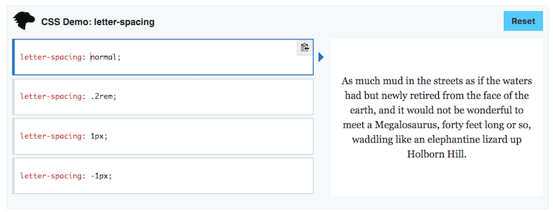
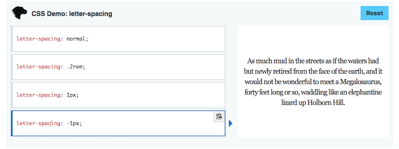
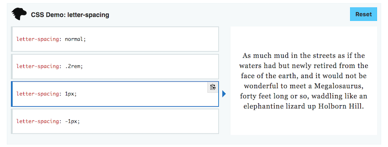
Tracking: Tracking, or letter-spacing, is often confused with kerning as it too relates to adding space in between letters. However, whereas kerning adjusts spacing between two letters in order to improve appearances, tracking is used to adjust spacing across a line. This is used more for the purposes of fixing density issues while reading.
To give you a sense for how this differs, here’s an example from Mozilla on how to use tracking to change letter-spacing:
Leading: Leading, or line spacing, is the amount of distance granted between the baselines of text (the bottom line upon which a font rests). Like tracking, this can be adjusted to fix density issues.
If you’ve been using word processing software for a while, you’re already familiar with leading. Single-spaced text. Double-spaced text. Even 1.5-spaced text. That’s leading.
The Role Of Typography In Modern Web Design
As for why we care about typography and each of the defining characteristics of it in modern web design, there’s a good reason for it. While it would be great if a well-written blog post or super convincing sales jargon on a landing page were enough to keep visitors happy, that’s not always the case. The choices you make in terms of typography can have major ramifications on whether or not people even give your site’s copy a read.
These are some of the ways in which typography affects your end users:
Reinforce Branding
Typography is another way in which you create a specific style for your web design. If images all contain clean lines and serious faces, you would want to use an equally buttoned-up typeface.
Set the Mood
It helps establish a mood or emotion. For instance, a more frivolous and light-bodied typeface would signal to users that the brand is fun, young and doesn’t take itself seriously.
Give It a Voice
It conveys a sense of personality and voice. While the actual message in the copy will be able to dictate this well, using a font that reinforces the tone would be a powerful choice.
Encourage Reading
As you can see, there are a number of ways in which you can adjust how type appears on a screen. If you can give it the right sense of speed and ease, you can encourage more users to read through it all.
Allow for Scanning
Scanning or glancing (which I’ll talk about shortly) is becoming more and more common as people engage with the web on their smart devices. Because of this, we need ways to format text to improve scannability and this usually involves lots of headers, pull quotes and in-line lists (bulleted, numbered, etc.).
Improve Accessibility
There is a lot to be done in order to design for accessibility. Your choice of font plays a big part in that, especially as the mobile experience has to rely less on big, bold designs and swatches of color and more on how quickly and well you can get visitors to your message.
Because typography has such a diverse role in the user experience, it’s a matter that needs to be taken seriously when strategizing new designs. So, let’s look at what the experts and tests have to say about handling it for mobile.
Typography For Mobile Web Design: What You Need To Know
Too small, too light, too fancy, too close together… You can run into a lot of problems if you don’t strike the perfect balance with your choice of typography in design. On mobile, however, it’s a bit of a different story.
I don’t want to say that playing it safe and using the system default from Google or Apple is the way to go. After all, you work so hard to develop unique, creative and eye-catching designs for your users. Why would you throw in the towel at this point and just slap Roboto all over your mobile website?
We know what the key elements are in defining and shaping a typeface and we also know how powerful fonts are within the context of a website. So, let’s drill down and see what exactly you need to do to make your typography play well with mobile.
1. Size
In general, the rule of thumb is that font size needs to be 16 pixels for mobile websites. Anything smaller than that could compromise readability for visually impaired readers. Anything too much larger could also make reading more difficult. You want to find that perfect Goldilocks formula and, time and time again, it comes back to 16 pixels.
In general, that rule is a safe one to play by when it comes to the main body text of your mobile website. However, what exactly are you allowed to do for header text? After all, you need to be able to distinguish your main headlines from the rest of the text. Not just for the sake of calling attention to bigger messages, but also for the purposes of increasing scannability of a mobile web page.
The Nielsen Norman Group reported on a study from MIT that covered this exact question. What can you do about text that users only have to glance at? In other words, what sort of sizing can you use for short strings of header text?
Here is what they found:
Short, glanceable strings of text lead to faster reading and greater comprehension when:
- They are larger in size (specifically, 4mm as opposed to 3mm).
- They are in all caps.
- Lettering width is regular (and not condensed).
"Lowercase lettering required 26% more time for accurate reading than uppercase, and condensed text required 11.2% more time than regular. There were also significant interaction effects between case and size, suggesting that the negative effects of lowercase letters are exacerbated with small font sizes."
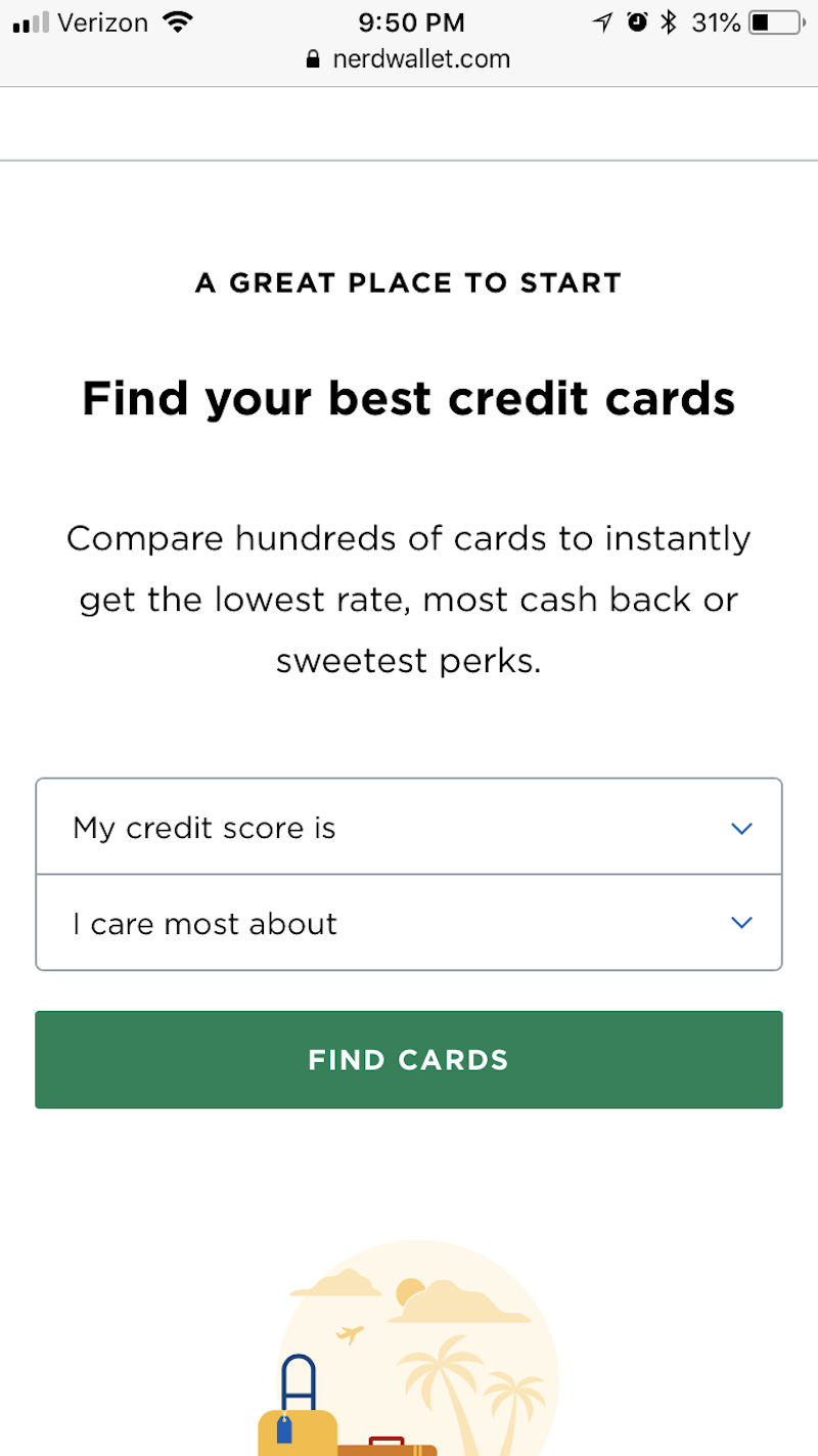
I’d be interested to see how the NerdWallet website does, in that case. While I do love the look of this, they have violated a number of these sizing and styling suggestions:
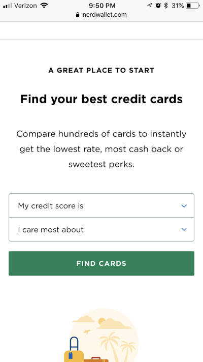
Having looked at this a few times now, I do think the choice of a smaller-sized font for the all-caps header is an odd choice. My eyes are instantly drawn to the larger, bolder text beneath the main header. So, I think there is something to MIT’s research.
Flywheel Sports, on the other hand, does a great job of exemplifying this point.
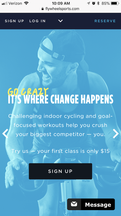
There’s absolutely no doubt where the visitors’ attention needs to go: to the eye-catching header. It’s in all caps, it’s larger than all the other text on the page, and, although the font is incredibly basic, its infusion with a custom handwritten-style type looks really freaking cool here. I think the only thing I would fix here is the contrast between the white and yellow fonts and the blue background.
Just remember: this only applies to the sizing (and styling) of header text. If you want to keep large bodies of text readable, stick to the aforementioned sizing best practices.
2. Color And Contrast
Color, in general, is an important element in web design. There’s a lot you can convey to visitors by choosing the right color palette for designs, images and, yes, your text. But it’s not just the base color of the font that matters, it’s also the contrast between it and the background on which it sits (as evidenced by my note above about Flywheel Sports).
For some users, a white font on top of a busy photo or a lighter background may not pose too much of an issue. But “too much” isn’t really acceptable in web design. There should be no issues users encounter when they read text on a website, especially from an already compromised view of it on mobile.
Which is why color and contrast are top considerations you have to make when styling typography for mobile.
The Web Content Accessibility Guidelines (WCAG) has clear recommendations regarding how to address color contrast in section 1.4.3. At a minimum, the WCAG suggests that a contrast of 4.5 to 1 should be established between the text and background for optimal readability. There are a few exceptions to the rule:
- Text sized using 18-point or a bold 14-point only needs a contrast of 3 to 1.
- Text that doesn’t appear in an active part of the web page doesn’t need to abide by this rule.
- The contrast of text within a logo can be set at the designer’s discretion.
If you’re unsure of how to establish that ratio between your font’s color and the background upon which it sits, use a color contrast checking tool like WebAIM.
The one thing I would ask you to be mindful of, however, is using opacity or other color settings that may compromise the color you’ve chosen. While the HEX color code will check out just fine in the tool, it may not be an accurate representation of how the color actually displays on a mobile device (or any screen, really).
To solve this problem and ensure you have a high enough contrast for your fonts, use a color eyedropper tool built into your browser like the ones for Firefox or Chrome. Simply hover the eyedropper over the color of the background (or font) on your web page, and let it tell you what the actual color code is now.
Here is an example of this in action: Dollar Shave Club.
This website has a rotation of images in the top banner of the home page. The font always remains white, but the background rotates.


Based on what we know now, the purple is probably the only one that will pass with flying colors. However, for the purposes of showing you how to work through this exercise, here is what the eyedropper tool says about the HEX color codes for each of the backgrounds:
- Grey: #9a9a9a
- Beige/taupe: #ffd0a8
- Purple: #4c2c59.
Here is the contrast between these colors and the white font:
- Grey: 2.81 to 1
- Beige/taupe: 1.42 to 1
- Purple: 11.59 to 1.
Clearly, the grey and beige backgrounds are going to lend themselves to a very poor experience for mobile visitors.
Also, if I had to guess, I’d say that “Try a risk-free Starter Set now.” is only a 10-point font (which is only about 13 pixels). So, the size of the font is also working against the readability factor, not to mention the poor choice of colors used with the lighter backgrounds.
The lesson here is that you should really make some time to think about how color and contrast of typography will work for the benefit of your readers. Without these additional steps, you may unintentionally be preventing visitors from moving forward on your site.
3. Tracking
Plain and simple: tracking in mobile web design needs to be used in order to control density. The standard recommendation is that there be no more than between 30 and 40 characters to a line. Anything more or less could affect readability adversely.
While it does appear that Dove is pushing the boundaries of that 40-character limit, I think this is nicely done.
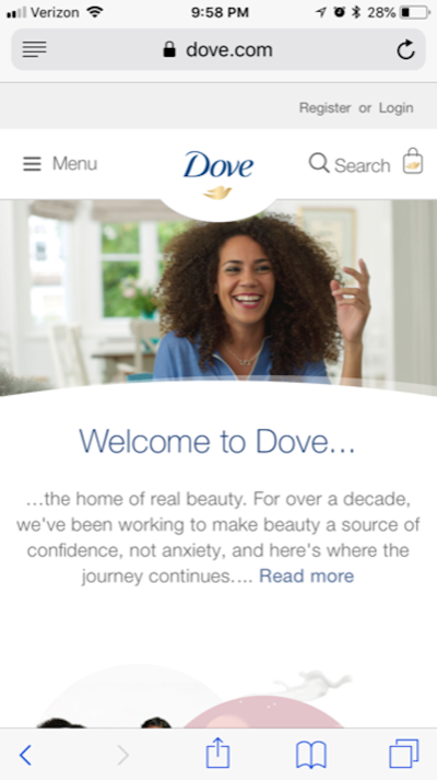
The font is so simple and clean, and the tracking is evenly spaced. You can see that, by keeping the amount of words on a line relegated to the recommended limits, it gives this segment of the page the appearance that it will be easy to read. And that’s exactly what you want your typography choices to do: to welcome visitors to stop for a brief moment, read the non-threatening amount of text, and then go on their way (which, hopefully, is to conversion).
4. Leading
According to the NNG, content that appears above the fold on a 30-inch desktop monitor equates to five swipes on a 4-inch mobile device. Granted, this data is a bit old as most smartphones are now between five and six inches:

Even so, let’s say that equates to three or four good swipes of the smartphone screen to get to the tip of the fold on desktop. That’s a lot of work your mobile visitors have to do to get to the good stuff. It also means that their patience will already be wearing thin by the time they get there. As the NNG pointed out, a mobile session, on average, usually lasts about only 72 seconds. Compare that to desktop at 150 seconds and you can see why this is a big deal.
This means two things for you:
- You absolutely need to cut out the excess on mobile. If this means creating a completely separate and shorter set of content for mobile, do it.
- Be very careful with leading.
You’ve already taken care to keep optimize your font size and width, which is good. However, too much leading and you could unintentionally be asking users to scroll even more than they might have to. And with every scroll comes the possibility of fatigue, boredom, frustration, or distraction getting in the way.
So, you need to strike a good balance here between using line spacing to enhance readability while also reigning in how much work they need to do to get to the bottom of the page.
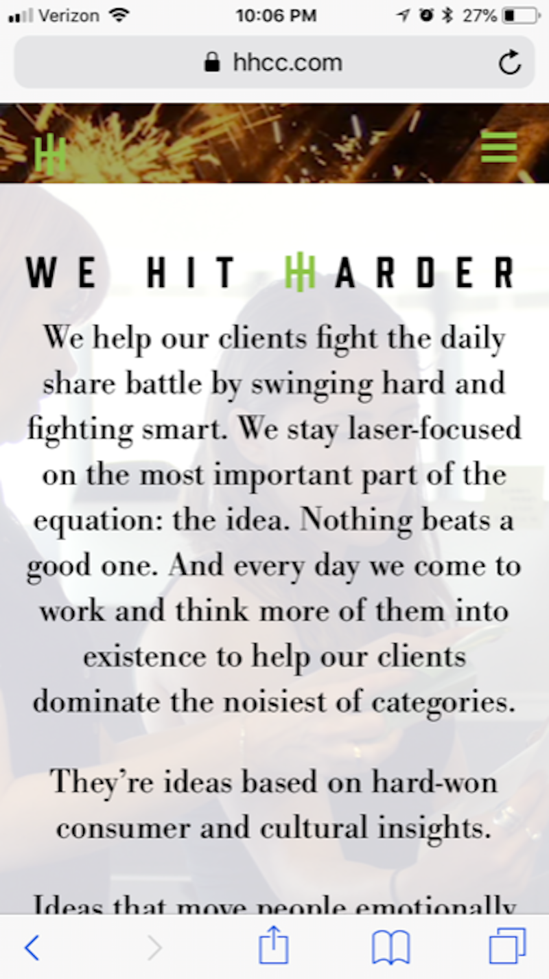
The Hill Holliday website isn’t just awesome inspiration on how to get a little “crazy” with mobile typography, but it also has done a fantastic job in using leading to make larger bodies of text easier to read:

Different resources will give you different guidelines on how to create spacing for mobile devices. I’ve seen suggestions for anywhere between 120% to 150% of the font’s point size. Since you also need to consider accessibility when designing for mobile, I’m going to suggest you follow WCAG’s guidelines:
- Spacing between lines needs to be 1.5 (or 150%, whichever ratio works for you).
- Spacing between paragraphs then needs to be 2.5 (or 250%).
At the end of the day, this is about making smart decisions with the space you’re given to work with. If you only have a minute to hook them, don’t waste it with too much vertical space. And don’t turn them off with too little.
5. Acceptable Fonts
Before I break down what makes for an acceptable font, I want to first look at what Android’s and Apple’s typeface defaults are. I think there’s a lot we can learn just by looking at these choices:
Android
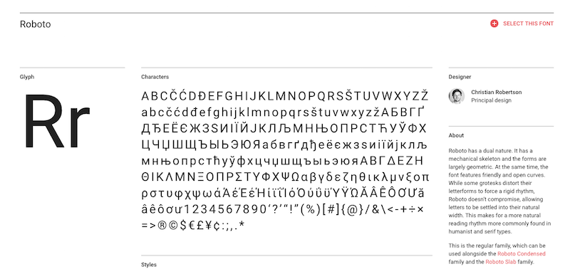
Google uses two typefaces for its platforms (both desktop and mobile): Roboto and Noto. Roboto is the primary default. If a user visits a website in a language that doesn’t accept Roboto, then Noto is the secondary backup.
This is Roboto:

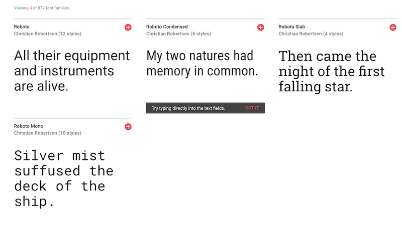
It’s also important to note that Roboto has a number of font families to choose from:
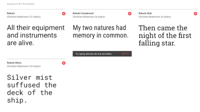
As you can see, there are versions of Roboto with condensed kerning, a heavier and serifed face as well as a looser, serif-like option. Overall, though, this is just a really clean and simply stylized typeface. You’re not likely to stir up any real emotions when using this on a website, and it may not convey much of a personality, but it’s a safe, smart choice.
Apple
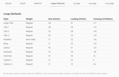
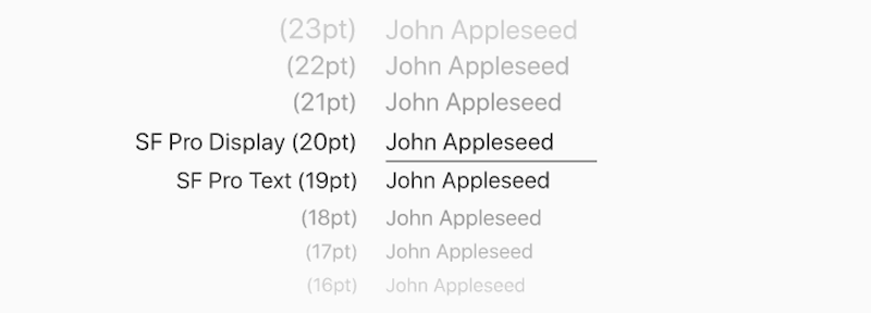
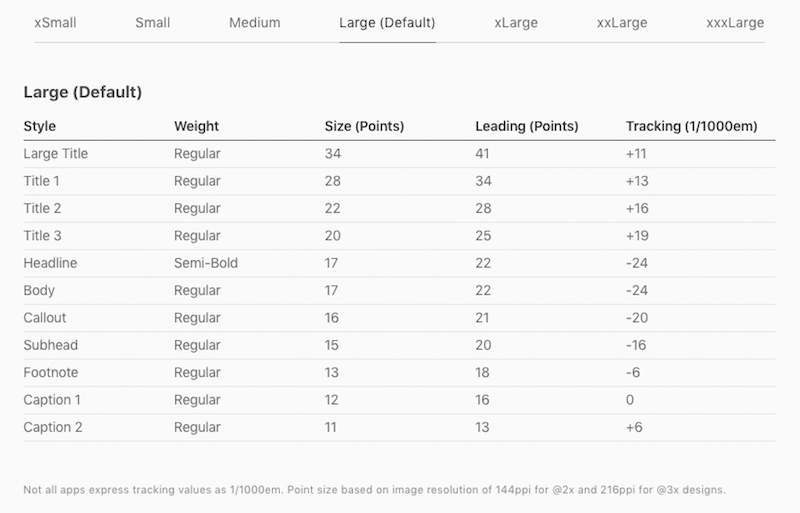
Apple has its own set of typography guidelines for iOS along with its own system typeface: San Francisco.

For the most part, what you see is what you get with San Francisco. It’s just a basic sans serif font. If you look at Apple’s recommended suggestions on default settings for the font, you’ll also find it doesn’t even recommend using bold stylization or outlandish sizing, leading or tracking rules:
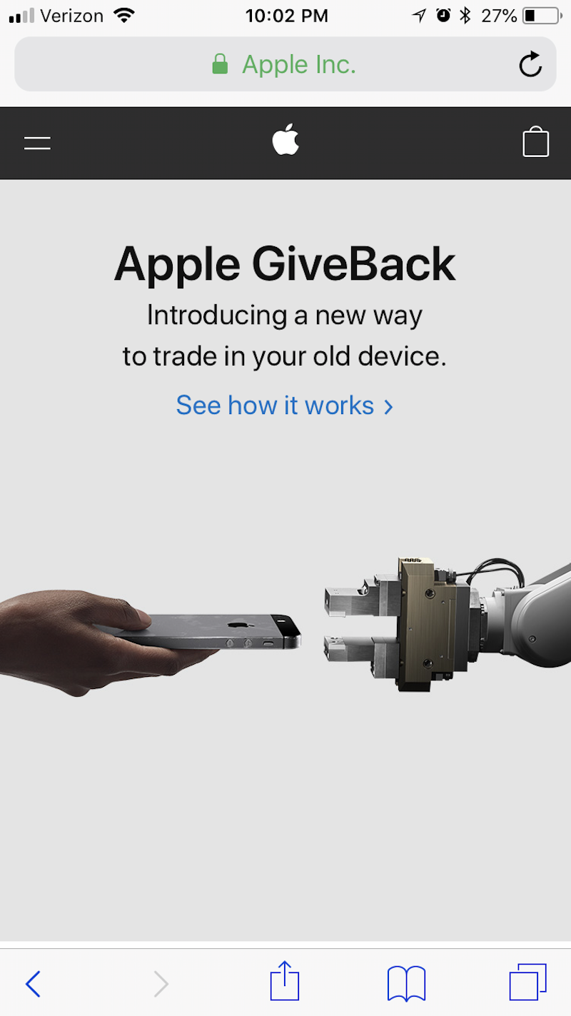
Like with pretty much everything else Apple does, the typography formula is very basic. And, you know what? It really works. Here it is in action on the Apple website:
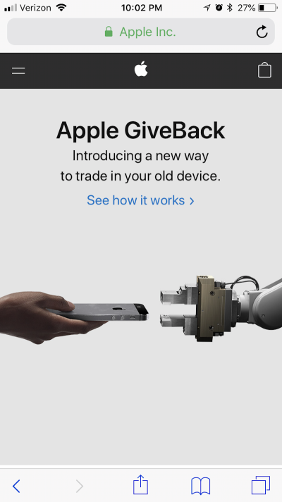
Much like Google’s system typeface, Apple has gone with a simple and classic typeface. While it may not help your site stand out from the competition, it will never do anything to impair the legibility or readability of your text. It also would be a good choice if you want your visuals to leave a greater impact.
My Recommendations
And, so, this now brings me to my own recommendations on what you should use in terms of type for mobile websites. Here’s the verdict:
- Don’t be afraid to start with a system default font. They’re going to be your safest choices until you get a handle on how far you can push the limits of mobile typography.
Use only a sans serif or serif font. If your desktop website uses a decorative or handwritten font, ditch it for something more traditional on mobile.
That said, you don’t have to ignore decorative typefaces altogether. In the examples from Hill Holliday or Flywheel Sports (as shown above), you can see how small touches of custom, non-traditional type can add a little flavor.
Never use more than two typefaces on mobile. There just isn’t enough room for visitors to handle that many options visually.
Make sure your two typefaces complement one another. Specifically, look for faces that utilize a similar character width. The design of each face may be unique and contrast well with the other, but there should still be some uniformity in what you present to mobile visitors’ eyes.
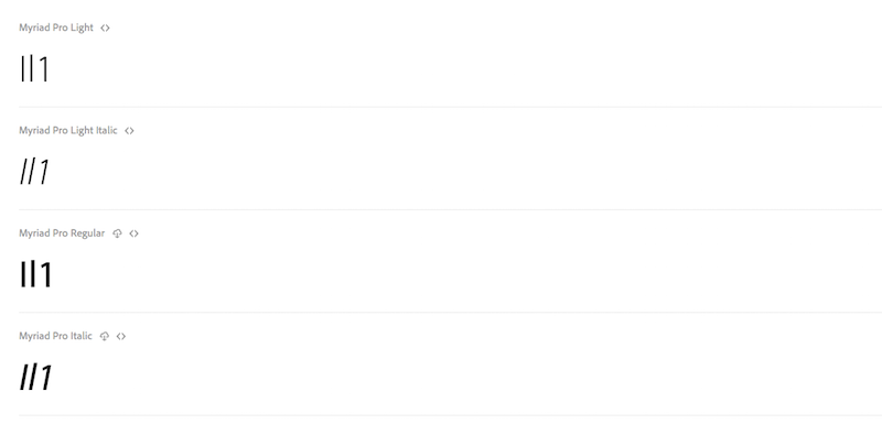
Avoid typefaces that don’t have a distinct set of characters. For instance, compare how the uppercase “i”, lowercase “l” and the number “1” appear beside one another. Here’s an example of the Myriad Pro typeface from the Typekit website:

Myriad Pro’s typeface in action. (Source: Typekit) (Large preview) While the number “1” isn’t too problematic, the uppercase “i” (the first letter in this sequence) and the lowercase “l (the second) are just too similar. This can create some unwanted slowdowns in reading on mobile.
Also, be sure to review how your font handles the conjunction of “r” and “n” beside one another. Can you differentiate each letter or do they smoosh together as one indistinguishable unit? Mobile visitors don’t have time to stop and figure out what those characters are, so make sure you use a typeface that gives each character its own space.
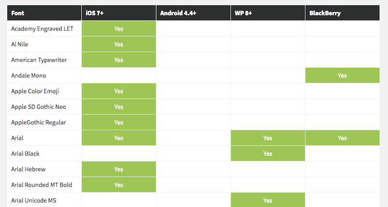
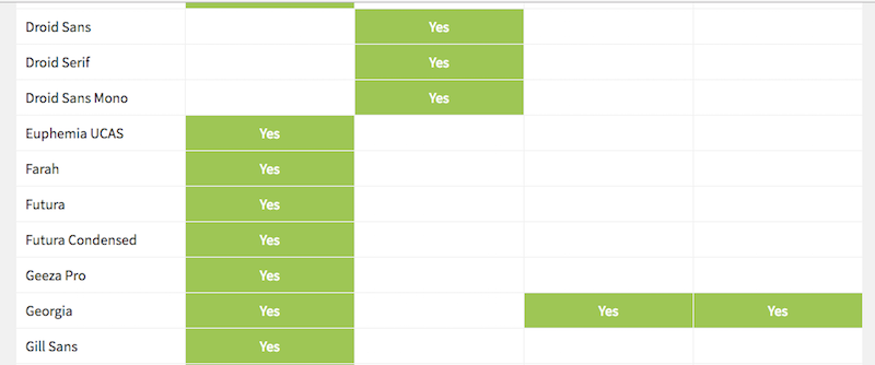
Use fonts that are compatible across as many devices as possible. Your best bets will be: Arial, Courier New, Georgia, Tahoma, Times New Roman, Trebuchet MS and Verdana.

A list of system default typefaces for various mobile devices. (Source: tinytype) (Large preview) 
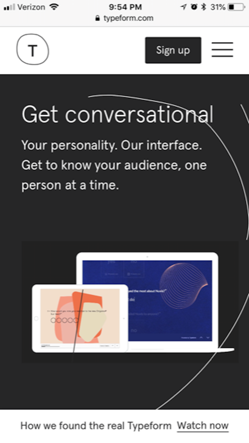
Another view of the table that includes some Android-supported typefaces. (Source: tinytype) (Large preview) I think the Typeform website is a good example of one that uses a “safe” typeface choice, but doesn’t prevent them from wowing visitors with their message or design.

Typeform’s striking typeface has nothing to do with the actual font. (Source: Typeform) (Large preview) It’s short, to the point, perfectly sized, well-positioned, and overall a solid choice if they’re trying to demonstrate stability and professionalism (which I think they are).
- When you’re feeling comfortable with mobile typography and want to branch out a little more, take a look at this list of the best web-safe typefaces from WebsiteSetup. You’ll find here that most of the choices are your basic serif and sans serif types. It’s definitely nothing exciting or earth-shattering, but it will give you some variation to play with if you want to add a little more flavor to your mobile type.
Wrapping Up
I know, I know. Mobile typography is no fun. But web design isn’t always about creating something exciting and cutting edge. Sometimes sticking to practical and safe choices is what will guarantee you the best user experience in the end. And that’s what we’re seeing when it comes to mobile typography.
The reduced amount of real estate and the shorter times-on-site just don’t lend themselves well to the experimental typography choices (or design choices, in general) you can use on desktop. So, moving forward, your approach will have to be more about learning how to reign it in while still creating a strong and consistent look for your website.
Further Reading
- The AI Dilemma In Graphic Design: Steering Towards Excellence In Typography And Beyond
- Picture Perfect: Meet Pixo, A Photo Editor For Your End Users
- A New Way To Reduce Font Loading Impact: CSS Font Descriptors
- FabUnit: A Smart Way To Control And Synchronize Typo And Space
 (lf, ra, yk, il, mrn)

