Pattern Library First: An Approach For Managing CSS

Email Newsletter
Weekly tips on front-end & UX.
Trusted by 182,000+ folks.


 Custom Web Forms for Angular, React, & Vue. Your backend.
 Celebrating 10 million developers
In this article, based on the talk that I gave at Smashing Conference in Toronto, I’m going to describe a method of working that I’ve adopted over the past two years that helps me to manage CSS across my projects.
I’ll be showing you how to use the pattern library tool Fractal, to manage your CSS on a component by component basis, while allowing you to use the tools you are already familiar with. While this serves as an introduction to Fractal, and why we have selected this particular pattern library, it is likely this way of working would transfer to other solutions.
Our Projects
My company has a couple of products — Perch and Perch Runway CMS and Notist, a software as a service application for public speakers. These products are quite different, especially given that Perch is a self-hosted system and Notist is SaaS, however, they both have a lot of user interface to develop. We also have all of the associated websites and documentation for these products, plus other things that we work on such as the 24 Ways website. After discovering Fractal two years ago, we have moved every new project — large and small — into Fractal.
Problems We Wanted To Solve
I began investigating pattern library solutions two years ago when I started work rebuilding the Perch UI for version 3. A feature of Perch is that the templates you create for the output of content on your website become the schema of the admin UI. This means that any fieldtype used in a template needs to be able to exist alongside any other fieldtype. We don’t know how our customers might combine these, and there are a huge number of possible combinations. It's also not a "website", and I didn't want to try and force the pattern library into something designed for organizing website patterns.
As Perch is self-hosted — people download it and host it on their own servers — we need to use the simplest tech stack possible in order to not place any additional barriers to entry in front of people, many of who are new to using a CMS. To add an extra level of fun, we support back to Internet Explorer 9, yet I intended to use a lot of Flexbox — as this was before Grid Layout shipped.
I was also keen to avoid using tools which came with a lot of relearning how we worked, and completely changing our process. Any additional tool or change to the way that you work on your projects brings with it new friction. You can solve one problem, but bring in a whole new set of problems if you make large changes to the way that you work. In our case, we were using Sass in a fairly limited way, and processing that using Gulp. None of our projects use a Javascript framework, we’re just writing HTML, CSS and JavaScript.
Fractal fit our needs perfectly. It is agnostic as to the way you develop or the tools you want to use. Importantly for our purposes, it didn’t assume we were building a website. The experiment was so successful that we found ourselves using Fractal for every project large or small, as it makes the process of working on CSS far more straightforward. Even small sites I create on my own often start life in Fractal, because there are more benefits than you might think in terms of working with a pattern library, and many of those benefits make as much sense for a team of one as a large team.
Before we think about how to develop using Fractal and why I think it makes sense for small projects as well as large ones, let’s take a look at how to get the environment set up.
Getting Started With Fractal
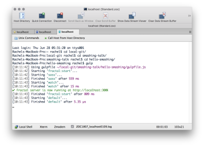
The most straightforward approach for working with Fractal is to go to the Fractal website and take a look at the Getting Started Guide. You will first need to install Fractal globally, you can then follow the steps listed here to create a new Fractal project.
With your new project installed, at the command line change into the folder you have just created and run the command:
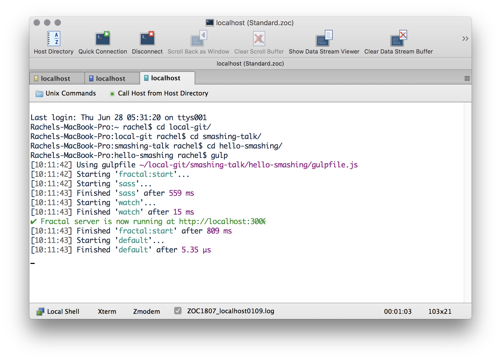
fractal start --syncThis will start up a little server at port 3000, so you should be able to go to https://localhost:3000 in a web browser and see your project.
Now that your project is up and running, open up the project folder in your favorite text editor and find the example component under components/example. You will find a config file and a file named example.hbs. The example.hbs template is the HTML of your component, you can add some more HTML to that and Fractal will automatically reload and display it. Change the file to:
<h1>This is my heading</h1>
<p>{{ text }}</p>
You should see the heading appear in the browser. The config file can be used to add content and otherwise configure your component. If you want to read your heading text out of that file then edit that file to look like the following example:
title: Example component
context:
    text: This is an example component!
    heading: My heading
Now change your example.hbs file to read in that text.
<h1>{{ heading }}</h1>
<p>{{ text }}</p>
Adding Additional Components
You can follow the pattern of the example component to add your own. At a minimum, you need a folder (the name of the component) and a .hbs file using the same name. You can add the config file if you want to set configuration options.
Components can be nested into folders to make it easier to locate particular components, and how you structure the folders is completely up to you.
Note: It is really easy to find yourself spending a lot of time worrying about how to name your components. In Fractal at least, renaming and also reorganizing components into folders is straightforward. You can rename or move them and Fractal will update to show the new structure. I find that often the ideal structure only becomes apparent as I’m developing so I don’t worry too much at the outset and then firm it up later.
Adding A CSS Workflow
So far, we are able to create HTML components as handlebars templates, and a config file to insert data, however, we haven’t added any CSS. Ideally, we want to add the CSS for each component into the same folder as the rest of the component files and then combine it all together.
I mentioned that Fractal makes very few assumptions about your workflow; due to this, it does far less out of the box than it might if it were forcing you down a particular way of working. However, we can fairly easily get Fractal working with a Gulp setup.
Combining Fractal, Sass, And Gulp
The following describes a minimal setup using Gulp and Sass to create a single output CSS file. Hopefully, you can follow this process to do anything else that you would normally do in Gulp. The key thing to note is that most of this is not Fractal specific, so once you get the Fractal part working you can add in anything else following the same patterns. If you are familiar with another build tool then it is likely that you could create a similar process; if you do, and are happy to share, let us know in the comments.
First some setup, the following will enable you to follow along with the code listed in this tutorial, the locations of your Sass files and output CSS might ultimately be different to mine. The key thing is that the output CSS file needs to be somewhere in the public folder.
- Inside the public folder in your Fractal install, add a folder named css.
- In the root folder of your Fractal, install add a folder assets inside which is a folder scss. Create a Sass file named global.scss inside that folder. Inside that file add the following line:
```
```@import "../../components/**/*.scss"; - Create a file named example.scss in your
examplecomponent directory. - Create gulpfile.js in the root of your Fractal project and add the below code.
'use strict';

const gulp         = require('gulp');
const fractal      = require('./fractal.js');
const logger       = fractal.cli.console;
const sass         = require('gulp-sass');
const sassGlob     = require('gulp-sass-glob');
const plumber      = require('gulp-plumber');
const notify       = require('gulp-notify');
const path         = require('path');

gulp.task('sass',function() {
    return gulp.src('assets/scss/**/*.scss')
    .pipe(customPlumber('Error running Sass'))
    .pipe(sassGlob())
    .pipe(sass())
    .pipe(gulp.dest('public/css'))
});

gulp.task('watch', ['sass'], function() {
   gulp.watch([
        'components/**/*.scss',
        'assets/scss/**/*.scss'
        ], ['sass']);
});

function customPlumber(errTitle) {
    return plumber({
        errorHandler: notify.onError({
            title: errTitle || "Error running Gulp",
            message: "Error: <%= error.message %>",
        })
    });
}

gulp.task('fractal:start', function(){
    const server = fractal.web.server({
        sync: true
    });
    server.on('error', err => logger.error(err.message));
    return server.start().then(() => {
        logger.success(`Fractal server is now running at ${server.url}`);
    });
});

gulp.task('default', ['fractal:start', 'sass', 'watch']);
I then install the dependencies listed at the top of the file. If you were to install those at the command line you would run:
npm install gulp gulp-sass gulp-sass-glob gulp-plumber gulp-notify
The sass function compiles the Sass from assets into a single file, and outputs it into the folder in public.
gulp.task('sass',function() {
return gulp.src('src/assets/scss/**/*.scss')
.pipe(customPlumber('Error running Sass'))
.pipe(sassGlob())
.pipe(sass())
.pipe(gulp.dest('public/css'))
});
I then create a watch function that will watch my Sass in assets and also that in individual components and compile it into the folder in public.
gulp.task('watch', ['sass'], function() {
   gulp.watch([
'components/**/*.scss',
'assets/scss/**/*.scss'
], ['sass']);
});
That’s my CSS building. I now want to make it so that I can run gulp and it will kick off the watching of the CSS file as well as starting fractal. I do this by creating a gulp task to run the fractal start command.
gulp.task('fractal:start', function(){
const server = fractal.web.server({
sync: true
});
server.on('error', err => logger.error(err.message));
return server.start().then(() => {
logger.success(Fractal server is now running at ${server.url});
});
});
Finally, I need to ensure that the Sass building and Fractal start run when I run gulp and the command line:
gulp.task('default', 'fractal:start', 'sass', 'watch');
That’s my completed gulpfile.js. If you add this into your default Fractal project, make sure the folders are in place for the paths mentioned. You should be able to go to the command line, run gulp, and Fractal will start.
We can test out our Sass by adding a variable in the global.scss file; you will need to add this above the line that includes the components so that the variable is available for those components.
$color1: rebeccapurple;Then in example.scss add a rule for the level 1 heading we added earlier:
h1 {
  color: $color1;
}
If everything is set up correctly, you should find you have a .css file in public/css which contains the rule:
h1 {
  color: rebeccapurple;
}
We need to do one more thing so that we can preview our components using the CSS we are building. We need to create a preview file, which will link in the stylesheet from the public folder.
Inside your components folder, create a file named _preview.hbs.
The preview file is essentially an HTML document, linking in our CSS and anything else you need to include. In the body is a tag {{ yield }}, and this is where a component will be placed.
<!doctype html>
<html lang="en">
<head>
	<meta charset="utf-8" />
	<title>Preview Layout</title>
	<meta name="viewport" content="width=device-width, initial-scale=1, shrink-to-fit=no">
	<link rel="stylesheet" href="{{ path '/css/global.css' }}">
</head>
<body>
	{{{ yield }}}
</body>
</html>Note: The public folder can also house any other assets that you need to display in components such as images, fonts and so on.
The Pattern Library As Source Of Truth
As we have seen, Fractal can build our CSS. In our projects, we make it so that Fractal is the only place we build and process CSS and other assets for the site. What this means is that our pattern library and site or application do not drift. Drift happens after you deploy the site if people start editing the CSS of the site and not bringing those changes back to the pattern library. If you can make the pattern library the place where CSS is processed then changes have to start there — which prevents drift between the live site and library.
We build everything in Fractal and then copy those public assets over to the live sites to be deployed. In addition to preventing drift between the systems, it also makes managing CSS in source control much easier. When multiple people work on one CSS file, merge conflicts can be reasonably hard to deal with. With people working on individual components in the pattern library, you can usually avoid two people committing changes to the same file at once, and if they do it is only a small file to sort out and not all of your CSS.
Using A Pattern Library First Approach For Managing Fallbacks
I have found that working pattern library first makes dealing with fallbacks in your code far more straightforward and less overwhelming than attempting to fix up a complete site or application at once. It also allows us to concentrate on the best possible case, and be creative with new techniques, rather than limit what we do due to being worried about how we will get it to work well in non-supporting browsers.
We can look at a simple case of a media object component to see how that might work. To follow along, create a media folder inside components in Fractal, and add the files media.hbs and media.scss.
Start With Good Markup
Your starting point should always be well-structured markup. In the pattern library, it may be that you will use this component with a range of markup, for example, you could use a component with content marked up as a figure in one place and just with divs in another. Your content should, however, be structured in a way that makes sense and can be read from top to bottom.
This ensures that your content is accessible at a very basic level, but it also means you can take advantage of normal flow. Normal Flow is how browsers display your content by default, with block elements progressing one after the other in the block dimension and inline elements — such as words in a sentence — running along the inline axis. For a lot of content that is exactly what you want, and by taking advantage of normal flow rather than fighting against it you make your job far easier as you create your layout.
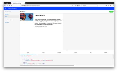
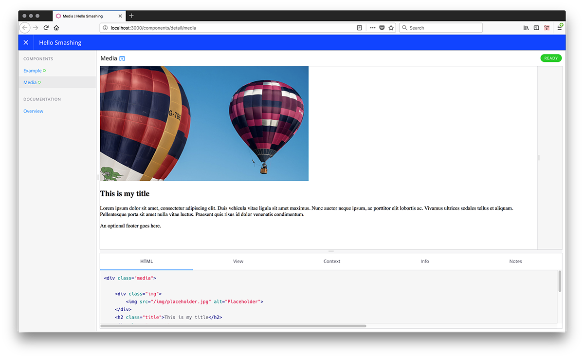
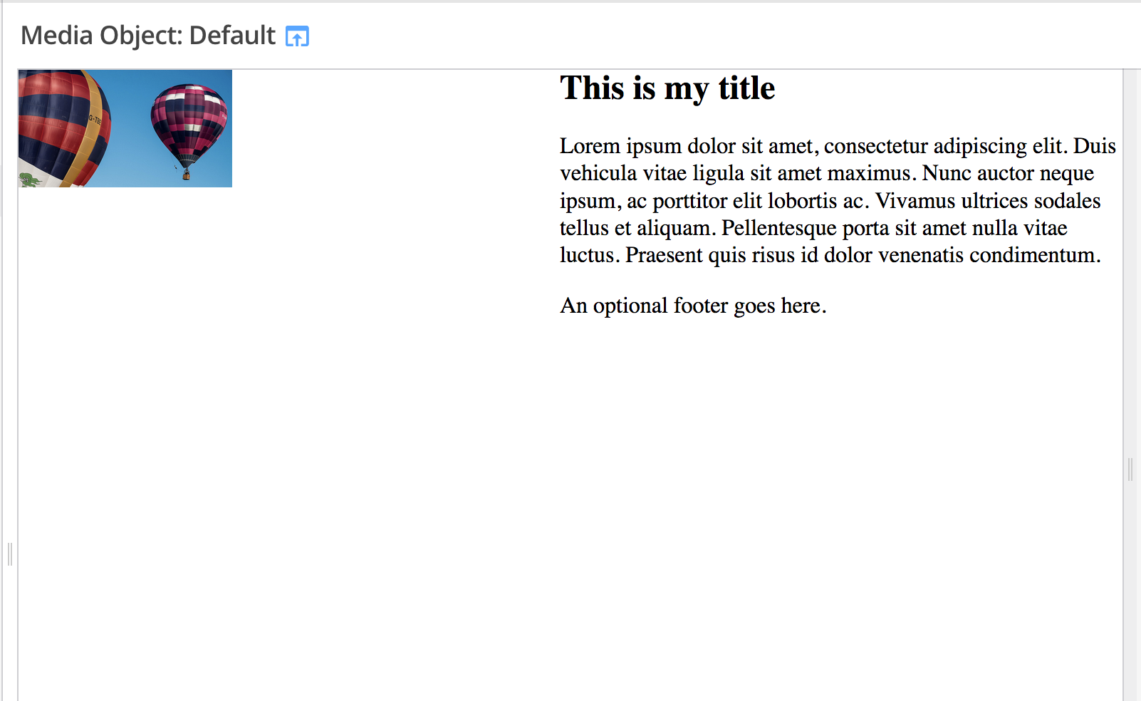
Therefore, my component has the following markup which I add to media.hbs.
<div class="media">

  <div class="img">
    <img src="/img/placeholder.jpg" alt="Placeholder">
  </div>
  <h2 class="title">This is my title</h2>
  <div class="content">
      <p>Lorem ipsum dolor sit amet, consectetur adipiscing elit. Duis vehicula vitae ligula sit amet maximus. Nunc auctor neque ipsum, ac porttitor elit lobortis ac. Vivamus ultrices sodales tellus et aliquam. Pellentesque porta sit amet nulla vitae luctus. Praesent quis risus id dolor venenatis condimentum.</p>
  </div>
  <div class="footer">
    An optional footer goes here.
  </div>
</div>
You can see how this then displays inside Fractal:

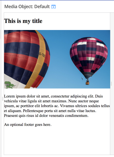
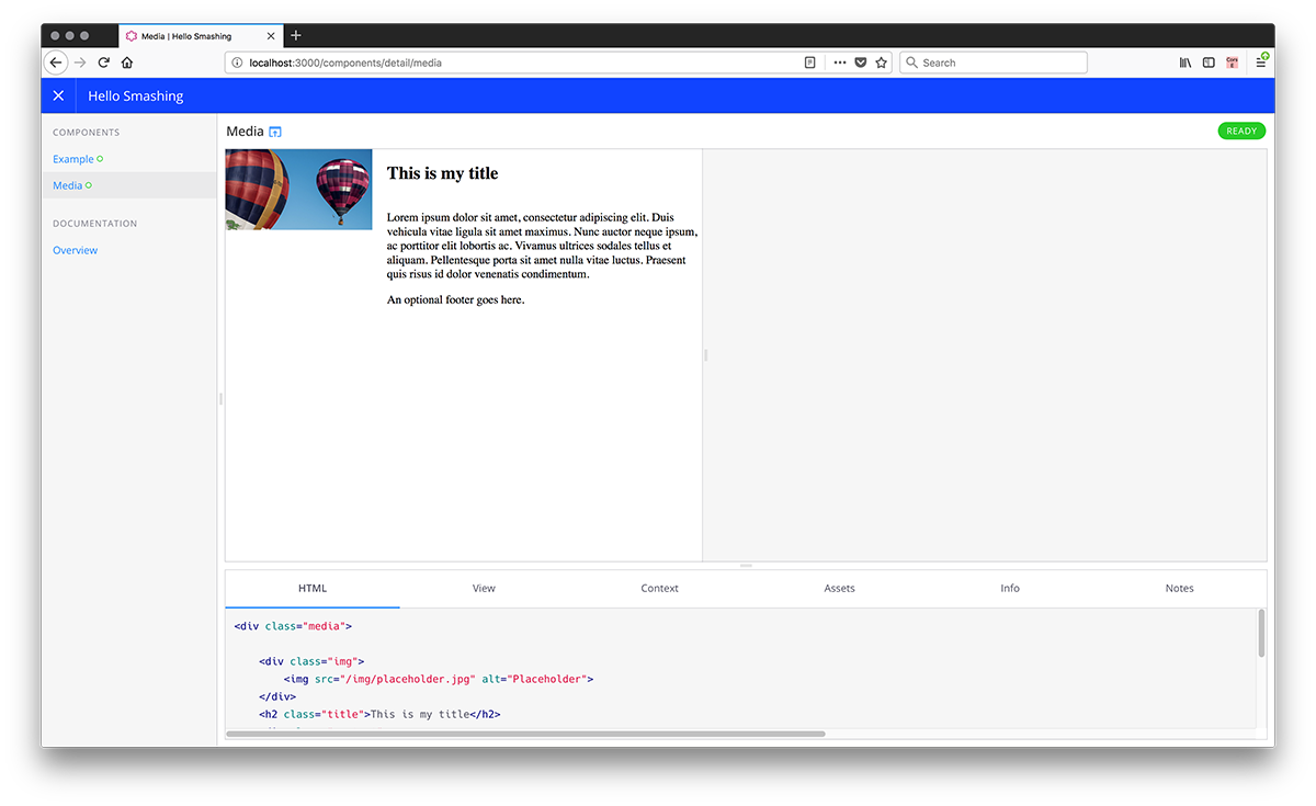
Once I’ve got the markup that I want, I am going to work on the desktop display that I have in mind. I’m going to use CSS Grid Layout and the grid-template-areas method of doing so. Add the following to media.scss.
img { max-width: 100%; }

.media > .title {
  grid-area: title;
}

.media > .img {
  grid-area: img;
}

.media > .content {
  grid-area: bd;
}

.media > .footer {
  grid-area: ft;
}

.media {
  margin-bottom: 2em;
  display: grid;
  grid-column-gap: 20px;
  grid-template-columns: 200px 3fr;
  grid-template-areas:
    "img title"
    "img bd"
    "img ft";
  }
We now have a simple media object layout:
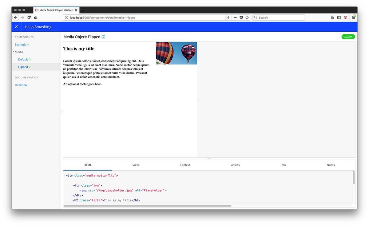
Something you can do in Fractal is to add variations of a component. You might want to flip the media object so that the image is on the right.
Now add the CSS to media.scss in order to flip the layout:
.media.media-flip {
grid-template-columns: 3fr 200px ;
grid-template-areas:
  "title img"
  "bd img"
  "ft img";
  }
There are two ways to create variants: file-based and configuration based. File-based is simplest and is also useful if your variant has different markup. To create a file-based variant, make a copy of your component in the media folder with the name media --flip.hbs (that’s two dashes in the filename).
This component should have identical markup with the class media-flip added to the first line, and you will then be able to see both versions.
<div class="media media-flip">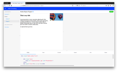
Alternately, as in this case all we need to do is add a class, you can create a variant using a config file.
If you want to do this, remove your variant file, and instead add a config file named media.config.json containing the following code:
{
    "title": "Media Object",
    "context": {
        "modifier": "default"
    },
    "variants": [
        {
            "name": "Flipped",
            "context": {
                "modifier": "flip"
            }
        }
    ]
}
Then modify the first line of media.hbs as follows:
<div class="media media-{{ modifier }}">
Note: You can add as many variants as you like (take a look at the documentation for variants to read more).
We might now think about adding some CSS to change the layout based on screen size. Wrapping the layout we have created in a media query and above that creating a single column layout for smaller devices.
img {
  max-width: 100%;
}

.media > .title {
  grid-area: title;
}

.media > .img {
  grid-area: img;
}

.media > .content {
  grid-area: bd;
}

.media > .footer {
  grid-area: ft;
}

.media {
  display: grid;
  grid-column-gap: 20px;
  grid-template-areas:
    "title"
    "img"
    "bd"
    "ft";
  }

  @media (min-width: 600px) {
    .media {
      margin-bottom: 2em;
      display: grid;
      grid-column-gap: 20px;
      grid-template-columns: 200px 3fr;
      grid-template-areas:
        "img title"
        "img bd"
        "img ft";
    }

    .media.media-flip {
      grid-template-columns: 3fr 200px ;
      grid-template-areas:
        "title img"
        "bd img"
        "ft img";
    }
}
Then, just as we manage the view for smaller devices within our component, we can manage the layout for older browsers which do not support grid.
In this case, I’m going to build a float-based fallback (this will work for pretty much any legacy browser). I’m only going to worry about it for wider screen sizes and leave the component displaying in normal flow for older mobile devices.
Just inside the media query, add the following CSS:
.media:after {
  content: "";
  display: table;
  clear: both;
}

.media > .media {
  margin-left: 160px;
  clear: both;
}

.media .img {
  float: left;
  margin: 0 10px 0 0;
  width: 150px;
}

.media.media-flip .img {
  float: right;
  margin: 0 0 0 10px;
}

.media > * {
  margin: 0 0 0 160px;
}

.media.media-flip > * {
  margin: 0 160px 0 0;
}
This should sort out the display in non-grid browsers. For browsers that do support grid, you don’t need to worry about floats, i.e. when the floated item becomes a grid item, the float is removed. What will be a problem are any margins. The layout in grid supporting browsers will now be all spaced out due to the extra margins.

This is where we can add a feature query, removing the margins if we know that our browser supports grid.
@supports(display: grid) {
  .media > *,
  .media.media-flip > * {
    margin: 0;
  }

  .media .img,
  .media.media-flip .img {
    width: auto;
    margin: 0;
  }

  .media:after {
    content: none;
  }
}
That’s our small component finished. While a simple example — and it might be argued that it’s one which doesn’t really need grid at all if you need to have a fallback — it demonstrates the approach I’m taking across all of my projects, large and small.
To get my CSS file into production, we can take the CSS file from the public folder and add that to our production site. You could even script this process to copy it over to your site folder as it builds.
Reduced Test Case First Development
Something I have discovered as a key benefit in working this way, is that it really does make the browser support piece of the puzzle easier. Not only is it easier to see what fallback CSS is being included with this component, but also if we are having problems with a browser, it makes it far easier to debug them.
When you are battling with a browser issue then the thing you will generally be told to do is create a reduced test case. Reduce the problem down to the smallest thing that exhibits the issue. A component in a pattern library is often very close to that reduced test case already. Certainly far closer than if you are trying to debug a problem while looking at your entire website.
In addition to making browser debugging easier, having your fallbacks included alongside the rest of the CSS makes it easier to remove the fallback code once it is no longer needed, it’s obvious this fallback code is for this component. I know that removing it won’t change the way anything else displays.
This ease of organizing our code is really why Fractal makes sense even in small projects. Given that we tend to use Gulp and Sass anyway (even on smaller projects), adding Fractal to the mix isn't a big overhead. We don't need to see it as only for our bigger projects, as even a small site might have a reasonable amount of CSS.
See The Code
I've created a GitHub Project which has all of the code mentioned in the article. I would suggest setting up Fractal as described in the article and then grabbing any bits - such as the gulpfile or preview layout, from my repository.
As an additional reference and to see some published Fractal projects, we have the published version of the Perch Pattern Library, and also the Pattern Library for 24 Ways (built by Paul Robert Lloyd), which you can take a look at. These are good examples of a non-website pattern library, and a more traditional one used for a site.
How Do You Manage CSS?
I really like this way of working; it allows me to write CSS in a straightforward, progressively enhanced way. Depending on the project, we may include far more tooling and processing of files. Or, I may be building a simple site in which case the setup will be pretty much as we have seen in this article — with some light processing of Sass. The fact that Fractal means we can have the same process for sites big and small, for web applications or websites. It means we can always work in a familiar way.
This works for us, and I hope this article might give you some things to experiment with. However, I would love to know the ways in which you and your team have approached managing CSS in your projects and the strengths and weaknesses of the approaches you have tried. I’d be especially interested in hearing from anyone who has developed a similar process using another pattern library solution. Add your experiences in the comments.
Further Reading
- CSS Blurry Shimmer Effect
- How To Draw Radar Charts In Web
- Recovering Deleted Files From Your Git Working Tree
- Building A Large-Scale Design System For The U.S. Government (Case Study)
 (il, mrn)

