So You Want to Persuade Users? Make Things Simple!

Email Newsletter
Weekly tips on front-end & UX.
Trusted by 182,000+ folks.
(This article is kindly sponsored by Adobe.) The persuasive design toolbox is filled with powerful tools based on psychology. These tools range from Cialdini’s set of six principles of persuasion to ten times that number of Persuasive Patterns. Presented with all these methods, it can be tempting to use all of them to cover all possible bases, using a shotgun approach, hoping that one will resonate with your target users.
However, applying persuasion principles and patterns in a haphazard manner just ends up being persuasive design clutter. Like user experience design, designing for everyone is designing for no one. Randomly thrown together persuasive techniques will also make users feel manipulated, not in control, making them abandon the site or experience. The key to persuading your users is to keep it simple: using focused persuasive techniques and tactics that will work for your users.
Persuasion Funnel
AIDA is an acronym used in marketing and advertising to describe the stages that a customer goes through in the purchase process. The stages of Attention, Interest, Desire and Action, generically follow a series of cognitive (thinking) and affective (feeling) stages culminating in a behavioral (doing e.g. purchase or trial) stage. This should sound familiar since this is what we do through design, especially persuasive design.
When it comes to persuasive design, users go through a few stages between Awareness and Action, and the design should guide them from one stage to the next. I don’t have a clever acronym for it (yet), but the stages the design has to take the users through are:
- Awareness
- Relevant
- Credible
- Usable
- Desirable
- Persuasive
- Action
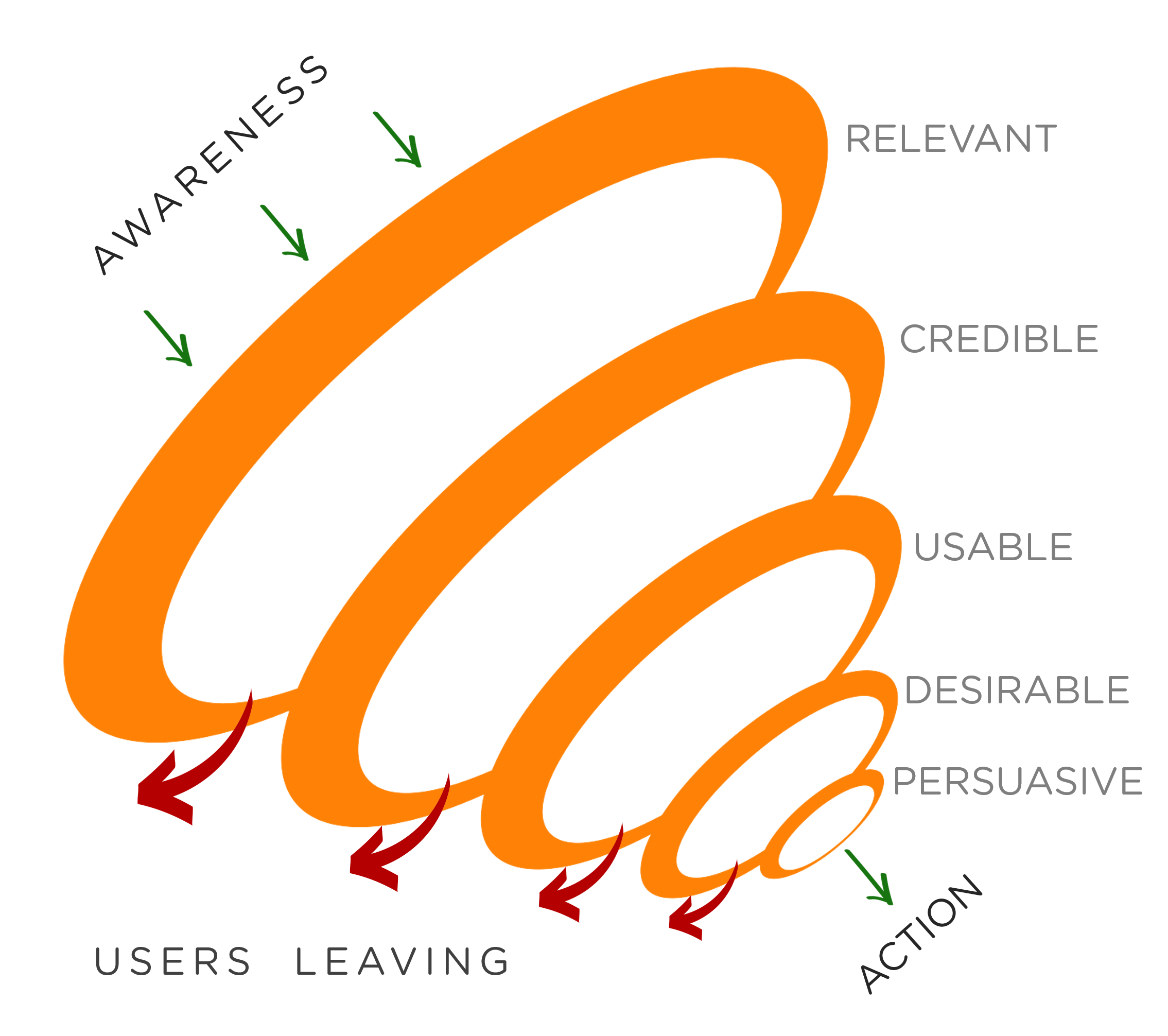
When users are contemplating an action (like booking a hotel room), they have to be aware of your site, app, or experience. Once they begin their journey on your site, they quickly evaluate the experience and either proceed to the next step or leave and go elsewhere. With fewer users continuing to subsequent stages, the number of users at each stage begins to resemble the shape of a funnel as shown above.
Let’s peek inside what could be going on in hypothetical users’ minds as they go through the experience of booking a hotel room for New Year’s Eve in Times Square, and some of the reasons they may drop off in each stage.
Awareness
“Hmmm… Where do I start? Hotel chains promise the lowest rate if we book directly with them, but I won’t be able to see other hotel options around Times Square. Hotel… Maybe I should try an online travel agency like Trivago (looks like the Trivago guy / Trivago girl advertising works!) to find a wider range of hotels. I’m going to also quickly Google it to see if there are other options.”
Users have to be aware of your site, app or experience to use it — Duh!
Relevant
“I found HotelTonight on Google. It looks like a great way to get rooms last minute, but not this far in advance — it’s not relevant to me.”
If your experience is not relevant to the task they are trying to accomplish, users will leave and try elsewhere. If your products or services are relevant, but not findable by the user, work on your navigation, search, and content layout to ensure your products and services are visible. Everything does not have to be one click away, but if the user gets the scent of information, or cues that make them think they are on the right path, they will follow the trail to that information.
Credible
“This design looks like it hasn’t been updated since the [GeoCities era](https://www.arngren.net/).
— Warning bells go off in head —
I’m out of here.”
Users are aware of many of the risks available online and look for trust indicators including a known brand and domain, secure site, professional design, real-world contact information and third-party certificates or badges. Incorporate these elements to create a comfort level for the user.
Usable
“I can’t figure out where things are in the navigation, and the search results had hundreds of unhelpful results. The homepage has nice big images, but that meant I had to scroll before I could see any real content.”
Usability is surprisingly still an issue with many sites. Follow User Experience best practices during design, and test with users to validate that the design is usable.
Desirable
“This reminds me of Craigslist — it is usable, but the design does not make me want to stay and use it. I’ll try that other hotel website that provides an immersive, interactive experience as I search for hotels.”
As much as we like to believe it, users’ decisions are not always rational, and very often driven by emotion, and we can address that through design. Usability is about making it work well; this is about making it beautiful as well.
In his book Emotional Design, Don Norman explains: “Attractive things do work better — their attractiveness produces positive emotions, causing mental processes to be more creative, more tolerant of minor difficulties.” Don talks about the three different aspects of design: visceral, behavioral, and reflective. Visceral design is about appearance, behavioral about the pleasure and effectiveness of use, and reflective design involves the rationalization and intellectualization of a product.
Persuasive
“Oh, Wow! That’s a long list of hotels, with plenty of availability for New Year’s Eve. There’s no real reason to book now. I’ll just come back to book after Thanksgiving…”
The user was interested, able, and willing, but the design did not motivate him to take intended action. Use relevant persuasion techniques that apply to your user to move them toward the desired action.
Action
“Oh, Wow! 65% of hotels are already booked in this area for New Year’s Eve. I better make a reservation now.. This looks like a nice hotel, and it also offers free cancellation - I’m reserving it now!”
The user who made it to this stage was interested, able, and willing, and the design nudged him to take intended action of making a reservation before leaving the site.
Persuasion is not about applying all available principles and patterns to your designs, but systematically identifying how you can address users’ barriers and motivators during each step of the journey, and guiding your users through the funnel to take the desired action.
The KISS Approach
Most of us are familiar with the acronym KISS: “Keep It Simple, Stupid,” a principle advocating simplicity as a key goal in design by avoiding unnecessary complexity. Let’s borrow that acronym for a 4-step approach to persuasive design.
Know The Right Behavior To Target
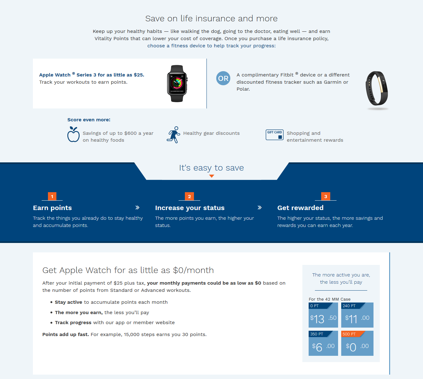
The first step is knowing the behavior you would like to target, and identifying the simplest action that can lead to that behavior change. Take the example of term life insurance companies who, to put it very bluntly, stand to benefit if their policyholders are healthy and don’t die while the policy is active. While those companies have a long-term ambitious goal of helping their policyholders lead healthy lives (mutually beneficial), that could be broken down into a simpler target behavior of walking 10,000 steps daily. This behavior is simple to understand, achieve, measure, and contributes to the long-term goal of healthier policyholders.
One such insurance company is offering new policyholders the latest Apple Watch for a low initial down payment ($25). The ongoing monthly payments can be waived each month that the policyholder leads an active lifestyle and exercises regularly (e.g. walks about 10,000 steps a day). About half the people who participated have achieved monthly goals, despite potential privacy implications.
Identify Barriers And Motivators
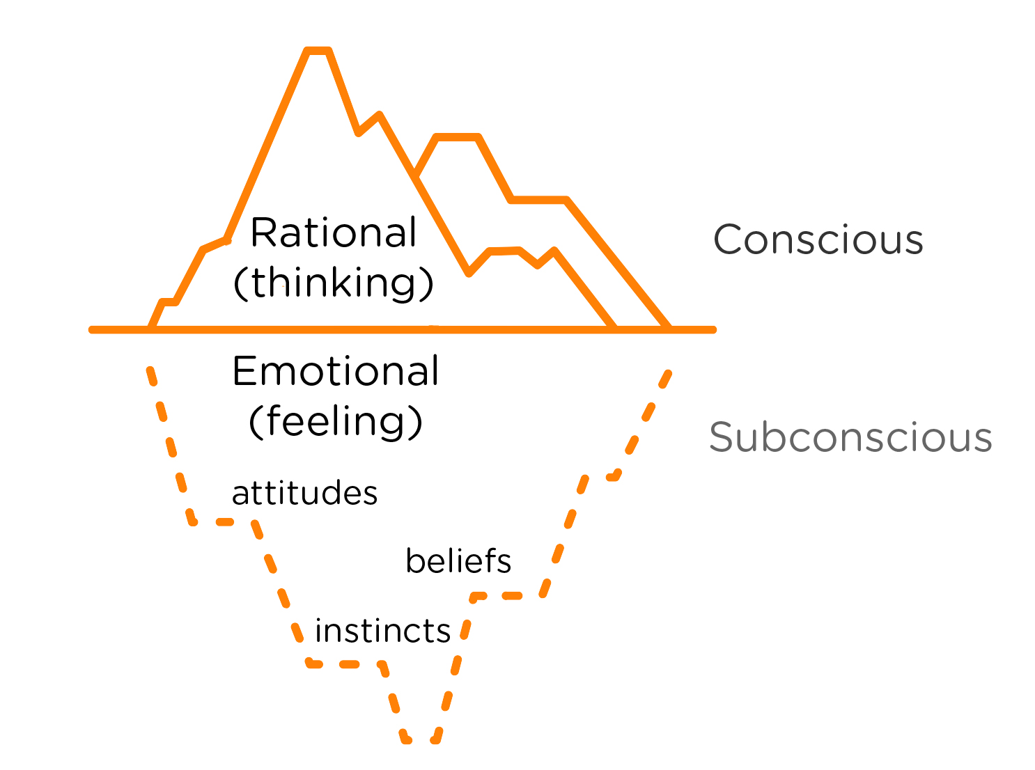
User research for persuasive design digs below the surface thinking level to the feeling level, and moves beyond the rational to the emotional level, as shown below. Getting to know your users at a deeper level will help you use psychology to focus your design to get users to engage in the target behavior identified above. User interviews that focus on users’ feelings and emotions are used to uncover barriers and motivators they consciously or subconsciously face while trying to achieve the target behavior. This helps us identify which blocks we need to weaken, and which motivators we should strengthen, through persuasive design techniques and tactics.
Simplify The Experience
Simplify the design experience of the first stages of the funnel, as users go through the mental verifications of relevancy, credibility, and usability of the experience. This includes making it easy for the user to find what they are looking for, credibility indicators like professional design, contact information, and third-party certificates or badges, as well as addressing usability issues. As Steve Krug put it very succinctly: “Don’t Make Me Think”.
Select Appropriate Triggers
Users who have made it this far in the process are interested in something you have to offer. As a designer, you have to nudge them to take the desired action. A good starting point is Robert Cialdini’s, six key principles of persuasion:
- Reciprocity
People are obliged to give something back in exchange for receiving something. - Scarcity
People want more of those things they can have less of. - Authority
People follow the lead of credible, knowledgeable experts. - Consistency
People like to be consistent with the things they have previously said or done. - Liking
People prefer to say yes to those that they like. - Consensus (Social Proof)
Especially when they are uncertain, people will look to the actions and behaviors of others to determine their own.
These principles can be applied through dozens of different persuasive design patterns and methods, some of which have been previously published on Smashing Magazine (patterns, triggers), or in the books listed in the resources at the end. As you may notice, many persuasive patterns are related to UI patterns, because part of persuasion is reducing friction and simplifying what the user needs to do at any given point in time. For example, the persuasive pattern of Limited Choice can be realized through UI Pattern of Progressive Disclosure.
Given that there are dozens of patterns and methods (depending on where you look), it is important to selectively use methods that will resonate with your users. Applying all design patterns in the hope of some working will result in persuasion clutter and overwhelm the user, possibly driving them away from your site.
Examining Persuasion
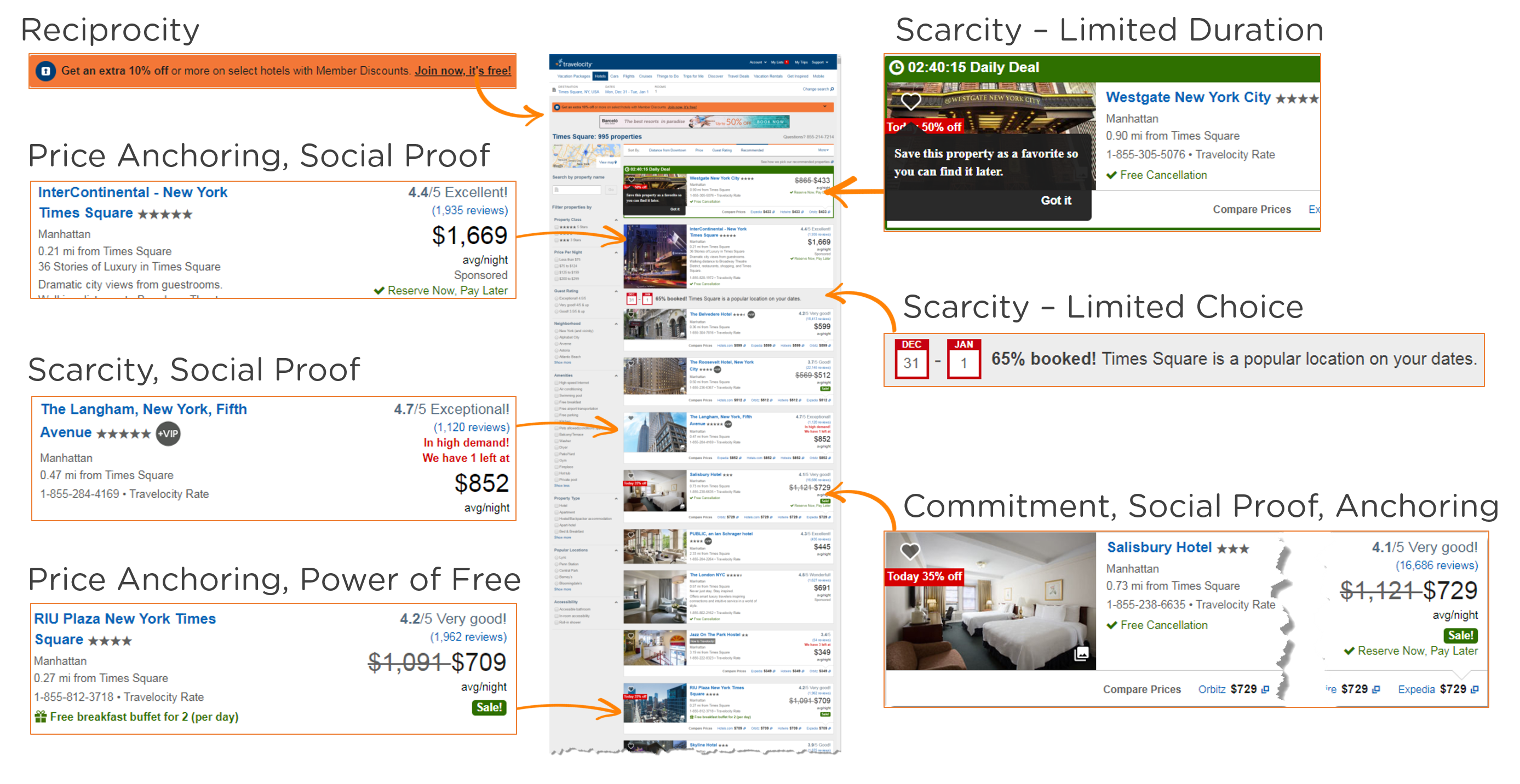
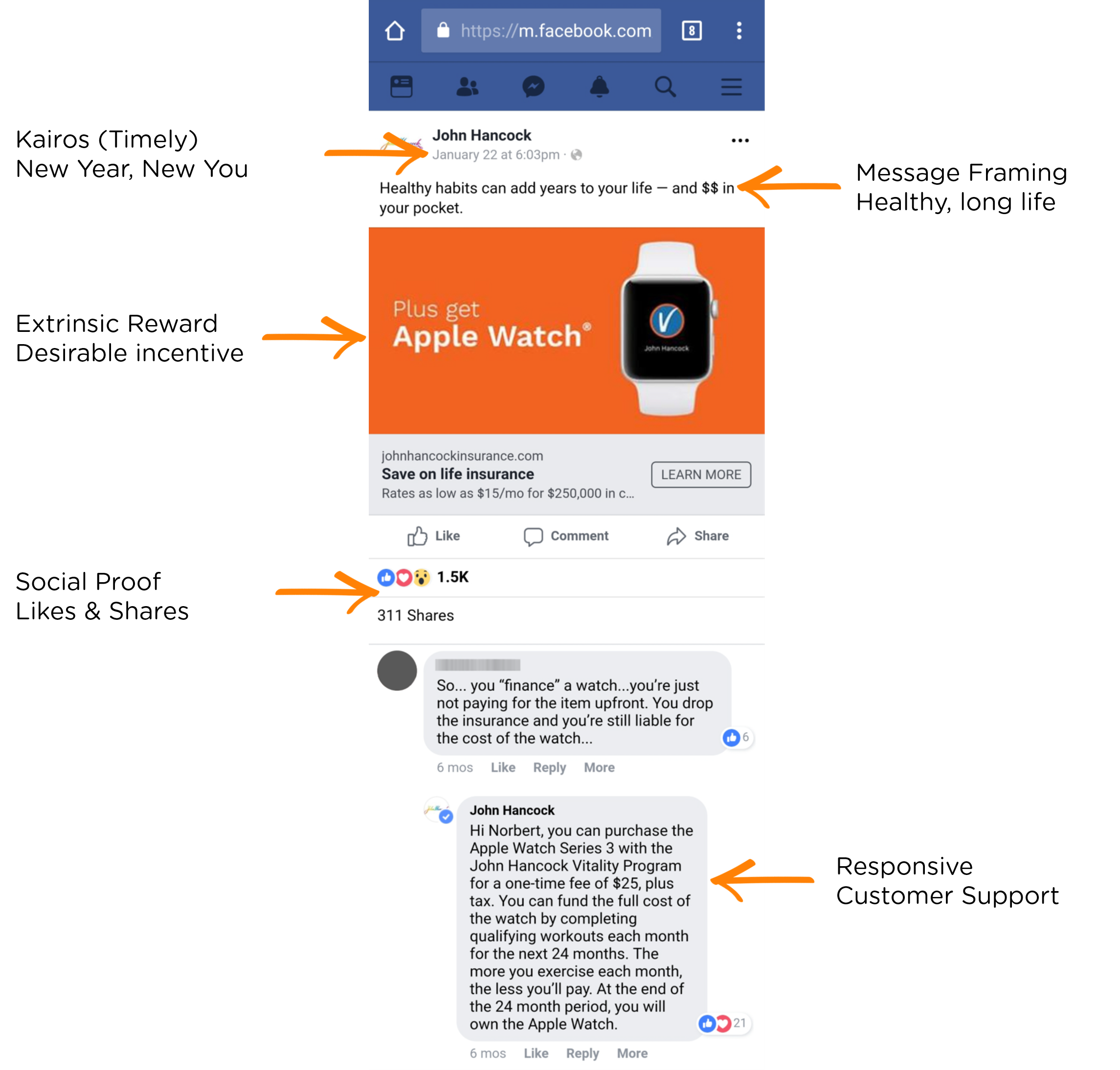
Let’s take a closer look at the earlier example of the term life insurance through the eyes of someone who is motivated (shopping for life insurance) and has the ability (to pay monthly life insurance cost). Like me, let’s assume that this user was made aware of this through a sponsored post on Facebook. During the stages of awareness and relevance, there are a few persuasive triggers as shown below that make the user click “Learn More”.
Clicking the “Learn More” button takes the user to a landing page that we will examine in sections for a persuasive flow:
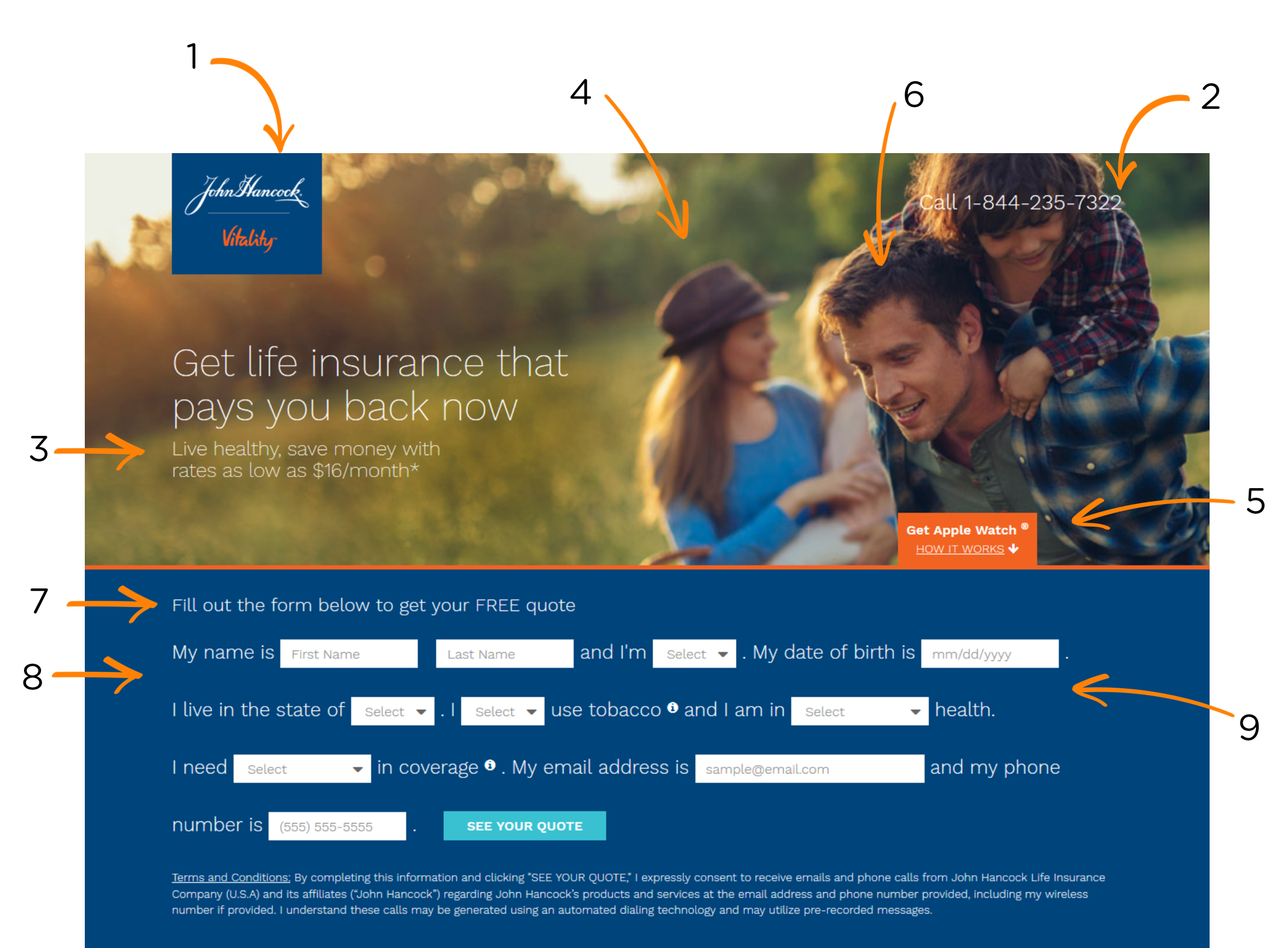
The user’s primary motivation in shopping for term life insurance is: “Protect Family,” and a big barrier is “High Cost.”
- Reputable Name (Credibility)
Even if you’ve not heard of this company, John Hancock is a famous person and the term used as a synonym in the United States for one's signature. The company reinforces it’s longevity later on the page. - Toll-free Number (Credibility)
Established and legitimate organization. - Message Framing
Live healthy, is also reinforced by the image of a family enjoying outdoors.“This life insurance product will help me live longer, lead a happy life like them, and protect my family in case something happens, and won’t cost much.”
- People Like Me & Association
This family looks like mine (or the family next door) — I can see myself in this wide-open field (visceral and reflective triggers). - Extrinsic Reward
An Apple watch for $25 — that’s a bonus here! - Visual Cueing
The person in focus (stereotypical breadwinner) has his gaze directly focused at the form below, leading the user to the next step. - Foot In The Door
This quote won’t cost anything — zip, nada. - Computer As A Social Actor
The information takes a conversational tone and format, not the usual form in rows and columns. The information seems reasonable to generate a quote. - Commitment & Consistency
By filling this quick, easy, and free form, chances are that the user will act consistently and proceed when it comes to the next step (application), unless there’s another barrier (price, benefits, etc.)
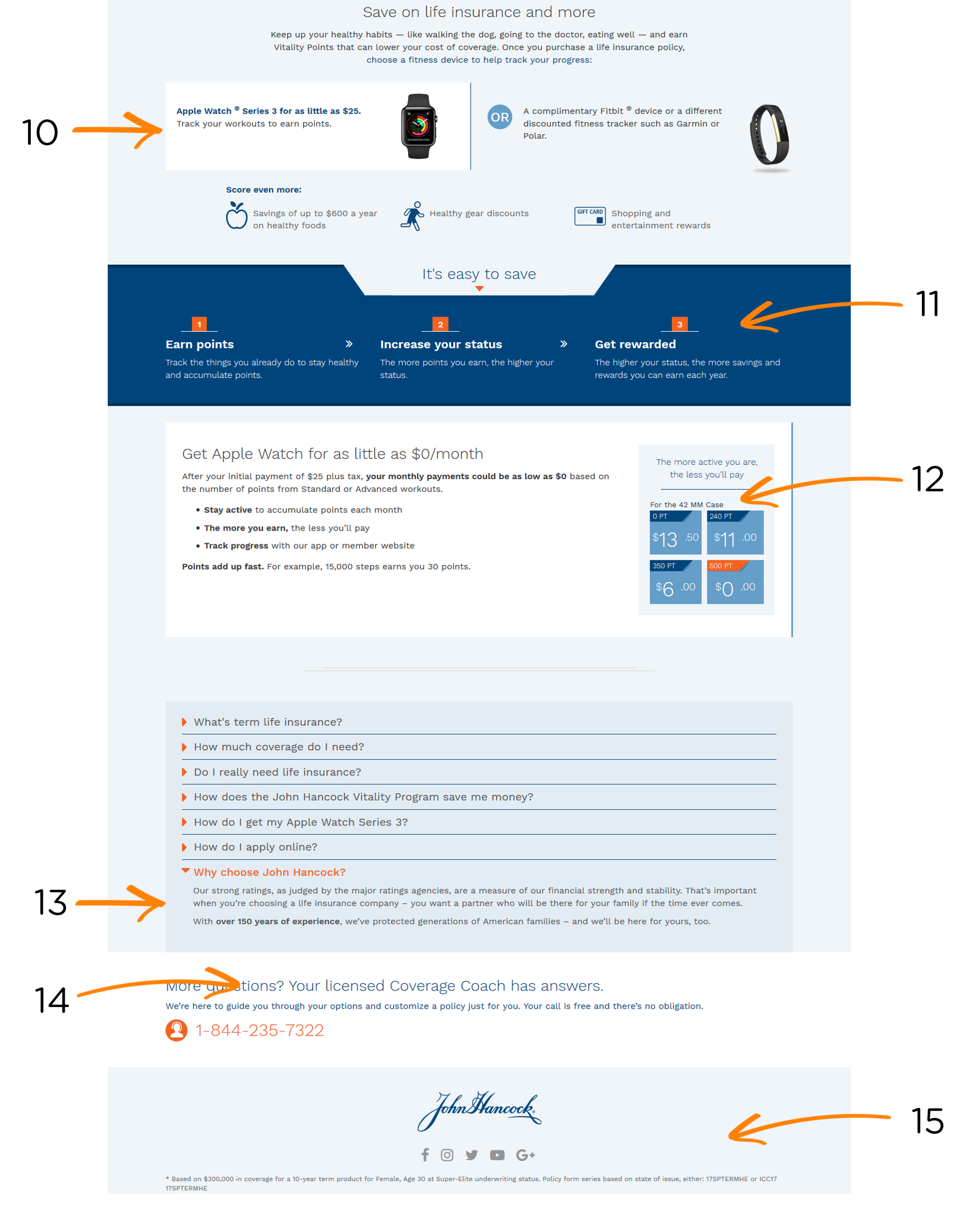
(Large preview) - Control
The user has a choice of devices. - Extrinsic Rewards
More rewards to be earned. - Control
The user controls how much they pay (the more active, the less you’ll pay). Also, in case the user does is not active, the cost is framed as just $13 (for a month). - Credibility
The company reinforces longevity and protector of America. - Authority
Licensed Coverage Coach (not just a sales agent). - Flow
One way to keep users in the flow and not get distracted is by disabling the social media links (which could raise the question: why display them?).
That took longer to dissect and read than it does in real life, where most of this is processed consciously and subconsciously in a few seconds, often with a glance or two.
Apart from the methods establishing credibility, the persuasive methods are used to strengthen the primary motivator of “Protect Family” (get insurance, extrinsic reward will help me live longer for my family), and weaken the barrier of “High Cost” (low monthly cost, additional savings, no ongoing watch payments). Note how they work together and don’t conflict or clutter the experience.
Conclusion
Persuasion is all around us, in our everyday lives. As designers, we can use ethical persuasive design methods to get users to take some action. With plenty of persuasive methods available, we have to be selective about what we use. We can use the KISS approach to keep it simple:
- Know the right behavior to target
- Identify barriers and motivators
- Simplify the experience
- Select appropriate triggers
KISS also reminds us to Keep It Simple & Straightforward, by selecting a simple target behavior, simplifying the experience for the user, and by applying persuasive techniques that will lead to the target behavior without overwhelming the user.
Other Resources
- “Neuro Web Design: What Makes Them Click?,” Susan Weinschenk
- “Design for the Mind: Seven Psychological Principles of Persuasive Design,” Victor S. Yocco
- “Influence: The Psychology of Persuasion, by Robert B. Cialdini
- “Persuasive Technology: Using Computers to Change What We Think and Do,” B.J. Fogg
- “Persuasive Design Patterns (scroll down the page),” UI-Patterns
- “Persuasive Patterns Card Deck,” UI-Patterns
This article is part of the UX design series sponsored by Adobe. Adobe XD tool is made for a fast and fluid UX design process, as it lets you go from idea to prototype faster. Design, prototype, and share — all in one app. You can check out more inspiring projects created with Adobe XD on Behance, and also sign up for the Adobe experience design newsletter to stay updated and informed on the latest trends and insights for UX/UI design.
Further Reading
- When Words Cannot Describe: Designing For AI Beyond Conversational Interfaces
- How Accessibility Standards Can Empower Better Chart Visual Design
- Five-Second Testing: Taking A Closer Look At First Impressions (Case Study)
- Modern Technology And The Future Of Language Translation