The Holy Grail Of Reusable Components: Custom Elements, Shadow DOM, And NPM

Email Newsletter
Weekly tips on front-end & UX.
Trusted by 182,000+ folks.
 Celebrating 10 million developers


 Custom Web Forms for Angular, React, & Vue. Your backend.
For even the simplest of components, the cost in human-labour may have been significant. UX teams do usability testing. An array of stakeholders have to sign off on the design.
Developers conduct AB tests, accessibility audits, unit tests and cross-browser checks. Once you’ve solved a problem, you don’t want to repeat that effort. By building a reusable component library (rather than building everything from scratch), we can continuously utilize past efforts and avoid revisiting already solved design and development challenges.
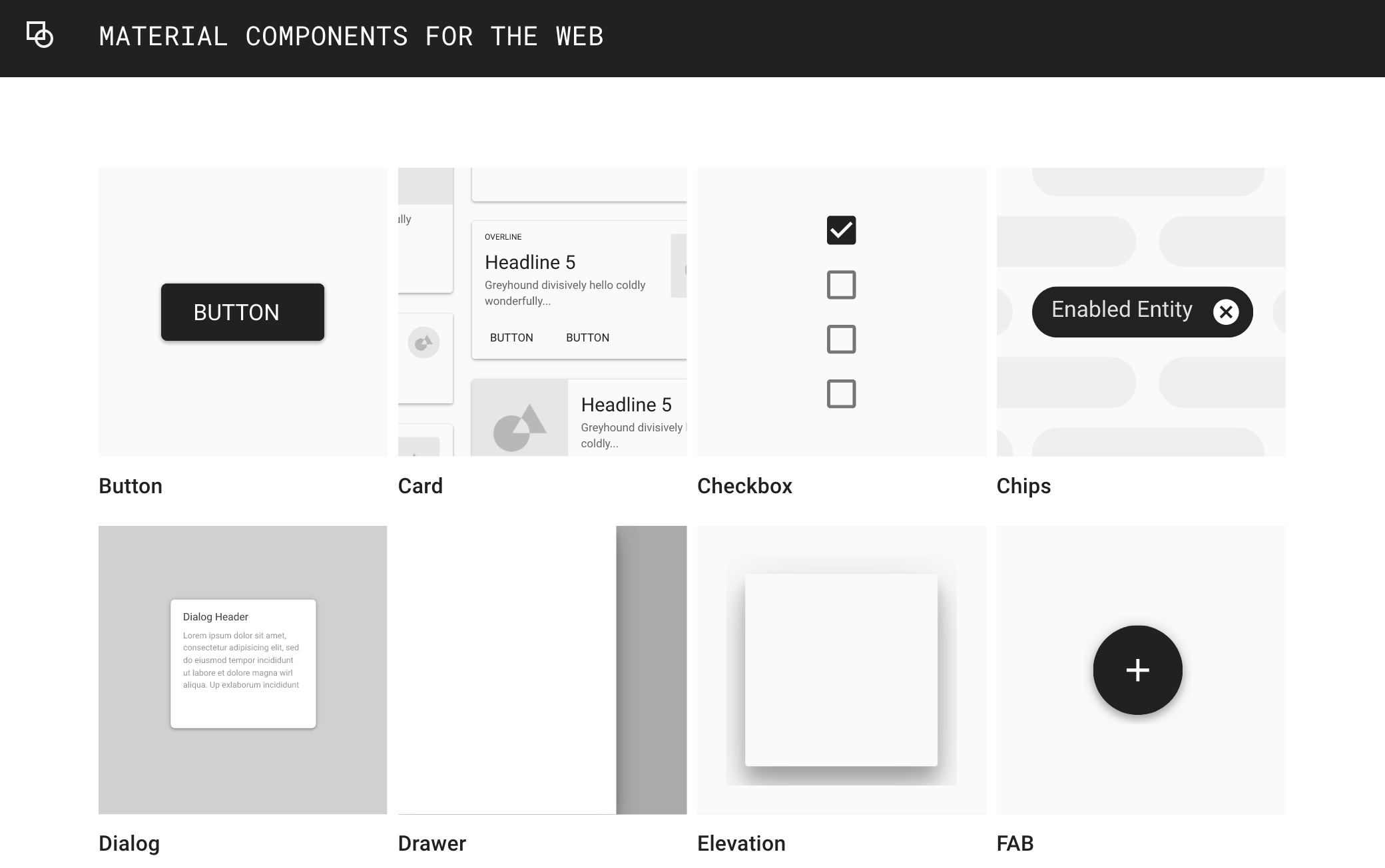
Building an arsenal of components is particularly useful for companies such as Google that own a considerable portfolio of websites all sharing a common brand. By codifying their UI into composable widgets, larger companies can both speed up development time and achieve consistency of both visual and user-interaction design across projects. There’s been a rise in interest in style guides and pattern libraries over the last several years. Given multiple developers and designers spread over multiple teams, large companies seek to attain consistency. We can do better than simple color swatches. What we need is easily distributable code.
Sharing And Reusing Code
Manually copy-and-pasting code is effortless. Keeping that code up-to-date, however, is a maintenance nightmare. Many developers, therefore, rely on a package manager to reuse code across projects. Despite its name, the Node Package Manager has become the unrivalled platform for front-end package management. There are currently over 700,000 packages in the NPM registry and billions of packages are downloaded every month. Any folder with a package.json file can be uploaded to NPM as a shareable package. While NPM is primarily associated with JavaScript, a package can include CSS and markup. NPM makes it easy to reuse and, importantly, update code. Rather than needing to amend code in myriad places, you change the code only in the package.
The Markup Problem
Sass and Javascript are easily portable with the use of import statements. Templating languages give HTML the same ability — templates can import other fragments of HTML in the form of partials. You can write the markup for your footer, for example, just once, then include it in other templates. To say there exists a multiplicity of templating languages would be an understatement. Tying yourself to just one severely limits the potential reusability of your code. The alternative is to copy-and-paste markup and to use NPM only for styles and javascript.
This is the approach taken by the Financial Times with their Origami component library. In her talk “Can't You Just Make It More like Bootstrap?” Alice Bartlett concluded “there is no good way to let people include templates in their projects”. Speaking about his experience of maintaining a component library at Lonely Planet, Ian Feather reiterated the problems with this approach:
“Once they copy that code they are essentially cutting a version which needs to be maintained indefinitely. When they copied the markup for a working component it had an implicit link to a snapshot of the CSS at that point. If you then update the template or refactor the CSS, you need to update all versions of the template scattered around your site.”
A Solution: Web Components
Web components solve this problem by defining markup in JavaScript. The author of a component is free to alter markup, CSS, and Javascript. The consumer of the component can benefit from these upgrades without needing to trawl through a project altering code by hand. Syncing with the latest changes project-wide can be achieved with a terse npm update via terminal. Only the name of the component and its API need to stay consistent.
Installing a web component is as simple as typing npm install component-name into a terminal. The Javascript can be included with an import statement:
<script type="module">
import './node_modules/component-name/index.js';
</script>
Then you can use the component anywhere in your markup. Here is a simple example component that copies text to the clipboard.
See the Pen Simple web component demo by CSS GRID (@cssgrid) on CodePen.
A component-centric approach to front-end development has become ubiquitous, ushered in by Facebook’s React framework. Inevitably, given the pervasiveness of frameworks in modern front-end workflows, a number of companies have built component libraries using their framework of choice. Those components are reusable only within that particular framework.
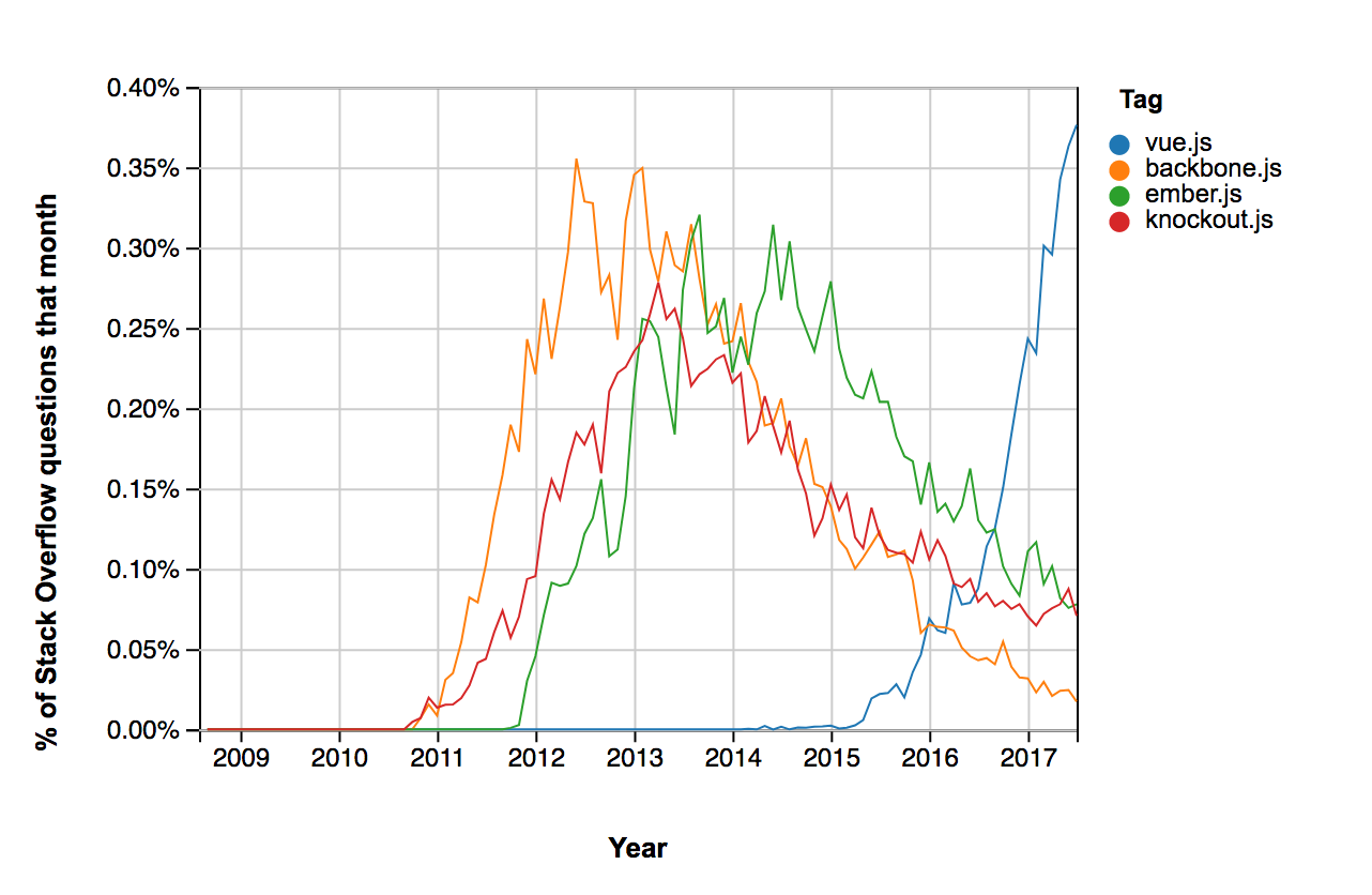
It’s rare for a sizeable company to have a uniform front-end and replatorming from one framework to another isn’t uncommon. Frameworks come and go. To enable the maximum amount of potential reuse across projects, we need components that are framework agnostic.
“I have built web applications using: Dojo, Mootools, Prototype, jQuery, Backbone, Thorax, and React over the years...I would love to have been able to bring that killer Dojo component that I slaved over with me to my React app of today.”
— Dion Almaer, Director of Engineering, Google
When we talk about a web component, we are talking about the combination of a custom element with shadow DOM. Custom Elements and shadow DOM are part of both the W3C DOM specification and the WHATWG DOM Standard — meaning web components are a web standard. Custom elements and shadow DOM are finally set to achieve cross-browser support this year. By using a standard part of the native web platform, we ensure that our components can survive the fast-moving cycle of front-end restructuring and architectural rethinks. Web components can be used with any templating language and any front-end framework — they’re truly cross-compatible and interoperable. They can be used everywhere from a Wordpress blog to a single page application.
Making A Web Component
Defining A Custom Element
It's always been possible to make up tag-names and have their content appear on the page.
<made-up-tag>Hello World!</made-up-tag>HTML is designed to be fault tolerant. The above will render, even though it’s not a valid HTML element. There’s never been a good reason to do this — deviating from standardized tags has traditionally been a bad practice. By defining a new tag using the custom element API, however, we can augment HTML with reusable elements that have built-in functionality. Creating a custom element is much like creating a component in React — but here were extending HTMLElement.
class ExpandableBox extends HTMLElement {
      constructor() {
        super()
      }
    }
A parameter-less call to super() must be the first statement in the constructor. The constructor should be used to set up initial state and default values and to set up any event listeners. A new custom element needs to be defined with a name for its HTML tag and the elements corresponding class:
customElements.define('expandable-box', ExpandableBox)It’s a convention to capitalize class names. The syntax of the HTML tag is, however, more than a convention. What if browsers wanted to implement a new HTML element and they wanted to call it expandable-box? To prevent naming collisions, no new standardized HTML tags will include a dash. By contrast, the names of custom elements have to include a dash.
customElements.define('whatever', Whatever) // invalid
customElements.define('what-ever', Whatever) // valid
Custom Element Lifecycle
The API offers four custom element reactions — functions that can be defined within the class that will automatically be called in response to certain events in the lifecycle of a custom element.
connectedCallback is run when the custom element is added to the DOM.
connectedCallback() {
    console.log("custom element is on the page!")
}
This includes adding an element with Javascript:
document.body.appendChild(document.createElement("expandable-box")) //“custom element is on the page”as well as simply including the element within the page with a HTML tag:
<expandable-box></expandable-box> // "custom element is on the page"Any work that involves fetching resources or rendering should be in here.
disconnectedCallback is run when the custom element is removed from the DOM.
disconnectedCallback() {
    console.log("element has been removed")
}
document.querySelector("expandable-box").remove() //"element has been removed"
adoptedCallback is run when the custom element is adopted into a new document. You probably don’t need to worry about this one too often.
attributeChangedCallback is run when an attribute is added, changed, or removed. It can be used to listen for changes to both standardized native attributes like disabled or src, as well as any custom ones we make up. This is one of the most powerful aspects of custom elements as it enables the creation of a user-friendly API.
Custom Element Attributes
There are a great many HTML attributes. So that the browser doesn’t waste time calling our attributeChangedCallback when any attribute is changed, we need to provide a list of the attribute changes we want to listen for. For this example, we’re only interested in one.
static get observedAttributes() {
            return ['expanded']
        }
So now our attributeChangedCallback will only be called when we change the value of the expanded attribute on the custom element, as it’s the only attribute we’ve listed.
HTML attributes can have corresponding values (think href, src, alt, value etc) while others are either true or false (e.g. disabled, selected, required). For an attribute with a corresponding value, we would include the following within the custom element’s class definition.
get yourCustomAttributeName() {
  return this.getAttribute('yourCustomAttributeName');
}
set yourCustomAttributeName(newValue) {
  this.setAttribute('yourCustomAttributeName', newValue);
}
For our example element, the attribute will either be true or false, so defining the getter and setter is a little different.
get expanded() {
  return this.hasAttribute('expanded')
}

// the second argument for setAttribute is mandatory, so we’ll use an empty string
set expanded(val) {
  if (val) {
    this.setAttribute('expanded', '');
  }
  else {
    this.removeAttribute('expanded')
  }
}
Now that the boilerplate has been dealt with, we can make use of attributeChangedCallback.
attributeChangedCallback(name, oldval, newval) {
  console.log(`the ${name} attribute has changed from ${oldval} to ${newval}!!`);
  // do something every time the attribute changes
}
Traditionally, configuring a Javascript component would have involved passing arguments to an init function. By utilising the attributeChangedCallback, its possible to make a custom element that’s configurable just with markup.
Shadow DOM and custom elements can be used separately, and you may find custom elements useful all by themselves. Unlike shadow DOM, they can be polyfilled. However, the two specs work well in conjunction.
Attaching Markup And Styles With Shadow DOM
So far, we’ve handled the behavior of a custom element. In regard to markup and styles, however, our custom element is equivalent to an empty unstyled ``. To encapsulate HTML and CSS as part of the component, we need to attach a shadow DOM. It’s best to do this within the constructor function.
class FancyComponent extends HTMLElement {
        constructor() {
            super()
            var shadowRoot = this.attachShadow({mode: 'open'})
            shadowRoot.innerHTML = `<h2>hello world!</h2>`
            }
Don’t worry about understanding what the mode means — its boilerplate you have to include, but you’ll pretty much always want open. This simple example component will just render the text “hello world”. Like most other HTML elements, a custom element can have children — but not by default. So far the above custom element we’ve defined won’t render any children to the screen. To display any content between the tags, we need to make use of a slot element.
shadowRoot.innerHTML = `
<h2>hello world!</h2>
<slot></slot>
`
We can use a style tag to apply some CSS to the component.
shadowRoot.innerHTML =
`<style>
p {
color: red;
}
</style>
<h2>hello world!</h2>
<slot>some default content</slot>`
These styles will only apply to the component, so we are free to make use of element selectors without the styles affecting anything else of the page. This simplifies writing CSS, making naming conventions like BEM unnecessary.
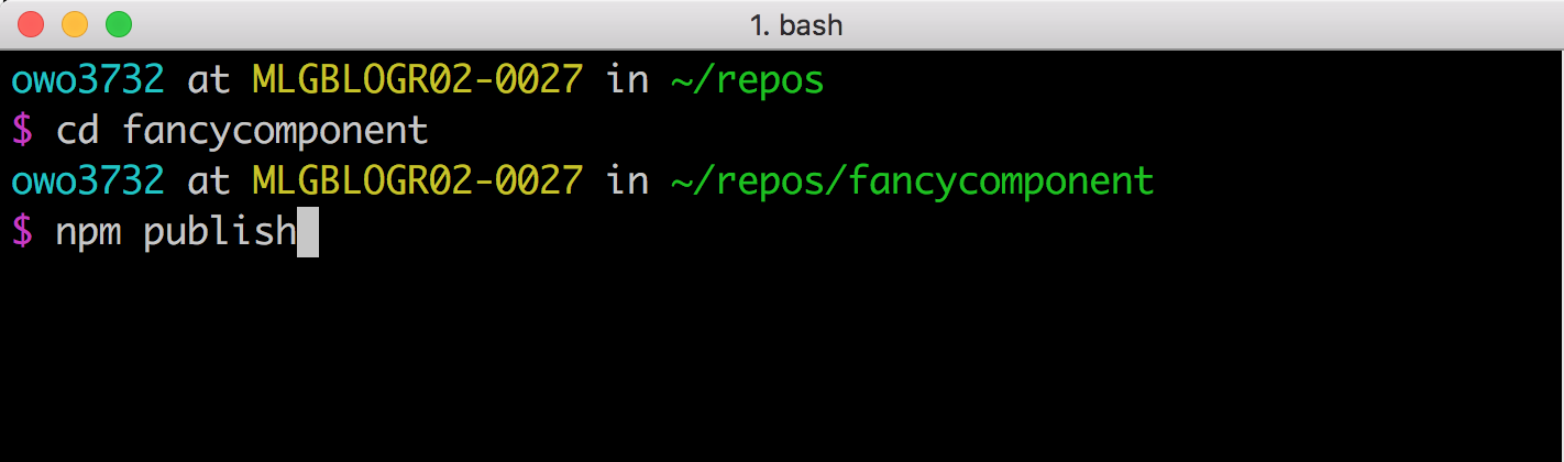
Publishing A Component On NPM
NPM packages are published via the command line. Open a terminal window and move into a directory that you would like to turn into a reusable package. Then type the following commands into the terminal:
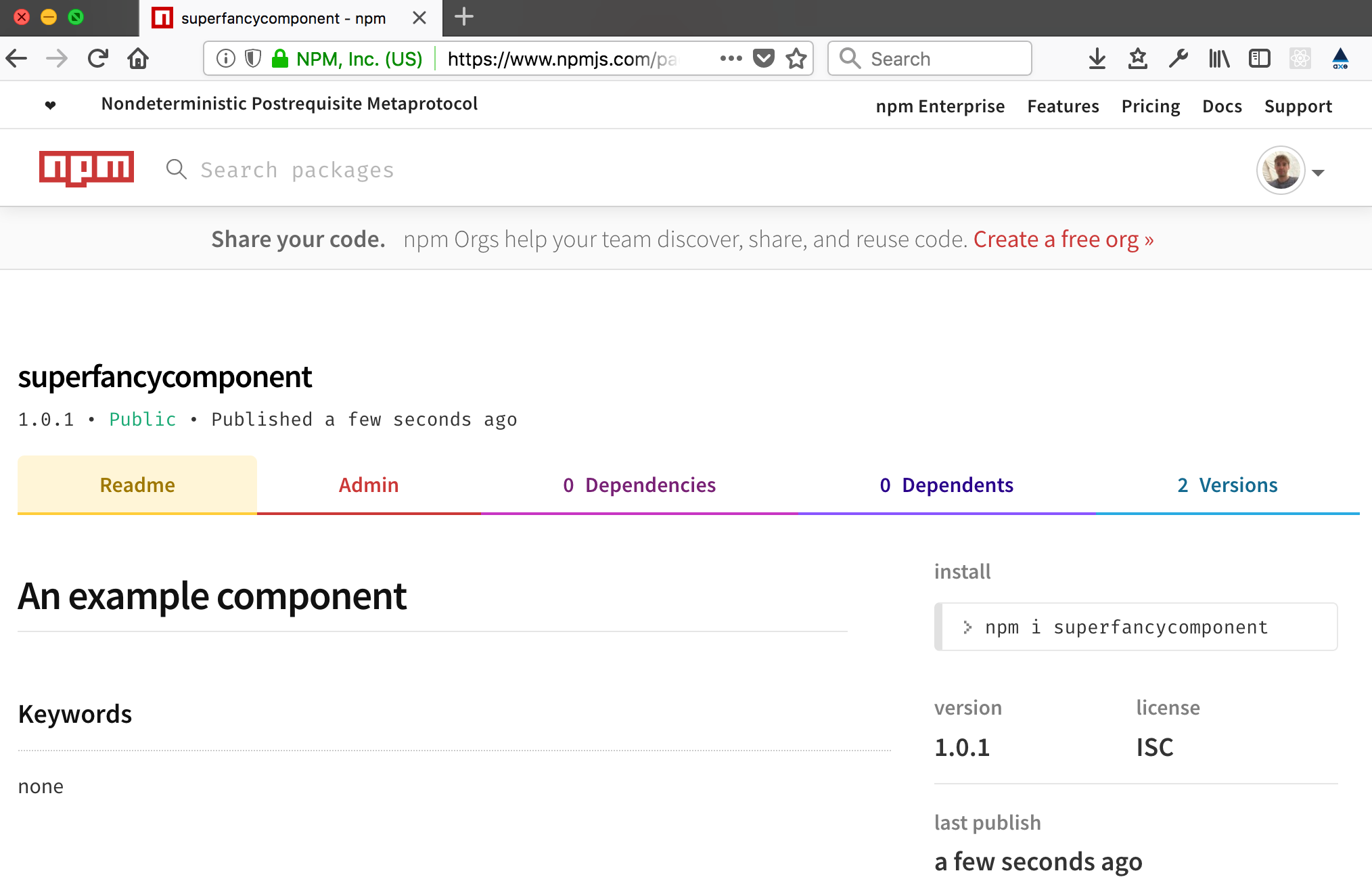
- If your project doesn’t already have a package.json,
npm initwill walk you through generating one. npm adduserlinks your machine to your NPM account. If you don’t have a preexisting account, it will create a new one for you.npm publish
If all’s gone well, you now have a component in the NPM registry, ready to be installed and used in your own projects — and shared with the world.
The web components API isn’t perfect. Custom elements are currently unable to include data in form submissions. The progressive enhancement story isn’t great. Dealing with accessibility isn’t as easy as it should be.
Although originally announced in 2011, browser support still isn’t universal. Firefox support is due later this year. Nevertheless, some high-profile websites (like Youtube) are already making use of them. Despite their current shortcomings, for universally shareable components they’re the singular option and in the future we can expect exciting additions to what they have to offer.
Further Reading
- A Web Designer’s Accessibility Advocacy Toolkit
- Recreating YouTube’s Ambient Mode Glow Effect
- How To Draw Radar Charts In Web
- The End Of My Gatsby Journey
 (il, ra, yk, mrn)

