Everything You Need To Know About Alignment In Flexbox

Email Newsletter
Weekly tips on front-end & UX.
Trusted by 182,000+ folks.


 Celebrating 10 million developers
 Custom Web Forms for Angular, React, & Vue. Your backend.

In the first article of this series, I explained what happens when you declare display: flex on an element. This time we will take a look at the alignment properties, and how these work with Flexbox. If you have ever been confused about when to align and when to justify, I hope this article will make things clearer!
History Of Flexbox Alignment
For the entire history of CSS Layout, being able to properly align things on both axes seemed like it might truly be the hardest problem in web design. So the ability to properly align items and groups of items was for many of us the most exciting thing about Flexbox when it first started to show up in browsers. Alignment became as simple as two lines of CSS:
See the Pen Smashing Flexbox Series 2: center an item by Rachel Andrew (@rachelandrew) on CodePen.
The alignment properties that you might think of as the flexbox alignment properties are now fully defined in the Box Alignment Specification. This specification details how alignment works across the various layout contexts. This means that we can use the same alignment properties in CSS Grid as we use in Flexbox — and in future in other layout contexts, too. Therefore, any new alignment capability for flexbox will be detailed in the Box Alignment specification and not in a future level of Flexbox.
The Properties
Many people tell me that they struggle to remember whether to use properties which start with align- or those which start with justify- in flexbox. The thing to remember is that:
justify-performs main axis alignment. Alignment in the same direction as yourflex-directionalign-performs cross-axis alignment. Alignment across the direction defined byflex-direction.
Thinking in terms of main axis and cross axis, rather than horizontal and vertical really helps here. It doesn’t matter which way the axis is physically.
Main Axis Alignment With justify-content
We will start with the main axis alignment. On the main axis, we align using the justify-content property. This property deals with all of our flex items as a group, and controls how space is distributed between them.
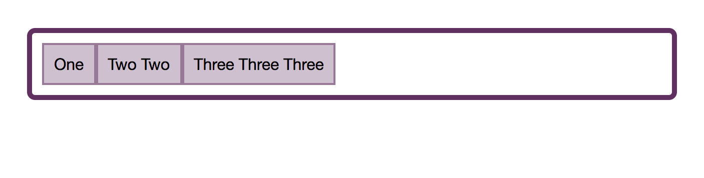
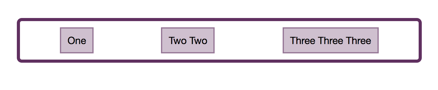
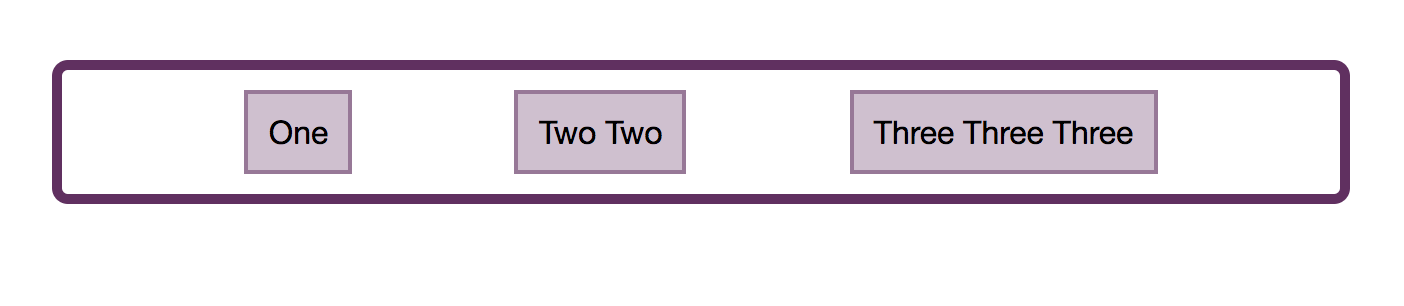
The initial value of justify-content is flex-start. This is why, when you declare display: flex all your flex items line up against the start of the flex line. If you have a flex-direction of row and are in a left to right language such as English, then the items will start on the left.
Note that the justify-content property can only do something if there is spare space to distribute. Therefore if you have a set of flex items which take up all of the space on the main axis, using justify-content will not change anything.
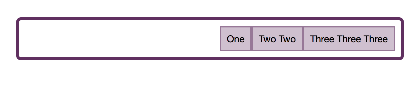
If we give justify-content a value of flex-end then all of the items will move to the end of the line. The spare space is now placed at the beginning.
We can do other things with that space. We could ask for it to be distributed between our flex items, by using justify-content: space-between. In this case, the first and last item will be flush with the ends of the container and all of the space shared equally between the items.
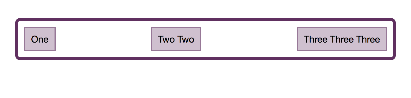
We can ask that the space to be distributed around our flex items, using justify-content: space-around. In this case, the available space is shared out and placed on each side of the item.
A newer value of justify-content can be found in the Box Alignment specification; it doesn’t appear in the Flexbox spec. This value is space-evenly. In this case, the items will be evenly distributed in the container, and the extra space will be shared out between and either side of the items.
You can play with all of the values in the demo:
See the Pen Smashing Flexbox Series 2: justify-content with flex-direction: row by Rachel Andrew (@rachelandrew) on CodePen.
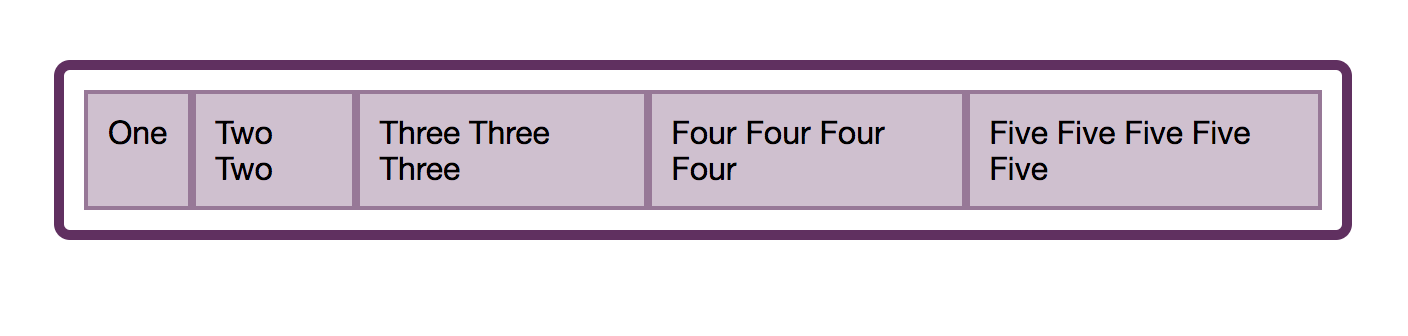
These values work in the same way if your flex-direction is column. You may not have extra space to distribute in a column however unless you add a height or block-size to the flex container as in this next demo.
See the Pen Smashing Flexbox Series 2: justify-content with flex-direction: column by Rachel Andrew (@rachelandrew) on CodePen.
Cross Axis Alignment With align-content
If you have added flex-wrap: wrap to your flex container, and have multiple flex lines then you can use align-content to align your flex lines on the cross axis. However, this will require that you have additional space on the cross axis. In the below demo, my cross axis is running in the block direction as a column, and I have set the height of the flex container to 60vh. As this is more than is needed to display my flex items I have spare space vertically in the container.
I can then use align-content with any of the values:
See the Pen Smashing Flexbox Series 2: align-content with flex-direction: row by Rachel Andrew (@rachelandrew) on CodePen.
If my flex-direction were column then align-content would work as in the following example.
See the Pen Smashing Flexbox Series 2: align-content with flex-direction: column by Rachel Andrew (@rachelandrew) on CodePen.
As with justify-content, we are working with the lines as a group and distributing the spare space.
The place-content Shorthand
In the Box Alignment, we find the shorthand place-content; using this property means you can set justify-content and align-content at once. The first value is for align-content, the second for justify-content. If you only set one value then both values are set to that value, therefore:
.container {
    place-content: space-between stretch;
}
Is the same as:
.container {
    align-content: space-between;
    justify-content: stretch;
}
If we used:
.container {
    place-content: space-between;
}
This would be the same as:
.container {
    align-content: space-between;
    justify-content: space-between;
}
Cross Axis Alignment With align-items
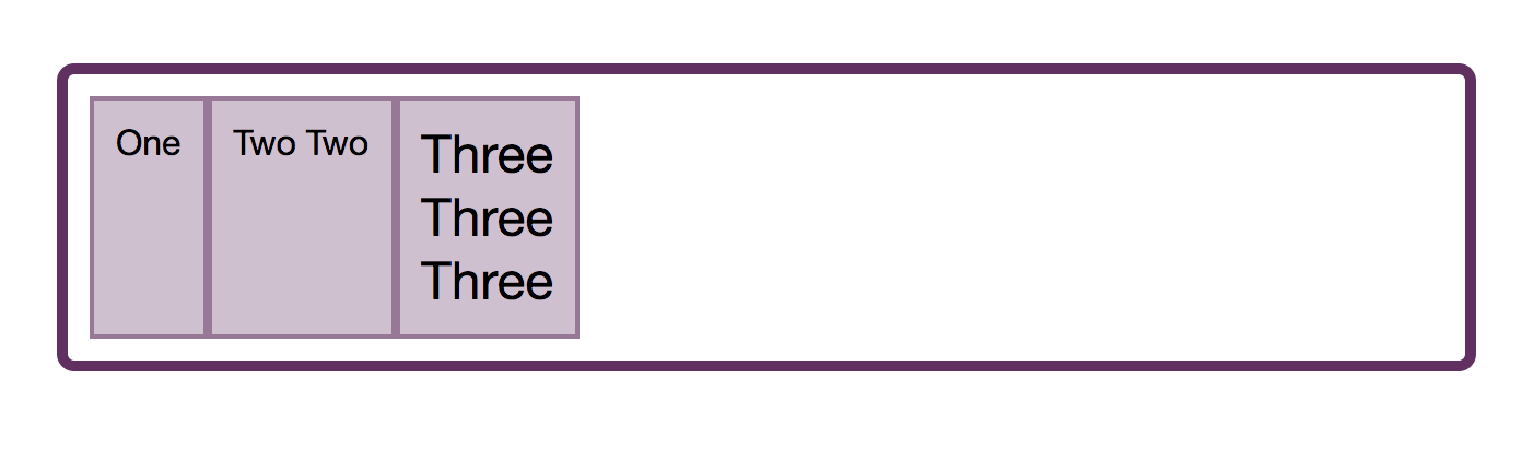
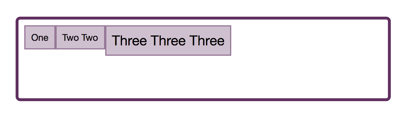
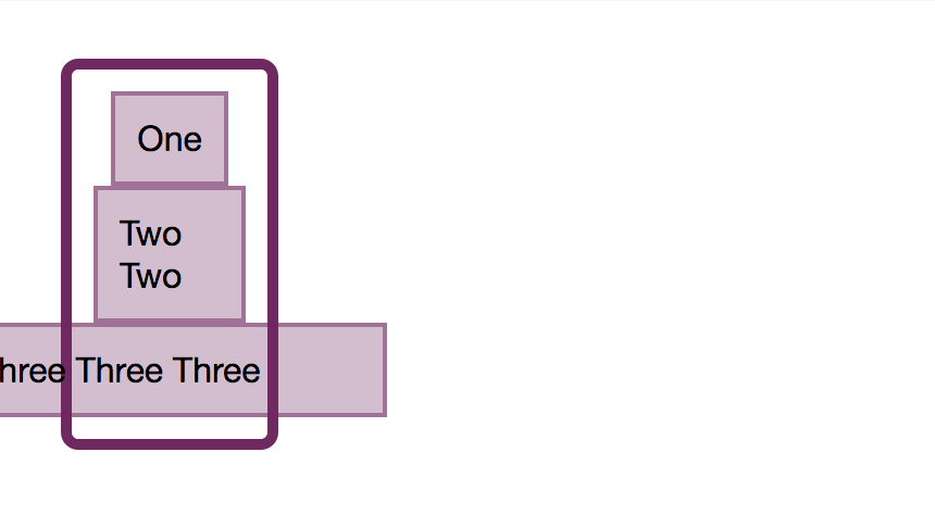
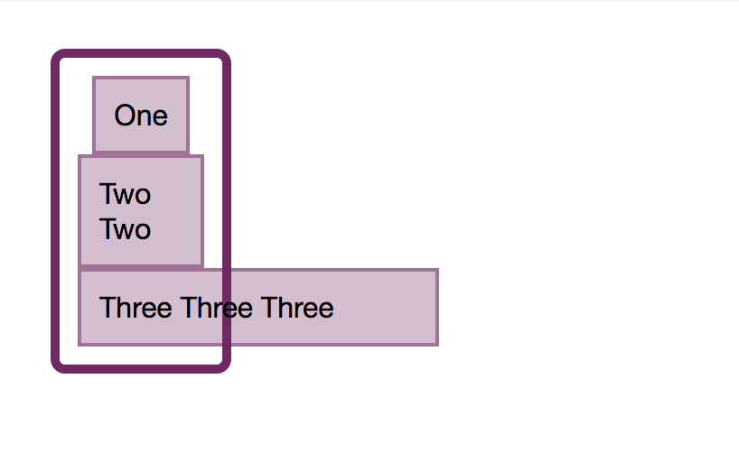
We now know that we can align our set of flex items or our flex lines as a group. However, there is another way we might wish to align our items and that is to align items in relationship to each other on the cross axis. Your flex container has a height. That height might be defined by the height of the tallest item as in this image.
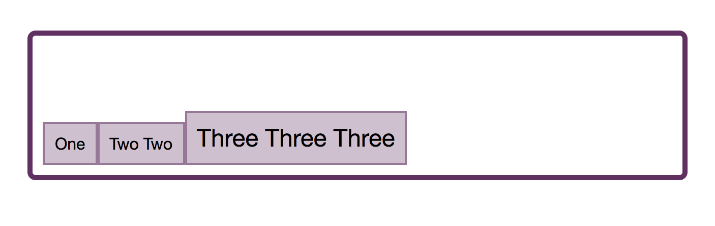
It might instead be defined by adding a height to the flex container:
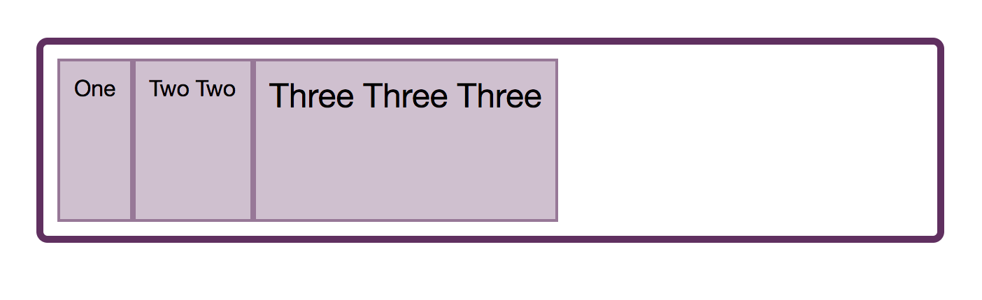
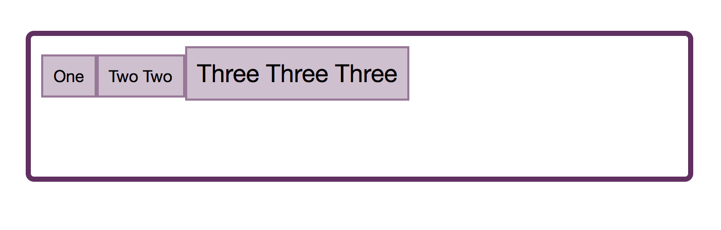
The reason that flex items appear to stretch to the size of the tallest item is that the initial value of align-items is stretch. The items stretch on the cross axis to become the size of the flex container in that direction.
Note that where align-items is concerned, if you have a multi-line flex container, each line acts like a new flex container. The tallest item in that line would define the size of all items in that line.
In addition to the initial value of stretch, you can give align-items a value of flex-start, in which case they align to the start of the container and no longer stretch to the height.
The value flex-end moves them to the end of the container on the cross axis.
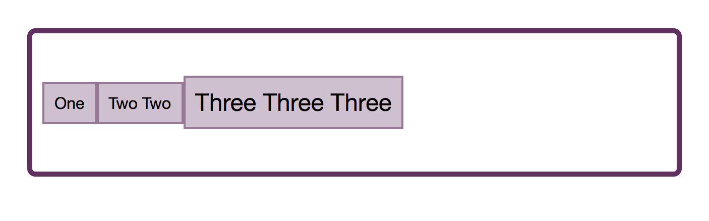
If you use a value of center the items all centre against each other:
We can also do baseline alignment. This ensures that the baselines of text line up, as opposed to aligning the boxes around the content.
You can try these values out in the demo:
See the Pen Smashing Flexbox Series 2: align-items by Rachel Andrew (@rachelandrew) on CodePen.
Individual Alignment With align-self
The align-items property means that you can set the alignment of all of the items at once. What this really does is set all of the align-self values on the individual flex items as a group. You can also use the align-self property on any individual flex item to align it inside the flex line and against the other flex items.
In the following example, I have used align-items on the container to set the alignment for the group to center, but also used align-self on the first and last items to change their alignment value.
See the Pen Smashing Flexbox Series 2: align-self by Rachel Andrew (@rachelandrew) on CodePen.
Why Is There No justify-self?
A common question is why it is not possible to align one item or a group of the items on the main axis. Why is there no -self property for main axis alignment in Flexbox? If you think about justify-content and align-content as being about space distribution, the reason for their being no self-alignment becomes more obvious. We are dealing with the flex items as a group, and distributing available space in some way — either at the start or end of the group or between the items.
If might be also helpful to think about how justify-content and align-content work in CSS Grid Layout. In Grid, these properties are used to distribute spare space in the grid container between grid tracks. Once again, we take the tracks as a group, and these properties give us a way to distribute any extra space between them. As we are acting on a group in both Grid and Flexbox, we can’t target an item on its own and do something different with it. However, there is a way to achieve the kind of layout that you are asking for when you ask for a self property on the main axis, and that is to use auto margins.
Using Auto Margins On The Main Axis
If you have ever centered a block in CSS (such as the wrapper for your main page content by setting a margin left and right of auto), then you already have some experience of how auto margins behave. A margin set to auto will try to become as big as it can in the direction it has been set in. In the case of using margins to center a block, we set the left and right both to auto; they each try and take up as much space as possible and so push our block into the center.
Auto margins work very nicely in Flexbox to align single items or groups of items on the main axis. In the next example, I am achieving a common design pattern. I have a navigation bar using Flexbox, the items are displayed as a row and are using the initial value of justify-content: start. I would like the final item to be displayed separated from the others at the end of the flex line — assuming there is enough space on the line to do so.
I target that item and give it a margin-left of auto. This then means that the margin tries to get as much space as possible to the left of the item, which means the item gets pushed all the way over to the right.
See the Pen Smashing Flexbox Series 2: alignment with auto margins by Rachel Andrew (@rachelandrew) on CodePen.
If you use auto margins on the main axis then justify-content will cease to have any effect, as the auto margins will have taken up all of the space that would otherwise be assigned using justify-content.
Fallback Alignment
Each alignment method details a fallback alignment, this is what will happen if the alignment you have requested can’t be achieved. For example, if you only have one item in a flex container and ask for justify-content: space-between, what should happen? The answer is that the fallback alignment of flex-start is used and your single item will align to the start of the flex container. In the case of justify-content: space-around, a fallback alignment of center is used.
In the current specification you can’t change what the fallback alignment is, so if you would prefer that the fallback for space-between was center rather than flex-start, there isn’t a way to do that. There is a note in the spec which says that future levels may enable this.
Safe And Unsafe Alignment
A more recent addition to the Box Alignment specification is the concept of safe and unsafe alignment using the safe and unsafe keywords.
With the following code, the final item is too wide for the container and with unsafe alignment and the flex container on the left-hand side of the page, the item becomes cut off as the overflow is outside the page boundary.
.container {
    display: flex;
    flex-direction: column;
    width: 100px;
    align-items: unsafe center;
}

.item:last-child {
    width: 200px;
}
A safe alignment would prevent the data loss occurring, by relocating the overflow to the other side.
.container {
    display: flex;
    flex-direction: column;
    width: 100px;
    align-items: safe center;
}

.item:last-child {
    width: 200px;
}
These keywords have limited browser support right now, however, they demonstrate the additional control being brought to Flexbox via the Box Alignment specification.
See the Pen Smashing Flexbox Series 2: safe or unsafe alignment by Rachel Andrew (@rachelandrew) on CodePen.
In Summary
The alignment properties started as a list in Flexbox, but are now in their own specification and apply to other layout contexts. A few key facts will help you to remember how to use them in Flexbox:
justify-the main axis andalign-the cross axis;- To use
align-contentandjustify-contentyou need spare space to play with; - The
align-contentandjustify-contentproperties deal with the items as a group, sharing out space. Therefore, you can’t target an individual item and so there is no-selfalignment for these properties; - If you do want to align one item, or split a group on the main axis, use auto margins to do so;
- The
align-itemsproperty sets all of thealign-selfvalues as a group. Usealign-selfon the flex child to set the value for an individual item.
Further Reading
- Modern CSS Tooltips And Speech Bubbles (Part 1)
- A Guide To Hover And Pointer Media Queries
- How To Choose Typefaces For Fintech Products: Our Best Practices Guide (Part 1)
- A Primer On CSS Container Queries
 (il, mrn)

